A personal library assistant that reminds you of the best things you've read.
02
Color
#478CD0Accent
#1F1F1FInk
#FFFFFFBG
#F5F5F5BG soft
#808080Muted
rgba(0,0,0,0.1)Line
High-contrast monochrome base with a single functional blue for actions and links.
03
Typography
transitional-serif · humanist-sans · monospace
display50px · 800
h228px · 700
body16px · 400
Transitional serif for headlines to evoke a literary and educational feel. · Humanist sans for body text to maintain high readability and a modern aesthetic. · Generous line-height for comfortable reading of long-form content.
04
Spacing
4px
8px
12px
16px
24px
32px
48px
64px
96px
Consistent 4px base grid with generous padding (24px-35px) for content blocks.
05
Surfaces
sm · 4px
md · 8px
lg · 10px
pill · 999px
Subtle 1px borders used primarily for navigation underlines and input states.
06
Layout
1280container
12columns
24pxgutter
768 / 1024breakpoints
Centered single-column layout with alternating image-text sections.
07
Motion & Interaction
200msmicro
400mssmall
800msmedium
cubic-bezier(1, 0.3, 0.54, 1.39)easing
Simple background-color and color transitions on hover. · Smooth opacity and transform transitions for interactive elements.
Change in background-color or color with a 0.2s transition. · Immediate feedback via state change.
08
Components
buttonSolid blue fill with white text, rounded corners, or outline style with dark borders.
cardUsed primarily within product screenshots to show nested interface elements.
chipSmall rounded tags with distinct background colors for categorization.
inputStandard form fields with subtle borders and clear focus states.
heroLarge centered headline, supporting subtext, and a primary call-to-action button.
09
Voice & Don'ts
ToneEducational, encouraging, and focused on personal growth.
HeadlinesClear, benefit-driven statements in a large serif font.
CTAsDirect and action-oriented, such as 'GET STARTED FOR FREE'.
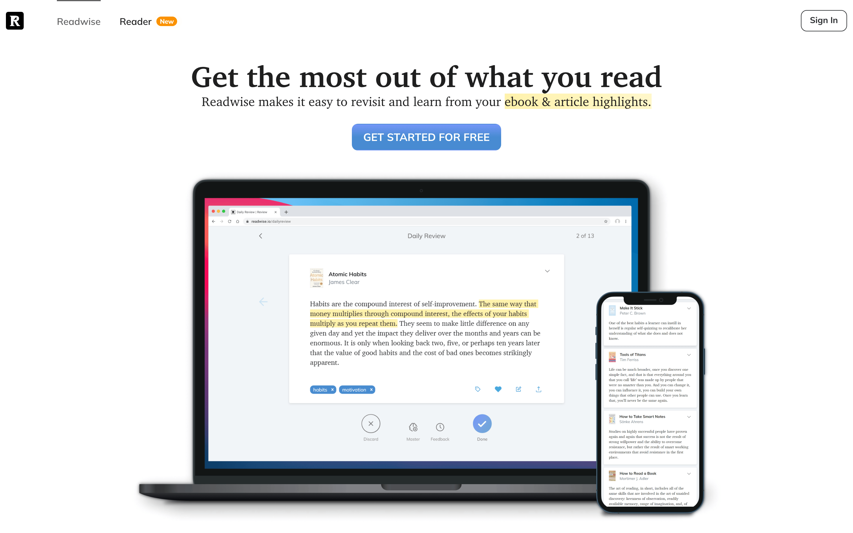
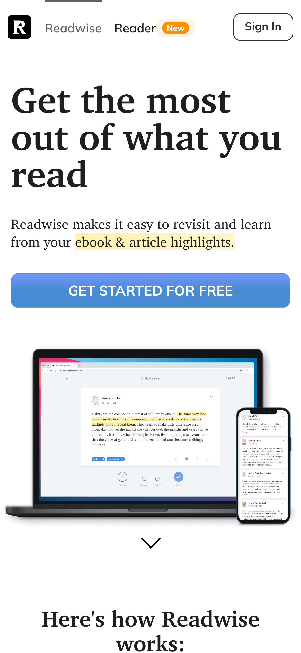
don't use a dark background for the main interface — screenshot shows a predominantly white background.
don't use monospace fonts for body text — screenshot shows a humanist sans-serif for readability.
don't use neon or overly bright accent colors — screenshot shows a functional, muted blue (#478CD0).
don't use complex gradients on primary buttons — screenshot shows solid color fills.
don't use high-contrast drop shadows on cards — screenshot shows a clean, border-based or flat UI.
don't use condensed or decorative fonts for headlines — screenshot uses a clear transitional serif.
Captured from the live site · real computed styles
11
System prompt
Readwise is a productivity tool for readers, focusing on memory and knowledge retention through spaced repetition. The design DNA is a clean, minimalist aesthetic that prioritizes readability. The core color palette is monochrome: white backgrounds (#FFFFFF) with near-black ink (#1F1F1F), accented by a functional blue (#478CD0). Typography is a refined mix of transitional-serif for headlines (evoking literature) and humanist-sans for body text (ensuring legibility). Critical design constraints: don't use dark mode or dark backgrounds, don't use neon or high-chroma accent colors, and don't use complex gradients or busy background patterns. The layout is spacious and centered, focusing the user's attention on the content and the value of their reading highlights.
Bring this taste to your agent
Hand your AI agent a machine-readable spec of this design — tokens, type, motion, the whole DNA.