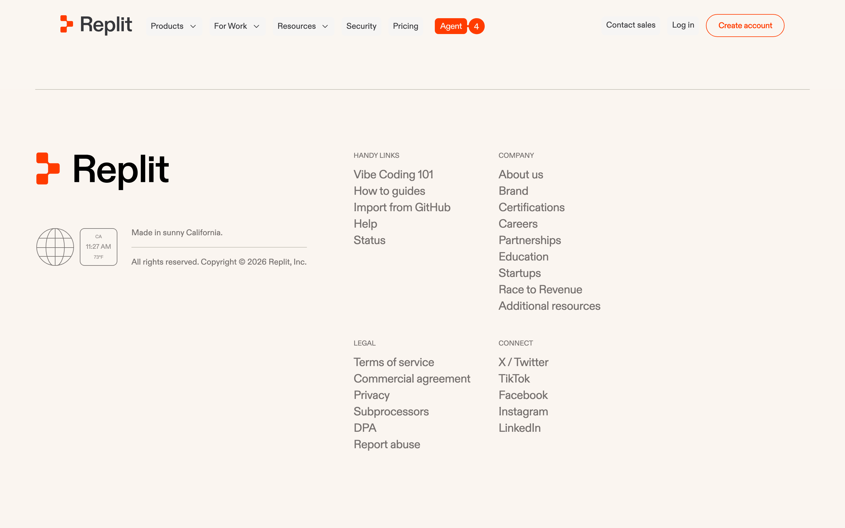
An open, airy workshop where builders sketch ideas and compile them into reality.
02
Color
#FF3C00Accent
#0E0E0FInk
#36373BInk soft
#F7F6F4BG
#F1F0EEBG soft
#FFFFFFBG quiet
#898C94Muted
rgba(137,140,148,0.3)Line
Warm, off-white neutrals with a single high-energy orange accent for action.
03
Typography
geometric-sans · monospace
display56px · 500
headline40px · 500
body16px · 400
caption14px · 400
Headlines use tight negative tracking for a compact, punchy feel. · Line heights are relatively tight even for body text to maintain density. · Font weight 500 is used for display/headline emphasis rather than a bold 700.
04
Spacing
4px
8px
12px
16px
24px
32px
48px
64px
96px
A 4px baseline grid providing consistent, tight spacing between elements and generous padding for cards.
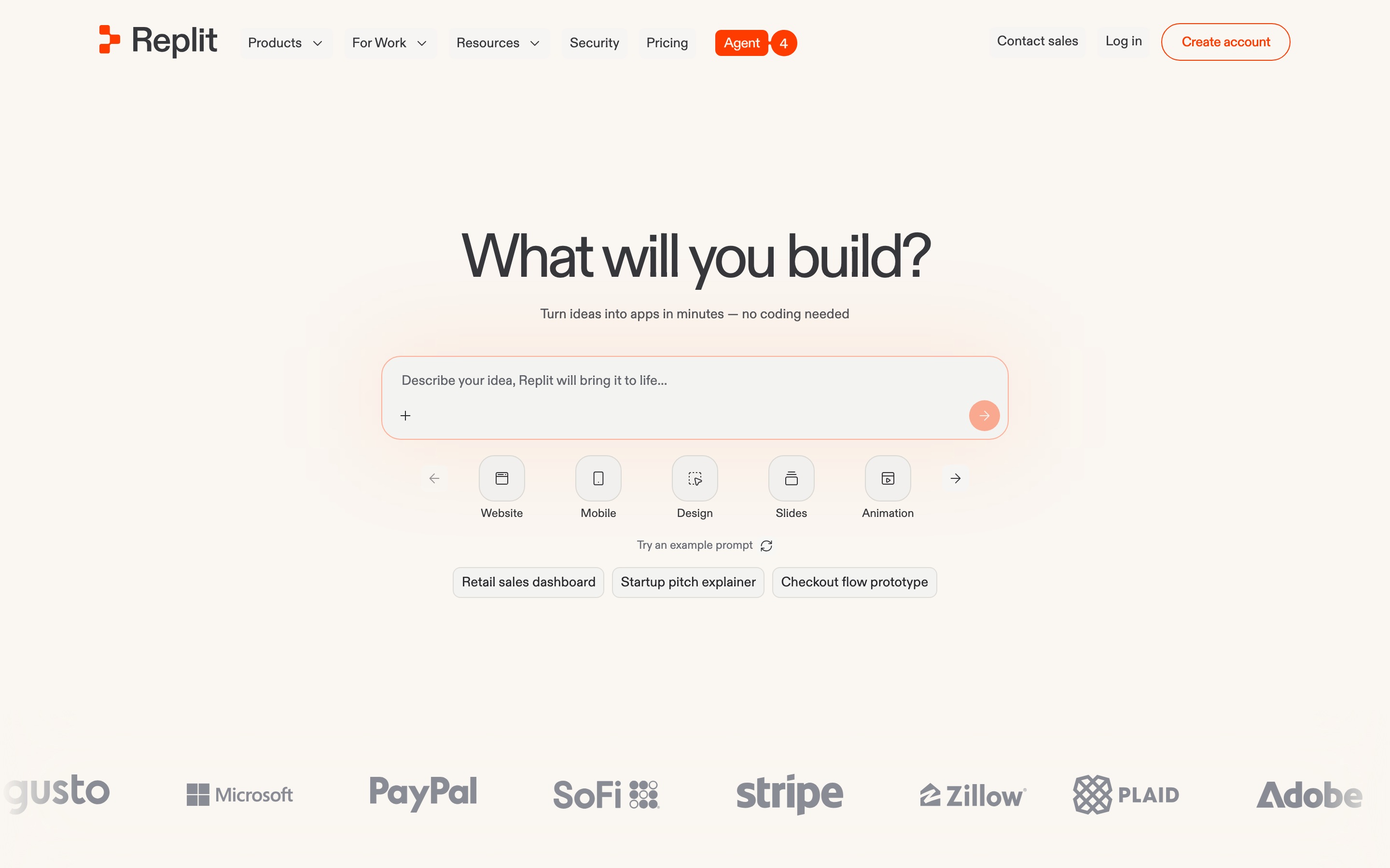
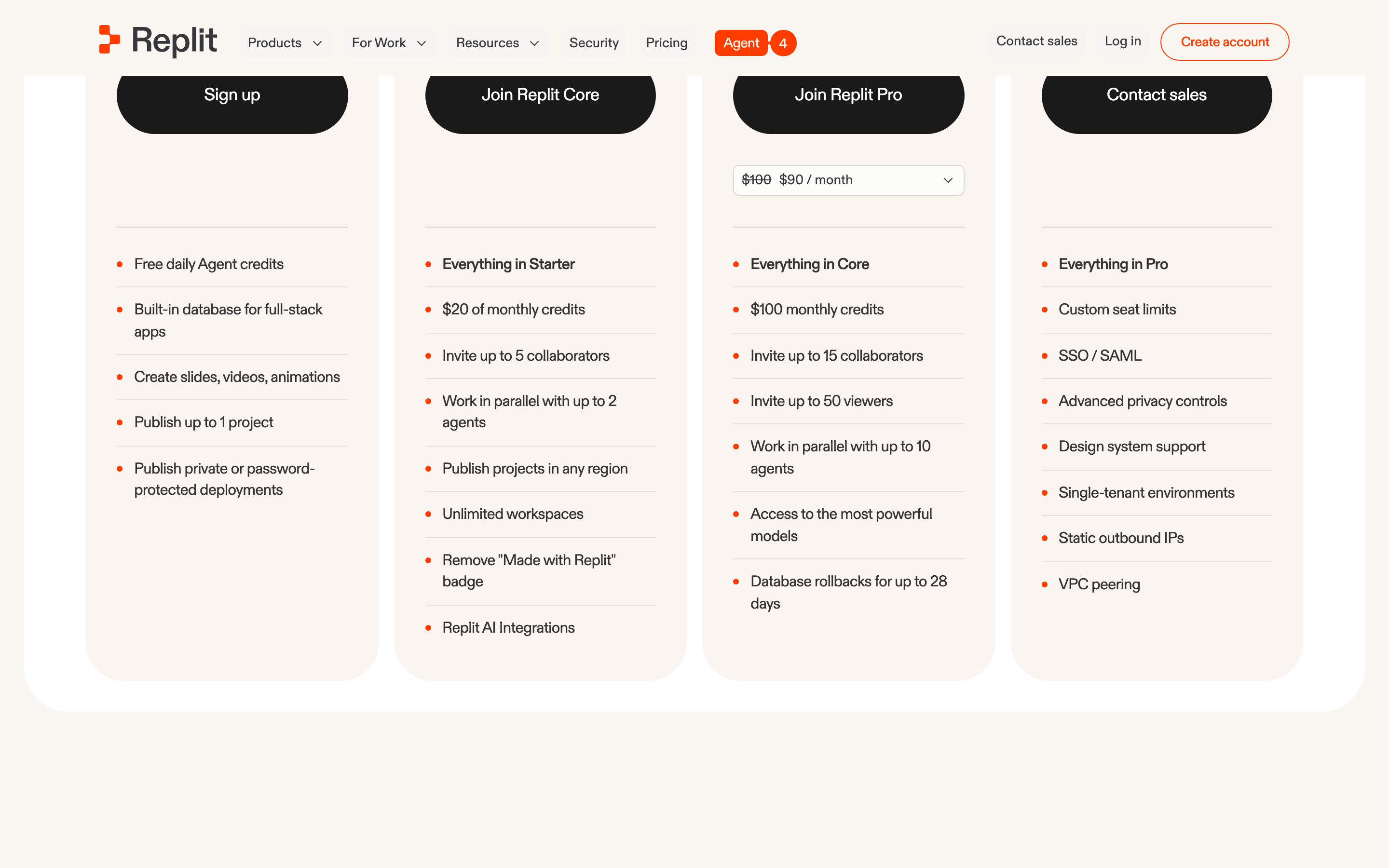
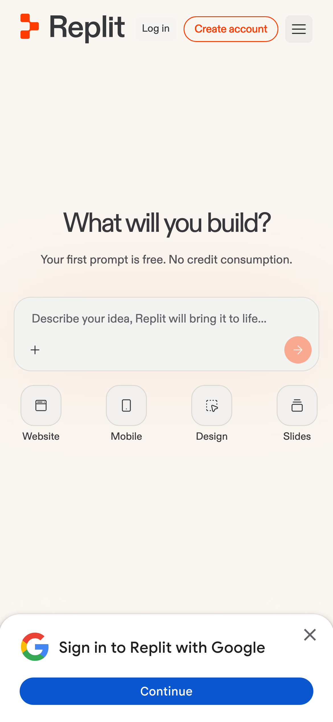
Centered single-column hero with a prominent input field, followed by a multi-column card layout for pricing or features.
07
Motion & Interaction
120msmicro
200mssmall
300msmedium
cubic-bezier(0.4, 0, 0.2, 1)easing
Smooth fade and background-color transitions on interactive elements. · Subtle scale or opacity shifts on hover for buttons and cards.
Background color fills for outline buttons; slight elevation change for cards. · Subtle scale-down effect on buttons; transition to the next state or page.
08
Components
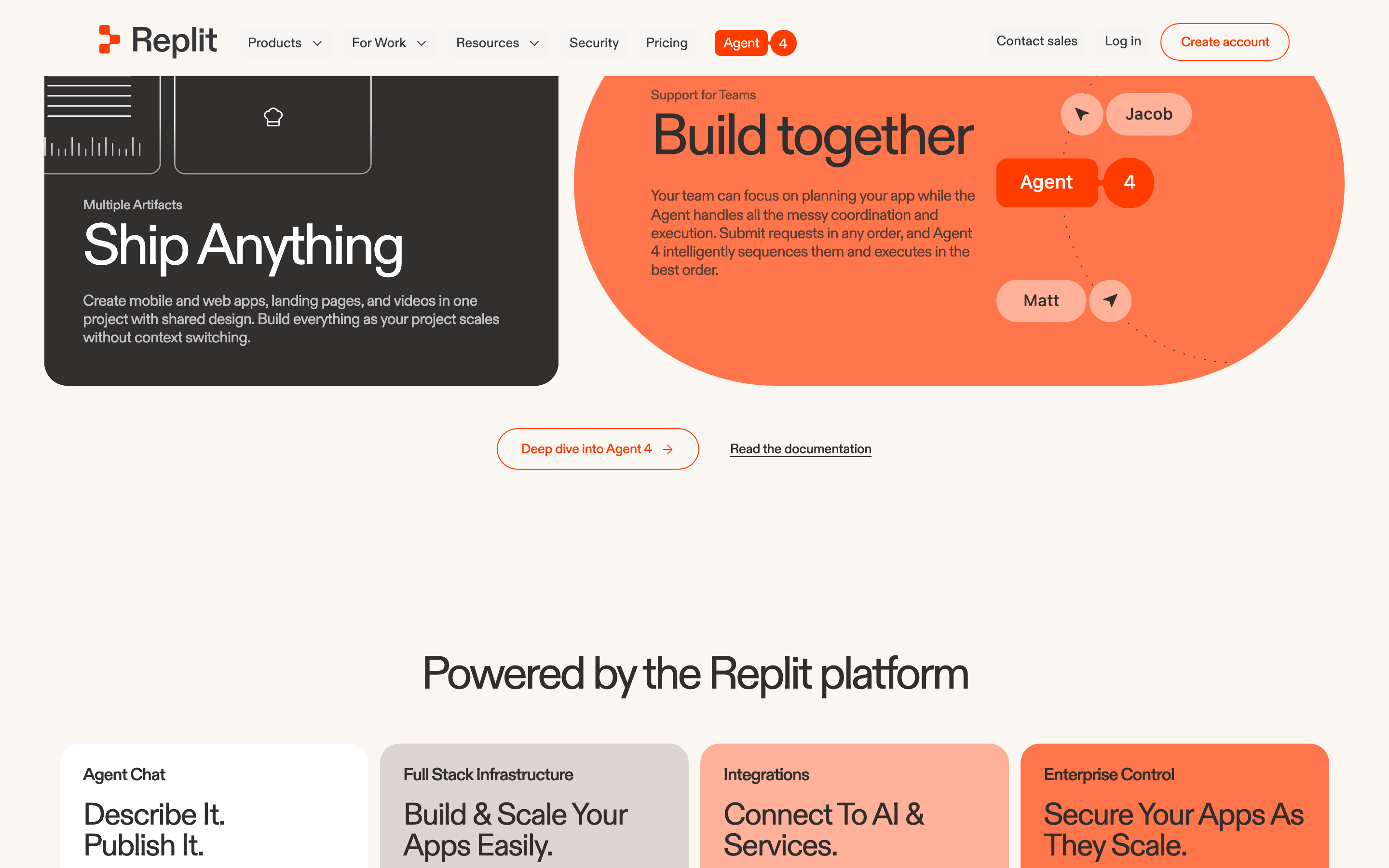
buttonPill-shaped outline buttons for primary actions and solid rounded buttons for secondary or specific triggers.
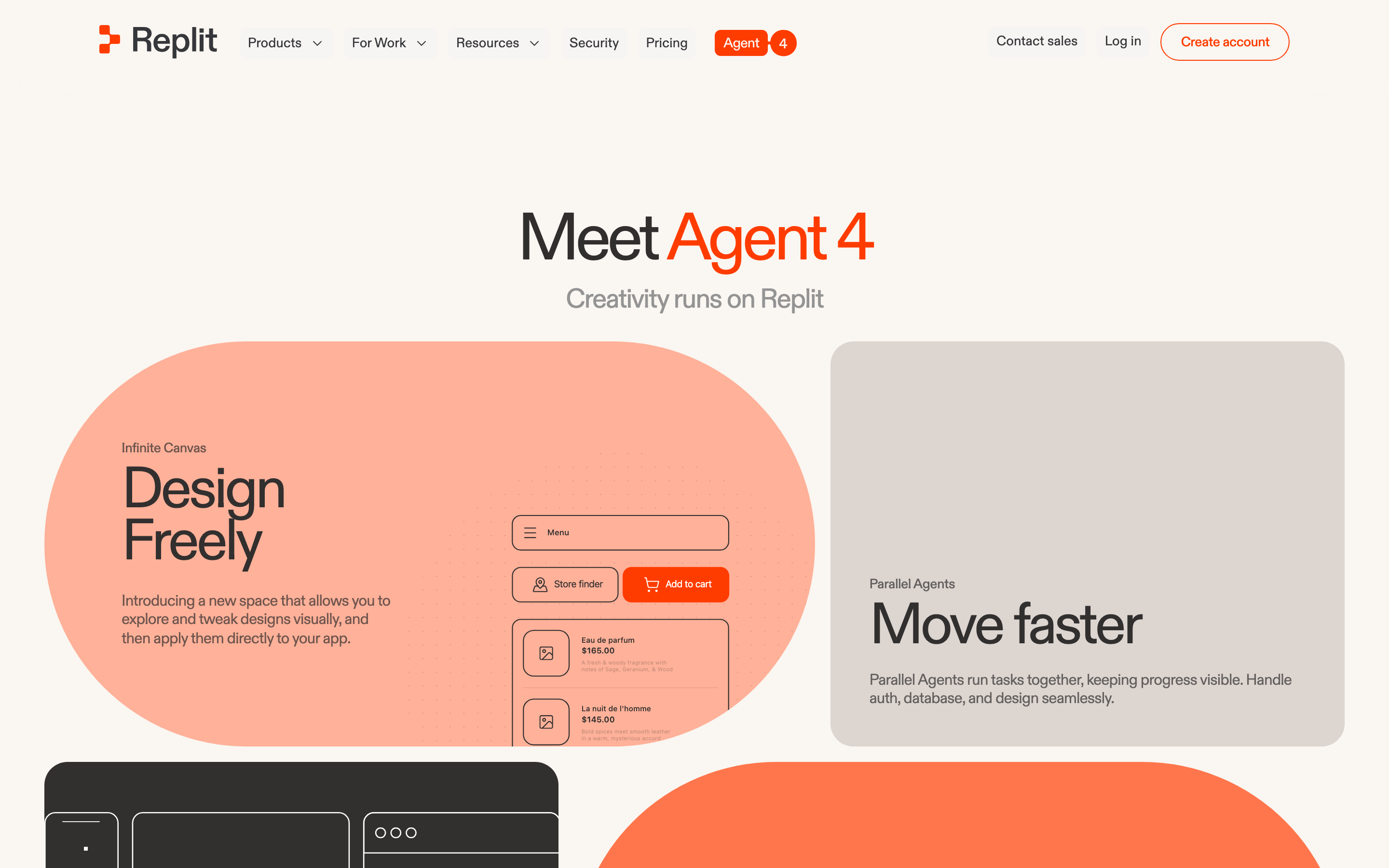
cardSoft off-white or light gray cards with large border-radius and subtle drop shadows.
chipLight gray rounded tags or suggestion chips for categorization or quick actions.
inputLarge, wide textarea or text input with rounded corners and a solid action button embedded on the right.
heroFull-width, vertically centered section with a large headline, concise subtext, and a dominant interactive input area.
09
Voice & Don'ts
ToneDirect, empowering, and slightly playful, inviting the user to create.
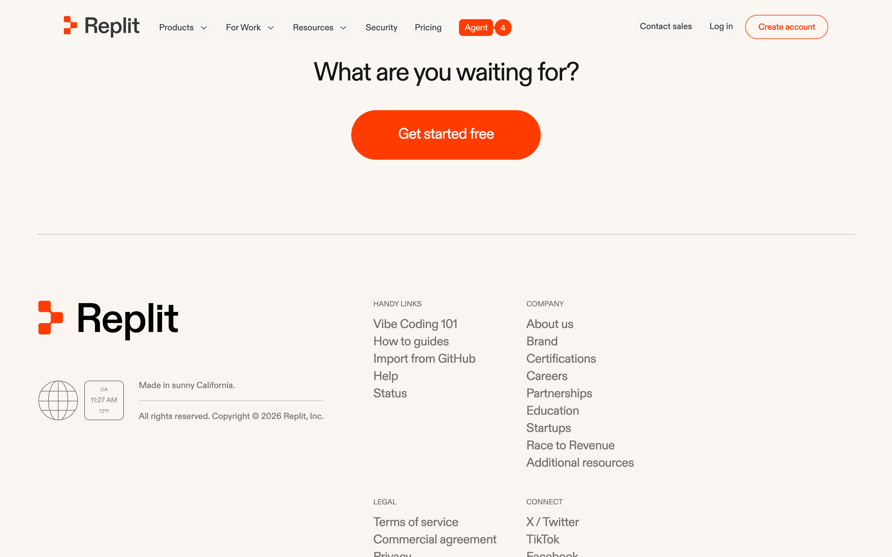
HeadlinesShort, punchy questions or statements like 'What will you build?' or 'Start Small. Scale Fast.'
CTAsClear, action-oriented text like 'Create account' or 'Sign up'.
Don't use stark pure black backgrounds — the design uses warm off-whites like #F7F6F4 instead.
Don't use overly decorative or serif fonts — the typography is consistently clean geometric sans-serif.
Don't use sharp, rectangular corners everywhere — elements rely on generous border-radius like 8px or pill shapes.
Don't flood the UI with the orange accent — it's reserved strictly for high-priority calls-to-action.
Don't use heavy drop shadows or high contrast borders — elevation is communicated through very soft, subtle shadows.
Don't use wide, loose line-heights for headlines — the text is kept tight and compact.
Captured from the live site · real computed styles
11
System prompt
Replit is a browser-based developer platform and IDE. Its design uses a warm, off-white palette (#F7F6F4, #F1F0EE) with a single high-energy orange accent (#FF3C00) for primary actions. Typography is strictly geometric sans-serif with tight letter-spacing for a modern, punchy feel. Critical donts: never use stark pure black backgrounds, avoid sharp rectangular corners everywhere, don't flood the UI with orange accents, don't use decorative serif fonts, don't use heavy shadows, and don't use wide line-heights for headlines. The overall feel is clean, premium, and focused on builder productivity.
Bring this taste to your agent
Hand your AI agent a machine-readable spec of this design — tokens, type, motion, the whole DNA.