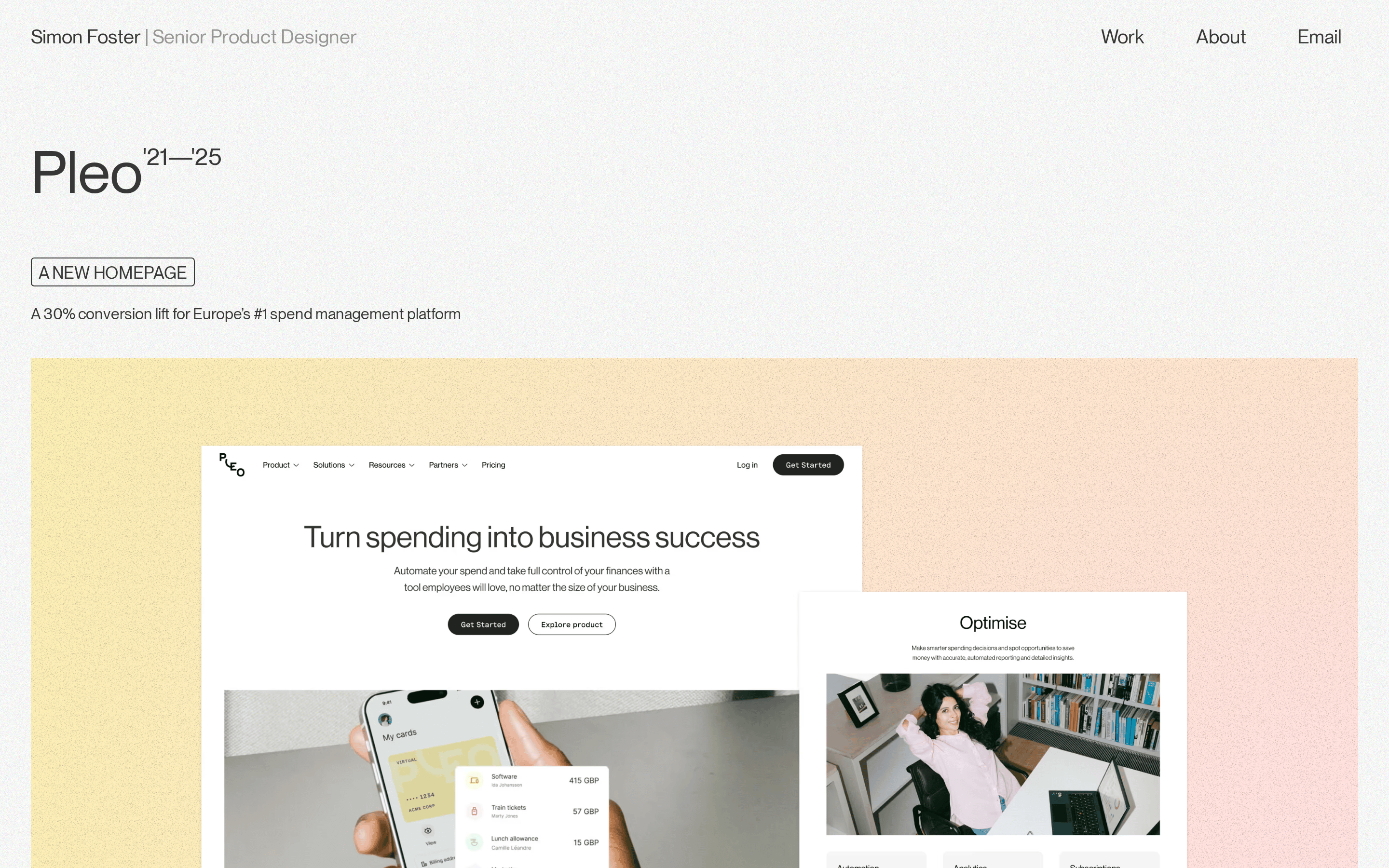
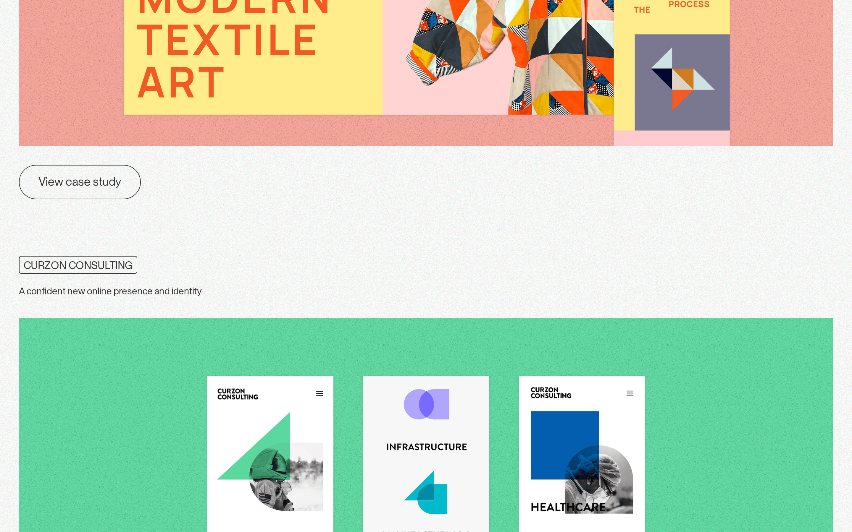
A curated gallery of design work presented with quiet confidence and precise typography
02
Color
#393737Ink
#F6F7F6BG
rgba(57,55,55,0.5)Muted
rgb(57,55,55)Line
Neutral warm grays with subtle noise texture, letting project imagery provide all color
03
Typography
grotesque-sans · monospace
display61px · 400
heading55px · 400
subhead24px · 400
body16px · 400
small14px · 400
All text uses weight 400 consistently · Uppercase is used sparingly for labels and tags · Tight leading on display sizes for impact
04
Spacing
4px
8px
16px
24px
32px
48px
64px
96px
Generous vertical spacing between sections with consistent 32px and 96px gaps creating breathing room
05
Surfaces
sm · 4px
md · 8px
lg · 12px
pill · 48px
1px solid borders in dark gray (#393737) with generous pill-shaped corners on buttons and tags
06
Layout
1280container
12columns
32pxgutter
768 / 1024breakpoints
Single-column portfolio layout with generous padding and centered content
07
Motion & Interaction
200msmicro
200mssmall
800msmedium
cubic-bezier(0.645, 0.045, 0.355, 1)easing
Smooth 0.2s transitions on all interactive elements · All transitions use consistent cubic-bezier easing
Subtle opacity or color transitions within 0.2s using custom cubic-bezier easing · Standard click behavior with pointer cursor on 23 interactive elements
08
Components
buttonPill-shaped outline buttons with generous padding (16px 32px) and 48px border-radius, dark text on transparent background
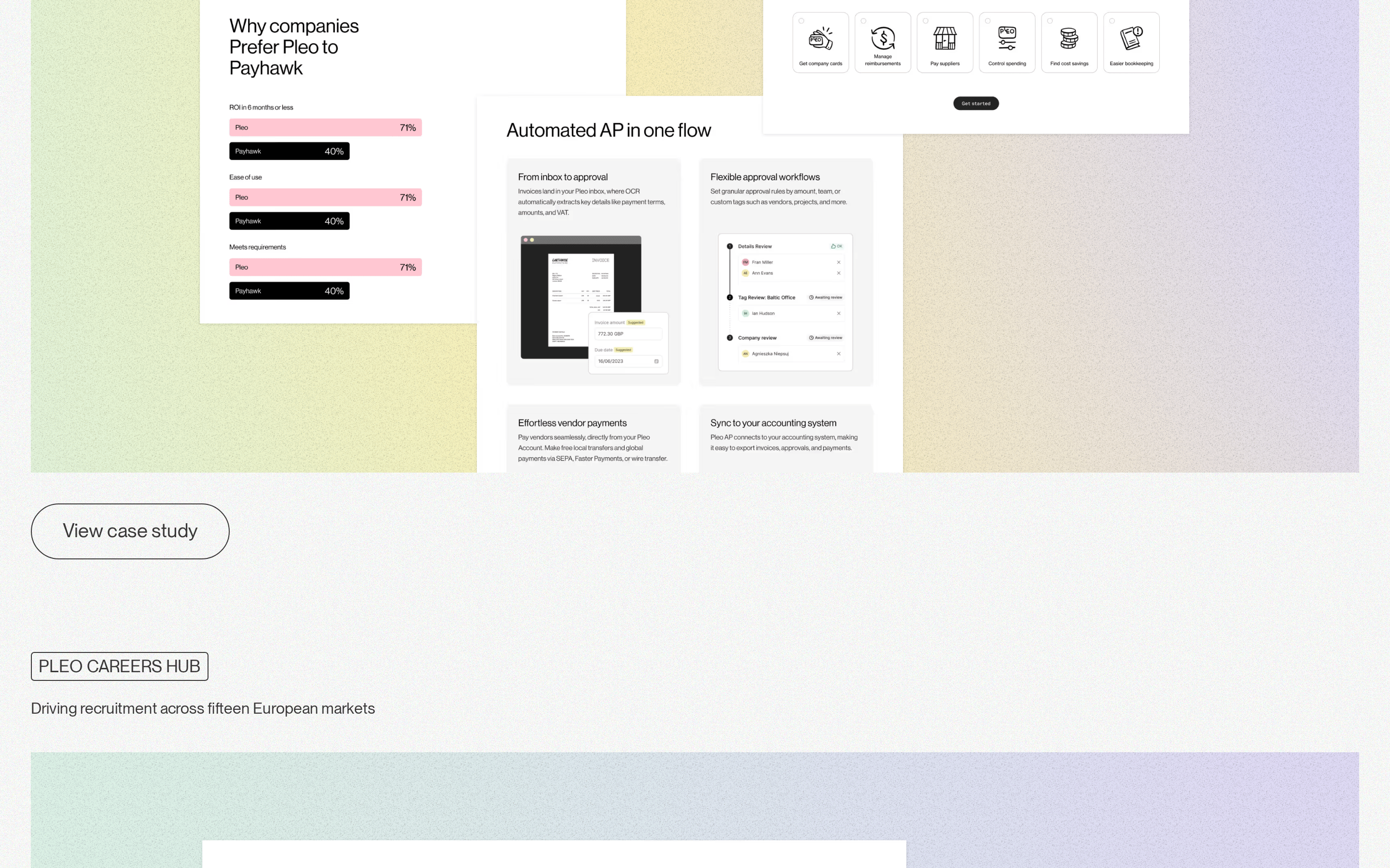
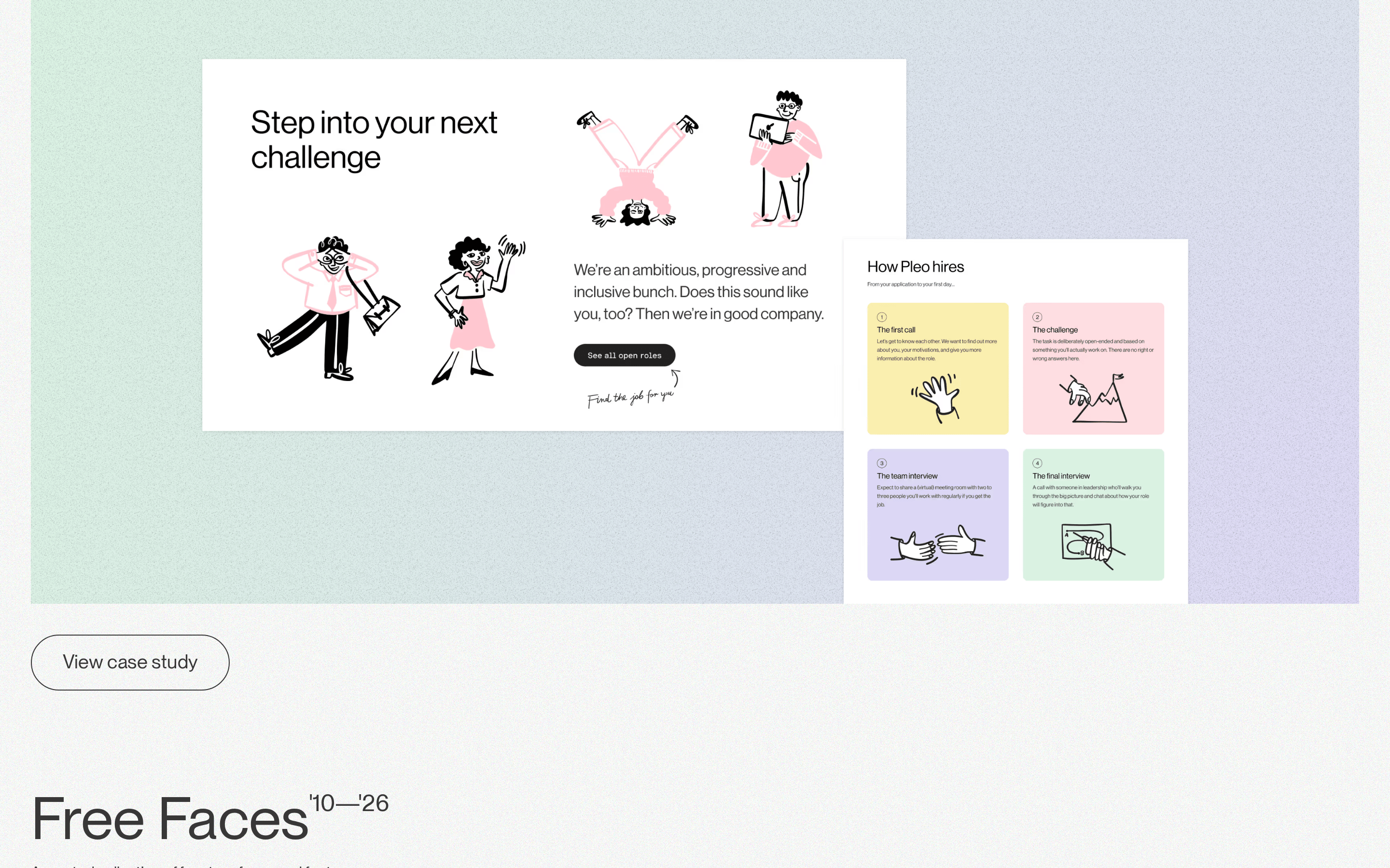
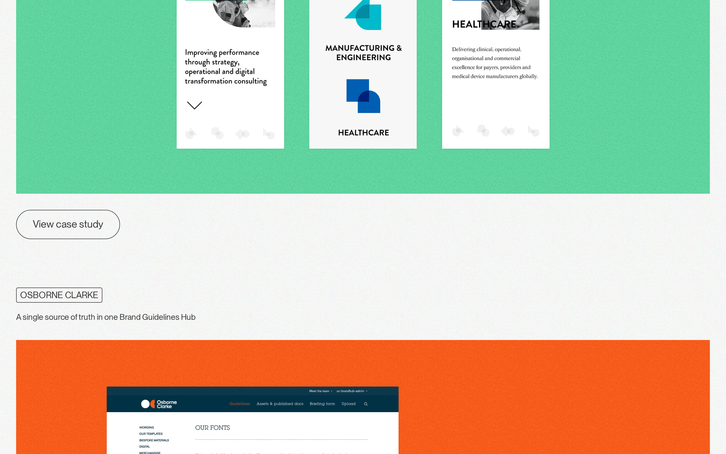
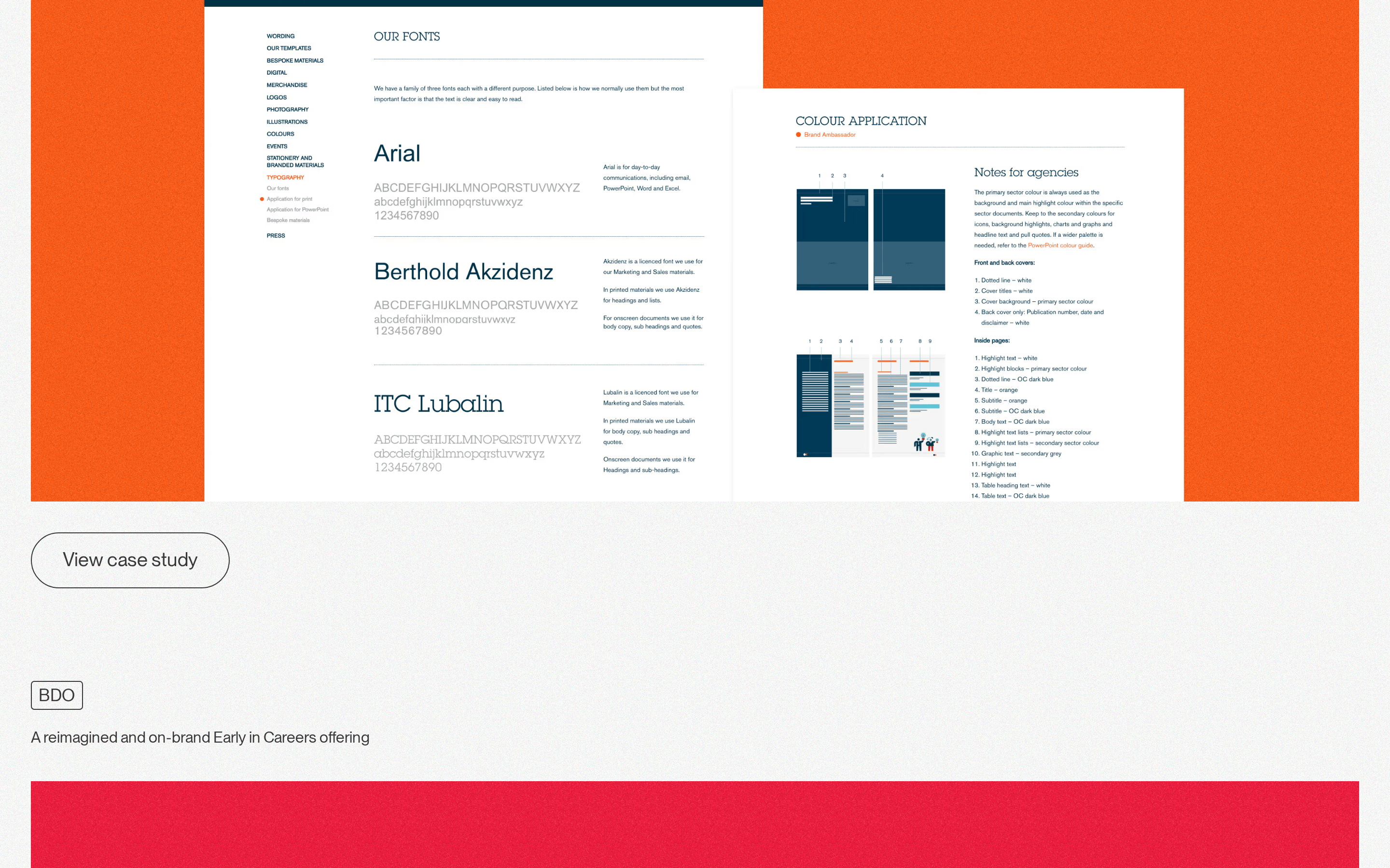
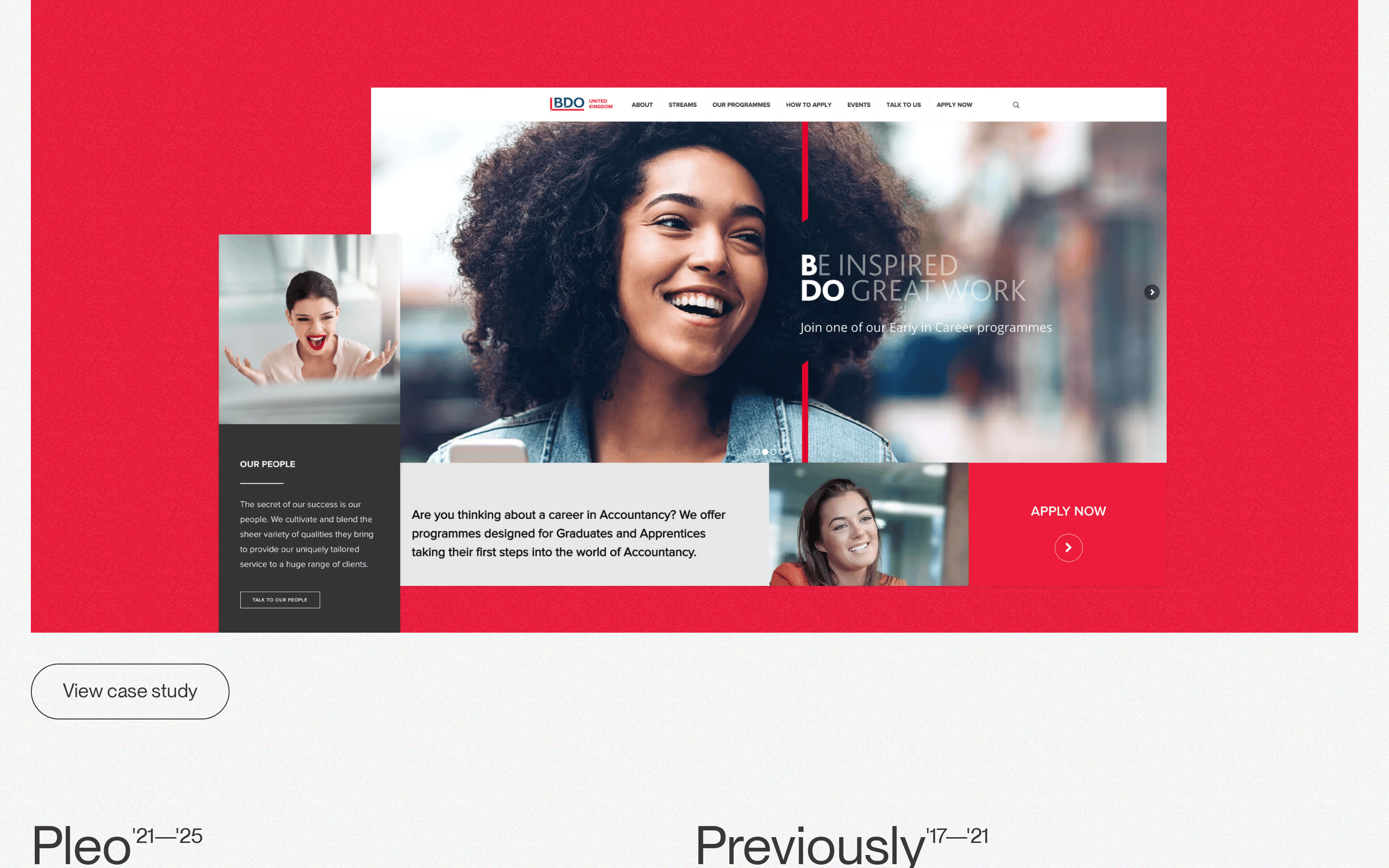
cardFull-width project showcases with noise-textured gradient backgrounds and embedded browser screenshots
chipSmall uppercase label tags with 1px solid borders and tight padding for categorization
heroLarge typographic project title with year range, tag label, and descriptive subtitle above a full-width project preview image
09
Voice & Don'ts
ToneProfessional, understated, and confident without being flashy
HeadlinesLarge, clean grotesque-sans titles with year ranges, presented with restrained elegance
CTAsSimple, uppercase text labels in pill-shaped outline buttons
Don't use multiple font weights — screenshot shows uniform weight 400 throughout
Don't add decorative graphics or illustrations — screenshot shows only typography and project imagery
Don't use bright accent colors in the UI — screenshot shows neutral grays with color coming only from project content
Captured from the live site · real computed styles
11
System prompt
This is a senior product designer's portfolio site with a clean, understated aesthetic. The design uses a neutral warm gray (#F6F7F6) background with subtle noise texture and dark charcoal (#393737) typography. All text uses Neue Montreal (grotesque-sans category) at weight 400, creating a consistent and refined appearance. Project titles are displayed large (55-61px) with tight leading. The layout is single-column with generous 96px spacing between sections. Buttons are pill-shaped with 48px border-radius and 1px solid borders. Accent colors are absent from the UI itself—color comes exclusively from project showcase imagery. Critical donts: never use multiple font weights, never add shadows, never use decorative graphics, and keep the palette strictly neutral grays. The site prioritizes content clarity and breathing room over visual complexity.
Bring this taste to your agent
Hand your AI agent a machine-readable spec of this design — tokens, type, motion, the whole DNA.