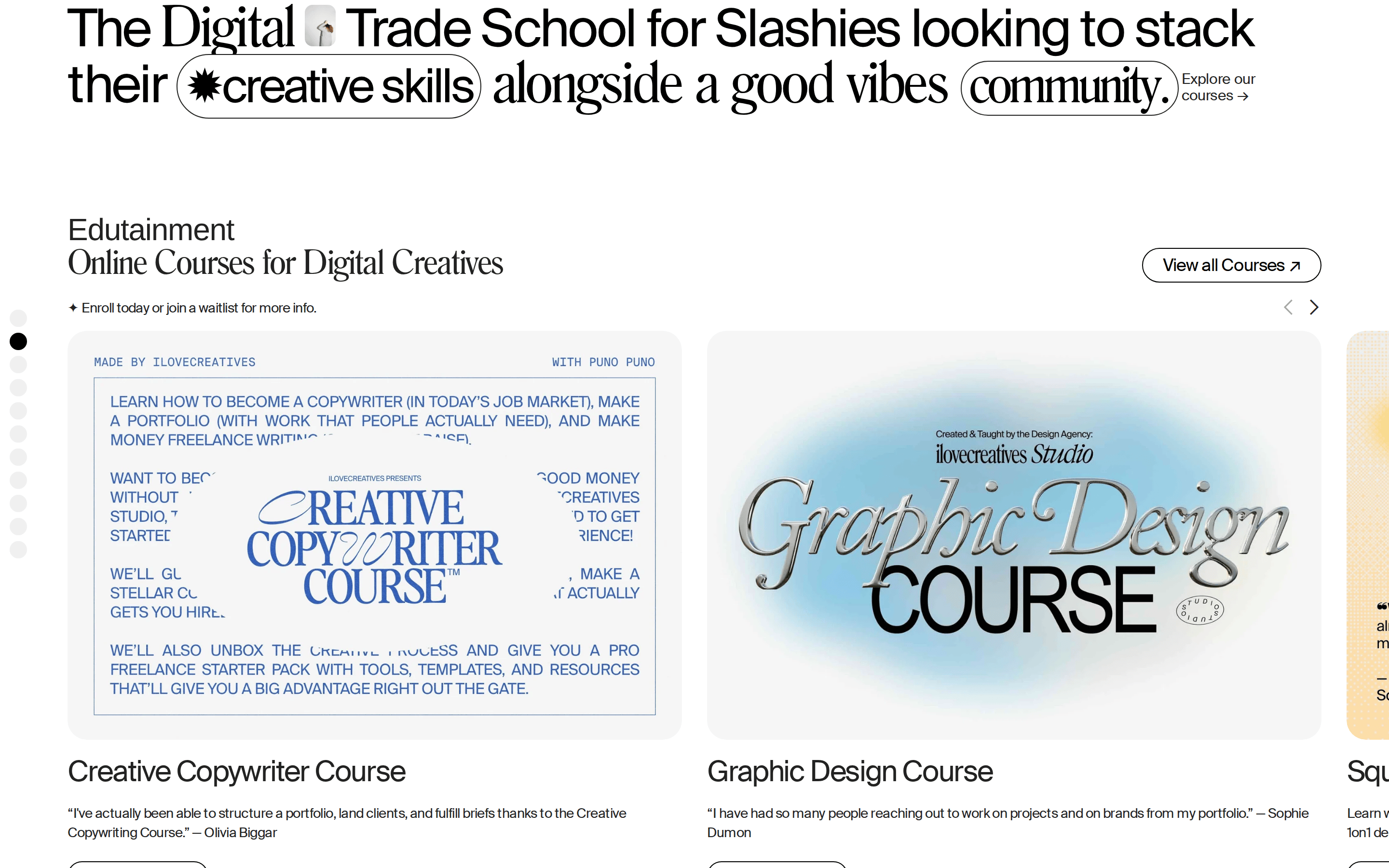
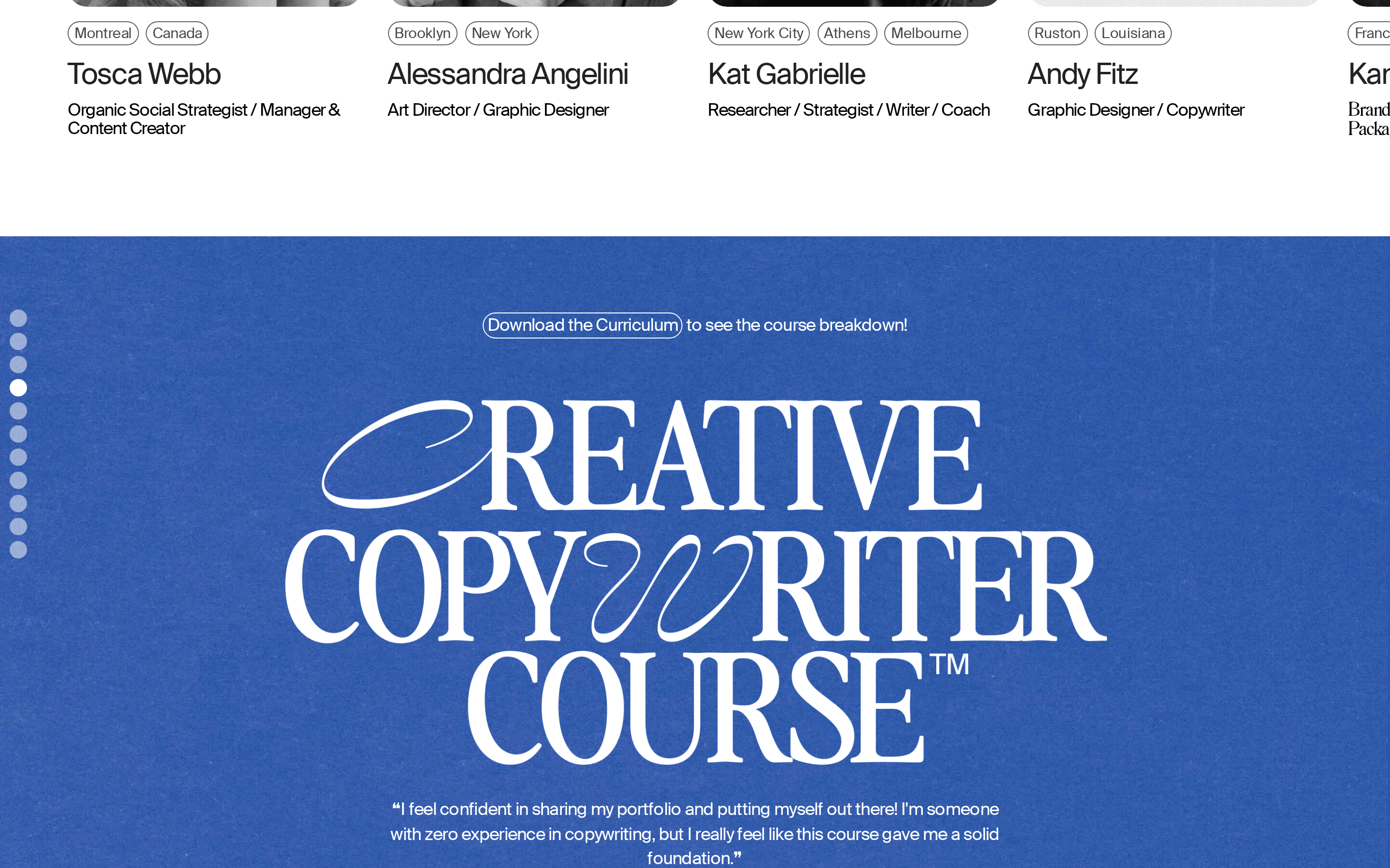
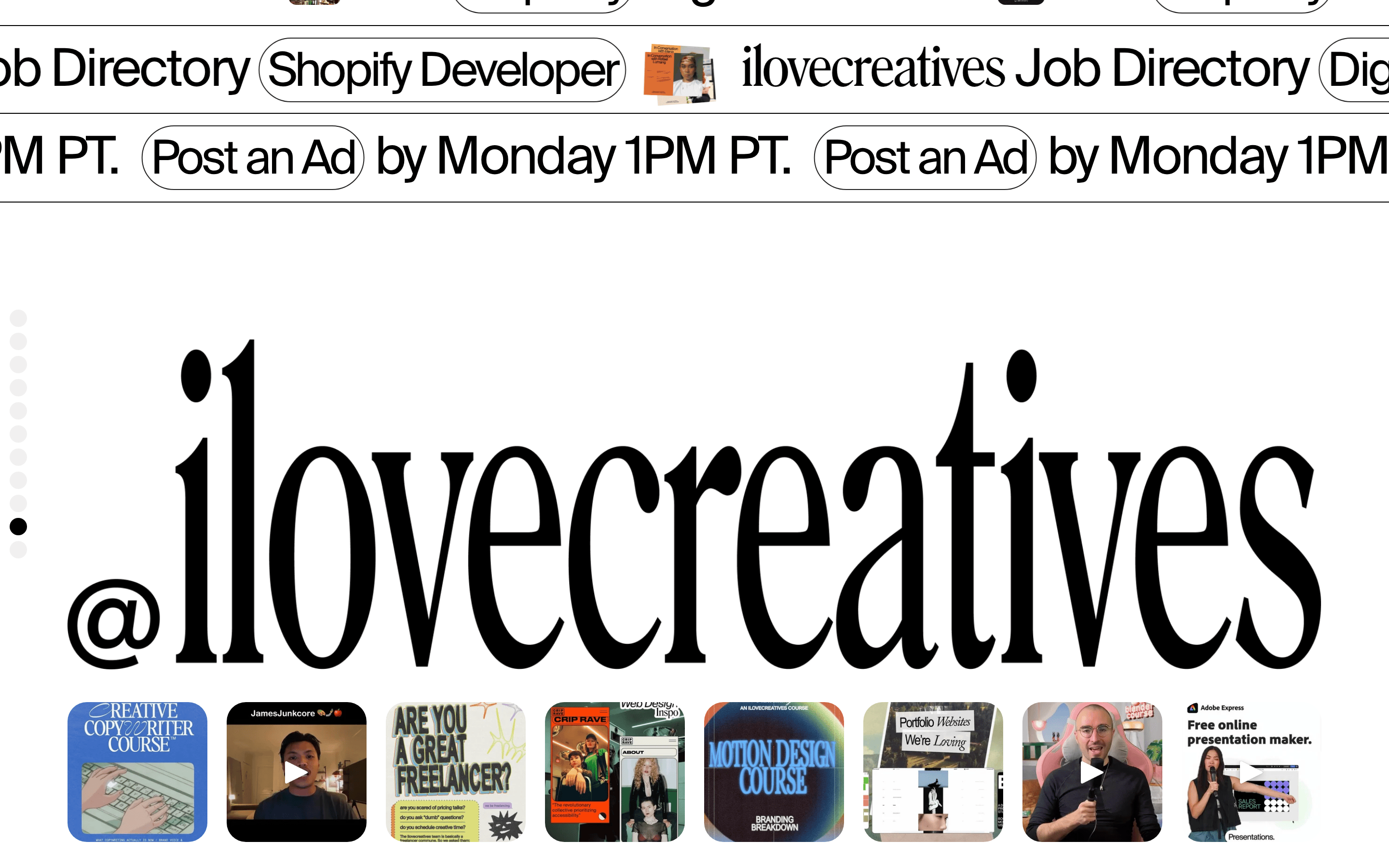
Display typography is set in a high-contrast transitional serif with tight tracking. · Body text is set in a light-weight humanist sans-serif. · Buttons use a pill shape with uppercase or capitalized styling.
04
Spacing
4px
8px
16px
24px
32px
48px
64px
96px
Consistent 4px base grid with generous padding in large container blocks.
05
Surfaces
sm · 4px
md · 8px
lg · 20px
pill · 450px
1px solid #222222
rgba(121,121,121,0.17) 2px 2px 20px 0px
06
Layout
1280container
12columns
24pxgutter
768 / 1024breakpoints
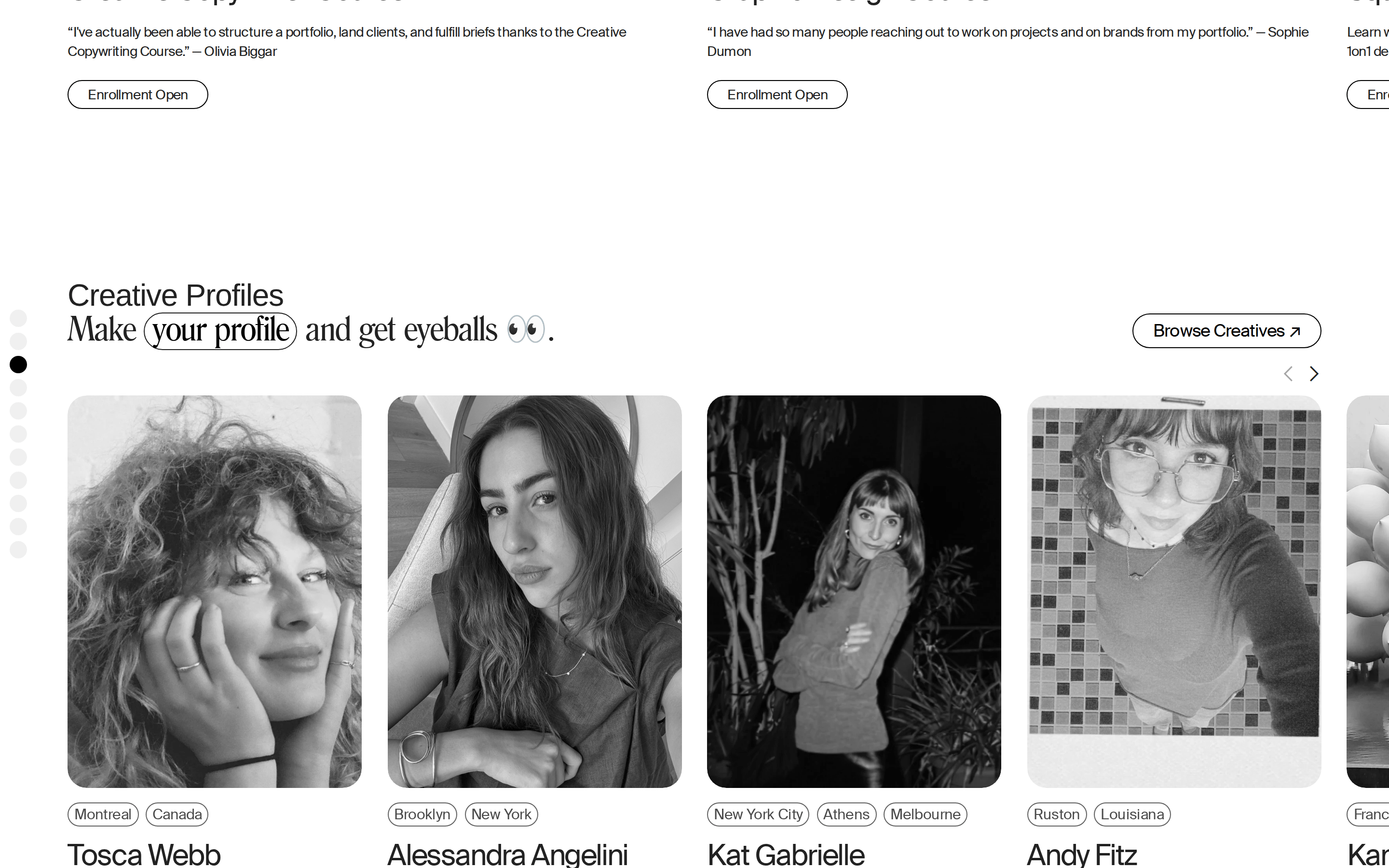
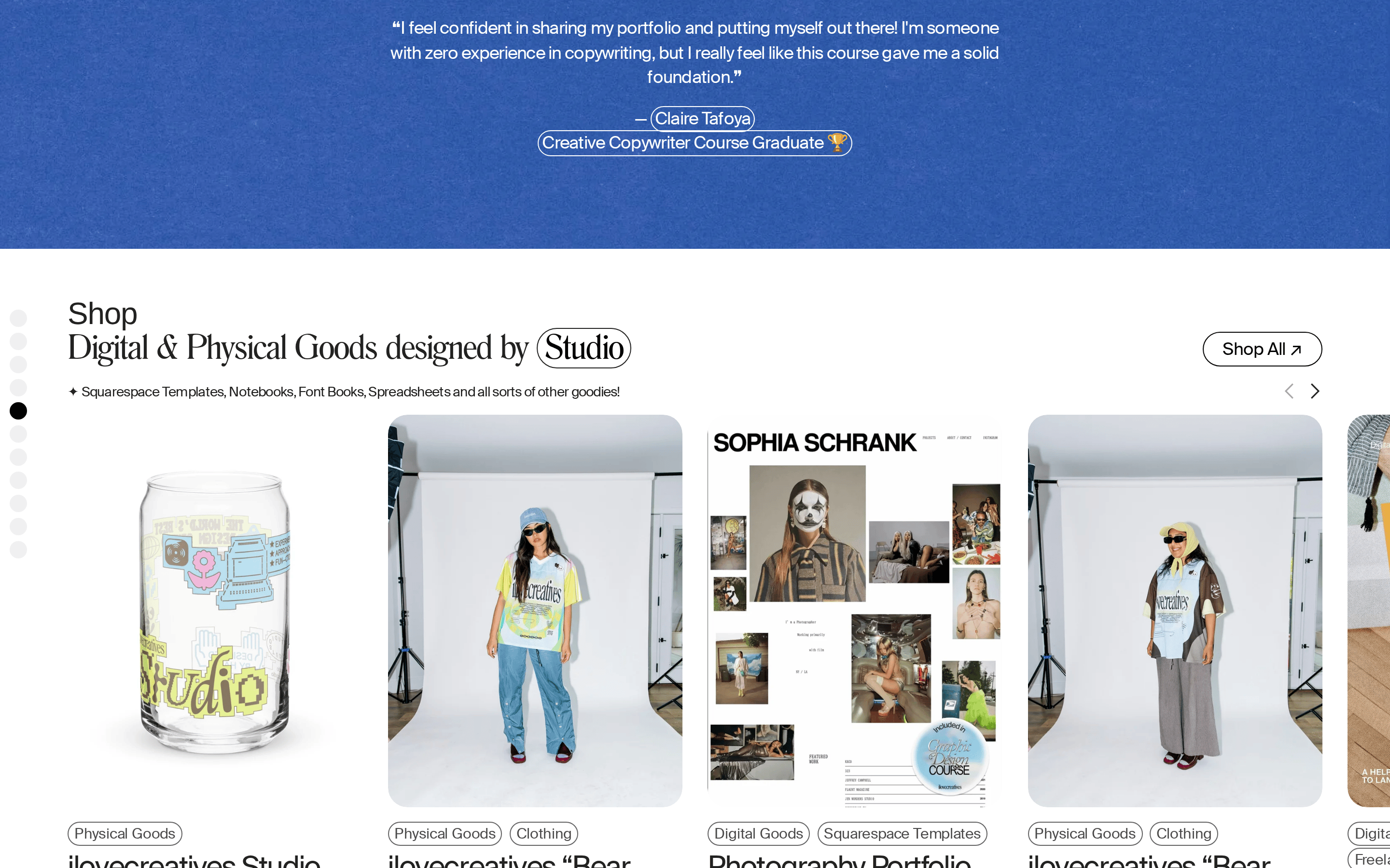
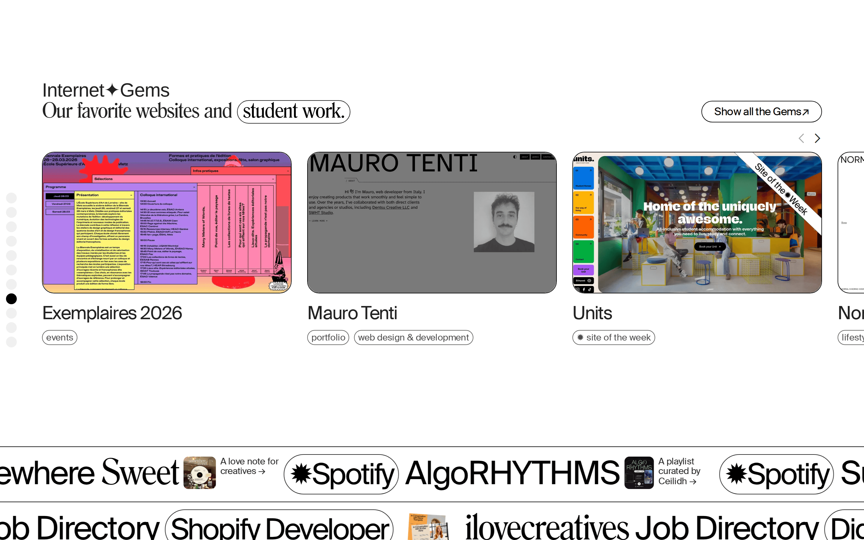
Full-bleed hero section transitioning into a structured, multi-column grid for products and community listings.
07
Motion & Interaction
100msmicro
170mssmall
600msmedium
cubic-bezier(0.25, 0.1, 0.25, 1.0)easing
Subtle opacity and color transitions on hover for buttons and links. · Fast 0.1s linear transitions for standard interactive elements.
Background fills to solid or text color inverts for buttons. · Immediate feedback via state change or link navigation.
08
Components
buttonPill-shaped with 1px solid borders and transparent backgrounds, transitioning to solid on hover.
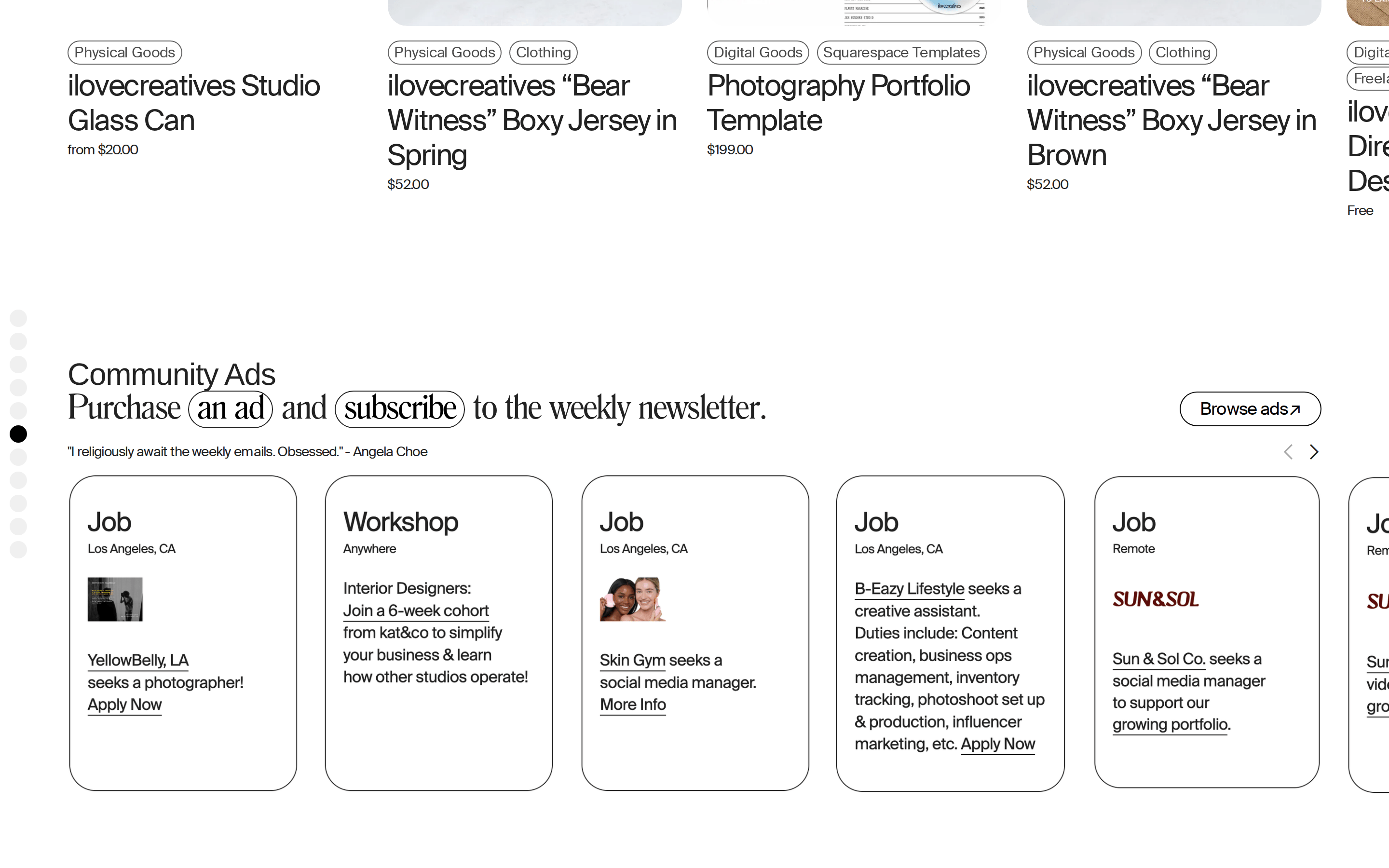
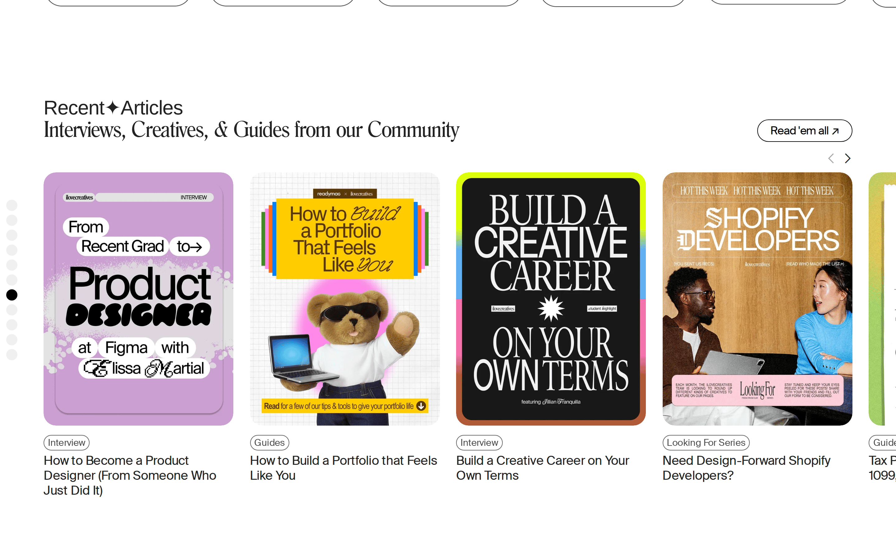
cardClean white cards with rounded corners (20px) and light shadows for product and job listings.
chipSmall, rounded pill tags for categories (e.g., Physical Goods, Clothing).
inputMinimal text inputs with subtle bottom borders or pill shapes.
heroFull-bleed photographic background with massive, overlapping serif typography and floating text elements.
09
Voice & Don'ts
TonePlayful, welcoming, and community-focused.
HeadlinesConversational, slightly irreverent, and direct.
CTAsClear, action-oriented, and frequently pill-shaped.
Don't use heavy drop shadows — screenshot shows minimal, soft shadows like rgba(121,121,121,0.17) 2px 2px 20px 0px.
Don't use bright, saturated accent colors — screenshot shows a muted, earthy green (#489442) only for specific banners.
Don't use bold font weights for body text — screenshot shows a consistent use of font-weight: 100 for standard copy.
Don't use sharp, square corners for cards or buttons — screenshot shows consistent use of pill shapes (radius: 450px) and large rounded corners (radius: 20px).
Don't use complex gradients for backgrounds — screenshot shows solid white backgrounds and photographic hero overlays.
Don't use wide, sprawling line heights — screenshot shows tight, controlled line-heights (1.2 to 1.4) for a dense, editorial feel.
Avoid: Formal corporate jargon
Avoid: Dense blocks of uninterrupted text without visual breaks
Captured from the live site · real computed styles
11
System prompt
This site is a creative community platform and digital trade school for 'slashies' (multi-passionate creatives). The visual identity is built on a clean, monochromatic base using #222222 ink on #FFFFFF backgrounds, accented by a muted #489442 green specifically for promotional banners. Typography relies on a bold, high-contrast transitional serif for massive display headlines and a light-weight humanist sans-serif (Suisse Regular at 100 weight) for body copy, creating a sophisticated editorial feel. Critical donts: avoid using saturated or neon colors, never use bold font weights for body text, and always use rounded pill shapes for primary buttons and tags. The layout combines full-bleed photographic hero sections with structured, card-based grids for products and community listings, all using tight letter-spacing and generous padding.
Bring this taste to your agent
Hand your AI agent a machine-readable spec of this design — tokens, type, motion, the whole DNA.