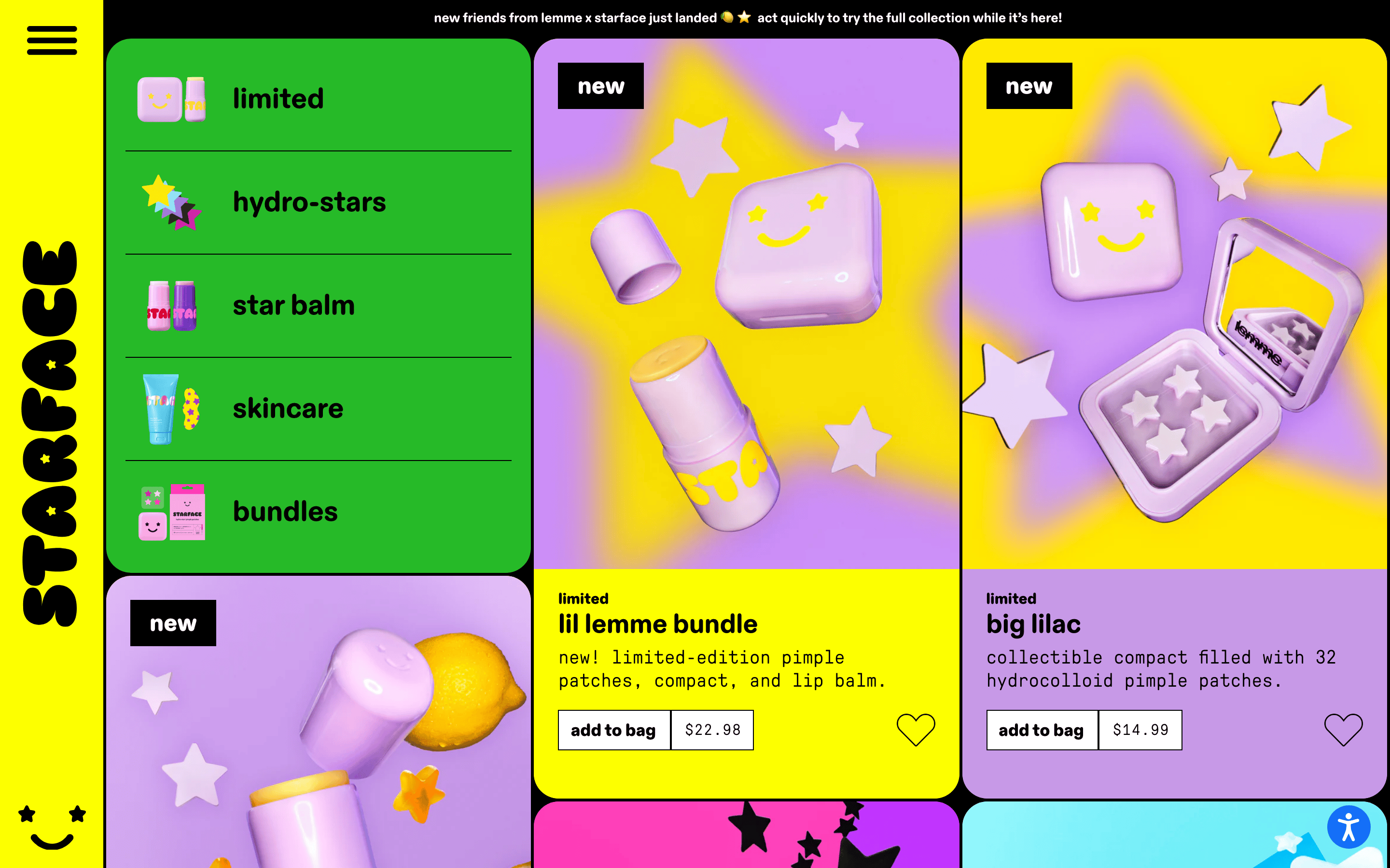
A loud, energetic teen magazine meets a pop-art candy store.
02
Color
#FF00D3Accent
#000000Ink
#FDFF00BG
rgba(0,0,0,0.2)Line
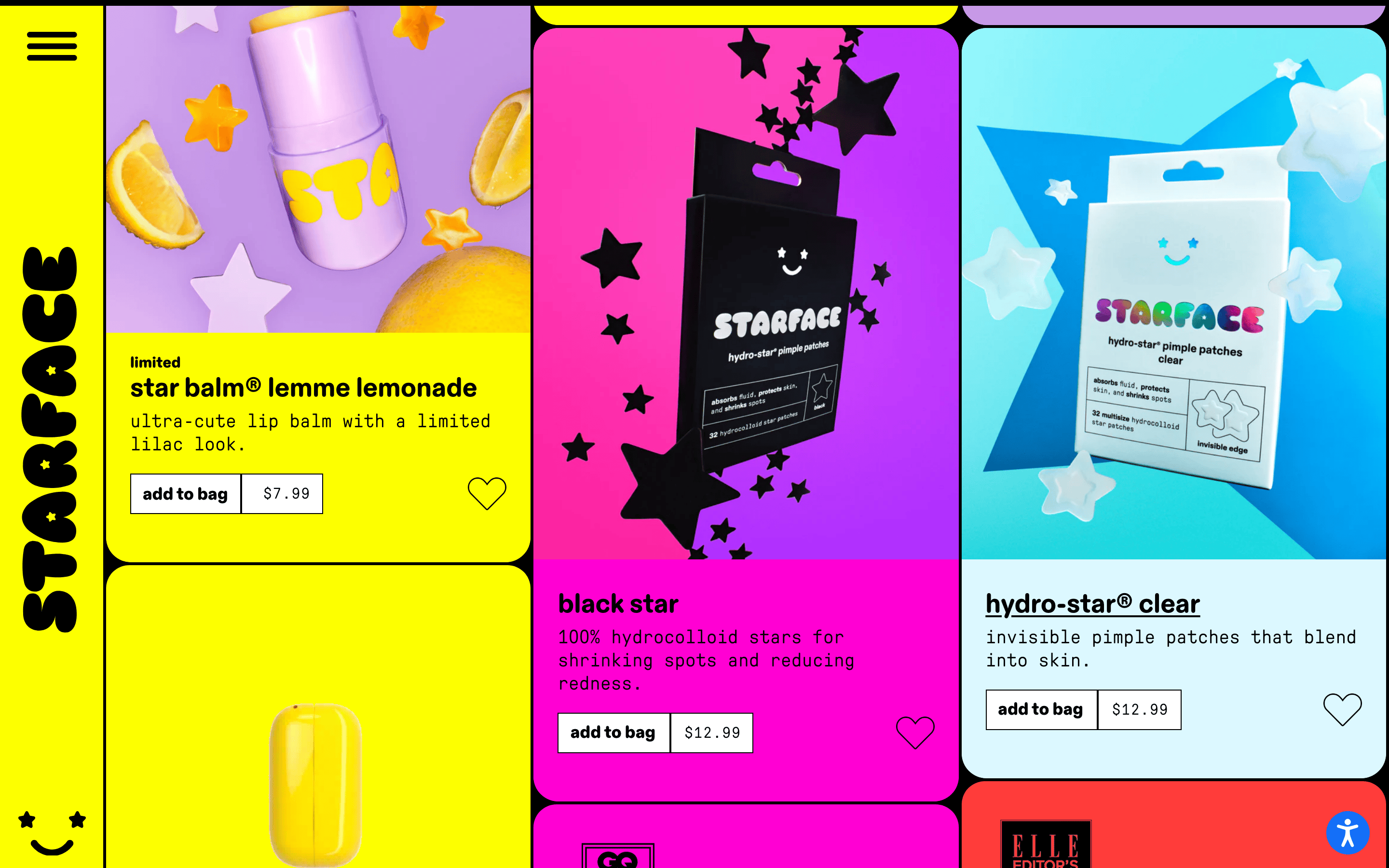
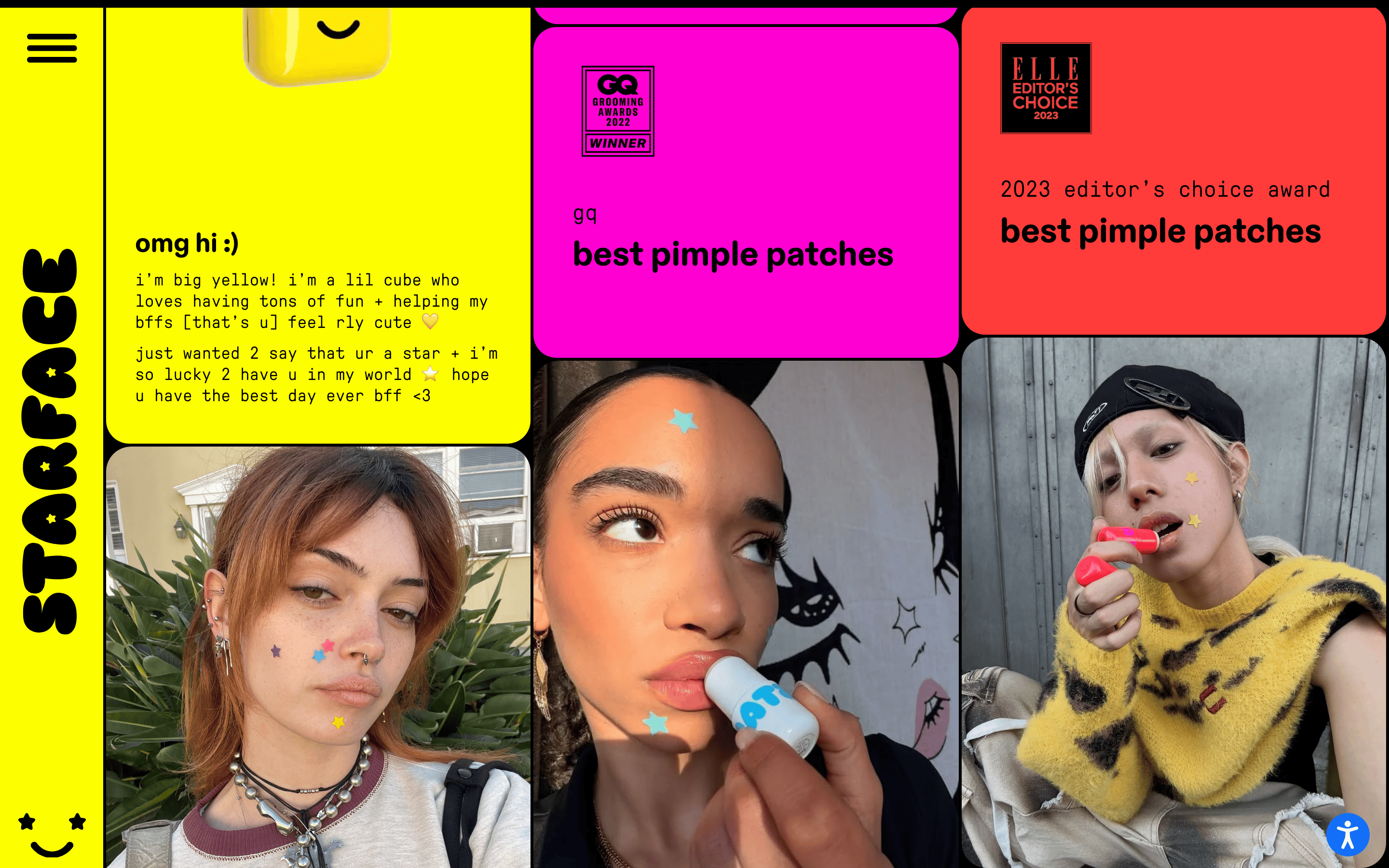
High-saturation color blocking using a signature electric yellow, vibrant magenta, and bright green against stark black borders.
03
Typography
geometric-sans · monospace
display40px · 700
body16px · 400
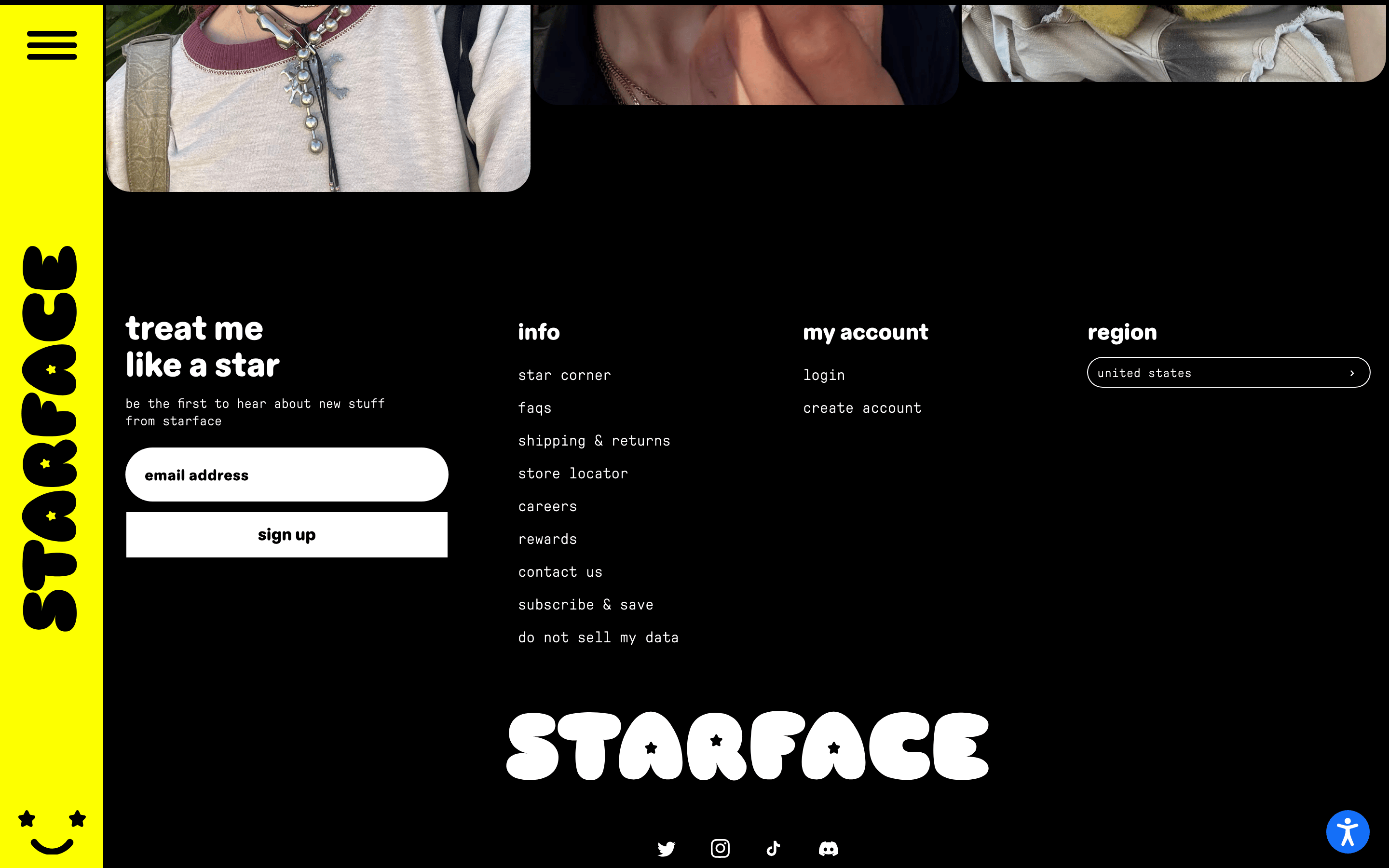
Text is consistently lowercase. · Monospace is used for almost all functional and descriptive text. · Heavy, bold, rounded sans-serif is used for impactful headers.
04
Spacing
4px
8px
16px
24px
32px
48px
64px
96px
Consistent internal padding (25px) within cards maintains a uniform rhythm despite varied card sizes.
05
Surfaces
sm · 4px
md · 16px
lg · 24px
pill · 999px
Bold, 2px black borders or solid black structural gaps define every element and separate color blocks.
none
06
Layout
1440container
12columns
24pxgutter
768 / 1024breakpoints
A rigid, full-bleed grid of solid color blocks separated by thick black lines.
07
Motion & Interaction
150msmicro
300mssmall
500msmedium
cubic-bezier(0.25, 0.46, 0.45, 0.94)easing
Subtle scaling on hover for product images. · Opacity fade-in for smooth transitions.
Subtle transform scaling or opacity changes on interactive elements. · Immediate, crisp feedback with no heavy lag.
08
Components
buttonBlack border, transparent background with text, or solid black background.
cardVibrant, solid-colored rectangles with rounded corners (24px), thick borders, and clear image/text separation.
chipPill-shaped or small rectangular color-coded tags for categories.
inputStandard bordered inputs matching the bold outline aesthetic.
heroLarge, colorful, image-heavy blocks that dominate the viewport.
09
Voice & Don'ts
ToneIncredibly casual, friendly, and slightly chaotic, using internet slang and emojis.
HeadlinesShort, punchy, lowercase, and enthusiastic.
CTAsDirect, lowercase, and action-oriented.
don't use serif fonts — screenshot shows exclusively monospace and geometric rounded sans-serif types.
don't use uppercase text — screenshot shows text is entirely lowercase.
don't use subtle gray borders — screenshot shows bold, solid black structural lines.
don't use complex shadows — screenshot shows flat color blocks with no depth effects.
don't use muted or pastel color palettes — screenshot shows highly saturated, neon-like primary colors.
don't use dense text blocks — screenshot shows short, punchy, and highly scannable copy.
Captured from the live site · real computed styles
11
System prompt
This is a playful, high-energy DTC e-commerce site for a Gen Z skincare brand. It uses a vibrant, high-contrast color palette centered around a signature electric yellow (#FDFF00), bold magenta (#FF00D3), and stark black (#000000). The typography combines a heavy, geometric rounded sans-serif for impactful headings with a clean monospace font for all descriptive body text, always rendered in lowercase. The layout is a rigid grid of solid color blocks separated by thick black lines or gaps, creating a bold, graphic aesthetic. Critical donts: never use serif fonts, never use uppercase text, and never use subtle gray borders or soft drop shadows; the brand relies on thick black outlines and flat color for all structural definition.
Bring this taste to your agent
Hand your AI agent a machine-readable spec of this design — tokens, type, motion, the whole DNA.