← OpenDesign CURATED · OPEN · FREE
Studiofew
A minimalist, premium type foundry site showcasing font specimens with stark monochrome photography and refined UI.
Typography Premium Studio Curation Monochrome
01
Identity DNA
Type Foundry Specimen Typography Studio
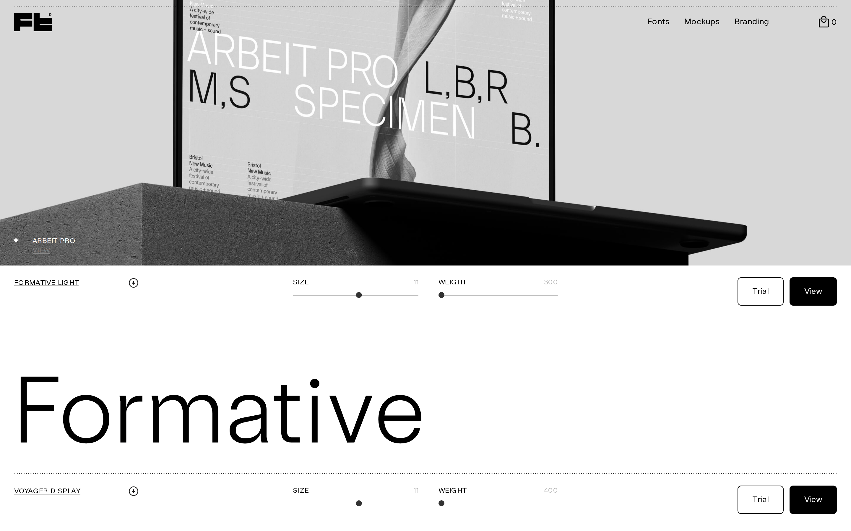
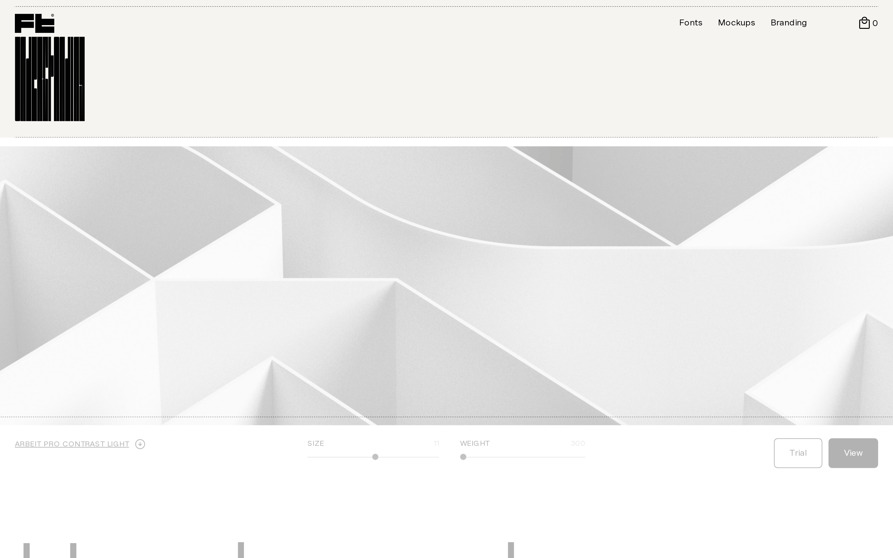
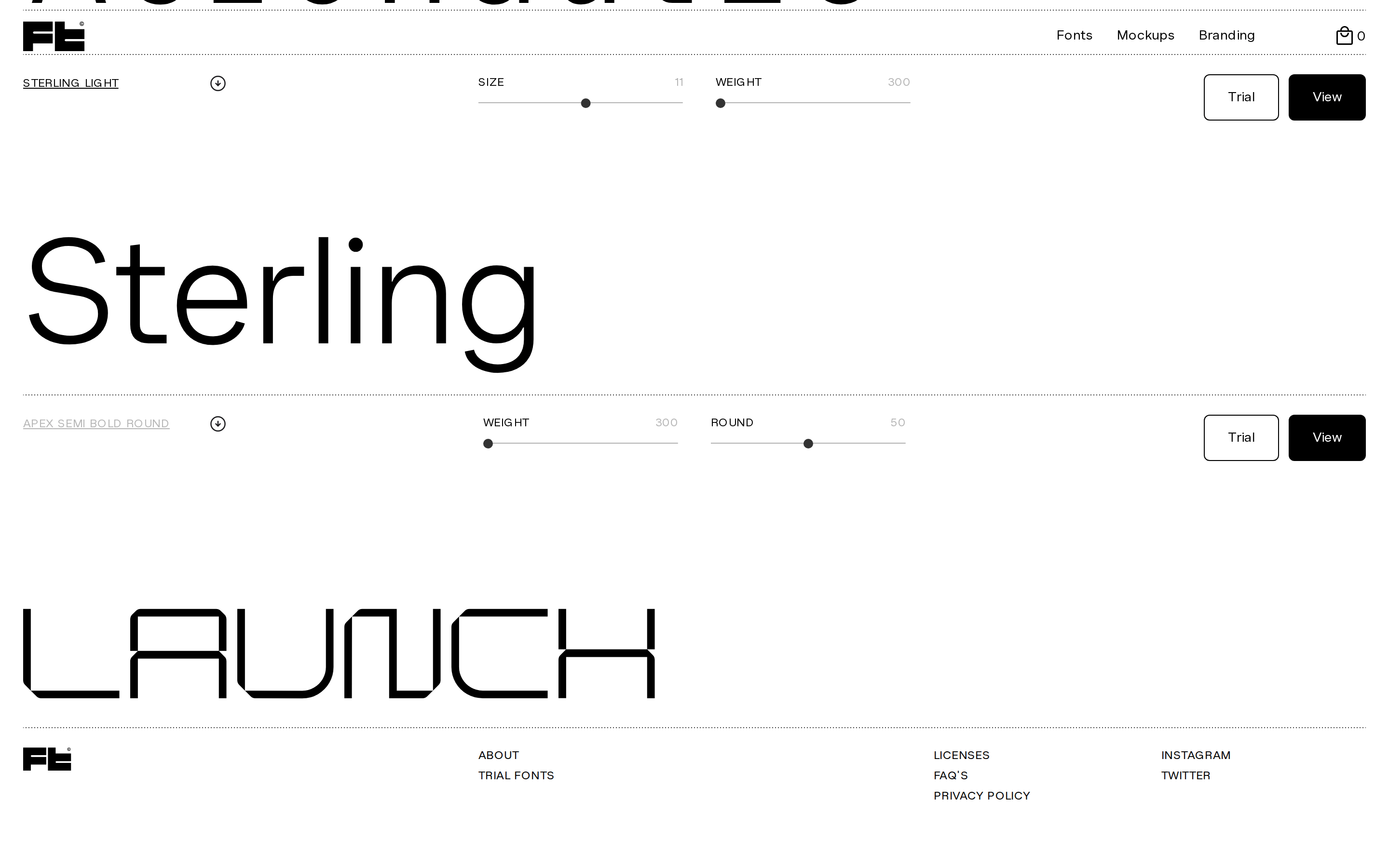
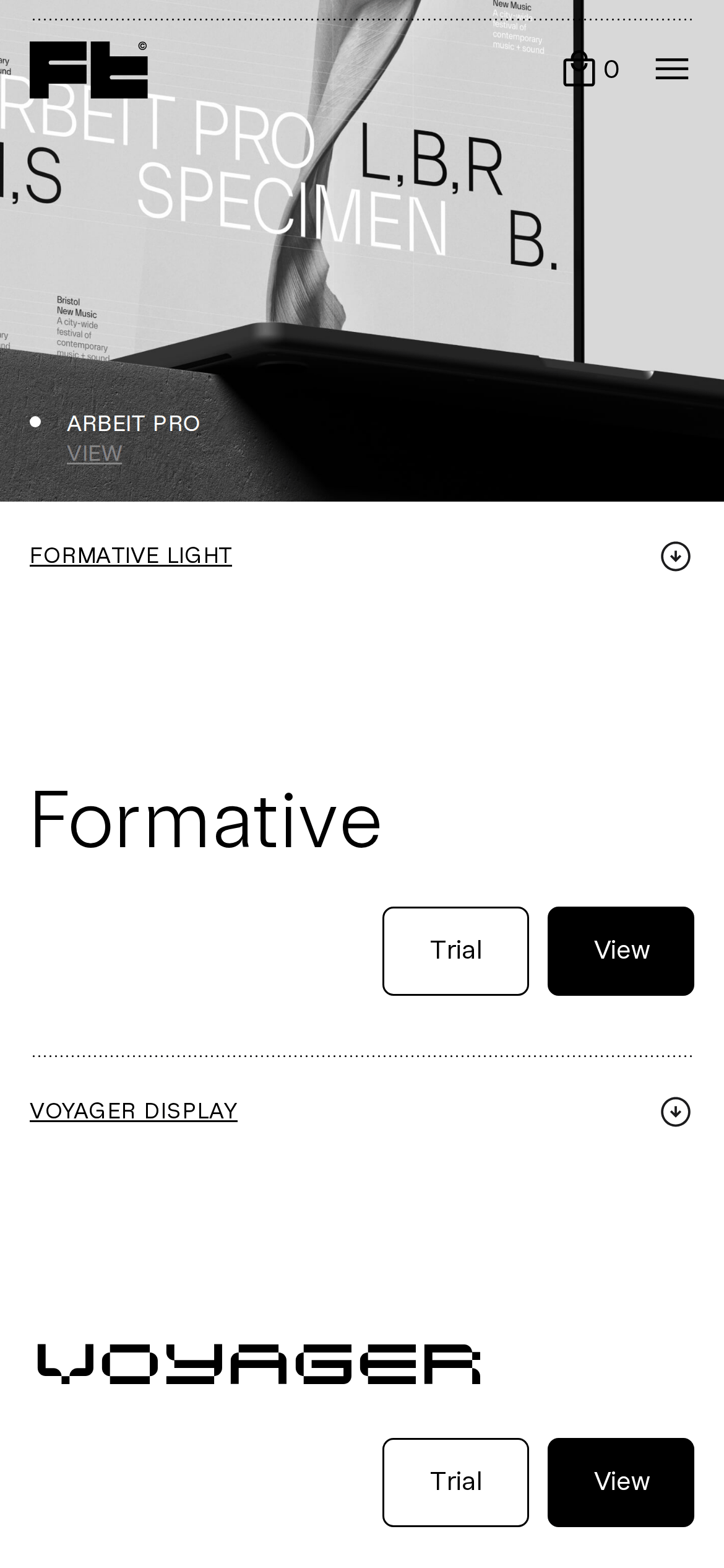
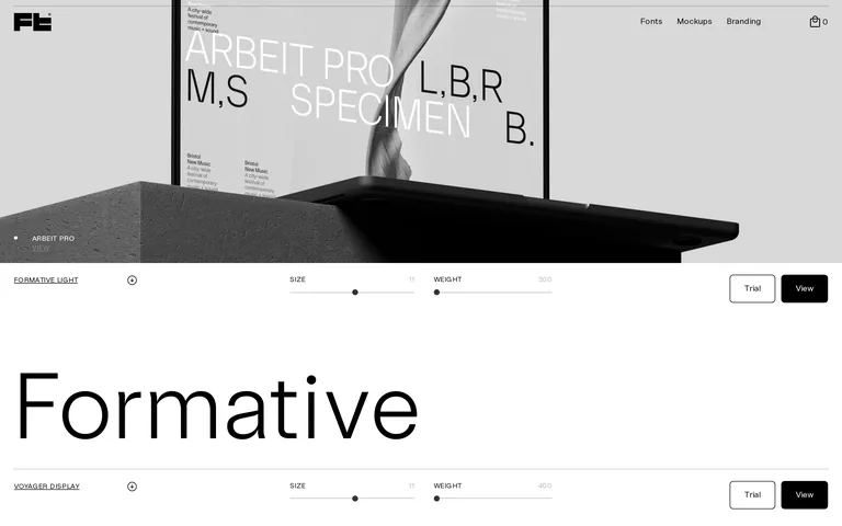
A high-end type foundry specimen book presented in a digital format
02
Color
#000000Ink
#333333Ink soft
#ffffffBG
#f6f4f1BG soft
#b3b3b3BG quiet
#b7b7b7Muted
rgba(0, 0, 0, 1)Line
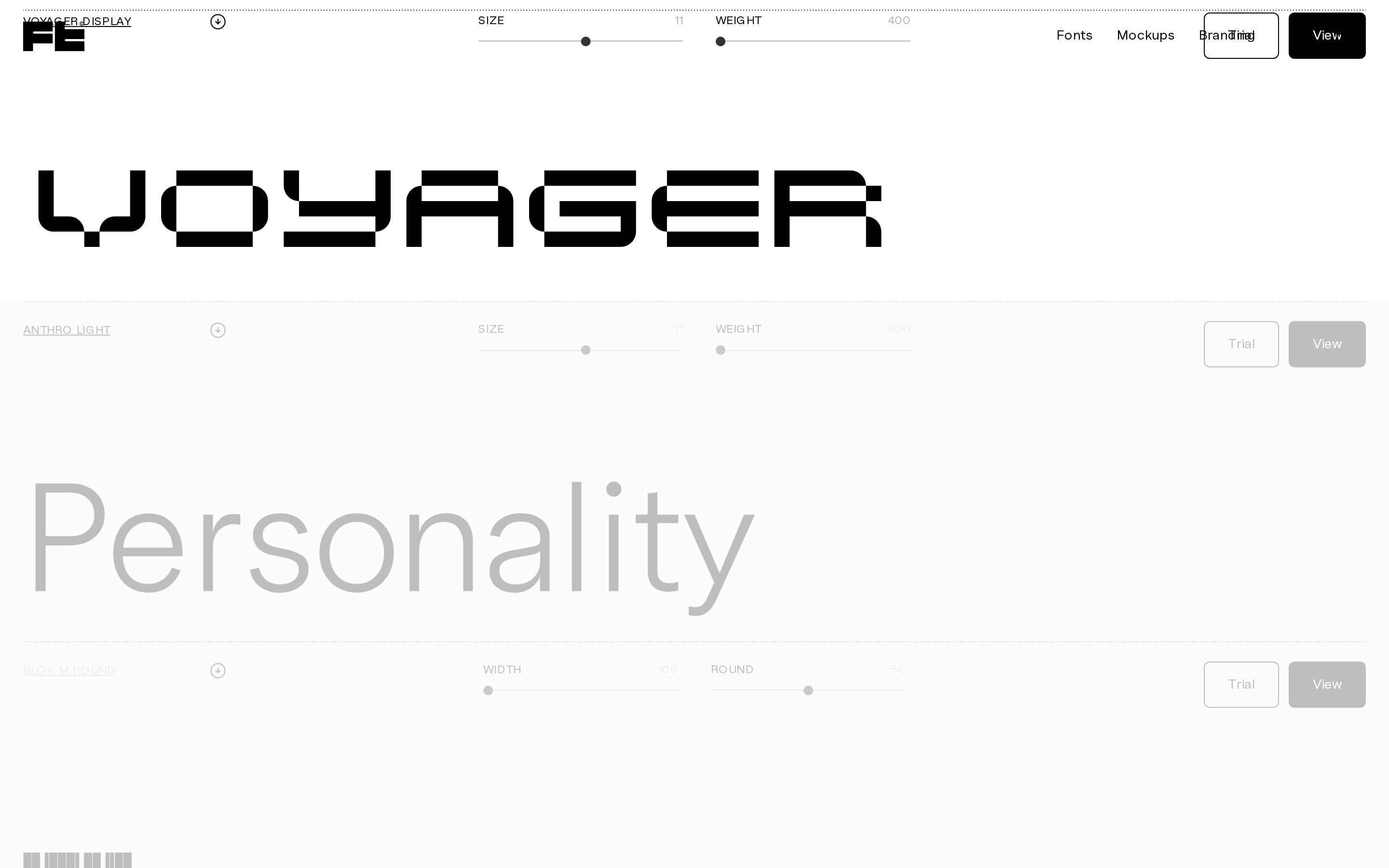
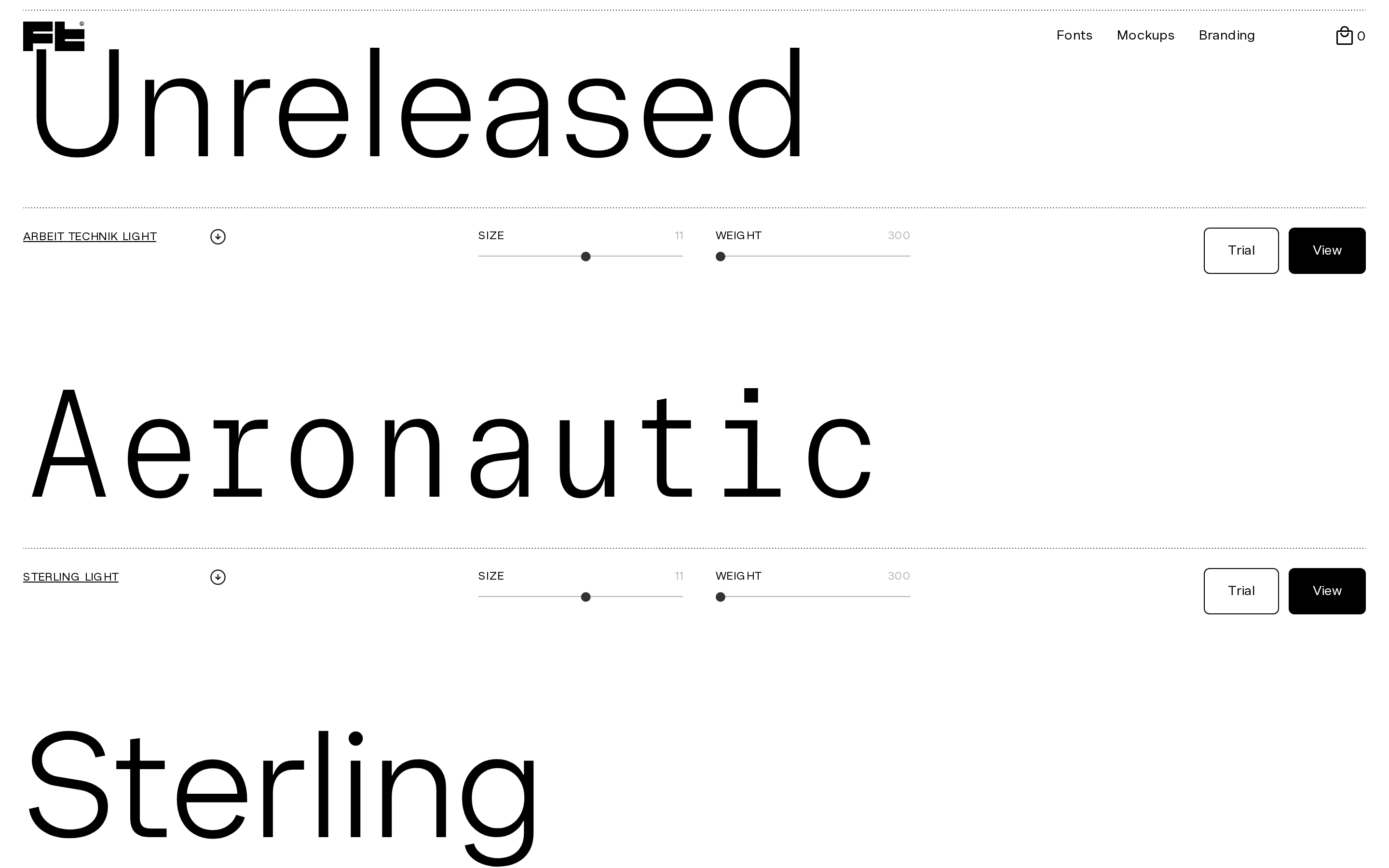
Strict monochromatic palette relying on stark black and white contrast with neutral grays for hierarchy and UI elements.
03
Typography
humanist-serif · humanist-sans · geometric-sans
display 158px · 400sub-display 115px · 400body 14px · 400caption 12px · 400All-caps for labels and navigation · Tight letter-spacing for large display type · Generous letter-spacing for small caps UI
04
Spacing
4px
8px
12px
16px
20px
24px
32px
48px
64px
96px
112px
160px
Strict 4px grid with generous padding around specimen sections
05
Surfaces
sm · 2px
md · 6px
lg · 0px
pill · 999px
1px solid black, dotted separators for sectioning
06
Layout
1440 container
12 columns
24px gutter
768 / 1024 breakpoints
Full-width specimen cards separated by dotted lines with sticky navigation
07
Motion & Interaction
220ms micro
400ms small
800ms medium
cubic-bezier(0.25, 0.1, 0.25, 1) easing
Standard opacity transitions on hover states · Smooth slider adjustments for font properties
Subtle opacity reduction or cursor change · Standard button press with no complex feedback
08
Components
button Minimal rectangular buttons with sharp corners, either filled black or outlined, uppercase text card Full-width sections dedicated to individual font specimens chip Small circular icons and badges used for cart counts input Slider controls with minimalist dot indicators hero Large photographic or 3D rendered imagery overlaid with massive specimen typography 09
Voice & Don'ts
Tone Authoritative, minimalist, design-focused Headlines Massive, tightly tracked, all-caps or large specimen display CTAs Direct, uppercase, high-contrast buttons like 'Trial' and 'View' don't use vibrant colors — screenshot shows a strictly monochrome black, white, and gray palette don't apply rounded corners to primary buttons — screenshot shows sharp, rectangular buttons don't use wide letter-spacing for large display text — screenshot shows tight tracking for specimen headlines don't hide behind playful language — screenshot shows direct, functional UI labels like 'SIZE' and 'WEIGHT' don't use heavy shadows or depth — screenshot shows flat, clean surfaces don't center-align everything — screenshot shows strong left-aligned typography and UI elements Avoid: Decorative elements Avoid: Vibrant colors Avoid: Playful language Avoid: Rounded corners on primary buttons 10
Inside the pack — real screenshots
桌面首屏(hero) 桌面滚动分段(90% viewport 步进,作为视觉证据) 桌面滚动分段(90% viewport 步进,作为视觉证据) 桌面滚动分段(90% viewport 步进,作为视觉证据) 桌面滚动分段(90% viewport 步进,作为视觉证据) 桌面滚动分段(90% viewport 步进,作为视觉证据) 移动首屏 Captured from the live site · real computed styles
11
System prompt
A premium, minimalist type foundry specimen site. Key colors are pure black (#000000), white (#ffffff), and neutral grays (#b3b3b3, #b7b7b7). Typography features massive, tightly tracked display type (humanist-serif) and functional sans-serif UI text. Critical donts: no vibrant colors, no rounded buttons, no wide letter-spacing on display text, no playful tone, no heavy shadows. Layout relies on full-width sections, dotted separators, and generous spacing to let the typography breathe.
More from the library en · zh-CN · zh-TW · ja · ko
OpenDesign · curated web aesthetics for AI-readable design DNA · opendesign.cc
Why we curated this: A masterclass in restrained design where the typography itself serves as the primary visual language.