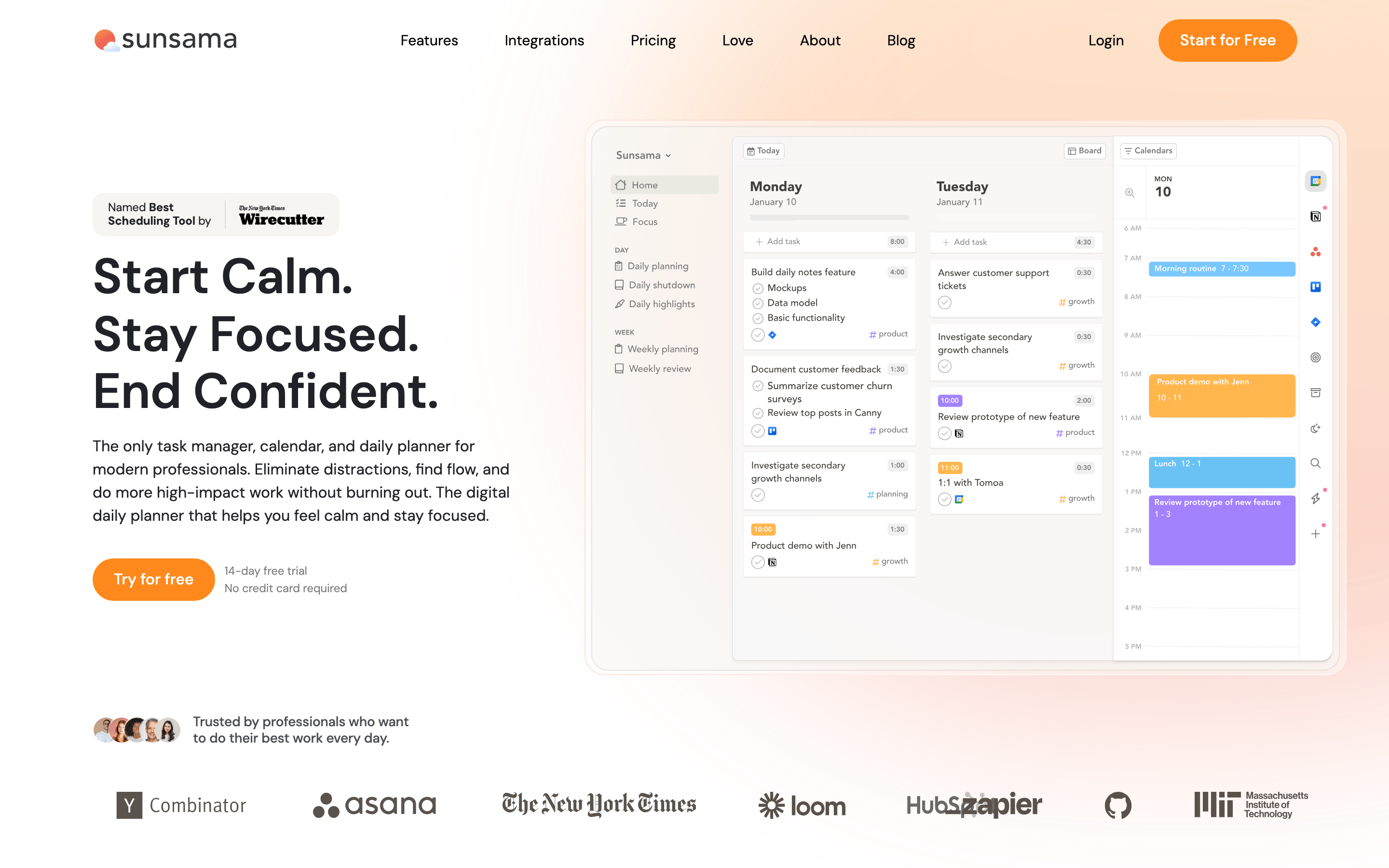
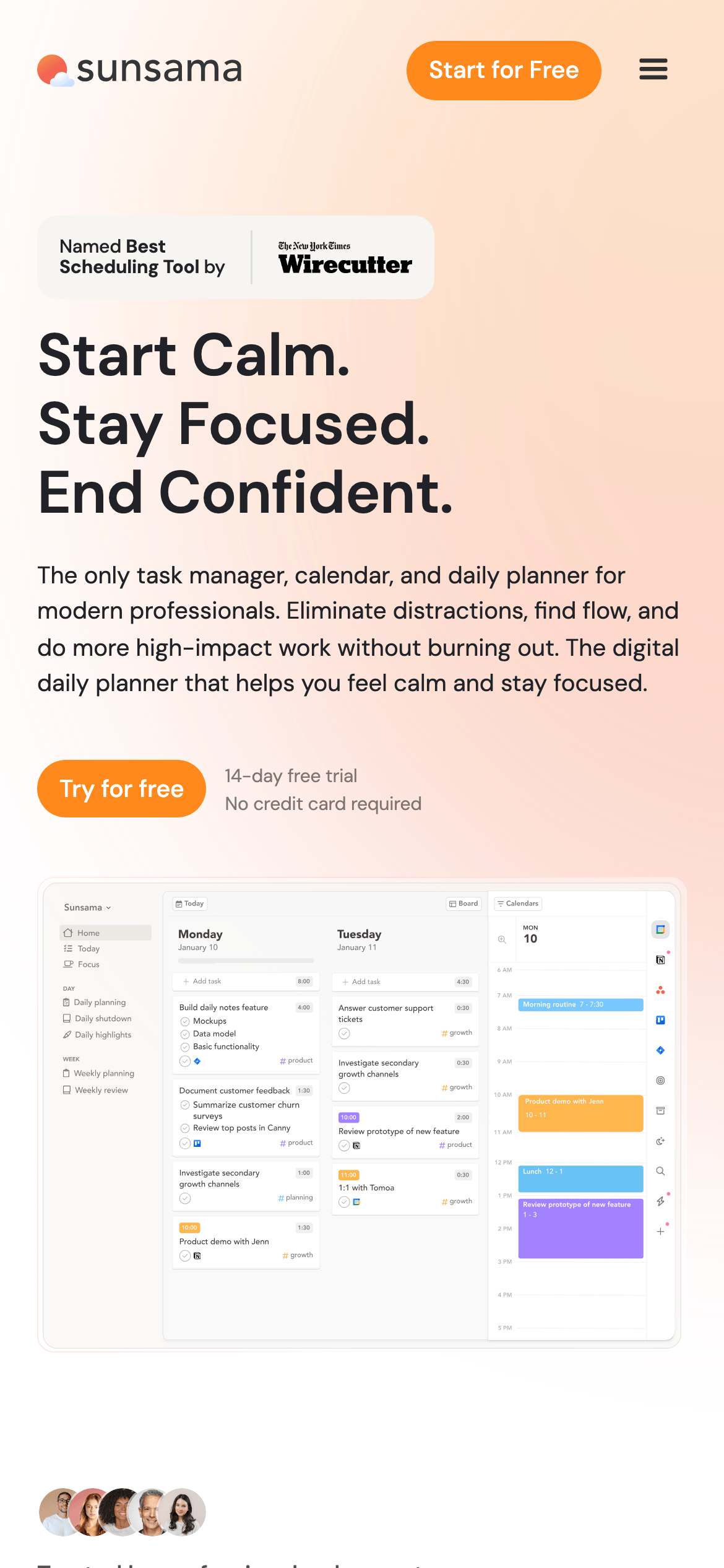
A serene daily planner that helps you feel calm and stay focused.
02
Color
#FF891CAccent
#202228Ink
#4C4F56Ink soft
#FFFFFFBG
#FAFAFABG soft
#F6F5F1BG quiet
#767F86Muted
rgba(32,34,40,0.1)Line
Clean white backgrounds with a warm, high-chroma orange accent and soft neutral grays.
03
Typography
geometric-sans · humanist-sans
display48px · 500
h227px · 400
body16px · 400
small14px · 400
04
Spacing
4px
8px
16px
24px
32px
48px
64px
96px
Consistent 4px base grid with generous vertical spacing for a breathable layout.
05
Surfaces
sm · 4px
md · 10px
lg · 40px
pill · 48px
1px solid rgba(32,34,40,0.1) used for subtle card and input boundaries.
None: None · None: None
06
Layout
1280container
12columns
24pxgutter
768 / 1024breakpoints
Wide content containers with a left-heavy hero section on desktop, flowing into a centered content stack on mobile.
07
Motion & Interaction
200msmicro
400mssmall
800msmedium
cubic-bezier(0.4, 0, 0.2, 1)easing
Smooth hover transitions on buttons and links · Subtle background-color shifts for interactive states
Subtle background-color darkening or lightening depending on the element's base color. · Immediate response with a slight scale-down effect for tactile feedback.
08
Components
buttonPill-shaped primary buttons with a bright orange background and white text.
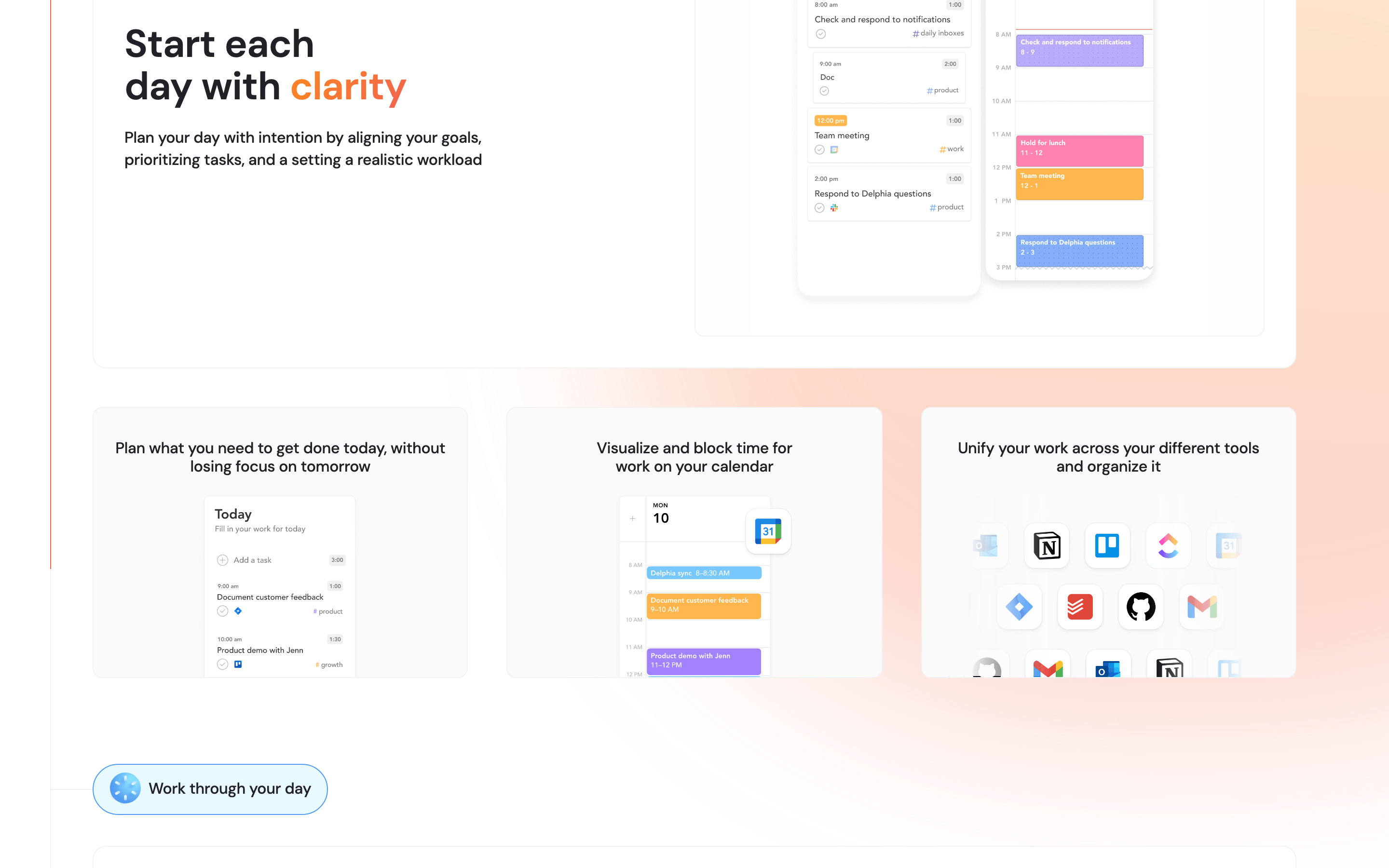
cardLightly shadowed, white or soft gray cards with generous border-radius (10px to 40px).
chipSmall, rounded tags or labels with subtle borders or light backgrounds.
inputClean inputs with subtle borders, focusing on readability.
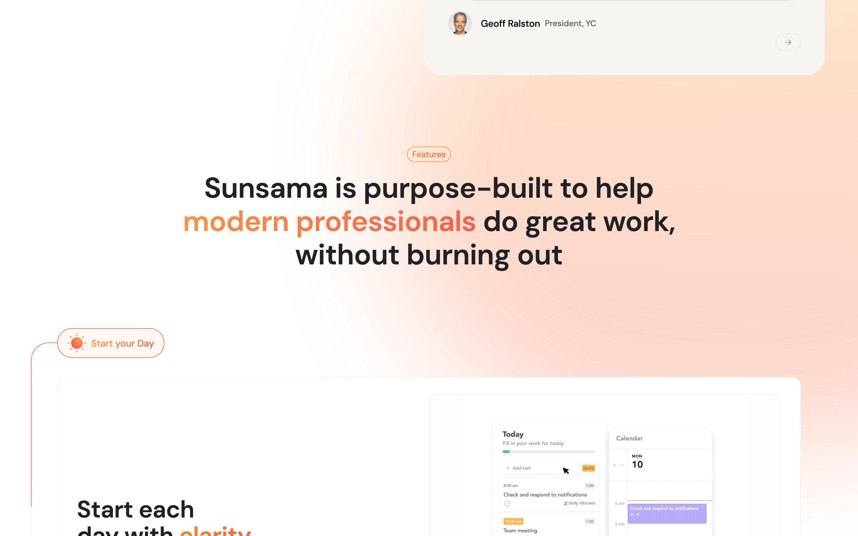
heroA large split-section with bold typography and a product screenshot on a soft background.
09
Voice & Don'ts
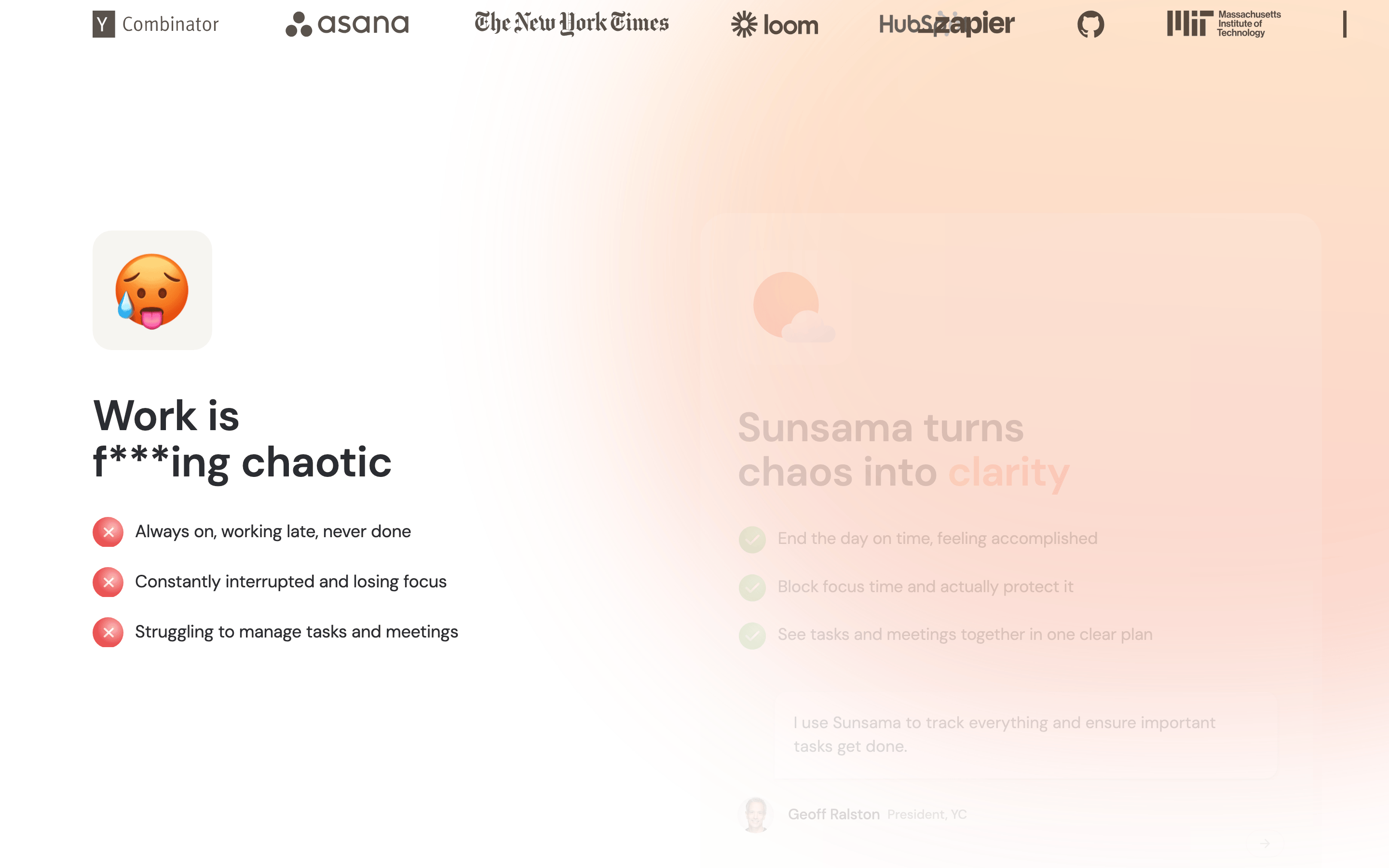
ToneCalm, professional, and reassuring.
HeadlinesShort, declarative, and benefit-driven (e.g., 'Start Calm. Stay Focused.').
CTAsDirect and low-pressure (e.g., 'Try for free', '14-day free trial').
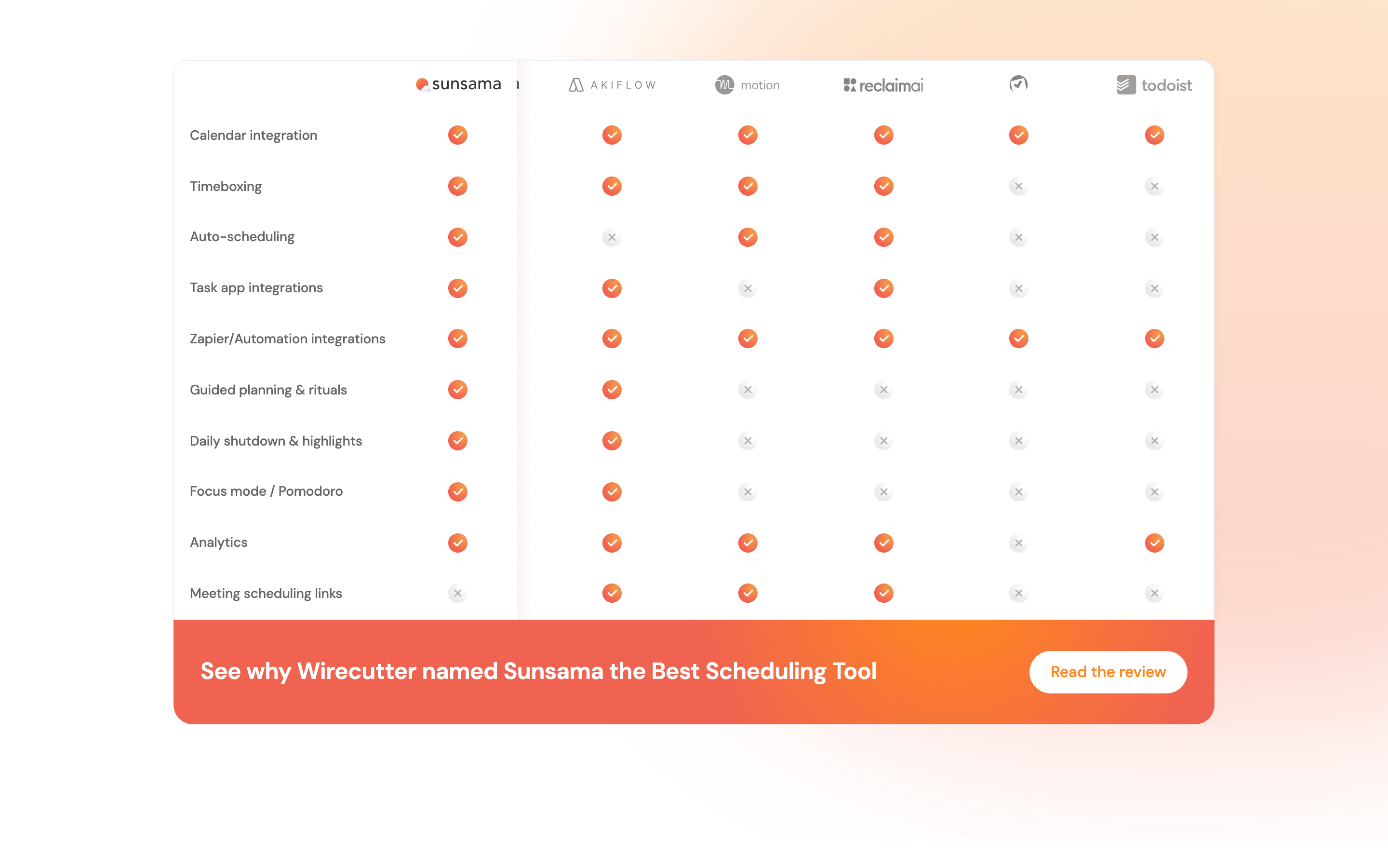
Don't use aggressive, high-contrast neon colors — screenshot shows a soft white, gray, and warm orange palette.
Don't use sharp, square corners on major components — screenshot shows 10px to 40px rounded corners.
Don't use dense, long-form text blocks — screenshot shows generous spacing and concise copy.
Don't use decorative, highly stylized display fonts — screenshot shows a clean, geometric/humanist sans-serif system.
Don't use dark mode or high-contrast black backgrounds — screenshot shows predominantly white and light-gray surfaces.
Don't use complex, heavy drop shadows — screenshot shows very subtle, low-opacity shadows for depth.
Captured from the live site · real computed styles
11
System prompt
This site is for Sunsama, a calm and focused daily planner for modern professionals. It uses a bright, clean white (#FFFFFF) and soft gray (#FAFAFA) palette, with a vibrant orange (#FF891C) accent. Typography is a clean mix of geometric and humanist sans-serif categories. Critical constraints: prioritize generous whitespace and a 4px grid, use 10-48px rounded corners for a friendly feel, and avoid any aggressive, dark, or cluttered visual metaphors that would disrupt the calm, productive positioning.
Bring this taste to your agent
Hand your AI agent a machine-readable spec of this design — tokens, type, motion, the whole DNA.