← OpenDesign CURATED · OPEN · FREE
Taiki Murayama
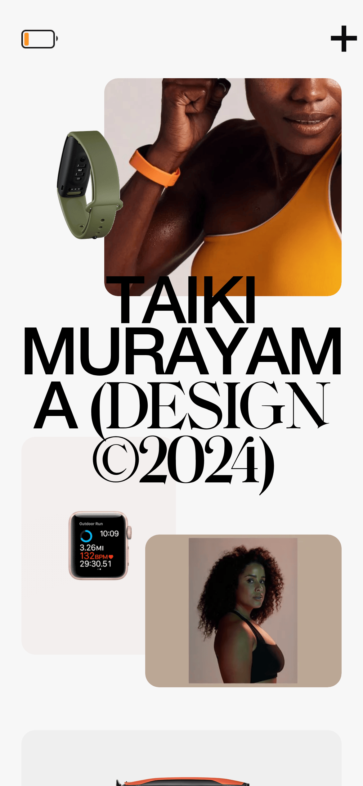
A bold, editorial design portfolio emphasizing large typography, high-contrast imagery, and minimal UI chrome to showcase work.
Portfolio Studio Clean Typography Editorial
01
Identity DNA
design portfolio minimal editorial high-end
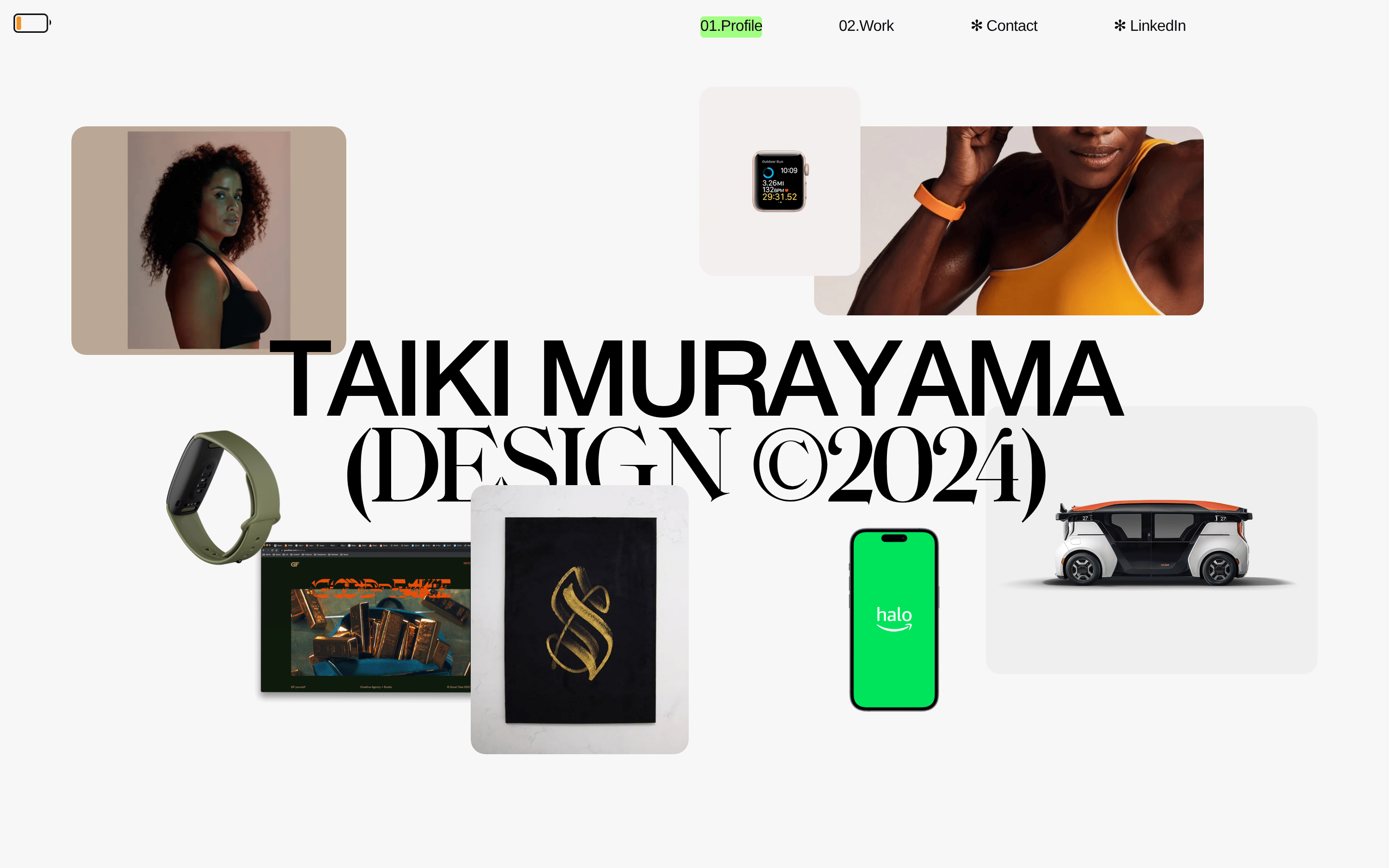
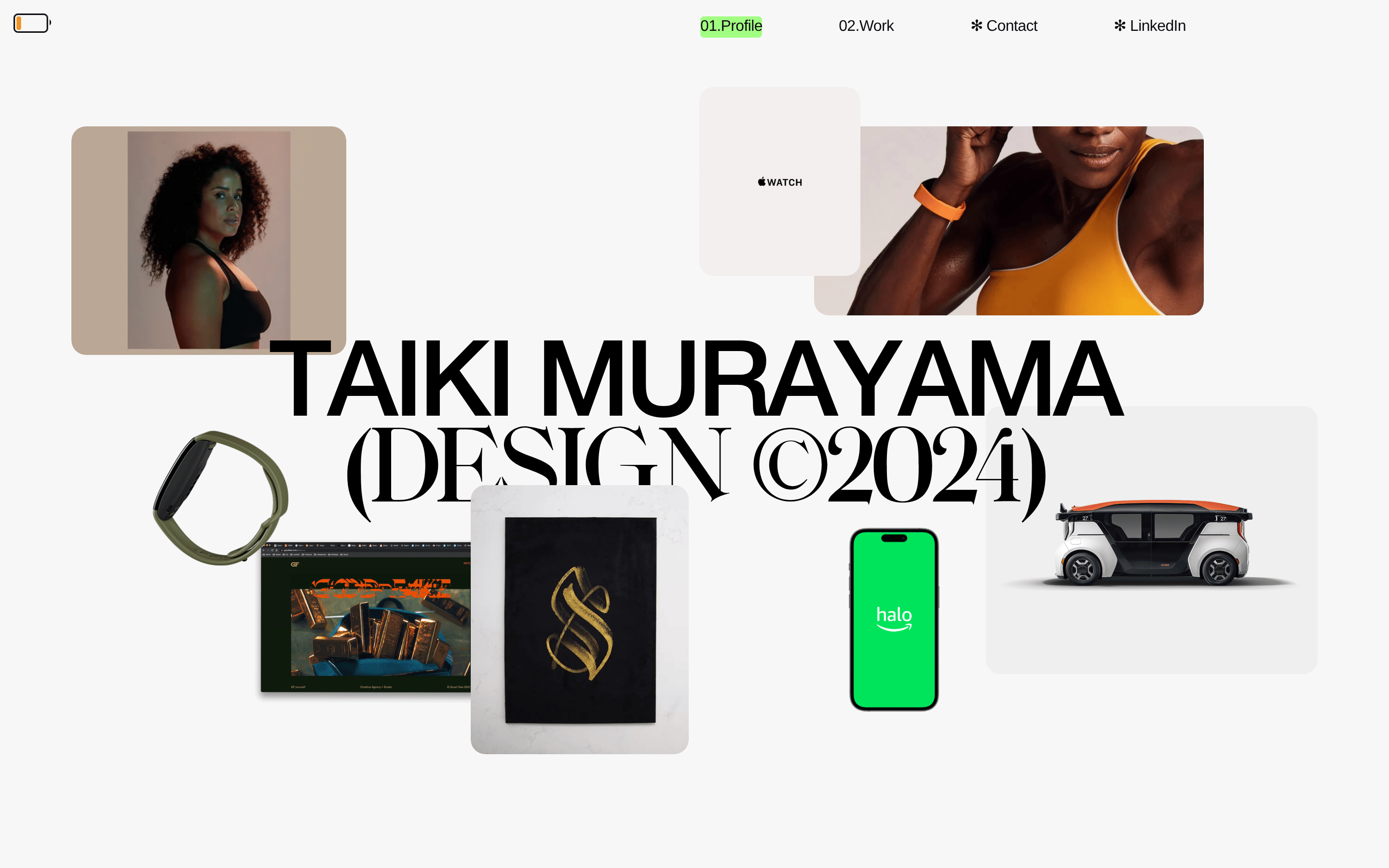
A curated gallery of a designer's work, presented with bold typography and restrained elegance.
02
Color
#42ff00Accent
#0b0b0fInk
#bbbbbbInk soft
#f7f7f7BG
rgba(11,11,15,1)Line
High-contrast monochrome palette with a single vibrant accent, using a light neutral background to let work imagery stand out.
03
Typography
geometric-sans · humanist-sans · monospace
display 110px · 400heading 54px · 400subhead 34px · 400body 28px · 400caption 16px · 40004
Spacing
4px
8px
16px
24px
32px
48px
64px
96px
A loose, editorial rhythm with generous padding and gaps to create an open, breathable layout.
05
Surfaces
sm · 4px
md · 15px
lg · 300px
pill · 999px
Thin, solid lines in near-black are used as primary separators between content sections.
06
Layout
1440 container
12 columns
24px gutter
768 / 1024 breakpoints
Asymmetric, editorial grid with overlapping imagery and large text blocks that break conventional column structures.
07
Motion & Interaction
140ms micro
200ms small
600ms medium
cubic-bezier(0.4, 0, 0.2, 1) easing
Smooth scaling and opacity transitions for interactive elements · Parallax-like movement for image clusters
Elements scale up slightly on hover. · Standard pointer cursor on all interactive elements.
08
Components
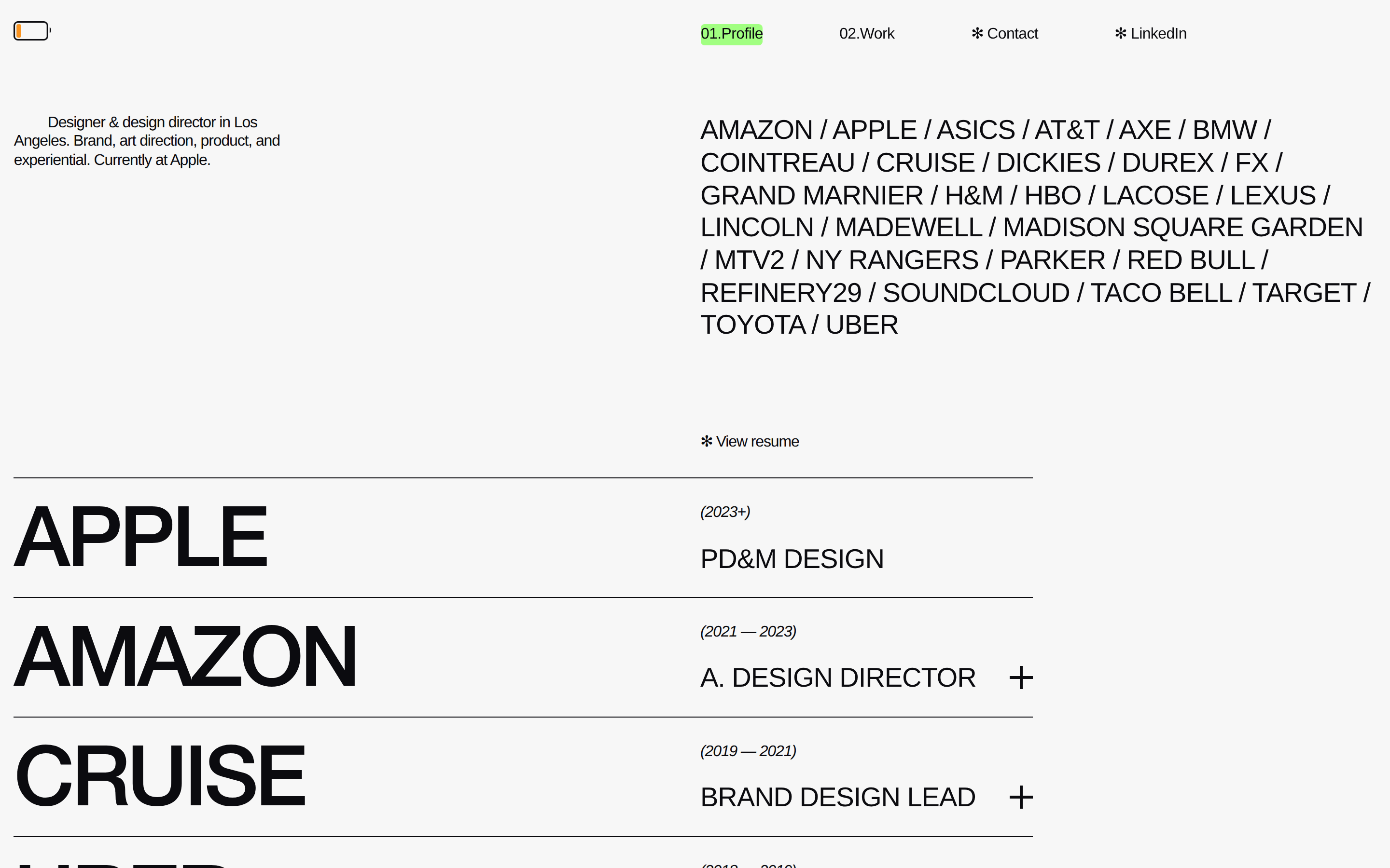
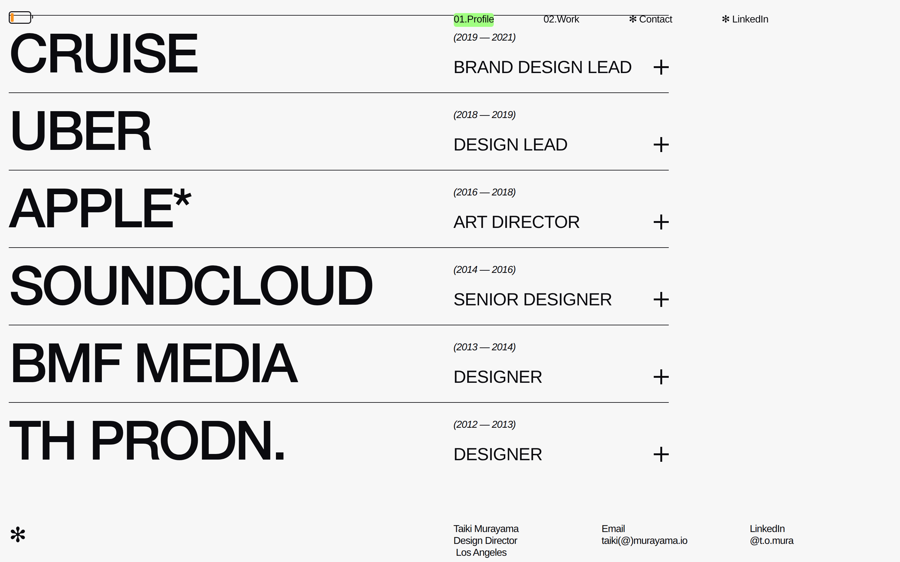
button Minimal, text-based navigation with a single active item highlighted by a vibrant green background block. card Images are presented in loose, overlapping clusters without strict containers, floating over the background. chip Not present. input Not present. hero A dynamic, collage-style composition featuring large, overlapping photography and bold, oversized typography. 09
Voice & Don'ts
Tone Confident, professional, and artistically bold. Headlines Ultra-large, tightly tracked geometric sans-serif names and titles. CTAs Minimal, relying on text and a single asterisk icon rather than traditional button shapes. Don't use drop shadows — screenshot shows flat images with clean edges. Don't use card containers for images — screenshot shows images floating and overlapping freely. Don't use multiple font weights for emphasis — screenshot shows almost exclusively weight 400, relying on size for hierarchy. Don't center-align headlines — screenshot shows left-aligned or asymmetrically placed text. Don't use multiple accent colors — screenshot shows only one vibrant green highlight. Don't use dense paragraph text — screenshot shows short, impactful statements and lists. Avoid: Avoid decorative flourishes or script fonts Avoid: Avoid multiple accent colors Avoid: Avoid dense text blocks or cluttered layouts Avoid: Avoid standard UI component patterns like cards or modals Avoid: Avoid busy backgrounds or gradients Avoid: Avoid using drop shadows for depth 10
Inside the pack — real screenshots
桌面首屏(hero) 桌面滚动分段(90% viewport 步进,作为视觉证据) 桌面滚动分段(90% viewport 步进,作为视觉证据) 桌面滚动分段(90% viewport 步进,作为视觉证据) 移动首屏 Captured from the live site · real computed styles
11
System prompt
This is a high-end design portfolio for a creative director, positioned with bold, editorial confidence. The design DNA is built on a strict, high-contrast monochrome palette: a very light gray background (#f7f7f7), near-black ink (#0b0b0f), and a single, vibrant green accent (#42ff00) used sparingly for active states. The typography is dominated by a geometric sans-serif display font (Helvetica Neue) used at massive scales (up to 110px) with tight tracking, paired with a humanist sans for body text. The layout is an asymmetric, grid-breaking composition with generous whitespace. Critical don'ts: never use drop shadows, never put images in card containers, and never use multiple accent colors. The site uses a loose, editorial rhythm and smooth transitions (cubic-bezier(0.4, 0, 0.2, 1)) for interactions.
More from the library en · zh-CN · zh-TW · ja · ko
OpenDesign · curated web aesthetics for AI-readable design DNA · opendesign.cc
Why we curated this: This site is worth including as a prime example of a bold, typographic portfolio that uses scale and whitespace as primary design tools.