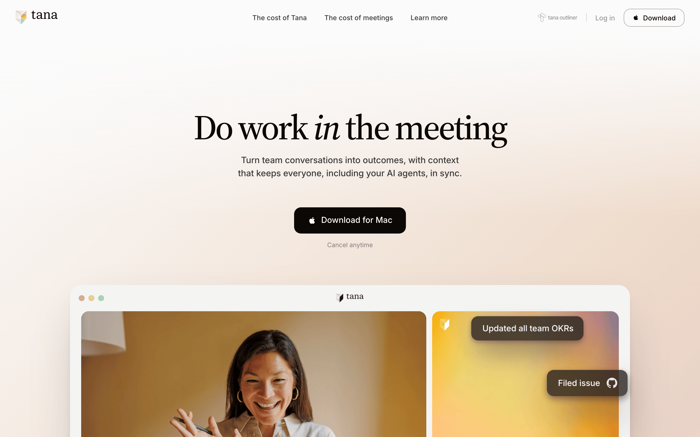
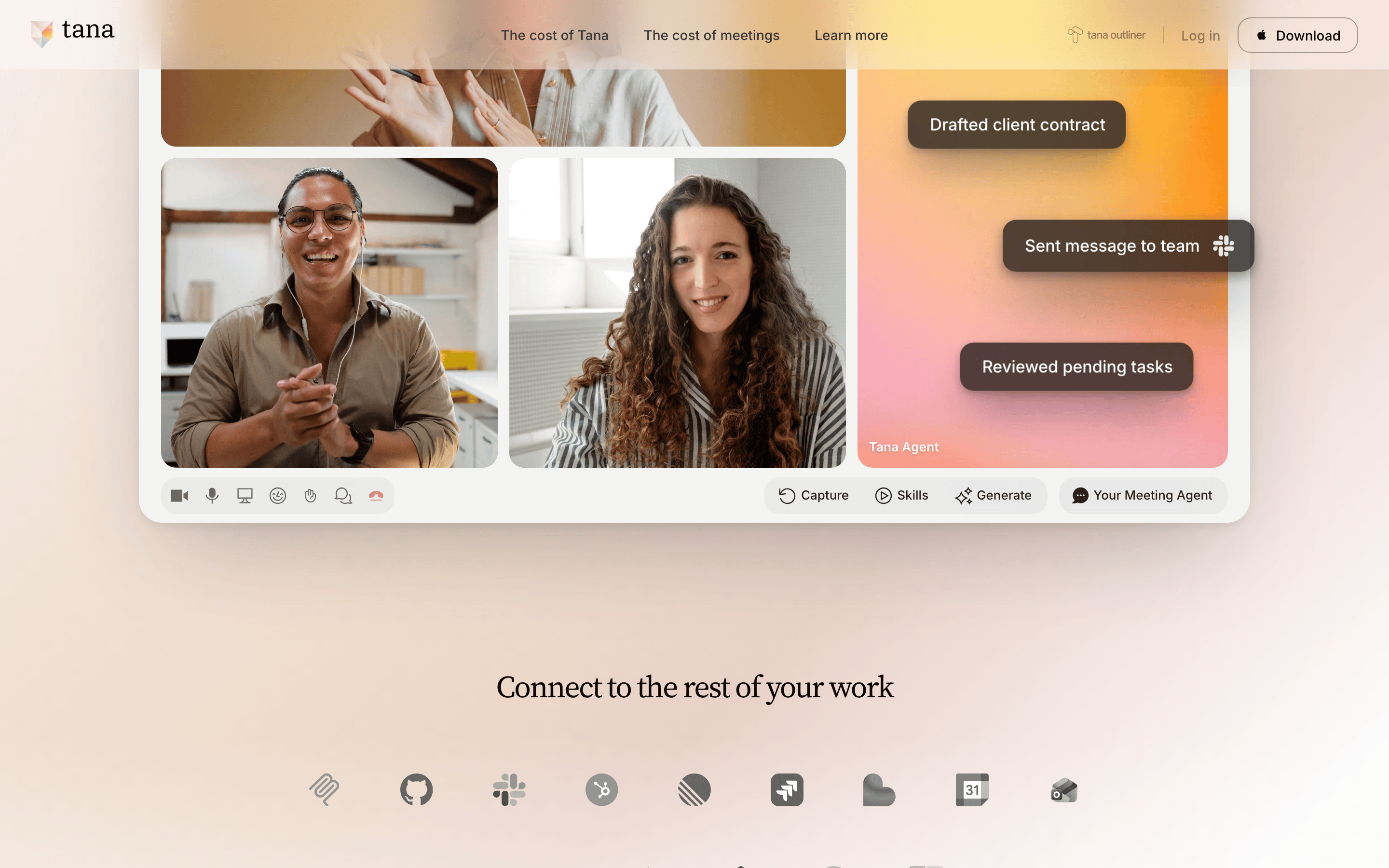
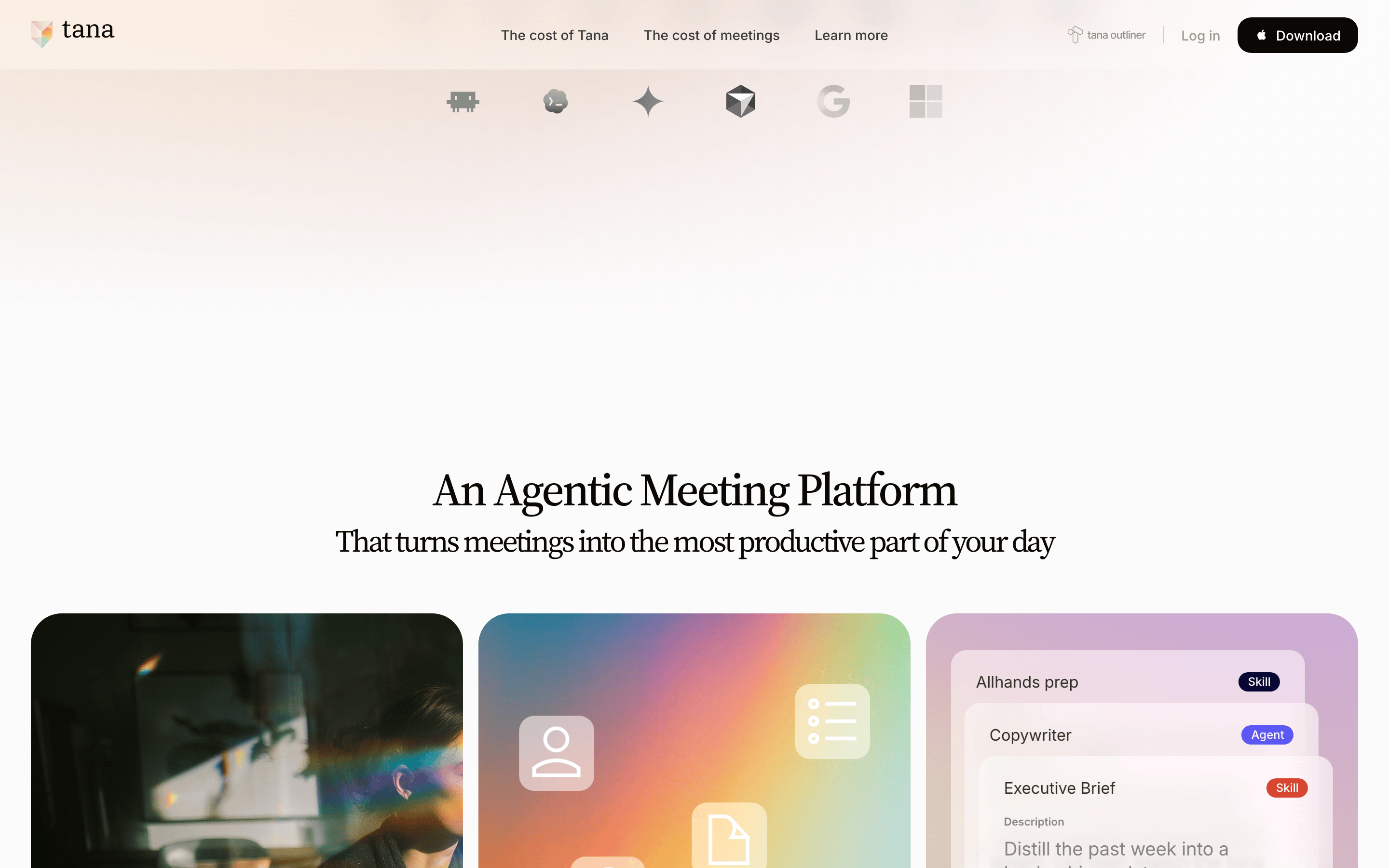
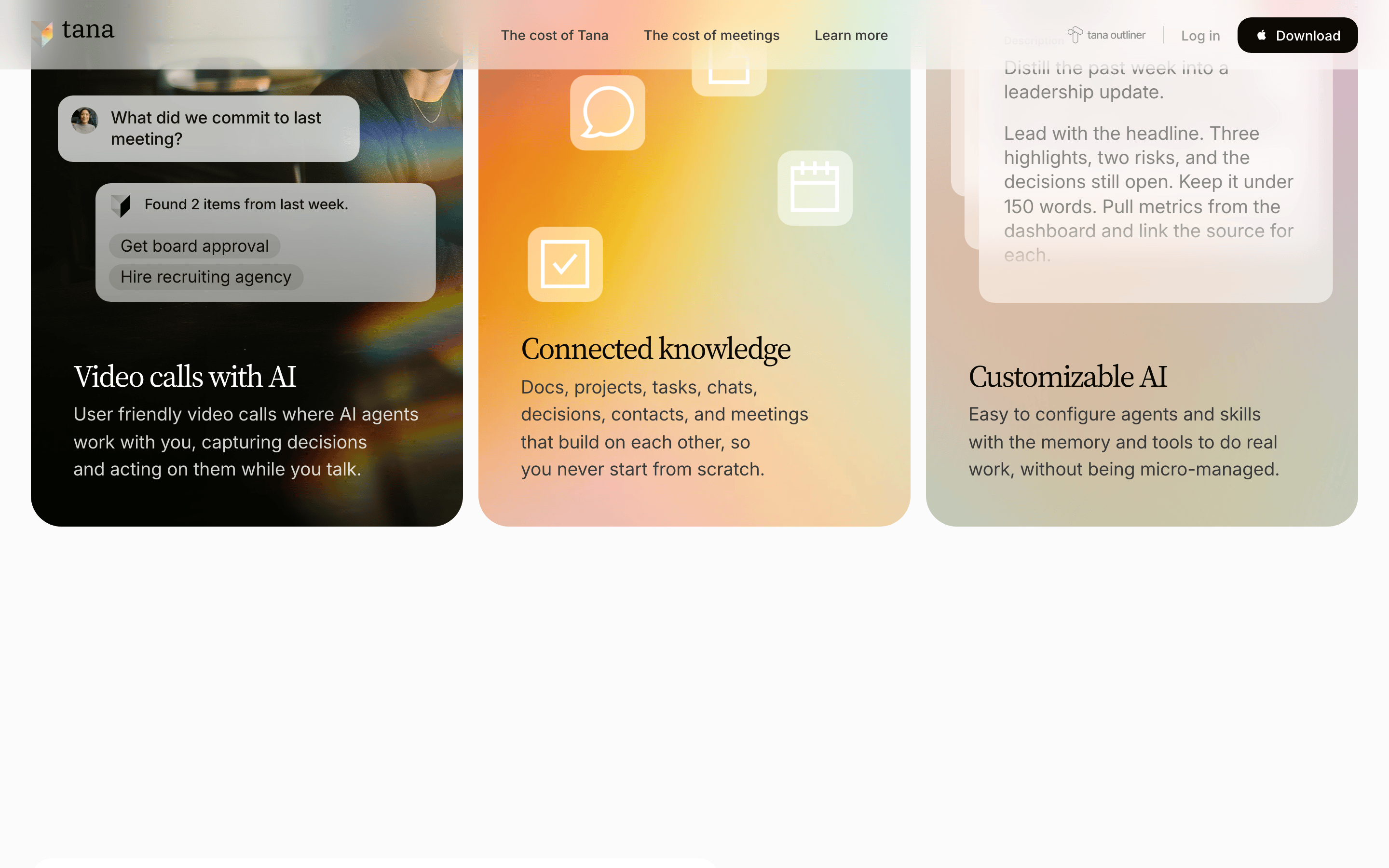
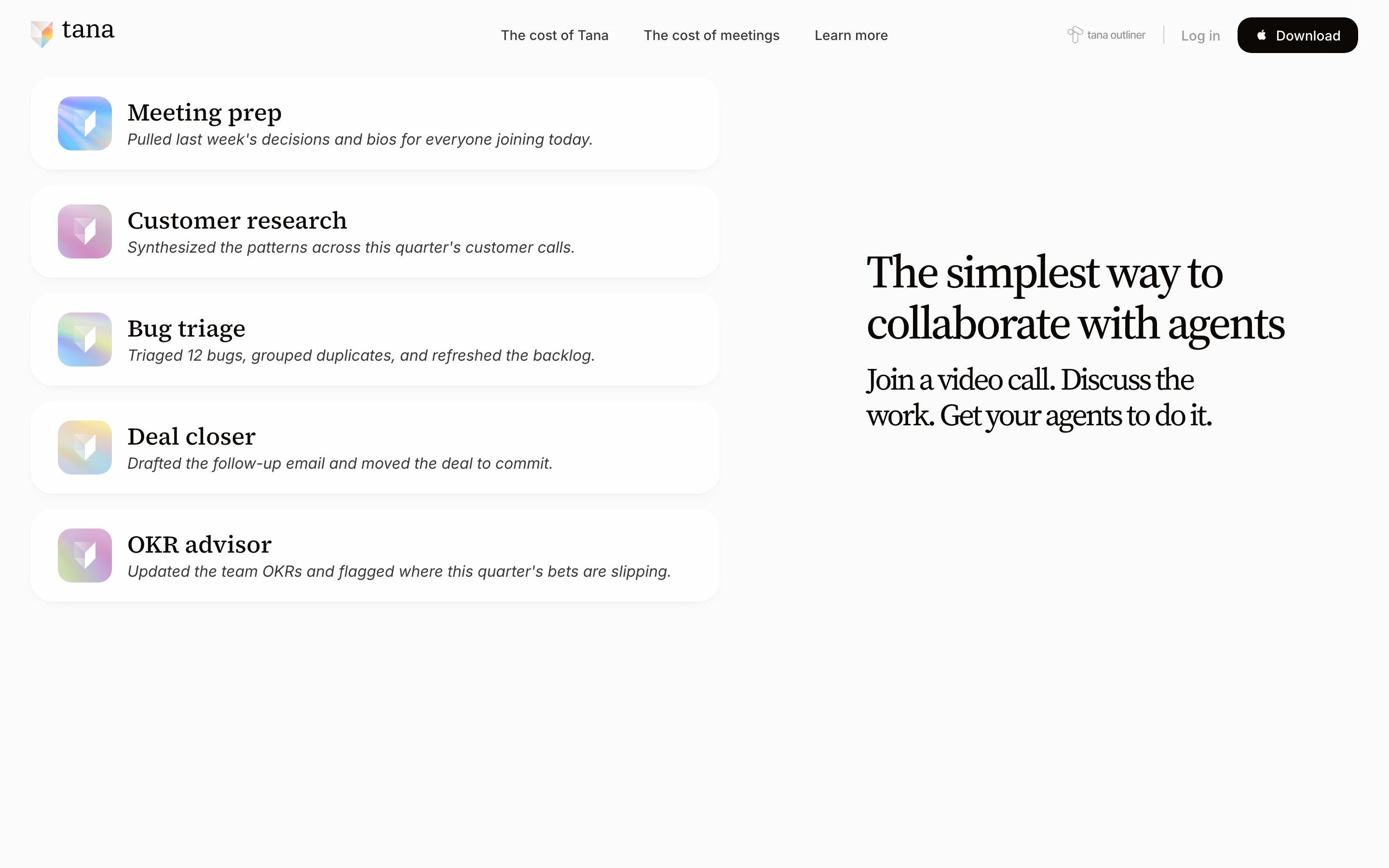
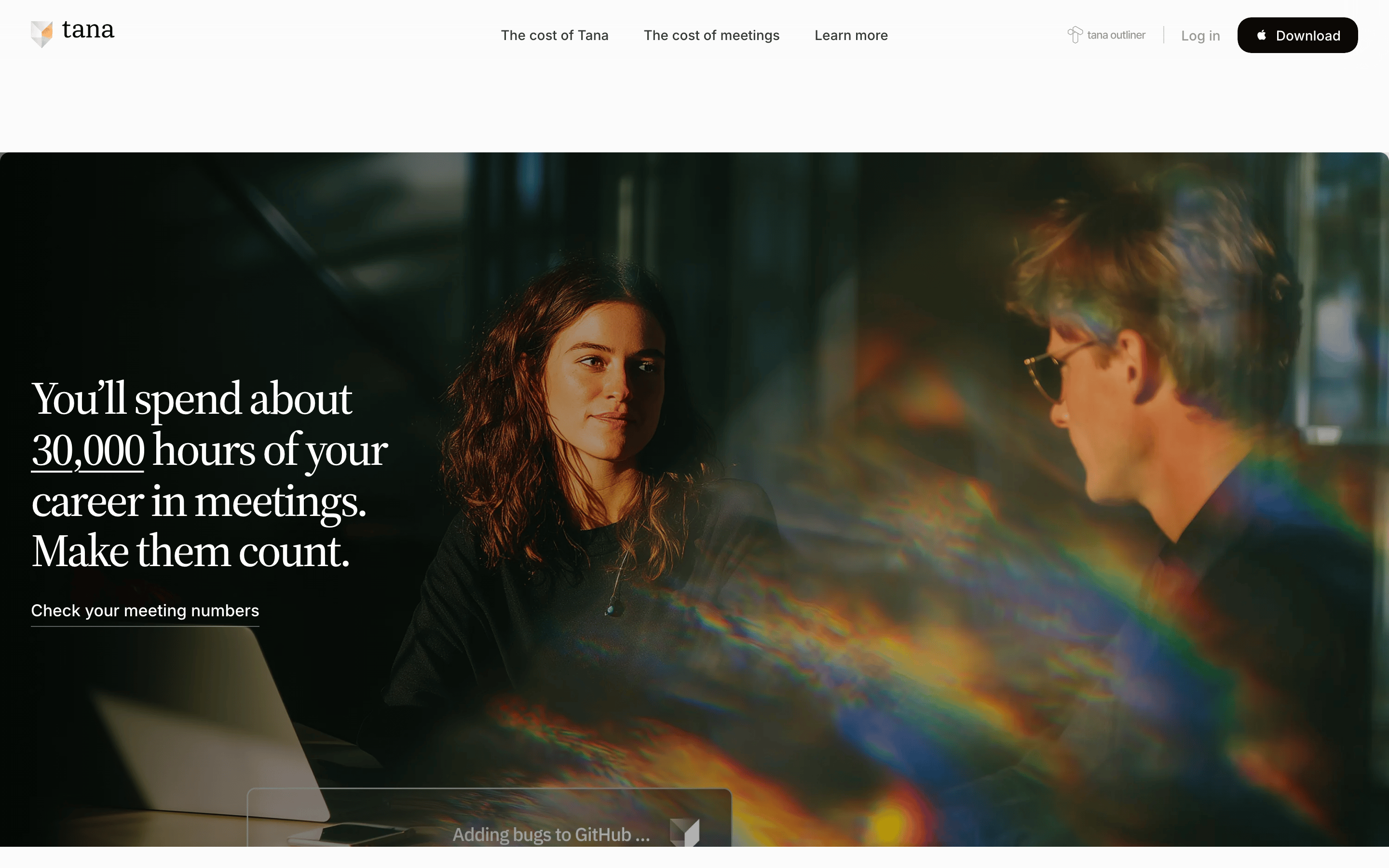
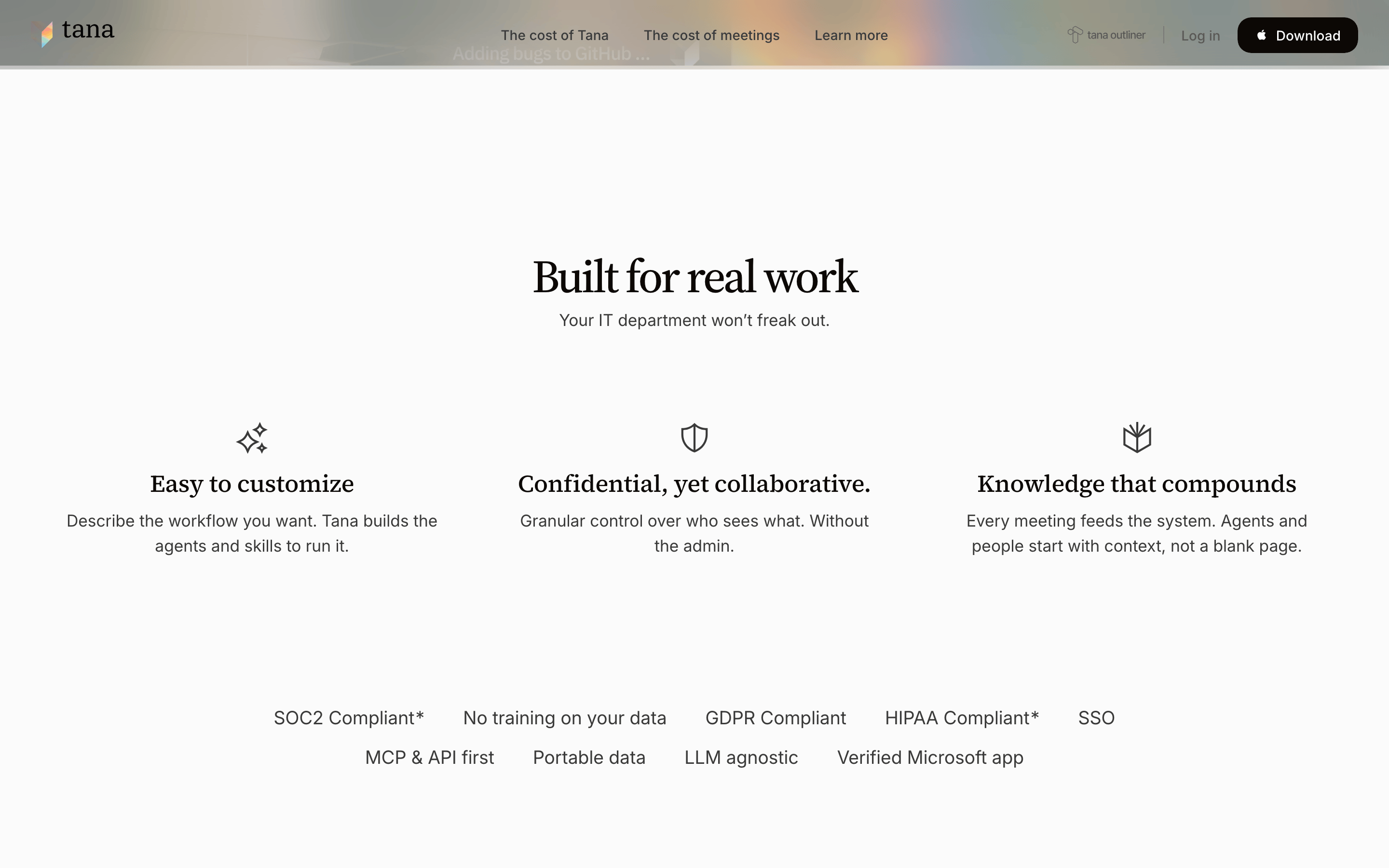
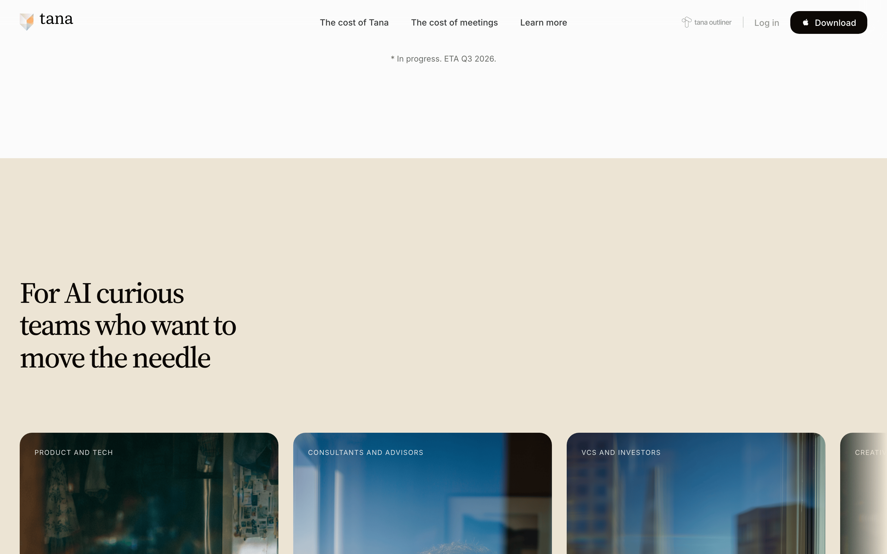
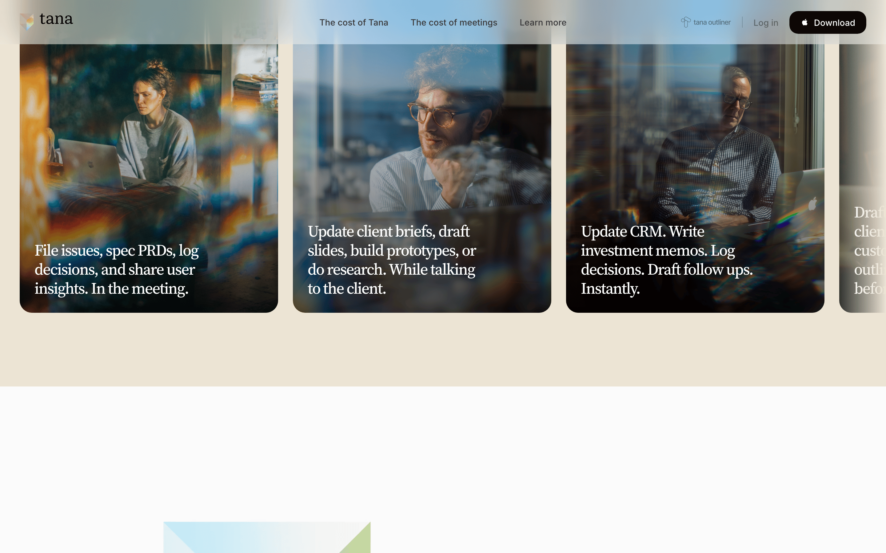
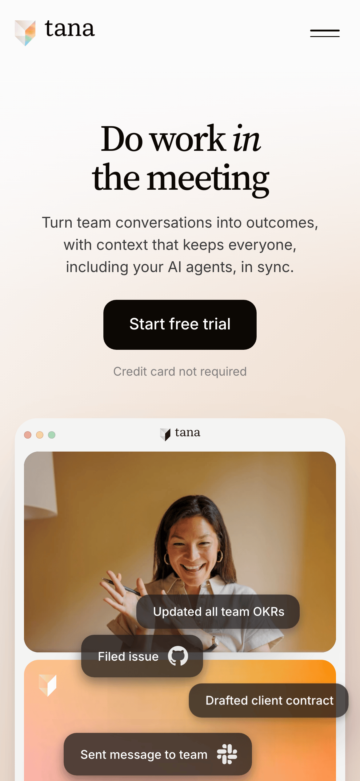
A sleek, high-end productivity application that blends classic editorial typography with modern app UI patterns.
02
Color
#0C0805Ink
#3A3A3AInk soft
#FBFBFBBG
#FFF2EFBG soft
#6A6A6AMuted
rgba(12,8,5,0.1)Line
Warm, high-contrast monochrome palette with soft peach accents, prioritizing readability and premium feel.
03
Typography
didone-serif · humanist-sans · monospace
display72px · 400
headline48px · 400
body17px · 400
nav15px · 400
Use Didone Serif (Source Serif 4) for large display text and headlines. · Use Humanist Sans (Inter) for body copy, UI elements, and navigation. · Maintain tight negative letter spacing for display text.
04
Spacing
4px
8px
12px
16px
24px
32px
48px
64px
96px
Use 4px base increments for consistent rhythm, ensuring generous padding (24px-48px) in cards and sections.
05
Surfaces
sm · 6px
md · 14px
lg · 20px
pill · 999px
Subtle 1px borders using rgba(12,8,5,0.1) for separation.
Captured from the live site · real computed styles
11
System prompt
Tana is a premium productivity tool that blends classic editorial design with modern app UI. The visual system uses a didone-serif (Source Serif 4) for large display headlines and a humanist-sans (Inter) for all body copy and UI elements. The primary color palette is a high-contrast monochrome (ink #0C0805 on off-white #FBFBFB) with a soft peach/warm accent (#FFF2EF) in specific sections. Critical constraints: Never use vibrant, high-chroma accent colors; always use soft, rounded corners (14px-20px radius); and ensure generous vertical whitespace (24px-96px) to maintain a premium, editorial feel. The tone is confident and professional, using short, impactful headlines with occasional italic emphasis.
Bring this taste to your agent
Hand your AI agent a machine-readable spec of this design — tokens, type, motion, the whole DNA.