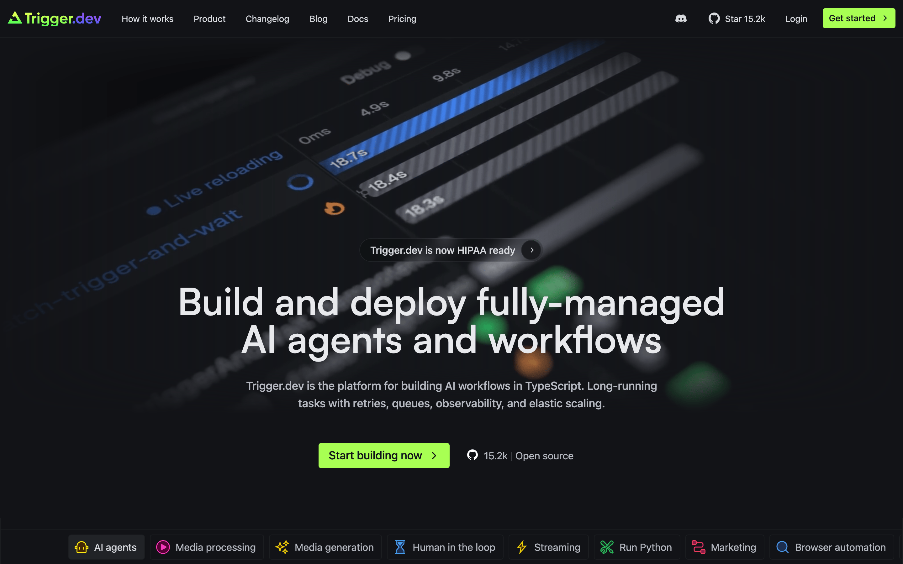
Deep dark surfaces with high-contrast neutral text and a single neon-green accent for primary actions.
03
Typography
geometric-sans · humanist-sans · monospace
display56px · 500
heading-230px · 500
body16px · 400
caption14px · 400
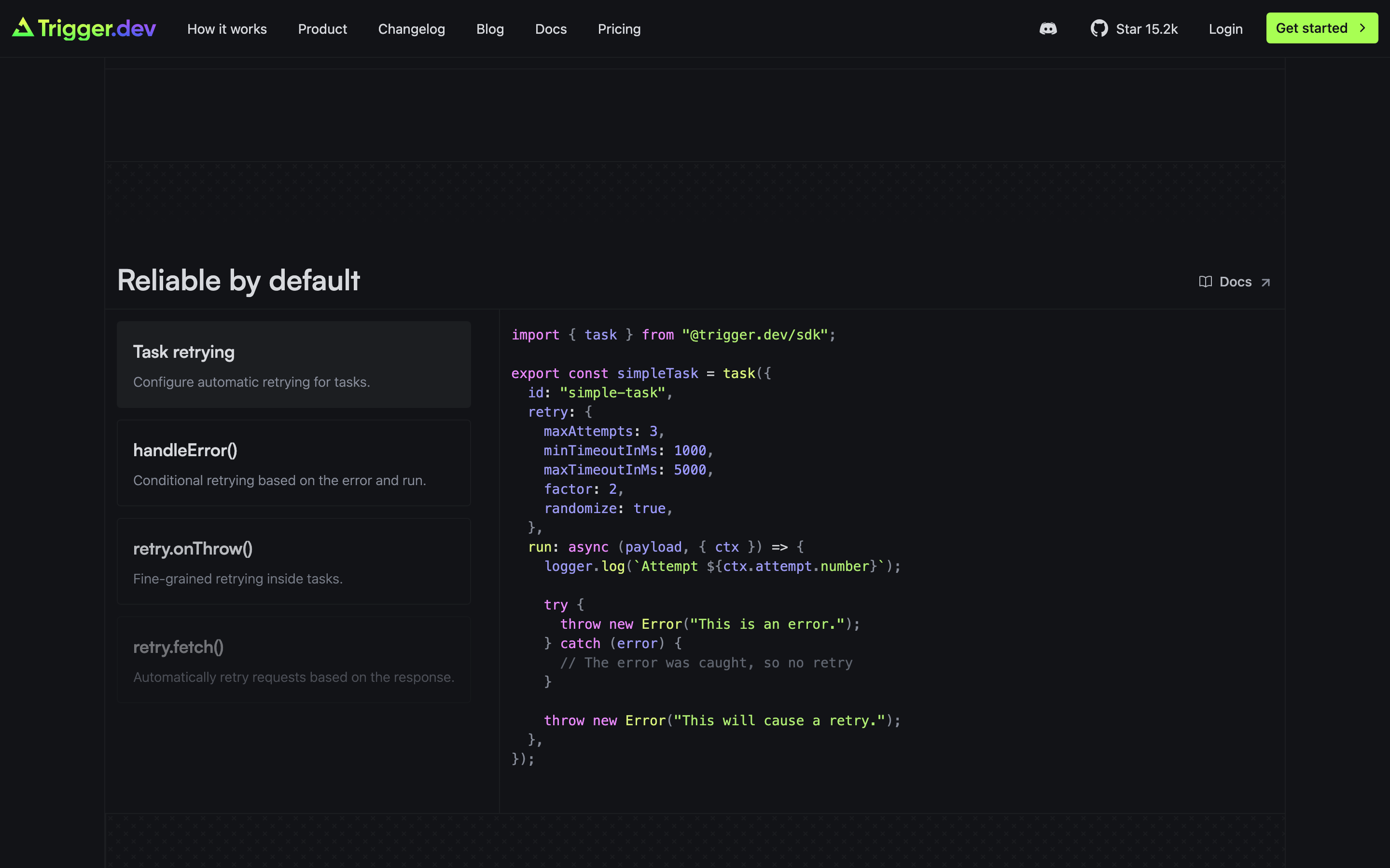
Use Geometric Sans for large display headlines. · Use Monospace for inline code references and terminal UI elements.
04
Spacing
4px
8px
12px
16px
24px
32px
48px
64px
96px
Consistent 4px grid with generous padding for large container elements.
05
Surfaces
sm · 4px
md · 6px
lg · 12px
pill · 9999px
1px solid rgba(59, 62, 69, 1)
0 1px 2px 0 rgba(0, 0, 0, 0.05)
06
Layout
1280container
12columns
24pxgutter
768 / 1024breakpoints
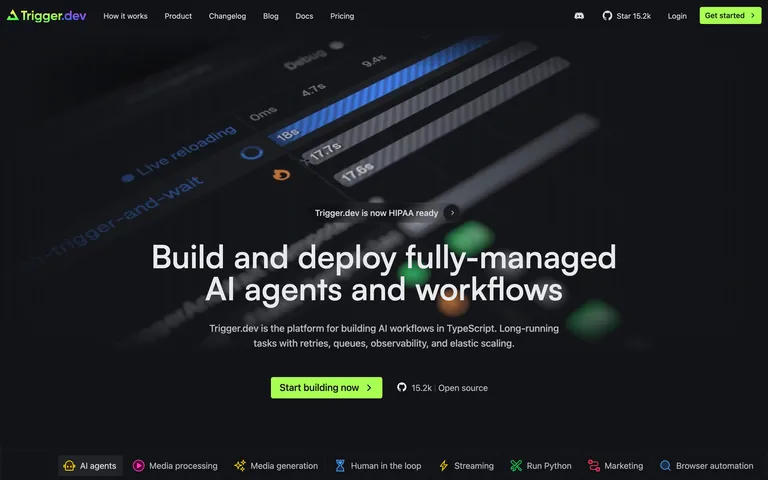
Standard centered layout with a prominent full-width hero section followed by grid-based feature sections.
07
Motion & Interaction
150msmicro
200mssmall
300msmedium
cubic-bezier(0.4, 0, 0.2, 1)easing
Standard color and background-color transitions on interactive elements. · Subtle opacity and transform changes for hover states.
Elements subtly change color or background-color on hover with a 0.15s to 0.3s duration. · Minimal feedback, primarily relying on color transitions to indicate state changes.
08
Components
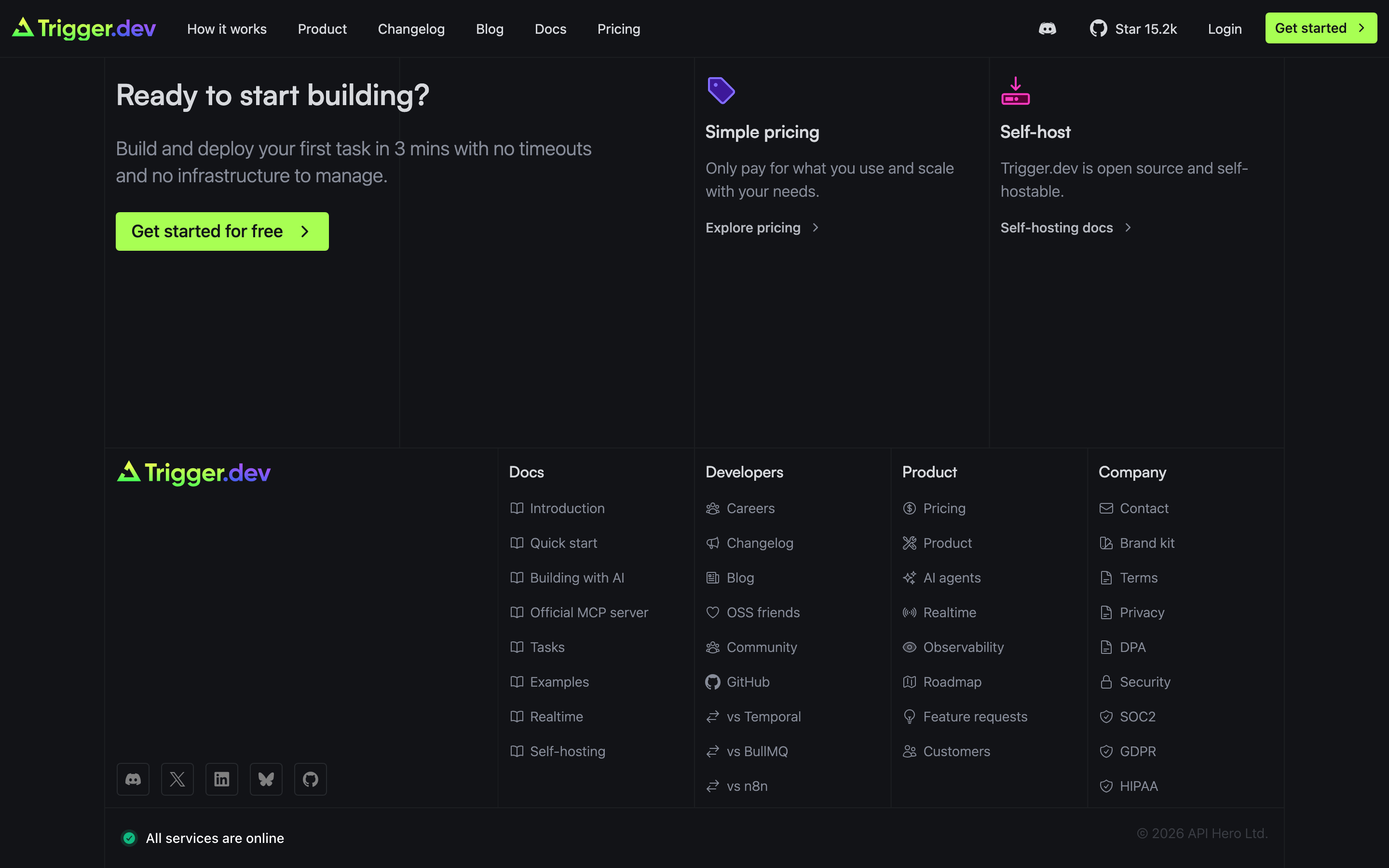
buttonPrimary buttons use a high-chroma neon-green background with black text, slightly rounded (4px), and dark text.
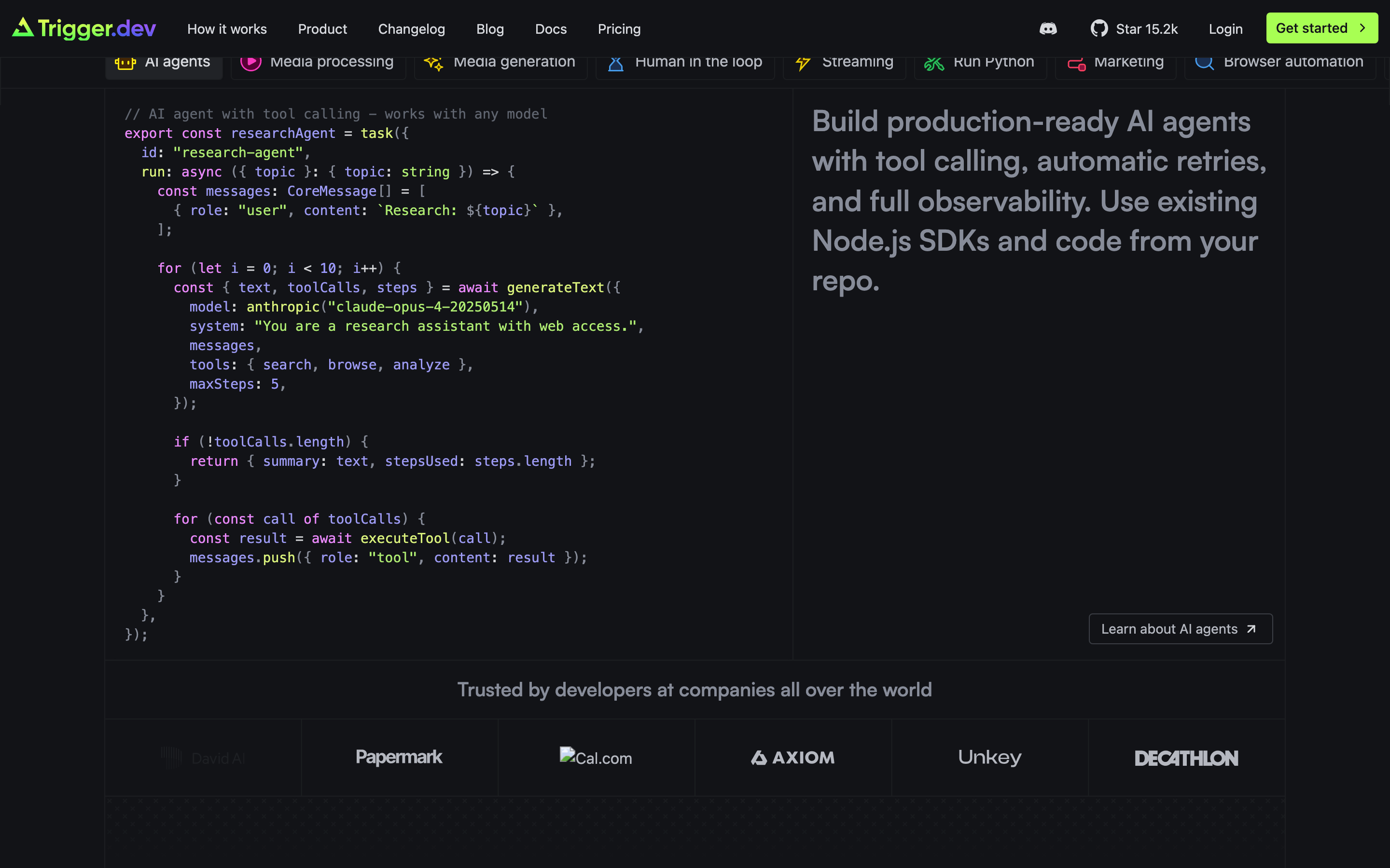
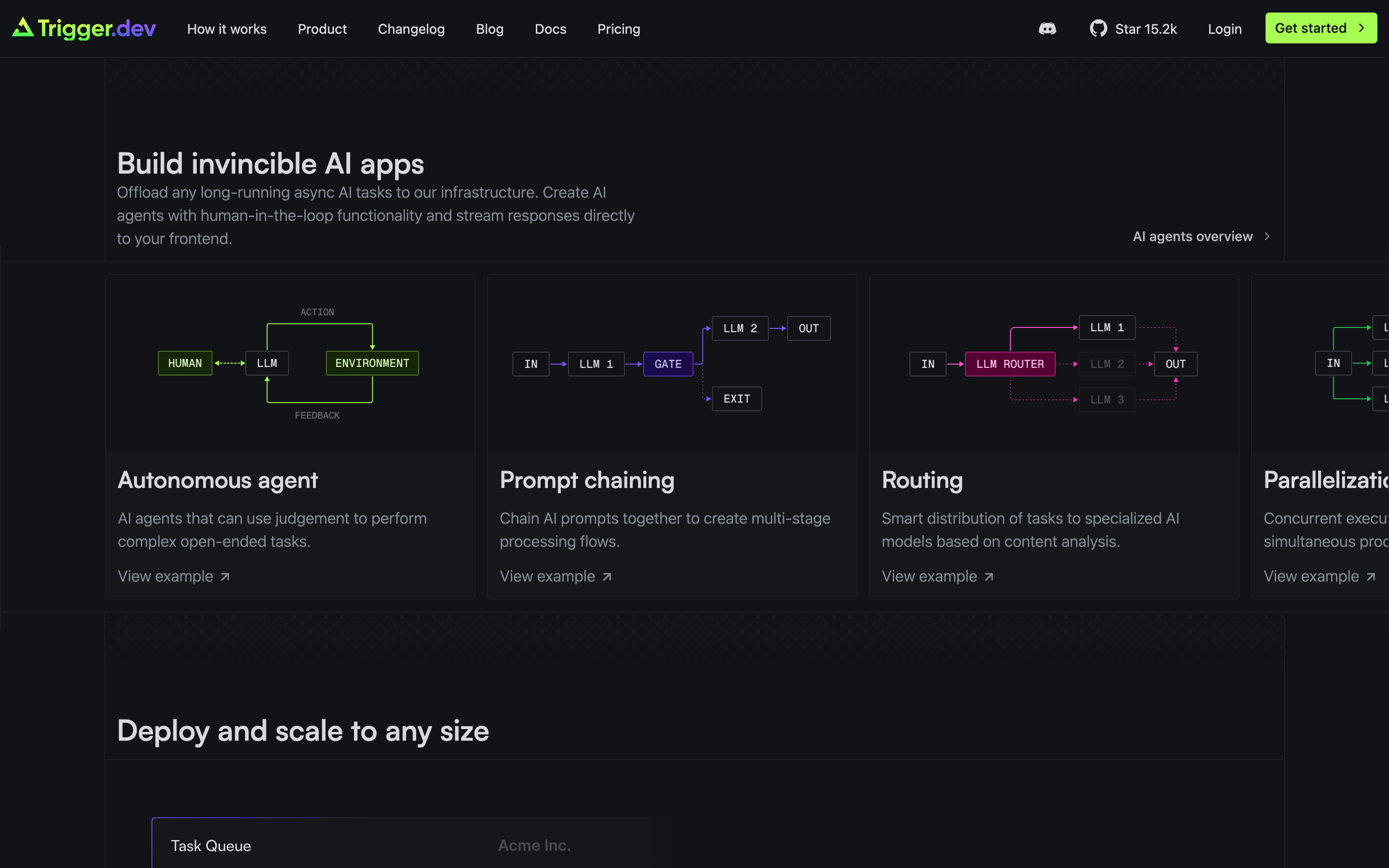
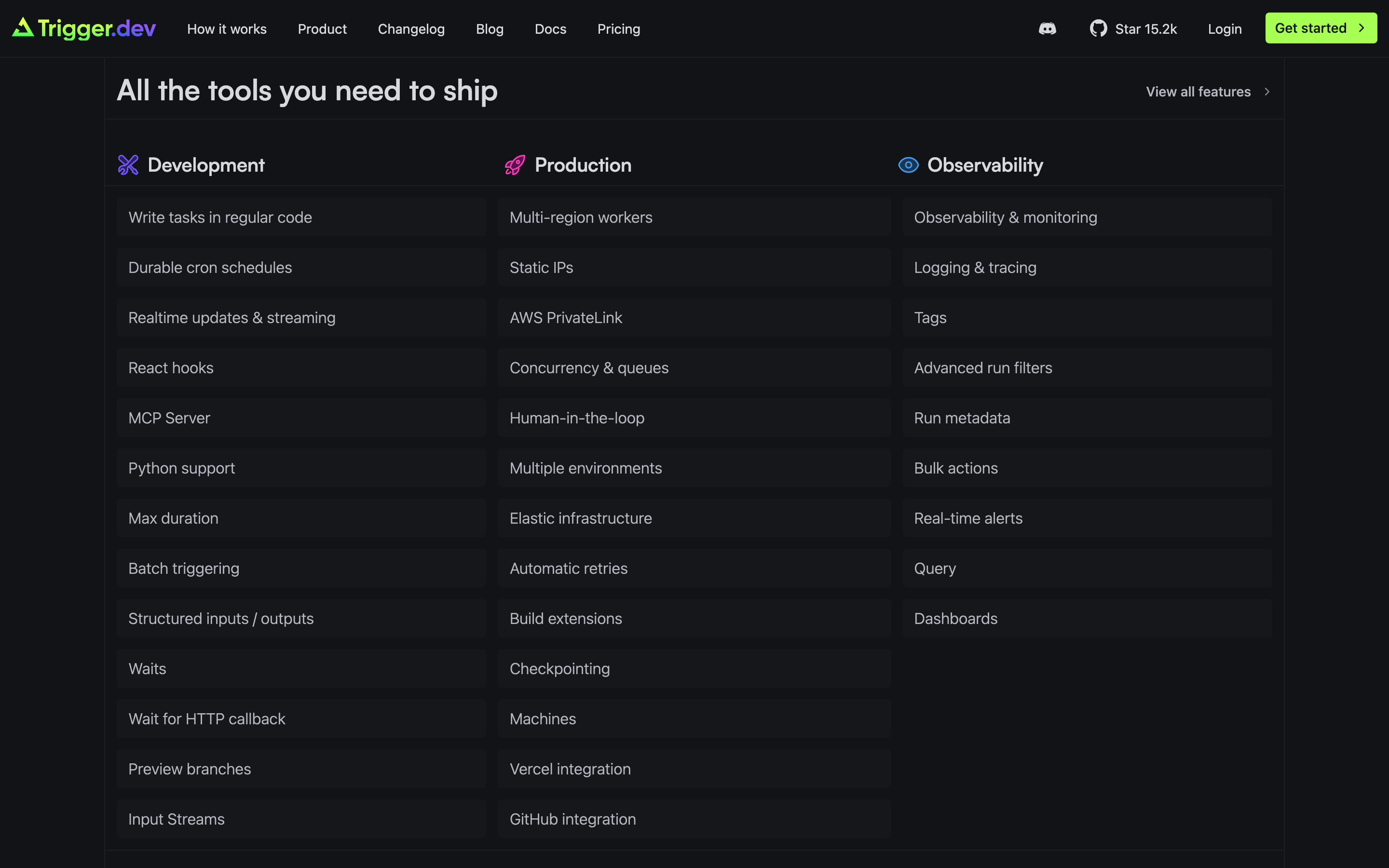
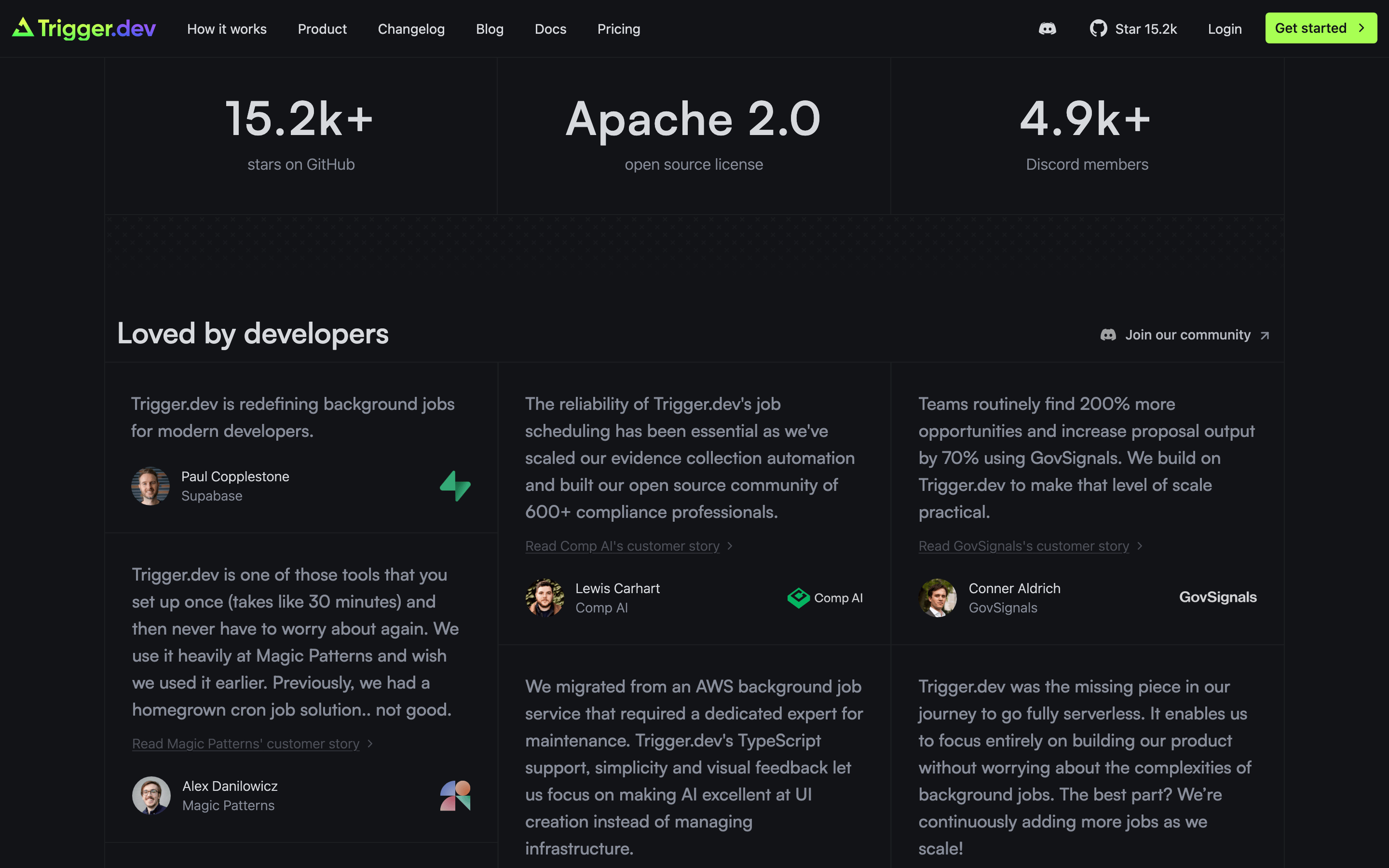
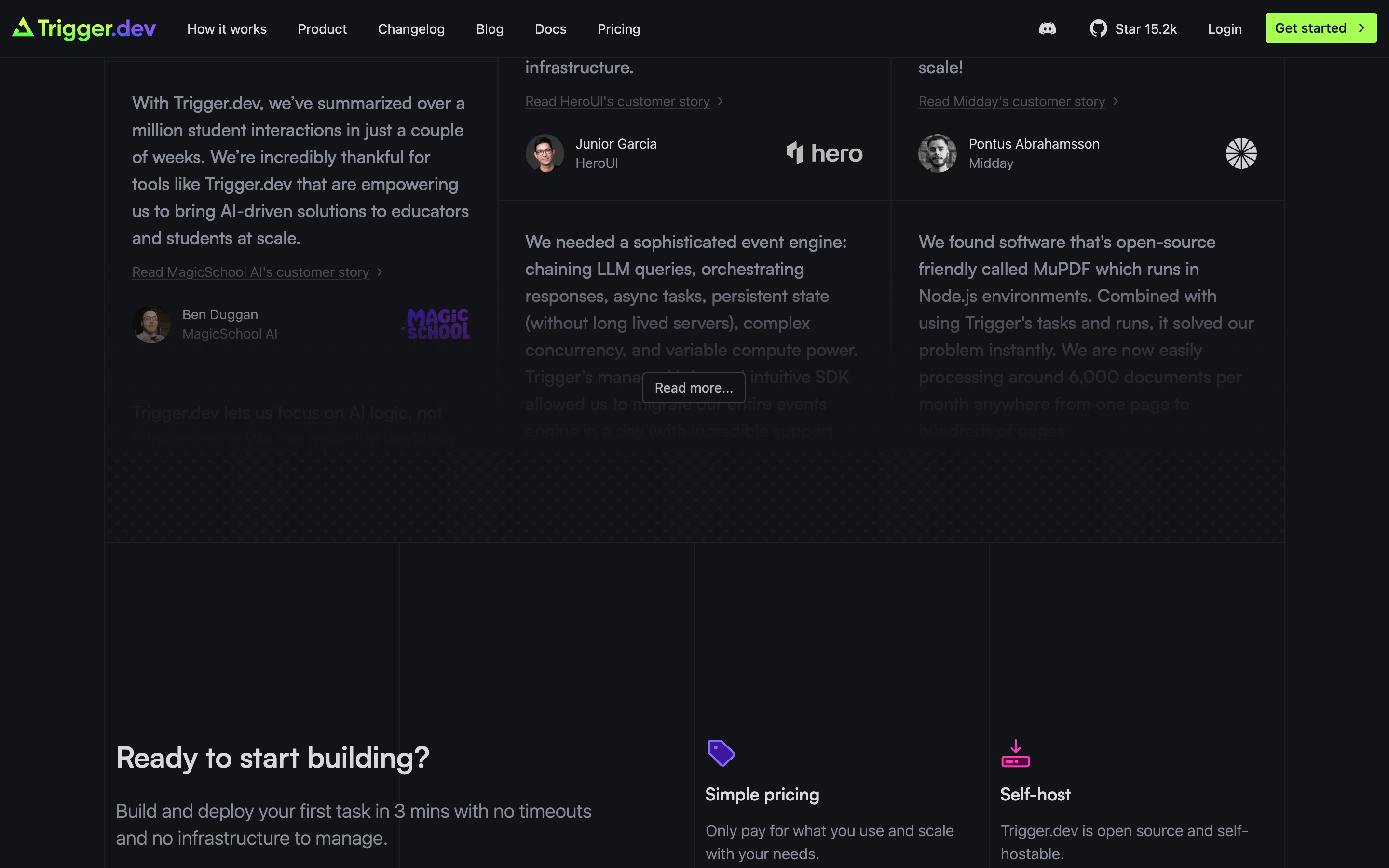
cardCards have subtle borders and dark backgrounds, often containing a list of features with a clear title and description.
chipSmall, rounded (pill) badges with dark backgrounds and subtle borders used for feature tags.
inputDark-themed input fields with subtle borders and rounded corners.
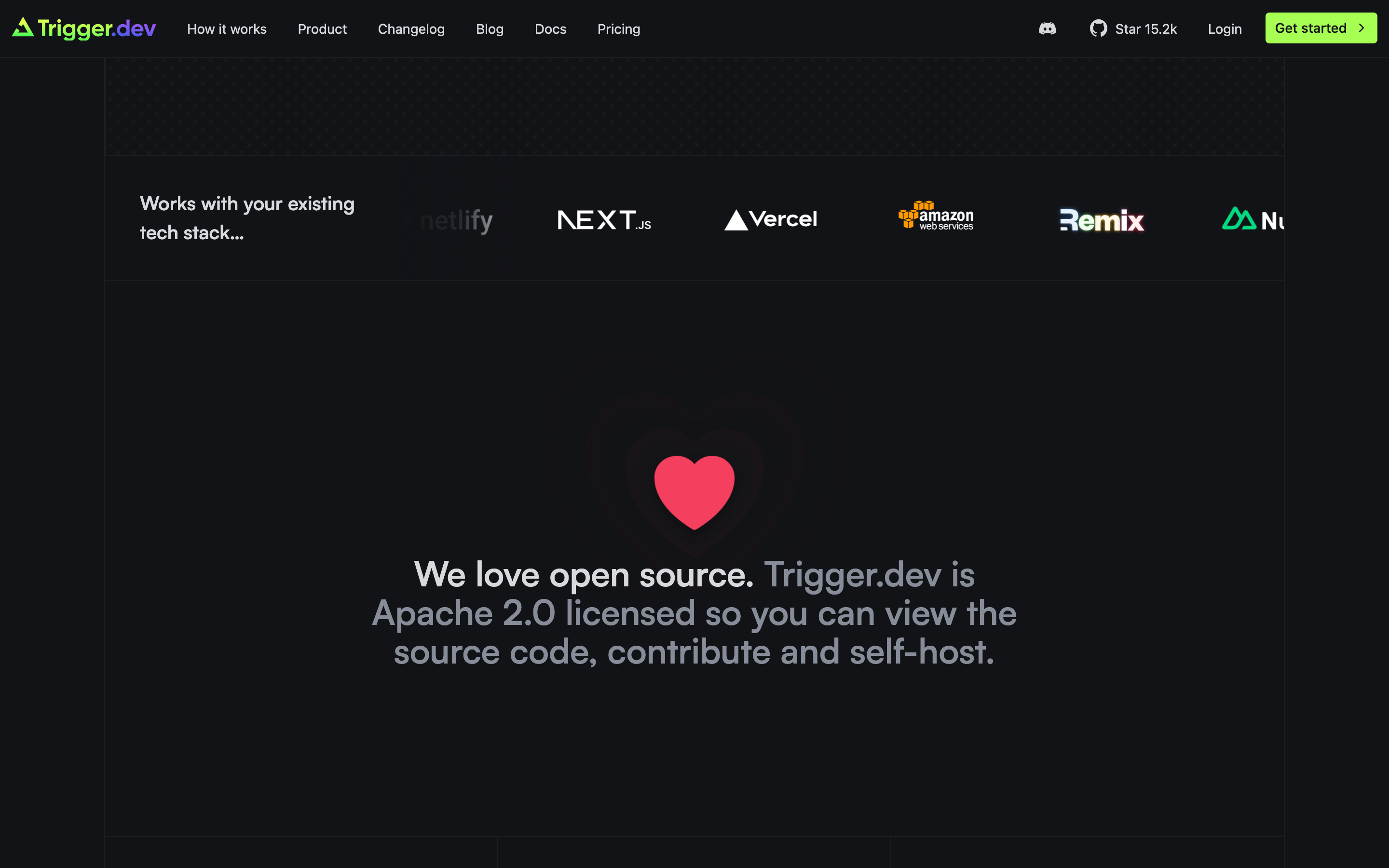
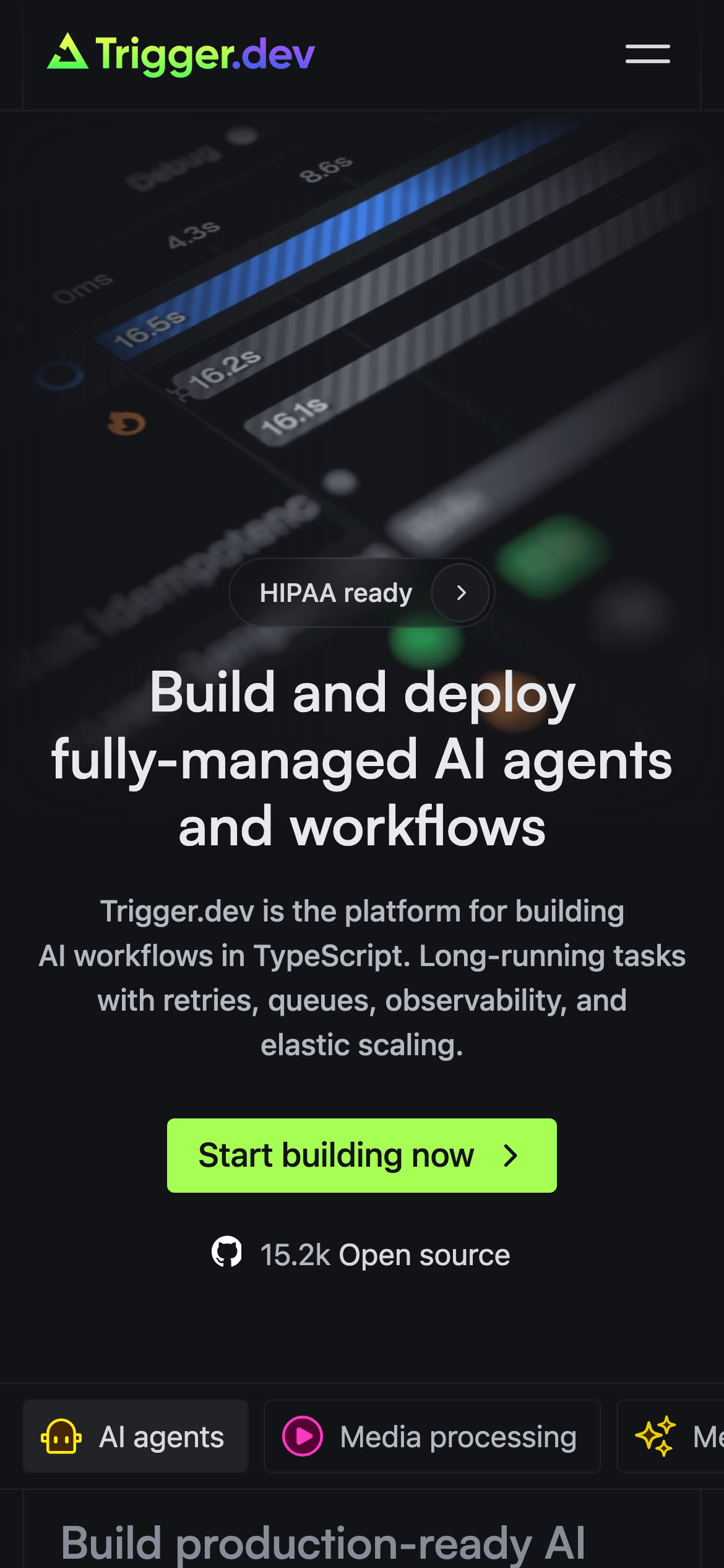
heroA full-width, dark-background section featuring a large, bold white headline and a high-contrast CTA button.
09
Voice & Don'ts
ToneTechnical, authoritative, and straightforward.
HeadlinesBold, declarative, and benefit-driven.
CTAsAction-oriented and direct, often using a high-contrast button.
don't use bright, saturated multi-color palettes — screenshot shows a predominantly dark, near-monochromatic background with very limited accent colors.
don't use decorative or script typography — screenshot shows clean geometric and humanist sans-serifs for all text.
don't use large, complex border-radius values on cards or containers — screenshot shows mostly 4px to 12px rounded corners.
don't use heavy drop shadows or glows for elevation — screenshot shows very subtle, almost non-existent shadows.
don't use light-mode color schemes — screenshot shows a deeply dark, low-brightness interface.
don't use centered, multi-column layouts for body text — screenshot shows left-aligned text in most non-hero sections.
Avoid: Overly casual or playful language.
Avoid: Marketing jargon without technical substance.
Captured from the live site · real computed styles
11
System prompt
This is a developer-focused AI platform with a dark, industrial aesthetic. The design DNA centers around a deep charcoal background (#121317) with high-contrast neutral text (#D7D9DD) and a single, high-chroma neon-green accent (#BFFF00) for primary calls to action. Typography is a clean combination of geometric and humanist sans-serifs for headlines and body text, with a monospace font for technical references. The layout is centered and spacious, using a consistent 4px spacing grid. Critical don'ts: never use a light-mode palette, never use decorative fonts, and never use heavy drop shadows or multi-color accents that distract from the technical, focused nature of the product. The system should maintain a professional, authoritative, and technical tone throughout.
Bring this taste to your agent
Hand your AI agent a machine-readable spec of this design — tokens, type, motion, the whole DNA.