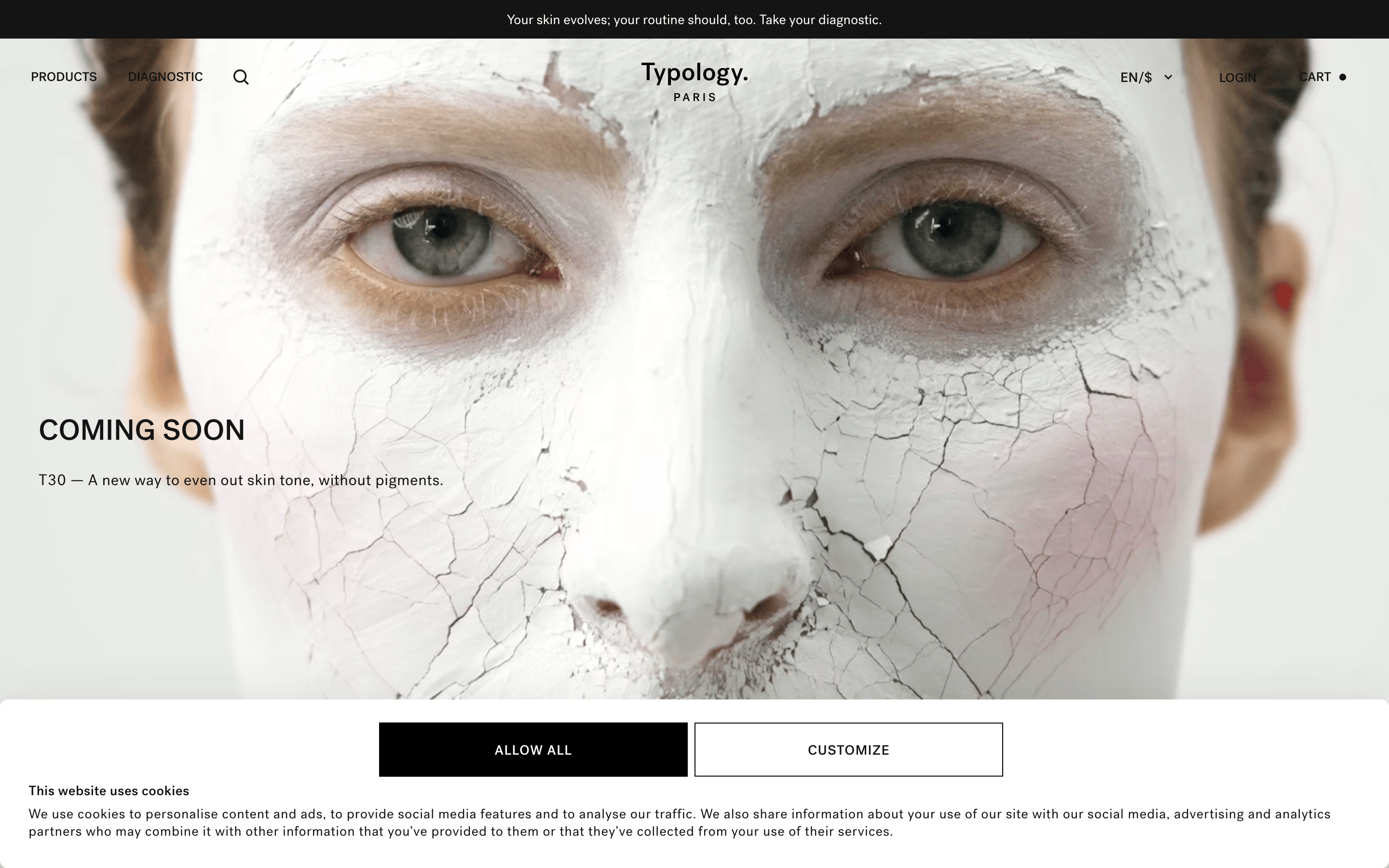
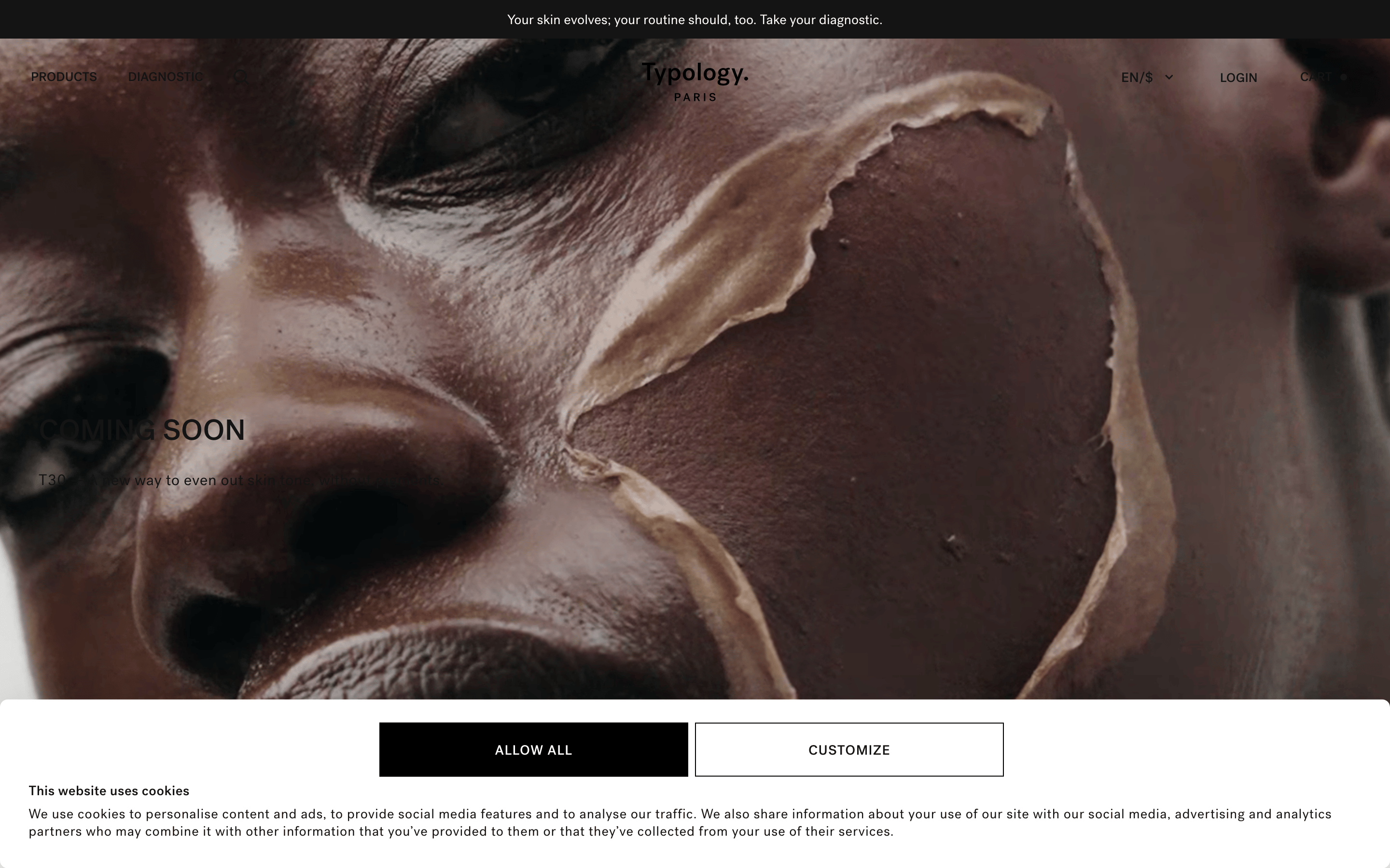
A modern apothecary meets high-end editorial magazine.
02
Color
#141414Ink
#4F4F4FInk soft
#FFFFFFBG
#F4F4F2BG soft
#FBF9F7BG quiet
#909090Muted
rgba(212, 212, 212, 1)Line
Monochromatic restraint with high-contrast typography to evoke clinical purity.
03
Typography
grotesque-sans · monospace
display64px · 500
h148px · 500
h232px · 500
body15px · 400
small13px · 400
micro10px · 400
Navigation and utility text are always uppercase. · Headlines use tight tracking and a heavy weight. · Body text maintains a clean, neutral sans-serif appearance.
04
Spacing
4px
8px
12px
16px
20px
24px
32px
48px
64px
96px
Consistent 4px base grid with generous whitespace for an airy, premium feel.
05
Surfaces
sm · 4px
md · 8px
lg · 12px
pill · 9999px
Thin 1px borders in black or dark gray, used sparingly for separation and buttons.
rgba(0, 0, 0, 0.3) 0px 30px 70px 0px
06
Layout
1280container
12columns
24pxgutter
768 / 1024breakpoints
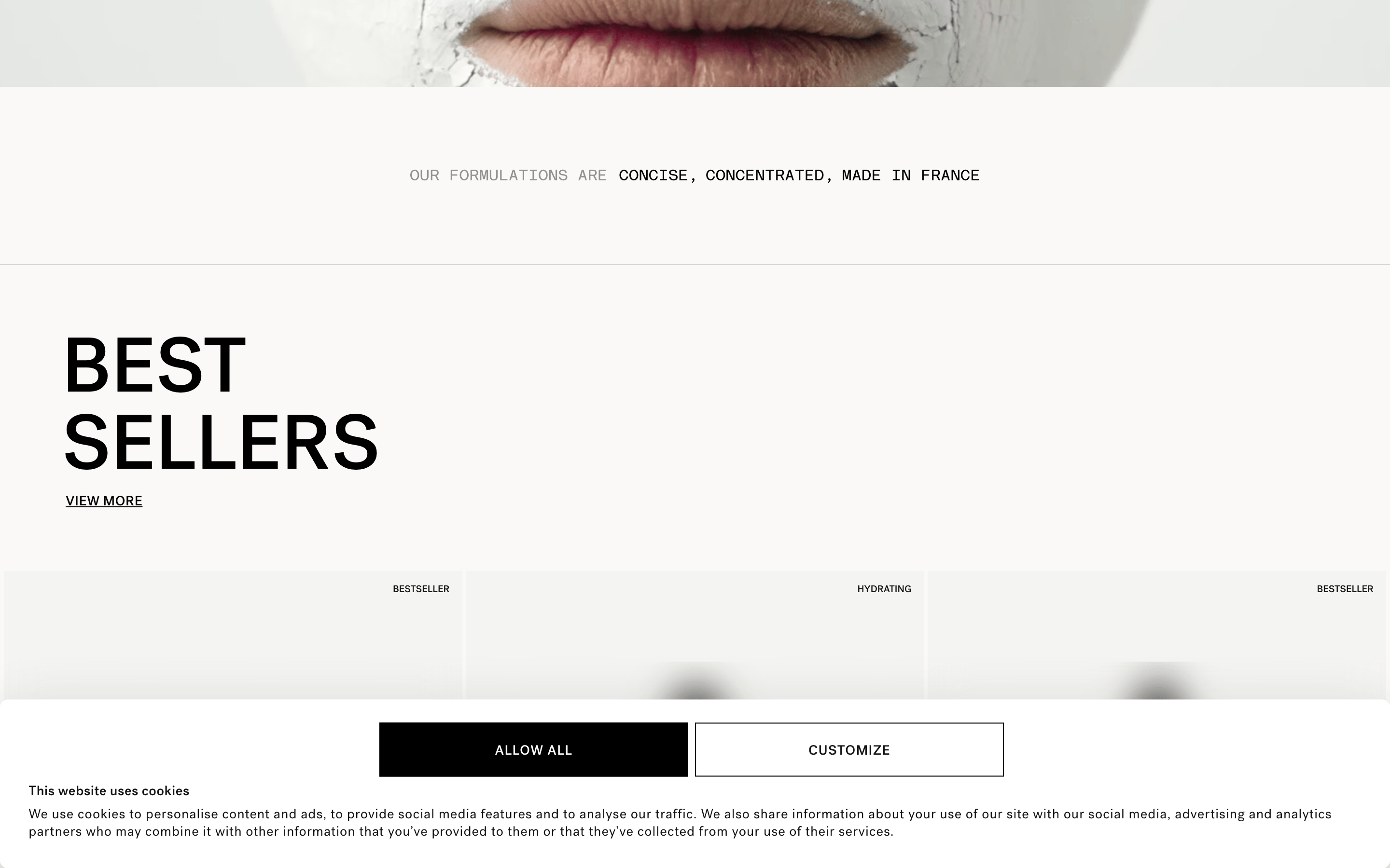
Full-width photographic heroes followed by clean, structured grids for product discovery.
07
Motion & Interaction
200msmicro
300mssmall
400msmedium
cubic-bezier(0.4, 0, 0.2, 1)easing
Smooth transitions for hover states on buttons and links. · Transform-based animations for subtle interactive feedback.
Subtle background color or opacity shifts, often with a transition. · Immediate visual feedback, typically via color change.
08
Components
buttonHigh-contrast rectangles with uppercase text; primary is black background with white text, secondary is white background with black border.
cardClean, borderless cards with high-quality product imagery and precise typography.
chipN/A - not present in the visible screenshot.
inputN/A - not present in the visible screenshot.
heroFull-bleed, high-impact photography with overlaid left-aligned text.
09
Voice & Don'ts
ToneClinical, direct, and sophisticated.
HeadlinesShort, bold, and declarative, often in all caps.
CTAsAction-oriented and clear, always in uppercase.
don't use rounded, bubbly shapes — screenshot shows sharp, geometric rectangles and squares.
don't use vibrant, saturated accent colors — screenshot shows a strictly monochromatic palette.
don't use decorative or script fonts — screenshot shows a clean, functional grotesque sans-serif.
don't clutter the interface with many borders or boxes — screenshot shows a clean, borderless layout with ample whitespace.
don't use heavy drop shadows everywhere — screenshot shows a single, subtle deep shadow used sparingly.
don't use lowercase for primary navigation and CTAs — screenshot shows consistent uppercase styling for these elements.
Captured from the live site · real computed styles
11
System prompt
This is a premium, minimalist skincare e-commerce site for Typology Paris. The design DNA is clinical, clean, and sophisticated, relying on a strict monochromatic palette (black, white, and off-white/gray) and a functional grotesque sans-serif typeface (Post Grotesk). The layout is spacious and editorial, using large-scale photography and bold, uppercase typography for headlines and navigation. Key hex colors are #FFFFFF for backgrounds, #F4F4F2 for soft surfaces, and #141414 for primary ink. Critical donts: never use vibrant accent colors, avoid rounded or bubbly shapes, and never use decorative or script fonts. The interface should feel precise, scientific, and high-end.
Bring this taste to your agent
Hand your AI agent a machine-readable spec of this design — tokens, type, motion, the whole DNA.