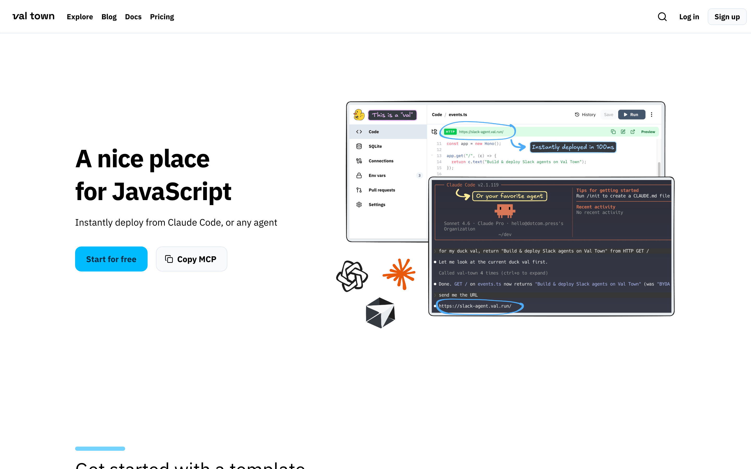
A welcoming local cafe for developers to quickly deploy scripts
02
Color
#2EC4FFAccent
#000000Ink
#4B5563Ink soft
#FFFFFFBG
#F7F9FCBG soft
#1C2433BG quiet
#6B7280Muted
rgba(0,0,0,0.1)Line
High-contrast dark-on-light foundation with a single vibrant cyan accent for primary actions.
03
Typography
geometric-sans · humanist-sans · slab-mono
display48px · 700
headline36px · 700
body16px · 400
caption14px · 400
code16px · 400
04
Spacing
4px
8px
12px
16px
24px
32px
48px
64px
96px
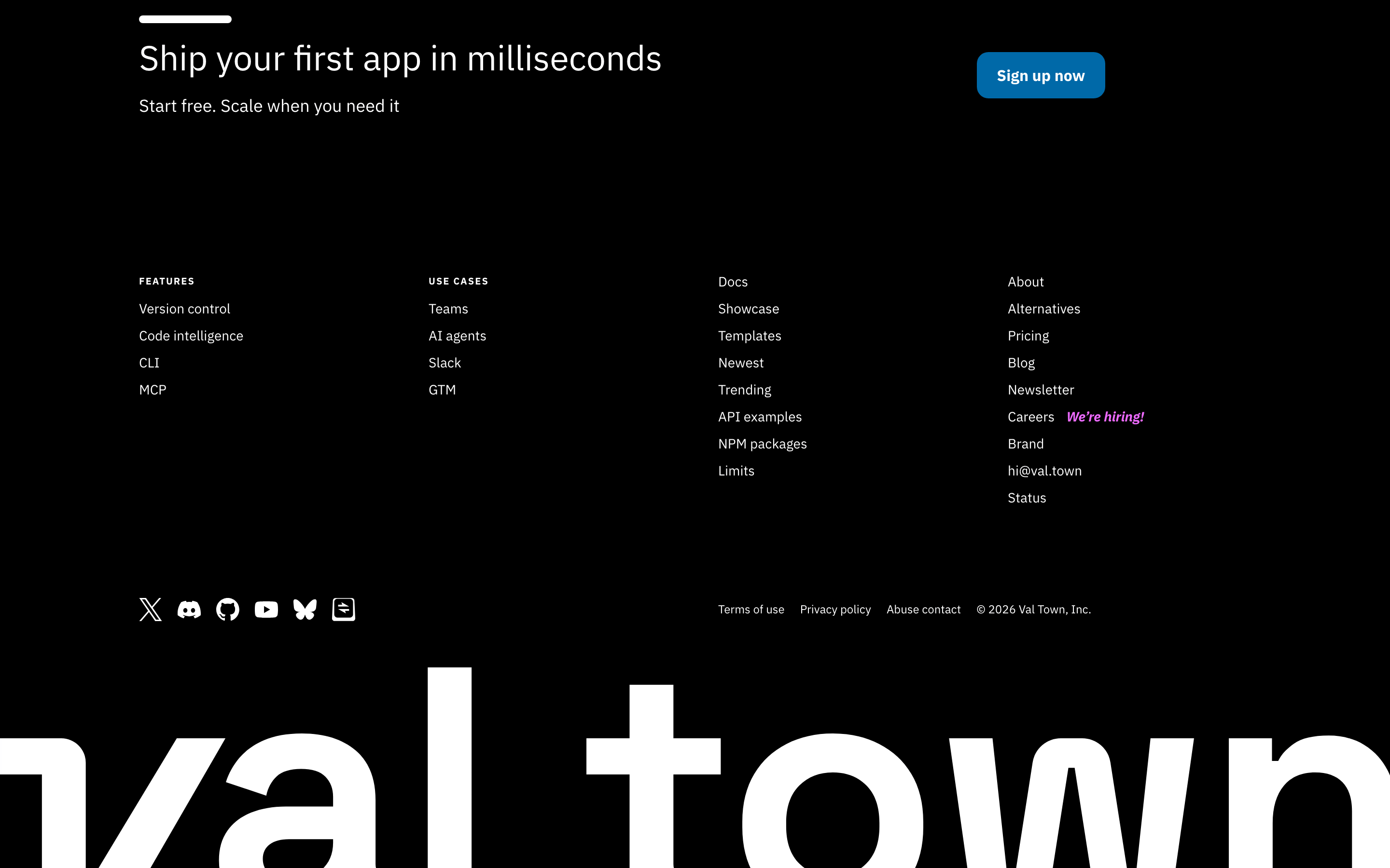
A base-4 system with generous vertical padding between sections, typically 96px, ensuring clear visual separation.
05
Surfaces
sm · 4px
md · 8px
lg · 16px
pill · 999px
1px solid rgba(0,0,0,0.1)
0 20px 25px -5px rgba(0,0,0,0.1) · 0 10px 15px -3px rgba(0,0,0,0.1) · 0 8px 10px -6px rgba(0,0,0,0.1)
06
Layout
1280container
12columns
24pxgutter
768 / 1024breakpoints
A centered hero section with text on the left and a complex overlapping composite image on the right, followed by stacked content sections.
07
Motion & Interaction
150msmicro
200mssmall
400msmedium
cubic-bezier(0.4, 0, 0.2, 1)easing
Standard color and background-color transitions for interactive elements · Smooth hover and focus state changes for buttons and links
Subtle background color shift or opacity change on buttons and links. · Immediate visual feedback with background color transition.
08
Components
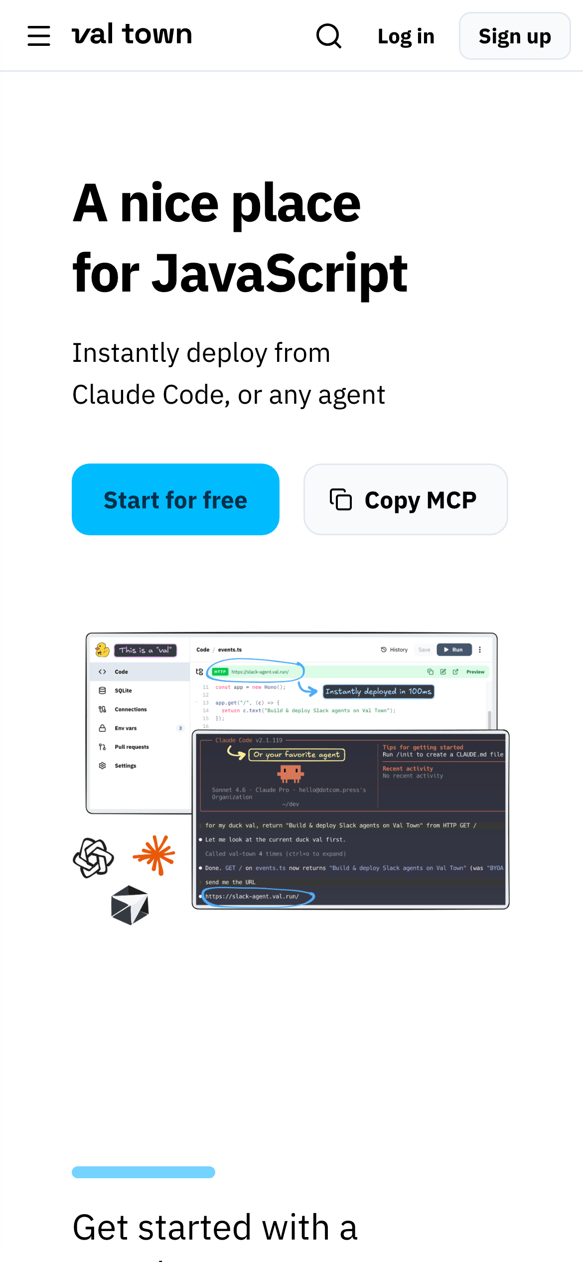
buttonPrimary buttons are pill-shaped with a vibrant cyan background and dark text; secondary buttons are pill-shaped with a subtle border and dark text.
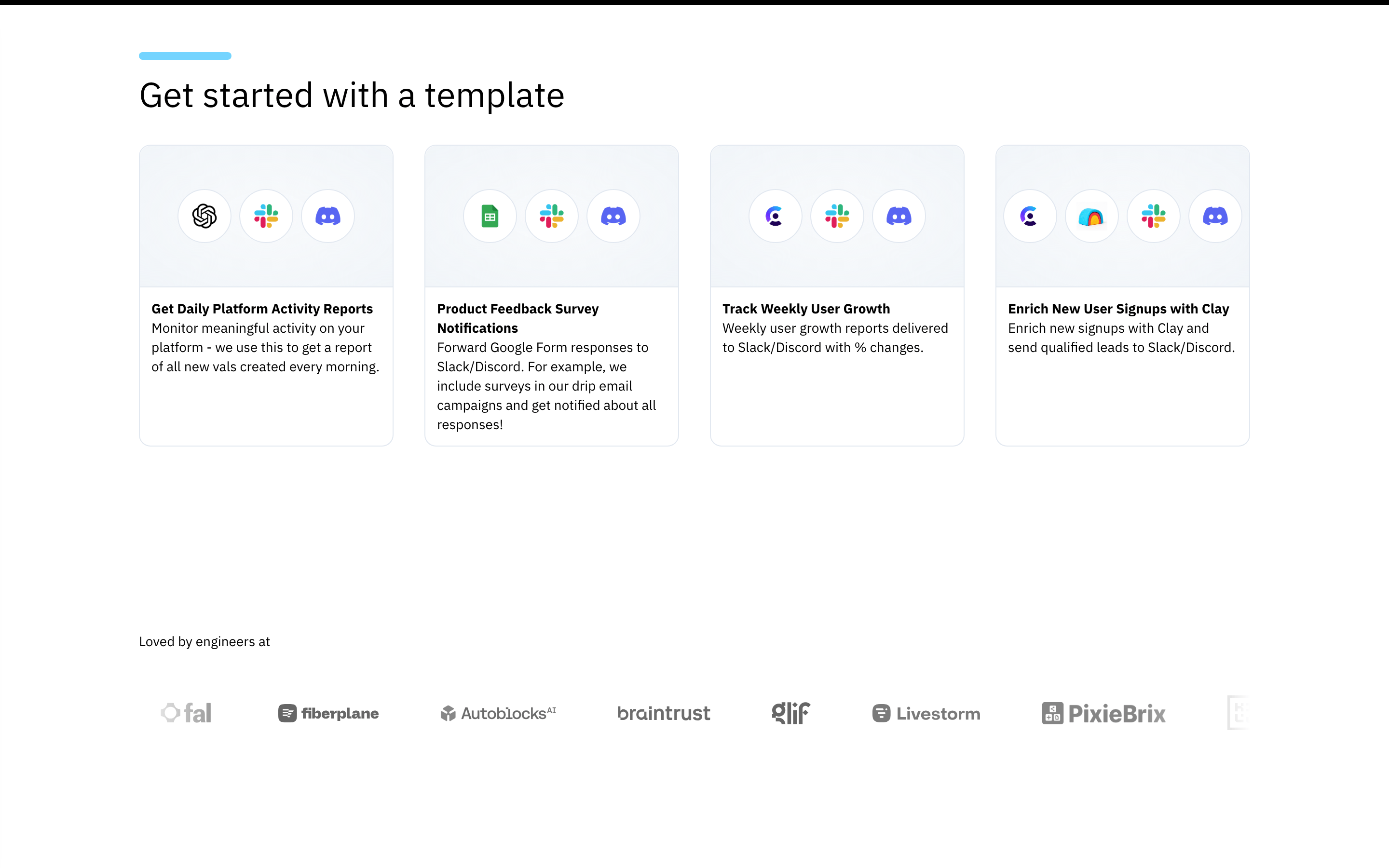
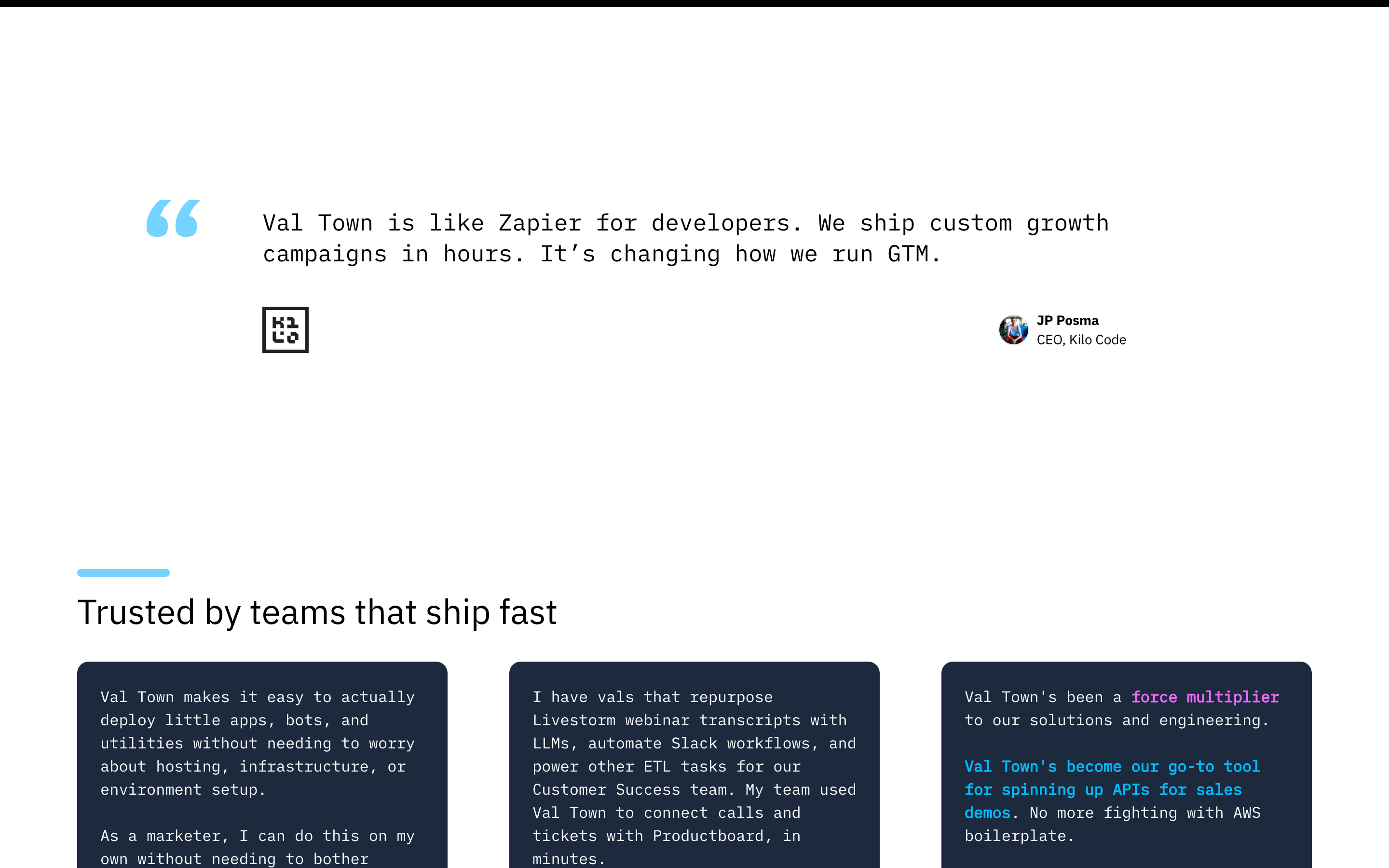
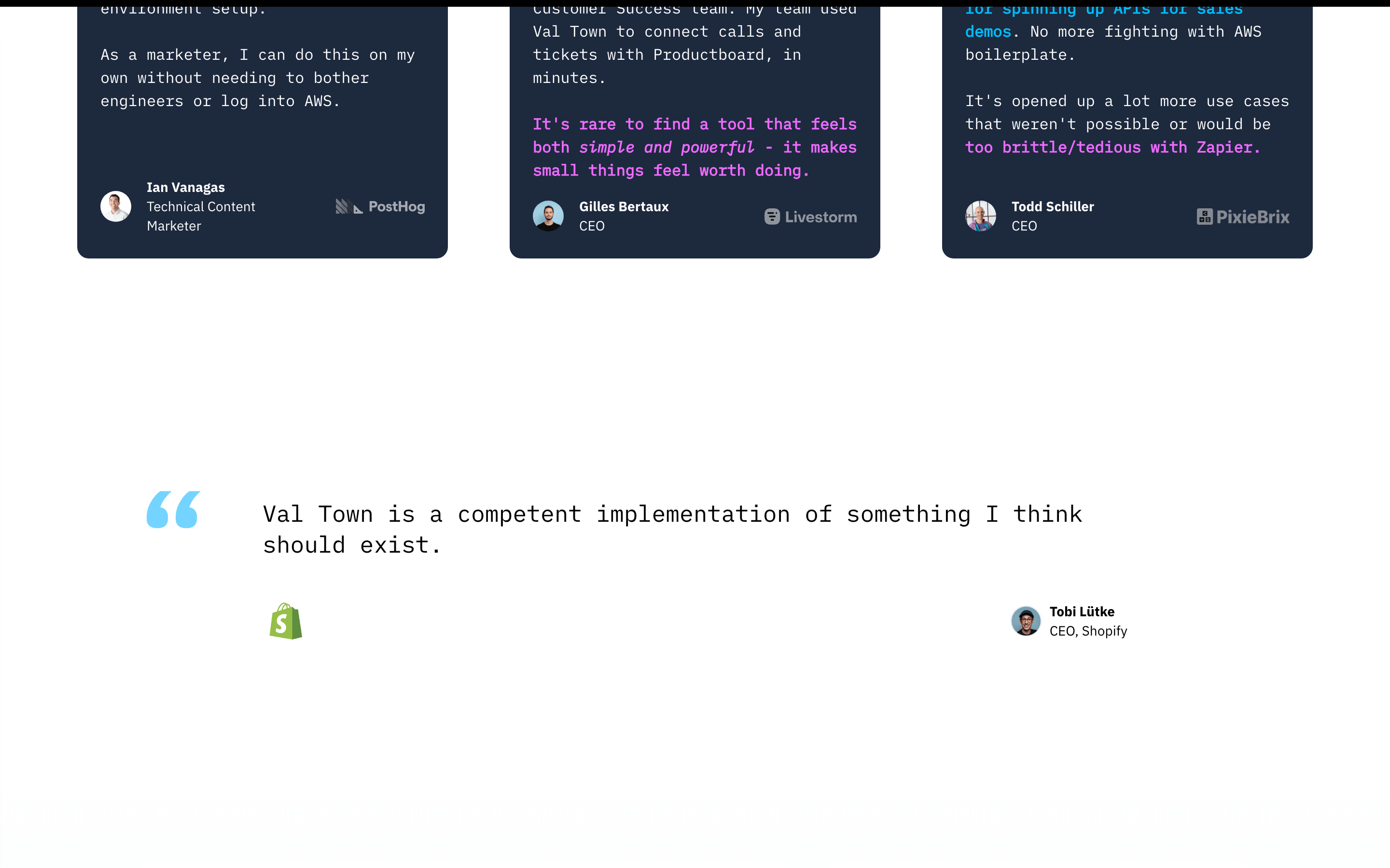
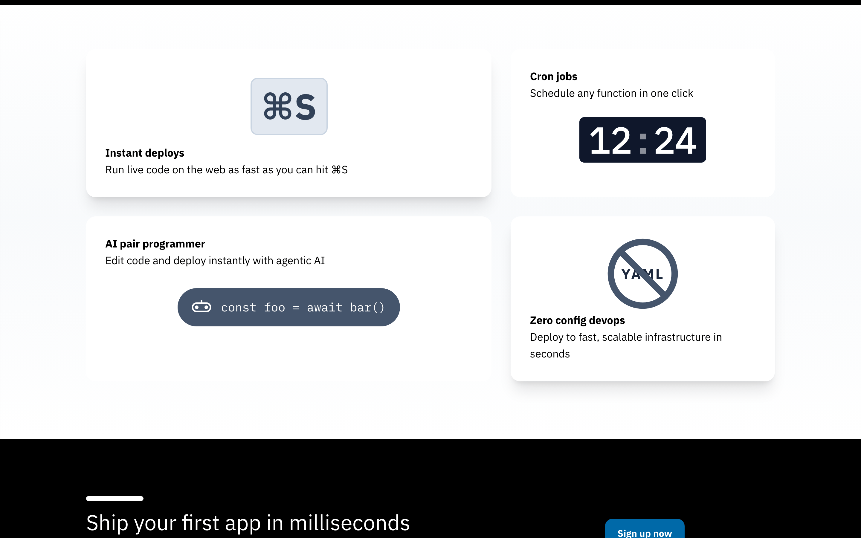
cardDark-themed cards with subtle shadows and rounded corners, used for testimonials and feature highlights.
chipMinimal use, primarily seen as badges or small labels within the UI mockup.
inputClean, bordered input fields with standard padding and rounded corners.
heroA split layout featuring a bold typographic headline, subtitle, two primary action buttons, and a large overlapping composite image of the product interface.
09
Voice & Don'ts
ToneFriendly, approachable, and slightly playful, yet technically competent.
HeadlinesDirect, benefit-oriented, and written in a casual, welcoming tone.
CTAsAction-oriented, using simple verbs like 'Start' or 'Copy' to encourage immediate engagement.
Don't use serif typography for headlines — the screenshot shows bold, geometric sans-serif typefaces throughout.
Don't use a dark theme as the default — the primary background is a clean, bright white.
Don't use harsh, saturated accent colors — the primary accent is a bright but approachable cyan (#2EC4FF).
Don't use sharp, square corners — the UI features rounded corners, often with a pill shape (999px) for buttons.
Don't use heavy drop shadows everywhere — shadows are subtle, used primarily on floating cards and composite images.
Don't make the layout dense — the design uses generous whitespace and padding, especially between major sections.
Avoid: Overly complex or jargon-heavy technical language
Avoid: Aggressive or urgent sales-driven copy
Avoid: Formal, stiff, or corporate-sounding phrasing
Captured from the live site · real computed styles
11
System prompt
Val Town is a friendly developer tool for instantly deploying JavaScript, characterized by a clean, approachable aesthetic. Key colors include a crisp white background (#FFFFFF), deep black text (#000000), and a vibrant cyan accent (#2EC4FF) for primary calls to action. The typography uses a geometric sans-serif for bold headings, a humanist sans-serif for body text, and a slab-mono for code. Critical design rules include: Don't use dark mode as the primary layout; the screenshot shows a bright, white-dominant interface. Don't use sharp, square corners; the UI uses rounded corners and pill-shaped buttons extensively. Don't use dense layouts; generous whitespace and clear visual hierarchy are essential. The tone is casual and welcoming, avoiding overly technical jargon.
Bring this taste to your agent
Hand your AI agent a machine-readable spec of this design — tokens, type, motion, the whole DNA.