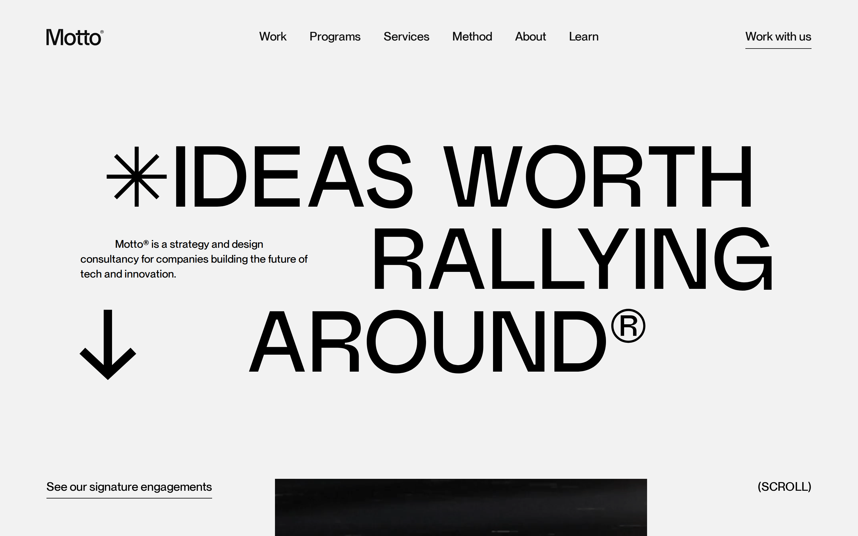
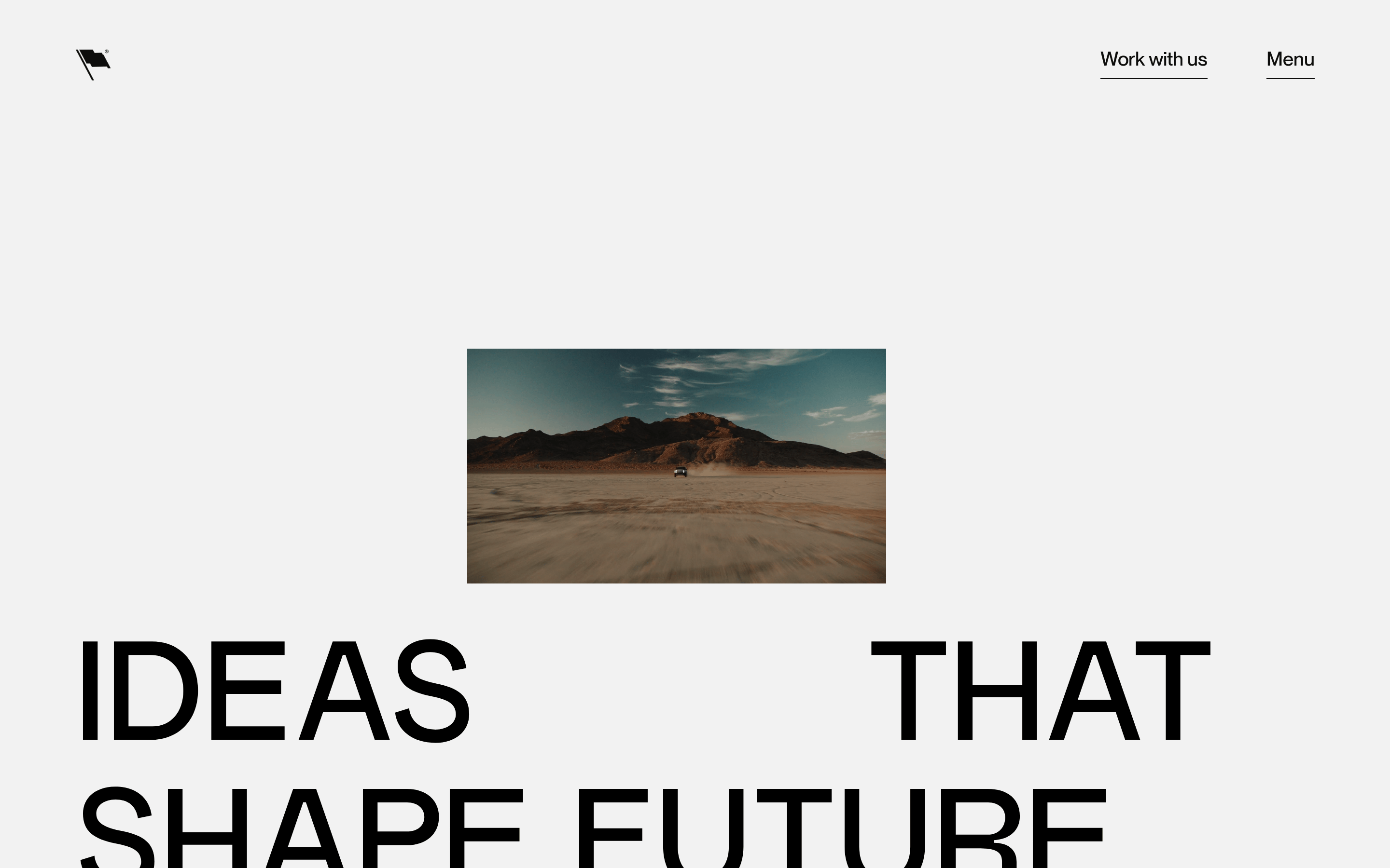
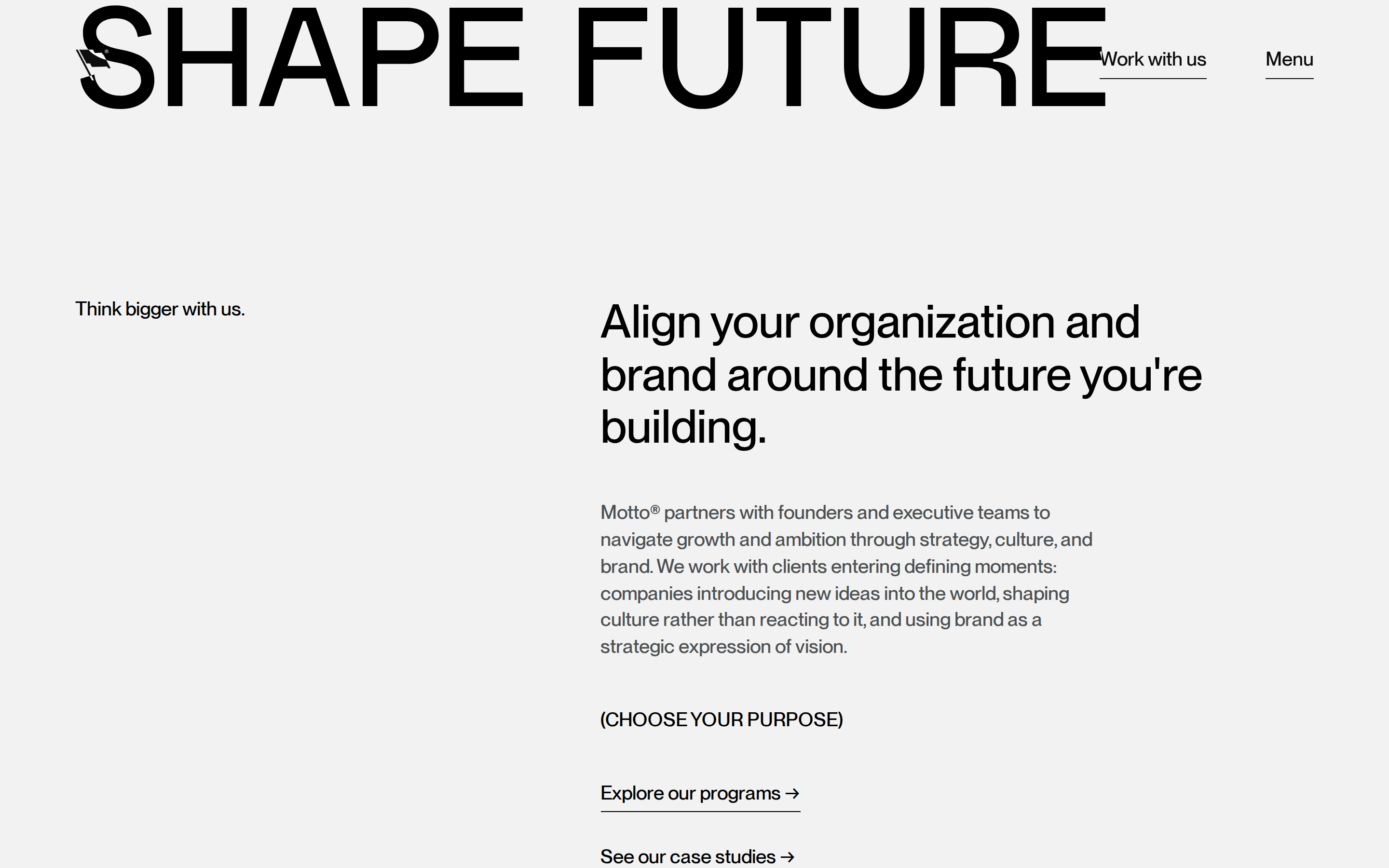
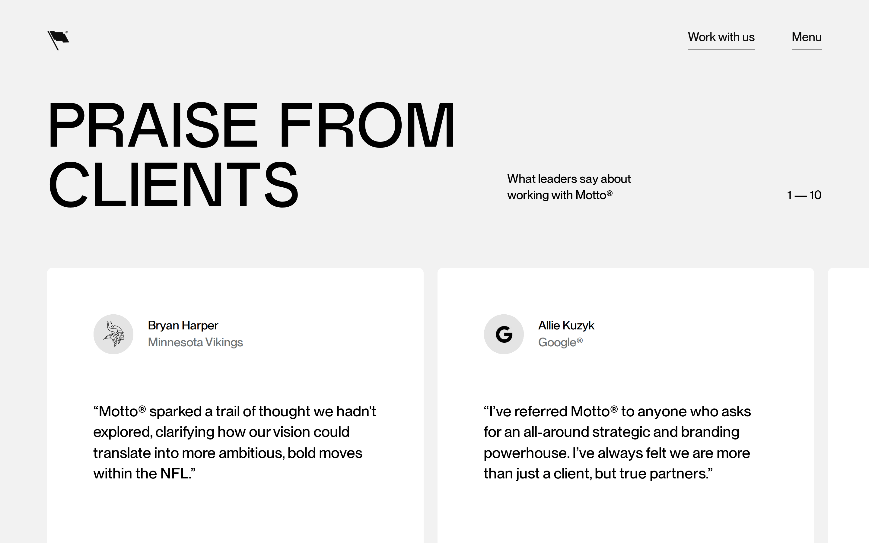
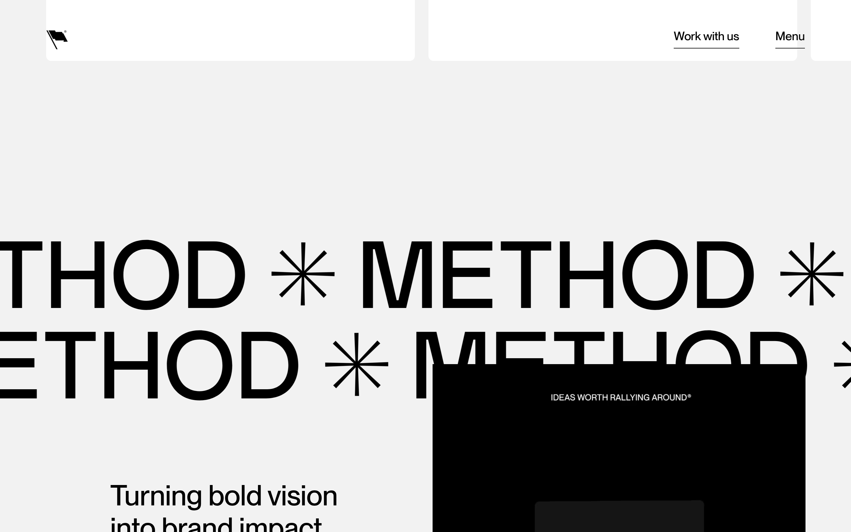
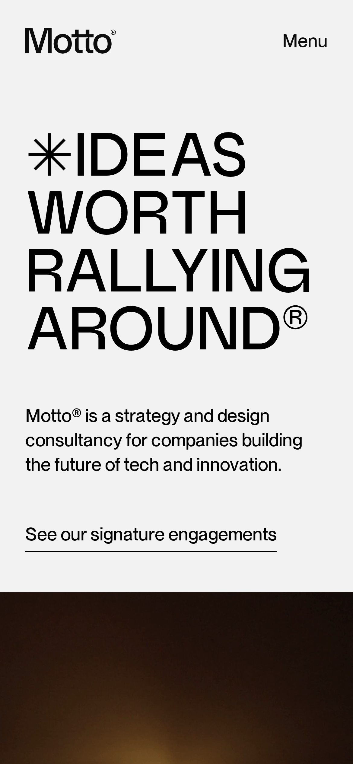
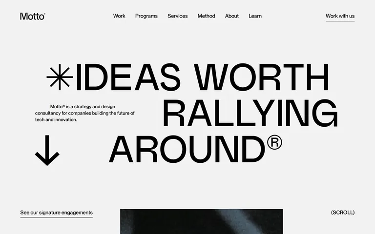
Massive, all-caps display type dominates the layout · Tight line heights (1.0) for large display text · Medium weight (500) used consistently across all text
04
Spacing
4px
8px
16px
19px
24px
32px
38px
48px
67px
77px
99px
158px
Generous vertical spacing with 158px top padding for major sections
05
Surfaces
sm · 0px
md · 9px
lg · 9999px
pill · 9999px
1px solid black for active CTA underlines
06
Layout
1440container
12columns
23pxgutter
768 / 1024breakpoints
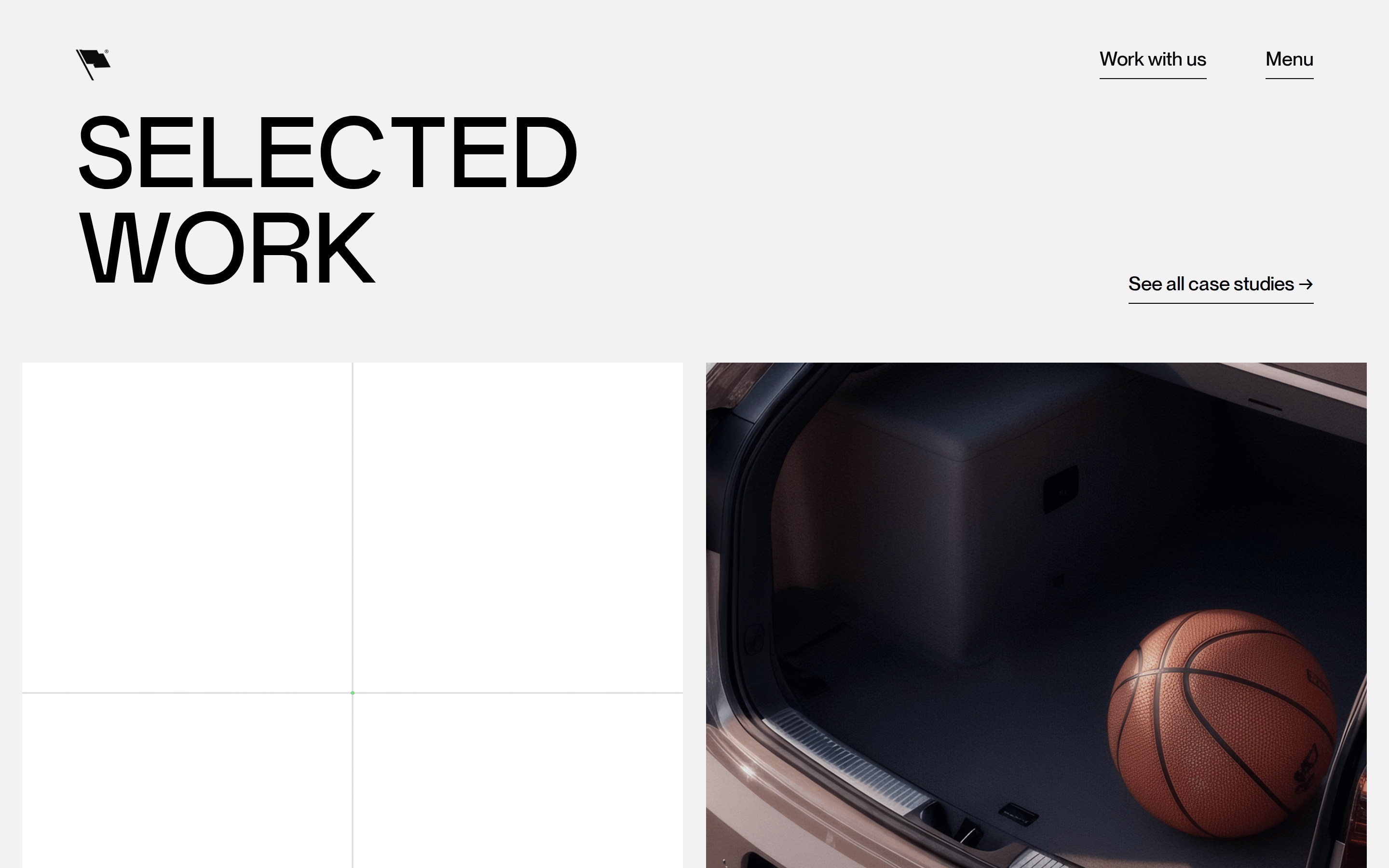
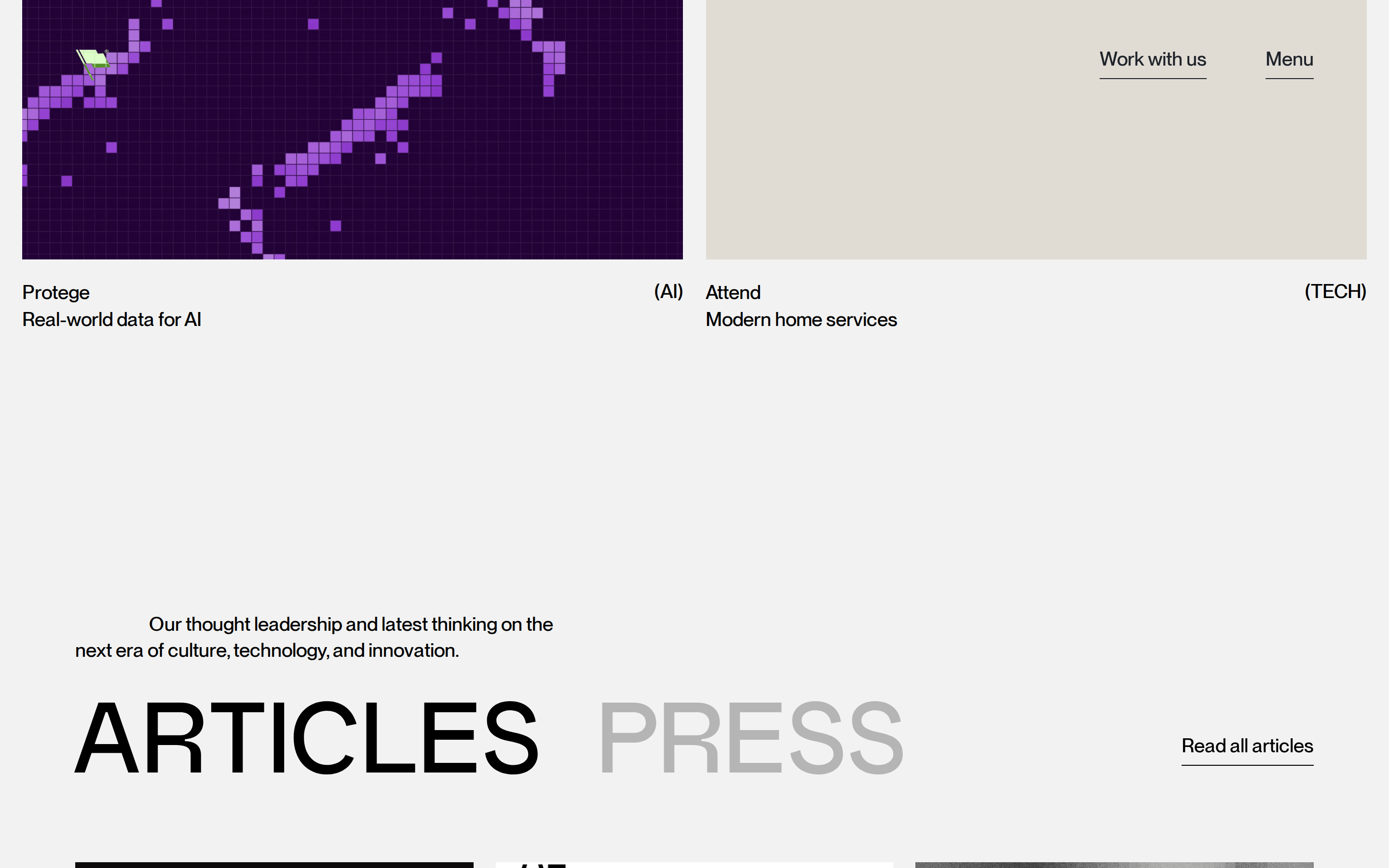
Full-bleed hero with a wide multi-column grid for portfolio items
07
Motion & Interaction
350msmicro
400mssmall
750msmedium
cubic-bezier(0.19, 1, 0.22, 1)easing
Smooth, high-out eases for content reveals · Subtle opacity transitions on hover · Complex transform animations for portfolio elements
Subtle color or opacity shifts on links and buttons · Immediate response with smooth easing into new state
08
Components
buttonText link with a solid black 1px underline
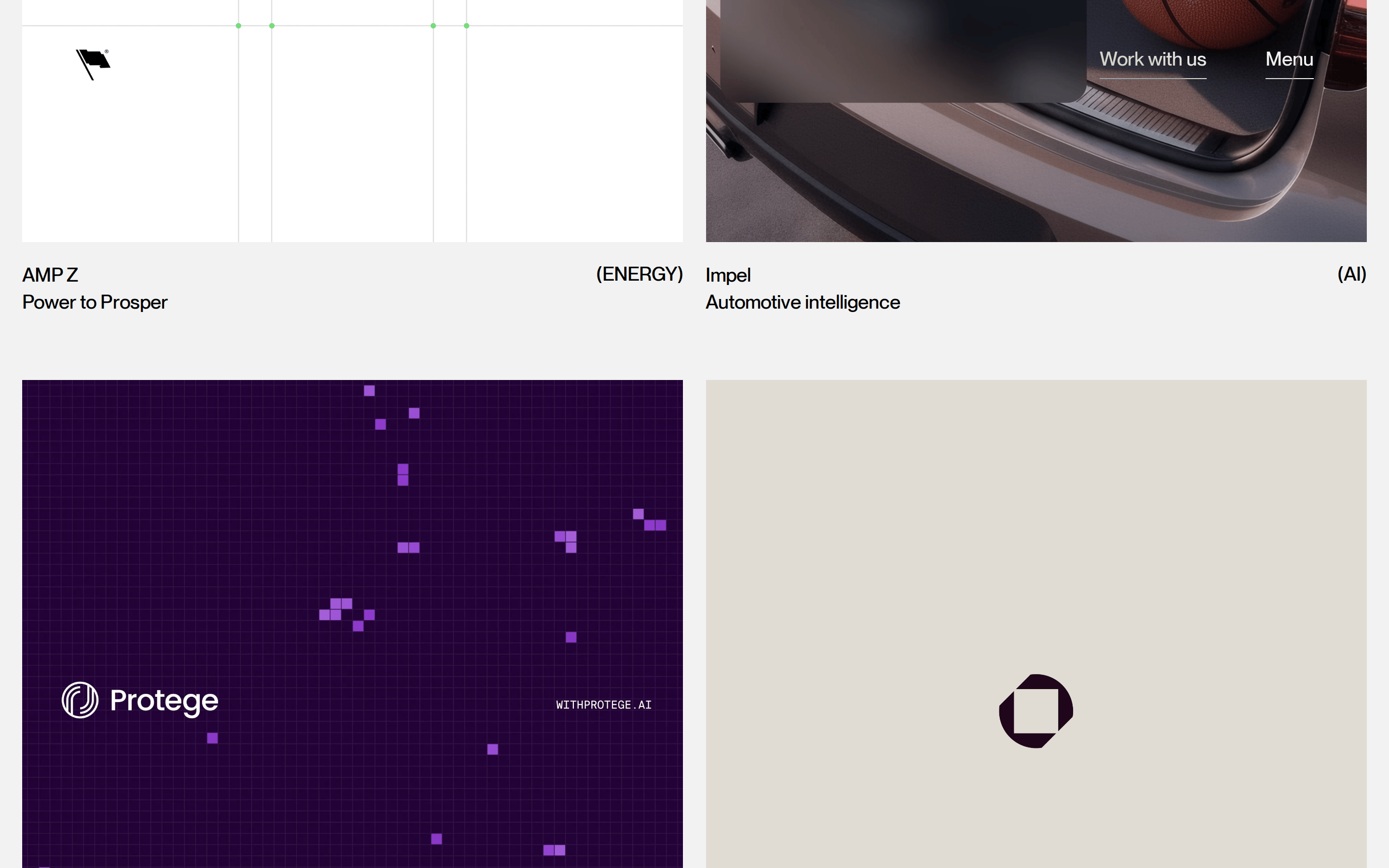
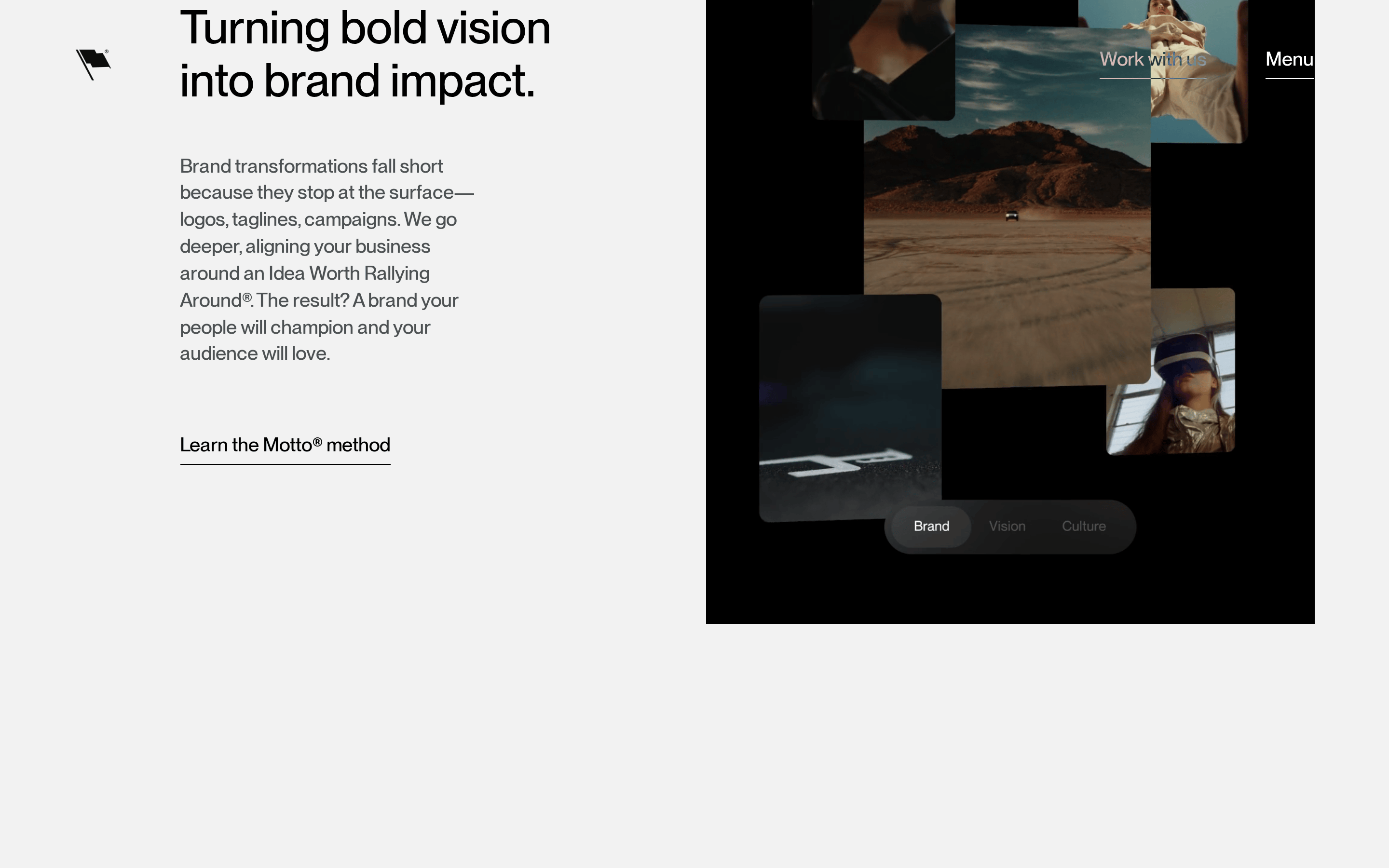
cardImage-heavy portfolio grid items with minimal text labels
heroMassive split-level headline with a left-aligned descriptor and downward arrow indicator
09
Voice & Don'ts
ToneConfident, authoritative, and visionary
HeadlinesDeclarative statements in massive, all-caps geometric sans-serif
CTAsSimple, direct text links with minimal visual weight
Don't use multiple accent colors — screenshot shows a strictly monochrome palette with a warm off-white background.
Don't use small, centered headlines — screenshot shows massive, left-aligned display type that spans the viewport.
Don't use heavy drop shadows or 3D effects — screenshot shows completely flat, 2D surfaces.
Don't use rounded buttons or cards — screenshot shows sharp edges or very specific circular pills.
Don't use serif fonts — screenshot shows a strictly sans-serif typographic system.
Don't use dense, multi-column text layouts — screenshot shows extreme whitespace and a single-column reading flow for primary content.
Captured from the live site · real computed styles
11
System prompt
This is a high-end agency and consultancy site characterized by massive, bold display typography and expansive whitespace. The primary colors are a warm off-white background (#F4F3F0) and deep black text (#1B1B1C), creating a sophisticated, high-contrast aesthetic. The typography uses geometric and humanist sans-serif categories, with display headlines set at extreme sizes (150px+) using a tight 1.0 line height and medium weight. Interactions are smooth and refined, relying on subtle opacity and color shifts. Critically, do not use rounded corners, drop shadows, or bright accent colors; the design relies purely on typographic scale and spatial rhythm. Avoid cluttered layouts and ensure all headlines remain left-aligned and uppercase for maximum impact.
Bring this taste to your agent
Hand your AI agent a machine-readable spec of this design — tokens, type, motion, the whole DNA.