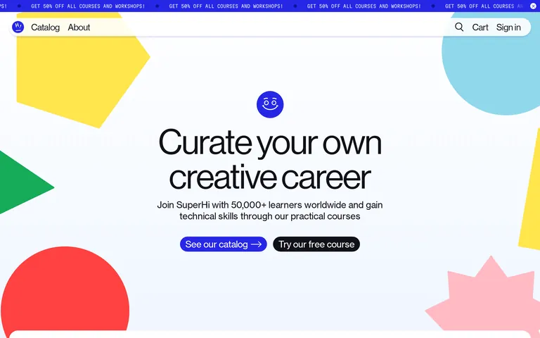
A colorful, approachable learning studio that feels like a creative playground.
02
Color
#2727E6Accent
#111118Ink
#F0F6FFBG
rgba(17, 17, 24, 0.1)Line
A primary palette of vibrant yellow and blue anchors the design, with the soft blue background providing a clean canvas for bold geometric shapes.
03
Typography
grotesque-sans · monospace
display72px · 400
h148px · 400
body16px · 400
Use a clean, neutral grotesque for all text levels · Maintain tight negative tracking on large display text · Use monospace for technical or secondary accents
04
Spacing
4px
8px
16px
24px
32px
48px
64px
96px
A consistent 4px grid system with generous padding and gaps for an open feel.
05
Surfaces
sm · 8px
md · 16px
lg · 24px
pill · 999px
Minimal, often using solid dark or blue lines for interactive elements.
rgba(18, 18, 151, 0.133) 0px 3.2px 4px 0px
06
Layout
1280container
12columns
24pxgutter
768 / 1024breakpoints
Centered, vertical stack with large, airy sections and overlapping geometric background elements.
07
Motion & Interaction
200msmicro
400mssmall
800msmedium
cubic-bezier(0.37, 0, 0.63, 1)easing
Smooth transitions for interactive states · Spring-like easing for transform-based animations
Subtle color or opacity shifts on links and buttons. · Immediate visual feedback, likely a slight scale or color change.
08
Components
buttonRounded pill-shaped buttons with solid fills (blue or black) and white text.
cardWhite cards with rounded corners (16-24px) and subtle blue shadows, used for testimonials.
heroA large, vertically stacked section with centered text, a mascot icon, and bold geometric background shapes.
09
Voice & Don'ts
ToneFriendly, encouraging, and direct.
HeadlinesBold, action-oriented statements that empower the user.
CTAsClear, direct calls to action like 'See our catalog' or 'Try our free course'.
Don't use a dark background — the site clearly uses a light, soft blue (#F0F6FF) as its primary canvas.
Don't use serif fonts — the entire site is built on clean, neutral grotesque sans-serif categories.
Don't make buttons rectangular — the design consistently uses pill-shaped, rounded buttons.
Don't use muted or pastel-only palettes — the site features vibrant, high-chroma accents like bright yellow and deep blue.
Don't create dense, small-scale layouts — the design prioritizes large whitespace and generous padding.
Don't use multiple accent colors in one component — each section typically highlights one primary accent color.
Captured from the live site · real computed styles
11
System prompt
Superhi is an online learning platform for creative tech skills. Its design DNA is characterized by a playful, friendly, and bold visual language. The core palette uses a soft blue background (#F0F6FF) with vibrant accents in deep blue (#2727E6) and bright yellow (#FFE600). Typography is a clean, neutral grotesque sans-serif with tight tracking on large display text. Key critical donts: never use dark mode backgrounds, avoid serif fonts entirely, and do not make buttons rectangular. The layout is airy, centered, and uses bold geometric shapes as playful background elements.
Bring this taste to your agent
Hand your AI agent a machine-readable spec of this design — tokens, type, motion, the whole DNA.