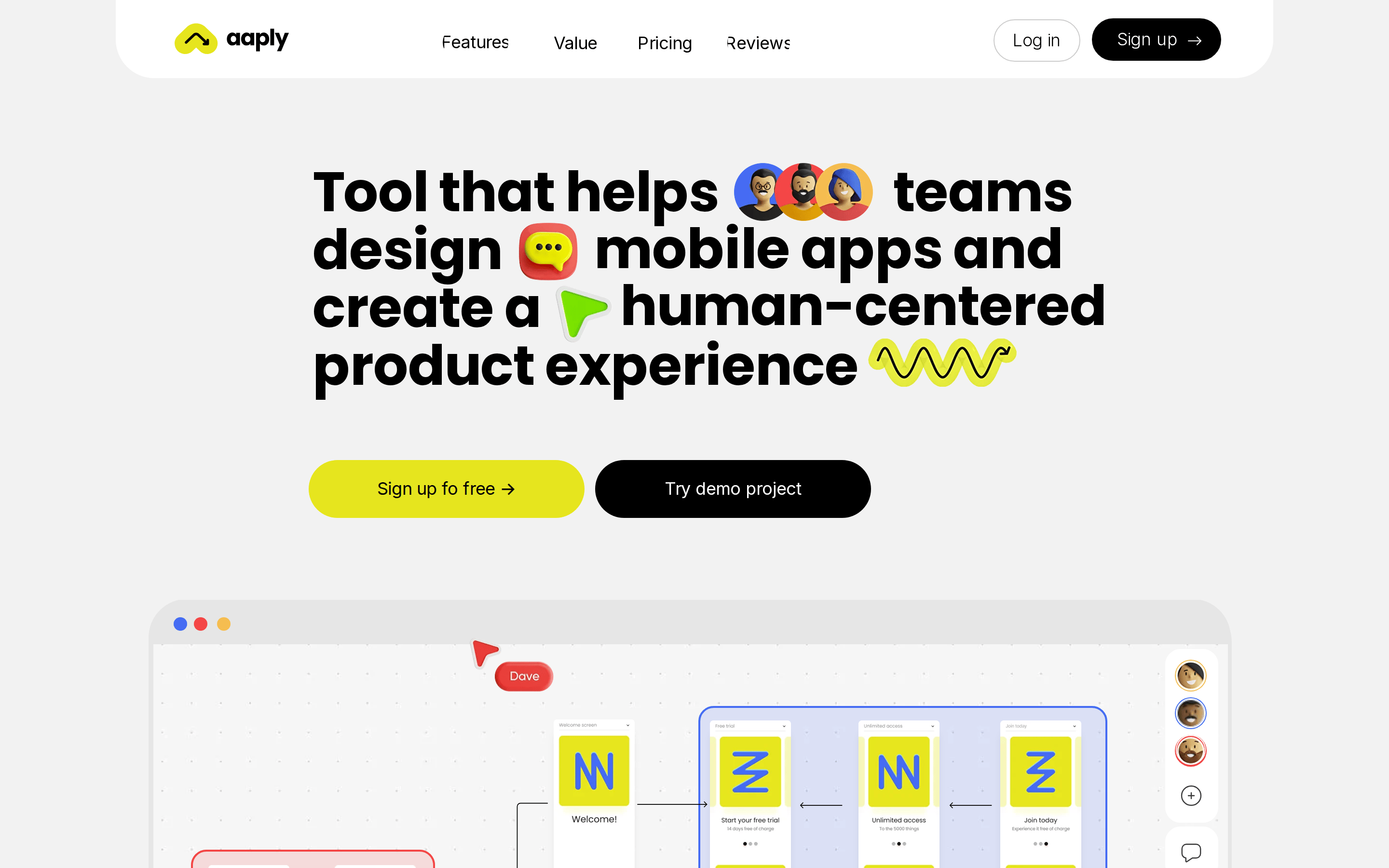
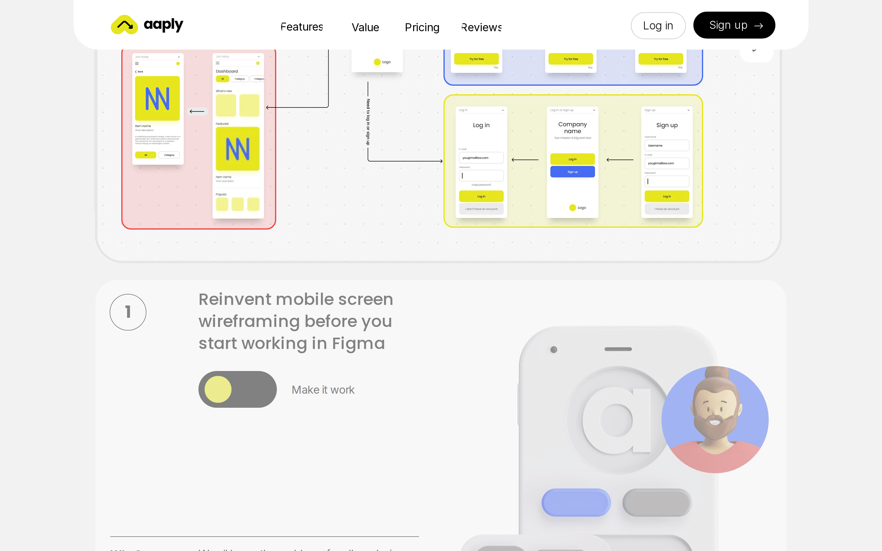
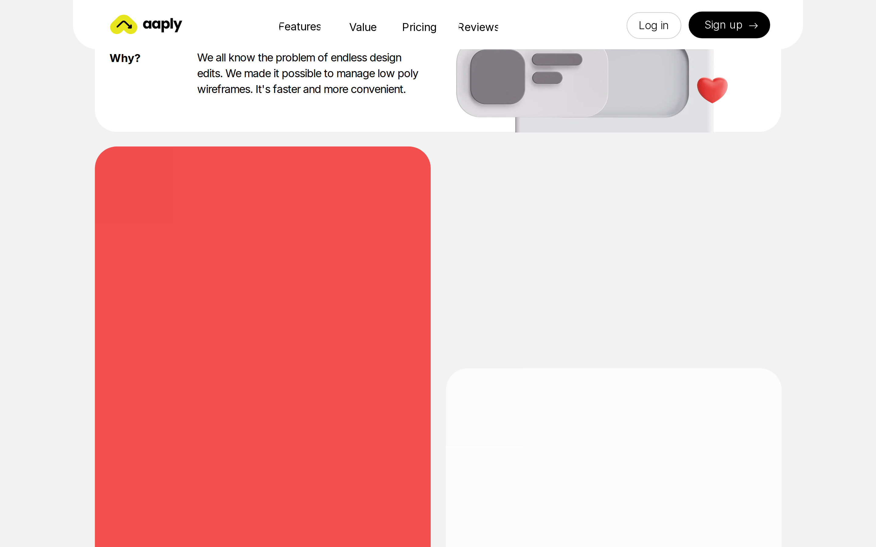
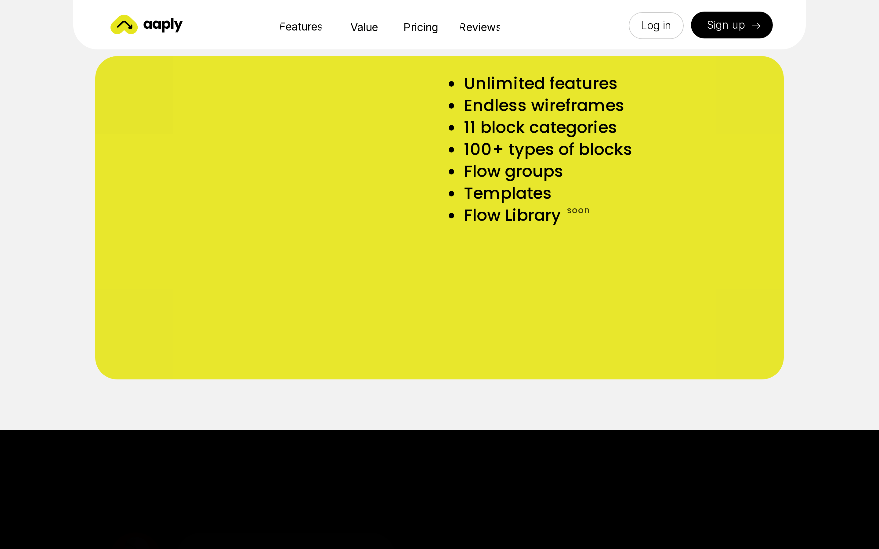
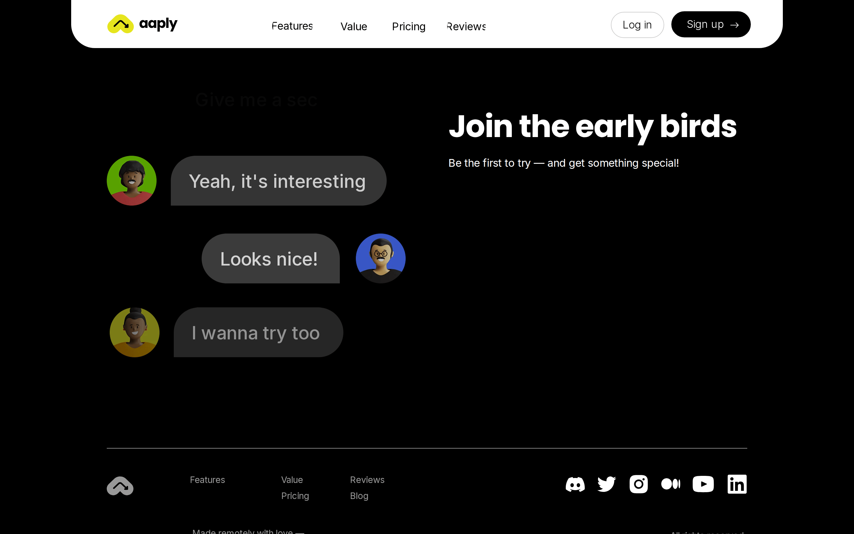
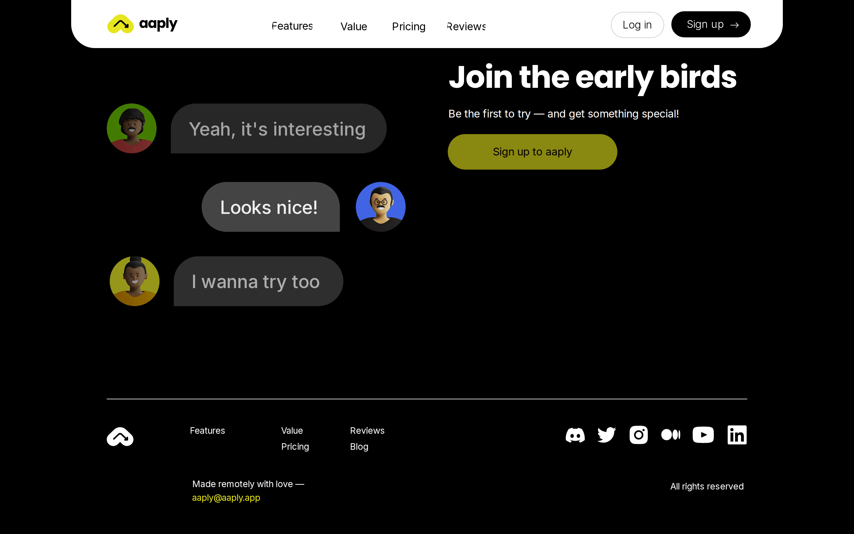
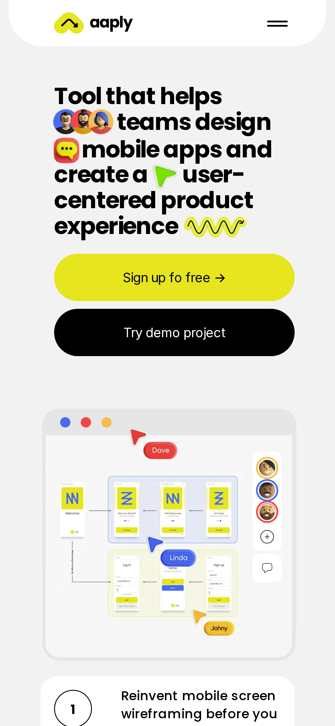
This is a playful, high-contrast SaaS landing page for a mobile app design tool. The core identity is built on a light gray (#f2f2f2) background with stark black (#000000) text and a vibrant, high-chroma yellow (#e6e51e) accent for primary actions. Typography features bold, geometric sans-serif display fonts (Poppins) paired with clean humanist sans-serif body text (Inter). The layout uses generous whitespace, centered containers, and heavily rounded, pill-shaped UI elements. Critical donts: avoid dark modes, avoid thin typography, avoid sharp corners, avoid muted accents, avoid cramped layouts, and avoid sterile, emoji-free headlines. The design is expressive, human-centered, and focused on collaborative mobile wireframing.
이 감각을 당신의 에이전트에
이 디자인의 기계 판독 가능한 사양——색상·타이포·모션까지——을 그대로 AI 에이전트에 전달하세요.