← OpenDesign CURATED · OPEN · FREE
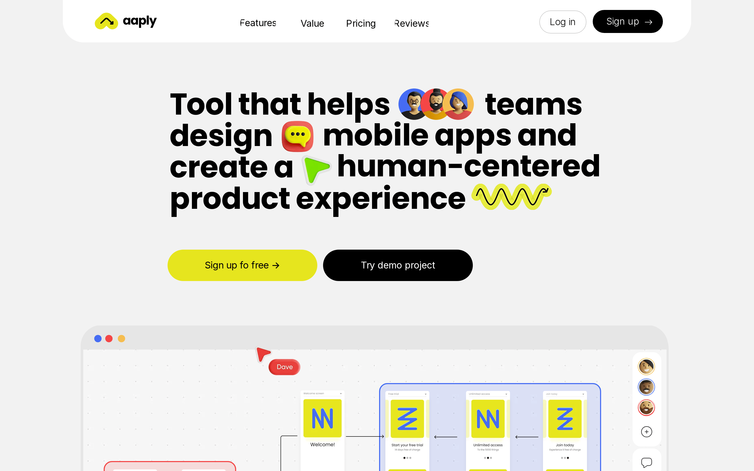
Aaply
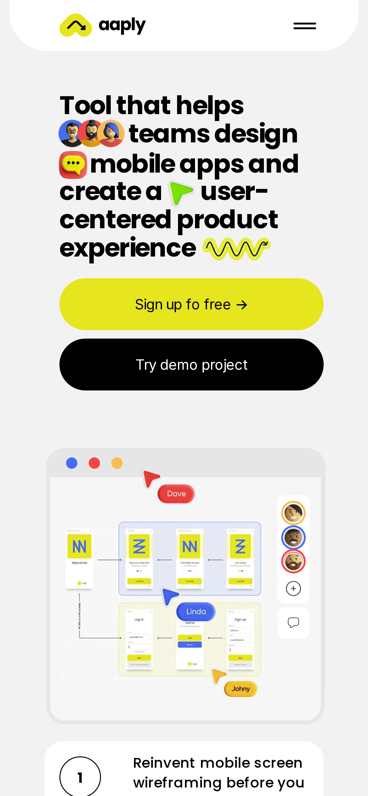
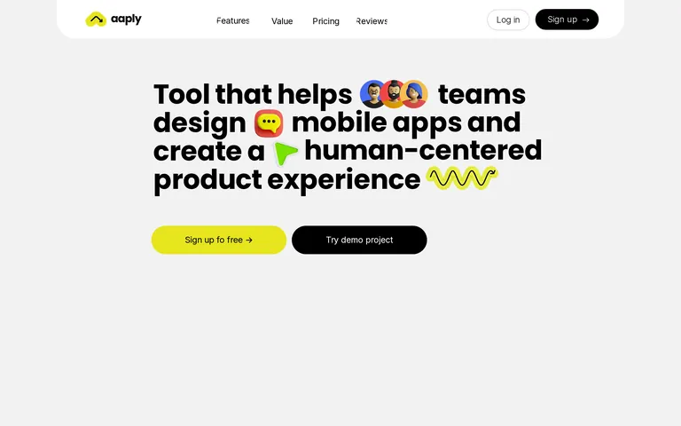
A collaborative tool for teams to design mobile apps and create user-centered product experiences.
SaaS Productivity App UI Bold Typography Playful
01
Identity DNA
collaborative mobile-first design tool human-centered
Figma for mobile wireframing
02
Color
#e6e51eAccent
#000000Ink
#f2f2f2BG
#ffffffBG soft
#c4c4c4Muted
rgba(0,0,0,1)Line
High-contrast black and white foundation with a punchy, high-chroma yellow accent for primary actions.
03
Typography
geometric-sans · humanist-sans · monospace
display 56px · 700headline 31px · 500body 16px · 40004
Spacing
4px
8px
16px
24px
32px
48px
64px
96px
Generous whitespace between sections to maintain a clean, airy feel.
05
Surfaces
sm · 16px
md · 30px
lg · 50px
pill · 3000px
1px solid black
rgba(0, 0, 0, 0.2) 0px 10px 10px -5px
06
Layout
1280 container
12 columns
24px gutter
768 / 1024 breakpoints
Centered container with large typography and generous vertical spacing.
07
Motion & Interaction
220ms micro
400ms small
1000ms medium
cubic-bezier(0.19, 1, 0.22, 1) easing
Fade and slide up on page load · Color and shadow transitions on hover
Background color transitions and subtle elevation changes via box-shadow. · Immediate feedback with subtle scale or color change.
08
Components
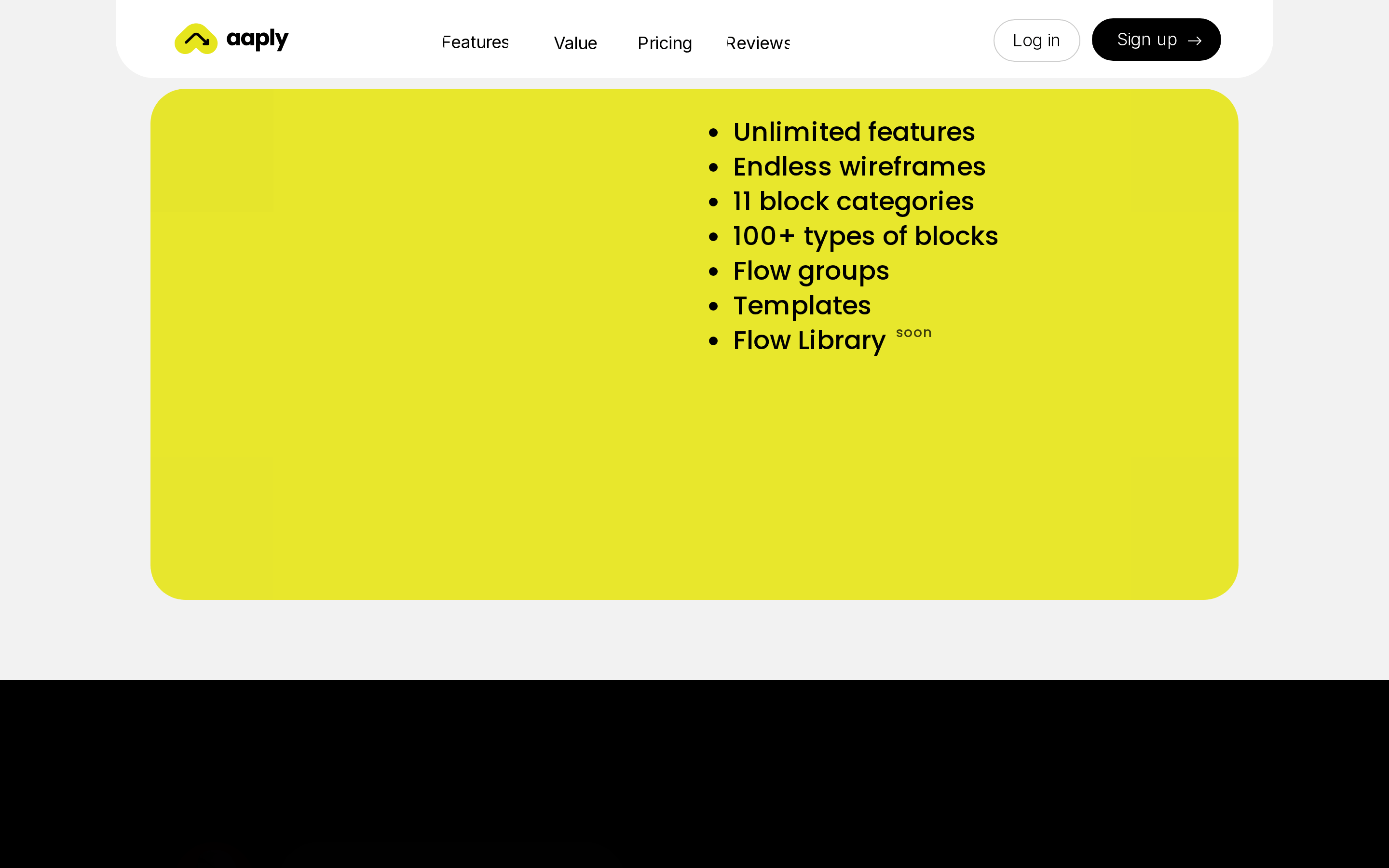
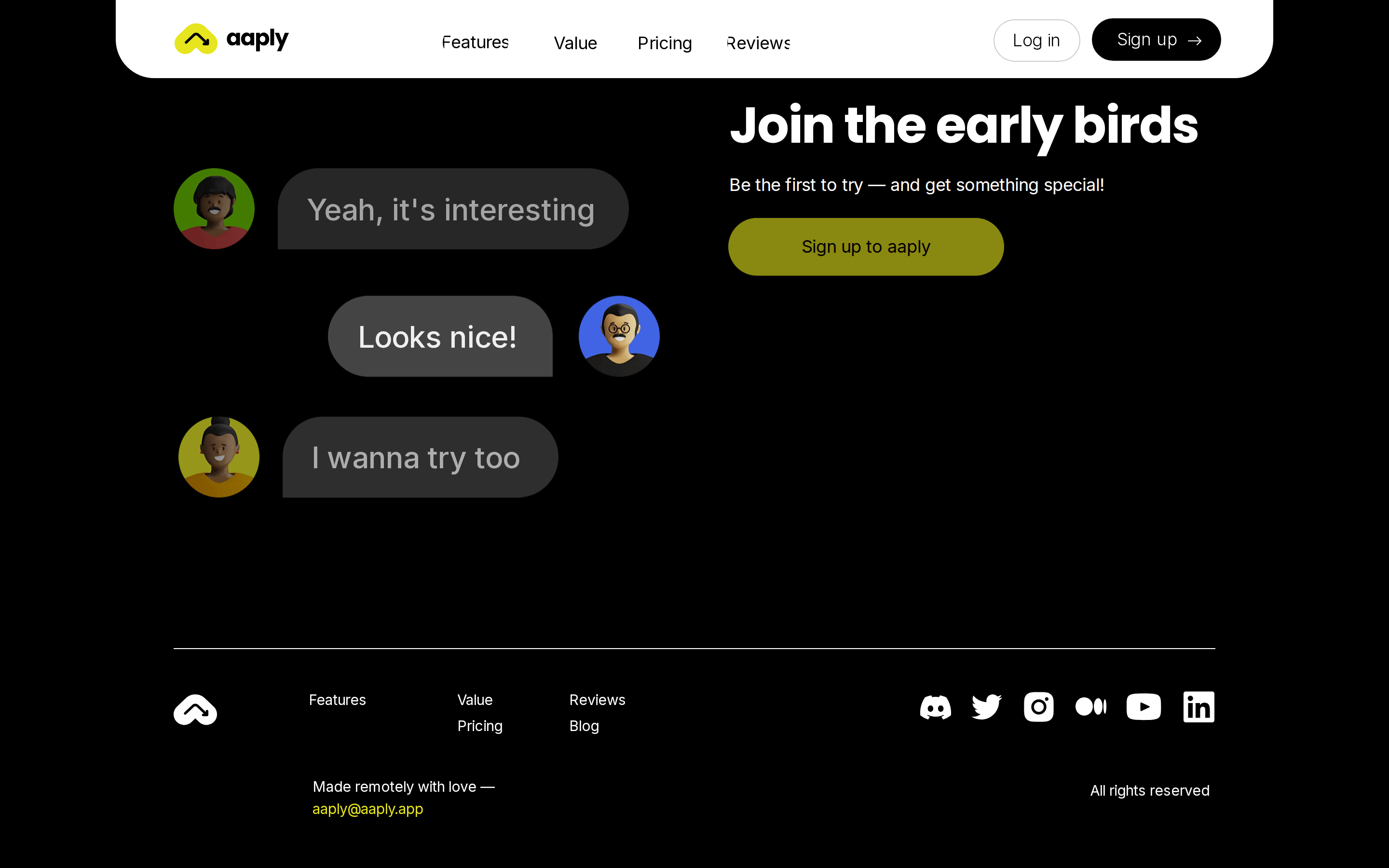
button Large, pill-shaped buttons with high contrast (solid black or solid yellow) and no border radius constraints. card Large, white, rounded containers for content sections. chip Not prominently featured. input Not prominently featured. hero Centered headline with inline emojis, followed by primary and secondary CTAs. 09
Voice & Don'ts
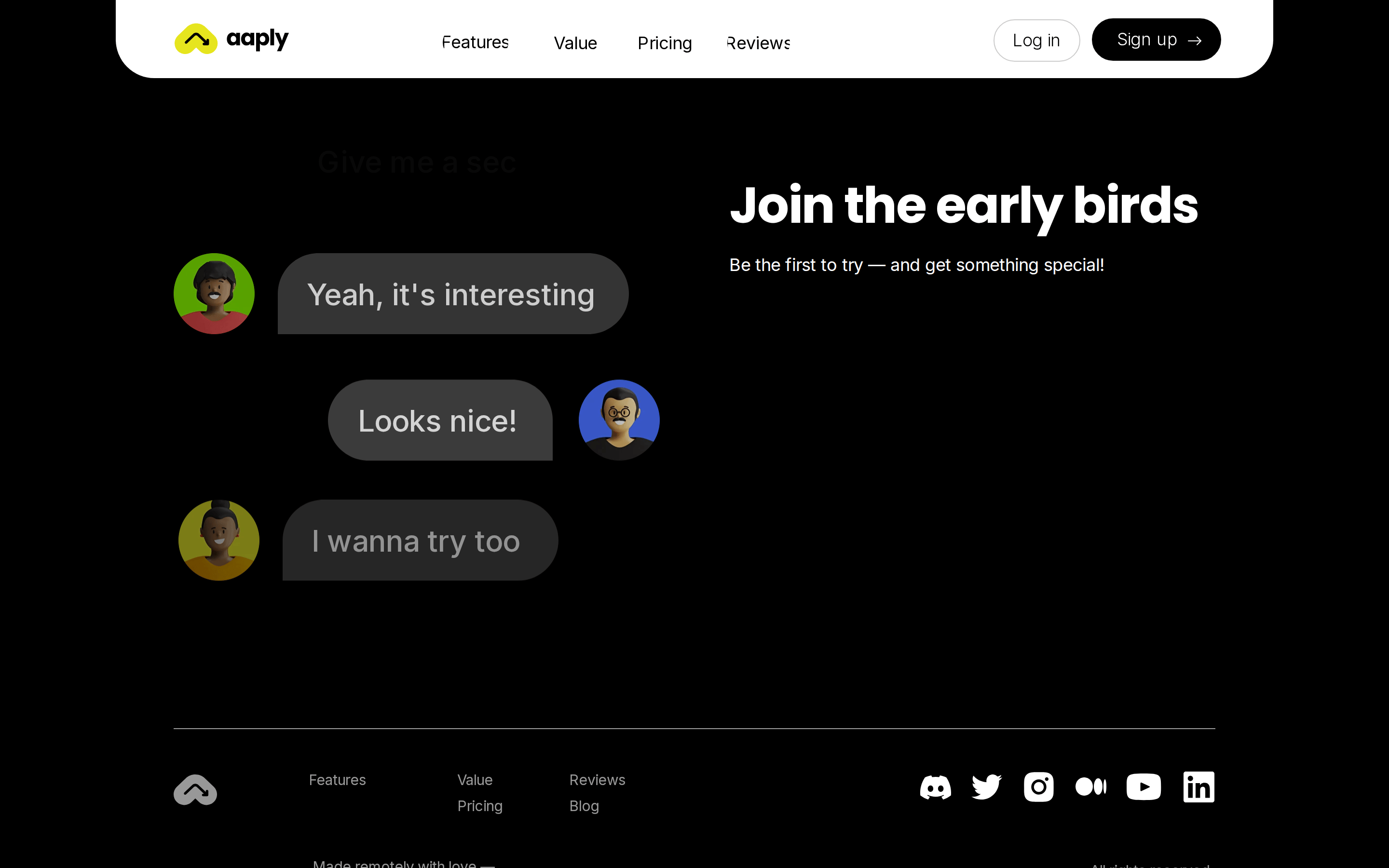
Tone Playful, direct, and human-centered. Headlines Conversational and expressive, often incorporating emojis directly into the text. CTAs Action-oriented and inviting, using simple, clear language. don't use a dark theme — screenshot shows a light gray (#f2f2f2) background with black text don't use thin, delicate typography — screenshot shows bold, geometric sans-serif display text don't use sharp, rectangular corners — screenshot shows heavily rounded pill-shaped buttons and rounded card containers don't use subtle, muted accents — screenshot shows a vibrant, high-chroma yellow (#e6e51e) as the primary accent don't use dense, cramped layouts — screenshot shows generous whitespace and large, centered content don't avoid inline visual elements — screenshot shows emojis integrated directly into the main headline text Avoid: Technical jargon Avoid: Cold or corporate language Avoid: Complex sentence structures 10
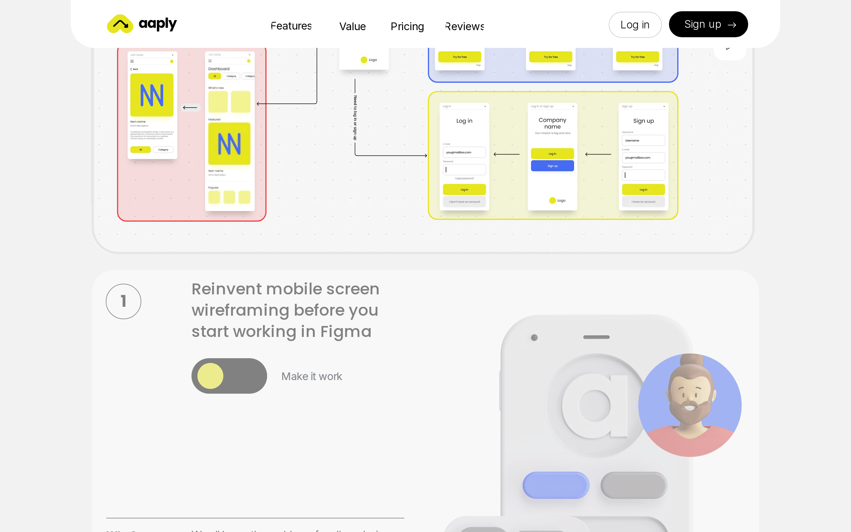
Inside the pack — real screenshots
桌面首屏(hero) 桌面滚动分段(90% viewport 步进,作为视觉证据) 桌面滚动分段(90% viewport 步进,作为视觉证据) 桌面滚动分段(90% viewport 步进,作为视觉证据) 桌面滚动分段(90% viewport 步进,作为视觉证据) 桌面滚动分段(90% viewport 步进,作为视觉证据) 桌面滚动分段(90% viewport 步进,作为视觉证据) 桌面滚动分段(90% viewport 步进,作为视觉证据) 移动首屏 Captured from the live site · real computed styles
11
System prompt
This is a playful, high-contrast SaaS landing page for a mobile app design tool. The core identity is built on a light gray (#f2f2f2) background with stark black (#000000) text and a vibrant, high-chroma yellow (#e6e51e) accent for primary actions. Typography features bold, geometric sans-serif display fonts (Poppins) paired with clean humanist sans-serif body text (Inter). The layout uses generous whitespace, centered containers, and heavily rounded, pill-shaped UI elements. Critical donts: avoid dark modes, avoid thin typography, avoid sharp corners, avoid muted accents, avoid cramped layouts, and avoid sterile, emoji-free headlines. The design is expressive, human-centered, and focused on collaborative mobile wireframing.
More from the library en · zh-CN · zh-TW · ja · ko
OpenDesign · curated web aesthetics for AI-readable design DNA · opendesign.cc
Why we curated this: The site's playful integration of emojis into typography and its bold, high-contrast aesthetic make it a strong example of expressive, human-centered SaaS design.