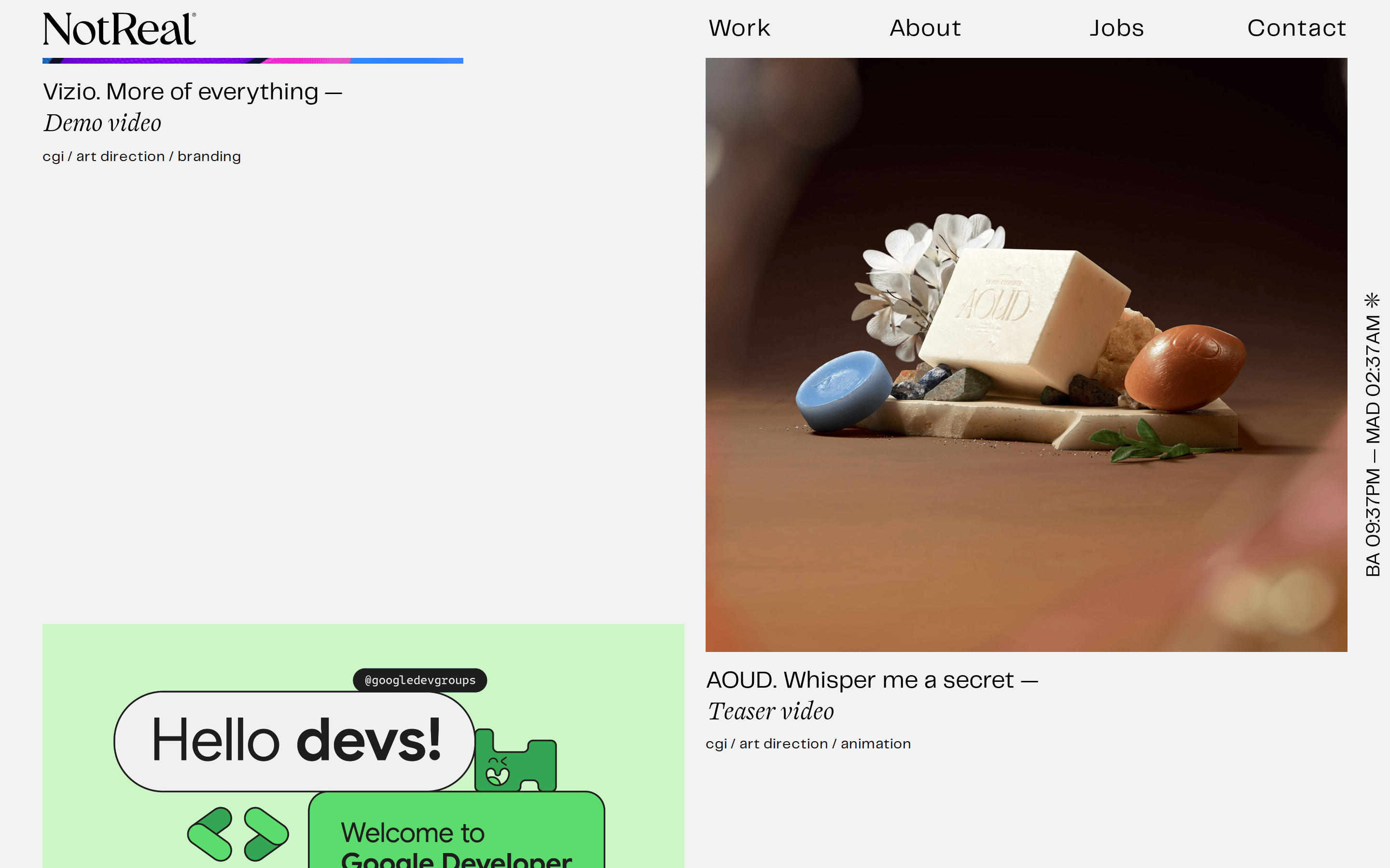
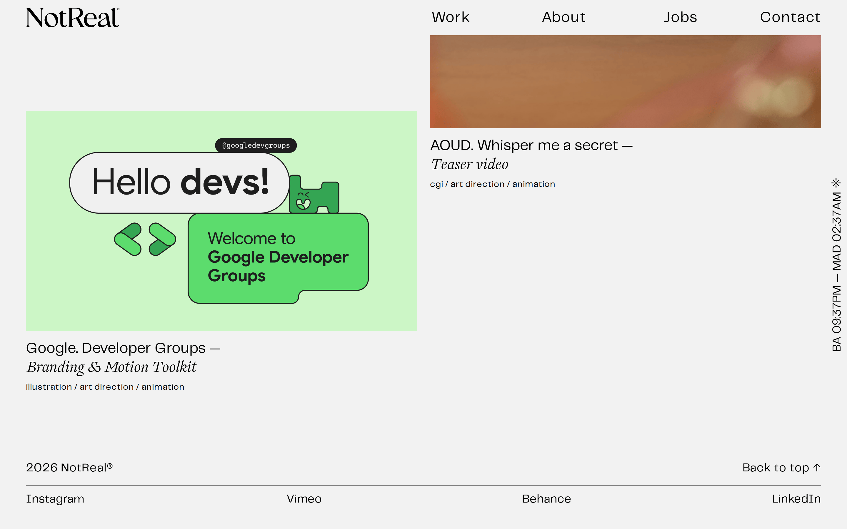
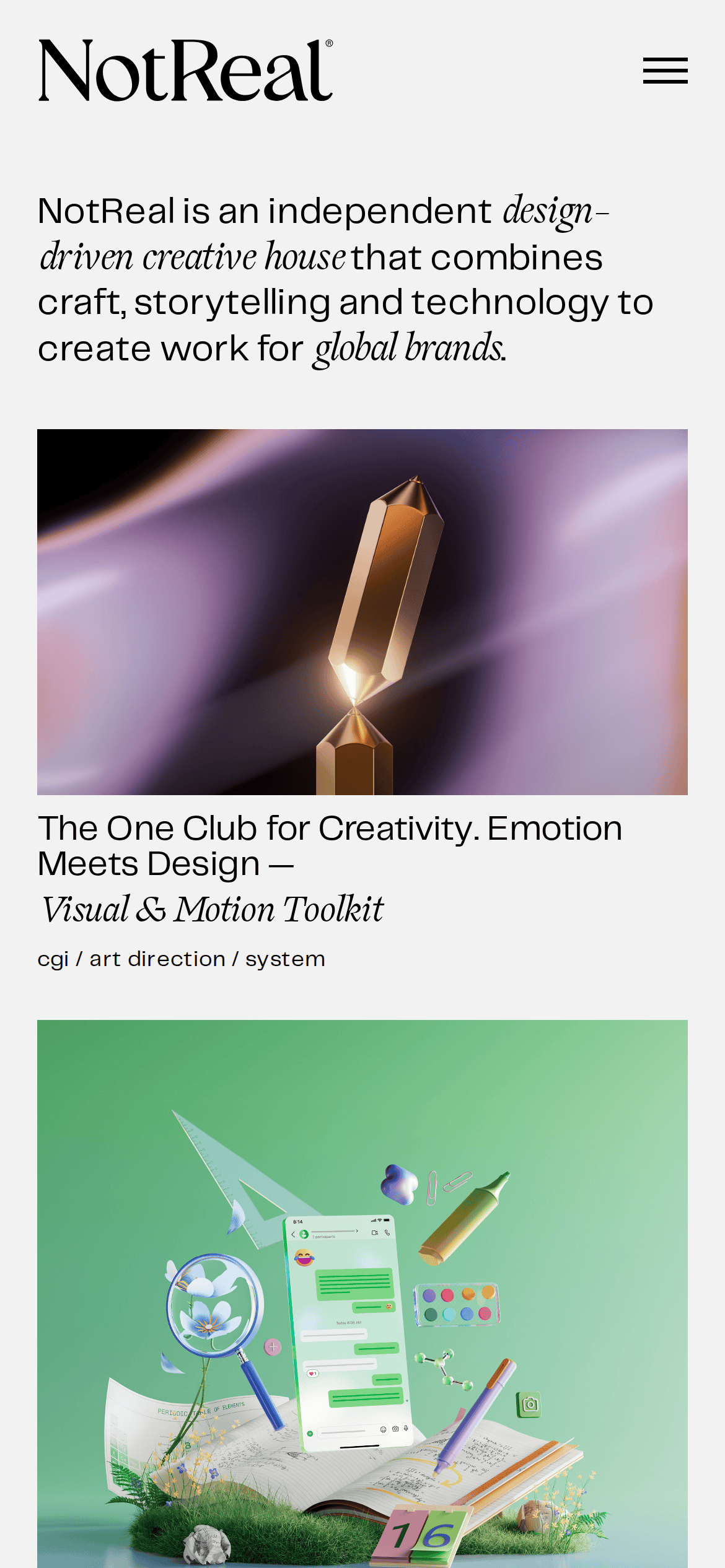
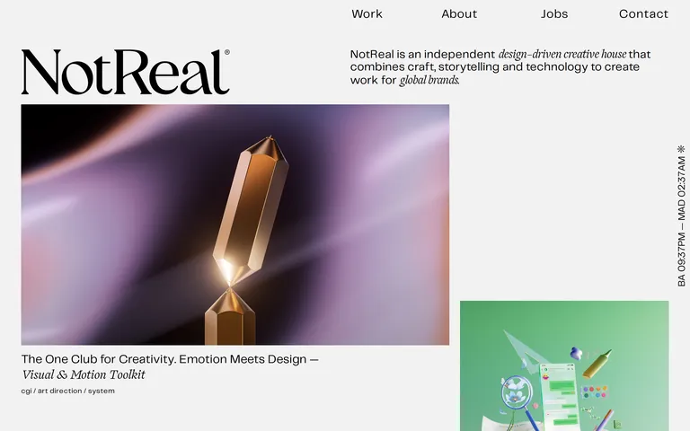
This is the design DNA for NotReal, an independent creative house. The site features a clean, editorial layout on an off-white (#f2f2f2) background with deep charcoal (#292a2c) text. Typography contrasts a refined transitional serif for the logo and accents with a clean geometric sans-serif for navigation and descriptions. The layout is grid-based but asymmetrical, giving significant visual weight to large, high-quality portfolio images. Critical design constraints: Do not use rounded corners or bright UI colors; the aesthetic is sharp, flat, and professional. Do not clutter the interface; ample whitespace is a core feature. Do not use sans-serif for the main 'NotReal' brand mark; it must remain a serif.
이 감각을 당신의 에이전트에
이 디자인의 기계 판독 가능한 사양——색상·타이포·모션까지——을 그대로 AI 에이전트에 전달하세요.