← OpenDesign CURATED · OPEN · FREE
Notreal Tv
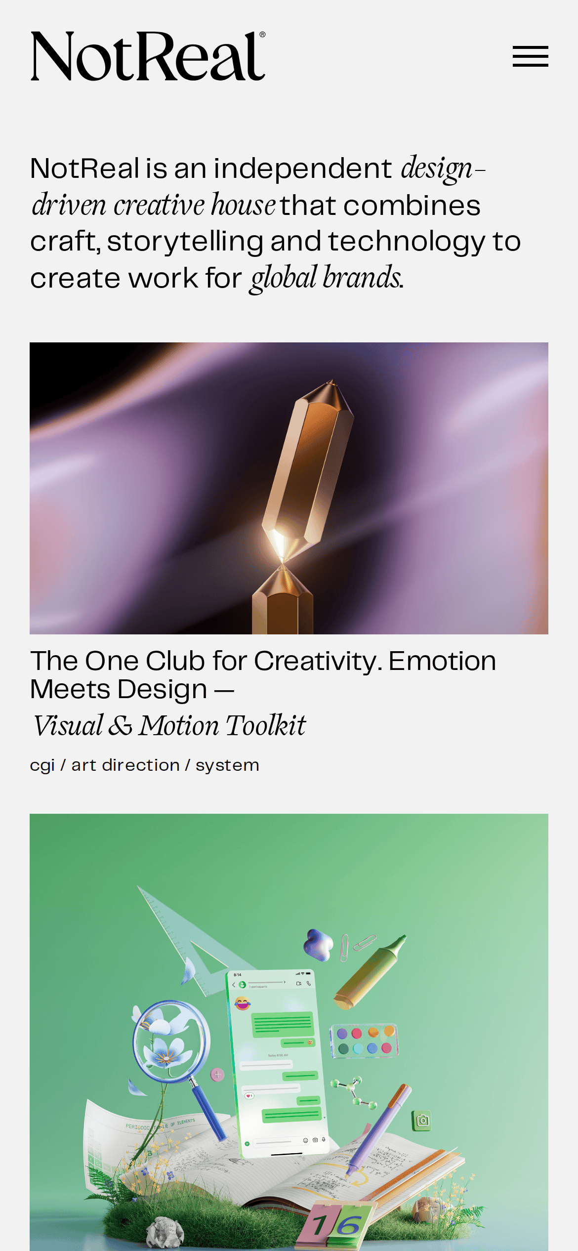
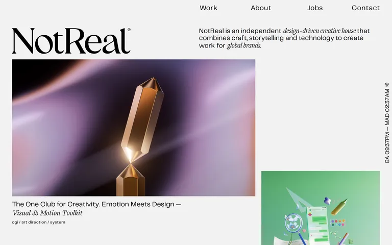
An independent creative house combining craft, storytelling, and technology for global brands.
Agency Portfolio Typography Editorial Clean
01
Identity DNA
creative independent design-driven craft storytelling technology
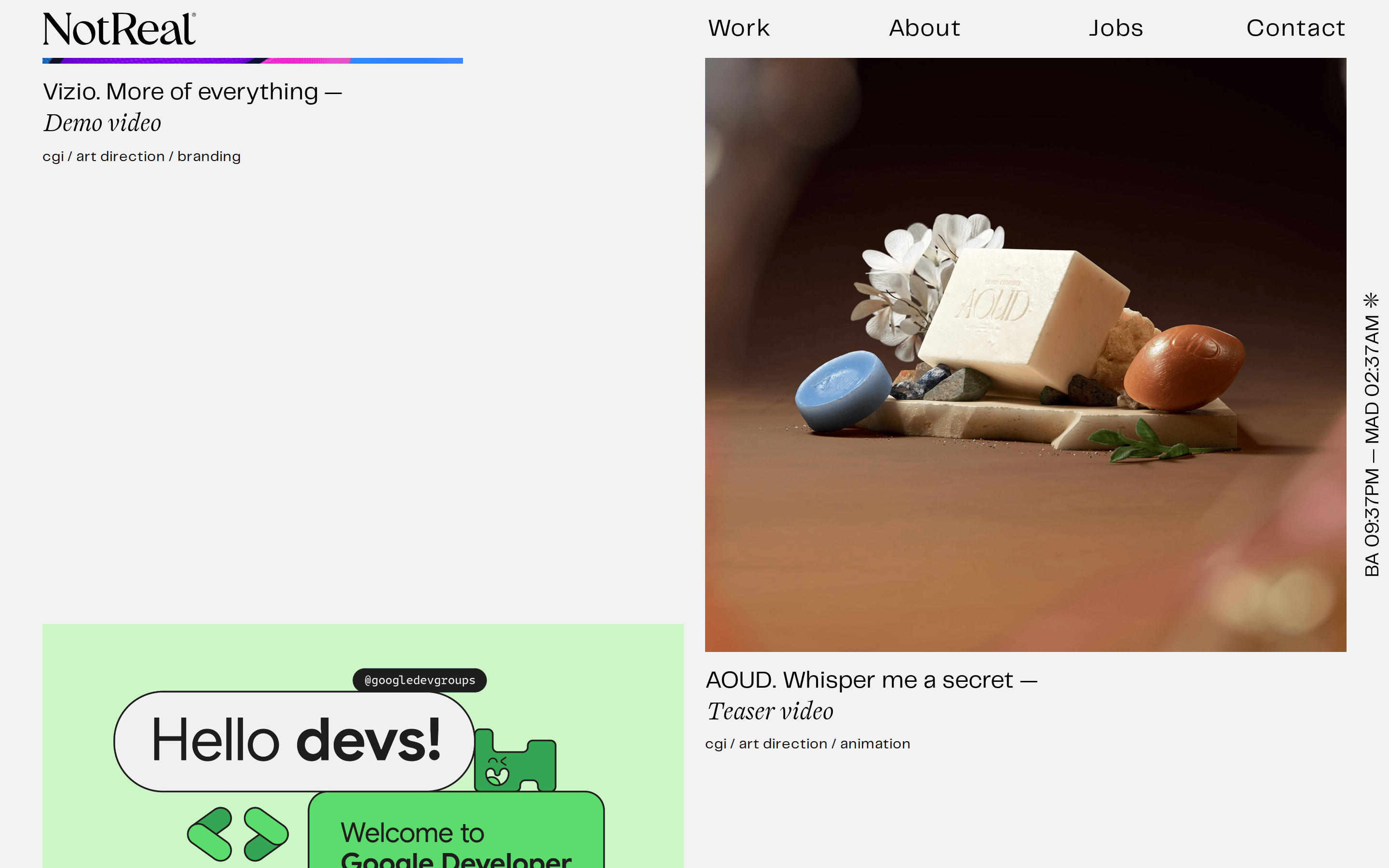
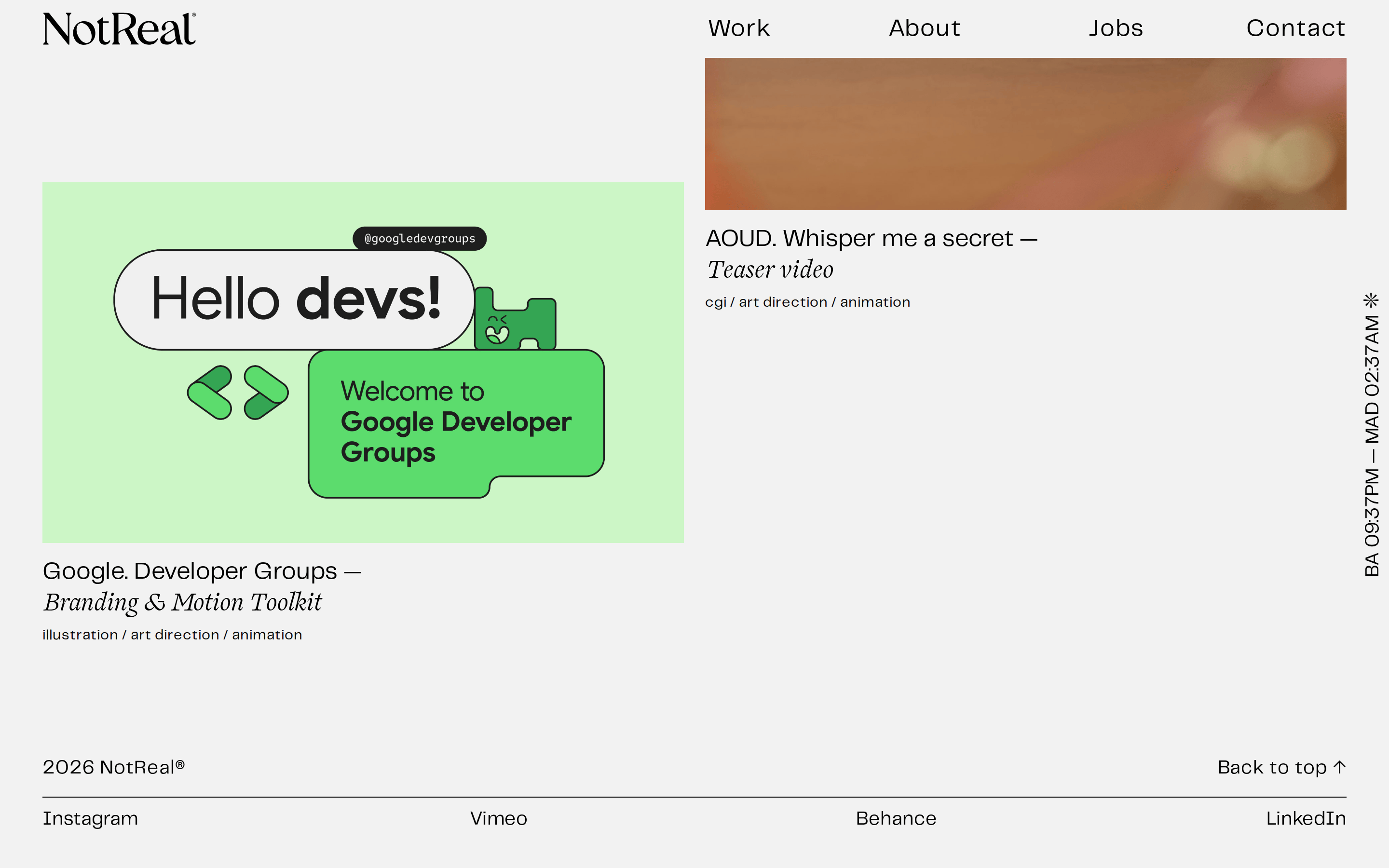
A curated gallery of a high-end creative studio.
02
Color
#292a2cInk
#f2f2f2BG
rgba(0,0,0,1)Line
Minimal, high-contrast canvas where the portfolio imagery provides the color.
03
Typography
transitional-serif · geometric-sans
display 80px · 400h2 25px · 400body 18px · 400Use the transitional serif for the main logo and artistic accents. · Use the geometric sans for all navigation, descriptions, and body text.
04
Spacing
4px
8px
16px
24px
32px
48px
64px
96px
Spacious and airy, with large margins between portfolio items and generous padding around text blocks.
05
Surfaces
sm · 0px
md · 0px
lg · 0px
pill · 999px
Minimal, occasionally a 2px solid black for subtle structural divisions.
0px 0px 5px 0px rgb(128, 128, 128)
06
Layout
1280 container
12 columns
24px gutter
768 / 1024 breakpoints
Asymmetrical, grid-based layout with large, prominent media blocks and concise, left-aligned text captions.
07
Motion & Interaction
200ms micro
300ms small
800ms medium
cubic-bezier(0.25, 0.1, 0.25, 1) easing
Subtle transitions on navigation and interactive elements. · Hover effects on portfolio items.
Subtle visual changes or underlines on text links and portfolio cards. · Direct navigation to project details.
08
Components
button Simple text links for navigation. card Full-width or half-width media blocks with captions directly below. hero Massive serif logo on the left, descriptive text on the right, and a large featured portfolio image below. 09
Voice & Don'ts
Tone Professional, refined, and artistic. Headlines Short, descriptive, and often italicized for emphasis. CTAs Minimal, text-based links in the navigation. Don't use rounded corners — screenshot shows sharp, square edges. Don't use bright, saturated UI colors — screenshot shows a neutral, off-white background. Don't use sans-serif for the main logo — screenshot shows a transitional serif. Don't clutter the layout — screenshot shows a very clean, airy grid with plenty of whitespace. Don't use drop shadows on primary elements — screenshot shows flat imagery with only minimal, subtle shadows on specific elements. Don't use all-caps for body text — screenshot shows sentence case or title case. Avoid: Overly casual or slang language. Avoid: Excessive use of exclamation points. Avoid: Vague or generic descriptions. 10
Inside the pack — real screenshots
桌面首屏(hero) 桌面滚动分段(90% viewport 步进,作为视觉证据) 桌面滚动分段(90% viewport 步进,作为视觉证据) 桌面滚动分段(90% viewport 步进,作为视觉证据) 桌面滚动分段(90% viewport 步进,作为视觉证据) 桌面滚动分段(90% viewport 步进,作为视觉证据) 桌面滚动分段(90% viewport 步进,作为视觉证据) 桌面滚动分段(90% viewport 步进,作为视觉证据) 移动首屏 Captured from the live site · real computed styles
11
System prompt
This is the design DNA for NotReal, an independent creative house. The site features a clean, editorial layout on an off-white (#f2f2f2) background with deep charcoal (#292a2c) text. Typography contrasts a refined transitional serif for the logo and accents with a clean geometric sans-serif for navigation and descriptions. The layout is grid-based but asymmetrical, giving significant visual weight to large, high-quality portfolio images. Critical design constraints: Do not use rounded corners or bright UI colors; the aesthetic is sharp, flat, and professional. Do not clutter the interface; ample whitespace is a core feature. Do not use sans-serif for the main 'NotReal' brand mark; it must remain a serif.
More from the library en · zh-CN · zh-TW · ja · ko
OpenDesign · curated web aesthetics for AI-readable design DNA · opendesign.cc
Why we curated this: A prime example of a high-end agency portfolio that uses typography and layout to convey prestige without relying on excessive decoration.