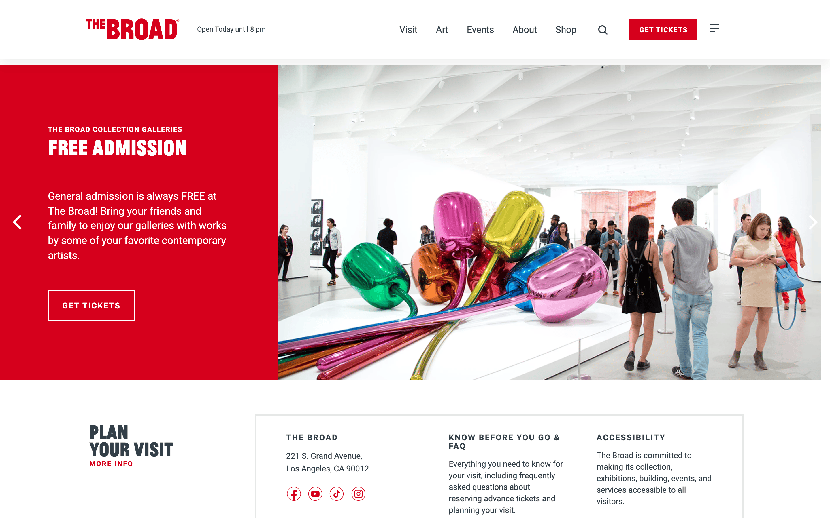
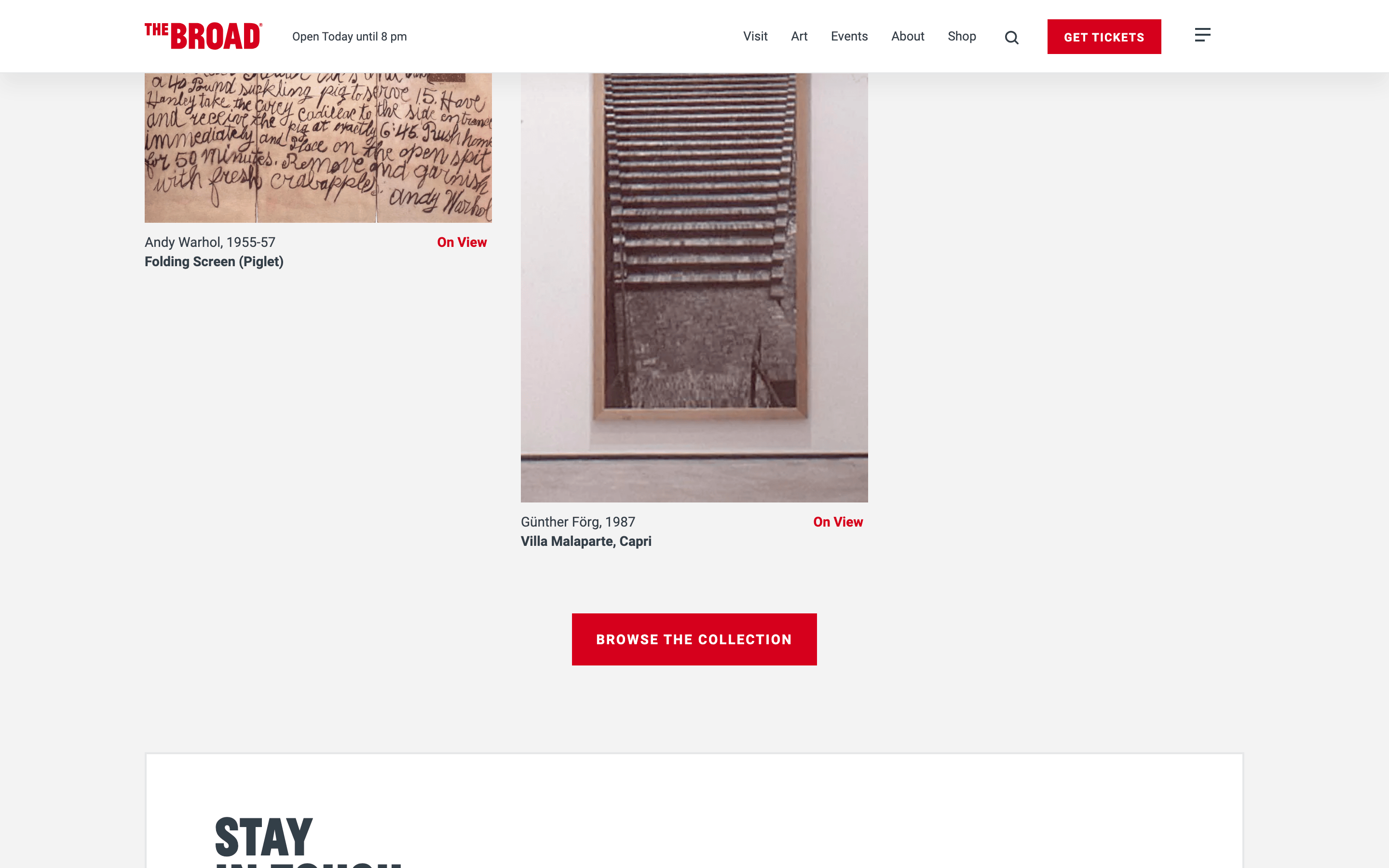
중성적인 화이트/그레이 캔버스와 기본 브랜딩 및 액션을 위한 지배적이고 고채도의 레드를 사용하는 고대비 전시 디자인입니다.
03
타이포그래피
grotesque-sans
display36px · 700
body14px · 400
텍스트 transform uppercase는 내비게이션, 라벨 및 제목에 광범위하게 사용됩니다. · 타이포그래피는 깔끔하고 기관적인 느낌을 위해 sans-serif 카테고리 내에서 엄격히 유지됩니다. · 제목의 행간은 타이트하게, 본문의 행간은 표준적으로 유지하여 가독성을 보장합니다.
04
여백
4px
8px
15px
16px
23px
24px
48px
64px
일관된 4px 기본 그리드가 적용되며, 내비게이션 및 인터랙티브 요소에는 표준 padding이 사용됩니다.
This is a museum and gallery website for 'The Broad'. The design DNA is institutional, clean, and high-contrast, designed to let contemporary artwork stand out. The primary palette is a clean white (#FFFFFF) background with a neutral dark grey (#333F48) for ink and a singular, dominant high-chroma red (#D6001C) for accents and calls to action. The typography relies on a clean grotesque-sans category, using uppercase text heavily for headings and navigation to create a bold, graphic feel. Critical donts include avoiding decorative serifs, avoiding muted pastel accents, and ensuring artwork is never obscured by heavy UI elements or complex gradients.
이 감각을 당신의 에이전트에
이 디자인의 기계 판독 가능한 사양——색상·타이포·모션까지——을 그대로 AI 에이전트에 전달하세요.