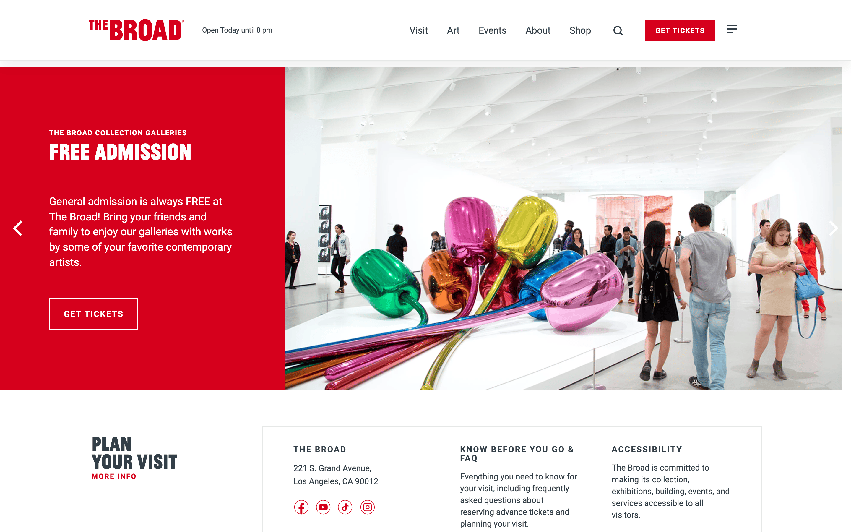
A clean, institutional gallery space with bold graphic signage and generous white walls.
02
Color
#D6001CAccent
#333F48Ink
#FFFFFFBG
#F3F3F3BG quiet
#687697Muted
rgba(51, 63, 72, 1.0)Line
High-contrast exhibition design using a neutral white/grey canvas with a dominant, high-chroma red for primary branding and actions.
03
Typography
grotesque-sans
display36px · 700
body14px · 400
Text transform uppercase is heavily used for navigation, labels, and headings. · Typography is kept strictly within the sans-serif category for a clean, institutional look. · Line heights are kept tight for headings and standard for body text to ensure readability.
04
Spacing
4px
8px
15px
16px
23px
24px
48px
64px
A consistent 4px base grid is applied, with standard padding used for navigation and interactive elements.
05
Surfaces
sm · 4px
md · 5px
lg · 0px
pill · 999px
1px solid #333F48 for primary borders, with occasional 2px accents.
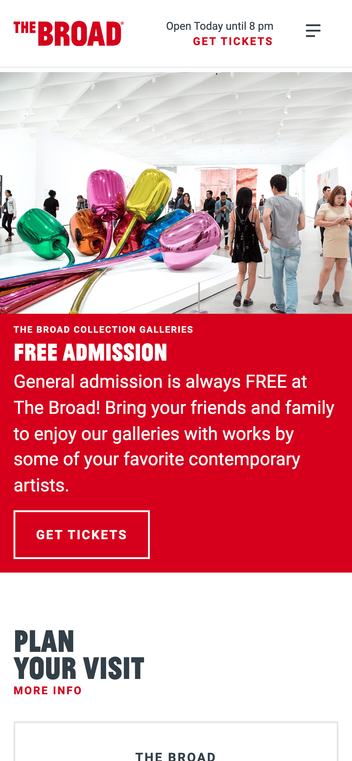
A split hero layout with a large image and solid color text block, transitioning to a multi-column grid for content.
07
Motion & Interaction
200msmicro
300mssmall
800msmedium
cubic-bezier(0.25, 0.46, 0.45, 0.94)easing
Standard opacity and box-shadow transitions for hover states.
Subtle transitions on hover, often involving box-shadow or slight opacity changes. · Direct navigation or state change without complex micro-interactions.
08
Components
buttonSolid primary buttons with uppercase text and tight padding, alongside outlined secondary buttons.
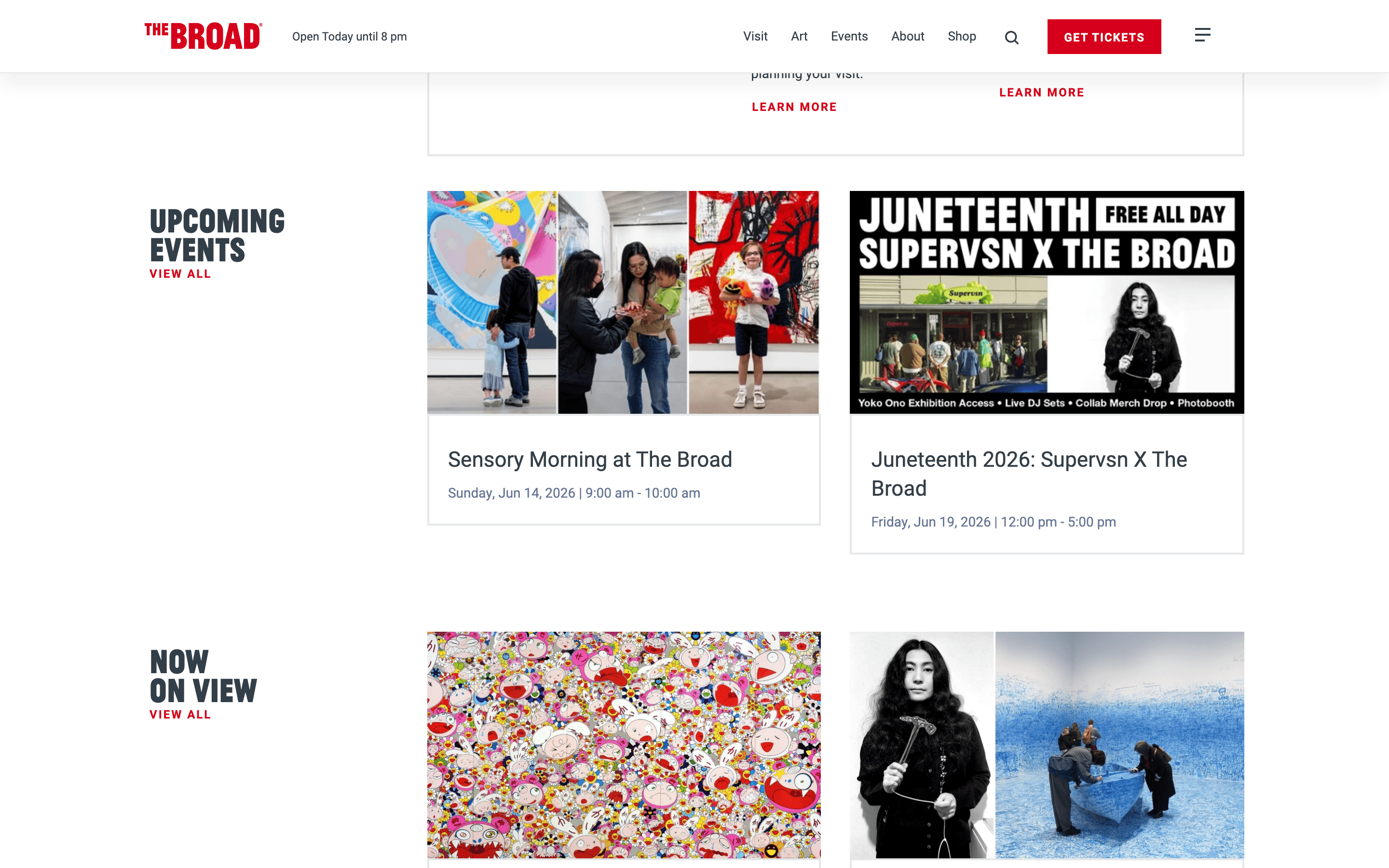
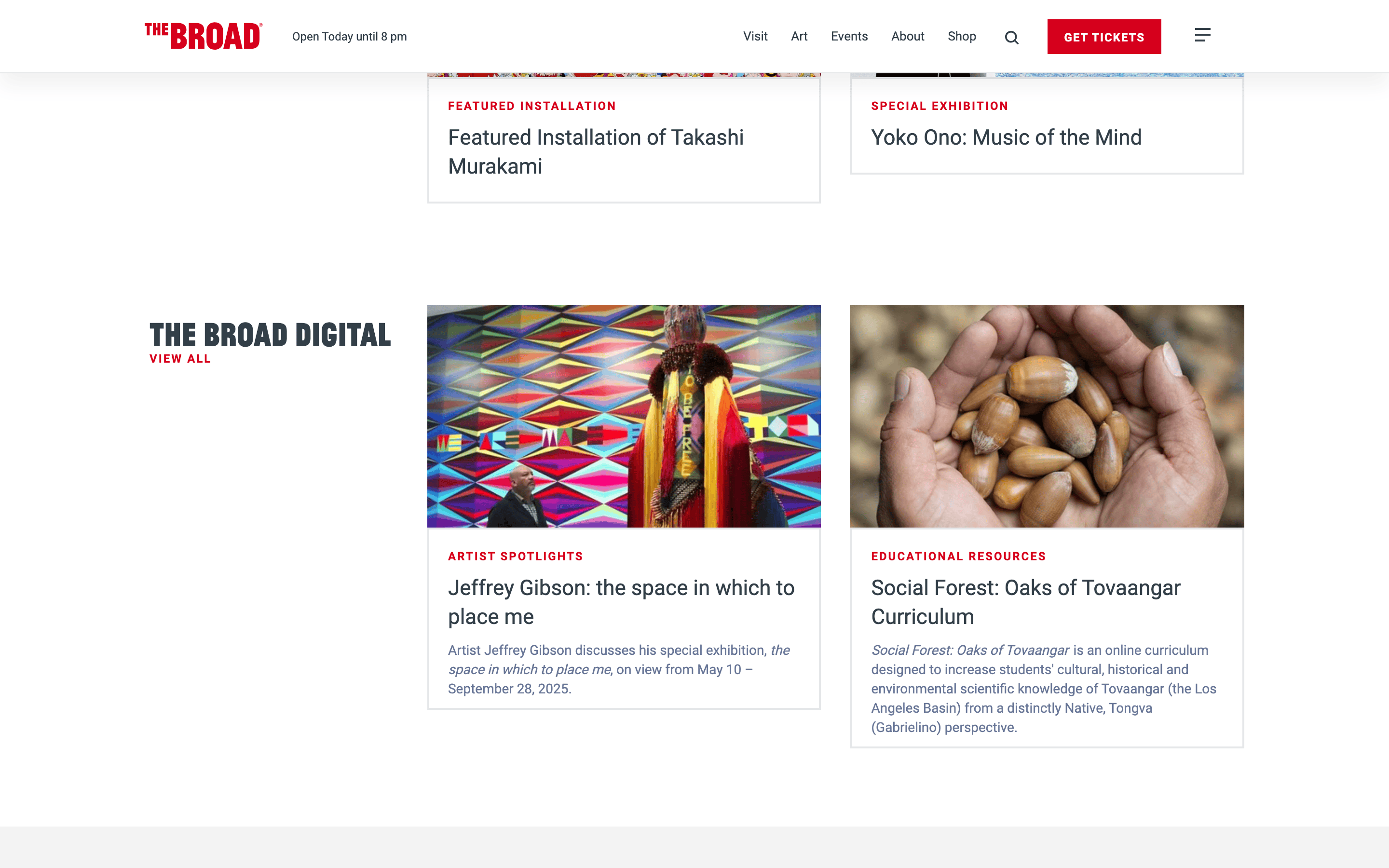
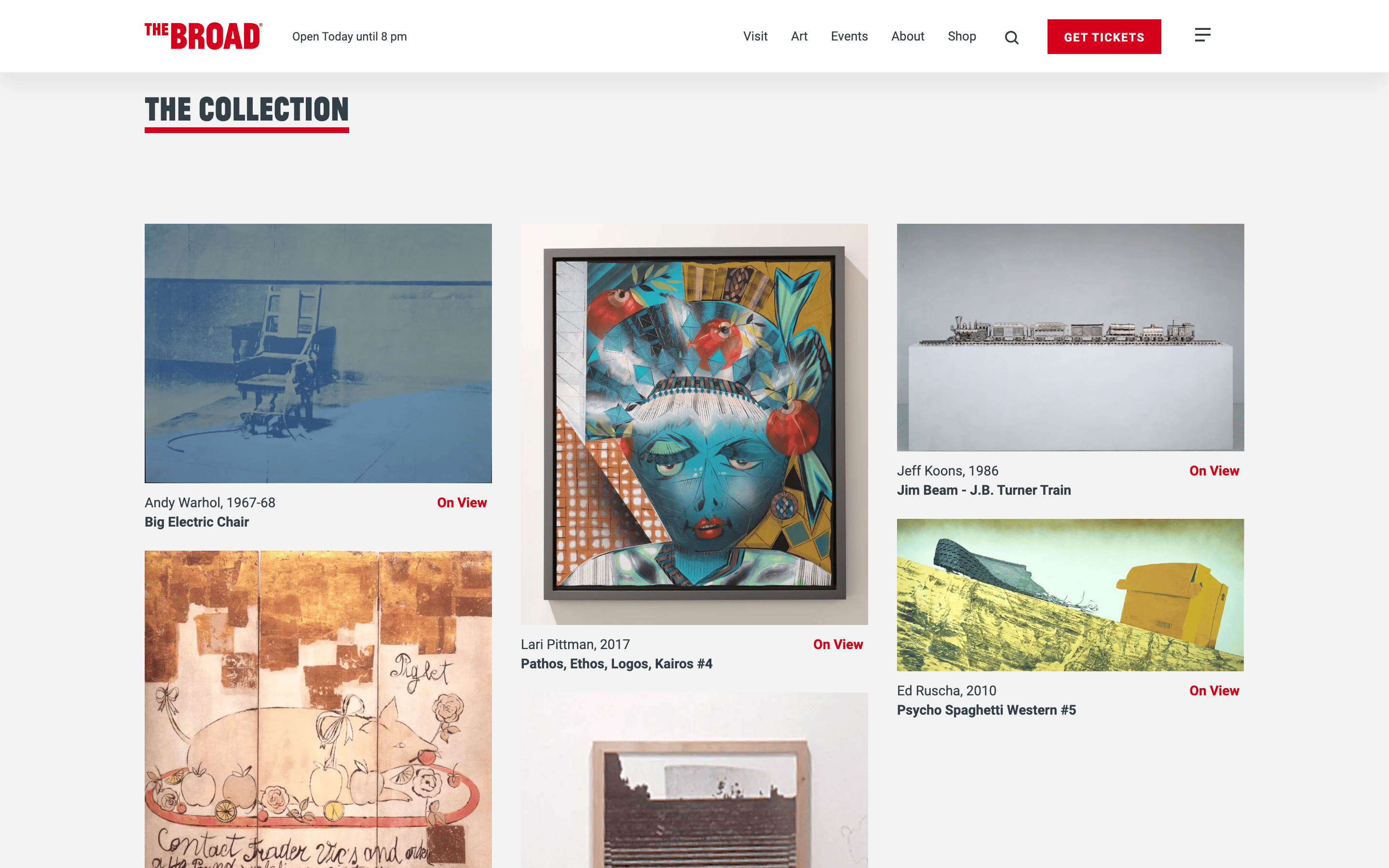
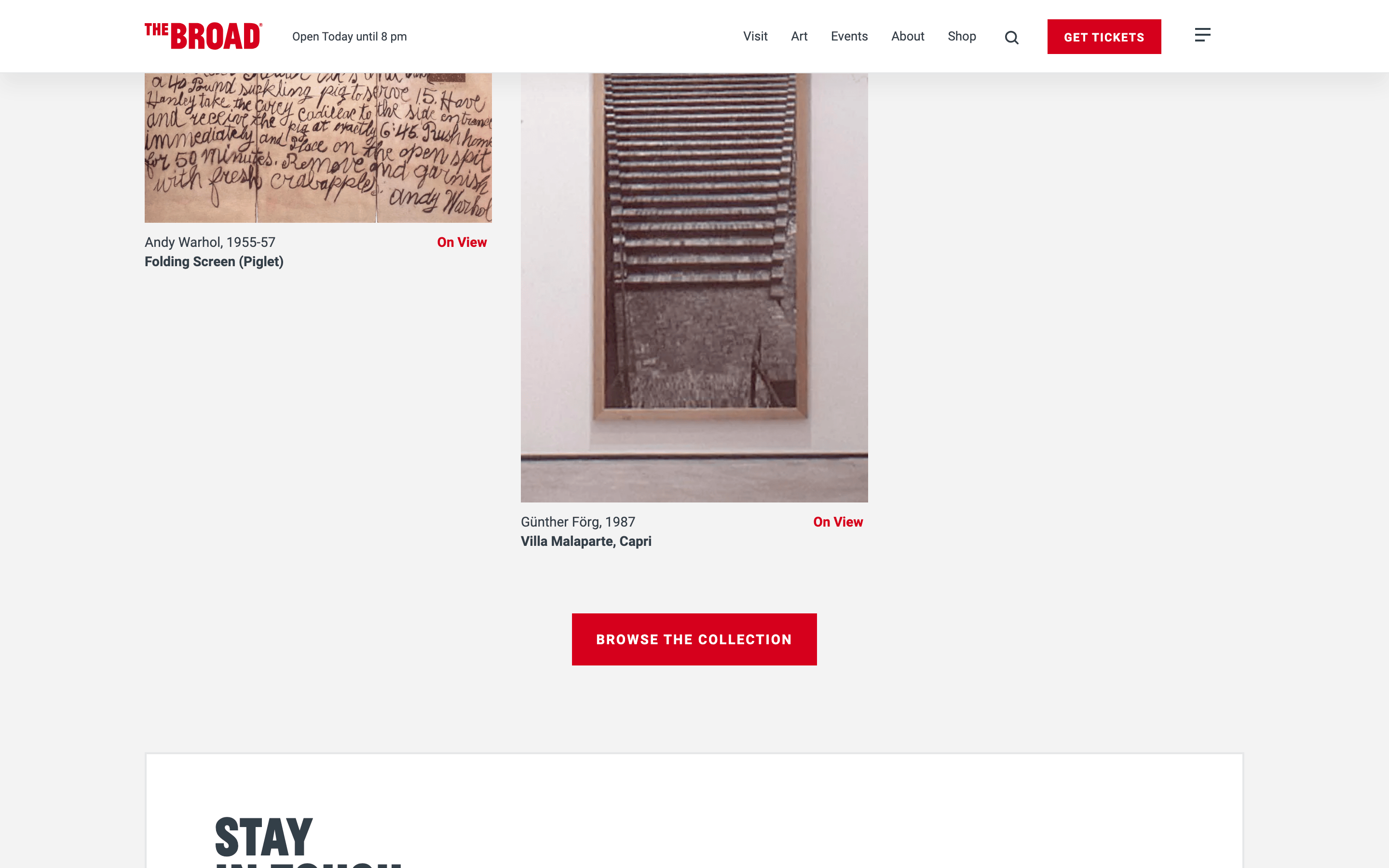
cardImage-heavy cards with simple text captions and aligned status indicators (e.g., 'On View').
heroA large split-panel hero featuring a full-width photography block and a high-contrast solid color panel with messaging.
09
Voice & Don'ts
ToneInviting, clear, and institutional, focusing on accessibility and information.
HeadlinesDirect, uppercase, and informative, using bold weights to establish hierarchy.
CTAsAction-oriented and highly visible, using solid color backgrounds or high-contrast borders.
Don't use decorative serif fonts — the screenshot shows a strict sans-serif institutional style.
Don't use muted or pastel accent colors — the screenshot shows a vibrant, high-chroma red (#D6001C) as the sole dominant accent.
Don't use rounded corners on major components — the screenshot shows sharp, square edges for panels and large buttons.
Don't obscure artwork with heavy overlays — the screenshot shows clean, unobstructed photography.
Don't use complex multi-column grids for primary navigation — the screenshot shows a clear, single-line top navigation bar.
Don't rely on subtle color shifts for interaction — the screenshot shows high-contrast buttons and clear, distinct sections.
Avoid: Avoid overly casual or playful language.
Avoid: Avoid decorative serif fonts.
Avoid: Avoid complex gradients or shadows that distract from the artwork.
Captured from the live site · real computed styles
11
System prompt
This is a museum and gallery website for 'The Broad'. The design DNA is institutional, clean, and high-contrast, designed to let contemporary artwork stand out. The primary palette is a clean white (#FFFFFF) background with a neutral dark grey (#333F48) for ink and a singular, dominant high-chroma red (#D6001C) for accents and calls to action. The typography relies on a clean grotesque-sans category, using uppercase text heavily for headings and navigation to create a bold, graphic feel. Critical donts include avoiding decorative serifs, avoiding muted pastel accents, and ensuring artwork is never obscured by heavy UI elements or complex gradients.
Bring this taste to your agent
Hand your AI agent a machine-readable spec of this design — tokens, type, motion, the whole DNA.