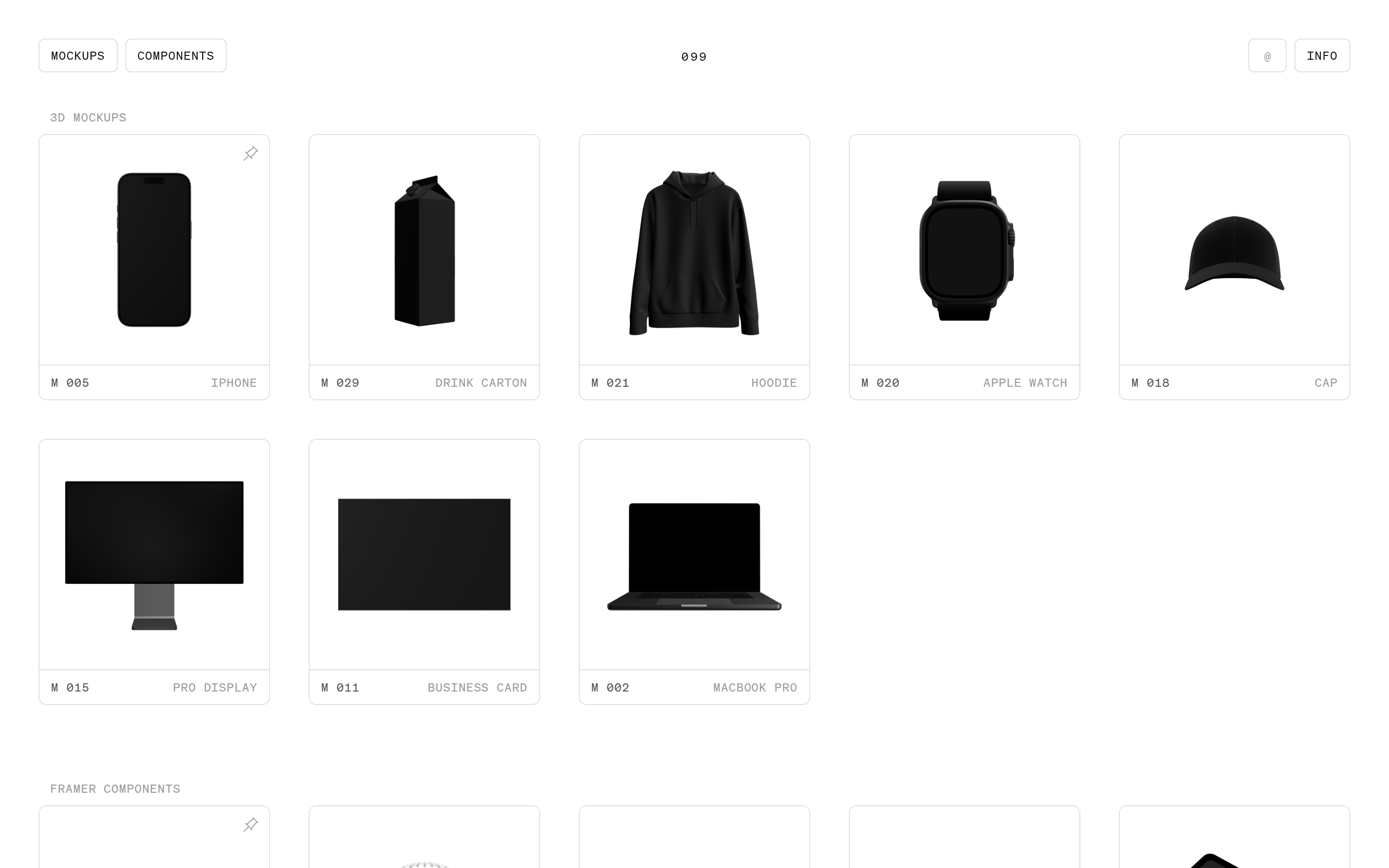
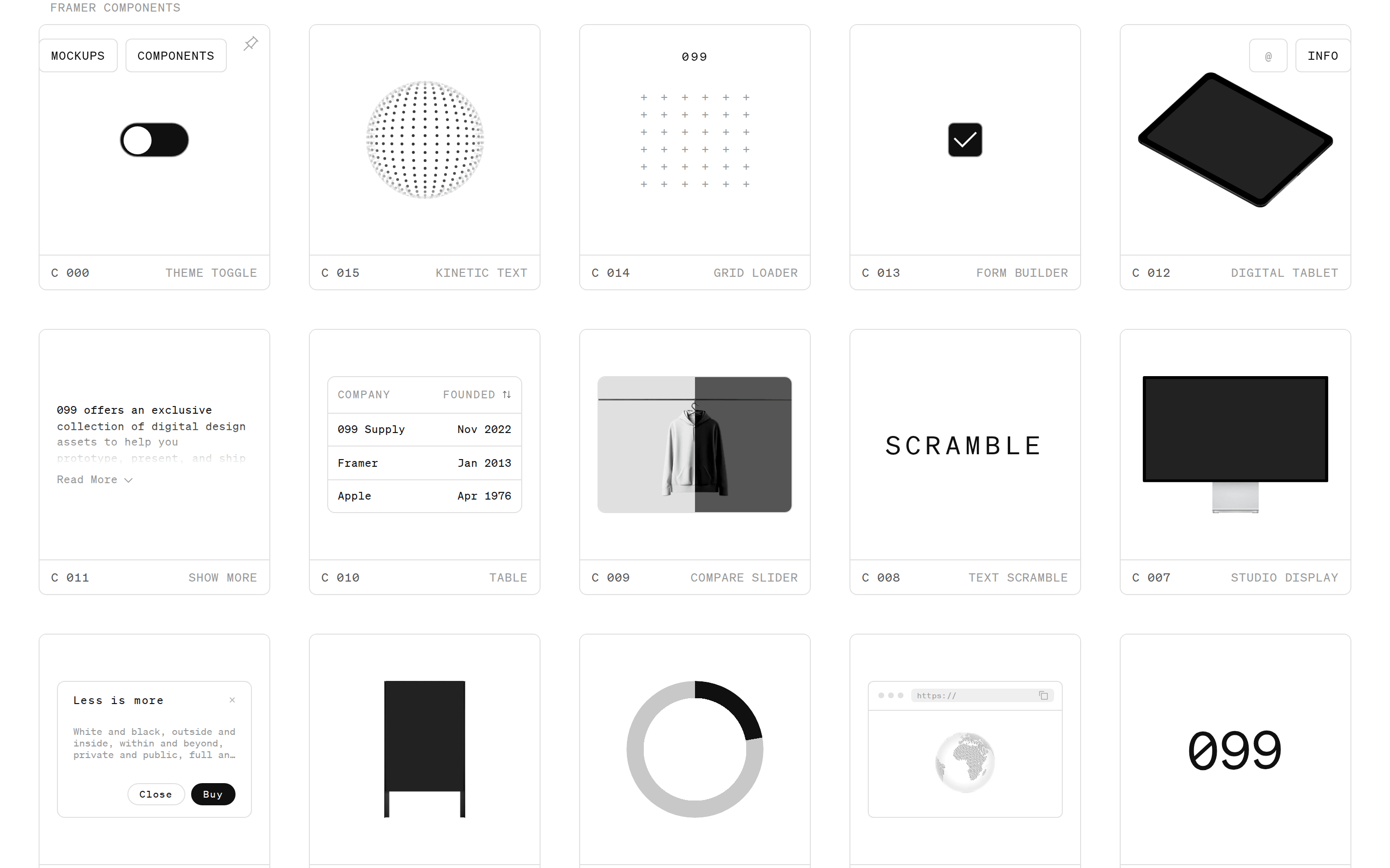
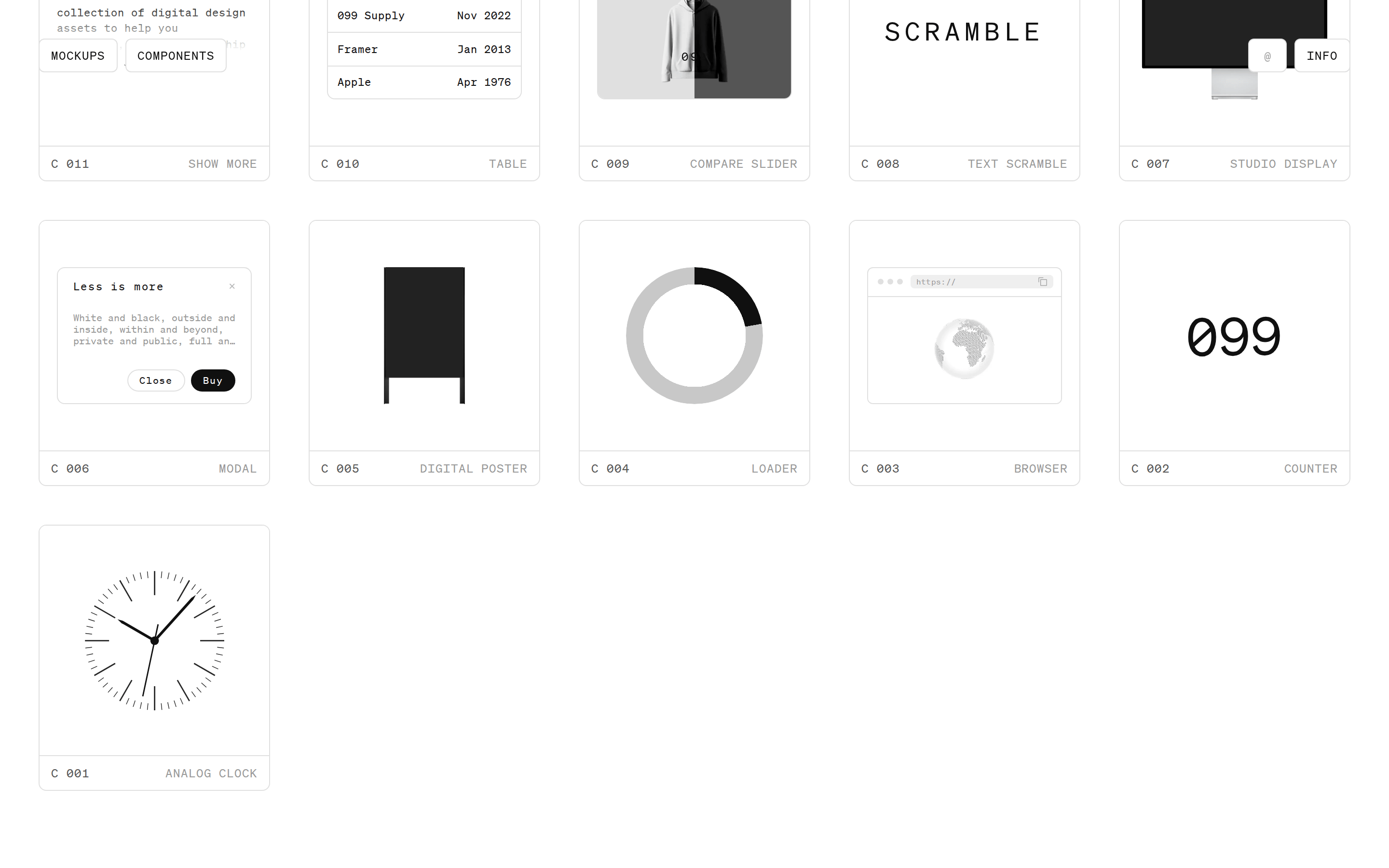
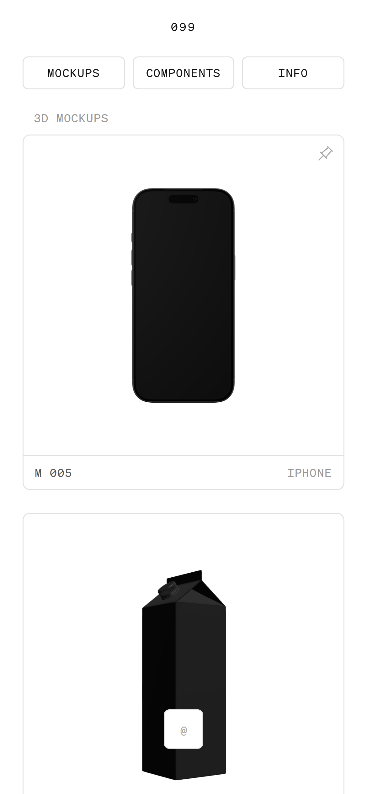
3D MockupsFramer ComponentsDigital AssetsUI KitDesign Supply
A digital warehouse for high-quality design assets.
02
Color
#101010Ink
#555555Ink soft
#FFFFFFBG
#999999Muted
rgba(224, 224, 224, 1)Line
Strictly achromatic, using pure black and grays to keep focus on the product renders.
03
Typography
monospaced
display54px · 400
All typography uses a single monospaced family. · Headings and UI labels are consistently uppercase. · Small text uses generous letter-spacing for legibility.
04
Spacing
4px
8px
12px
16px
24px
32px
40px
80px
Consistent 40px and 80px outer padding for main sections.
05
Surfaces
sm · 4px
md · 8px
lg · 8px
pill · 999px
1px solid #E0E0E0
0 1px 2px rgba(0,0,0,0.05)
06
Layout
1400container
5columns
24pxgutter
768 / 1024breakpoints
Responsive grid of equally sized cards.
07
Motion & Interaction
120msmicro
140mssmall
400msmedium
cubic-bezier(0.25, 0.1, 0.25, 1)easing
Quick 120ms transitions for border and color changes. · Subtle opacity and color fades on interactive elements.
Subtle border-color or background-color changes. · Immediate visual feedback with fast transitions.
08
Components
buttonOutlined pill buttons with monospaced uppercase text.
cardWhite cards with thin 1px borders, light hover states, and a bottom label bar.
chipOutlines only, used for top-level navigation.
inputSimple outlined fields with monospaced text.
heroA dense grid of product cards, focusing on the asset over branding.
09
Voice & Don'ts
ToneUtilitarian, technical, and efficient.
HeadlinesUppercase monospaced text, often with numerical prefixes.
CTAsClear, bordered buttons or simple text links.
Don't use a serif font — screenshot shows exclusive use of monospaced type.
Don't use colorful backgrounds — screenshot shows a strict white and gray palette.
Captured from the live site · real computed styles
11
System prompt
099 Supply is a minimalist digital marketplace for design assets. Its visual DNA is defined by an achromatic palette (FFFFFF background, 101010 ink, 999999 muted, E0E0E0 line) and a strictly monospaced typographic system. All text is uppercase, creating a technical, systematic feel. The layout is a clean, responsive grid of white cards with thin 1px borders. Critical donts: never use a serif font, never introduce color, and never use heavy drop shadows. The brand positioning is technical and utilitarian, targeting designers who value precision and utility over decorative expression. Use generous letter-spacing for small text to maintain legibility in the monospaced system.
Bring this taste to your agent
Hand your AI agent a machine-readable spec of this design — tokens, type, motion, the whole DNA.