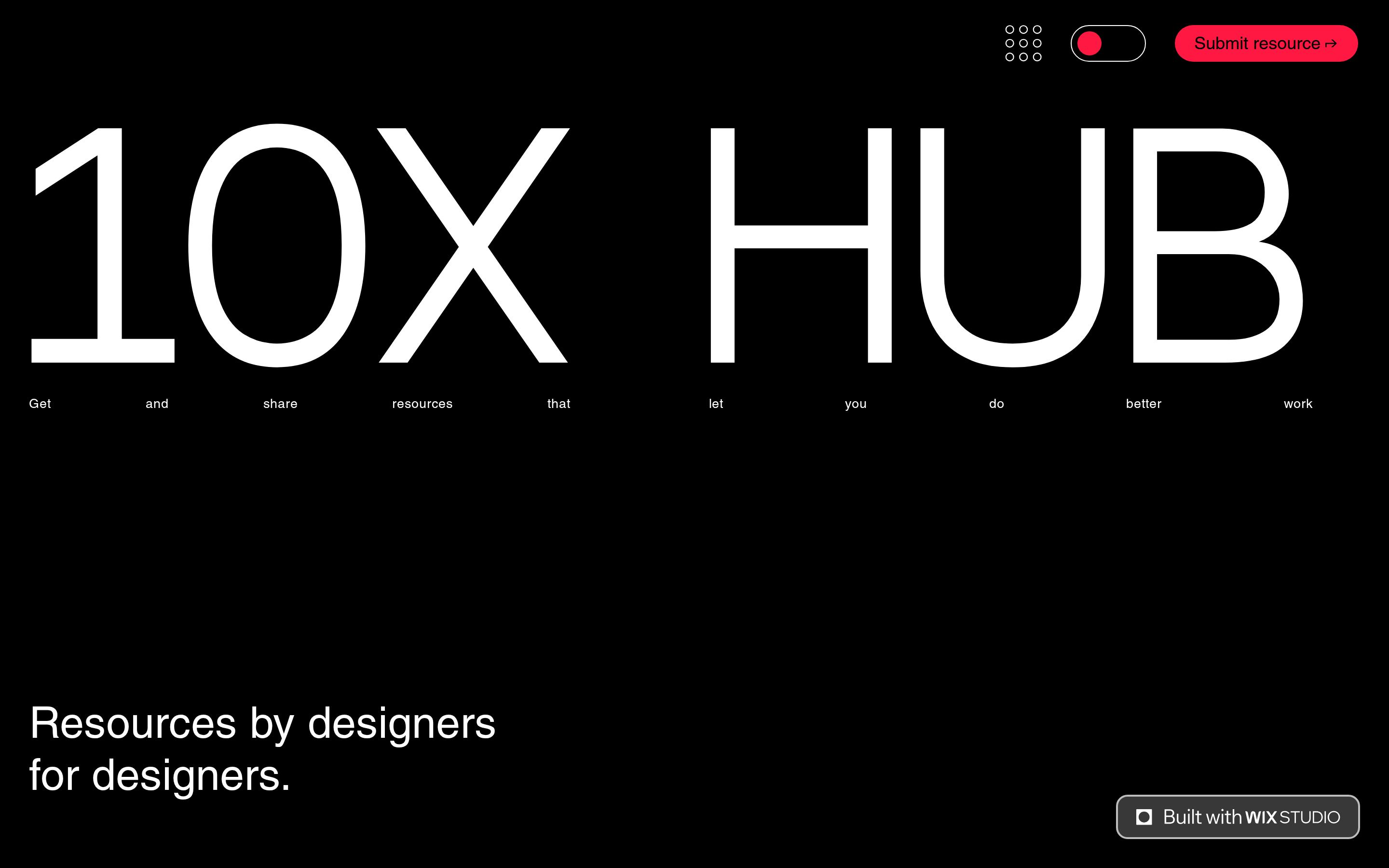
A high-end, minimal gallery of tools and assets for designers.
02
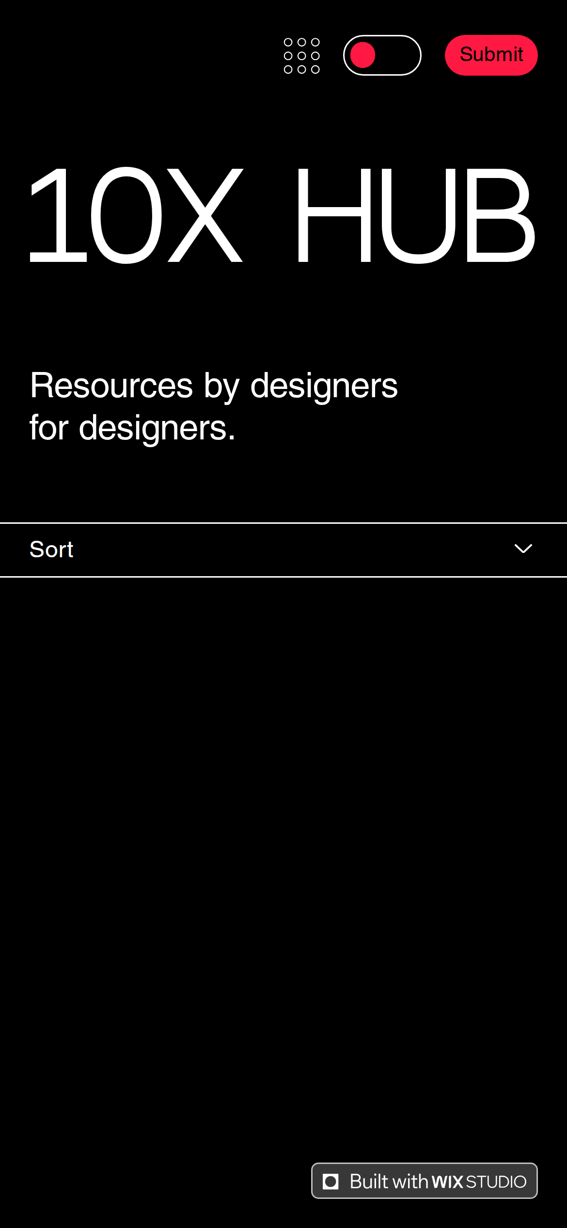
Color
#FF1841Accent
#FFFFFFInk
#000000BG
#949494Muted
rgba(148, 148, 148, 0.3)Line
Stark, high-contrast minimalism using a strict black-and-white base with a single high-chroma red accent.
03
Typography
grotesque-sans
display300px · 400
heading32px · 400
body18px · 400
small13px · 400
Use extremely tight letter-spacing (-12px) for massive display text to maintain visual cohesion. · Maintain consistent normal font-weight (400) across all elements to keep the design clean and uniform.
04
Spacing
4px
8px
16px
24px
32px
48px
64px
96px
Strict 4px baseline grid with generous, intentional spacing between elements.
05
Surfaces
sm · 2px
md · 12px
lg · 20px
pill · 999px
1px solid rgba(148, 148, 148, 0.3) used sparingly for dividers and input states.
none
06
Layout
1280container
12columns
24pxgutter
768 / 1024breakpoints
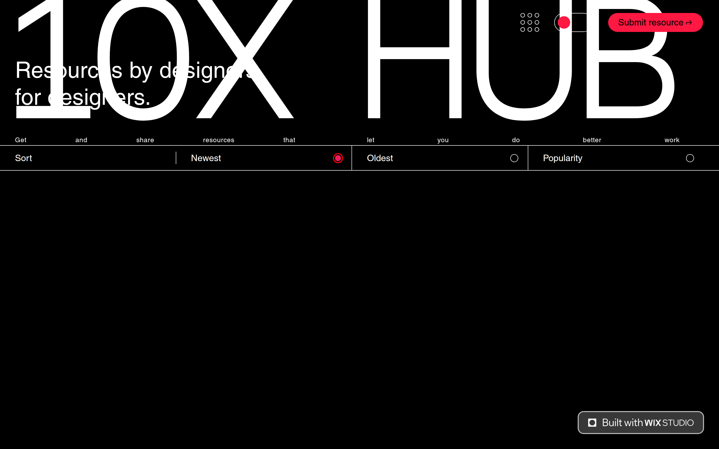
Full-width hero with massive typography, followed by a structured, grid-based content area.
07
Motion & Interaction
100msmicro
200mssmall
500msmedium
cubic-bezier(0.25, 0.1, 0.25, 1.0)easing
Smooth, linear visibility transitions for UI state changes. · Subtle hover effects on interactive elements.
Subtle color shifts or opacity changes to indicate interactivity. · Immediate, responsive feedback without complex animations.
08
Components
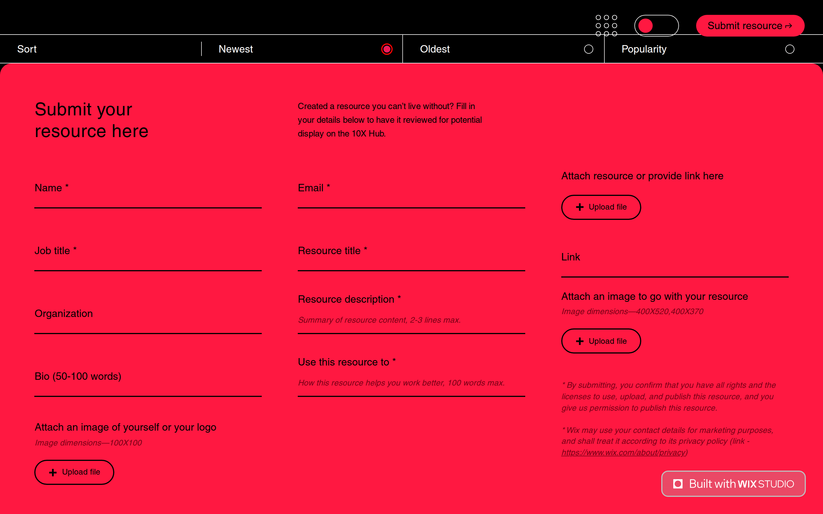
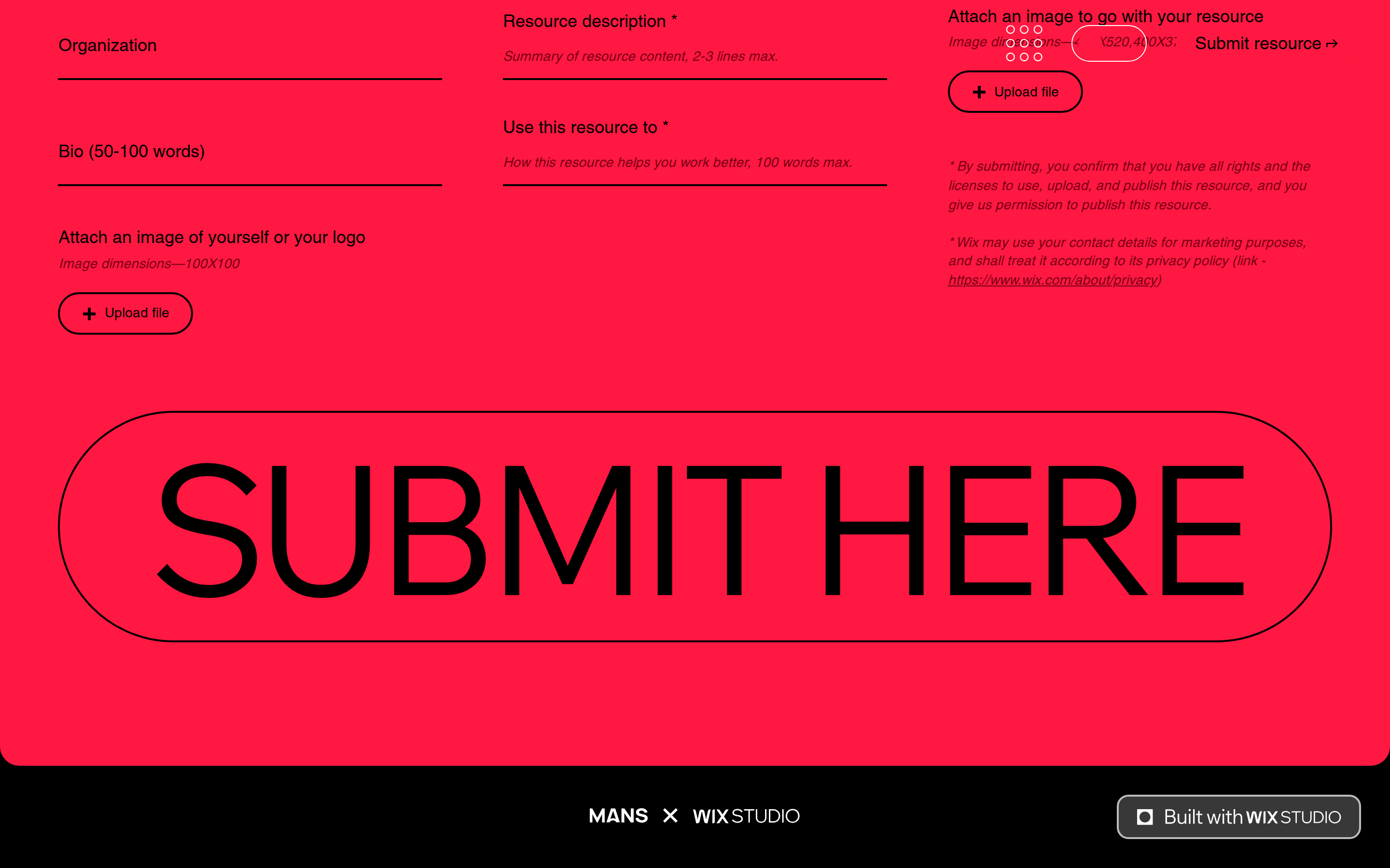
buttonPill-shaped primary action buttons with high-contrast colors and clean typography.
cardMinimalist cards focusing on content with clear typography and subtle borders.
chipRadio-style selection chips with distinct active and inactive states.
inputClean text inputs with rounded borders and smooth focus transitions.
heroFull-screen, immersive hero section dominated by a massive typographic statement.
09
Voice & Don'ts
ToneDirect, confident, and professional, speaking to a design-savvy audience.
HeadlinesBold, massive, and typographically expressive, often using tight spacing.
CTAsClear, action-oriented, and visually prominent, guiding the user to the next step.
Don't use a wide variety of font weights — screenshot shows exclusively weight 400.
Don't use multiple accent colors — screenshot shows only a single red accent (#FF1841).
Don't use soft or muted background colors — screenshot shows a stark, pure black background.
Don't use tight, dense spacing — screenshot shows generous whitespace and large typographic scale.
Don't use complex, decorative UI elements — screenshot shows clean, minimalist components.
Don't use heavy drop shadows or 3D effects — screenshot shows flat, high-contrast surfaces.
Avoid: Avoid overly decorative fonts or excessive color palettes.
Avoid: Avoid dense paragraphs; use generous spacing and clear hierarchy.
Avoid: Avoid complex animations that distract from the core content.
Captured from the live site · real computed styles
11
System prompt
A high-contrast, typography-driven resource hub for designers. Key features include a stark black background (#000000), pure white text (#FFFFFF), and a single vibrant red accent (#FF1841). The design relies heavily on grotesque-sans typography with massive display sizes (up to 300px) and extremely tight letter-spacing (-12px). Critical constraints: maintain a strict 400 font-weight throughout, avoid multiple accent colors, and preserve generous whitespace to highlight the bold typographic elements. Ensure components remain minimalist, using only a single red accent for primary actions and state indicators.
Bring this taste to your agent
Hand your AI agent a machine-readable spec of this design — tokens, type, motion, the whole DNA.