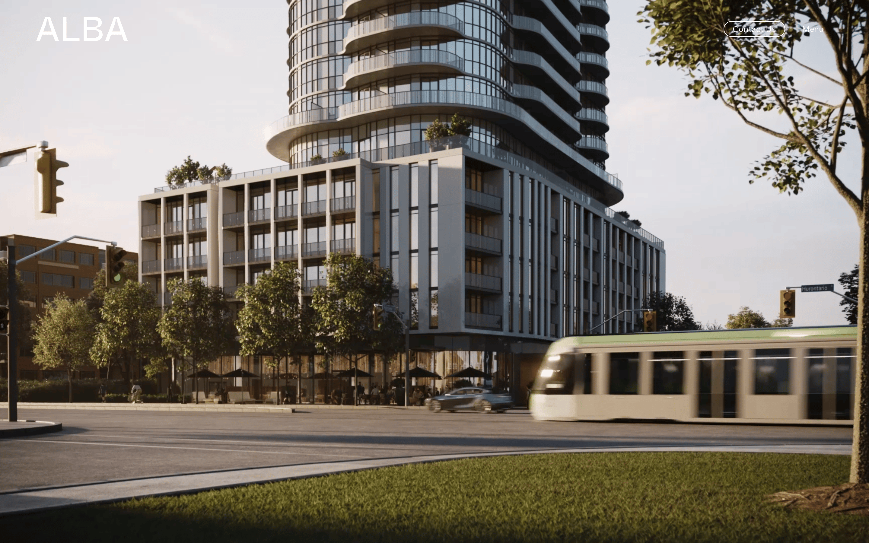
High-end real estate developer showcasing premium urban living spaces.
02
Color
#000000Ink
#F5F4F3BG
#737373Muted
rgb(115, 115, 115)Line
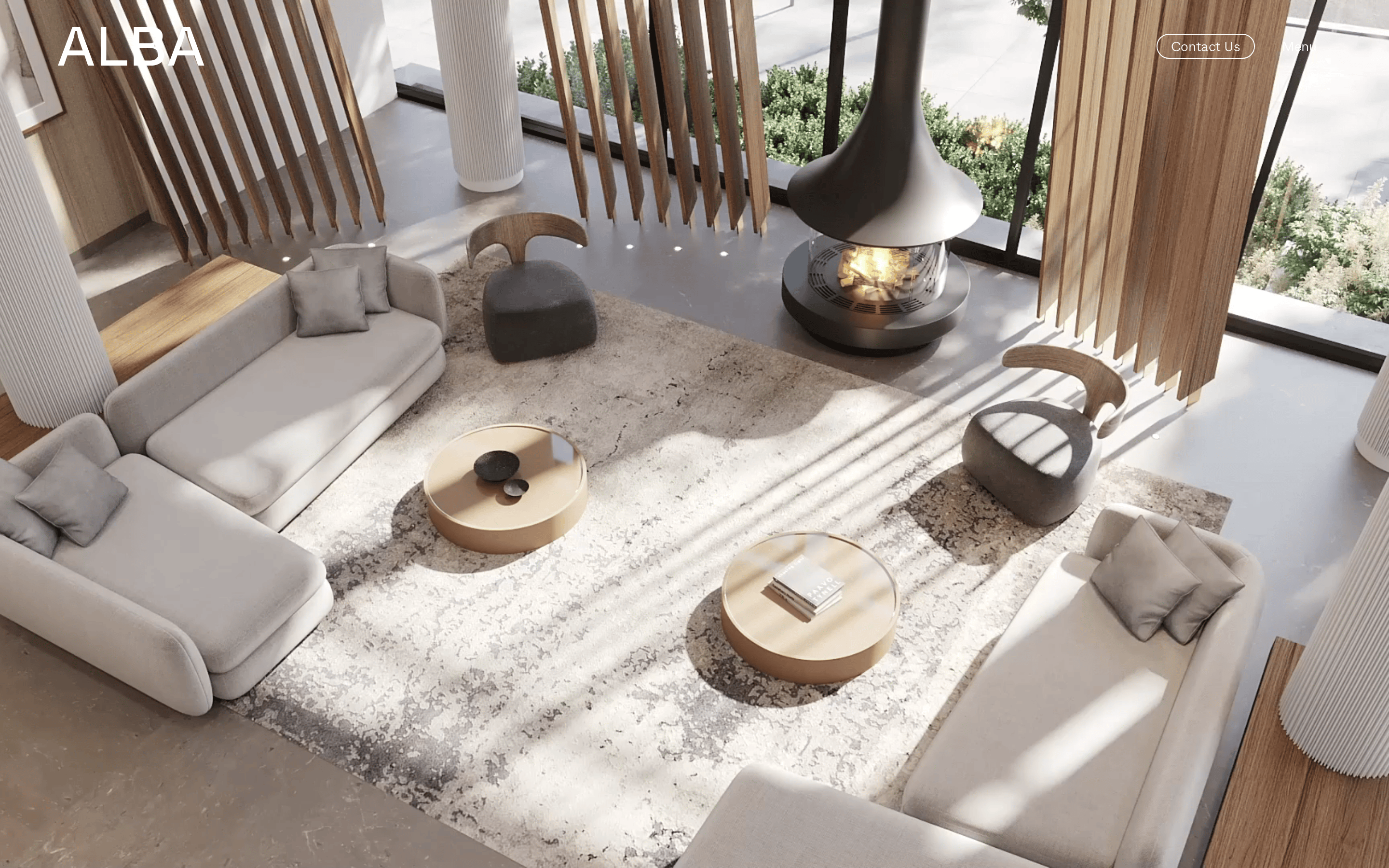
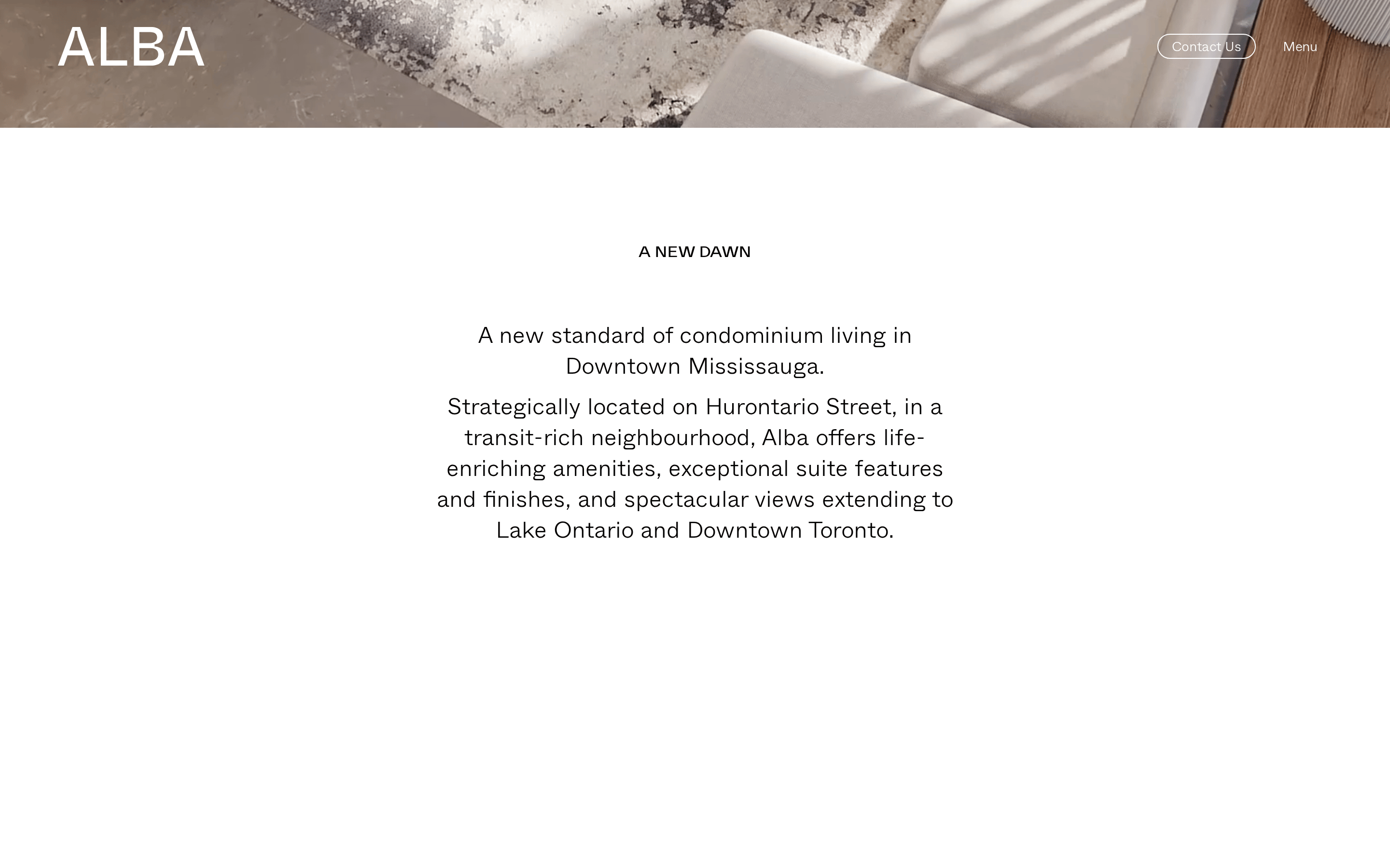
Monochromatic palette with deep warm undertones, relying entirely on large-scale photography for visual interest.
03
Typography
geometric-sans · humanist-sans
display95px · 500
headline40px · 300
body16px · 300
Primary typeface is a geometric sans (Montserrat family) with a dominant weight of 300 · Accented by a secondary display sans for branding elements · Uppercase transformation is applied extensively for navigation and feature tags · Generous tracking is applied to large numerical displays for a spacious feel
04
Spacing
4px
8px
16px
24px
32px
48px
64px
96px
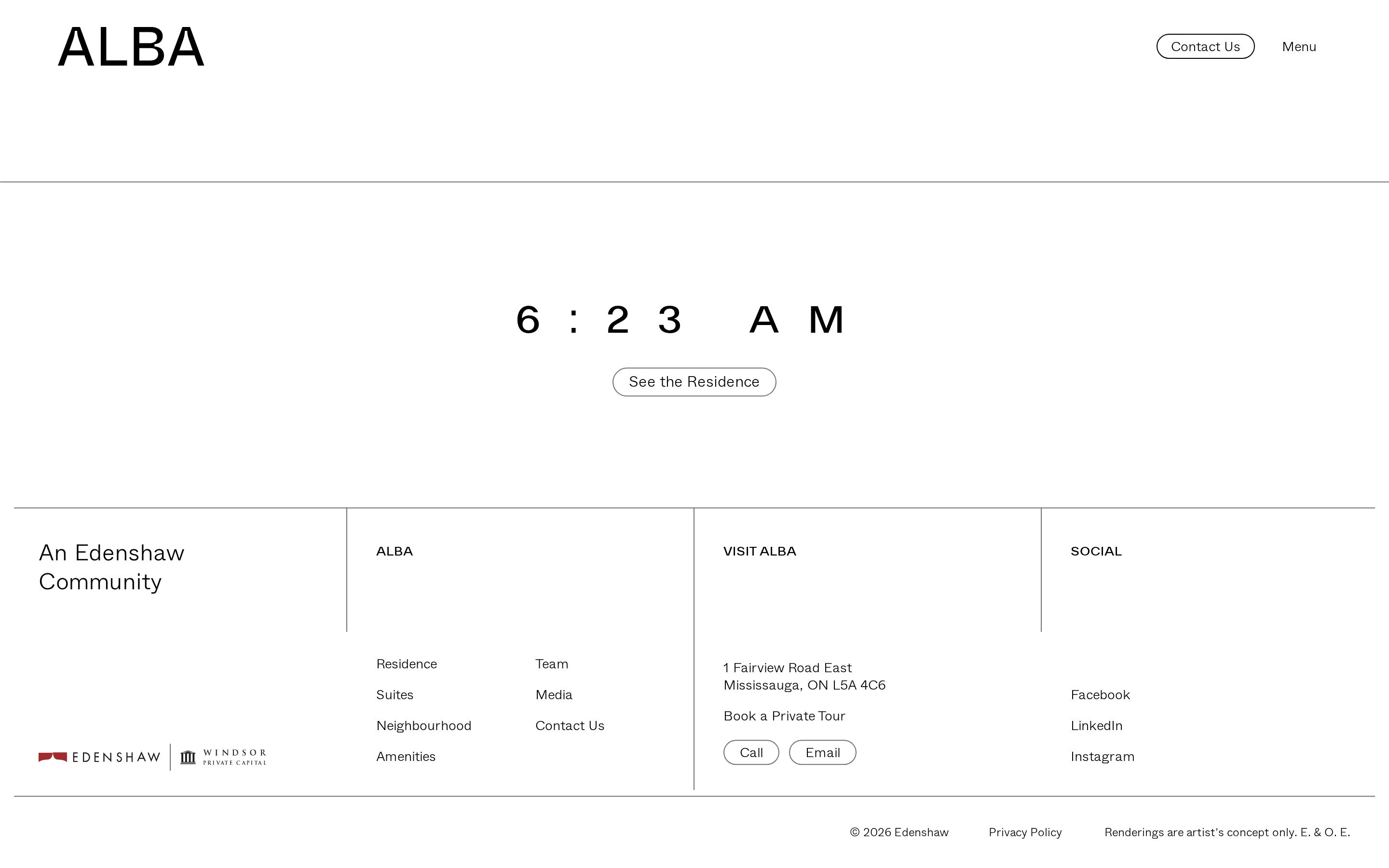
Vertical rhythm is established by extremely generous padding blocks of 115px, creating a calm, breathable layout.
05
Surfaces
sm · 4px
md · 8px
lg · 22px
pill · 999px
1px solid borders are used for pill-shaped buttons and small tag components.
06
Layout
1280container
12columns
24pxgutter
768 / 1024breakpoints
Asymmetric, masonry-style grid that breaks standard column alignment to create an editorial, magazine-like flow.
07
Motion & Interaction
400msmicro
600mssmall
1000msmedium
cubic-bezier(0.76, 0, 0.24, 1)easing
Clip-path transitions are heavily utilized for dramatic, cinematic reveal effects on imagery. · Fade-in and fade-out patterns with durations ranging from 0.4s to 1.5s for smooth page transitions.
Opacity and background color changes with a smooth 0.4s ease-out transition. · Immediate cursor pointer response with delayed transform transitions.
08
Components
buttonPill-shaped outline buttons with uppercase text and generous horizontal padding.
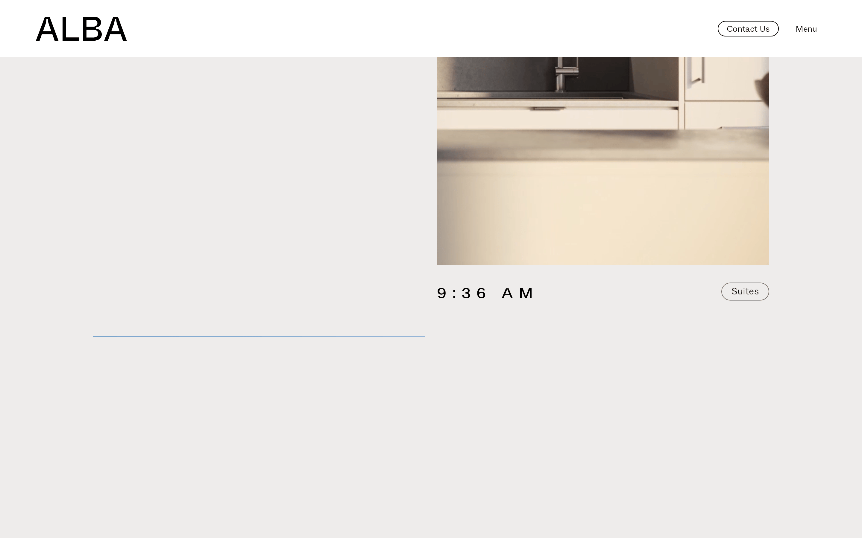
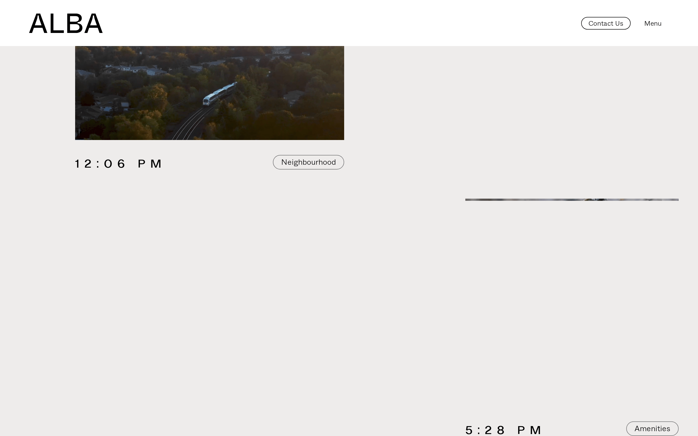
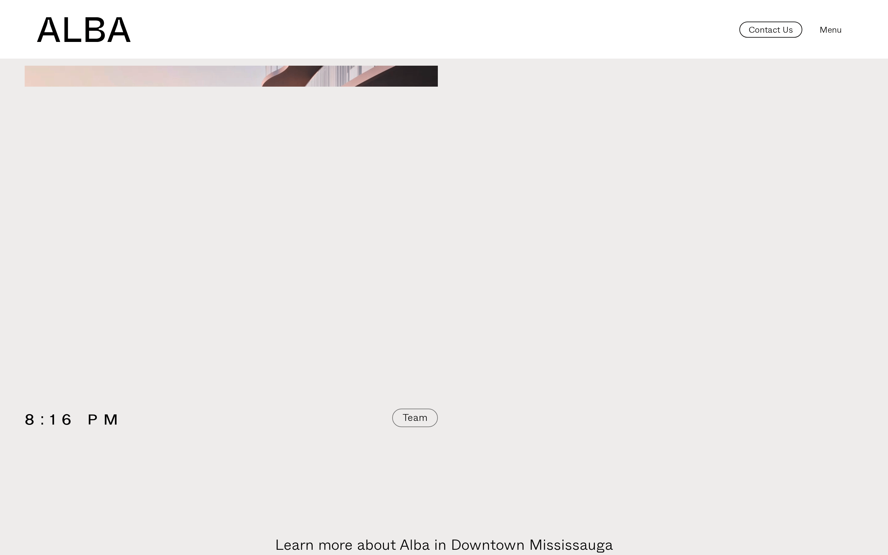
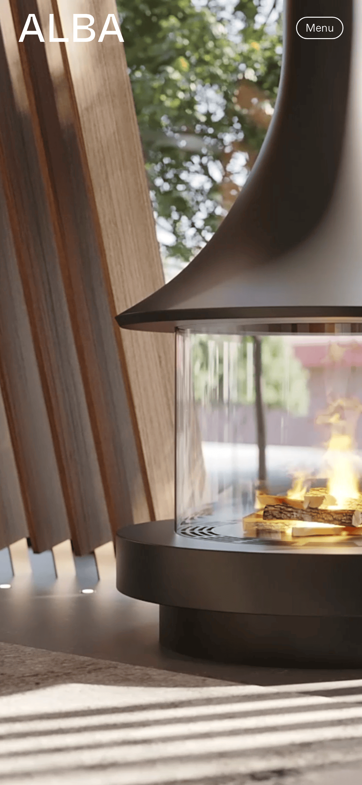
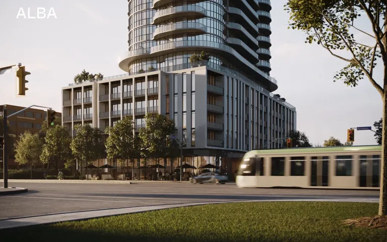
cardMinimalist cards defined primarily by large, high-resolution photographic content rather than heavy borders or shadows.
chipSmall pill-shaped tags with thin 1px borders and uppercase text for categorical labels.
inputMinimalist form fields that blend seamlessly into the light background.
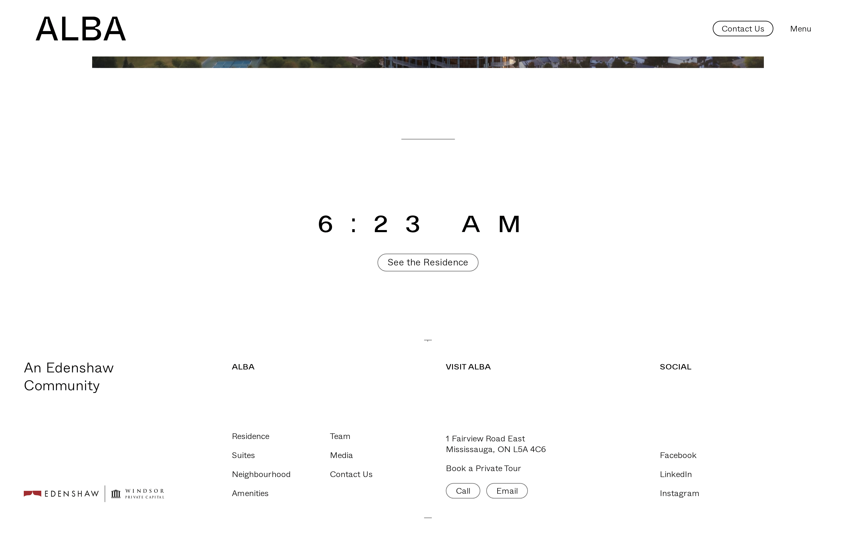
heroFull-viewport cinematic imagery that serves as the primary focal point, with absolute-positioned typography.
09
Voice & Don'ts
ToneSophisticated, confident, and tranquil.
HeadlinesMinimalist, often utilizing large numerical displays (timestamps) instead of traditional text headers.
CTAsUnderstated pill-shaped buttons with uppercase tracking.
don't use bright, saturated accent colors — screenshot shows a strict monochromatic palette dominated by photography.
don't use heavy drop shadows on cards — screenshot shows flat, borderless elements defined only by imagery.
don't use dense, cluttered layouts — screenshot shows massive whitespace (115px vertical padding) and breathable spacing.
don't use heavily stylized or decorative serif fonts for display — screenshot shows a strict geometric sans-serif for all typography.
don't use complex, multi-step border-radius for UI components — screenshot shows strict pill-shaped (fully rounded) buttons.
don't use busy, complex backgrounds — screenshot shows solid off-white backgrounds (#F5F4F3) for all text-heavy sections.
Avoid: Don't use bright, saturated colors or jarring gradients.
Avoid: Don't rely on heavy drop shadows or complex drop-shadow borders.
Avoid: Don't use cluttered grids with multiple small elements; prioritize large photographic areas.
Avoid: Don't use decorative or heavily stylized serif fonts.
Avoid: Don't use dense, small text; maintain generous whitespace between all elements.
Avoid: Don't use rounded rectangles with small corner radii; stick to strict pills or sharp corners.
Captured from the live site · real computed styles
11
System prompt
You are designing for a premium urban residential developer named 'ALBA'. The visual language is defined by expansive, cinematic photography paired with generous whitespace and a strict monochromatic palette. The primary background is a warm off-white (#F5F4F3) with solid black text (#000000). Typography relies heavily on a light-weight (300) geometric sans-serif for a refined, airy feel. UI elements, particularly buttons and tags, are strictly pill-shaped with thin 1px outlines and uppercase tracking. Complex clip-path animations are used for imagery reveals. Key constraints: Avoid any bright accent colors, drop shadows, or cluttered multi-column grids. Always prioritize large photographic areas and extreme vertical spacing (115px padding) to maintain a sense of luxury and calm. Never use decorative or heavy display fonts.
Bring this taste to your agent
Hand your AI agent a machine-readable spec of this design — tokens, type, motion, the whole DNA.