A minimalist architectural blueprint for a creative studio
02
Color
#CACACAInk
#727272Ink soft
#000000BG
#111111BG soft
rgba(202,202,202,0.2)Line
Strict monochrome with high-contrast typography on dark grounds
03
Typography
geometric-sans
display75px · 400
heading18px · 400
Tight letter-spacing for display text to enhance impact · Consistent 400 weight throughout for a refined, uniform look · Left-aligned typography creates a strong vertical axis
04
Spacing
4px
8px
16px
24px
32px
48px
64px
96px
Asymmetric padding with large bottom offsets to create full-viewport sections
05
Surfaces
sm · 0px
md · 0px
lg · 0px
pill · 0px
No visible borders; boundaries defined by color blocks and large imagery
06
Layout
1440container
12columns
24pxgutter
768 / 1024breakpoints
Full-bleed sections alternating between dark backgrounds with text and large-scale project imagery
07
Motion & Interaction
250msmicro
500mssmall
800msmedium
cubic-bezier(0.25, 0.1, 0.25, 1)easing
Smooth opacity transitions for text and navigation elements · Sequential appearance of page sections during scroll
Subtle color shifts on text links · Immediate visual response via opacity changes
08
Components
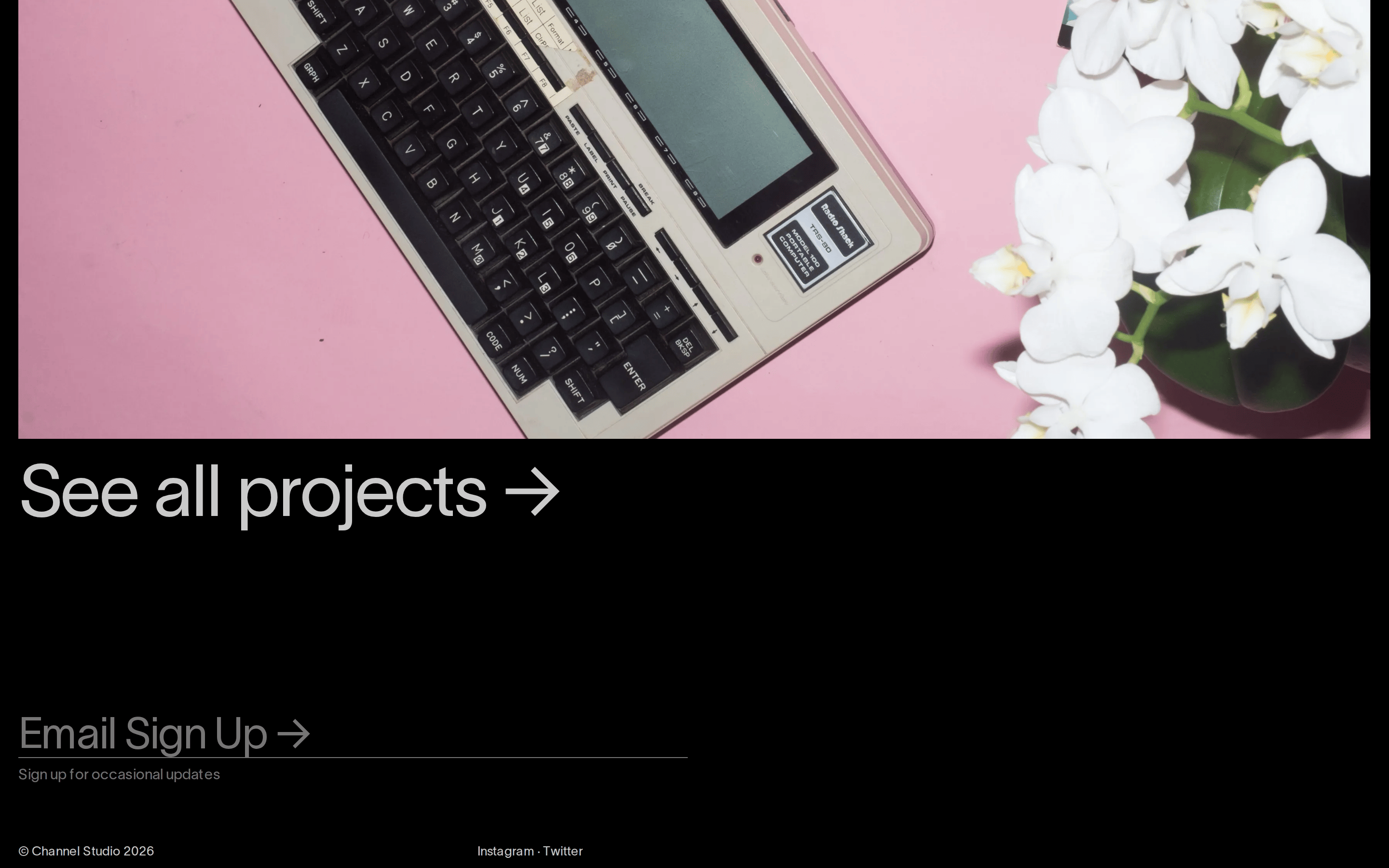
buttonMinimal text links with no background or border, sometimes accompanied by an arrow icon
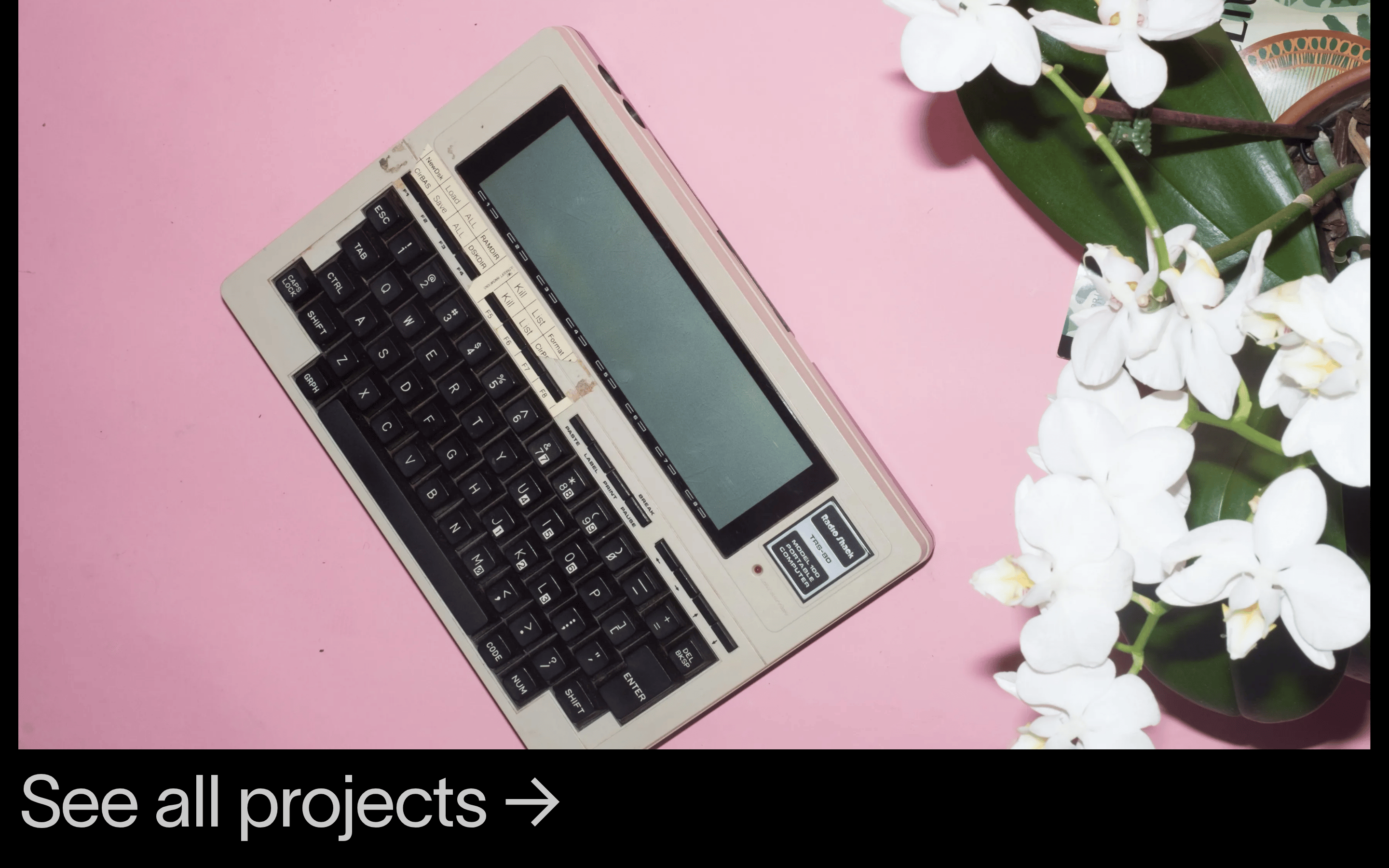
cardFull-bleed project cards consisting of a large title and a dominant background image
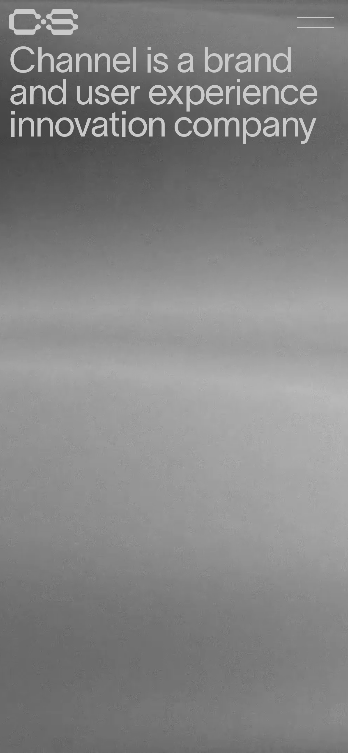
heroImmersive full-viewport section featuring a large, left-aligned statement over a textured dark background
09
Voice & Don'ts
ToneAuthoritative, direct, and sophisticated
HeadlinesDeclarative, high-impact statements using large-scale typography
CTAsUnderstated, functional text links that prioritize clarity over visual noise
don't use vibrant accent colors — screenshot shows a strict monochromatic palette with white and gray
don't use heavy borders or cards — screenshot shows full-bleed sections without visible containers
don't use multi-column grids for small text — screenshot shows generous whitespace and left-aligned blocks
don't use playful or rounded typography — screenshot shows a structured, geometric sans-serif
don't use cluttered navigation menus — screenshot shows a simple, vertically stacked text list
don't use drop shadows for depth — screenshot relies on large imagery and high-contrast text
Avoid: Avoid cluttered layouts or excessive UI elements
Avoid: Avoid decorative gradients or complex shadows
Captured from the live site · real computed styles
11
System prompt
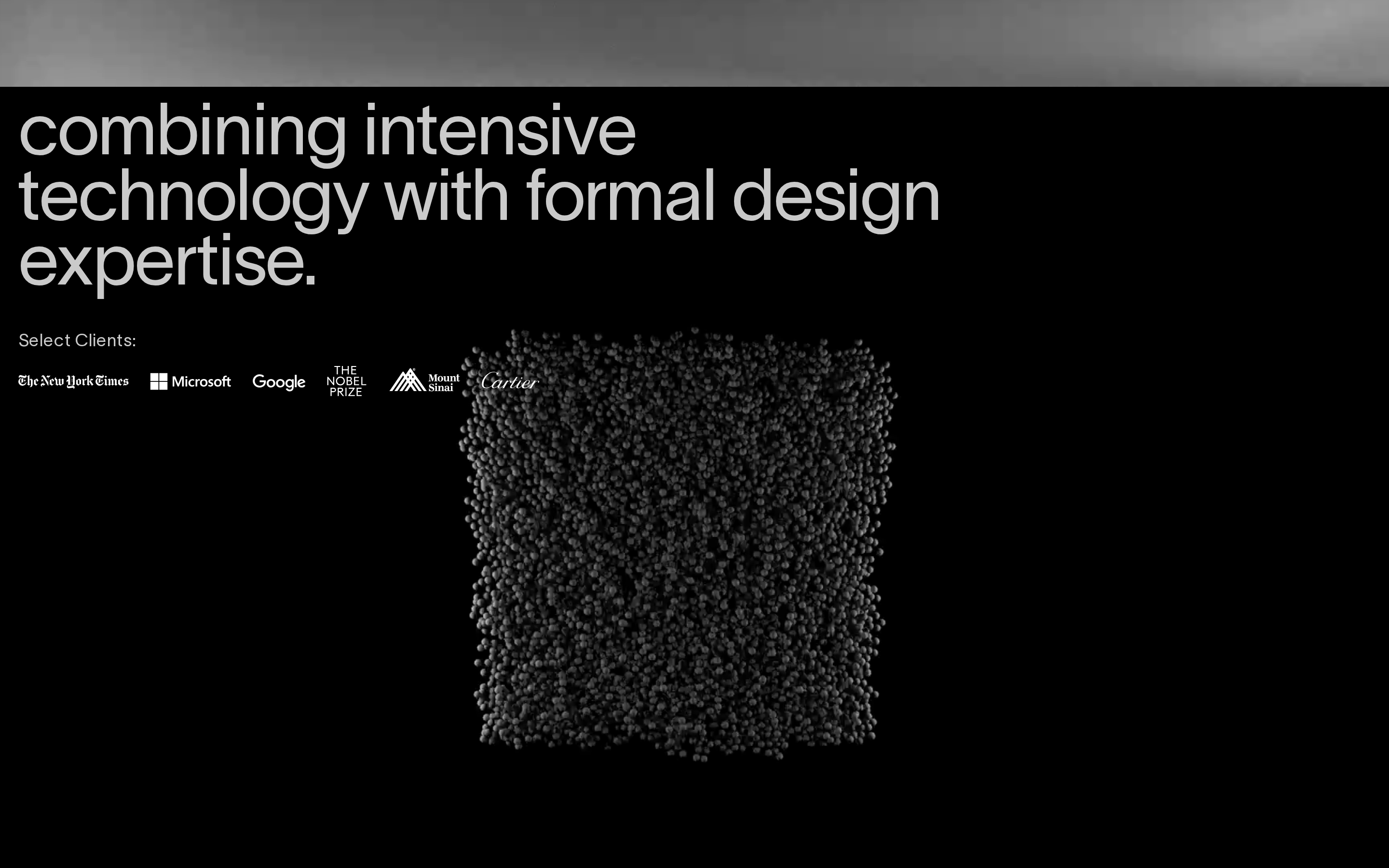
Channel Studio is a premium brand and user experience innovation agency. The visual language is defined by a strict monochromatic palette featuring a deep black background, crisp white text, and muted gray tones for secondary elements. Typography uses a clean geometric sans-serif category, presented in massive scales with tight tracking to create a bold, architectural feel. The layout is highly asymmetric, relying on full-bleed sections and oversized imagery to showcase project case studies. Critical constraints include avoiding any vibrant accent colors, removing decorative UI elements like cards or borders, and maintaining generous negative space. Transitions should be smooth and understated, focusing on opacity and subtle color shifts rather than flashy animations.
Bring this taste to your agent
Hand your AI agent a machine-readable spec of this design — tokens, type, motion, the whole DNA.