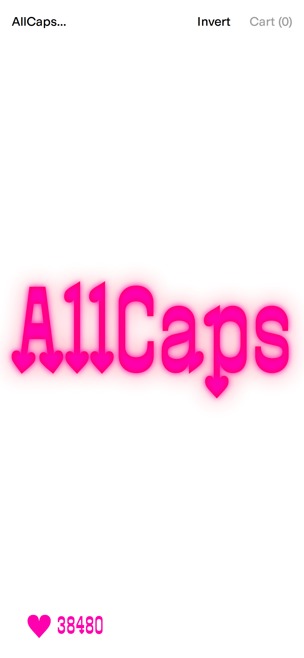
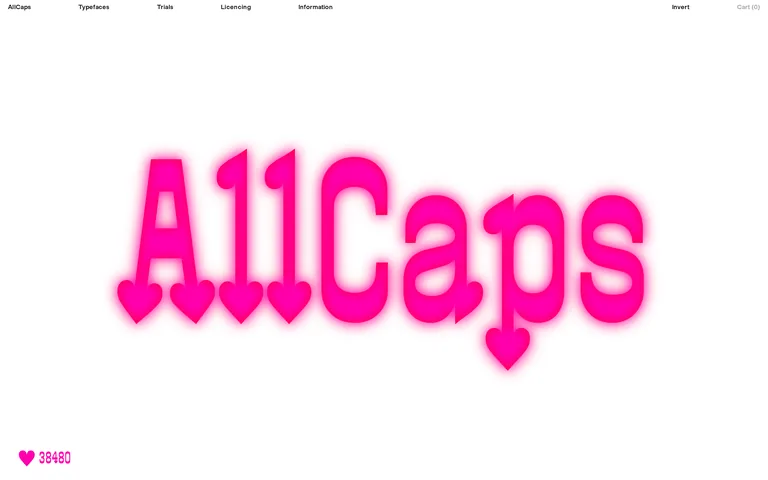
High-contrast monochrome with a single, intense neon-magenta accent.
03
Typography
grotesque-sans · monospaced
display432px · 500
heading32px · 400
body12px · 400
Use wide tracking for UI text to maintain a refined, airy feel. · Keep font weights strictly to 400 and 500 for a unified, modern look. · Allow display typography to be exceptionally large and expressive.
04
Spacing
4px
8px
16px
24px
32px
48px
64px
96px
Asymmetric with generous horizontal gaps.
05
Surfaces
sm · 3px
md · 4px
lg · 16px
pill · 999px
None; relies on spacing and color for separation.
06
Layout
1440container
12columns
18pxgutter
768 / 1024breakpoints
Full-width hero section followed by a grid of type specimens.
07
Motion & Interaction
100msmicro
300mssmall
600msmedium
cubic-bezier(0.25, 0.1, 0.25, 1)easing
Smooth opacity and transform transitions for interactive elements. · Subtle scale or color shifts on hover.
Subtle color shift or opacity change. · Immediate visual feedback.
08
Components
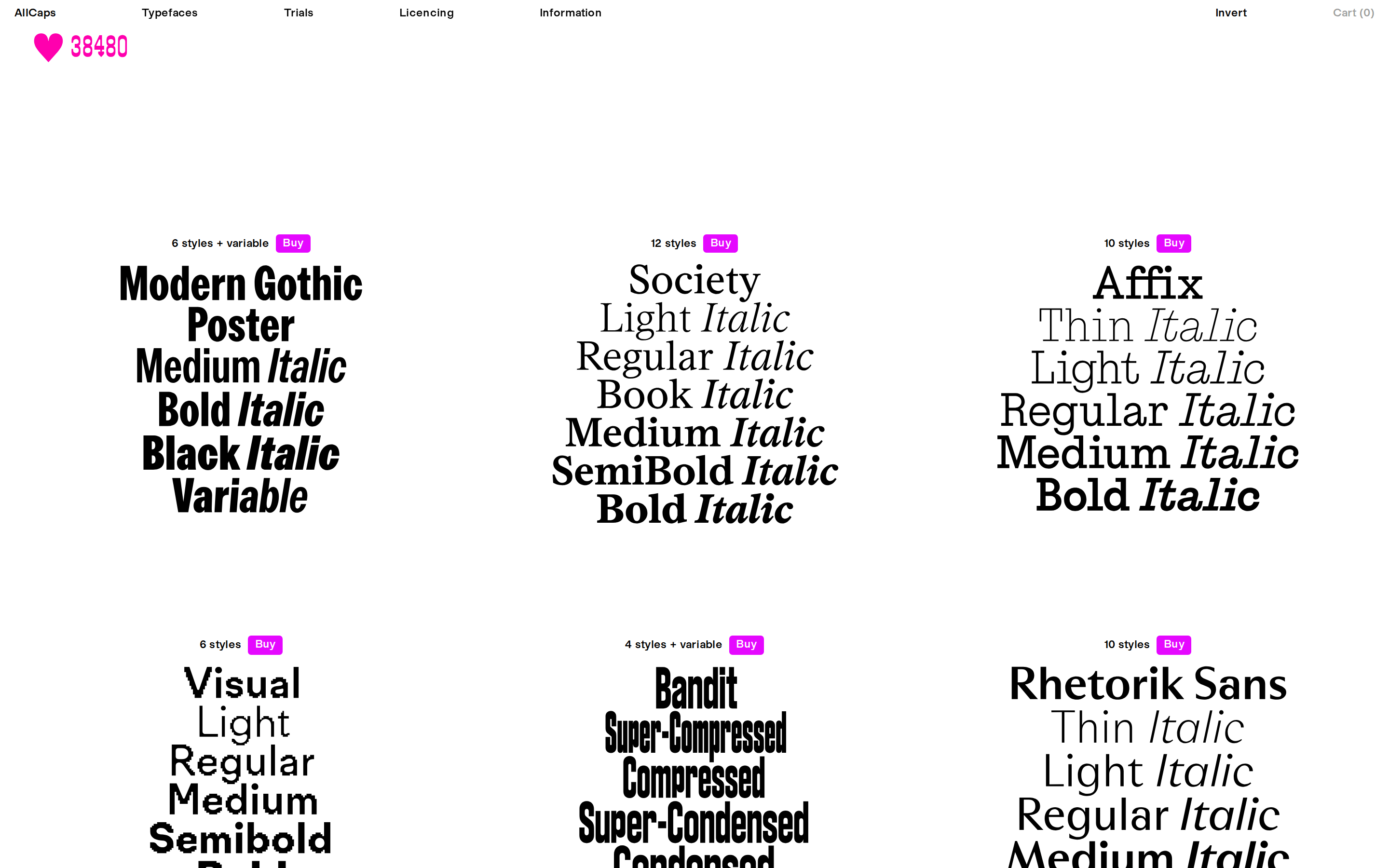
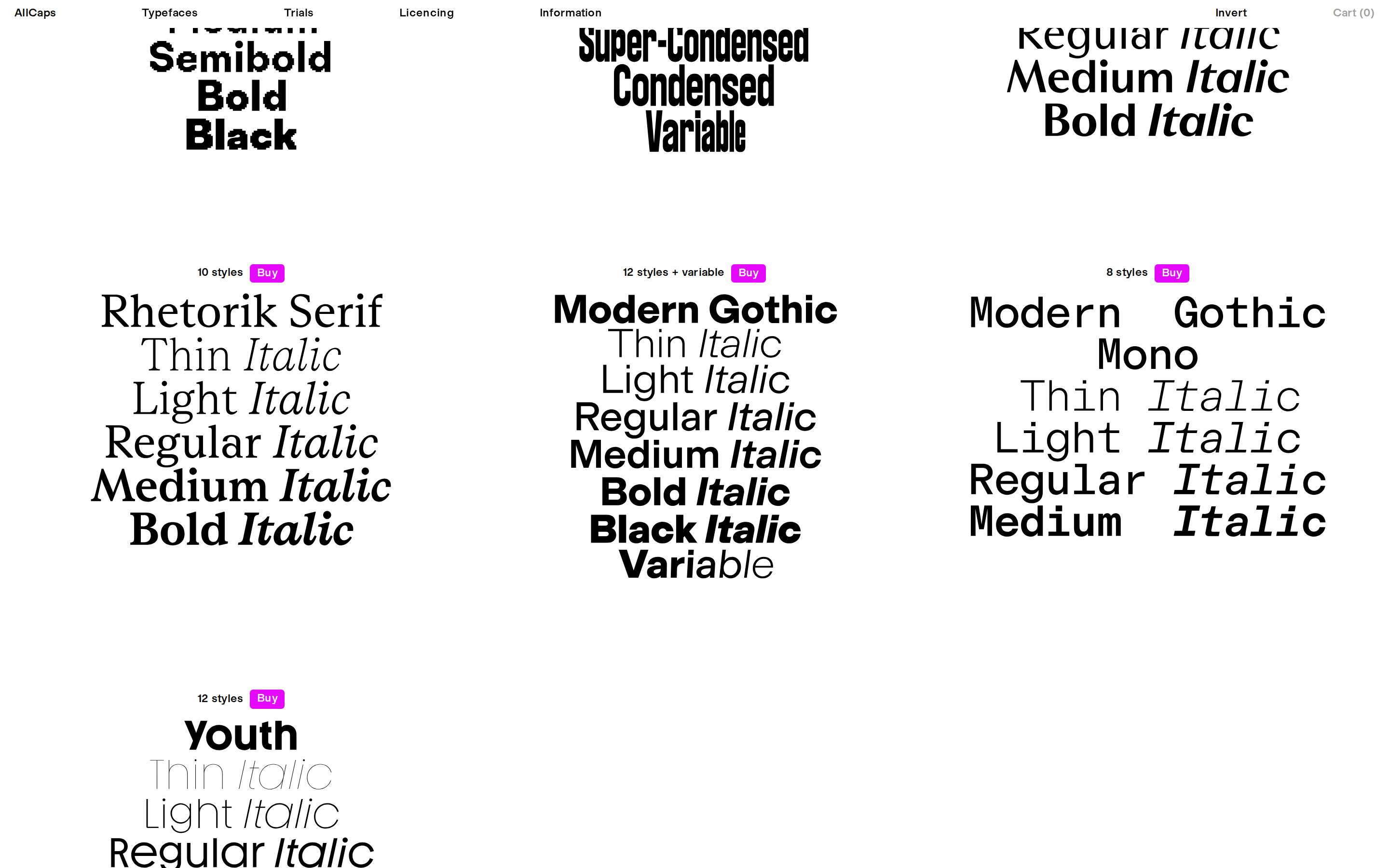
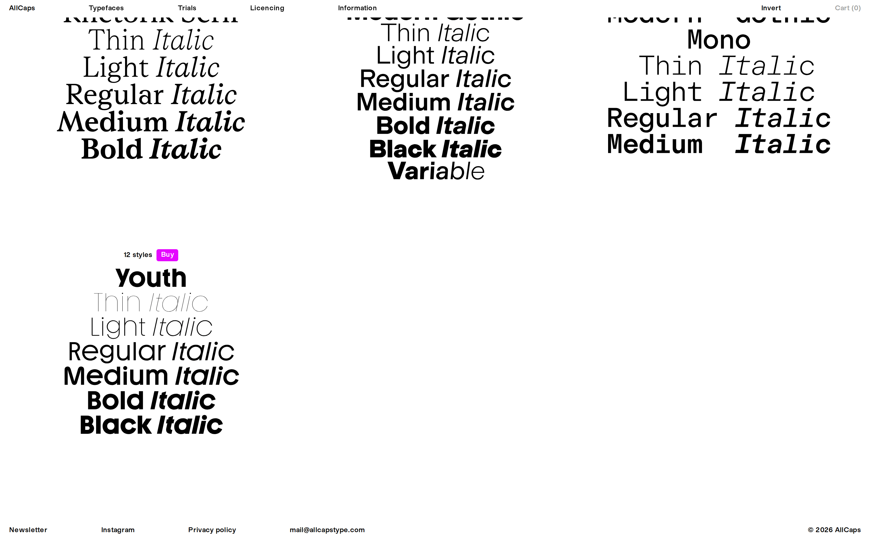
buttonHigh-contrast pill-shaped buttons with neon-magenta backgrounds.
cardMinimalist cards presenting type specimens with a focus on typography.
chipSmall, clean tags for style counts and metadata.
inputMinimal, borderless input fields.
heroDominating display type with a soft, neon-magenta glow effect.
09
Voice & Don'ts
ToneProfessional, refined, and slightly playful.
HeadlinesBold, display-focused, often with a neon glow.
CTAsDirect and action-oriented (e.g., 'Buy').
Don't use a dark background as the primary surface — the screenshot shows a bright white canvas.
Don't apply the neon-magenta accent to large text blocks — it is reserved for small interactive elements and the hero glow.
Don't use rounded corners on most components — the screenshot shows mostly square or very slightly rounded elements.
Don't use drop shadows for depth — the design relies on flat surfaces and color contrast.
Don't use small, cramped typography — the design prioritizes large scale and generous whitespace.
Don't use complex multi-color gradients — the palette is strictly monochrome plus a single accent.
Avoid: Avoid overly casual or conversational language.
Avoid: Avoid cluttering the interface with unnecessary text.
Avoid: Avoid using multiple competing accent colors.
Captured from the live site · real computed styles
11
System prompt
This is a premium typography foundry website with a clean, high-contrast aesthetic. The primary palette consists of a pure white background (#FFFFFF) and solid black text (#000000), with a single, vibrant neon-magenta accent (#FF009E) used sparingly for interactive elements and the hero's glow effect. The typography features a mix of bold, expressive grotesque-sans display fonts and refined, tracked-out body text. The layout is spacious and grid-based, allowing the typography to breathe. Critical constraints: Do not use the neon-magenta for body text; avoid heavy drop shadows; keep corners mostly square; maintain a strictly monochrome-plus-one-accent palette; and ensure generous whitespace between elements.
Bring this taste to your agent
Hand your AI agent a machine-readable spec of this design — tokens, type, motion, the whole DNA.