← OpenDesign CURATED · OPEN · FREE
Exhibition Magazine
A minimalist, image-forward editorial platform for fashion and art.
Editorial Photographic Typography Curation Gallery
01
Identity DNA
editorial fashion high-end curated minimalist
A digital fashion exhibition space that feels like a high-end print magazine.
02
Color
#000000Ink
#A8A8A8BG
#999999Muted
rgba(0,0,0,0.1)Line
High-contrast black and white with a neutral gray backdrop to let photography dominate.
03
Typography
condensed-grotesque-sans · transitional-serif
display 90px · 500heading 36px · 500body 16px · 40004
Spacing
4px
8px
16px
24px
32px
48px
64px
96px
Vertical spacing is dictated by large image blocks and generous padding.
05
Surfaces
sm · 0px
md · 0px
lg · 0px
pill · 0px
Minimal to none, except for thin 1px borders on the newsletter input.
06
Layout
1280 container
4 columns
24px gutter
768 / 1024 breakpoints
A full-width image-heavy layout with a persistent top navigation bar.
07
Motion & Interaction
220ms micro
400ms small
800ms medium
cubic-bezier(0.19, 1, 0.22, 1) easing
Slow, elegant fades for content transitions and hero slides.
Subtle opacity or color change on navigation links. · Triggers page navigation or modal open/close.
08
Components
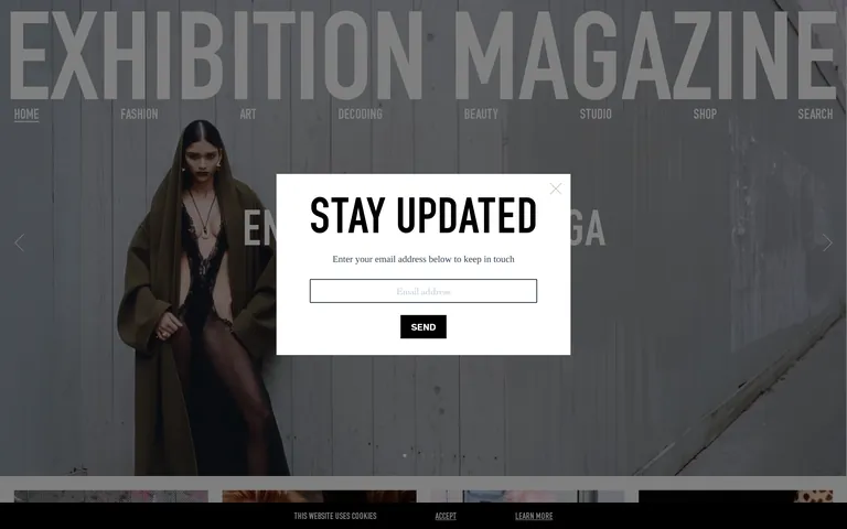
button Minimal, uppercase, often just text or a simple black background with white text. card A simple vertical stack of a large image followed by a bold serif title and a small description. input A simple single-line text field with a thin black border and centered placeholder text. hero A full-width, edge-to-edge photographic hero with large, semi-transparent masthead text overlaid. 09
Voice & Don'ts
Tone Authoritative, sophisticated, and understated. Headlines Bold, uppercase, and often in a condensed sans-serif. CTAs Minimal and direct, often just a single word in a bold, simple box. don't use decorative shadows — screenshot shows clean, flat image blocks without drop shadows don't use rounded corners — screenshot shows sharp, 90-degree corners on all cards and buttons don't use colorful accents — screenshot shows a strict black, white, and neutral gray palette don't use playful or rounded typography — screenshot shows sharp, high-contrast serif and condensed sans-serif fonts don't clutter the layout with many UI elements — screenshot shows a minimal interface dominated by large photography don't use complex gradients — screenshot shows solid neutral background colors and clear photographic images Avoid: Flashy animations Avoid: Decorative borders Avoid: Multiple accent colors 10
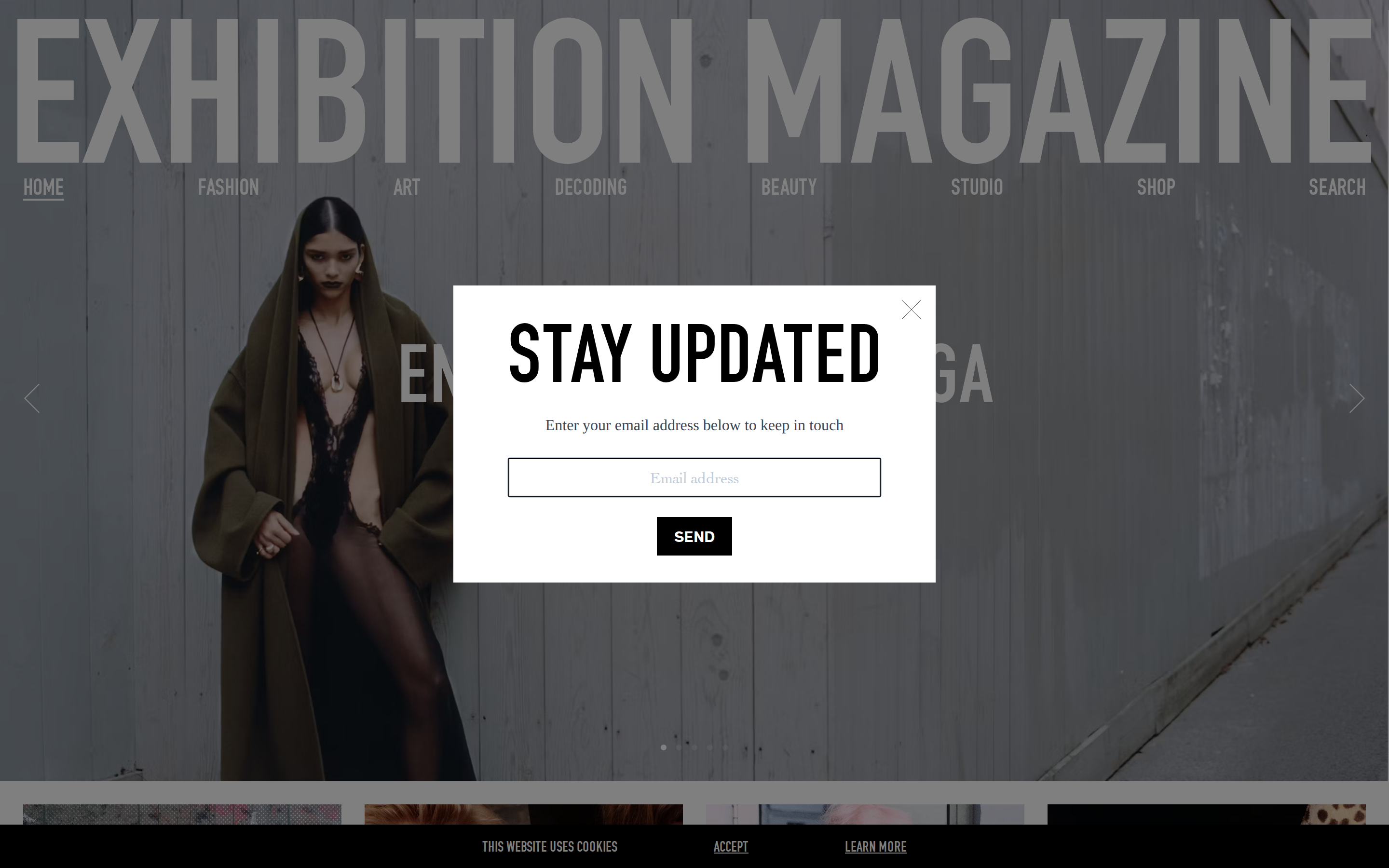
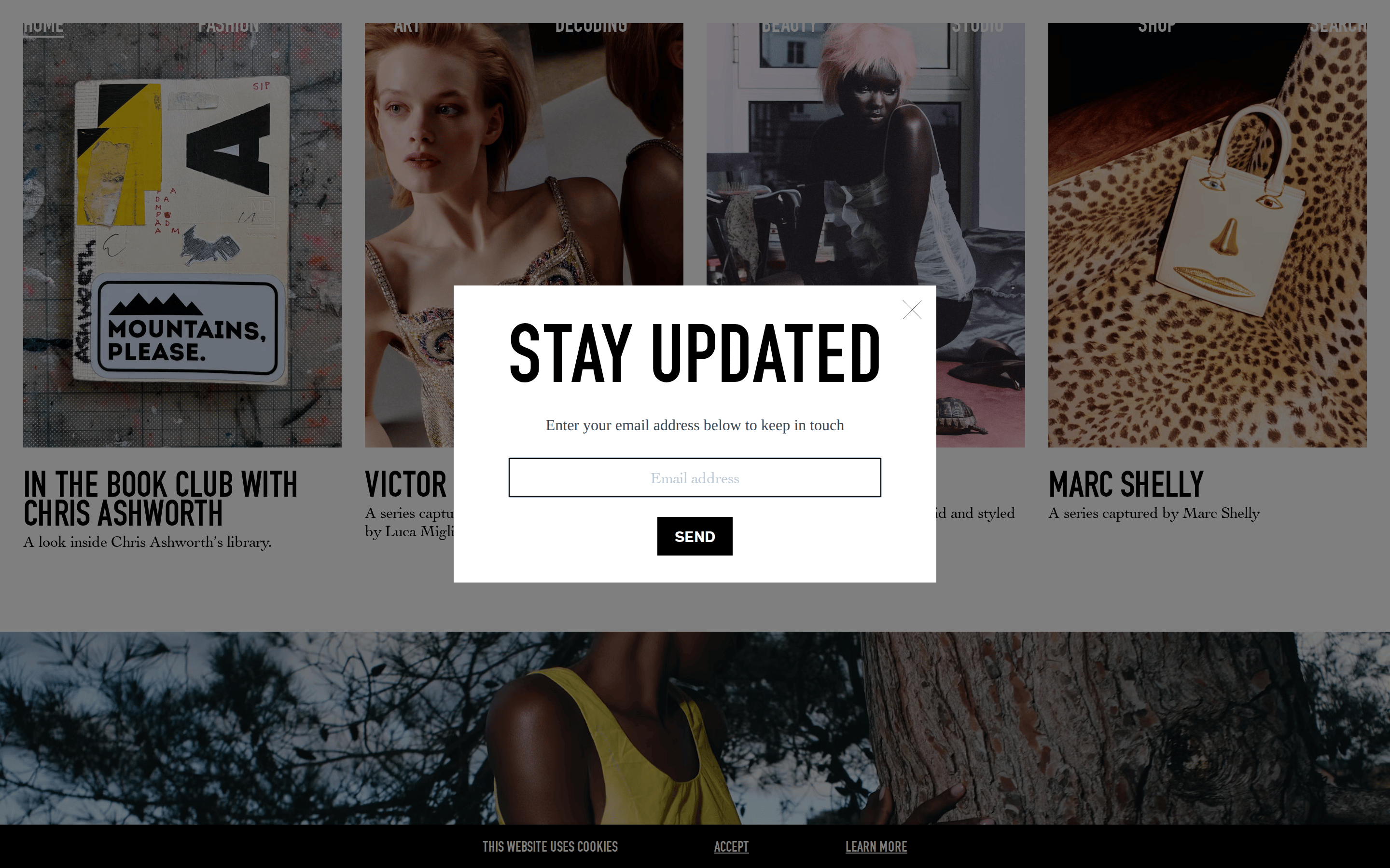
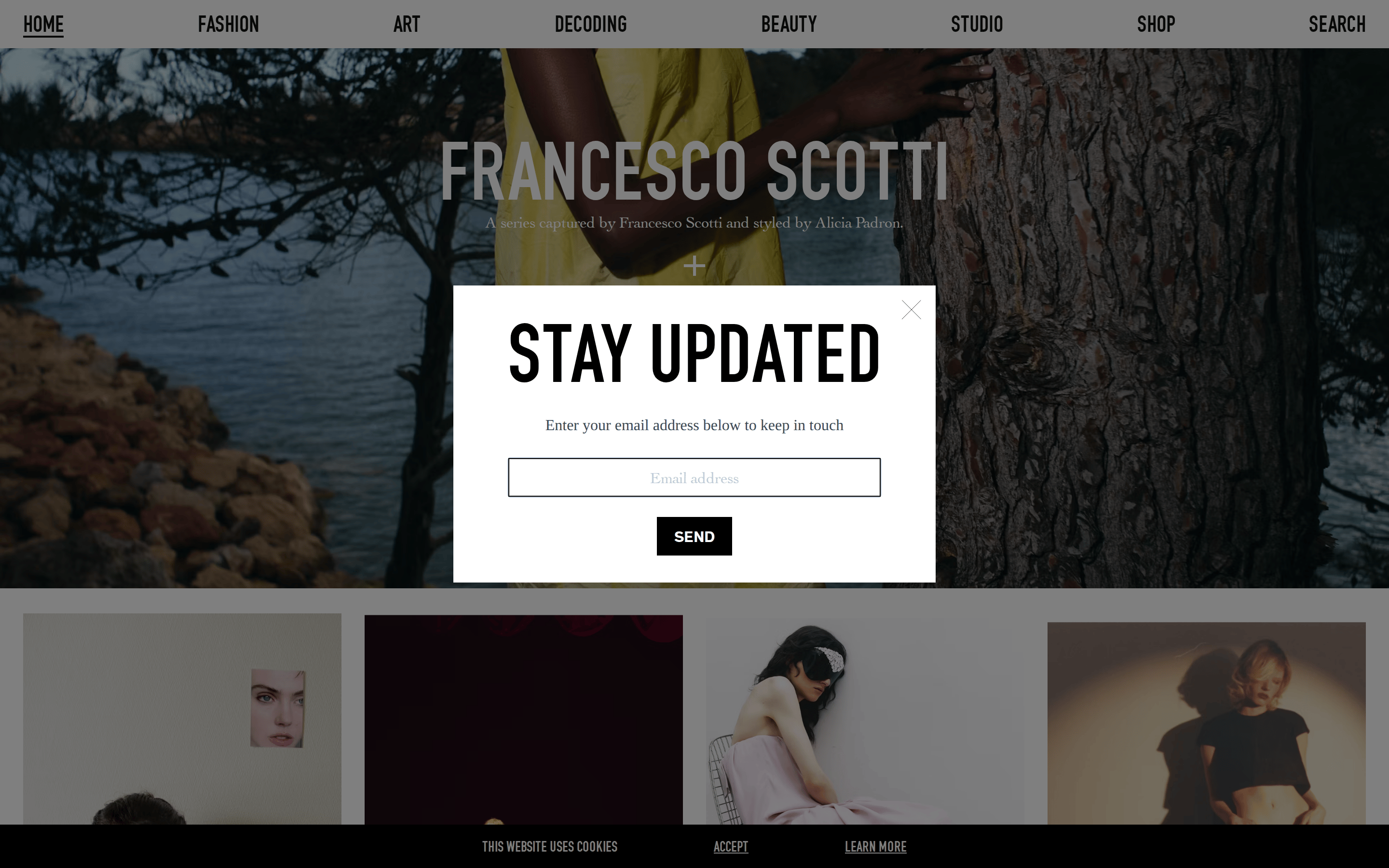
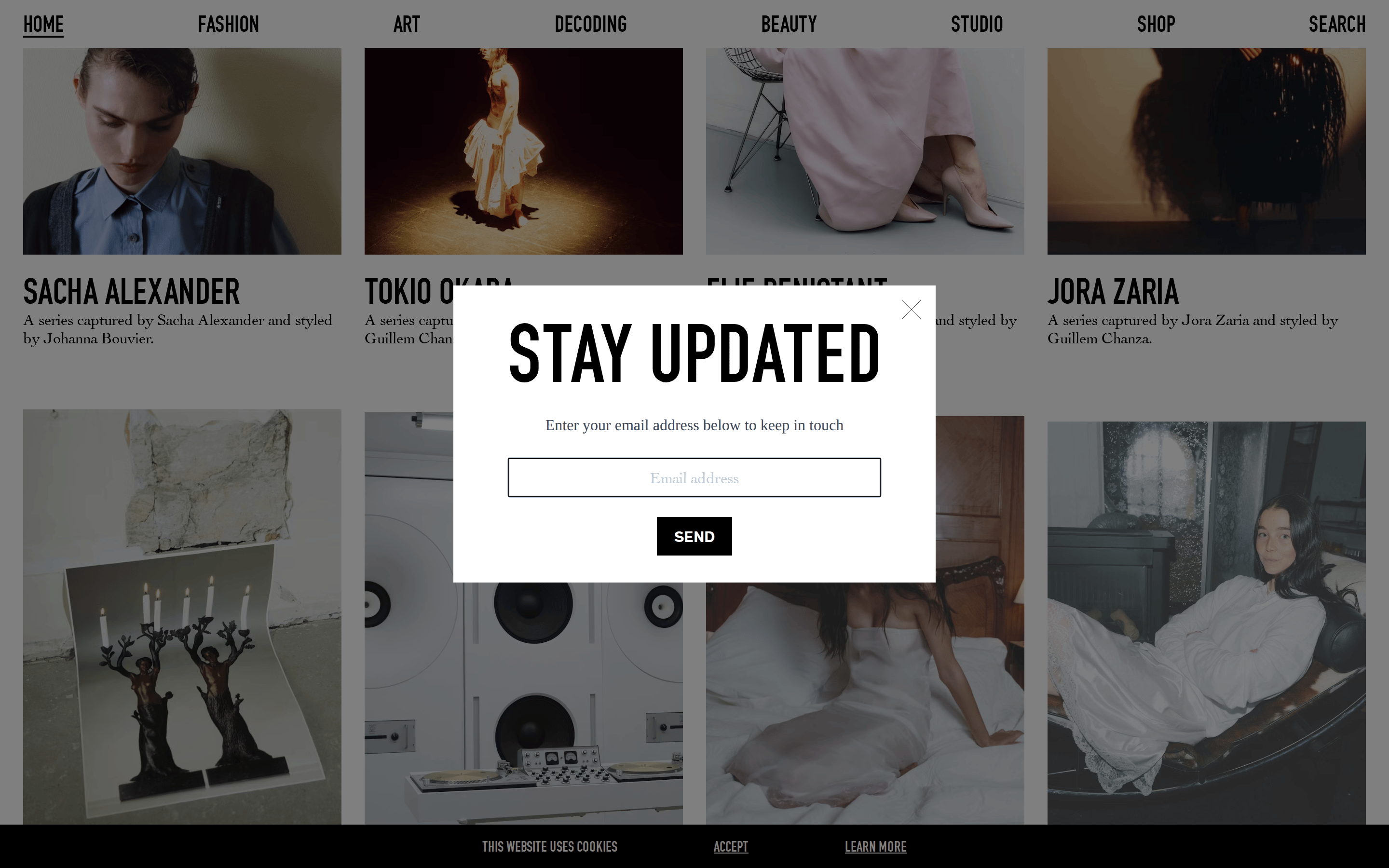
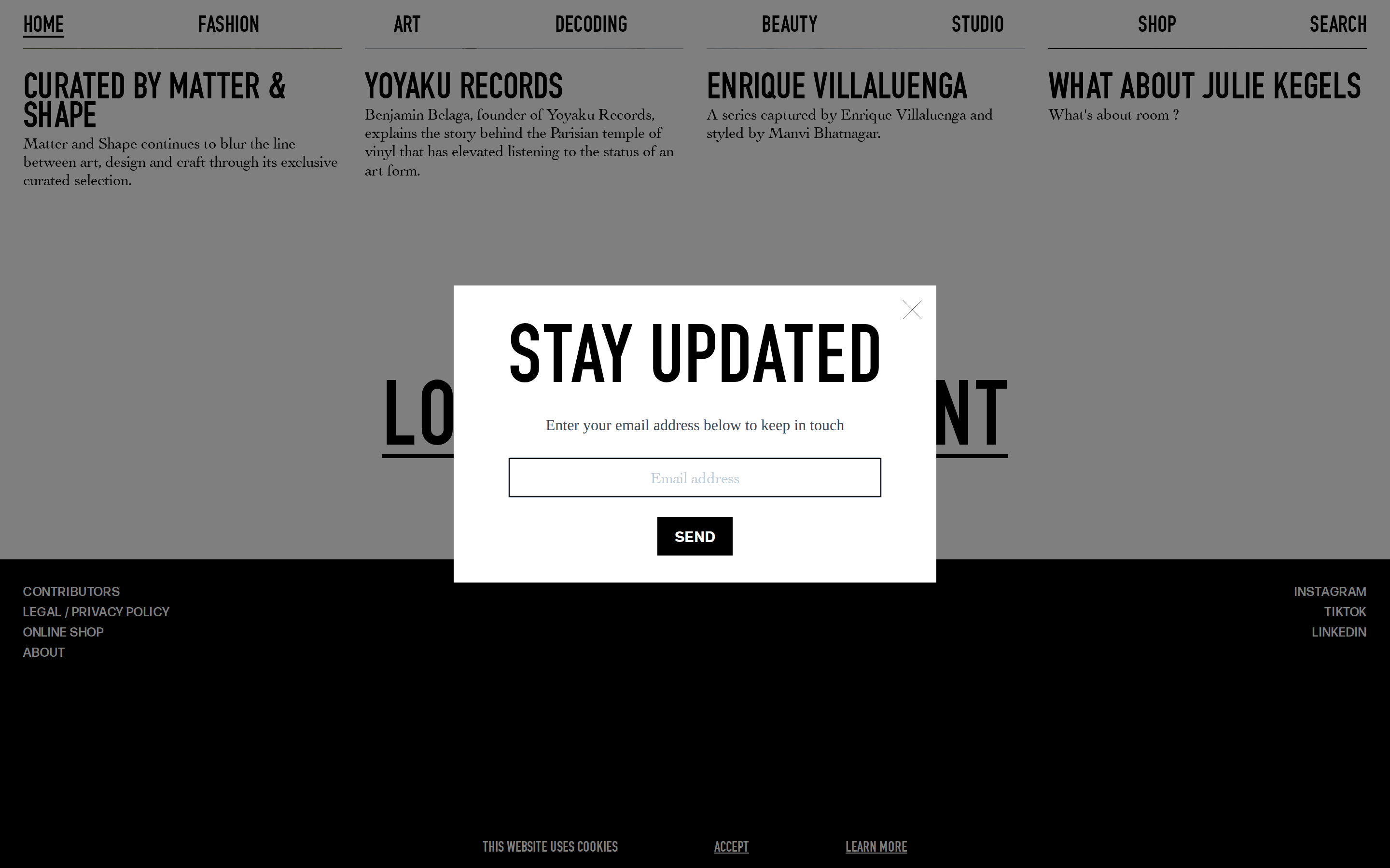
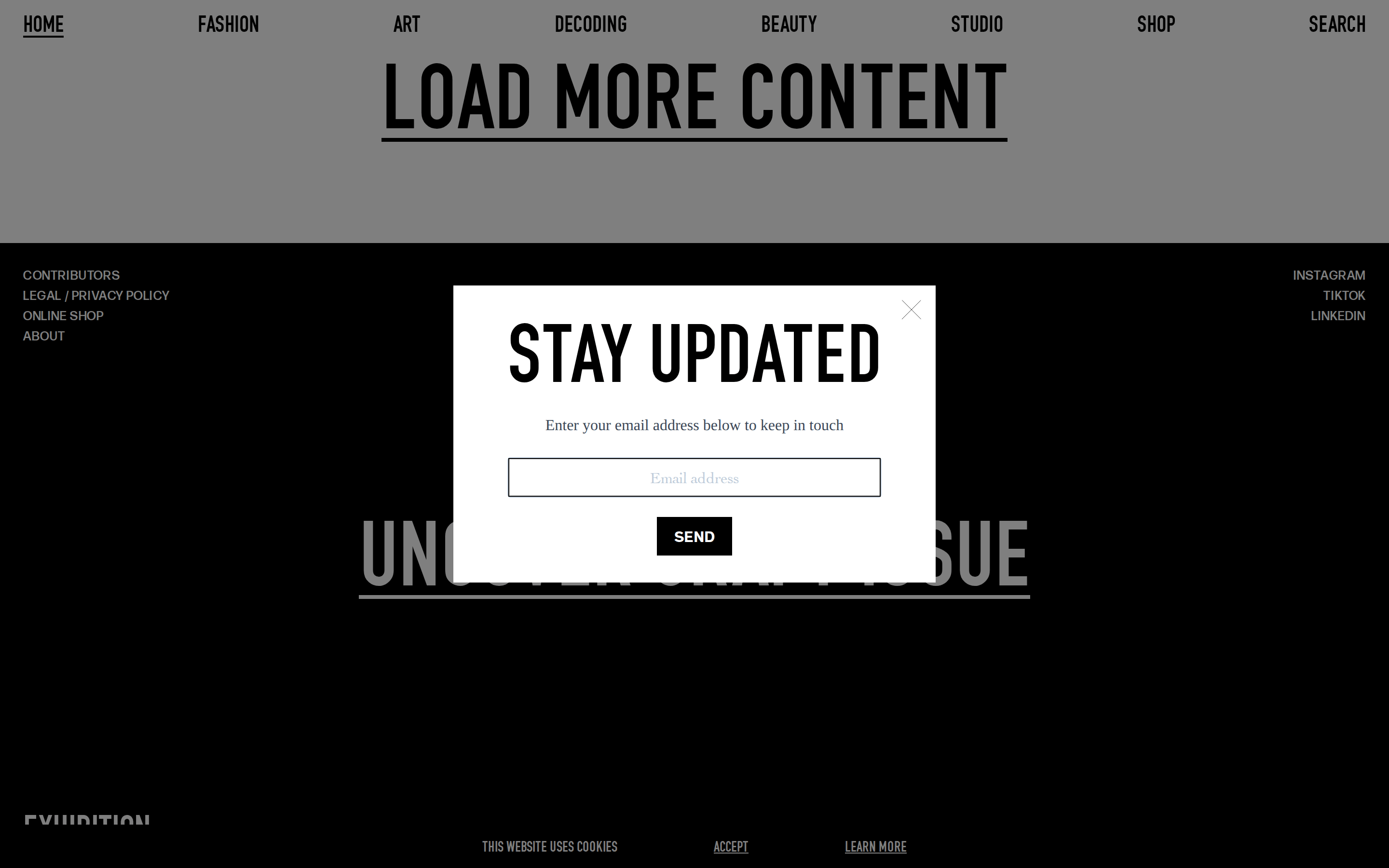
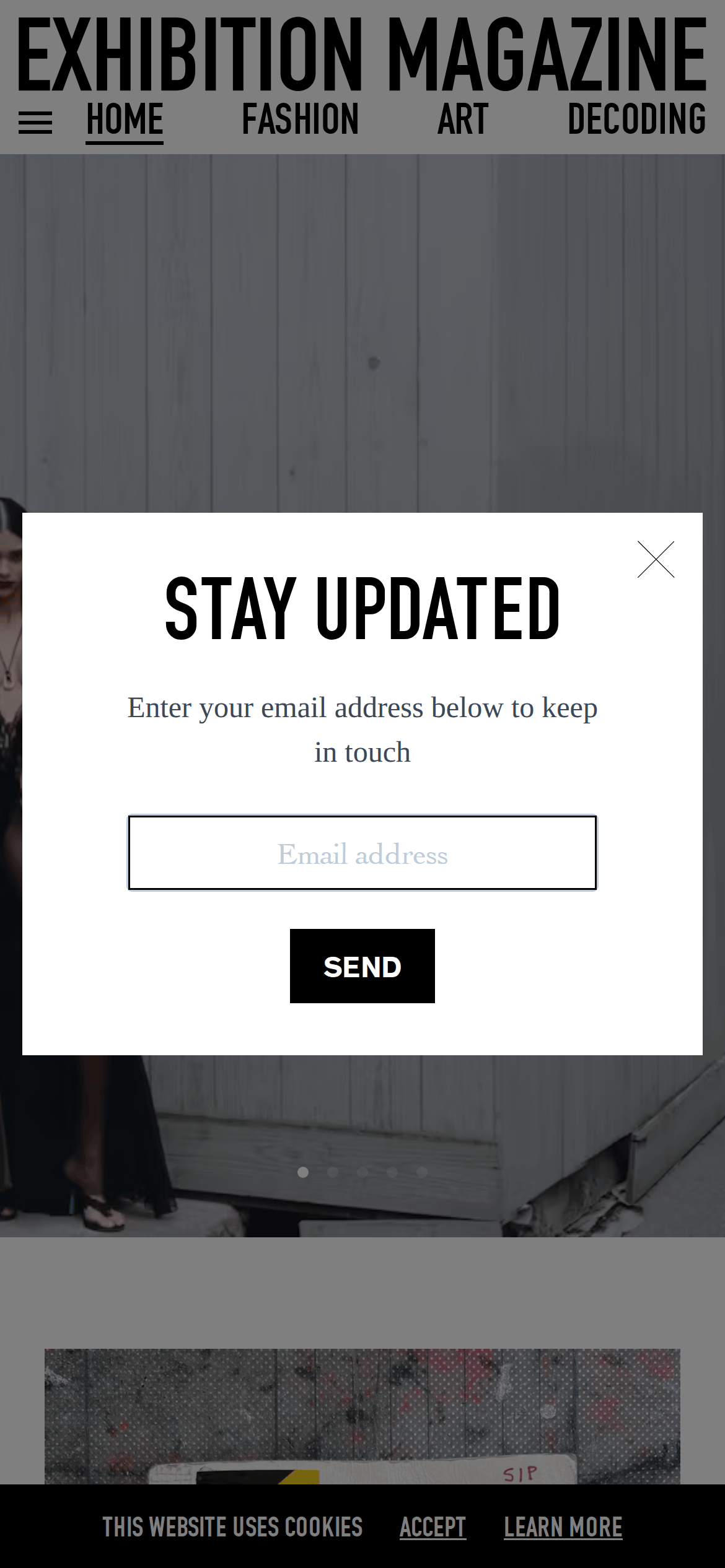
Inside the pack — real screenshots
桌面首屏(hero) 桌面滚动分段(90% viewport 步进,作为视觉证据) 桌面滚动分段(90% viewport 步进,作为视觉证据) 桌面滚动分段(90% viewport 步进,作为视觉证据) 桌面滚动分段(90% viewport 步进,作为视觉证据) 桌面滚动分段(90% viewport 步进,作为视觉证据) 桌面滚动分段(90% viewport 步进,作为视觉证据) 移动首屏 Captured from the live site · real computed styles
11
System prompt
Exhibition Magazine is a high-end digital editorial platform for fashion, art, and culture. Its design is strictly minimalist and image-forward, using a neutral gray background to let high-quality photography dominate. The typography is a sharp contrast between bold, condensed sans-serif headlines and elegant transitional serif body text. Key hex colors are #000000 (ink) and #A8A8A8 (bg). The layout is a clean, full-width grid with minimal UI interference. Critical constraints: never add rounded corners or decorative shadows; do not use multiple accent colors; avoid playful or decorative fonts to maintain the sophisticated, high-fashion aesthetic.
More from the library en · zh-CN · zh-TW · ja · ko
OpenDesign · curated web aesthetics for AI-readable design DNA · opendesign.cc
Why we curated this: This site is an excellent example of how extreme restraint and high-quality typography can create a premium, high-fashion editorial feel.