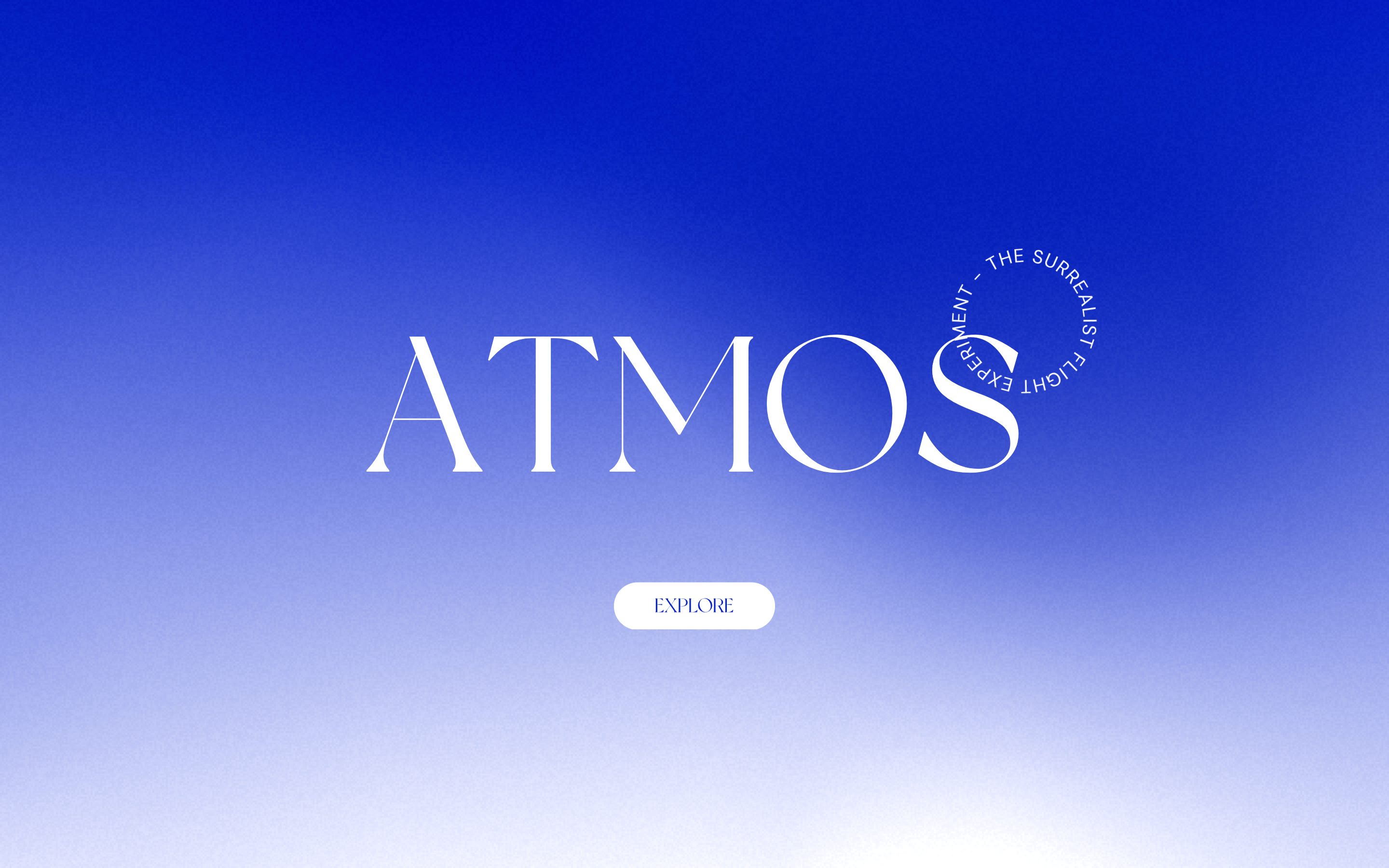
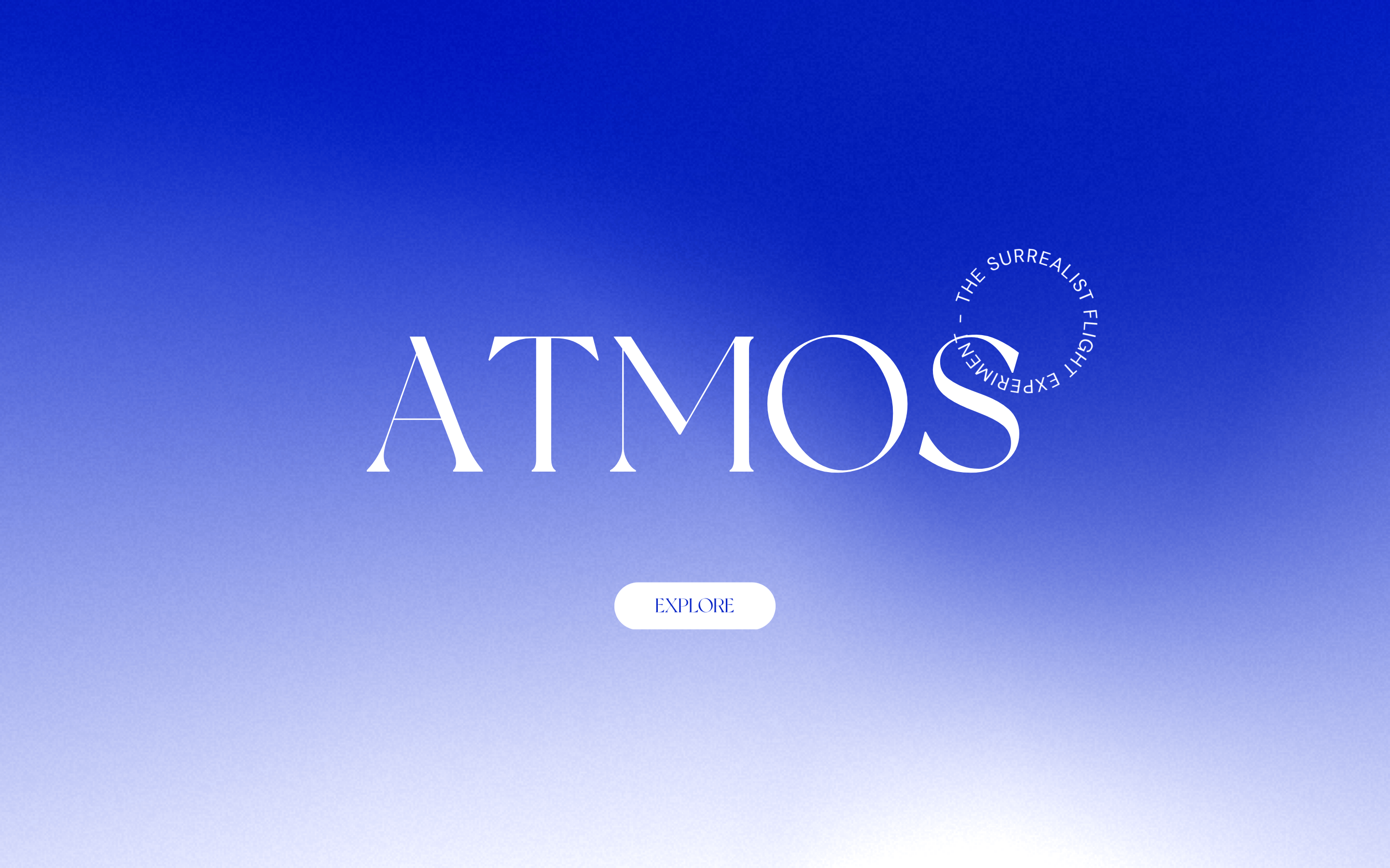
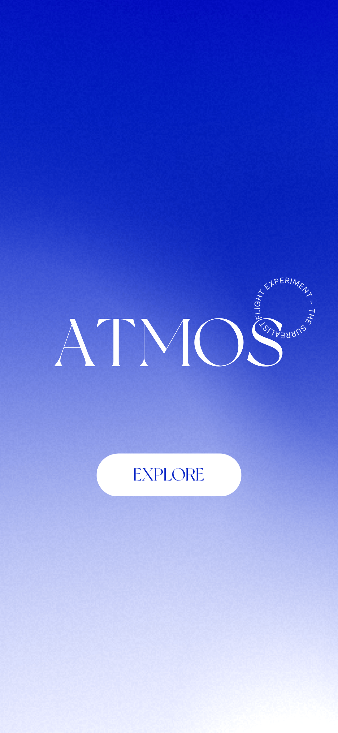
A luxury digital magazine or gallery space that feels ethereal and expansive
02
Color
#FFFFFFInk
#000000Ink soft
#0A1A99BG
#C5D2F0BG soft
rgba(0, 0, 0, 0.1)Line
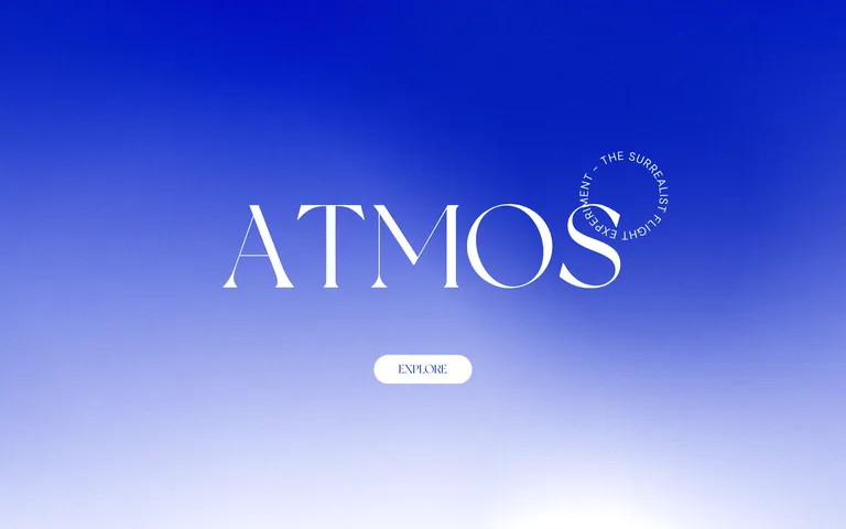
Ethereal blue-to-white gradient evokes an atmospheric, surreal sky with high-contrast white typography
03
Typography
didone-serif · humanist-sans
display200px · 400
heading50px · 700
subtitle30px · 400
body25px · 400
small20px · 400
Use DM Sans for body text and UI elements · Use Didone serif (like Times New Roman or _NewYork) for the main brand wordmark · Maintain strict uppercase for navigation and circular text elements
04
Spacing
4px
8px
16px
24px
32px
48px
64px
96px
144px
250px
Generous padding with 144px and 250px spacing for immersive hero sections
05
Surfaces
sm · 4px
md · 8px
lg · 12px
pill · 50px
1px bottom borders in white or black, pill-shaped buttons with 50px radius
06
Layout
1280container
12columns
24pxgutter
768 / 1024breakpoints
Full-bleed gradient background with centered content and generous vertical spacing
07
Motion & Interaction
220msmicro
500mssmall
1000msmedium
cubic-bezier(0.215, 0.61, 0.355, 1)easing
1s linear transitions for background and opacity changes · 0.5s cubic-bezier easing for interactive elements · Continuous rotation animation for circular text element
Subtle transitions with 0.5s cubic-bezier timing · Standard pointer interactions with grab cursor for certain elements
08
Components
buttonPill-shaped (50px radius) with white background and uppercase blue text
cardMinimal, likely transparent or gradient-backed with generous padding
chipNot visible in screenshot
inputNot visible in screenshot
heroFull-screen gradient with massive centered serif wordmark and circular rotating text
09
Voice & Don'ts
ToneEthereal, sophisticated, and slightly mysterious
HeadlinesMassive serif wordmarks with clean sans-serif subtitles
CTAsMinimal uppercase text in pill-shaped containers
Don't use cluttered layouts — screenshot shows generous whitespace and centered minimal composition
Don't use bright accent colors — screenshot shows only blue-to-white gradient with white typography
Don't use sans-serif for the main wordmark — screenshot shows serif typography for 'ATMOS'
Don't use small text for primary messaging — screenshot shows 200px display type for the main brand
Don't use sharp corners on interactive elements — screenshot shows 50px pill-shaped buttons
Don't use complex navigation — screenshot shows single 'EXPLORE' call-to-action button
Captured from the live site · real computed styles
11
System prompt
This is an immersive, surrealist digital experience that uses a blue-to-white atmospheric gradient with massive serif typography. The design centers on a 200px 'ATMOS' wordmark in a Didone serif typeface, paired with humanist-sans DM Sans for body text and UI elements. The palette is restricted to gradient blues (#0A1A99 to #C5D2F0 to #FFFFFF) with pure white (#FFFFFF) text and black (#000000) accents. Critical design principles include generous spacing (144px and 250px padding), pill-shaped buttons (50px radius), and smooth 1s linear transitions. Key don'ts: avoid cluttered layouts, don't use sans-serif for the main wordmark, and don't introduce bright accent colors that break the ethereal gradient aesthetic. The system uses DM Sans for functional text and serif fonts for display typography, creating a premium editorial feel.
Bring this taste to your agent
Hand your AI agent a machine-readable spec of this design — tokens, type, motion, the whole DNA.