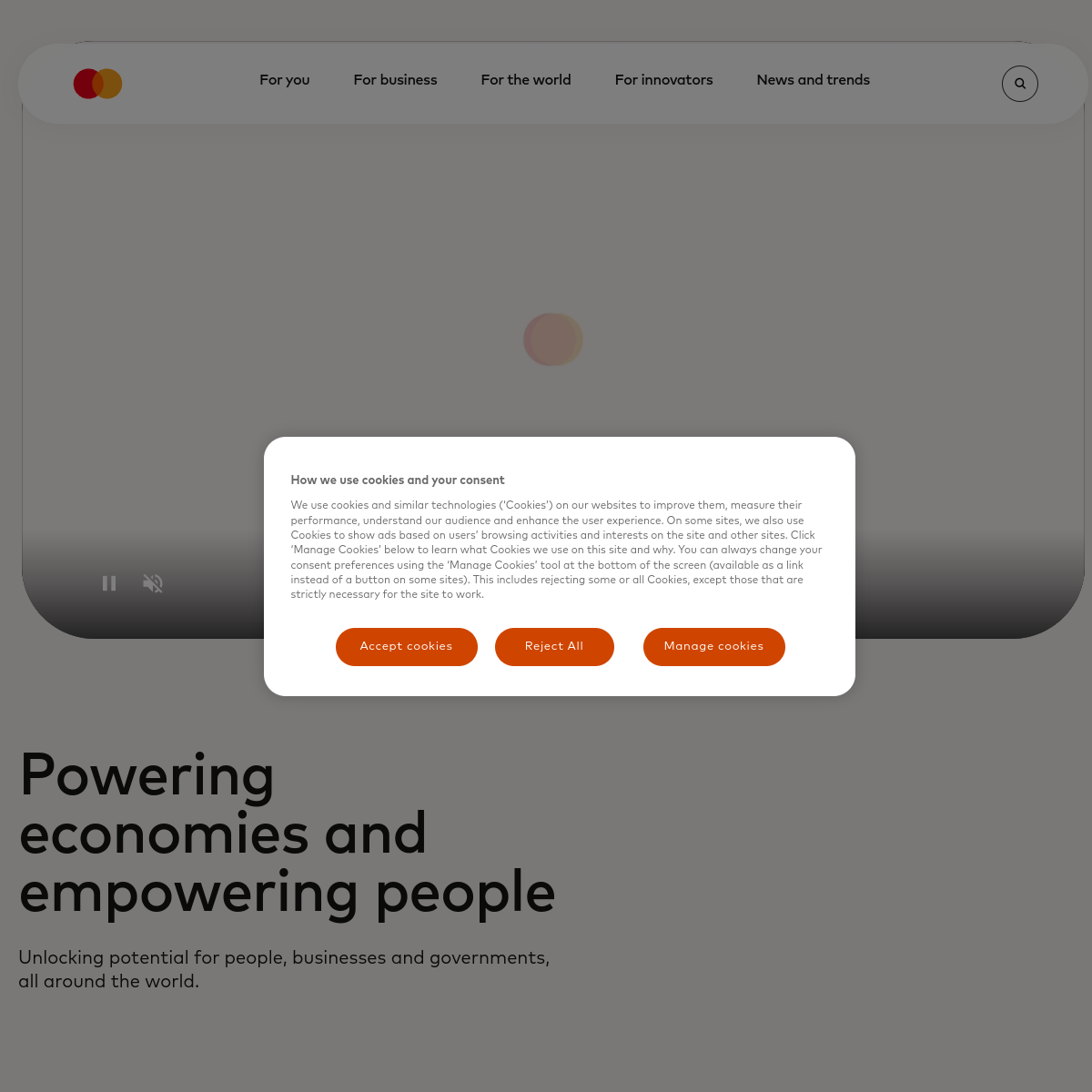
Don't use a vibrant accent color — screenshot shows a strictly monochrome palette instead.
Don't use heavy font weights — screenshot shows a consistent 400 weight instead.
Avoid: Slang
Avoid: Overly casual language
Avoid: Ambiguous phrasing
11
System prompt
Design a clean, authoritative, and neutral interface for a global financial utility. Use a strict monochrome palette: #000000 ink on #ffffff background. Typography is set in a transitional-serif category, 16px at 400 weight. Layout is spacious and grid-based. Do not use colored accents, rounded corners, or drop shadows. The goal is maximum clarity and trust.
Bring this taste to your agent
Hand your AI agent a machine-readable spec of this design — tokens, type, motion, the whole DNA.