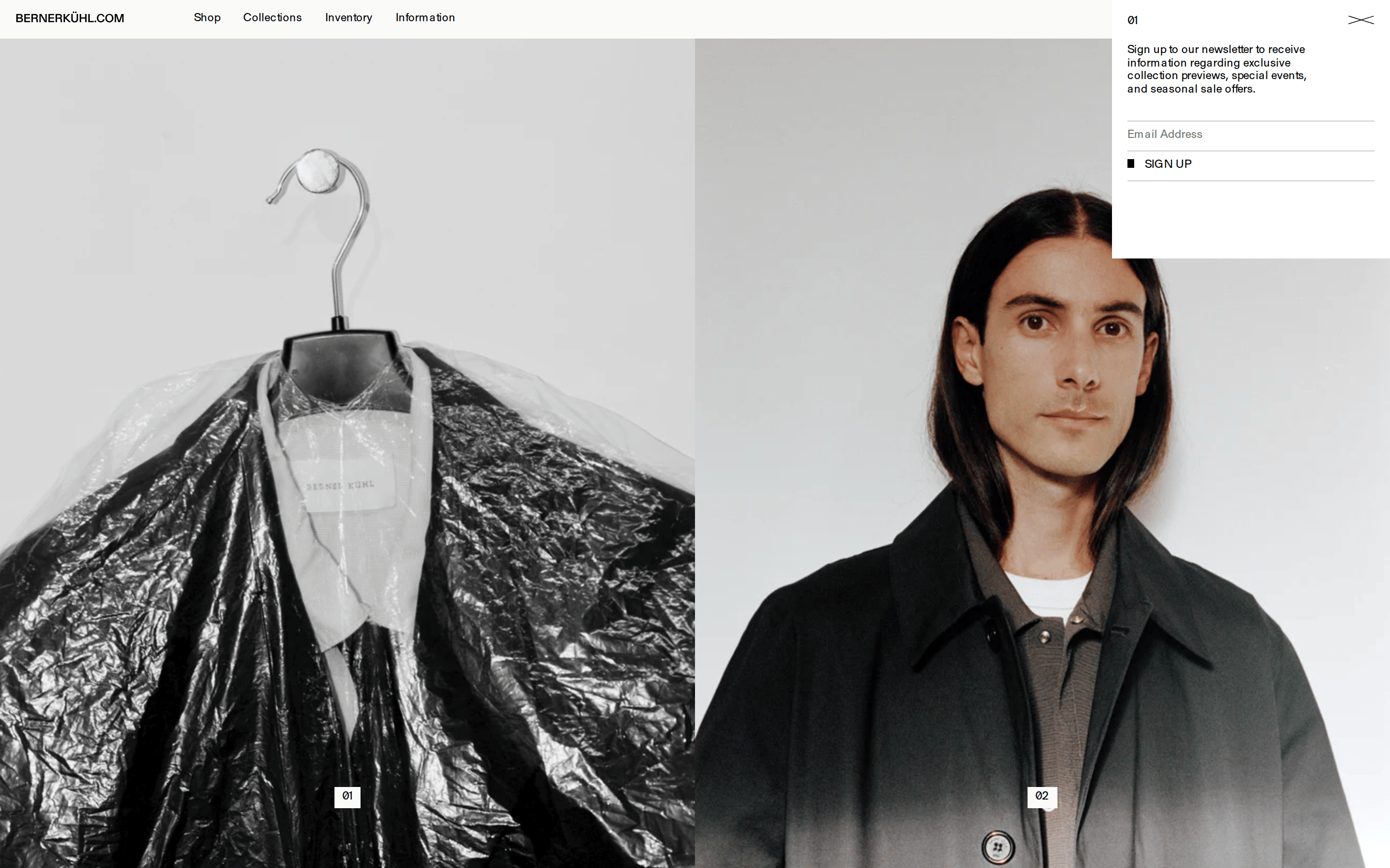
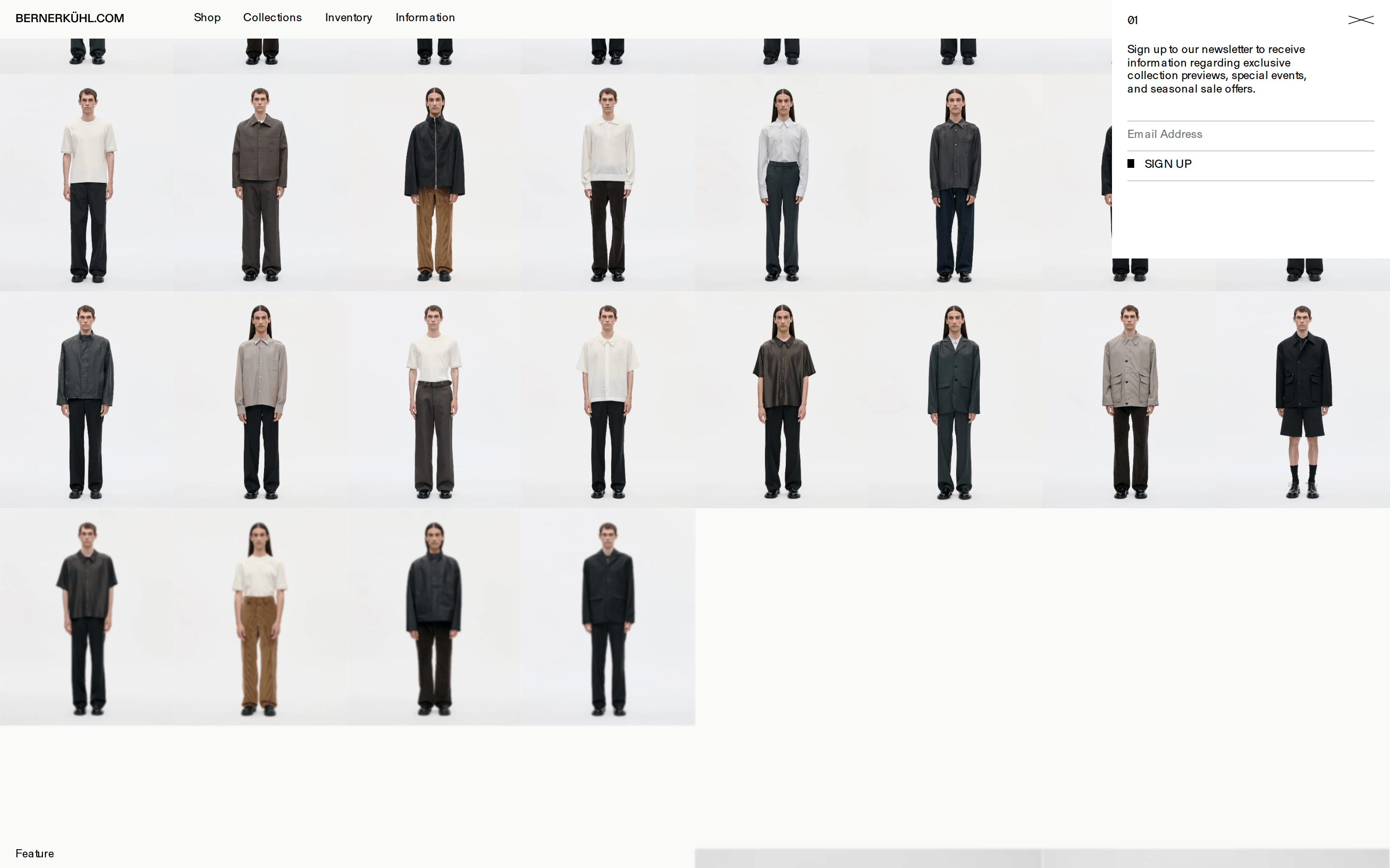
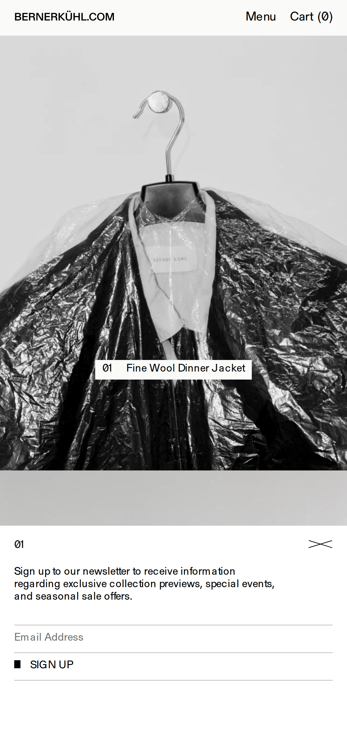
Monochromatic palette with a focus on high-contrast black on off-white backgrounds.
03
Typography
transitional-serif
display20px · 400
body12px · 400
Use uppercase for navigation and key labels. · Maintain tight leading for a compact, refined feel. · Standard weight (400) is used throughout for consistency.
04
Spacing
4px
8px
12px
16px
24px
32px
48px
64px
96px
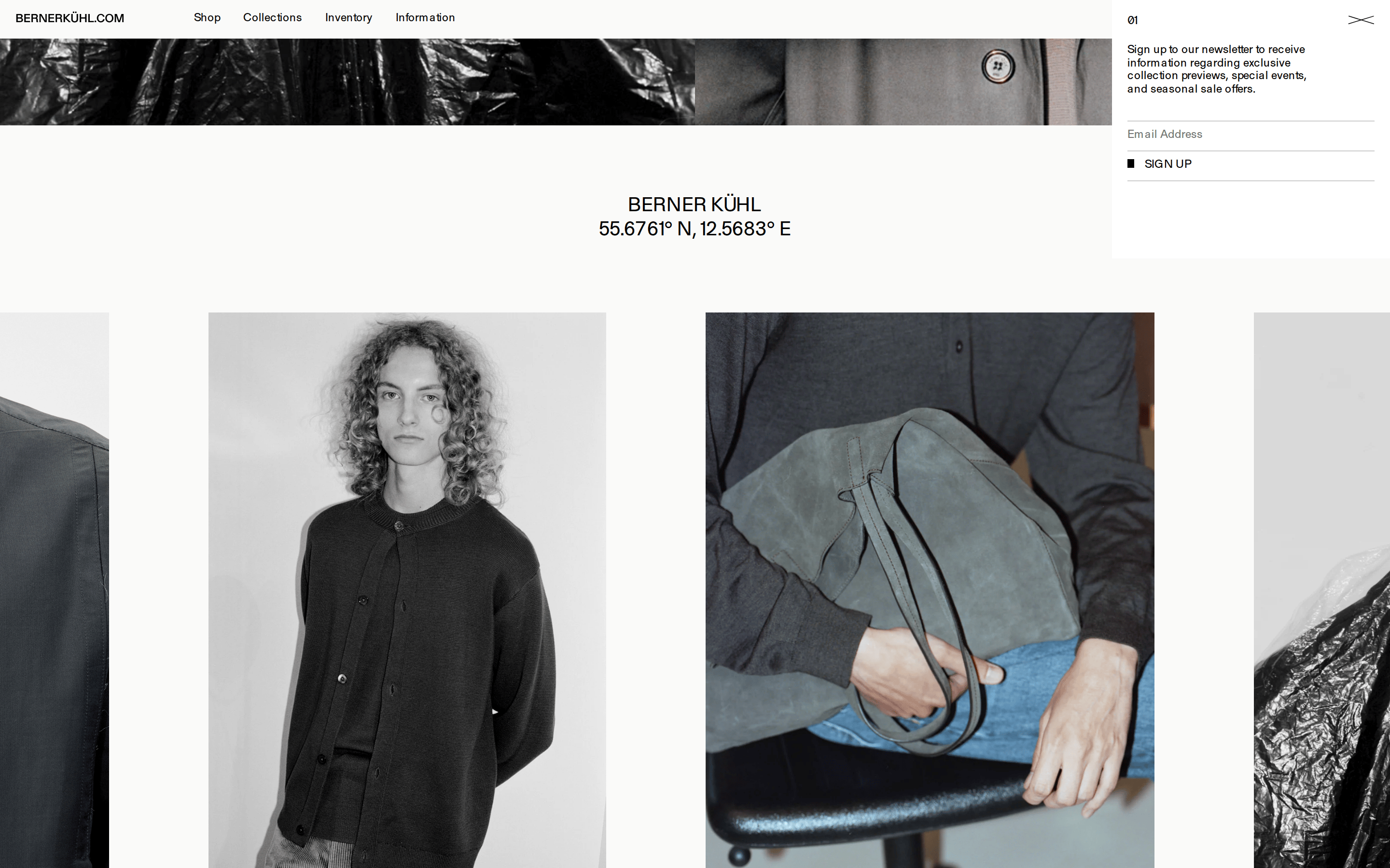
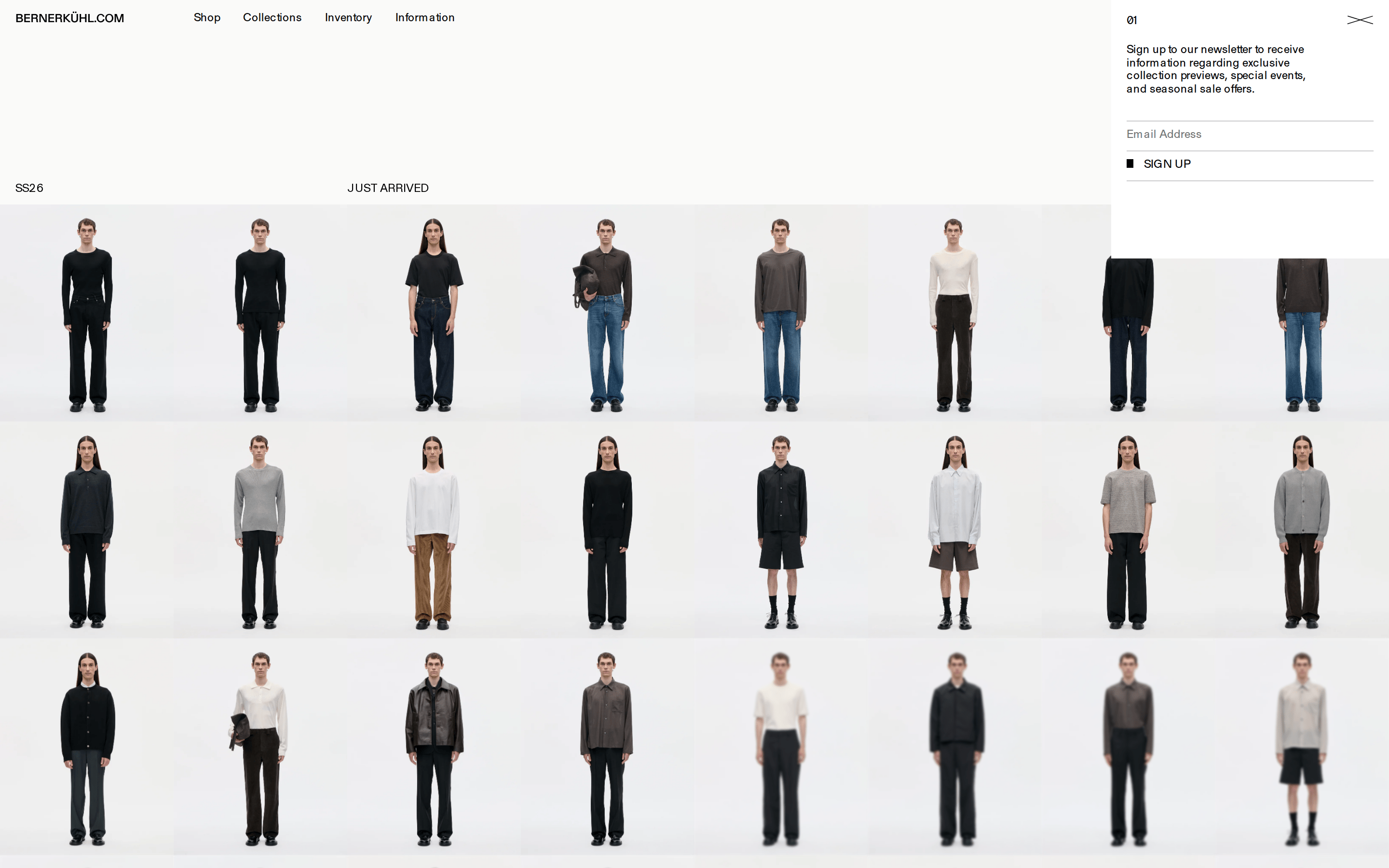
Generous whitespace between sections and a tight, structured grid for product displays.
05
Surfaces
sm · 0px
md · 0px
lg · 0px
pill · 999px
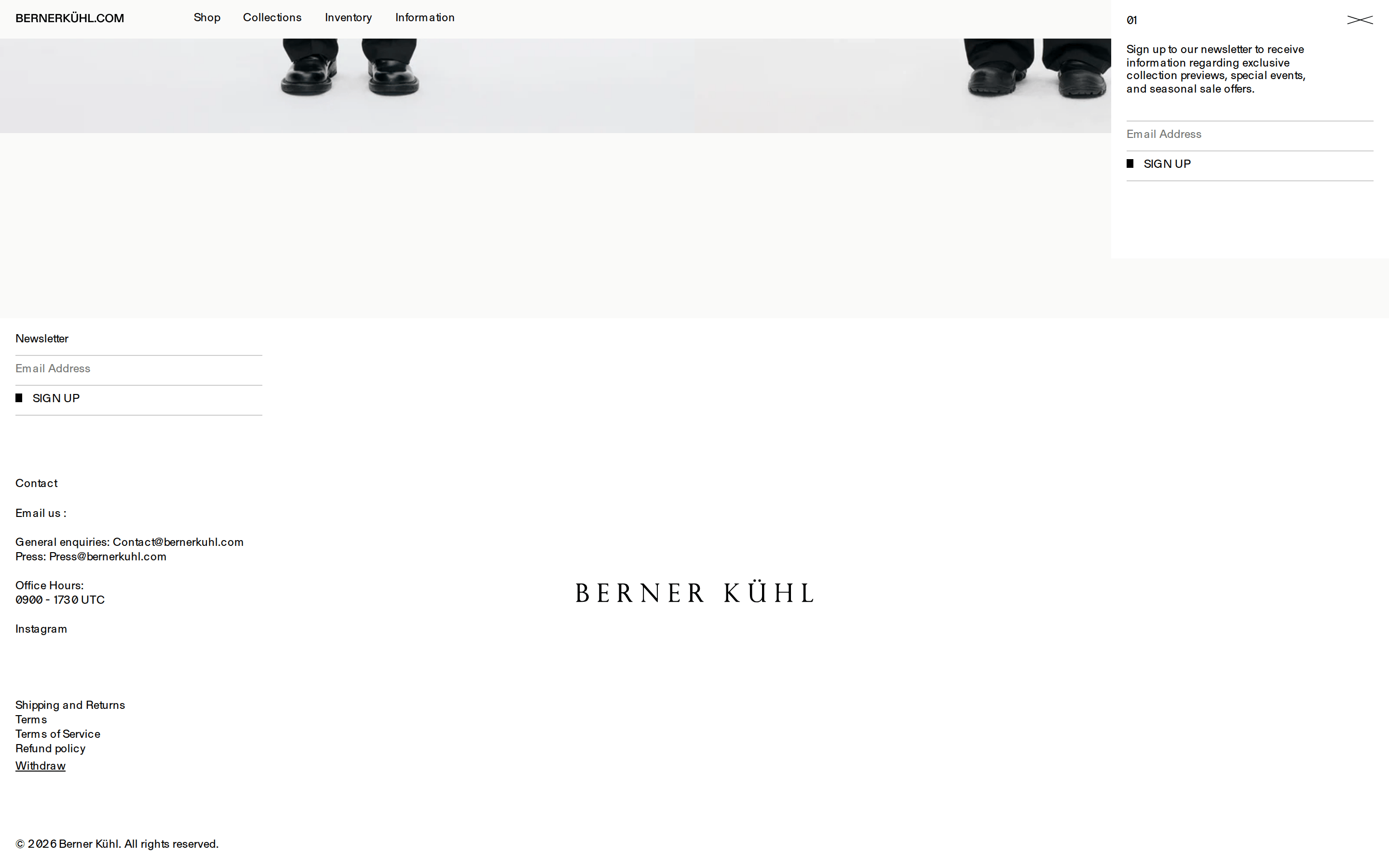
Sharp 1px solid black borders for inputs and dividers.
06
Layout
1920container
12columns
16pxgutter
768 / 1024breakpoints
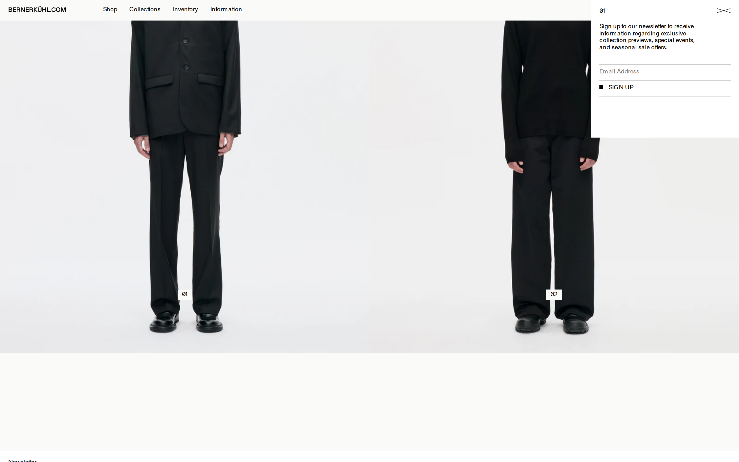
Edge-to-edge imagery on desktop, transitioning to a clean white background with a structured product grid.
07
Motion & Interaction
200msmicro
500mssmall
800msmedium
cubic-bezier(0.65, 0.05, 0.36, 0.5)easing
Smooth fade-ins and subtle transforms on scroll.
Cursor changes to a pointer on interactive elements, likely with subtle opacity shifts. · Immediate response with no heavy feedback animations.
08
Components
buttonMinimal text-based buttons, often uppercase, sometimes with a small solid square indicator.
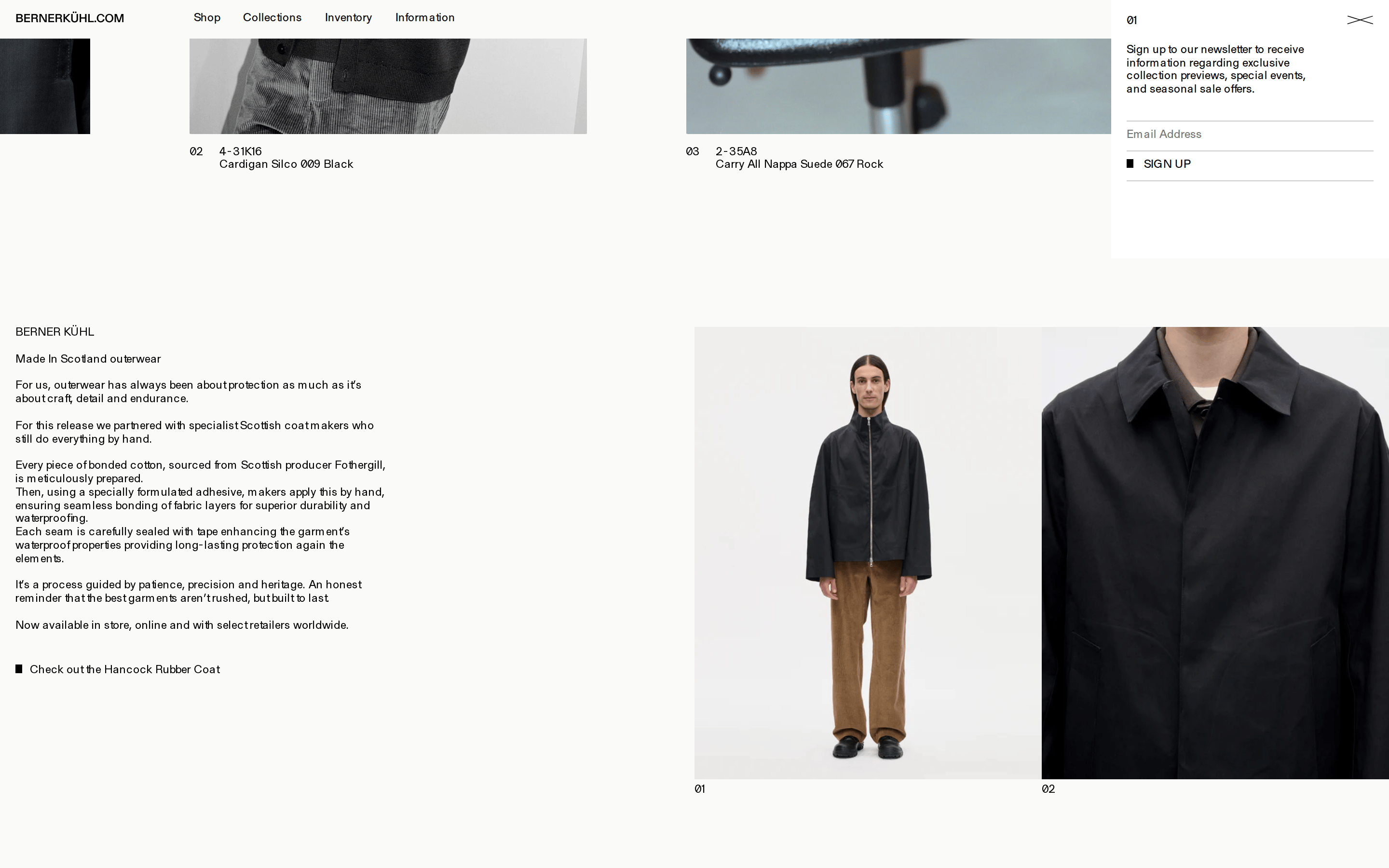
cardBorderless product cards that rely entirely on high-quality photography.
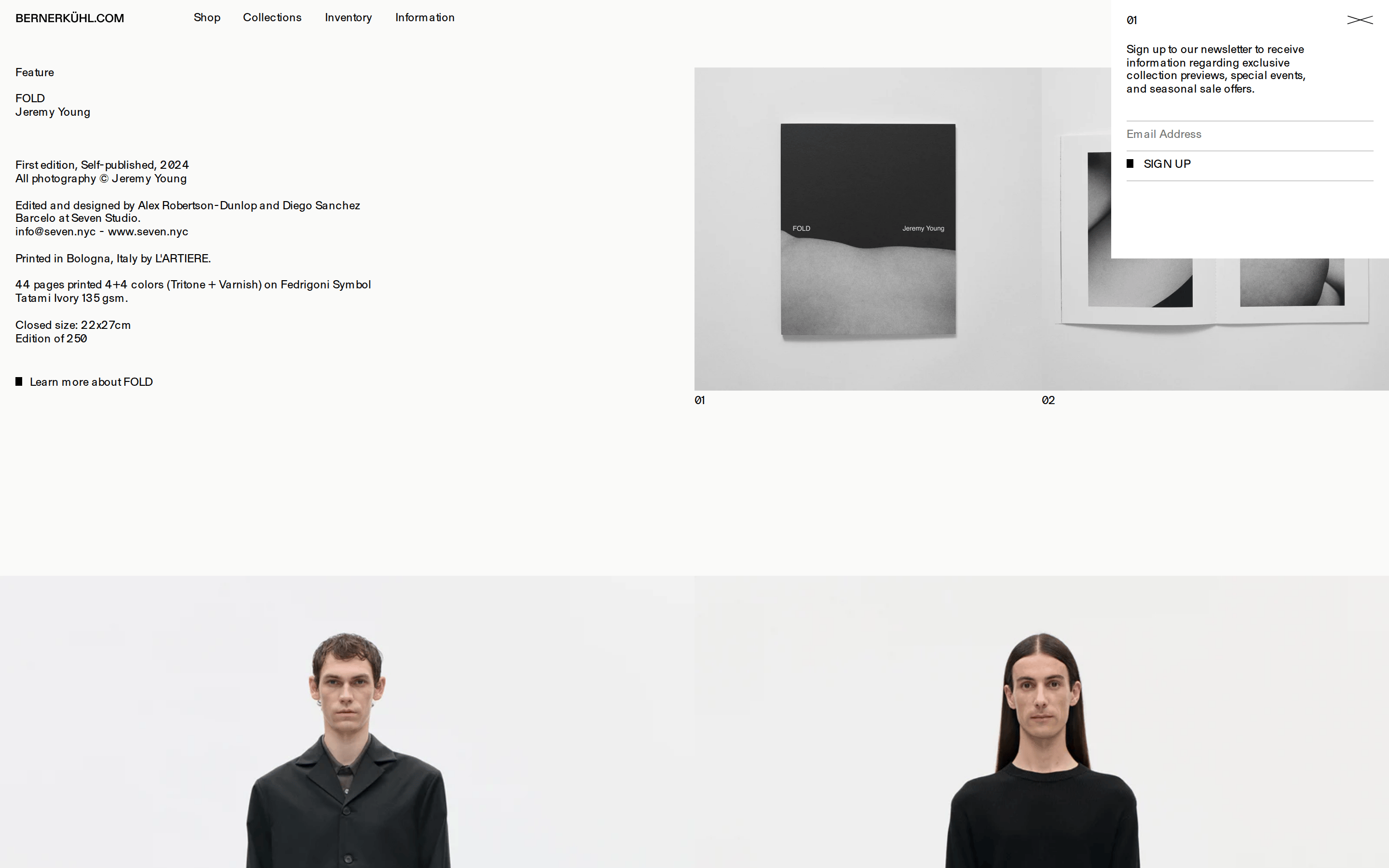
chipSmall, rounded white pills for product numbering.
inputMinimalist input fields with only a bottom border.
heroLarge, full-bleed split-screen imagery or single statement photograph.
09
Voice & Don'ts
ToneSophisticated, understated, and direct.
HeadlinesConcise and functional, often using numbered sequences.
CTAsAll-caps, minimal, and integrated into the overall grid.
Don't use rounded corners on cards or containers — screenshot shows sharp, square edges.
Don't use bold font weights — screenshot shows consistent use of weight 400 across all text.
Don't use vibrant accent colors — screenshot shows a strictly monochromatic black, white, and gray palette.
Don't use drop shadows on UI elements — screenshot shows a completely flat design.
Don't use complex multi-column layouts for body text — screenshot shows a very simple, often single-column structure.
Don't use standard sans-serif fonts — screenshot uses a distinct transitional serif for all typography.
Captured from the live site · real computed styles
11
System prompt
A minimalist, editorial e-commerce platform for a fashion brand. The design relies on a monochromatic palette of black (#000000) on off-white (#fafaf9) backgrounds, with muted gray (#c7c7c7) accents. Typography is strictly transitional-serif at a uniform weight of 400, featuring uppercase navigation and tight line heights. The layout is edge-to-edge with high-quality photography, transitioning into a clean, borderless product grid. Critical constraints: never use rounded corners or drop shadows; maintain a strictly monochromatic color scheme; always use all-caps for navigation and key labels; avoid using bold font weights anywhere in the interface.
Bring this taste to your agent
Hand your AI agent a machine-readable spec of this design — tokens, type, motion, the whole DNA.