A modern digital bank vault with a glowing neon edge
02
Color
#FFFFFFInk
#BBC7C6Ink soft
#001413BG
#012624BG soft
#003734BG quiet
#707777Muted
rgba(1, 38, 36, 1)Line
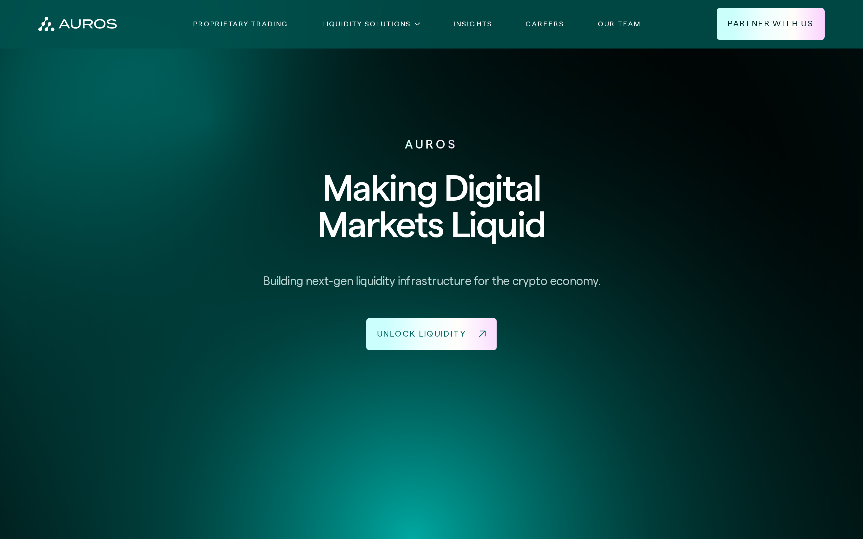
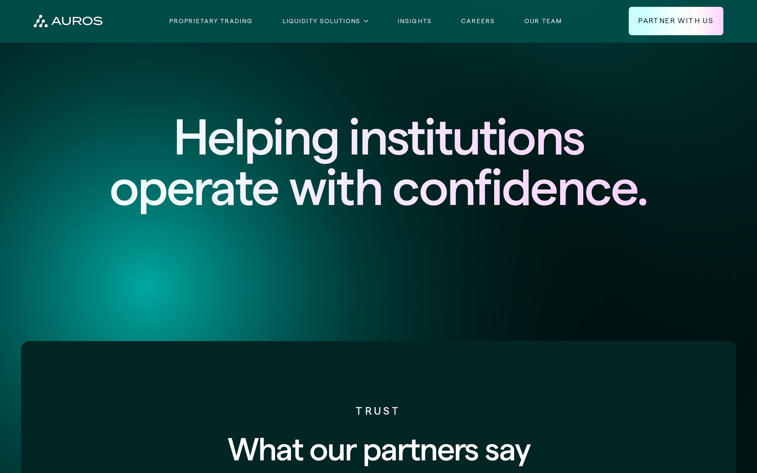
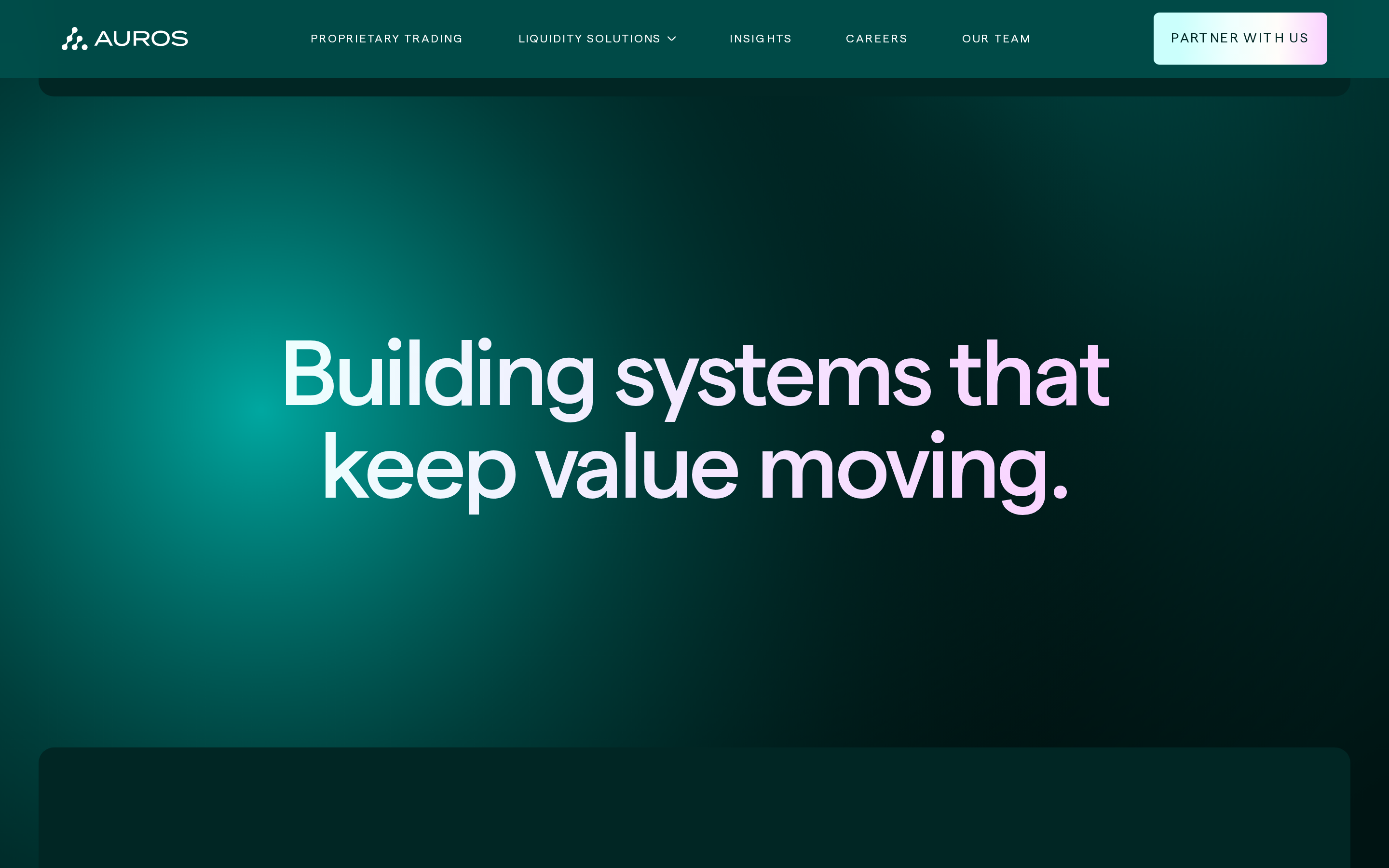
Deep teal foundation with ethereal, iridescent gradient accents on primary actions.
03
Typography
geometric-sans · sans-serif · monospace
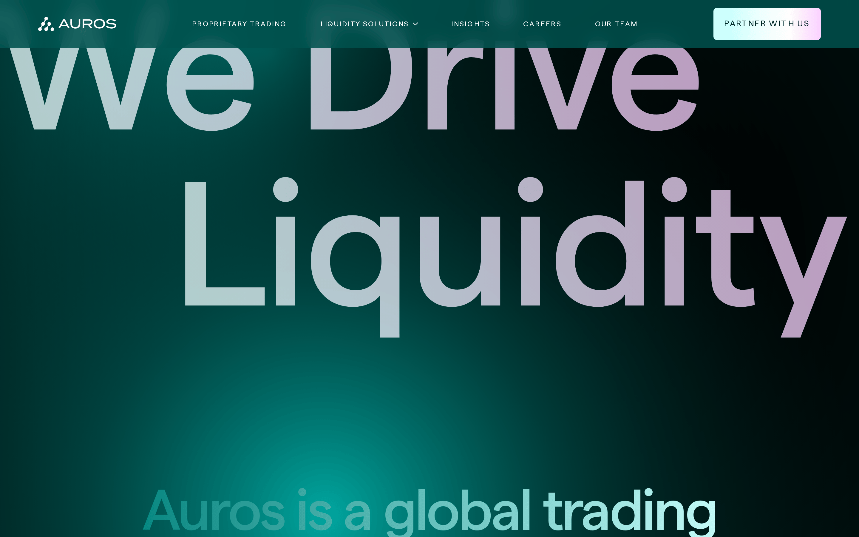
display96px · 500
heading60px · 500
body-lg20px · 400
body16px · 400
caption14px · 400
All primary navigation and buttons use all-caps with wide tracking · Headlines use tight negative letter-spacing for impact · Body text maintains comfortable line-heights for readability
04
Spacing
4px
8px
16px
24px
32px
48px
64px
96px
120px
Consistent 4px base grid with generous vertical whitespace for a premium feel.
05
Surfaces
sm · 4px
md · 6px
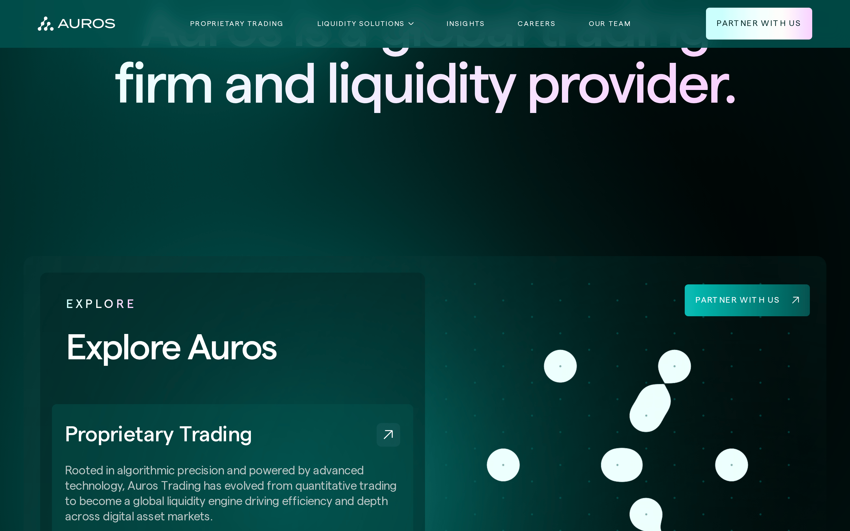
lg · 16px
pill · 999px
Minimal, using deep teal borders that blend with the dark background.
06
Layout
1280container
12columns
24pxgutter
768 / 1024breakpoints
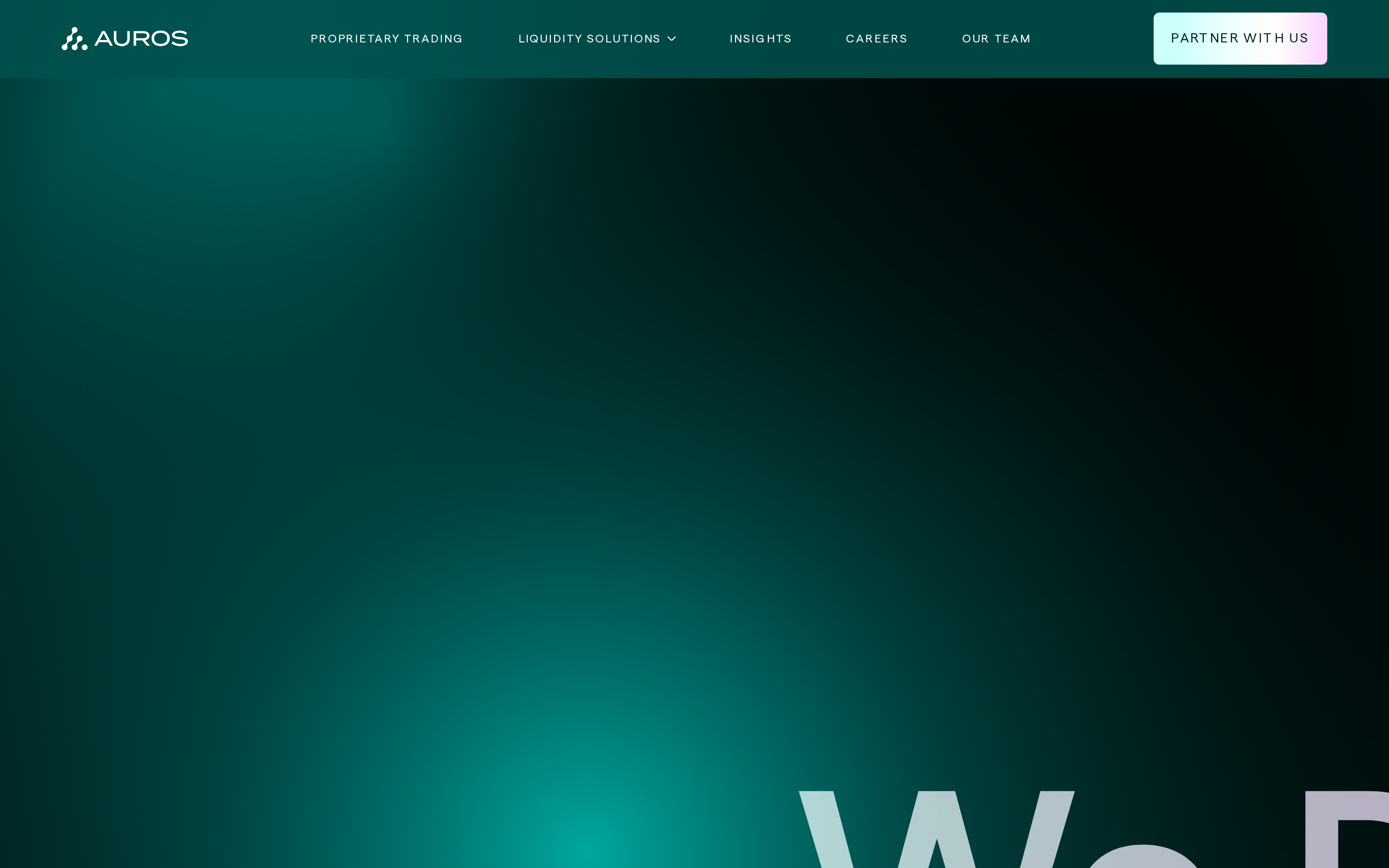
Full-width dark hero transitioning into structured content blocks with generous side padding.
07
Motion & Interaction
200msmicro
200mssmall
600msmedium
cubic-bezier(0.25, 0.1, 0.25, 1)easing
Smooth background-position shifts on gradients · Subtle opacity fades on hover states
Subtle background-color or opacity shift on 200ms ease-in-out. · Immediate visual feedback with reduced opacity.
08
Components
buttonIridescent gradient fill with dark text, using pill or soft-rectangle shapes.
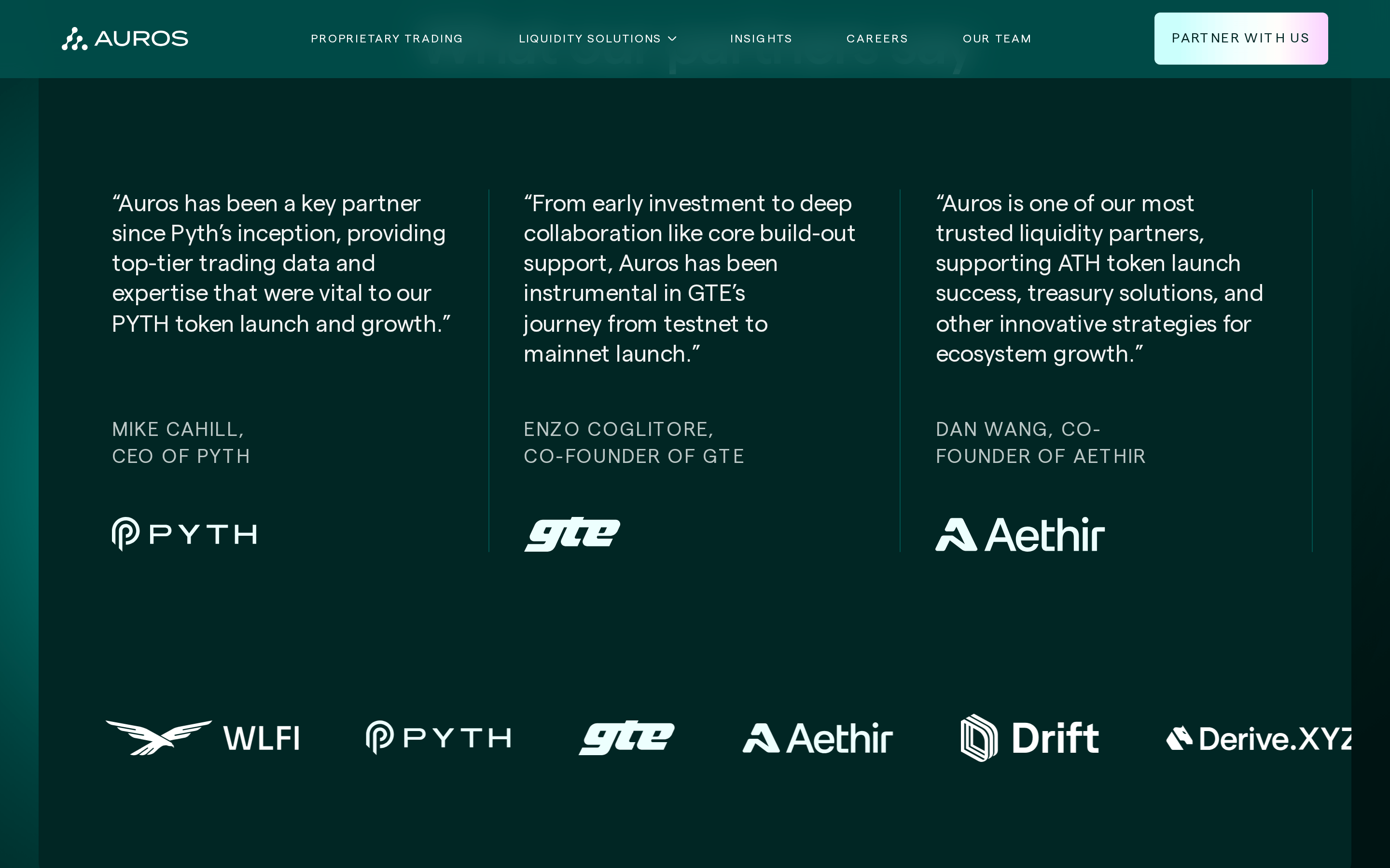
cardLarge, rounded cards with soft internal gradients and subtle glassmorphism effects.
chipSimple, text-based labels with subtle background fills.
inputClean, minimalist inputs with dark backgrounds and light borders.
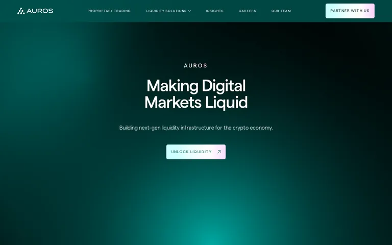
heroFull-width dark canvas with massive centered typography and a single, high-contrast CTA.
09
Voice & Don'ts
ToneAuthoritative, institutional, and forward-looking.
HeadlinesDirect, active verbs paired with high-impact nouns.
CTAsShort, action-oriented, and set in wide-tracked uppercase.
Don't use bright, saturated primary colors — screenshot shows a dark teal foundation with iridescent accents instead
Don't use thin, light typography for headlines — screenshot shows bold, 500-weight geometric sans-serif instead
Don't use sharp, square corners for major components — screenshot shows 16px rounded corners on cards and buttons instead
Don't use heavy drop shadows for elevation — screenshot shows flat, gradient-based depth instead
Don't use small, cramped spacing — screenshot shows generous padding (120px vertical) and gaps (48px) instead
Don't use lowercase for navigation and CTAs — screenshot shows strict all-caps with wide tracking instead
Captured from the live site · real computed styles
11
System prompt
This is a premium fintech website for a crypto liquidity provider. It features a deep dark teal background with an ethereal, iridescent gradient accent system. Typography relies on a geometric sans-serif for display and a clean sans-serif for body text, with heavy use of uppercase, wide-tracked labels. The layout is spacious and centered, emphasizing authority and institutional trust. Critical donts: never use bright saturated primary colors, avoid thin/light typography for headlines, do not use sharp square corners on cards or buttons, avoid heavy drop shadows, maintain generous spacing rather than cramped layouts, and never use lowercase for primary navigation or calls to action.
Bring this taste to your agent
Hand your AI agent a machine-readable spec of this design — tokens, type, motion, the whole DNA.