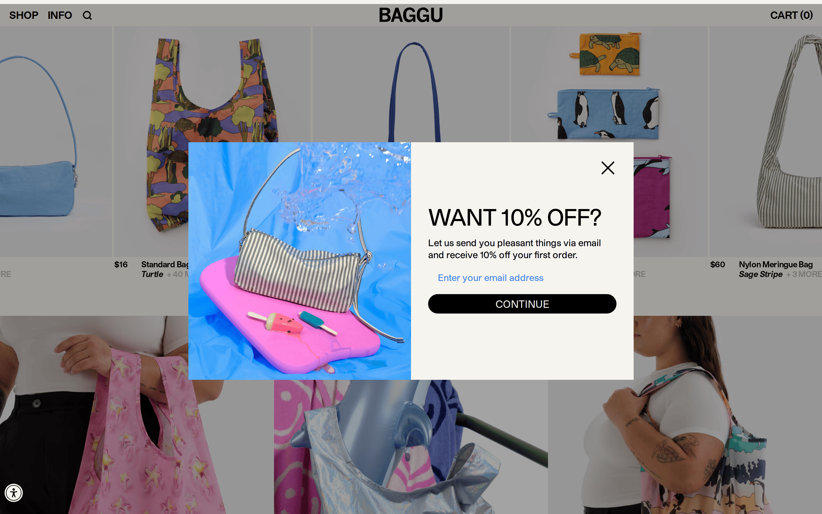
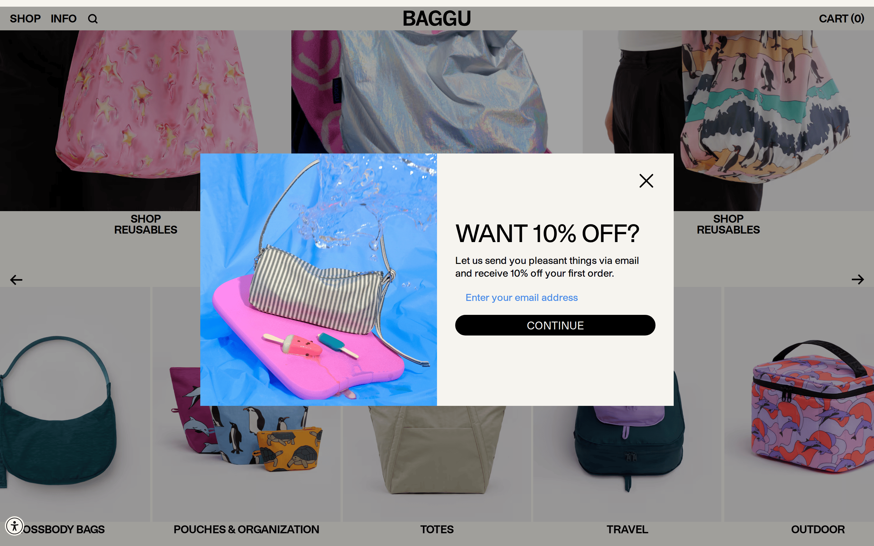
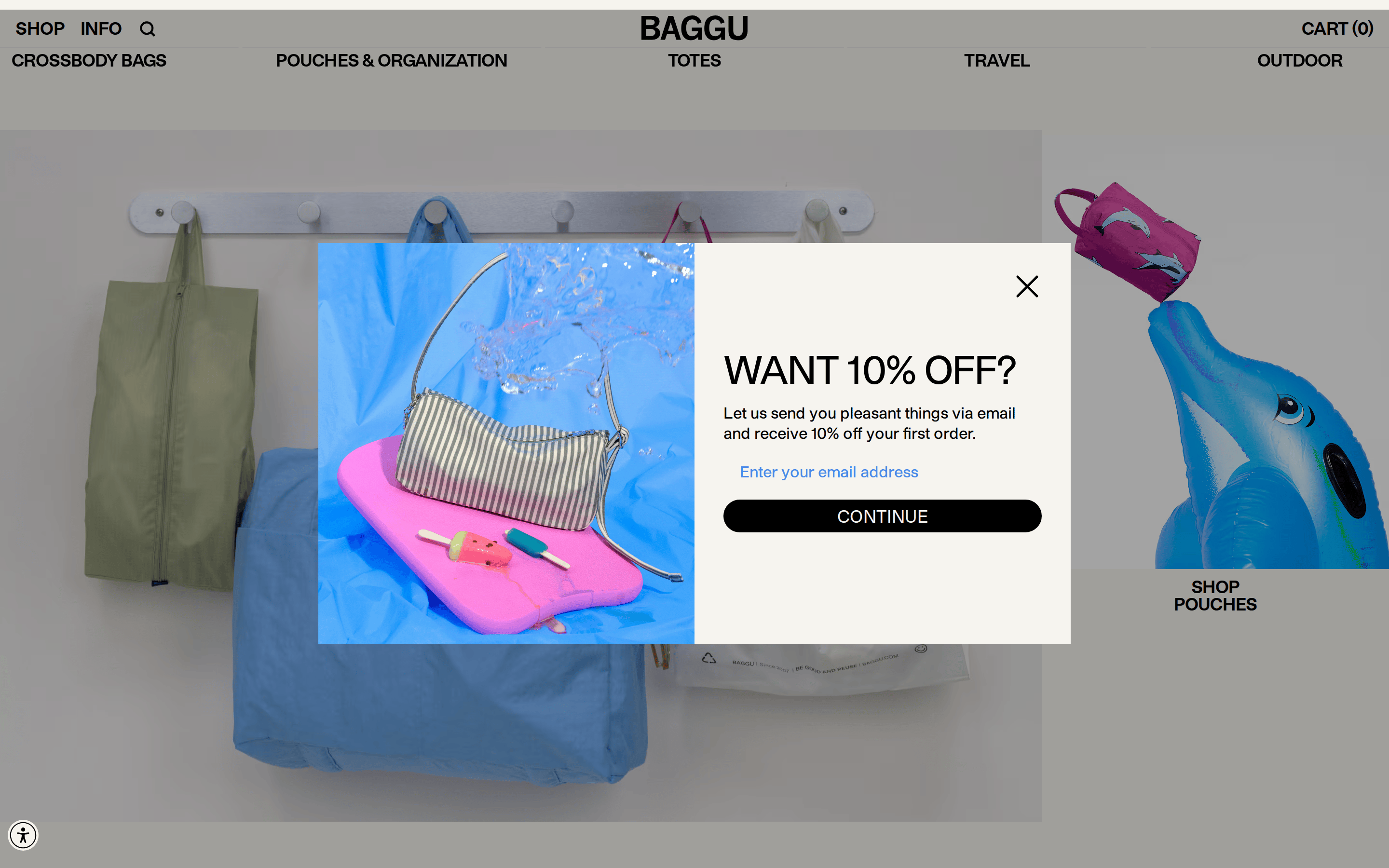
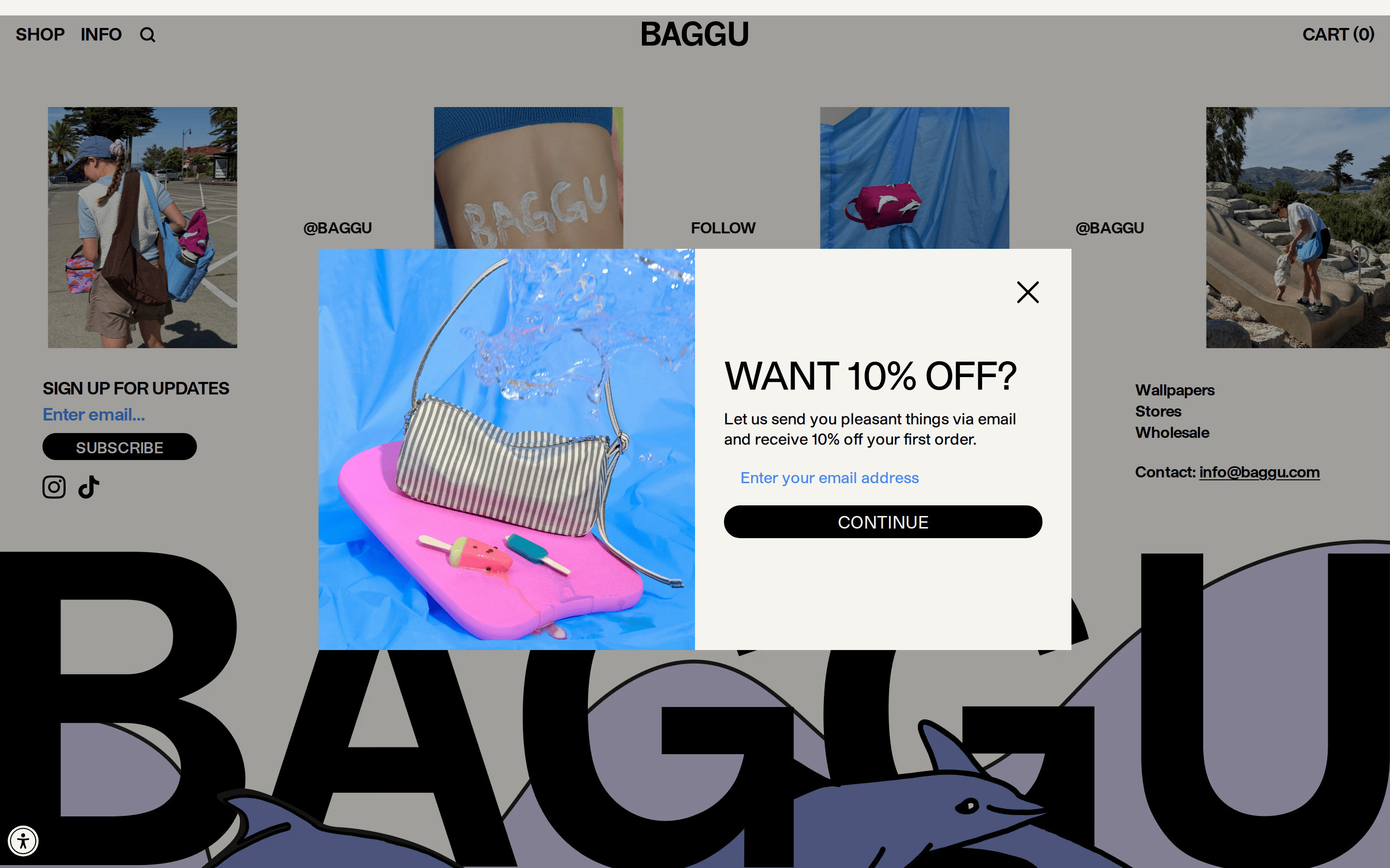
A brightly lit, organized retail store with colorful, high-quality products on display.
02
Color
#000000Ink
#212121Ink soft
#F6F4EEBG
rgba(0,0,0,1.0)Line
Warm neutral backgrounds serve as a clean, gallery-like canvas that lets the colorful product photography dominate the visual hierarchy.
03
Typography
grotesque-sans
display40px · 700
body16px · 400
label14px · 700
Use all-uppercase for navigation links, category labels, and primary call-to-action buttons. · Maintain tight negative letter-spacing for a compact, modern feel. · Prioritize high-weight (700) for section headers to ensure strong visual hierarchy.
04
Spacing
4px
8px
16px
24px
32px
48px
64px
96px
Standard 8px base grid with generous whitespace between major sections to let products breathe.
05
Surfaces
sm · 2px
md · 6px
lg · 0px
pill · 100px
1px solid #000000 for structural elements; buttons use pill-radius styling with solid backgrounds.
0px 32px 68px 0px rgba(0, 0, 0, 0.3)
06
Layout
1440container
12columns
16pxgutter
768 / 1024breakpoints
Full-width image-based hero sections followed by structured, grid-based product catalogs.
07
Motion & Interaction
100msmicro
200mssmall
400msmedium
cubic-bezier(0.4, 0, 0.2, 1)easing
Smooth color and transform transitions on hover states · Micro-interactions for cart and navigation state changes · Seamless image carousel transitions for product galleries
Subtle background or color transitions on clickable text elements and buttons. · Immediate visual feedback on button press, typically a slight color shift or scale down.
08
Components
buttonSolid black background (#000000) with white (#FFFFFF) uppercase text, highly rounded (pill-radius), minimal padding.
cardClean, borderless layout that relies on high-quality product photography against neutral backgrounds.
chipUppercase, bold text links for category navigation, heavily spaced, no visible background or border.
inputMinimal bottom-border only input field with black underline, floating placeholder text.
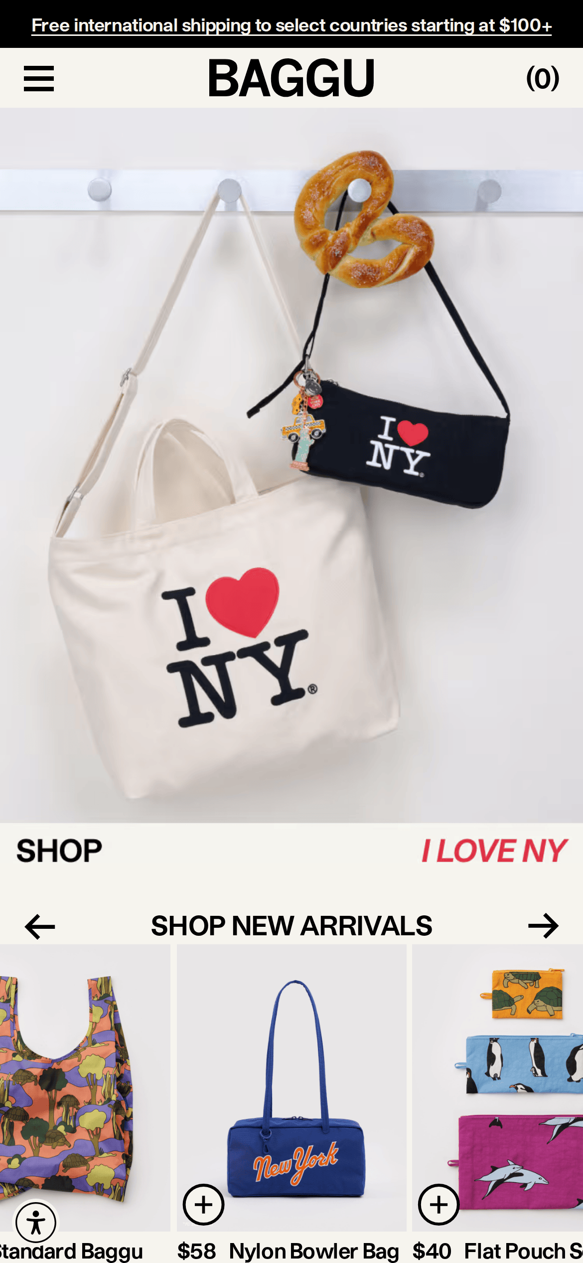
heroFull-bleed, high-chroma lifestyle photography spanning the entire width of the viewport.
09
Voice & Don'ts
ToneDirect, friendly, and confidently straightforward.
HeadlinesShort, punchy, and highly descriptive, often in all-caps.
CTAsAction-oriented, imperative verbs, and set in all-caps within high-contrast buttons.
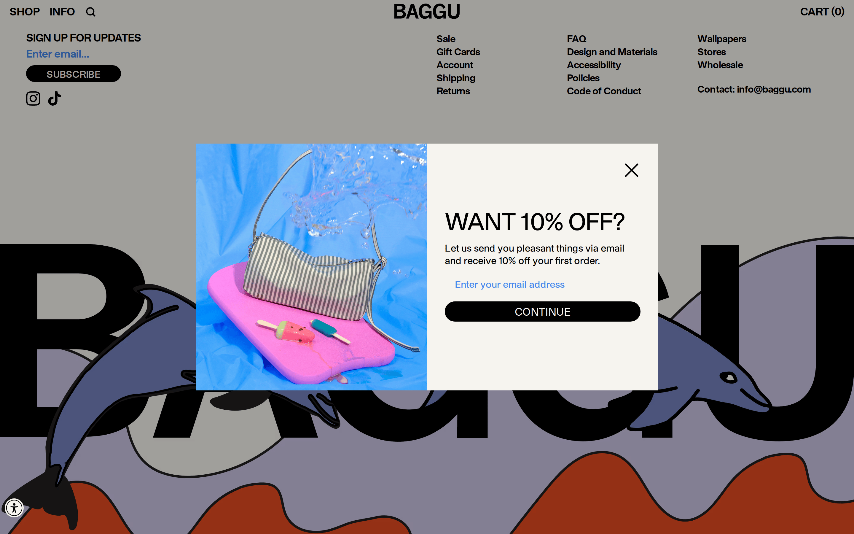
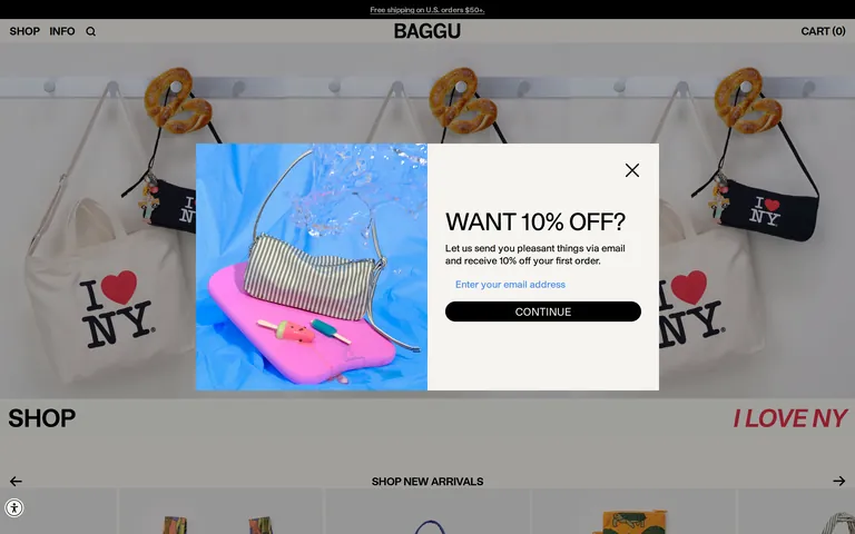
Don't use colorful or busy backgrounds for layout sections — screenshot shows a consistent neutral off-white (#F6F4EE) canvas.
Don't use serif or script fonts for headlines — screenshot shows a bold grotesque-sans style.
Don't use small, delicate buttons — screenshot shows high-contrast, pill-shaped black buttons.
Don't clutter the layout with dense text blocks — screenshot shows generous whitespace and large imagery.
Don't use dark mode or heavy charcoal backgrounds — screenshot shows predominantly light, warm-neutral backgrounds.
Don't hide products behind minimal photography — screenshot shows vibrant, high-chroma product shots as the main focal point.
Avoid: Flowery or overly technical jargon
Avoid: Excessive adjectives or superlatives
Avoid: Overly formal or distant corporate language
Captured from the live site · real computed styles
11
System prompt
Baggu is a modern e-commerce site for functional everyday bags and accessories. The design uses a warm neutral (#F6F4EE) background as a clean canvas to let vibrant, high-chroma product photography dominate the visual hierarchy. The typography relies on a bold grotesque-sans font, primarily used in uppercase for navigation, category labels, and strong call-to-action buttons. Buttons are solid black (#000000) with white text and a distinct pill shape. Key critical don'ts include: avoid using dark mode or heavy backgrounds, don't use delicate or small button styles, and never use serif fonts for headlines. The layout is spacious and image-forward, prioritizing clear, direct communication and a premium, curated feel.
Bring this taste to your agent
Hand your AI agent a machine-readable spec of this design — tokens, type, motion, the whole DNA.