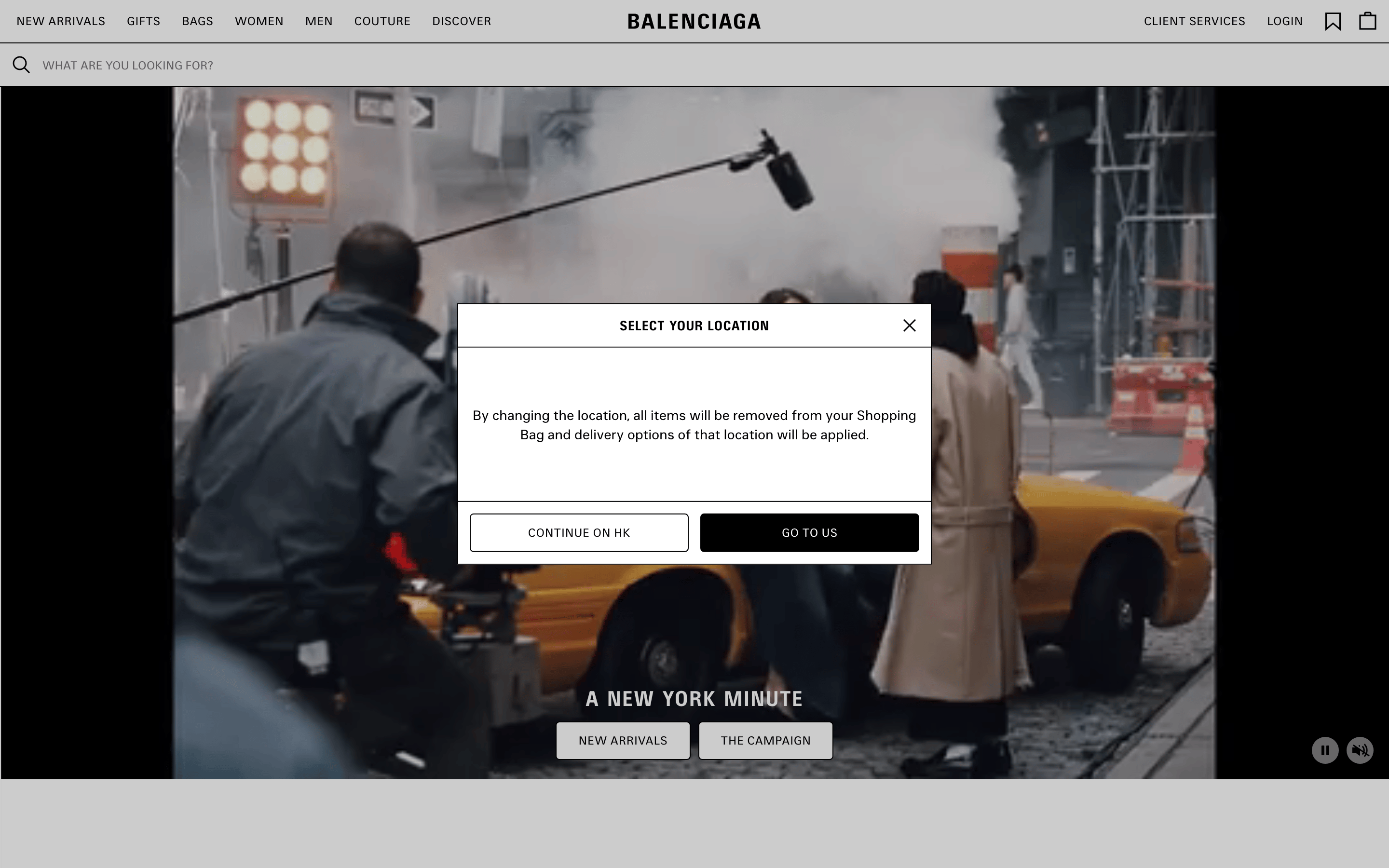
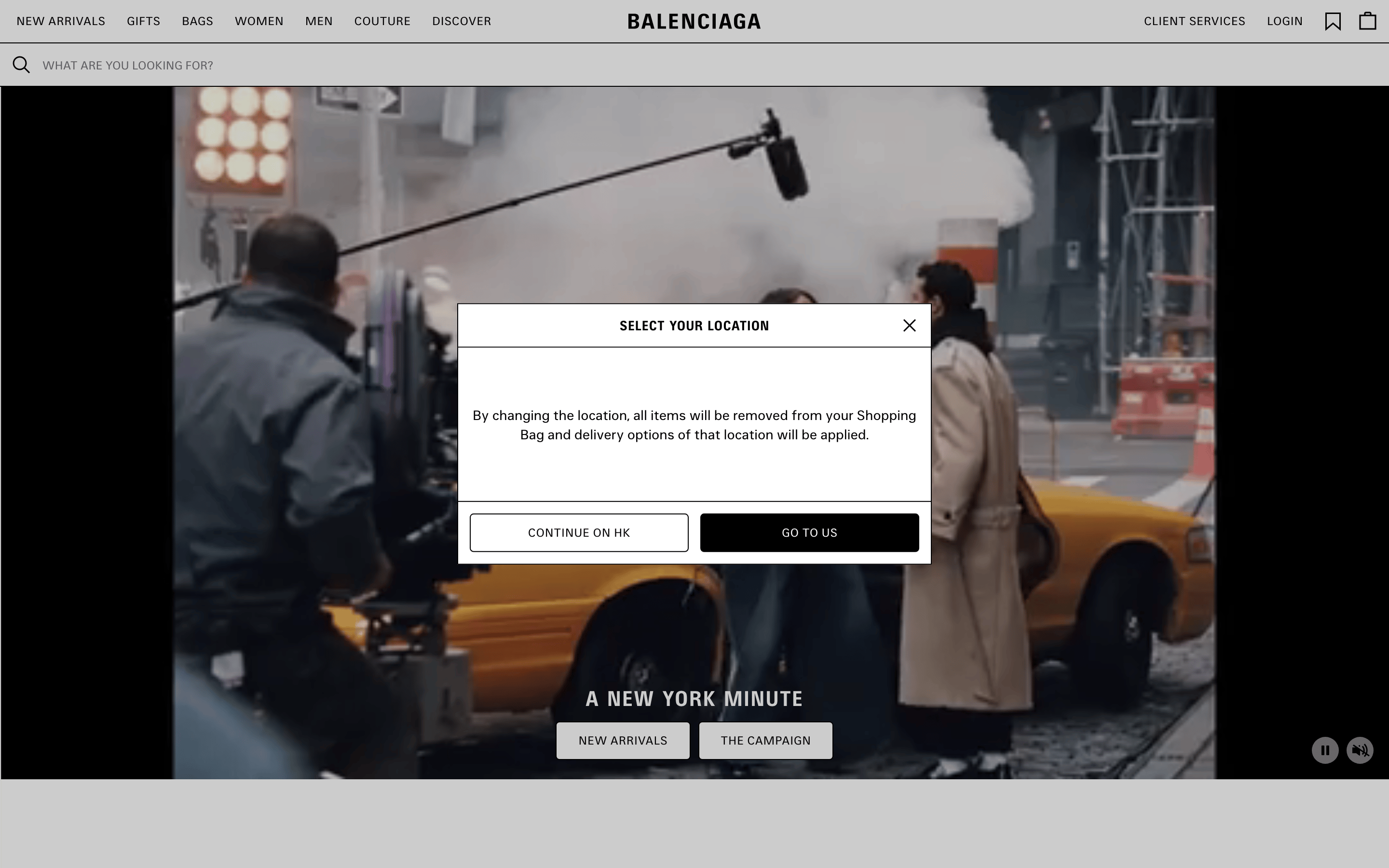
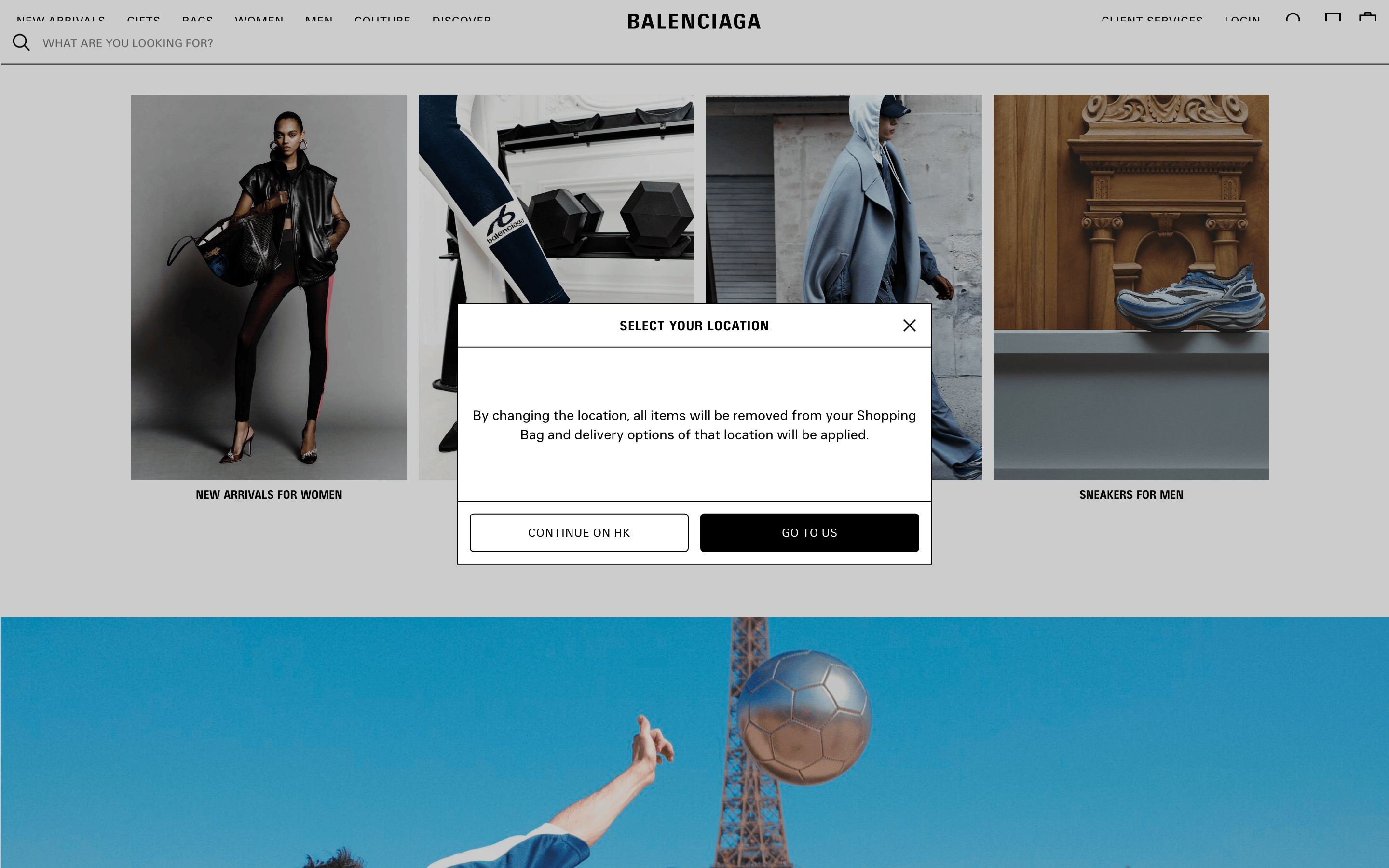
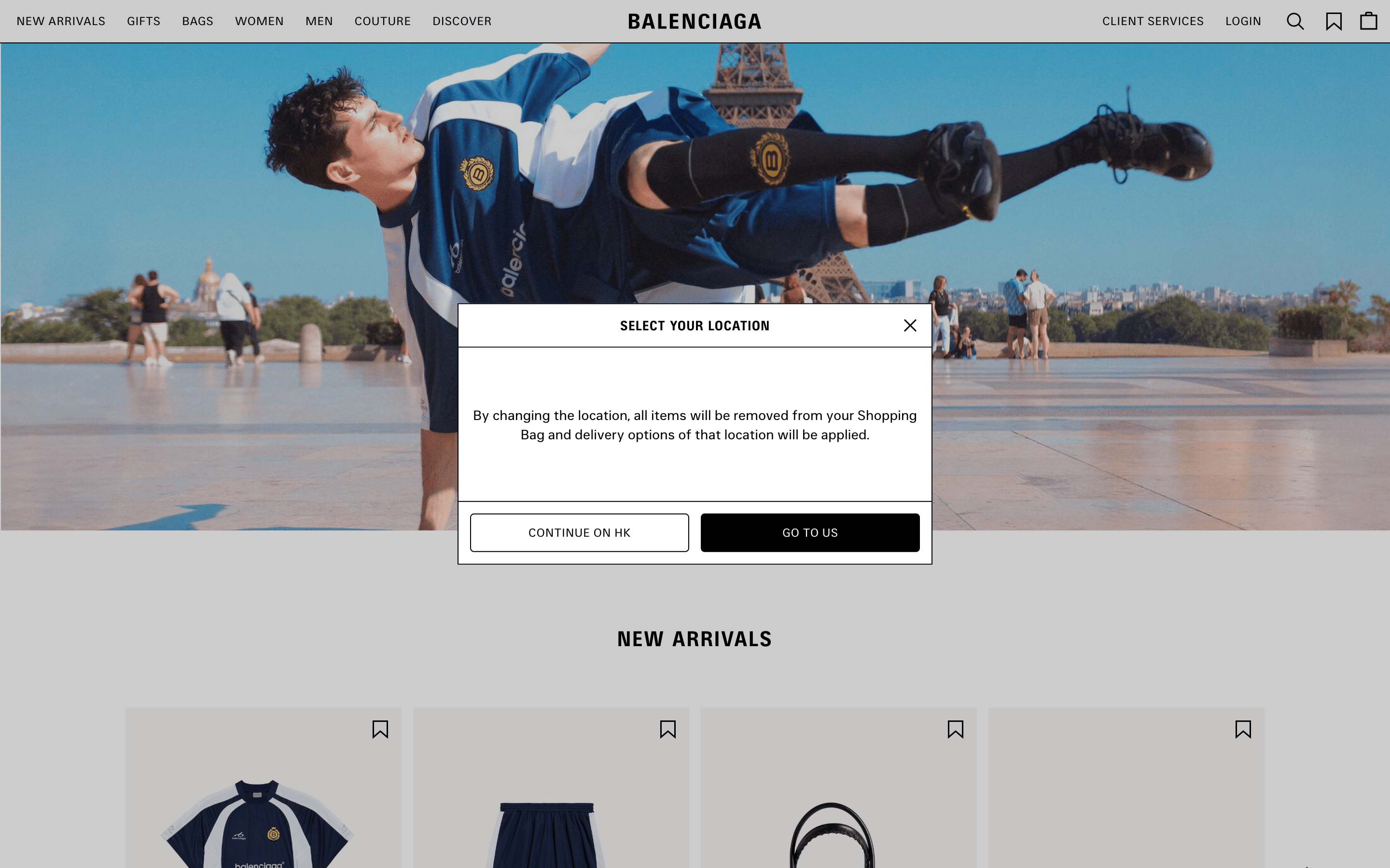
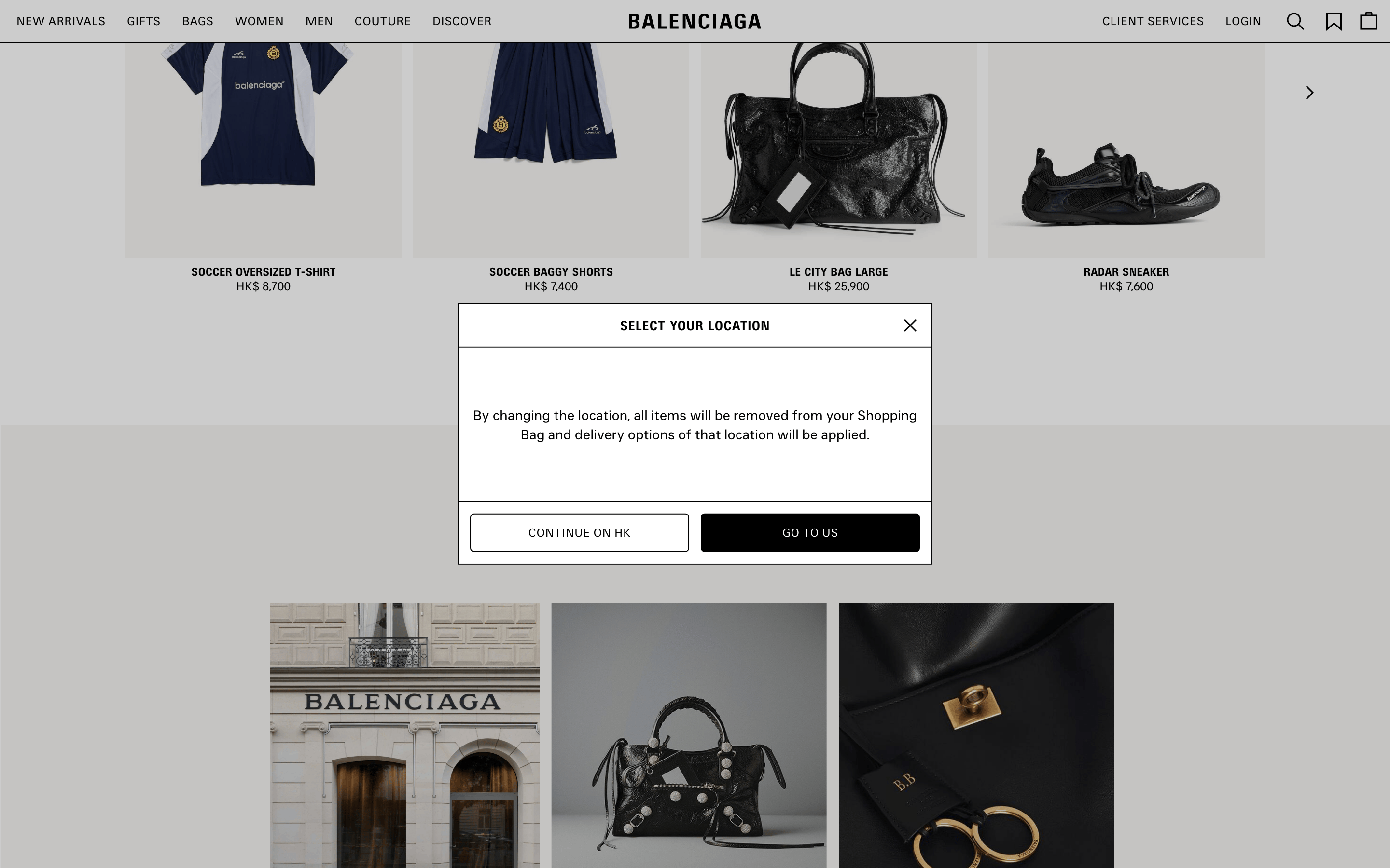
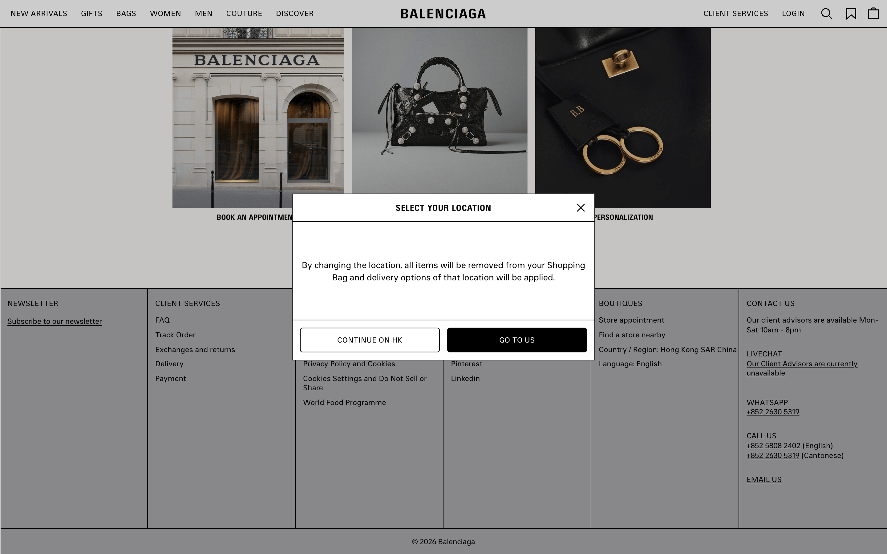
A stark, high-fashion magazine spread brought to life as an immersive digital shopping experience.
02
Color
#000000Ink
#FFFFFFBG
#767676Muted
rgba(0,0,0,1)Line
A high-contrast monochrome palette that prioritizes imagery and maintains a strict, austere luxury aesthetic.
03
Typography
sans-serif
display22px · 700
heading14px · 400
body12px · 400
All primary navigation and interactive text must be set in uppercase. · Primary UI typography must be set in a grotesque sans-serif category. · Use a wider letter-spacing (around 0.36px) for high-impact display text like section headers.
04
Spacing
4px
8px
16px
24px
32px
48px
64px
96px
A strict, uniform 4px base unit governs all spacing, creating a precise and structured layout.
A full-width, immersive grid that lets large-scale photography dominate the viewport, pushing standard UI elements to the periphery.
07
Motion & Interaction
150msmicro
250mssmall
350msmedium
cubic-bezier(0.32, 0, 0.67, 0)easing
Modal and overlay transitions use a 350ms duration with a sharp cubic-bezier easing curve. · Button interactions rely on quick 150ms box-shadow or color transitions for subtle feedback. · Page-level state changes are marked by a 0.25s ease-out opacity fade.
Subtle opacity or box-shadow transitions on interactive elements. · Immediate visual state change on press.
08
Components
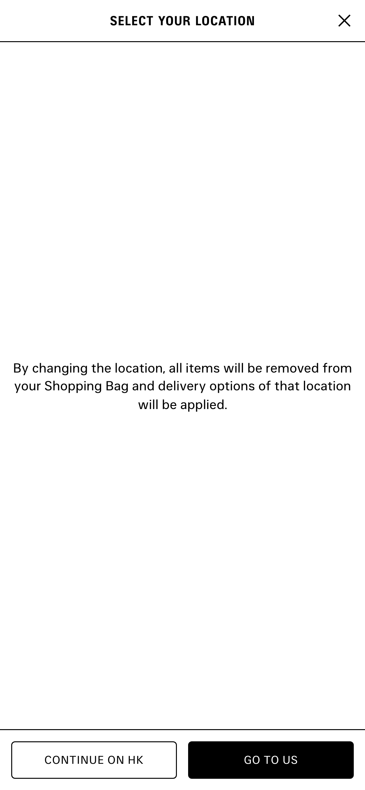
buttonStrictly rectangular with sharp corners, available as high-contrast filled (black) or outlined (white with black border) variants.
cardA clean, borderless container for product images, typically featuring a plain white background.
inputA minimalist text input with no visible border, defined only by placeholder text and a subtle underline.
heroA full-bleed, cinematic image or video hero that spans the entire viewport width, overlaid with minimal, centered UI.
09
Voice & Don'ts
ToneAuthoritative, austere, and minimalist.
HeadlinesShort, declarative, and set in uppercase sans-serif.
CTAsDirect and imperative, using uppercase text.
Don't use border-radius on UI elements — screenshot shows strictly rectangular buttons and cards.
Don't add drop shadows to cards or panels — screenshot shows flat surfaces with sharp borders.
Don't use serif fonts for UI text — screenshot shows a consistent use of sans-serif typography.
Don't use uppercase text for body copy — screenshot shows uppercase is strictly for navigation and headers.
Don't use multiple colors in the UI — screenshot shows a strict black, white, and gray palette.
Captured from the live site · real computed styles
11
System prompt
Balenciaga is a high-fashion e-commerce platform that uses a stark, monochromatic UI to let full-bleed cinematic photography dominate the user experience. The design relies on a strict black, white, and gray color palette (ink #000000, bg #FFFFFF, muted #767676) and a clean sans-serif typography system. UI elements are austere, featuring sharp rectangular buttons and minimal borders. Critical rules: 1) Maintain a strictly rectangular UI with zero border-radius. 2) Keep all primary navigation and headers in uppercase. 3) Never use drop shadows on cards or panels, relying instead on clean borders. 4) Use a sharp, cubic-bezier(0.32, 0, 0.67, 0) easing curve for modal transitions.
Bring this taste to your agent
Hand your AI agent a machine-readable spec of this design — tokens, type, motion, the whole DNA.