← OpenDesign CURATED · OPEN · FREE
Bottega Veneta
A clean, image-driven luxury fashion portal with restrained typography and a monochromatic palette.
fashion luxury
01
Identity DNA
Luxury Fashion Minimal Editorial Sophisticated
A high-end fashion magazine translated into a digital experience.
02
Color
#000000Ink
#333333Ink soft
#FFFFFFBG
#767676Muted
rgba(0, 0, 0, 0.1)Line
High-contrast monochrome relying on photography for color.
03
Typography
transitional-serif · geometric-sans
display 23px · 400body 14px · 400caption 12px · 400Typography is strictly uppercase for navigation and labels. · Font weights are minimal, restricted to regular and bold.
04
Spacing
4px
8px
16px
24px
32px
48px
64px
96px
Generous whitespace provides a refined, breathable layout.
05
Surfaces
sm · 4px
md · 8px
lg · 12px
pill · 999px
Minimal 1px borders are used primarily for buttons and interactive elements.
06
Layout
1280 container
12 columns
24px gutter
768 / 1024 breakpoints
A grid-based layout anchored by full-bleed editorial photography.
07
Motion & Interaction
220ms micro
400ms small
800ms medium
cubic-bezier(0.25, 1, 0.5, 1) easing
Subtle fade-in for text overlays. · Smooth vertical slide for menu reveals.
Subtle opacity reduction or underline appearance. · Immediate visual state change with no exaggerated feedback.
08
Components
button Minimalist rectangular buttons with solid black fill or simple black borders. card Clean cards defined by sharp edges and expansive imagery. chip N/A input Clean text inputs with bottom borders only. hero A full-viewport photographic hero with centered, uppercase text overlays. 09
Voice & Don'ts
Tone Confident, quiet, and authoritative. Headlines Short, evocative, and predominantly uppercase. CTAs Direct, simple, and completely capitalized. don't use bright or saturated accent colors — screenshot shows a strict monochromatic palette. don't use rounded corners on buttons — screenshot shows sharp, rectangular edges. don't use lowercase for primary navigation — screenshot shows all-caps text. don't use heavy drop shadows — screenshot shows completely flat surfaces. don't use busy backgrounds — screenshot shows clean white backgrounds or large photos. don't use playful or rounded typography — screenshot shows refined geometric and transitional fonts. Avoid: Exclamation marks Avoid: Salesy language Avoid: Overly decorative fonts 10
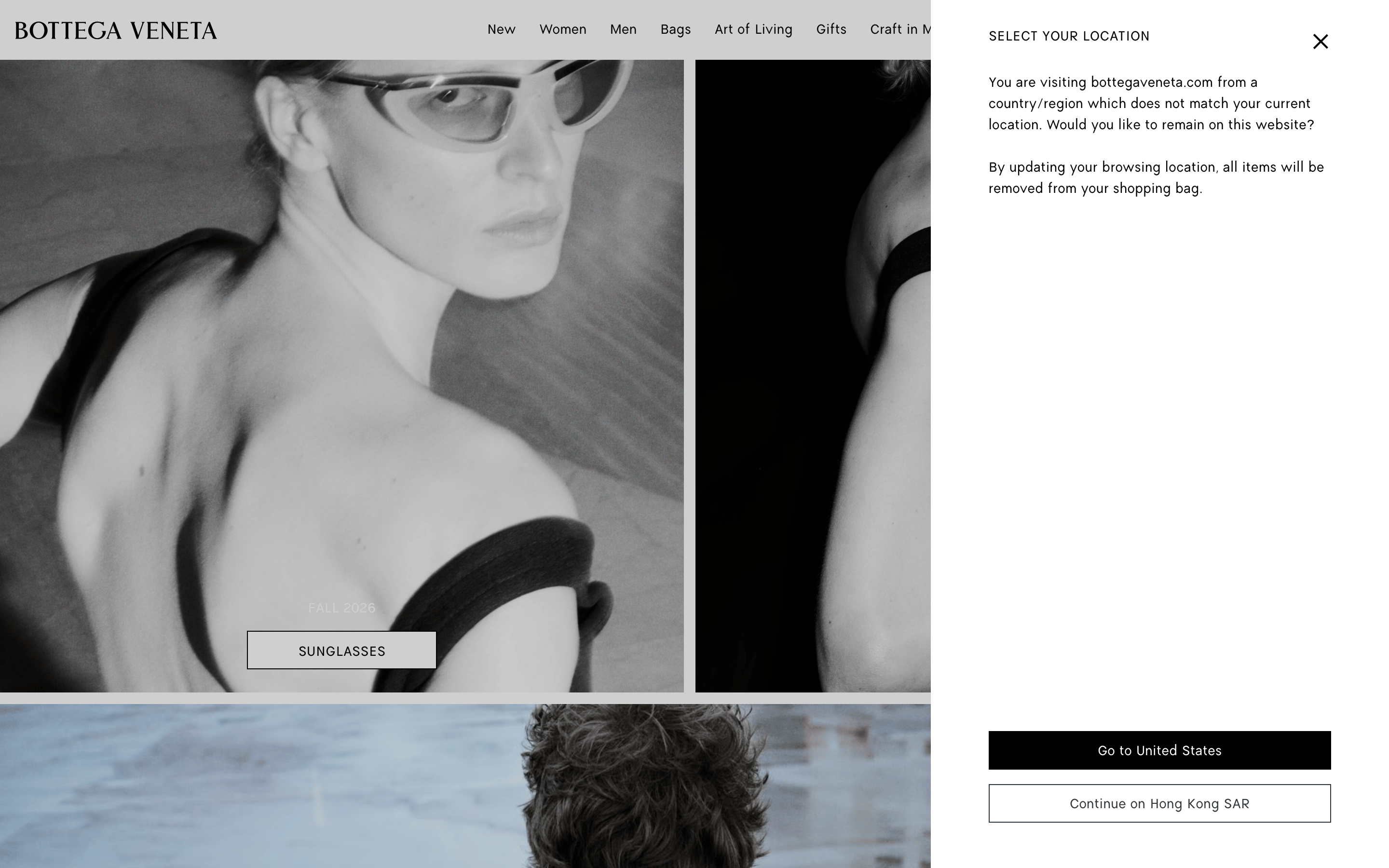
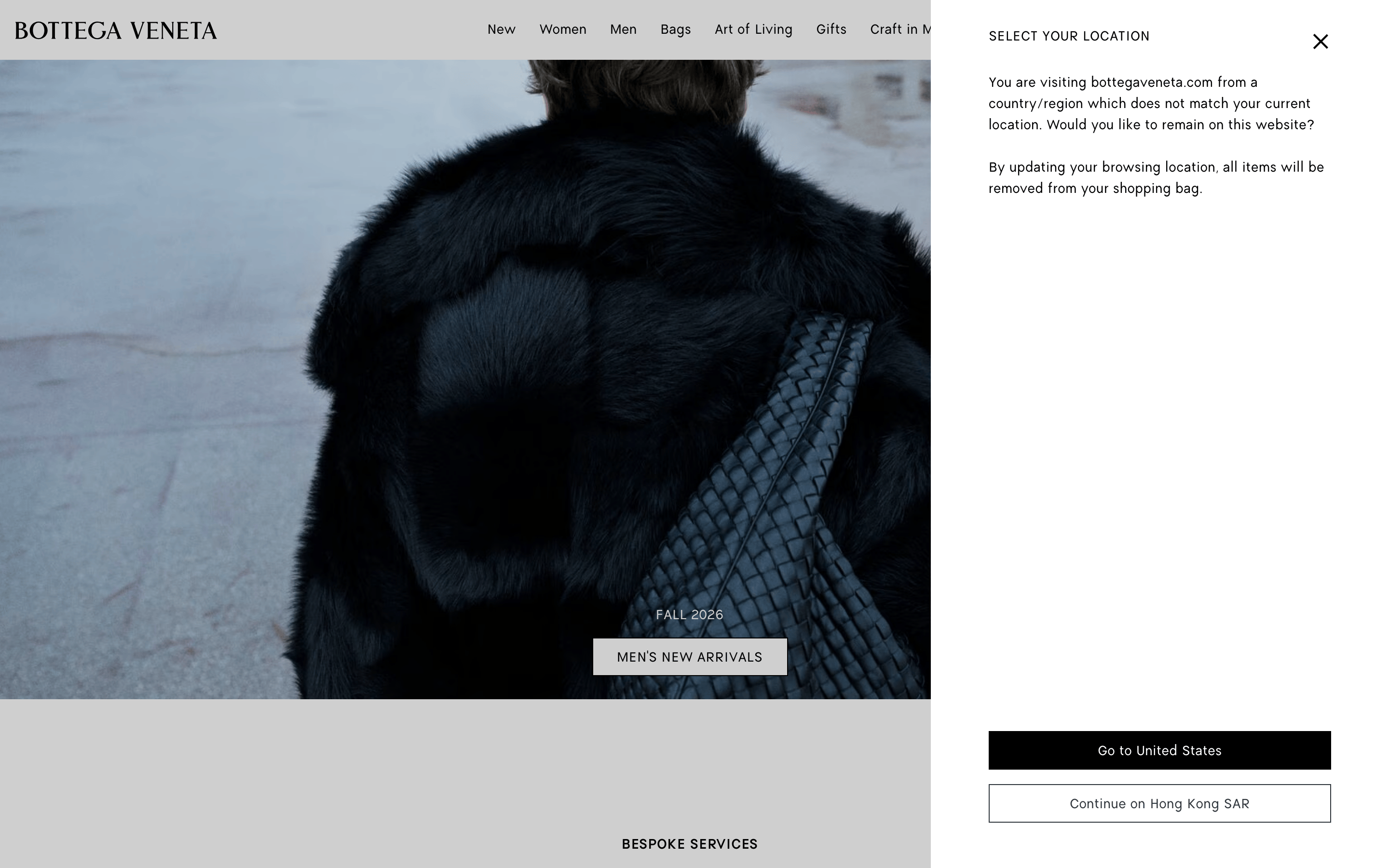
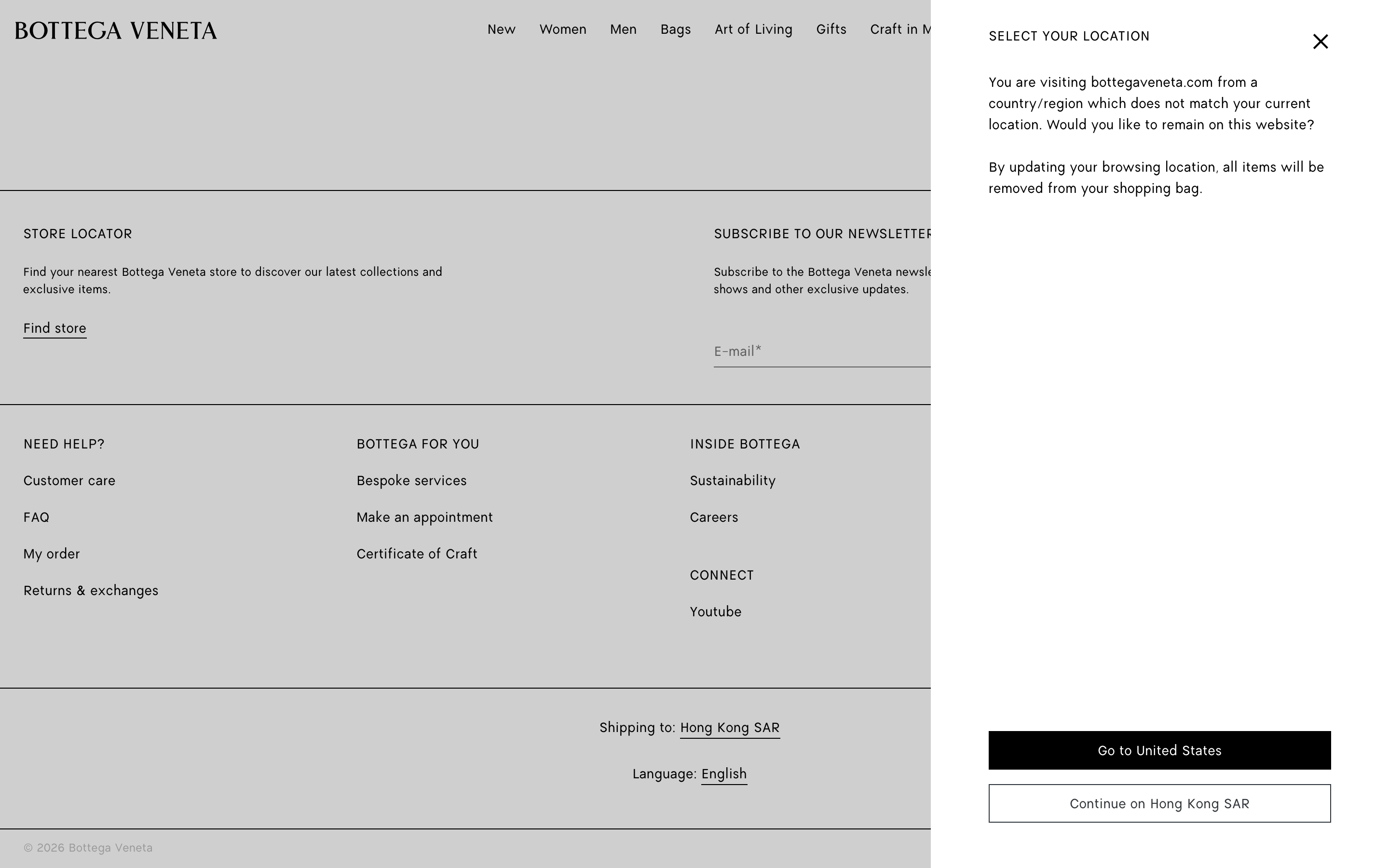
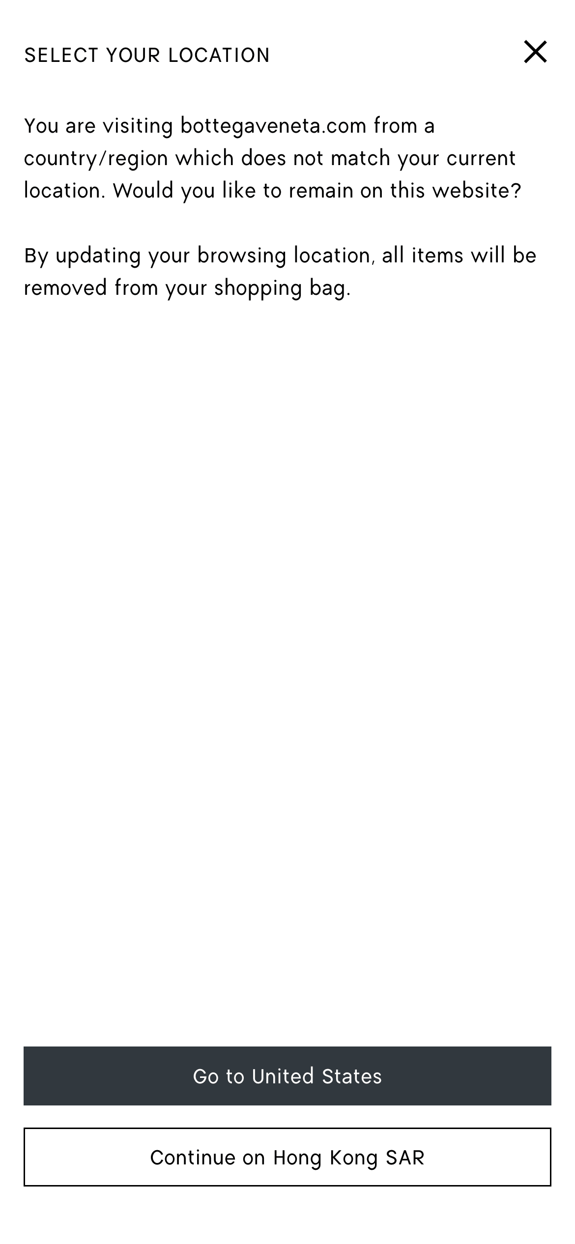
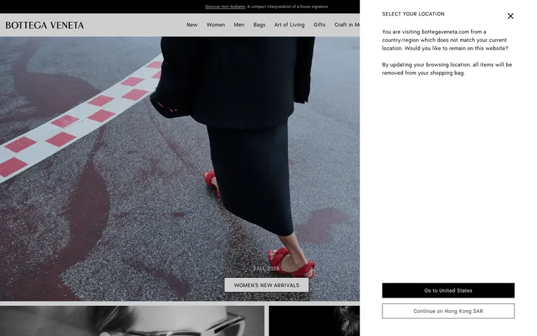
Inside the pack — real screenshots
桌面首屏(hero) 桌面滚动分段(90% viewport 步进,作为视觉证据) 桌面滚动分段(90% viewport 步进,作为视觉证据) 桌面滚动分段(90% viewport 步进,作为视觉证据) 桌面滚动分段(90% viewport 步进,作为视觉证据) 桌面滚动分段(90% viewport 步进,作为视觉证据) 移动首屏 Captured from the live site · real computed styles
11
System prompt
Bottega Veneta's design DNA is a masterclass in restrained luxury. The positioning is ultra-premium fashion, utilizing a stark monochromatic palette (#000000, #333333, #FFFFFF) to allow editorial photography to command attention. The typography combines a transitional-serif for the logo with a geometric-sans for all UI elements, maintaining a clean and authoritative presence. Critical don'ts include avoiding bright accent colors, avoiding rounded corners on UI components, and never using lowercase for primary navigation. The layout is spacious, grid-based, and intentionally minimal, ensuring the focus remains entirely on the product and brand imagery.
More from the library en · zh-CN · zh-TW · ja · ko
OpenDesign · curated web aesthetics for AI-readable design DNA · opendesign.cc
Why we curated this: The site is a premier example of 'quiet luxury' digital design, using extreme restraint to emphasize quality and craftsmanship.