← OpenDesign CURATED · OPEN · FREE
Bastienallard
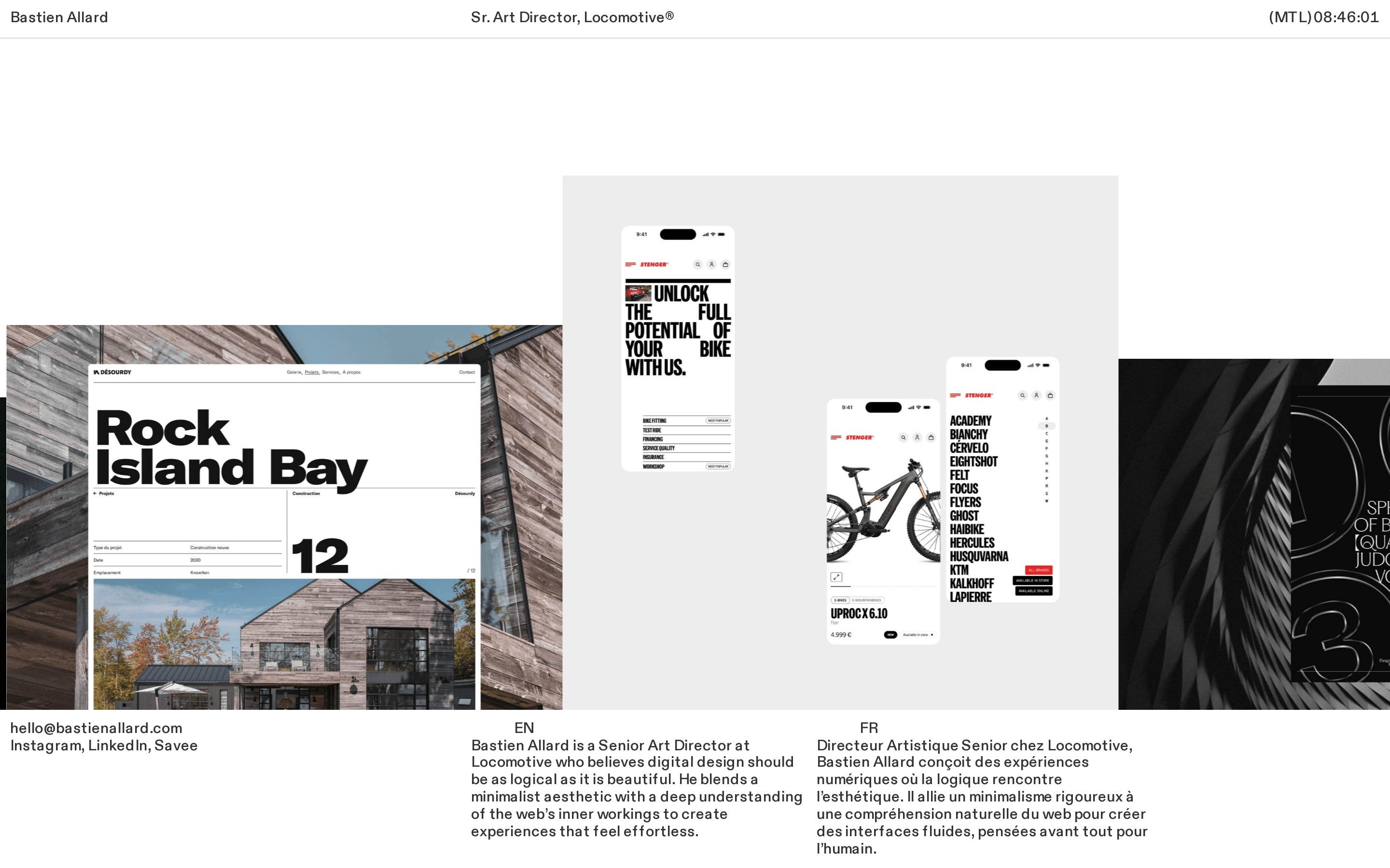
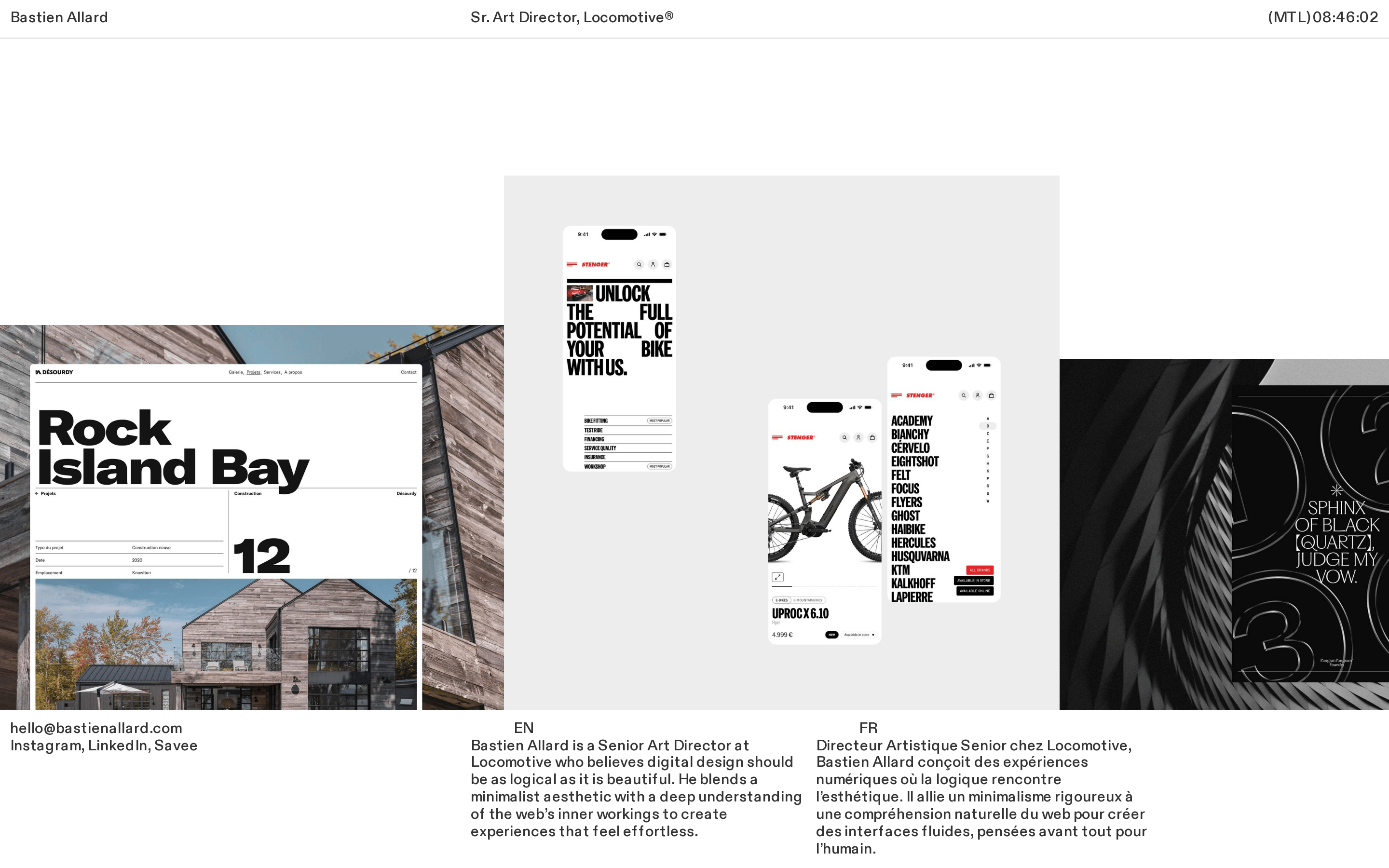
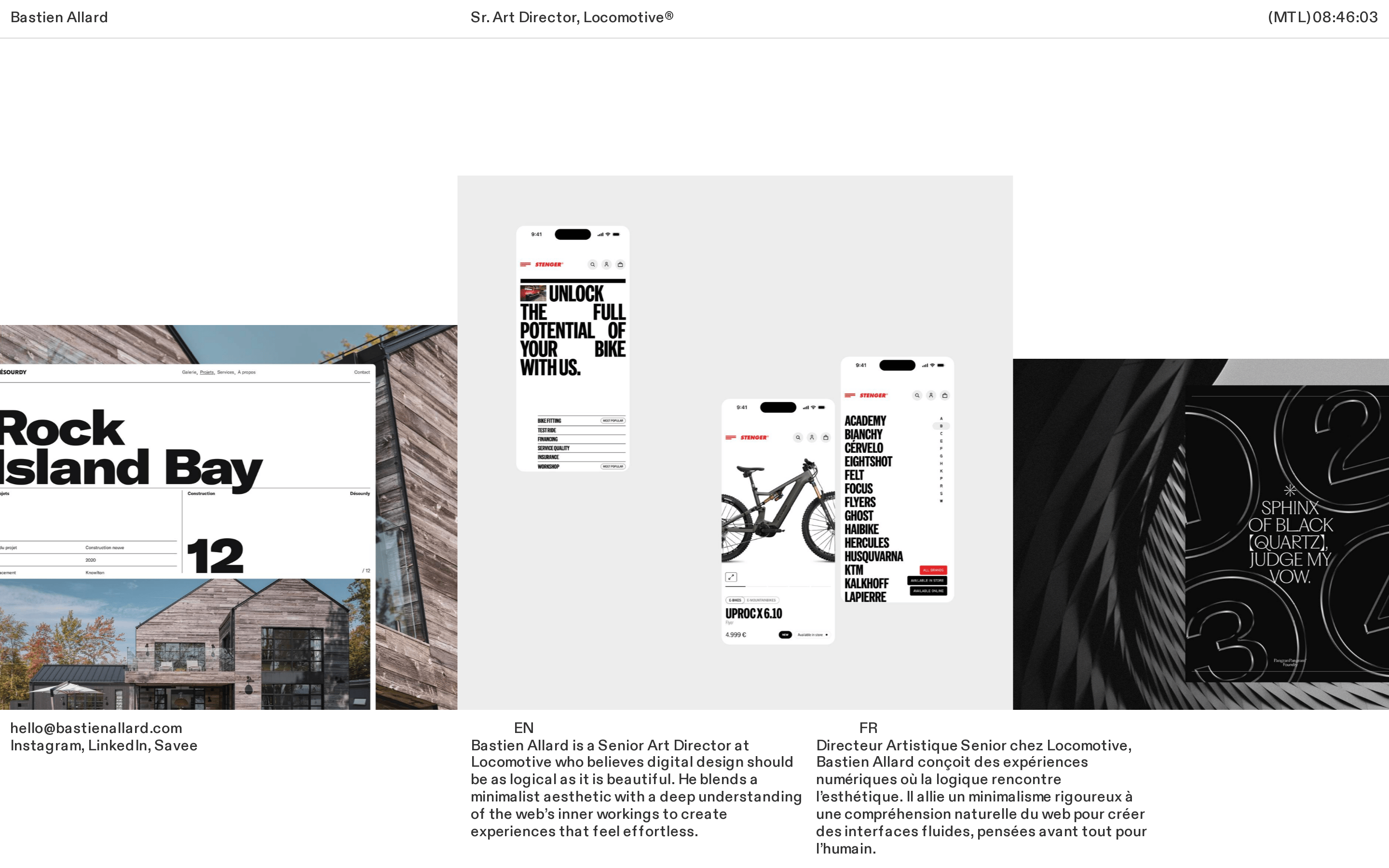
A minimalist personal portfolio for a Senior Art Director, featuring a monochromatic palette and strong typographic presence.
Portfolio Studio Typography Monochrome Curation
01
Identity DNA
Minimalist Logical Beautiful Effortless Studio
A clean, high-contrast editorial layout designed to showcase digital design expertise.
02
Color
#000000Ink
rgba(0,0,0,0.8)Ink soft
#FFFFFFBG
#7F7F7FMuted
Extreme high-contrast monochrome with no accent colors, relying on typography and photography for visual hierarchy.
03
Typography
geometric-sans · monospace
display 56px · 540body 16px · 540Use Diatype Variable for all UI text · Maintain tight letter-spacing on headlines · Use system fonts as fallbacks only
04
Spacing
4px
8px
16px
24px
32px
48px
64px
96px
Generous white space with a strict 4px baseline grid.
05
Surfaces
sm · 4px
md · 8px
lg · 12px
pill · 999px
Subtle 1px borders using rgba(0,0,0,0.8) for separation.
06
Layout
1440 container
12 columns
24px gutter
768 / 1024 breakpoints
A clean three-column footer layout with a wide, spacious main content area.
07
Motion & Interaction
220ms micro
400ms small
800ms medium
cubic-bezier(0.25, 0.1, 0.25, 1) easing
Smooth transitions on all interactive elements · Subtle cursor changes on hover
Subtle opacity changes or color inversions on links. · Immediate feedback with no heavy animation.
08
Components
button Minimalist text-based buttons without background fills. card Image-heavy project cards with subtle typography overlays. chip Simple text tags for categorization. input Clean, borderless text inputs. hero Large, high-impact typography paired with editorial photography. 09
Voice & Don'ts
Tone Professional, confident, and understated. Headlines Bold, direct, and highly legible. CTAs Subtle text links that guide rather than shout. Don't use a dark mode — the screenshot shows a pure white background. Don't add bright accent colors — the palette is strictly monochrome. Don't use decorative serif fonts — the screenshot shows a geometric sans-serif throughout. Don't add heavy drop shadows — the surfaces are flat and rely on borders or typography for depth. Don't clutter the UI with many colors — it uses a strict black, white, and gray palette. Don't use rounded corners on everything — the design is sharp and architectural. Avoid: Excessive decoration Avoid: Loud colors Avoid: Complex animations 10
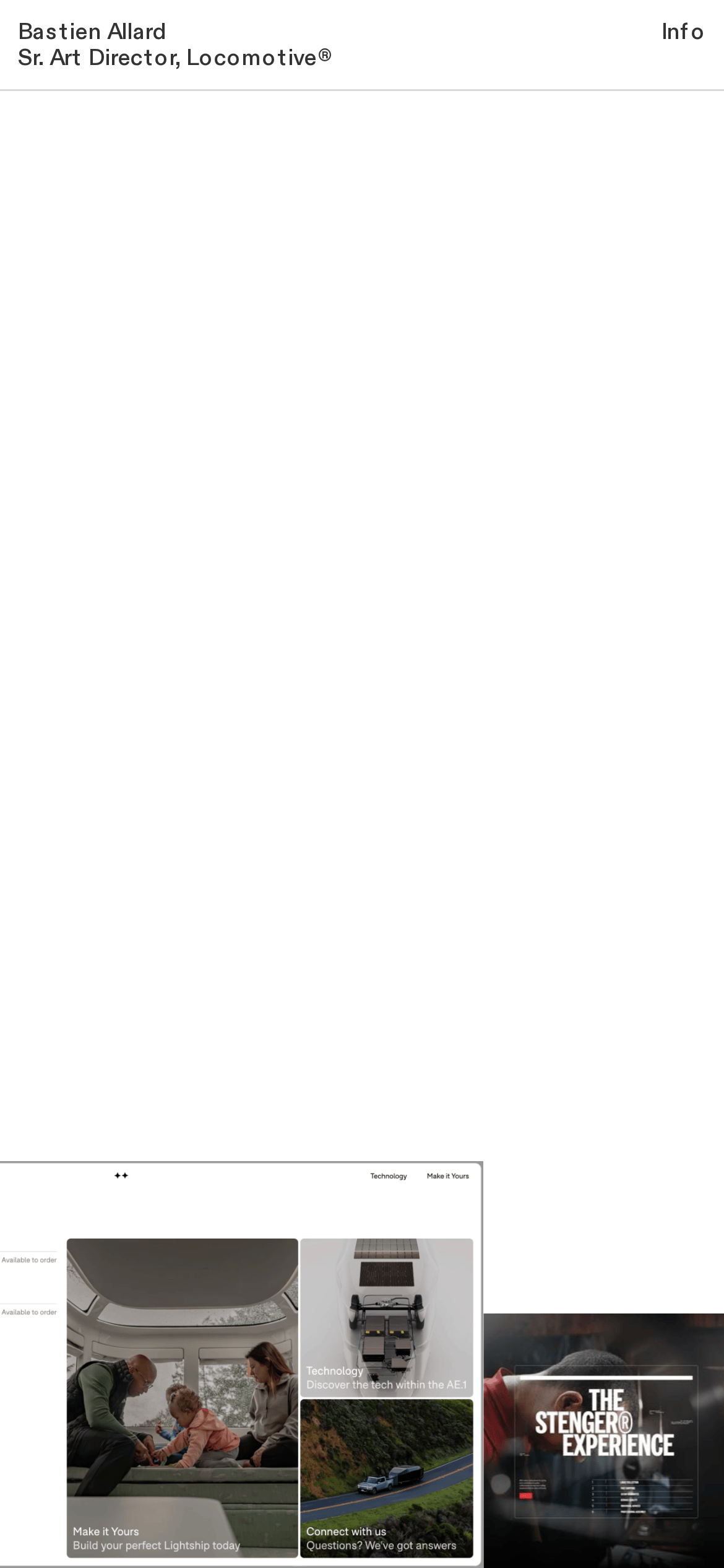
Inside the pack — real screenshots
桌面首屏(hero) 桌面滚动分段(90% viewport 步进,作为视觉证据) 桌面滚动分段(90% viewport 步进,作为视觉证据) 移动首屏 Captured from the live site · real computed styles
11
System prompt
This is a minimalist portfolio for a Senior Art Director, featuring a monochromatic palette (black ink #000000, white background #FFFFFF, muted gray #7F7F7F). The typography is a geometric sans-serif (Diatype Variable) with tight letter-spacing on display sizes. The layout is spacious with generous white space and a clear editorial feel. Critical don'ts: Don't introduce bright accent colors, don't use decorative serifs, and don't clutter the interface with heavy shadows or complex UI components. The design relies on strong photography and bold typography to create impact.
More from the library en · zh-CN · zh-TW · ja · ko
OpenDesign · curated web aesthetics for AI-readable design DNA · opendesign.cc
Why we curated this: This site is worth including as a prime example of a minimalist, typography-driven portfolio that prioritizes content and clarity over visual noise.