Stark monochrome palette with pure white backgrounds, solid black typography, and neutral gray for secondary text.
03
Typography
geometric-sans
display16px · 400
Extremely tight letter-spacing (-0.22px) for a refined, compact appearance. · Heavy use of small font sizes around 13px for body text. · Strictly uniform font weight of 400 across all visible elements.
04
Spacing
11px
18px
23px
45px
Defined by consistent 18px horizontal padding and 45px vertical section padding.
05
Surfaces
sm · 0px
md · 0px
lg · 0px
pill · 999px
No visible structural borders; separation relies entirely on white space.
06
Layout
1440container
1columns
768 / 1024breakpoints
Full-width stacked layout with generous vertical spacing between sections.
07
Motion & Interaction
220msmicro
400mssmall
1000msmedium
cubic-bezier(0.22, -0.01, 0.13, 0.99)easing
Slow, deliberate transitions (1s) for opacity, transform, and clip-path.
Cursor changes to pointer on interactive text elements. · Subtle opacity or transform changes likely linked to the 1s transitions.
08
Components
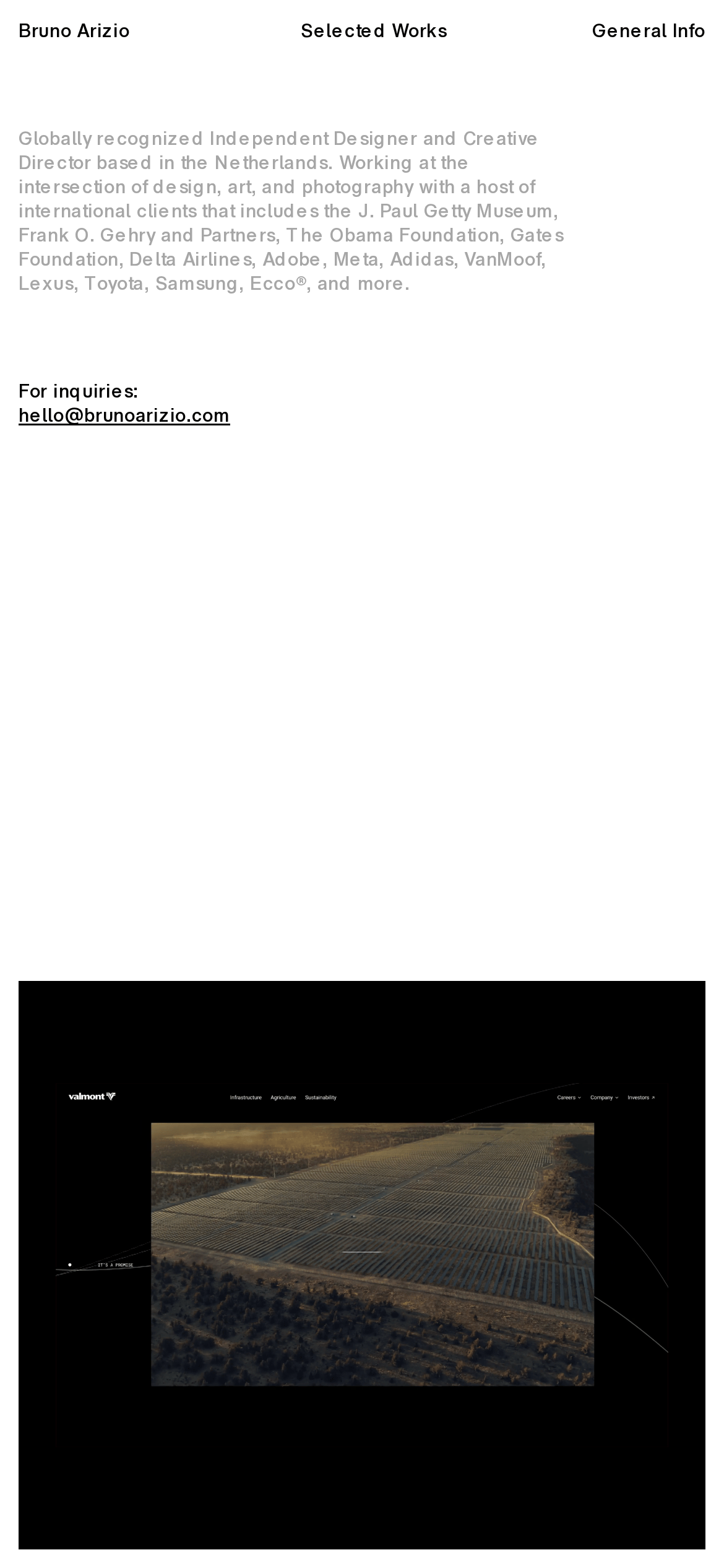
cardA single, full-bleed project preview card displaying a website design.
heroA highly minimalist, text-only introduction section without a traditional graphical hero image.
09
Voice & Don'ts
ToneProfessional, confident, and understated.
HeadlinesDirect and descriptive, stating credentials and client lists plainly.
CTAsHighly minimal, using a simple underlined email link for inquiries.
don't use multiple font weights — screenshot shows a uniform 400 weight across all text.
Captured from the live site · real computed styles
11
System prompt
This is a minimalist portfolio website for an independent designer and creative director. The visual DNA is defined by a stark, high-contrast monochrome palette (#FFFFFF background, #000000 ink, #A6A6A6 muted) and a clean, geometric sans-serif typeface used at small sizes with tight letter-spacing. The layout is incredibly spacious, relying on generous padding (18px horizontal, 45px vertical) and vertical stacking rather than complex grids. Critical donts include: never use multiple font weights, do not add shadows or complex borders, and never use wide letter-spacing. The motion profile is slow and deliberate, utilizing a custom cubic-bezier (0.22, -0.01, 0.13, 0.99) for transitions. The overall effect is refined, quiet, and highly professional, letting the work speak for itself.
Bring this taste to your agent
Hand your AI agent a machine-readable spec of this design — tokens, type, motion, the whole DNA.