← OpenDesign CURATED · OPEN · FREE
Beau To
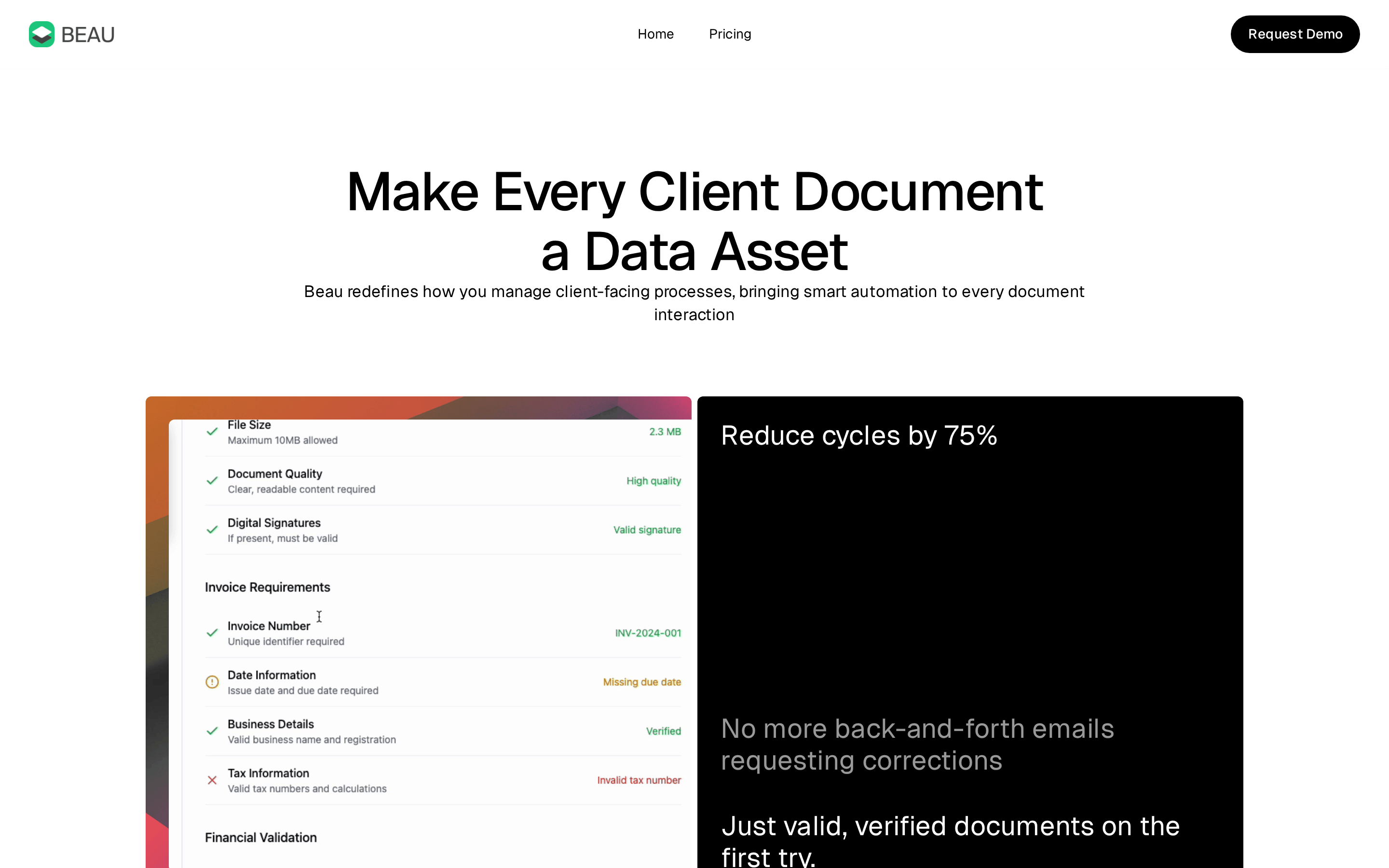
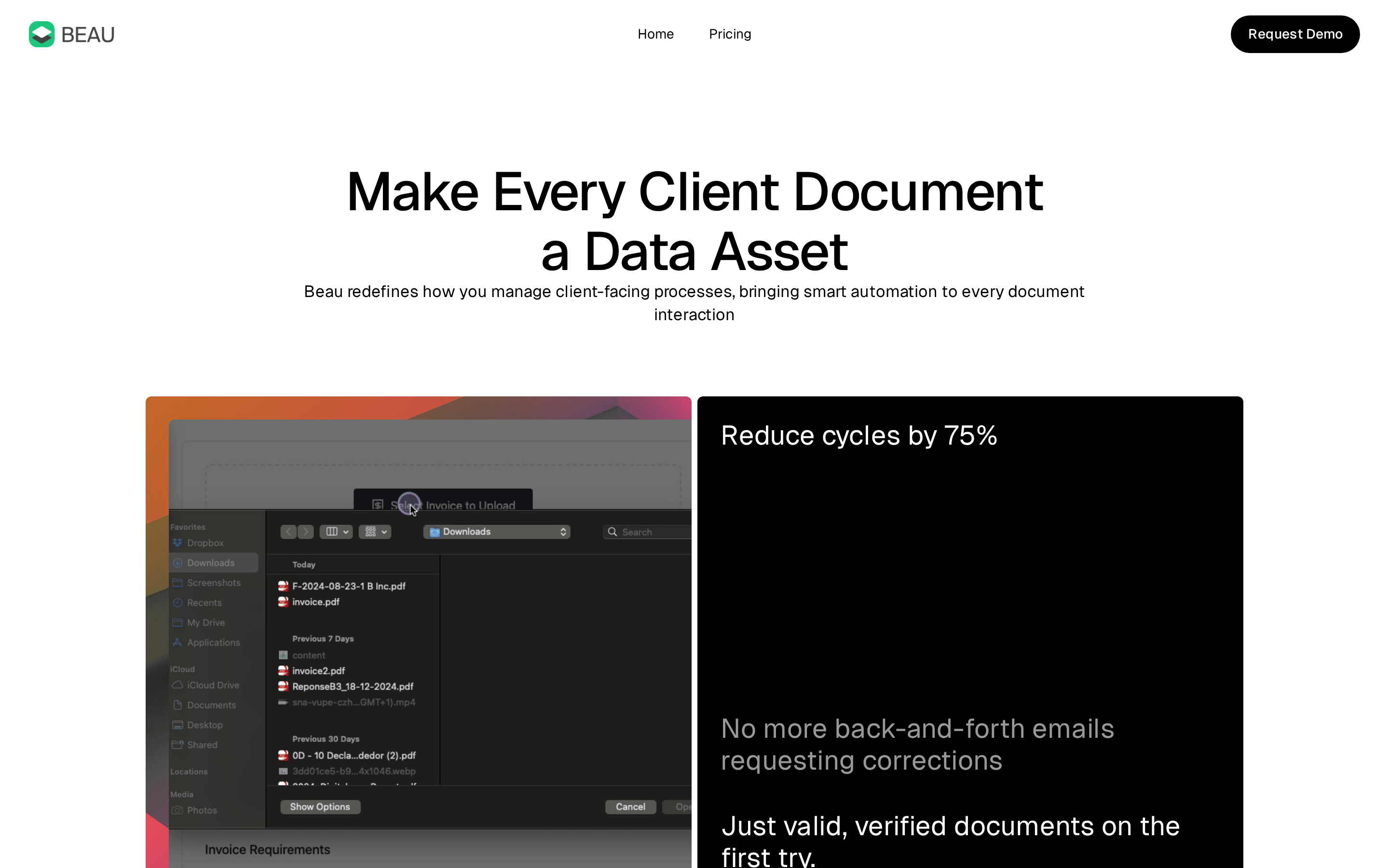
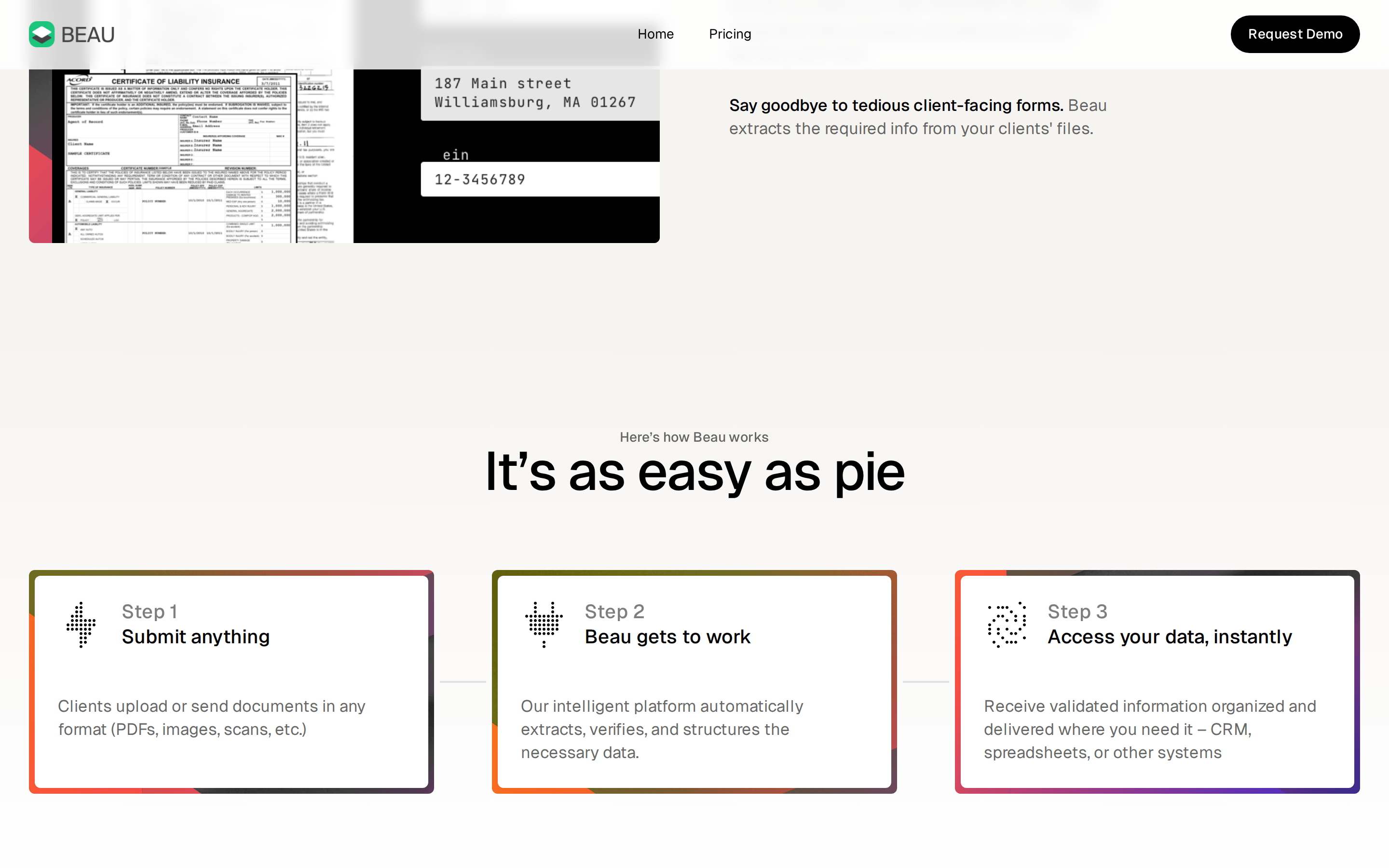
Beau redefines client-facing processes by bringing smart automation to every document interaction.
SaaS Productivity AI Clean Tooling
01
Identity DNA
automation documents data verification efficiency
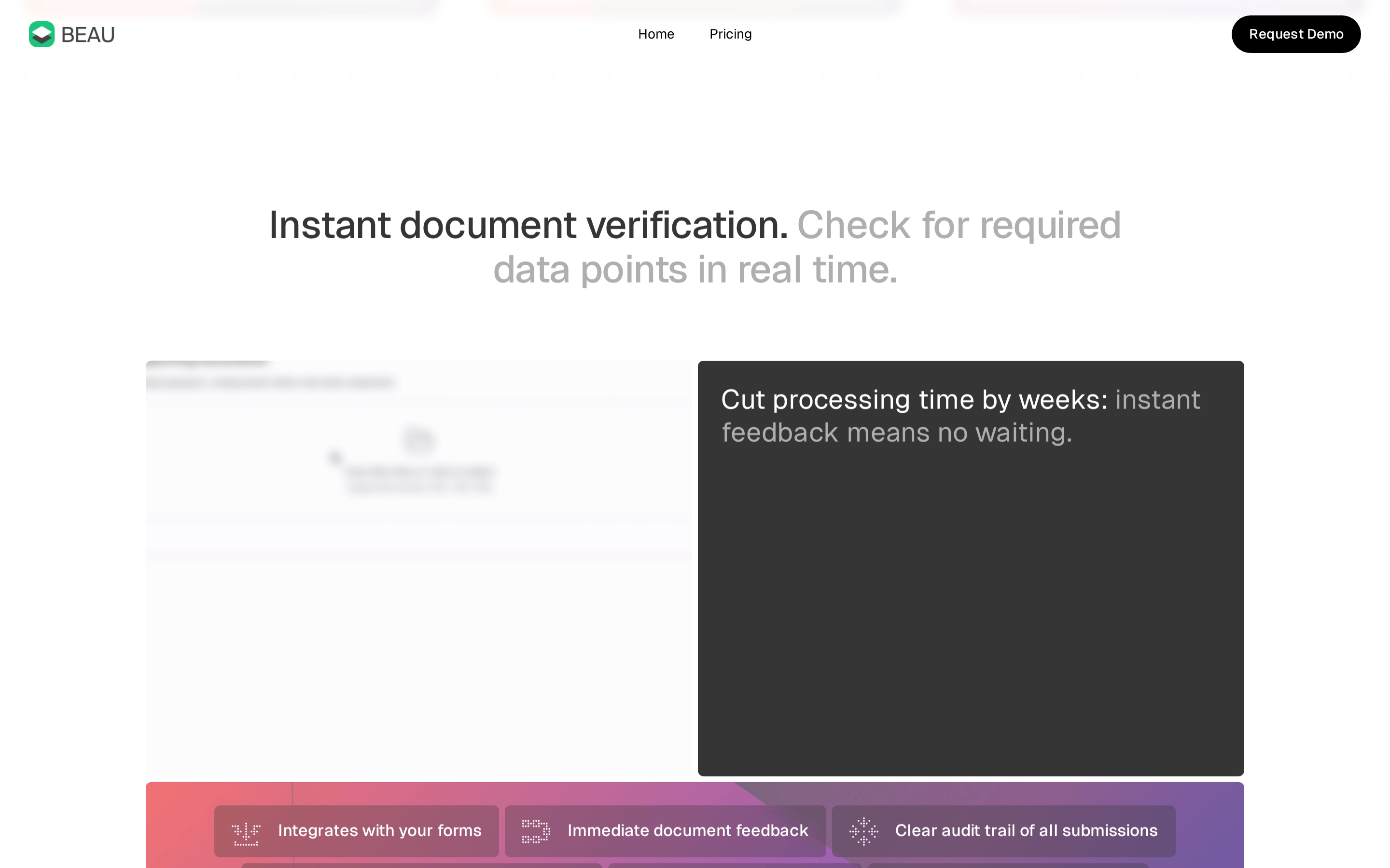
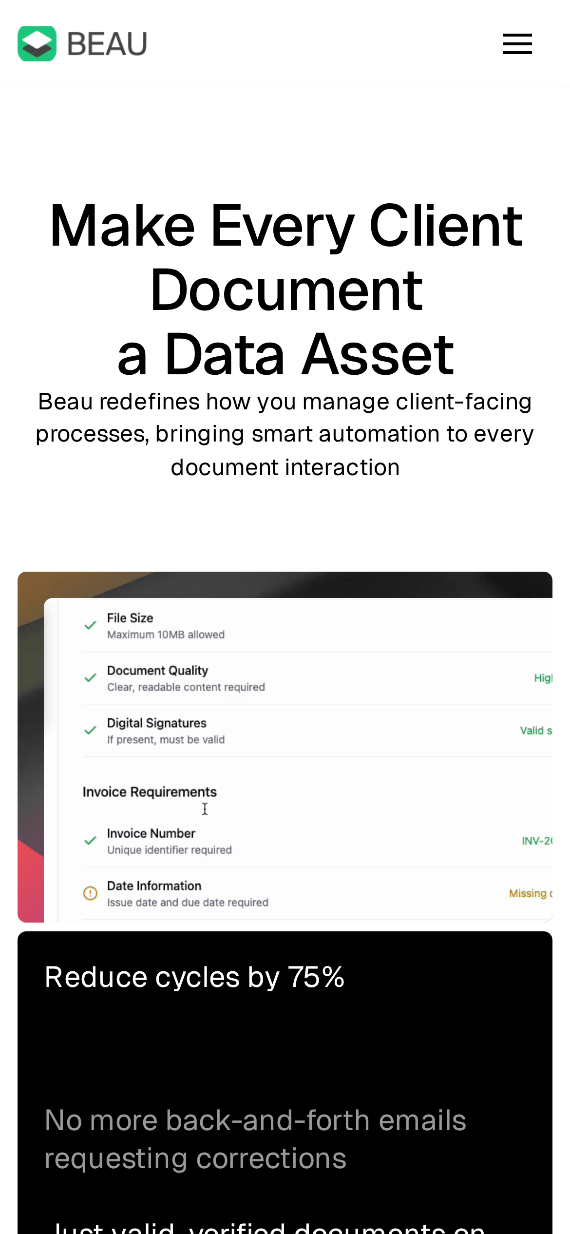
An intelligent document processing engine that automates data extraction and validation.
02
Color
#FF8308Accent
#000000Ink
#FFFFFFBG
#F6F4F1BG quiet
rgba(0,0,0,0.1)Line
High-contrast black and white for clarity, with vibrant gradient accents for dynamic energy.
03
Typography
humanist-sans · monospace
display 56px · 500display-sm 40px · 500heading 28px · 500body 17px · 400caption 14px · 40004
Spacing
4px
8px
12px
16px
18px
24px
48px
72px
96px
Based on a 4px grid with generous whitespace to emphasize clarity.
05
Surfaces
sm · 6px
md · 12px
lg · 24px
pill · 200px
Subtle 1px solid lines for separation.
0px 2px 6px 0px rgba(0, 0, 0, 0.06)
06
Layout
1280 container
12 columns
24px gutter
768 / 1024 breakpoints
Centered hero section followed by alternating split layouts and a 3-column feature grid.
07
Motion & Interaction
220ms micro
400ms small
800ms medium
cubic-bezier(0.4, 0, 0.2, 1) easing
Smooth opacity transitions on hover and state changes.
Cursor pointer with subtle color or opacity transitions. · Immediate visual feedback.
08
Components
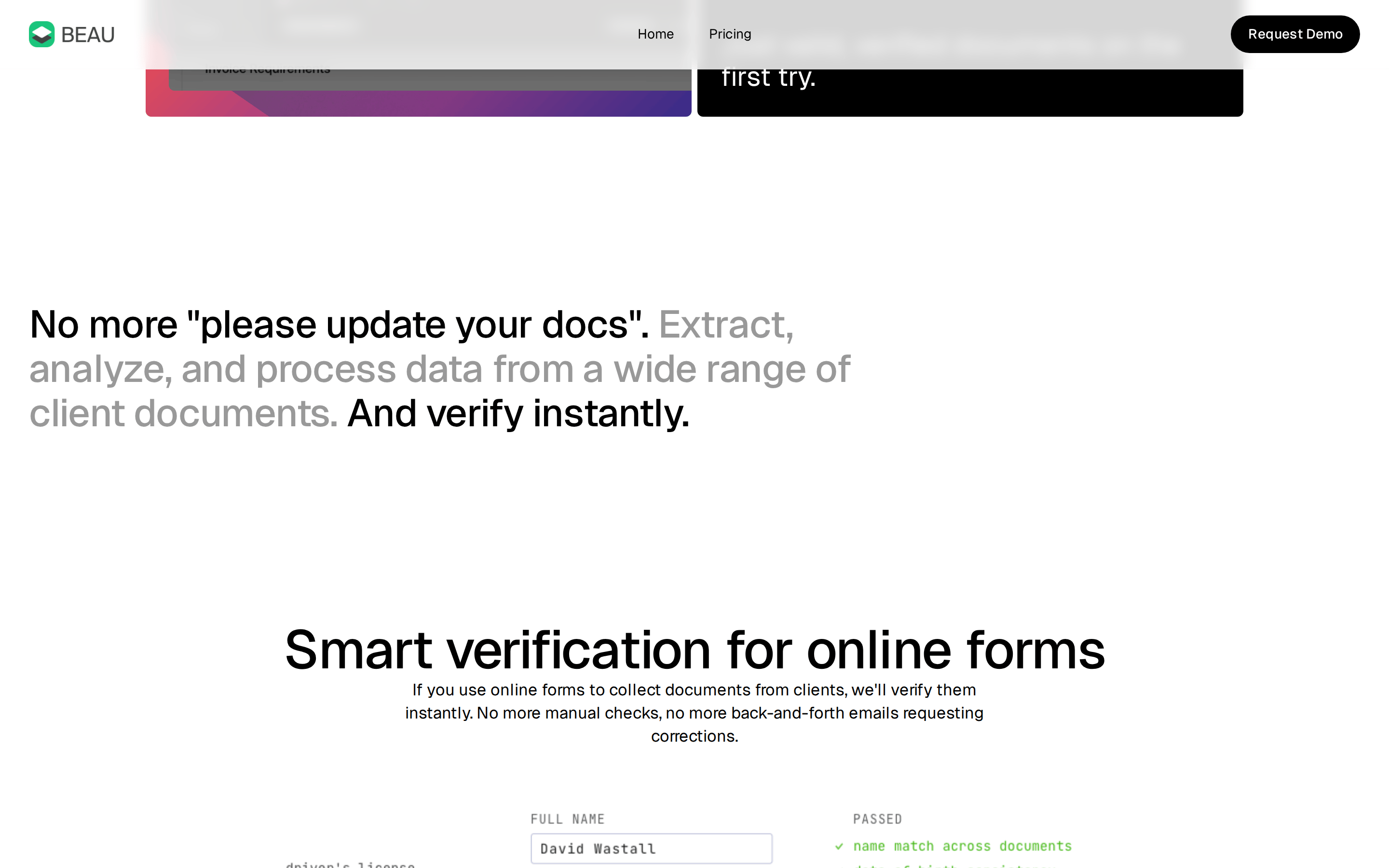
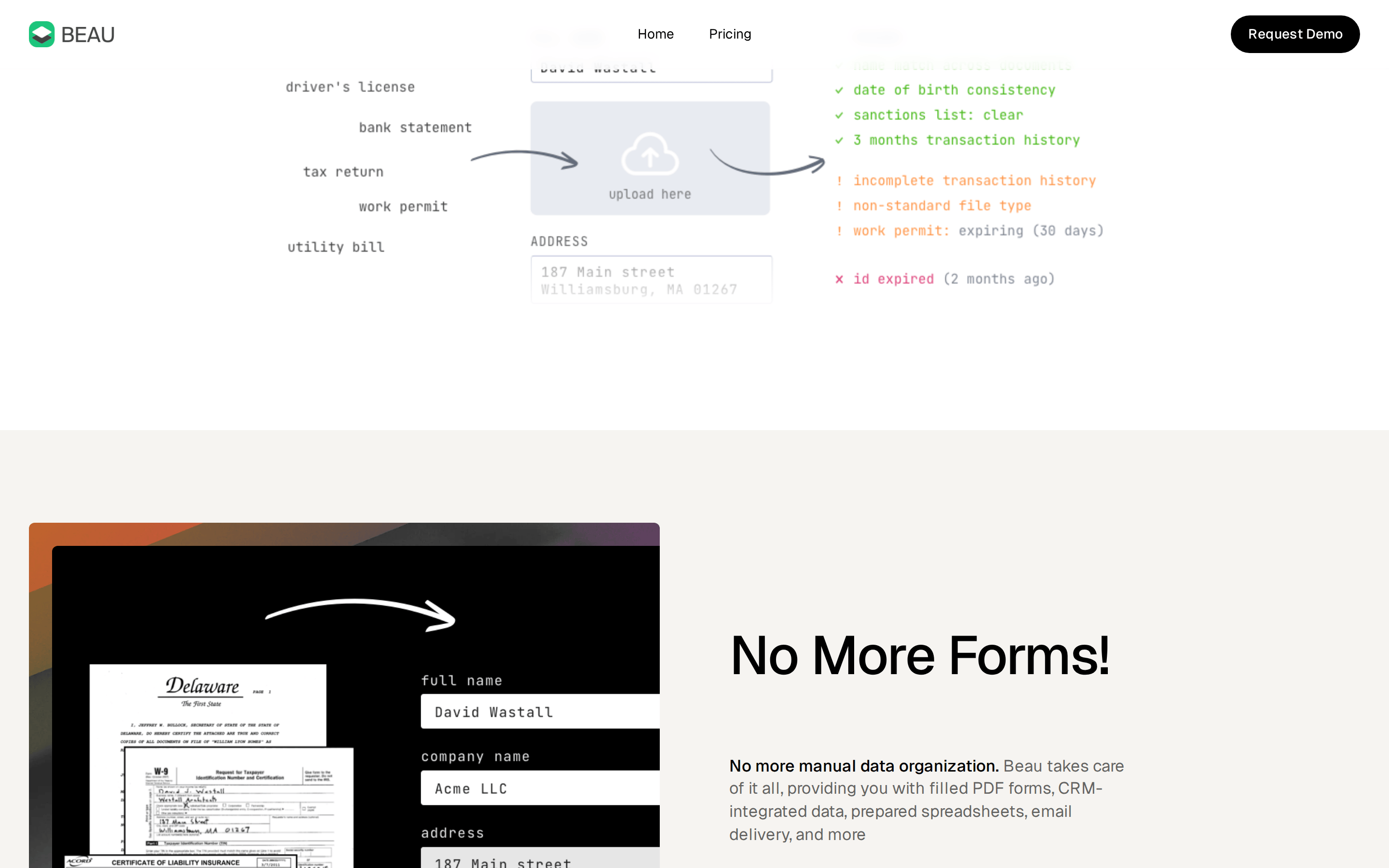
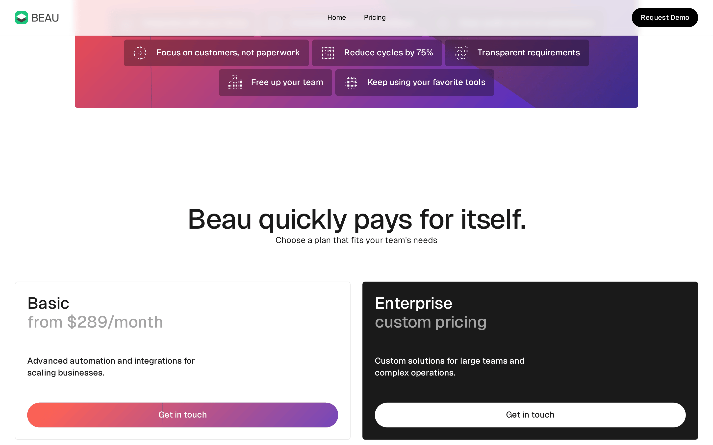
button Pill-shaped primary button with high contrast black background and white text. card Cards with subtle borders and soft shadows, often containing data validation examples. chip Status indicators with colored text (green for valid, orange for warning, red for invalid). input Clean text-based inputs for data entry. hero Large centered headline with a supporting subtitle and a complex UI mockup showcasing data validation. 09
Voice & Don'ts
Tone Professional, efficient, and confident. Headlines Direct and benefit-driven, often using large, bold typography. CTAs Clear and action-oriented, like 'Request Demo'. don't use multiple primary accent colors — screenshot shows a single gradient used for emphasis across steps don't use complex decorative backgrounds — screenshot shows a mostly clean white background with minimal noise don't use center-aligned body text — screenshot shows left-aligned text for readability in descriptions don't use rounded corners on all elements — screenshot shows sharp corners on some UI mockups but rounded on buttons don't use heavy drop shadows — screenshot shows very subtle, almost flat shadowing don't use sans-serif fonts for code — screenshot uses a monospace font for document data extraction Avoid: Fluff Avoid: Jargon Avoid: Passive voice 10
Inside the pack — real screenshots
桌面首屏(hero) 桌面滚动分段(90% viewport 步进,作为视觉证据) 桌面滚动分段(90% viewport 步进,作为视觉证据) 桌面滚动分段(90% viewport 步进,作为视觉证据) 桌面滚动分段(90% viewport 步进,作为视觉证据) 桌面滚动分段(90% viewport 步进,作为视觉证据) 桌面滚动分段(90% viewport 步进,作为视觉证据) 桌面滚动分段(90% viewport 步进,作为视觉证据) 移动首屏 Captured from the live site · real computed styles
11
System prompt
Beau is a SaaS platform for document automation, characterized by a clean, high-contrast aesthetic. Key hex colors are #FFFFFF, #000000, and a vibrant orange-red gradient (#FF8308). The typography is a modern humanist-sans-serif (Geist) with tight letter spacing for large headlines. Critical design constraints: maintain extreme clarity and whitespace, avoid visual clutter in favor of data-focused UI mockups, and use a consistent vibrant gradient as the only major accent color. The layout should remain spacious and centered to emphasize professional efficiency and trust.
More from the library en · zh-CN · zh-TW · ja · ko
OpenDesign · curated web aesthetics for AI-readable design DNA · opendesign.cc
Why we curated this: The site is worth including for its sophisticated use of UI mockups to demonstrate complex data validation processes within a clean, modern SaaS aesthetic.