High-contrast monochrome with a single striking red accent
03
Typography
grotesque-sans
display150px · 600
display-sm50px · 600
body19px · 400
caption16px · 400
Use tight negative letter-spacing for large display sizes · Maintain high weight contrast between headings and body · Allow large typography to dominate the visual hierarchy
04
Spacing
4px
8px
16px
20px
24px
32px
40px
50px
64px
96px
Generous whitespace around large typographic elements and image blocks
05
Surfaces
sm · 0px
md · 0px
lg · 0px
pill · 999px
Minimal 1px black borders used strictly for interactive elements and tags
None observed
06
Layout
1400container
12columns
24pxgutter
768 / 1024breakpoints
Asymmetric, text-led layouts with overlapping elements and dynamic grid shifts
07
Motion & Interaction
100msmicro
250mssmall
350msmedium
cubic-bezier(0.165, 0.84, 0.44, 1)easing
Hover state transitions for buttons and interactive elements · Subtle transform animations on grab-able elements
Background color or color inversion · Standard active states
08
Components
buttonMinimal outline pills with black text or black fill with white text
cardImage-led content blocks with strong typographic hierarchy and no container borders
chipSmall uppercase tags with 1px black borders
inputNot prominently featured
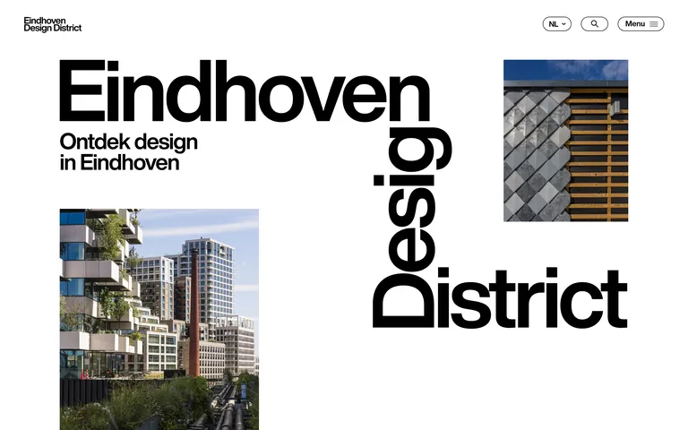
heroMassive typographic focal point accompanied by offset architectural photography
09
Voice & Don'ts
ToneDirect, curated, and authoritative
HeadlinesBold, often using sentence case or lowercase with tight tracking
CTAsClear, concise, and minimal
Don't use serif typography — screenshot shows strict use of grotesque sans-serifs
Don't add drop shadows to containers — screenshot shows flat, borderless image and text blocks
Don't center all content — screenshot shows strong alignment to the left and dynamic asymmetric layouts
Don't use multi-colored gradients — screenshot shows solid black and white backgrounds
Don't use small, delicate icons — screenshot shows bold, clear iconography like the menu hamburger
Don't overfill the screen with content — screenshot shows generous whitespace and breathing room
Captured from the live site · real computed styles
11
System prompt
A bold editorial design system for an urban design platform. Positioned as a curated guide to Eindhoven's design culture. Key colors are pure black (#000000) and white (#FFFFFF) for high contrast, with a single vibrant red (#FF0000) for accent tags and a light grey (#E8E8E8) for soft backgrounds. Typography is exclusively grotesque sans-serif, featuring massive display sizes with tight tracking and clear hierarchy. Critical donts: Do not use serif fonts or decorative typography; Do not center all text elements, rely on strong left alignment and asymmetry; Do not use drop shadows or heavy gradients, keep surfaces flat and clean; Do not shy away from massive, dominating text sizes in the hero sections.
Bring this taste to your agent
Hand your AI agent a machine-readable spec of this design — tokens, type, motion, the whole DNA.