digital agencyShopify partnerbrand buildingpremium commerce
A high-end fashion editorial meets digital storefront
02
Color
#C38133Accent
#000000Ink
#F2EFE6BG
rgba(0,0,0,1.0)Line
High-contrast monochrome with warm neutral accents
03
Typography
grotesque-sans · transitional-serif
display86px · 400
body16px · 400
caption11px · 500
Headlines: Neue Haas Grotesk Display, tightly tracked negative values · Body: Reckless Neue transitional serif, elegant and readable · Labels: Uppercase grotesque with standard weight
04
Spacing
4px
8px
16px
24px
32px
48px
64px
96px
100px
Asymmetric grid with generous whitespace on right half
05
Surfaces
sm · 4px
md · 4px
lg · 100px
pill · 100px
1px solid black on buttons and cards
06
Layout
1440container
12columns
35pxgutter
768 / 1024breakpoints
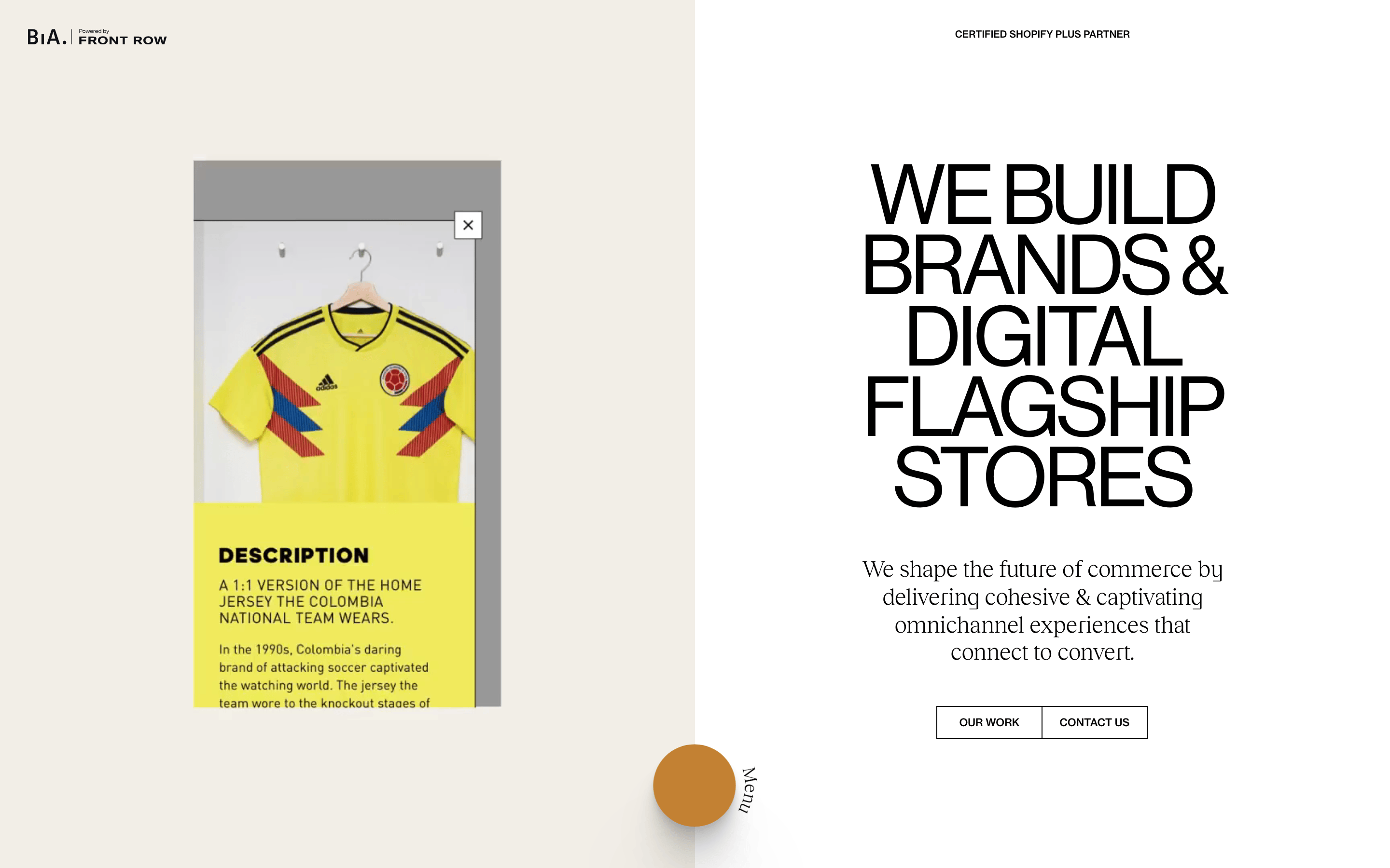
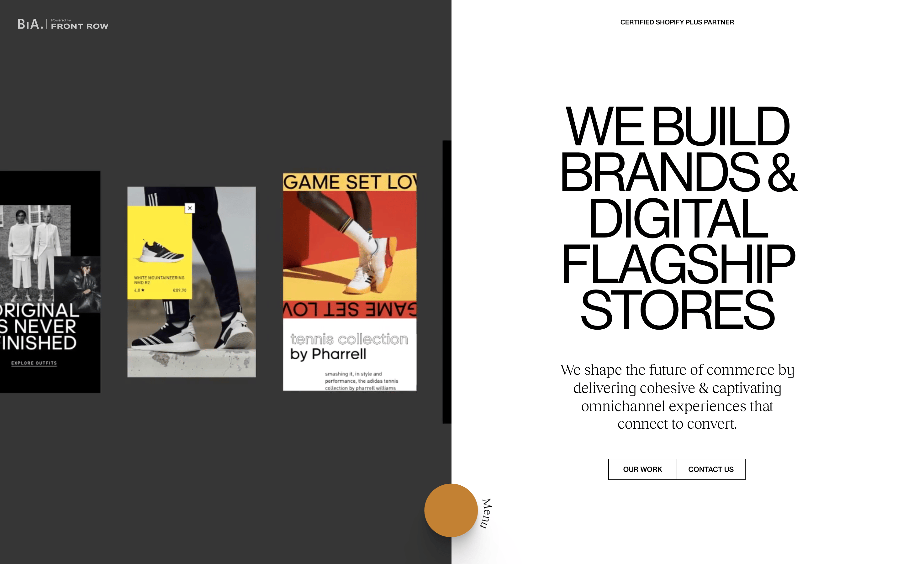
Split-screen: Left side showcases work/portfolio, right side contains hero text and CTAs
07
Motion & Interaction
100msmicro
250mssmall
500msmedium
cubic-bezier(0.45, 0.02, 0.09, 0.98)easing
Smooth opacity transitions for portfolio overlays · Transform-based hover effects on interactive elements · Staggered reveal animations for work items
Subtle transform shifts on cards and buttons · Immediate visual feedback with opacity changes
08
Components
buttonOutlined rectangular buttons with uppercase text and thin black borders
cardImage-based work cards with hover states, appearing as floating overlays
heroMassive typographic headline paired with serif body copy and split layout
09
Voice & Don'ts
ToneConfident, sophisticated, and authoritative
HeadlinesDirect, declarative statements in massive uppercase type
CTAsMinimal, uppercase text labels with thin borders
don't use bright saturated colors — screenshot shows muted warm neutrals with black accents
don't use rounded corners everywhere — screenshot shows sharp rectangular buttons with 4px radius only on specific elements
don't use sans-serif for body text — screenshot shows transitional serif (Reckless Neue) for paragraph copy
don't use centered text alignment — screenshot shows left-aligned and right-aligned text with asymmetric grid
don't use drop shadows on cards — screenshot shows flat borders and clean edges without shadow effects
don't use decorative script fonts — screenshot shows only grotesque sans-serif and transitional serif
Captured from the live site · real computed styles
11
System prompt
This is a premium digital agency (Build in Amsterdam) specializing in Shopify Plus ecommerce development. The visual identity centers on a warm off-white background (#F2EFE6) with black (#000000) typography and a signature amber accent (#C38133). Typography pairs Neue Haas Grotesk Display for massive headlines with tight negative tracking against Reckless Neue transitional serif for body copy. The layout uses a distinctive split-screen approach where work samples occupy the left half and brand messaging fills the right. Critical constraints: never use sans-serif for body paragraphs, avoid centered layouts, and maintain the warm neutral palette without introducing cool blues or greens. Buttons must remain outlined with thin 1px black borders. The amber accent appears only in specific UI elements like the circular menu trigger.
Bring this taste to your agent
Hand your AI agent a machine-readable spec of this design — tokens, type, motion, the whole DNA.