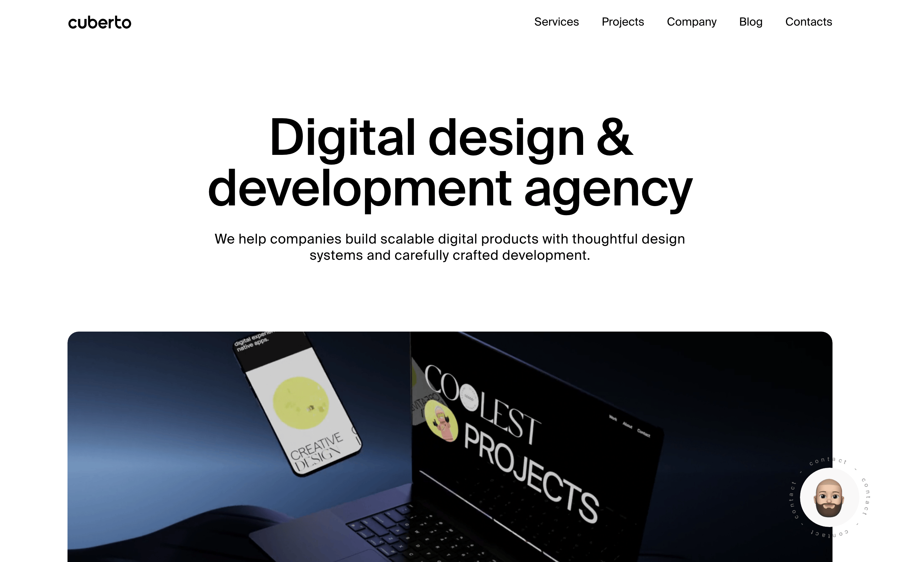
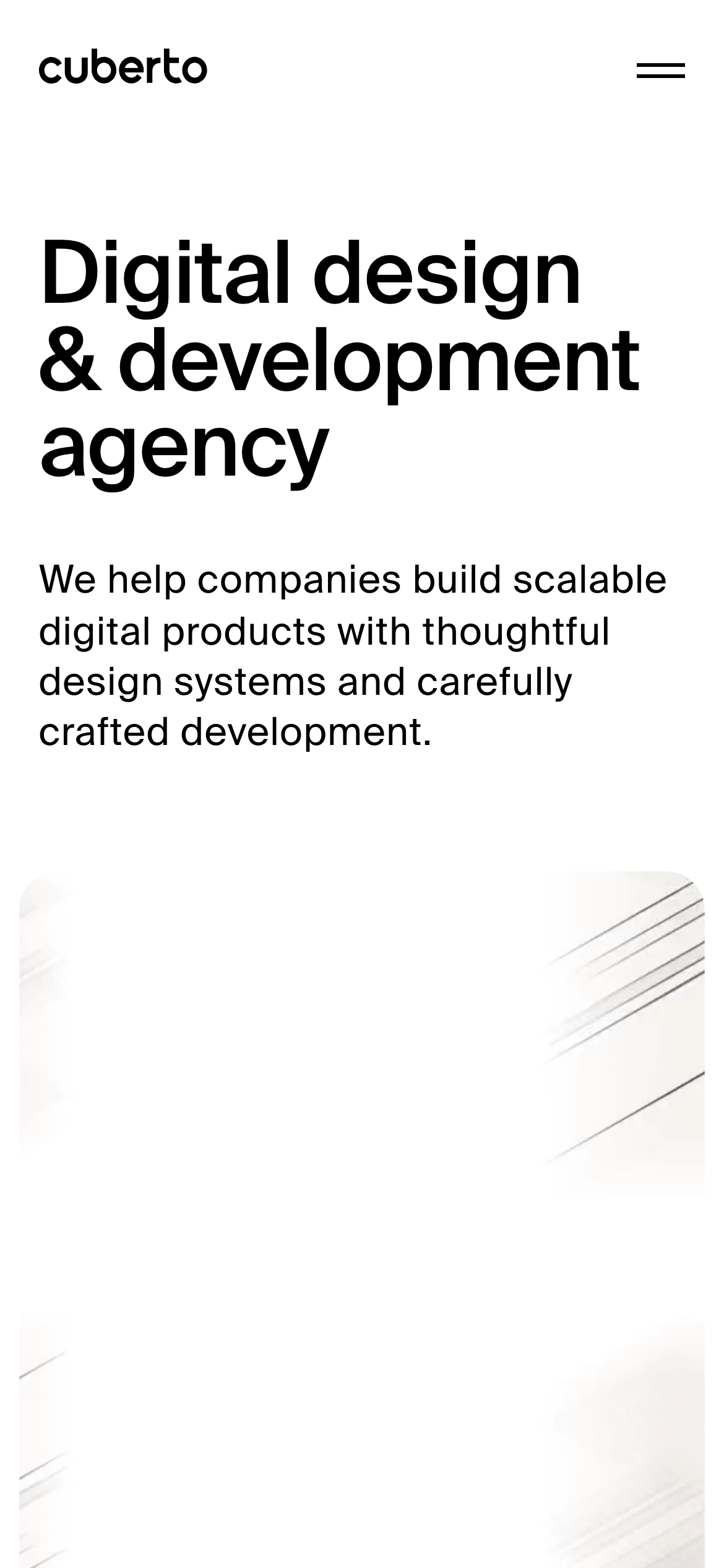
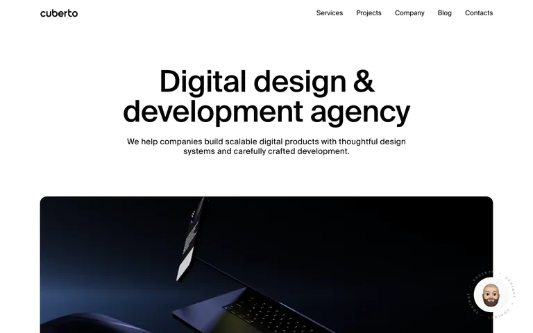
A monochrome agency portfolio that uses massive sans-serif headings and dark photographic hero sections to establish a premium, craftsmanship-first identity.
A high-end design and engineering studio that speaks through stark contrast and confident typography.
02
Color
#000000Ink
#FFFFFFBG
#161616BG quiet
#888888Muted
rgba(0,0,0,0.1)Line
Strict monochrome hierarchy using stark black-and-white contrast, allowing high-quality photography to provide the only color.
03
Typography
grotesque-sans
display81px · 400
heading23px · 400
body18px · 400
caption10px · 400
Use tight tracking (e.g., -1.62px) for large display text to create a solid, architectural feel. · Use generous tracking (e.g., 0.468px) for smaller text to maintain high legibility. · Limit font weights mostly to regular (400), using bold (700) sparingly for emphasis.
04
Spacing
4px
8px
16px
24px
32px
48px
64px
96px
Asymmetric and spacious, using large gaps (e.g., 90px) between major sections to let content breathe.
05
Surfaces
sm · 18px
md · 18px
lg · 72px
pill · 99999px
Minimal 1px solid borders used only for interactive elements and separators.
none
06
Layout
1280container
12columns
24pxgutter
768 / 1024breakpoints
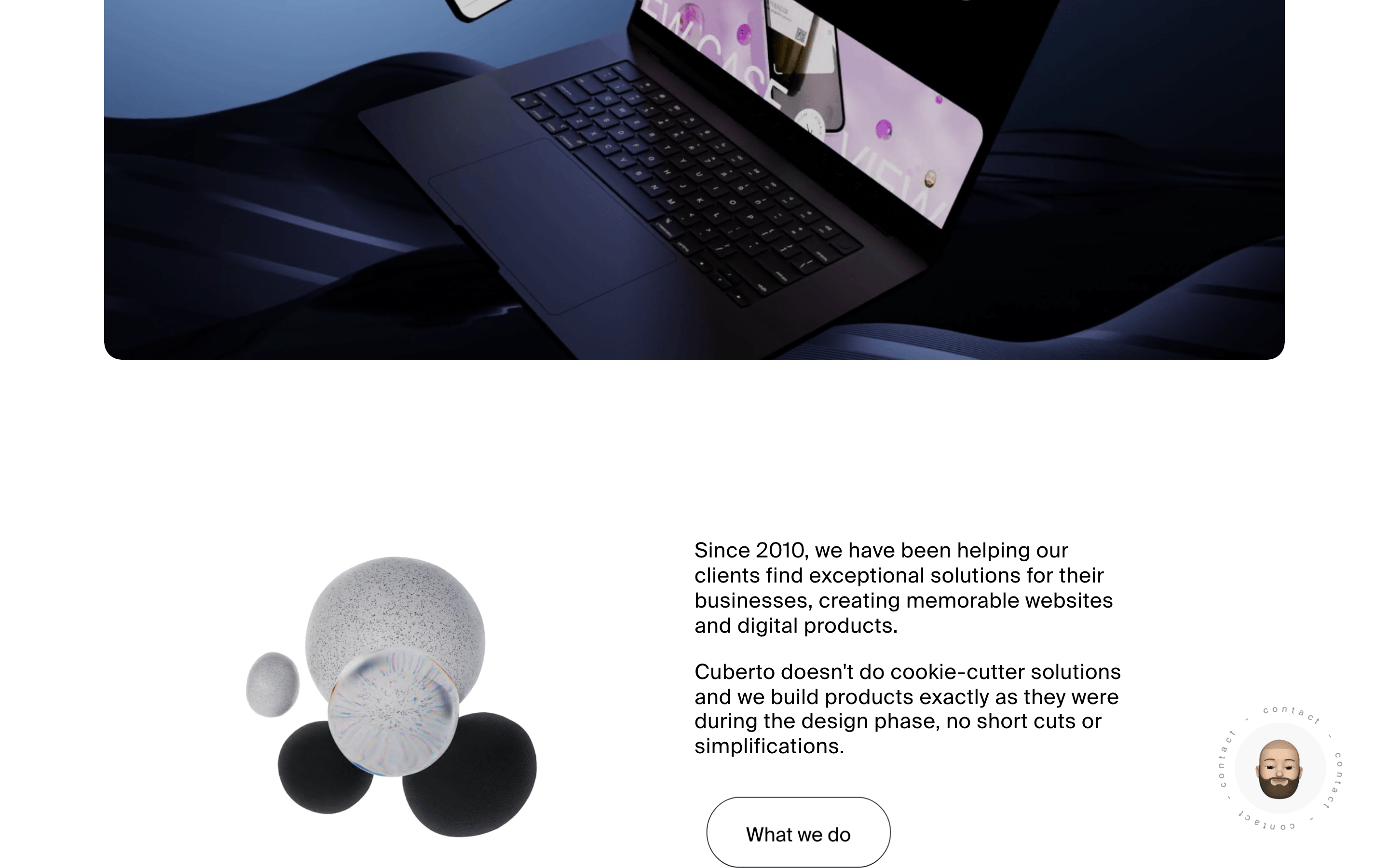
Large-scale hero sections with full-width media and centered typography, transitioning into 2-column project grids.
07
Motion & Interaction
300msmicro
400mssmall
1200msmedium
cubic-bezier(0.16, 1, 0.3, 1)easing
Smooth, physics-based sliding for page transitions and element reveals. · Persistent, rotating circular text badges for interactive prompts.
Subtle scaling or opacity shifts on interactive elements to provide feedback without distraction. · Smooth, immediate state changes with subtle motion.
08
Components
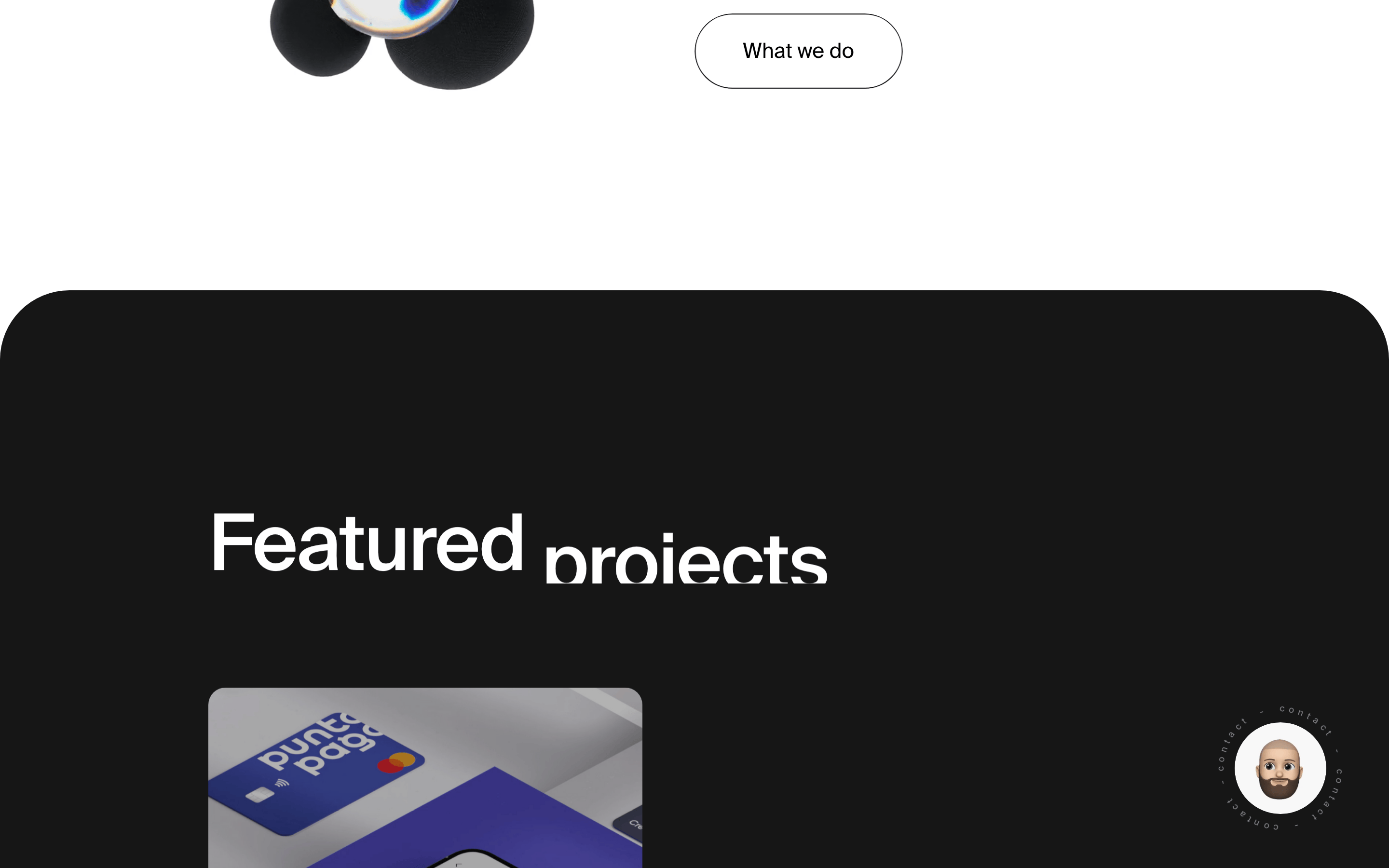
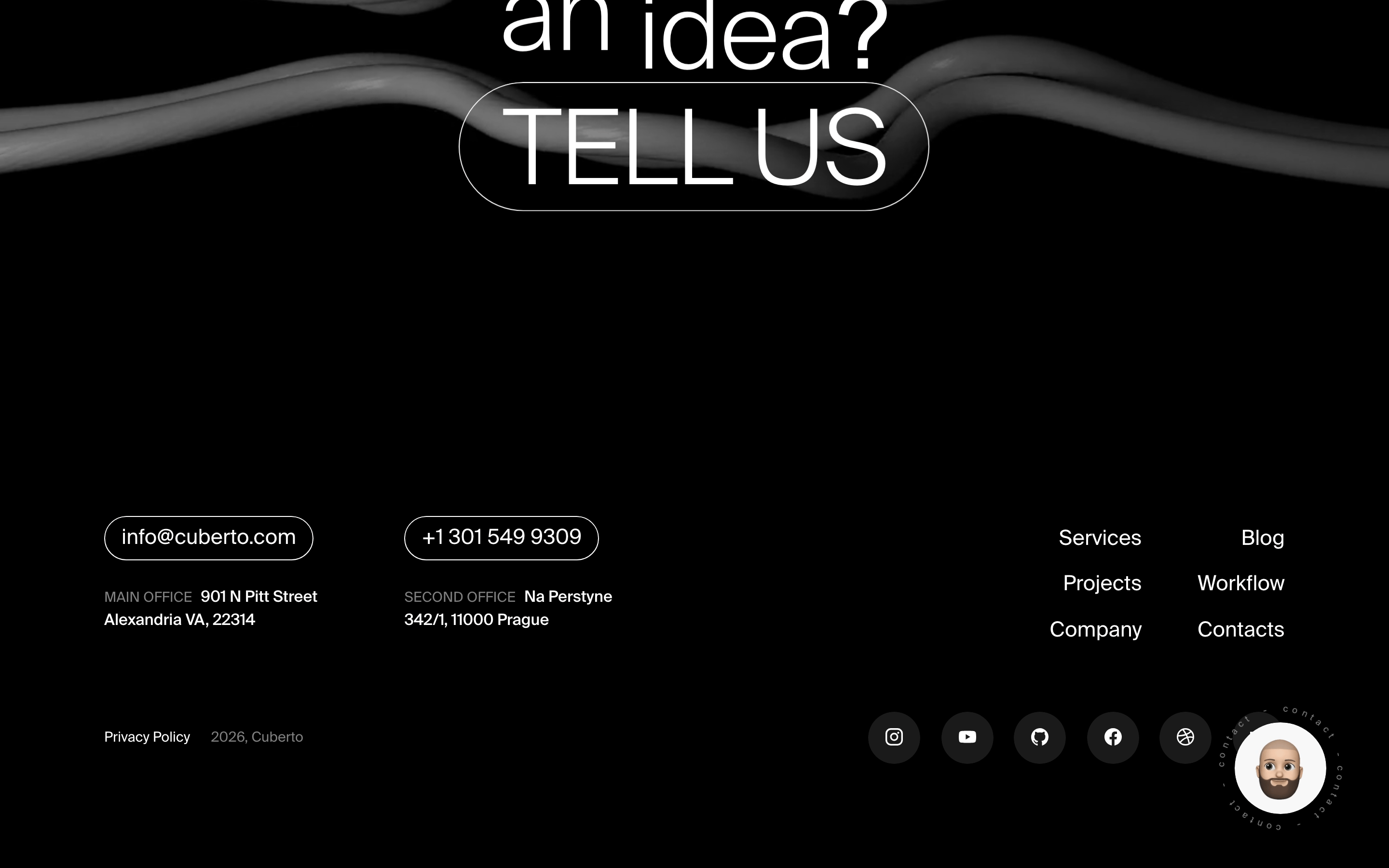
buttonPill-shaped (radius: 99999px) buttons, typically with a solid black or white background and minimal padding.
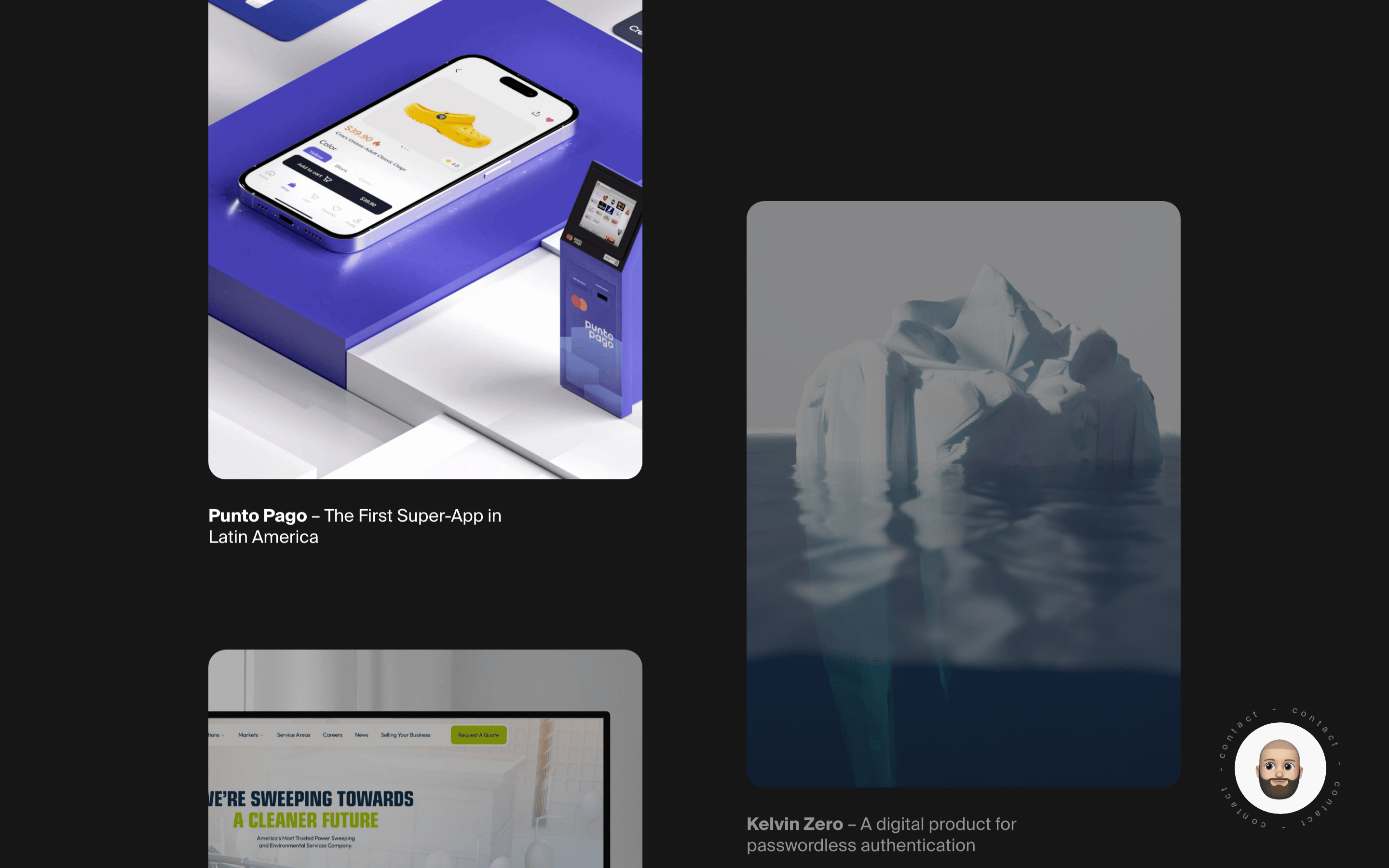
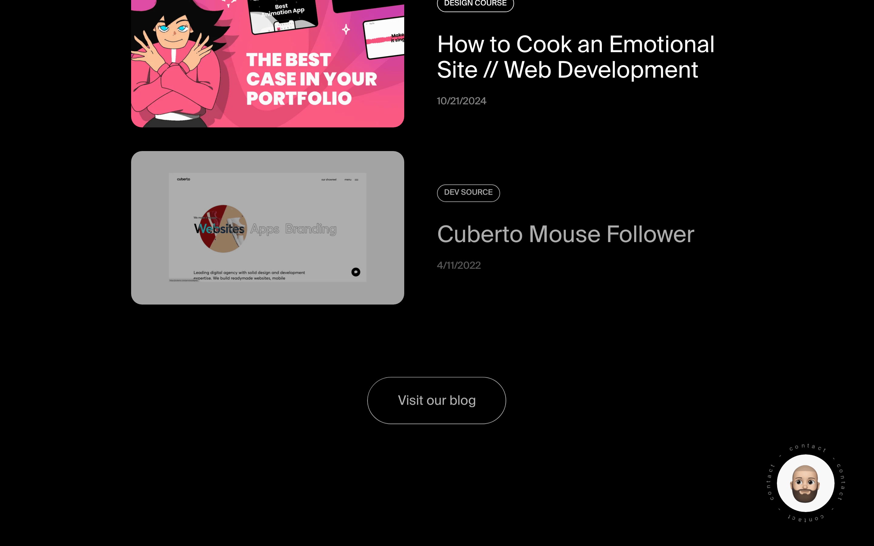
cardProject cards with large, rounded (18px) photographic thumbnails and concise, multi-line text labels.
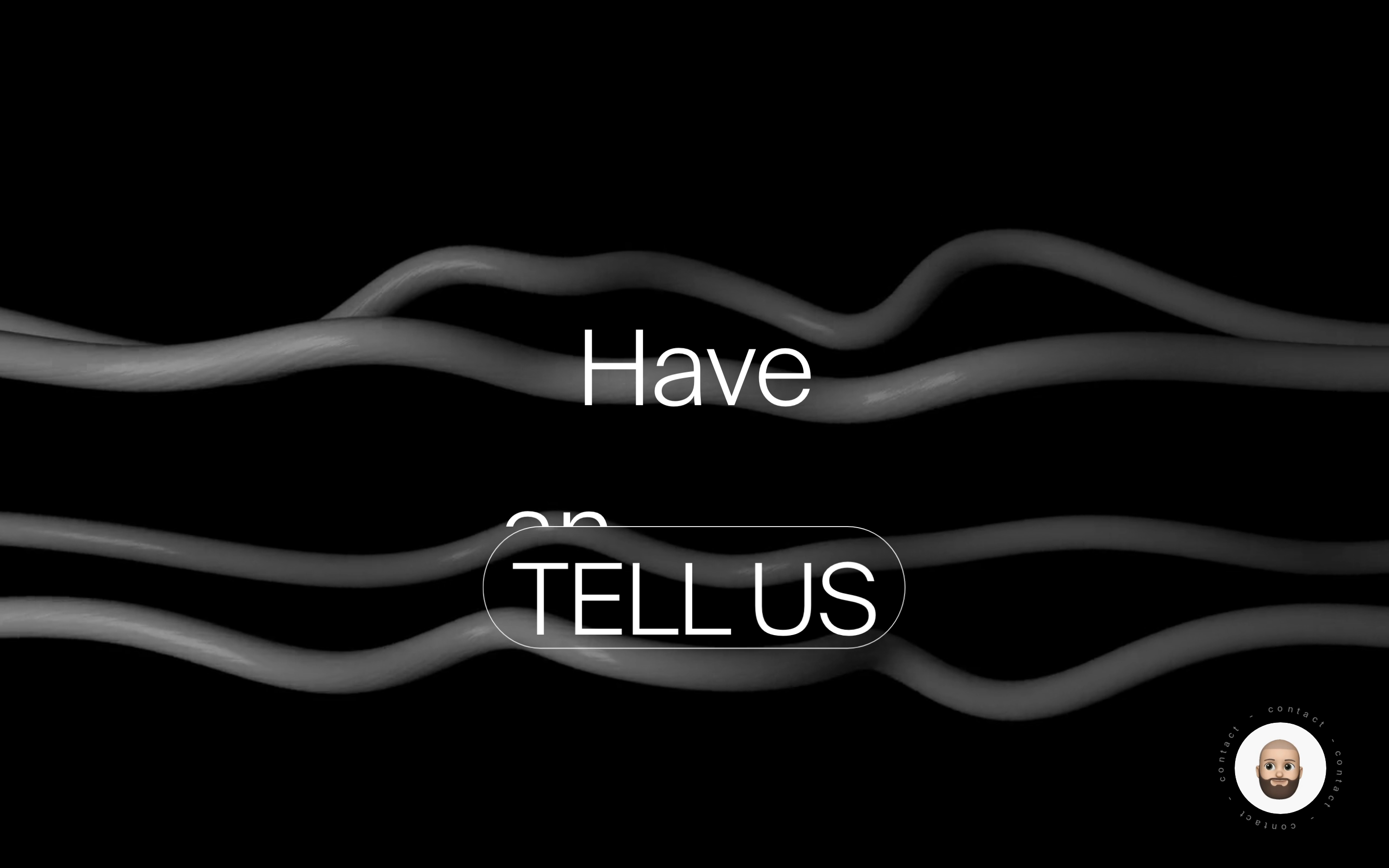
chipCircular rotating contact badges used for persistent, non-intrusive calls to action.
inputMinimal text inputs, likely underlined or borderless to match the clean aesthetic.
heroA dominant, full-screen hero with massive 81px typography, a single subtitle line, and a dark, rounded-corner media container.
09
Voice & Don'ts
ToneConfident, professional, and understated.
HeadlinesShort, punchy, and descriptive, focusing on the core value proposition.
CTAsPersistent but unobtrusive, often utilizing the rotating circular badge.
Don't use multiple bright accent colors — screenshot shows a strict monochrome palette.
Don't use decorative or script fonts — screenshot shows a consistent, clean grotesque-sans-serif.
Don't clutter the UI with many small elements — screenshot shows massive amounts of negative space.
Don't use sharp corners on all elements — screenshot shows consistent use of rounded corners (18px to pill).
Don't use heavy drop shadows or 3D effects — screenshot shows flat, clean surfaces.
Don't center-align every piece of text — screenshot shows left-aligned labels in project grids.
Captured from the live site · real computed styles
11
System prompt
This is a high-end digital design agency portfolio characterized by extreme minimalism and bold typography. The color palette is strictly monochromatic, relying on pure white (#FFFFFF), solid black (#000000), and a light gray (#888888) for secondary text. The typography features a clean, geometric grotesque-sans-serif font used at both massive display sizes (81px) and small UI scales. Layouts are spacious, using large gaps and rounded corners (18px) to soften the stark contrast. Key critical donts: avoid any use of bright accent colors, never use decorative or serif fonts, and do not fill the screen with excessive UI components. Maintain a premium, refined, and architectural feel throughout.
Bring this taste to your agent
Hand your AI agent a machine-readable spec of this design — tokens, type, motion, the whole DNA.