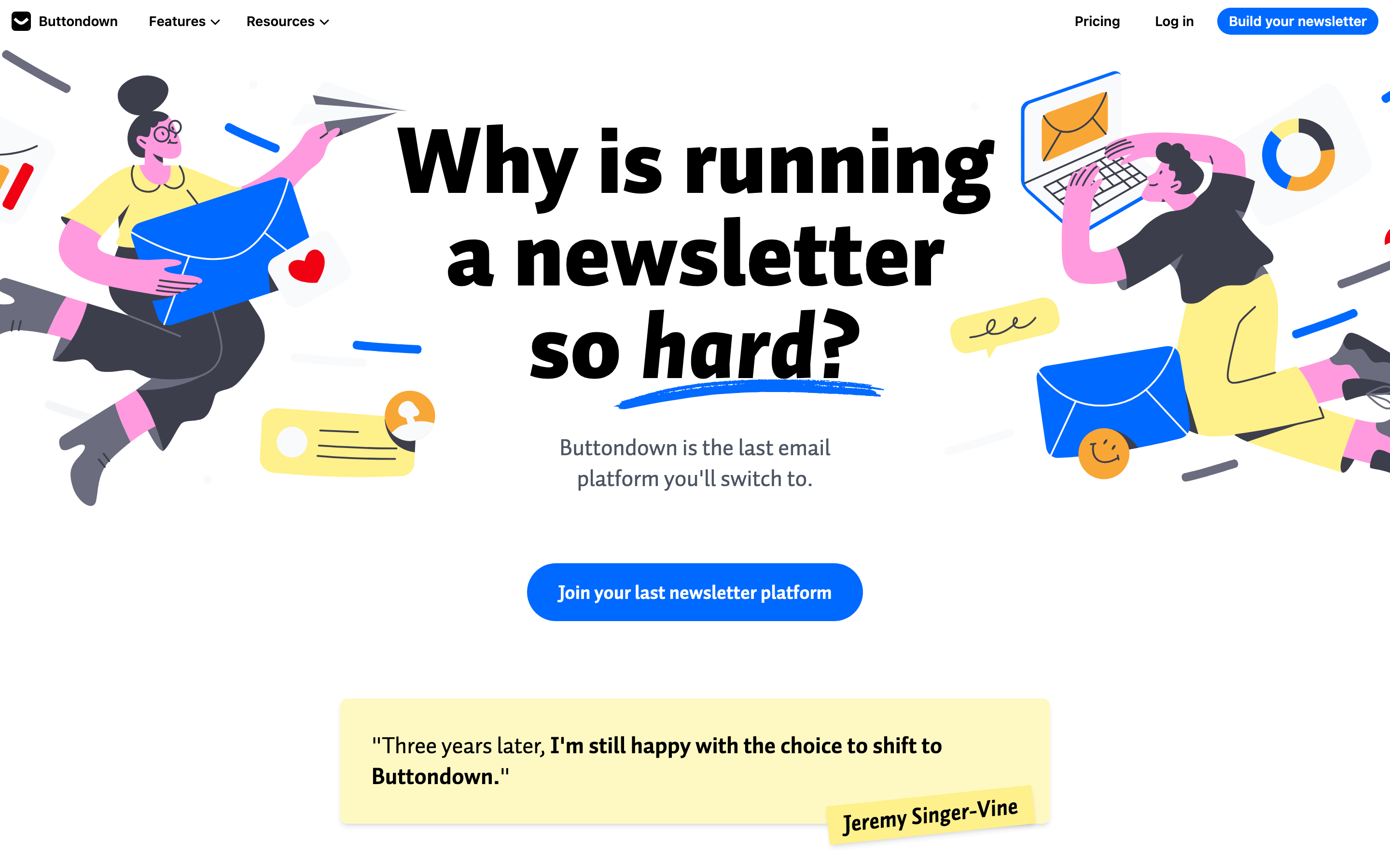
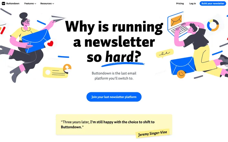
A calm, dependable post office for digital creators.
02
Color
#0069ffAccent
#000000Ink
#4b5563Ink soft
#ffffffBG
#fef9c3BG quiet
#6b7280Muted
rgba(0, 0, 0, 0.1)Line
High-contrast black-on-white for maximum readability, with a vibrant primary blue for actions and warm pastel accents.
03
Typography
transitional-serif · humanist-sans
display96px · 900
heading48px · 700
body18px · 400
caption14px · 400
Display typography uses a heavy, tightly tracked serif font. · Body text uses a clean sans-serif for high legibility. · Line lengths are kept short for comfortable reading.
04
Spacing
4px
8px
12px
16px
24px
32px
48px
64px
96px
Standard 4px baseline grid with generous vertical padding between sections.
Captured from the live site · real computed styles
11
System prompt
Buttondown is an email newsletter platform positioning itself as the reliable, human-friendly choice for independent creators. The design DNA is built on a clean, high-contrast palette featuring a pure white background, solid black text, and a vibrant primary blue (#0069ff) for calls-to-action, supplemented by warm pastel yellows for accents. Typography is defined by a heavy transitional-serif (Auto Pro) for impactful display headlines and a clean humanist-sans (Inter) for highly legible body text. Critical design constraints include avoiding dark mode, using only the established brand colors, and maintaining generous white space. Do not use a sans-serif for headlines, and do not use sharp, unrounded corners on buttons or cards.
Bring this taste to your agent
Hand your AI agent a machine-readable spec of this design — tokens, type, motion, the whole DNA.