A streamlined command center for digital creators to manage audience growth.
02
Color
#44B1FFAccent
#1E1E1EInk
#F9F7F4BG
#F2EFE9BG soft
#FFFFFFBG quiet
rgba(227, 227, 227, 1)Line
Neutral, warm off-whites and dark grays for a clean, accessible interface, with a single bright blue accent for primary actions.
03
Typography
humanist-sans · monospace
display64px · 700
h240px · 700
body16px · 400
caption14px · 400
Use bold weights (700) for primary headlines to create strong visual hierarchy. · Maintain tight letter spacing for display typography to enhance modern feel.
04
Spacing
4px
8px
16px
24px
32px
48px
64px
96px
Consistent 4px base grid with generous whitespace to maintain a clean, breathable layout.
A 12-column grid with a max-width container, using responsive breakpoints for mobile and desktop views.
07
Motion & Interaction
100msmicro
150mssmall
300msmedium
cubic-bezier(0.4, 0, 0.2, 1)easing
Smooth color and background-color transitions on hover and focus states.
Subtle color transitions on interactive elements like buttons and links. · Standard pointer cursor with immediate visual feedback.
08
Components
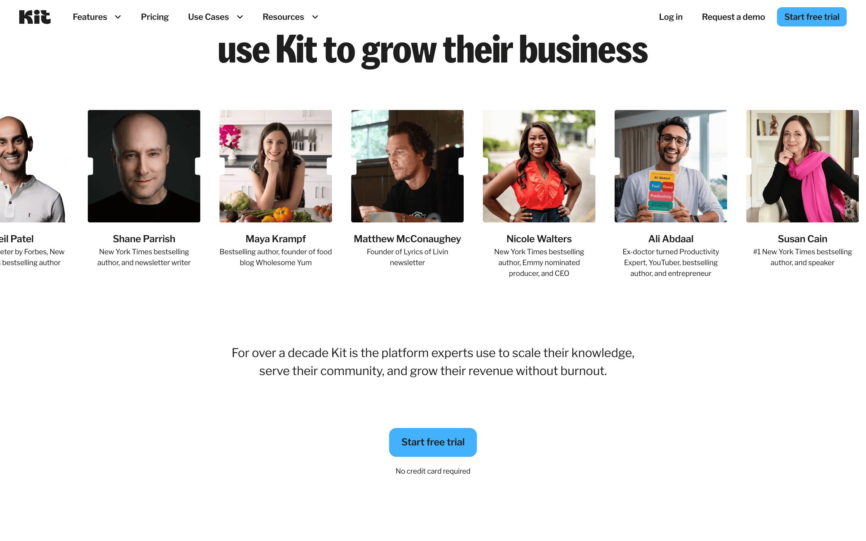
buttonPrimary buttons are pill-shaped with a bright blue (#44B1FF) background and black text. Secondary buttons are text-based or outlined.
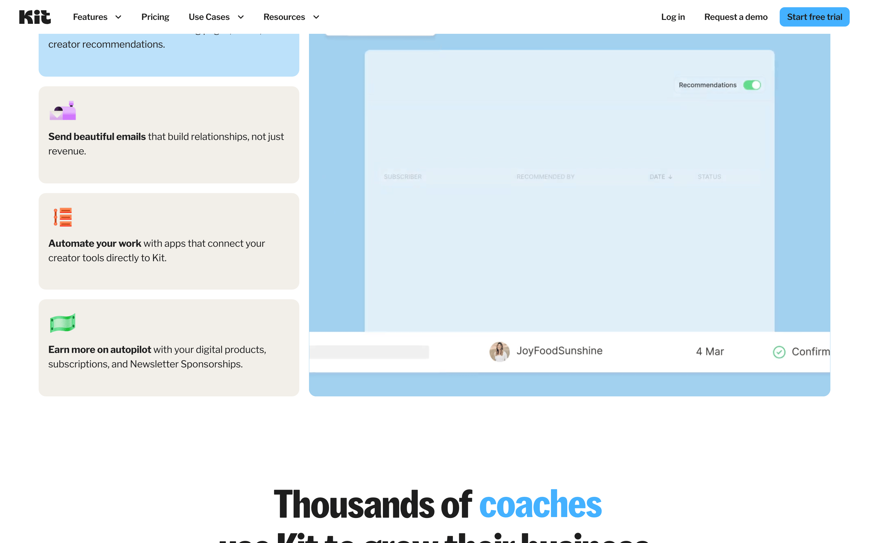
cardCards feature soft 12px or 16px border-radius, subtle shadows, and white or off-white backgrounds.
chipSmall, rounded tag-like elements with 8px border-radius, used for categorization.
inputStandard form inputs with 8px border-radius and a 1px solid #E3E3E3 border.
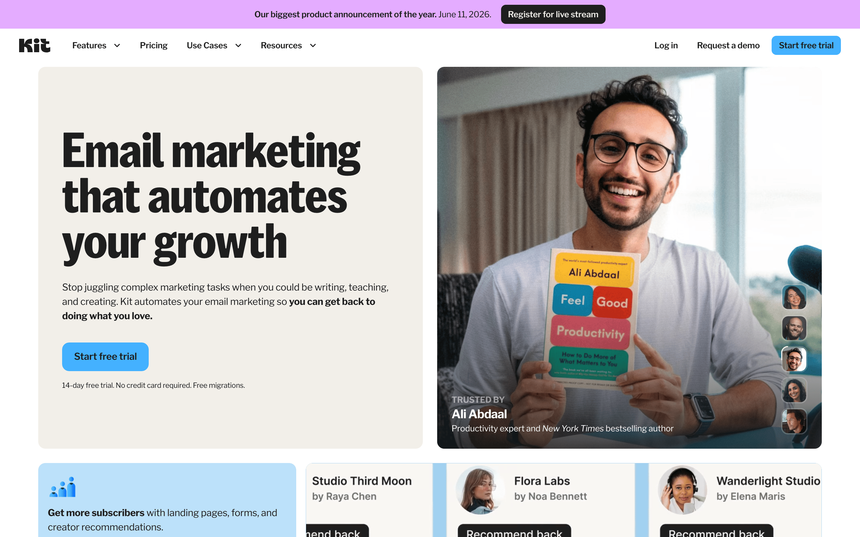
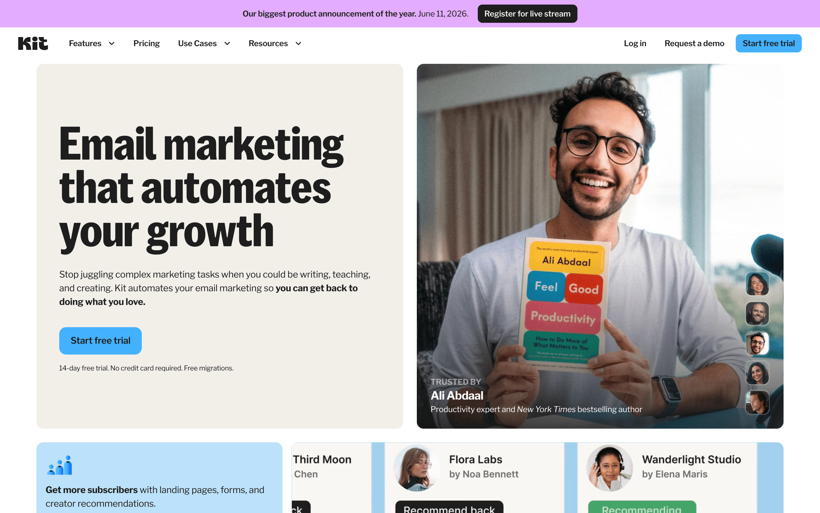
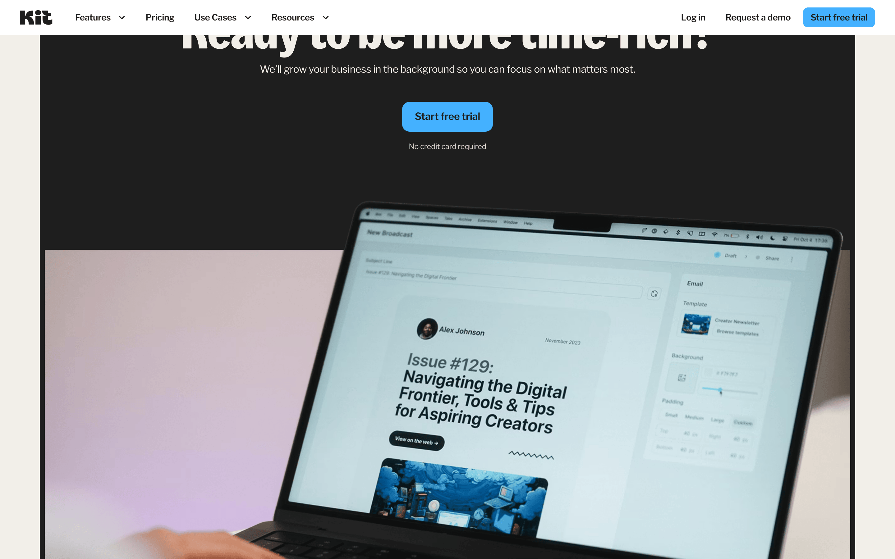
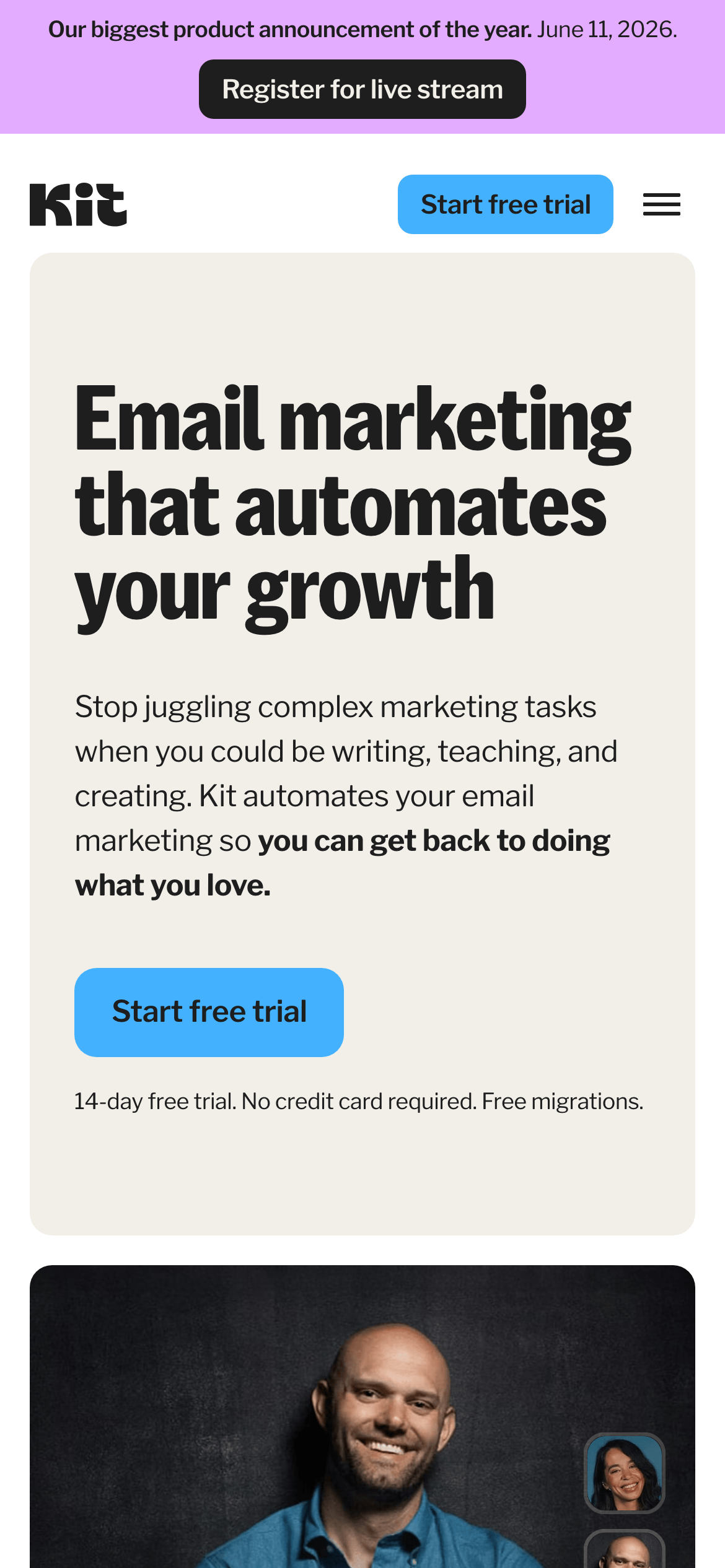
heroA split hero section with a large, bold headline on the left, a supporting paragraph, and a prominent CTA button, balanced by a large lifestyle image on the right.
09
Voice & Don'ts
ToneEmpowering, straightforward, and creator-focused.
HeadlinesBold, action-oriented statements that highlight benefits over features.
CTAsDirect and low-friction, emphasizing 'free trial' and 'no credit card required'.
Don't use a purely white background for primary content areas — the screenshot shows a warm, off-white (#F9F7F4) is used instead.
Don't use a wide variety of accent colors — the design relies on a single, consistent bright blue (#44B1FF) for all primary actions.
Don't use serif or decorative fonts for headlines — the screenshot shows all typography is a clean, humanist-sans category.
Don't apply heavy drop shadows to all elements — shadows are used sparingly, mainly on cards and elevated surfaces.
Don't use square corners for buttons or cards — the design consistently uses rounded corners (8px to 16px or pill shapes).
Don't use a dense, cramped layout — the design prioritizes generous whitespace and a clear vertical rhythm.
Captured from the live site · real computed styles
11
System prompt
This design is for a modern SaaS platform for creators, positioning itself as a streamlined tool for email marketing automation. The palette is built on a warm off-white (#F9F7F4) background with dark charcoal (#1E1E1E) text and a single, vibrant blue (#44B1FF) accent for calls-to-action. Typography relies on a clean humanist-sans category for both display and body text, featuring tight letter-spacing for a modern feel. Critical don'ts include: never use a stark white background for main sections, never introduce competing accent colors, and never use serif fonts. The layout is spacious and grid-based, emphasizing clarity and ease of use.
Bring this taste to your agent
Hand your AI agent a machine-readable spec of this design — tokens, type, motion, the whole DNA.