← OpenDesign CURATED · OPEN · FREE
Marxdesign Co Nz
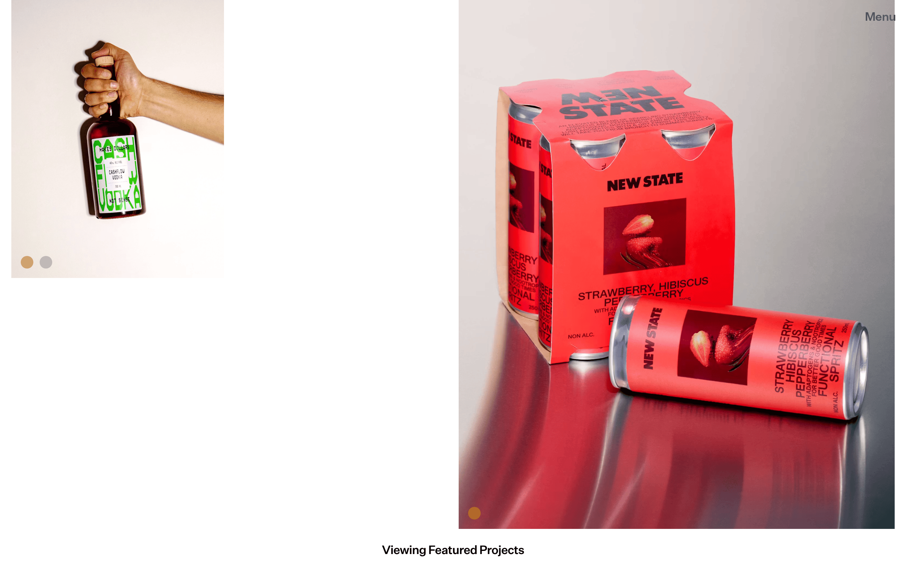
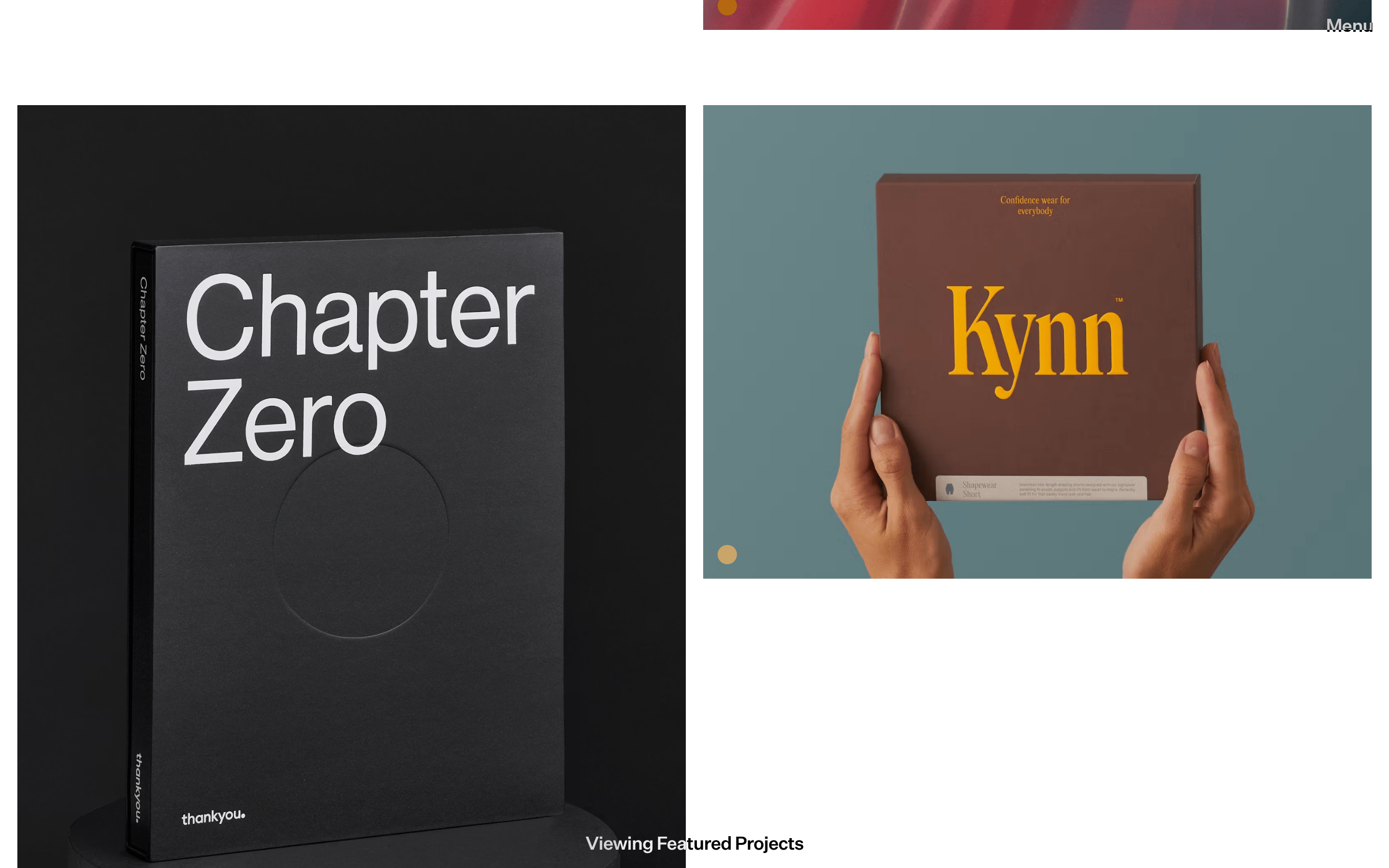
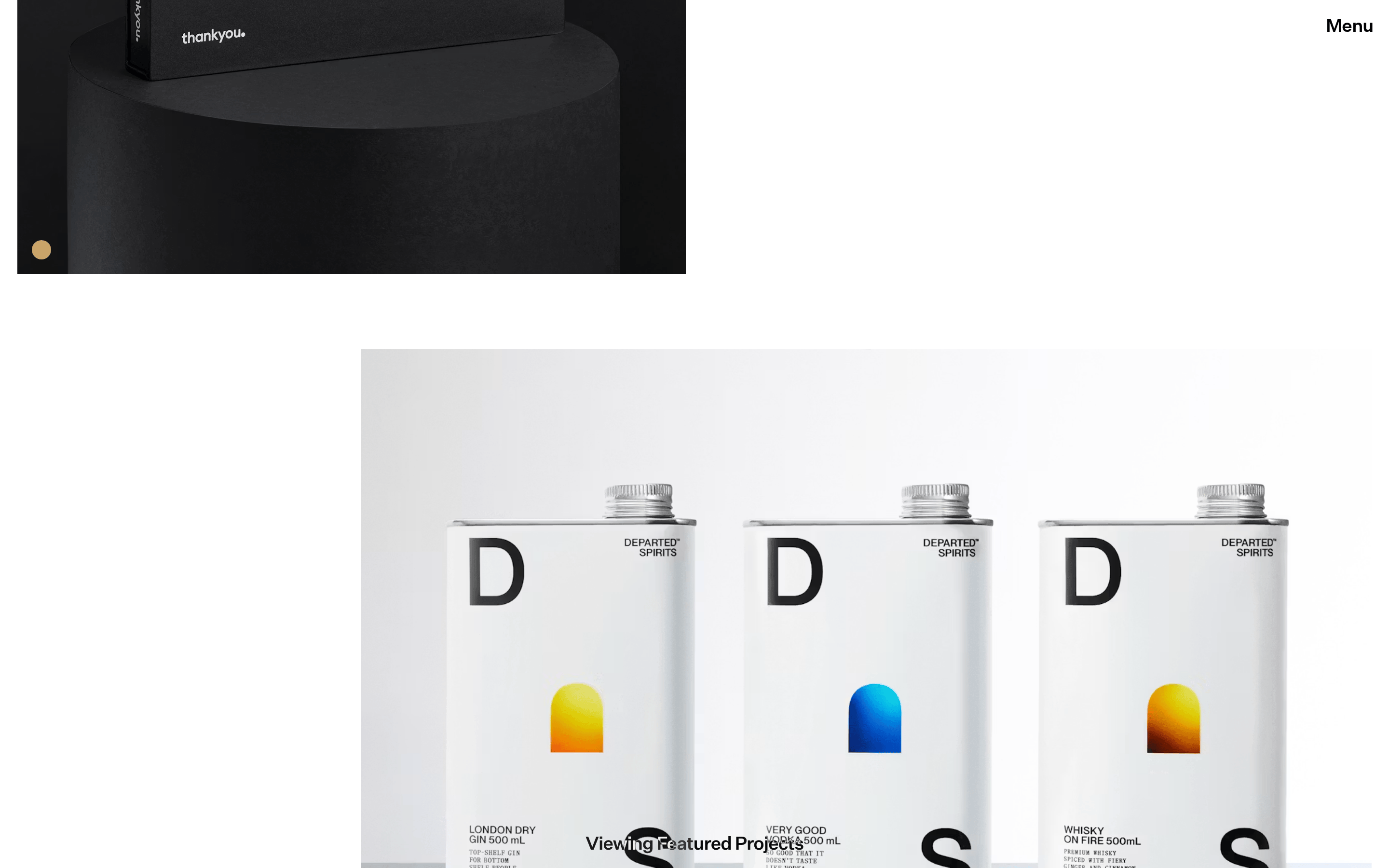
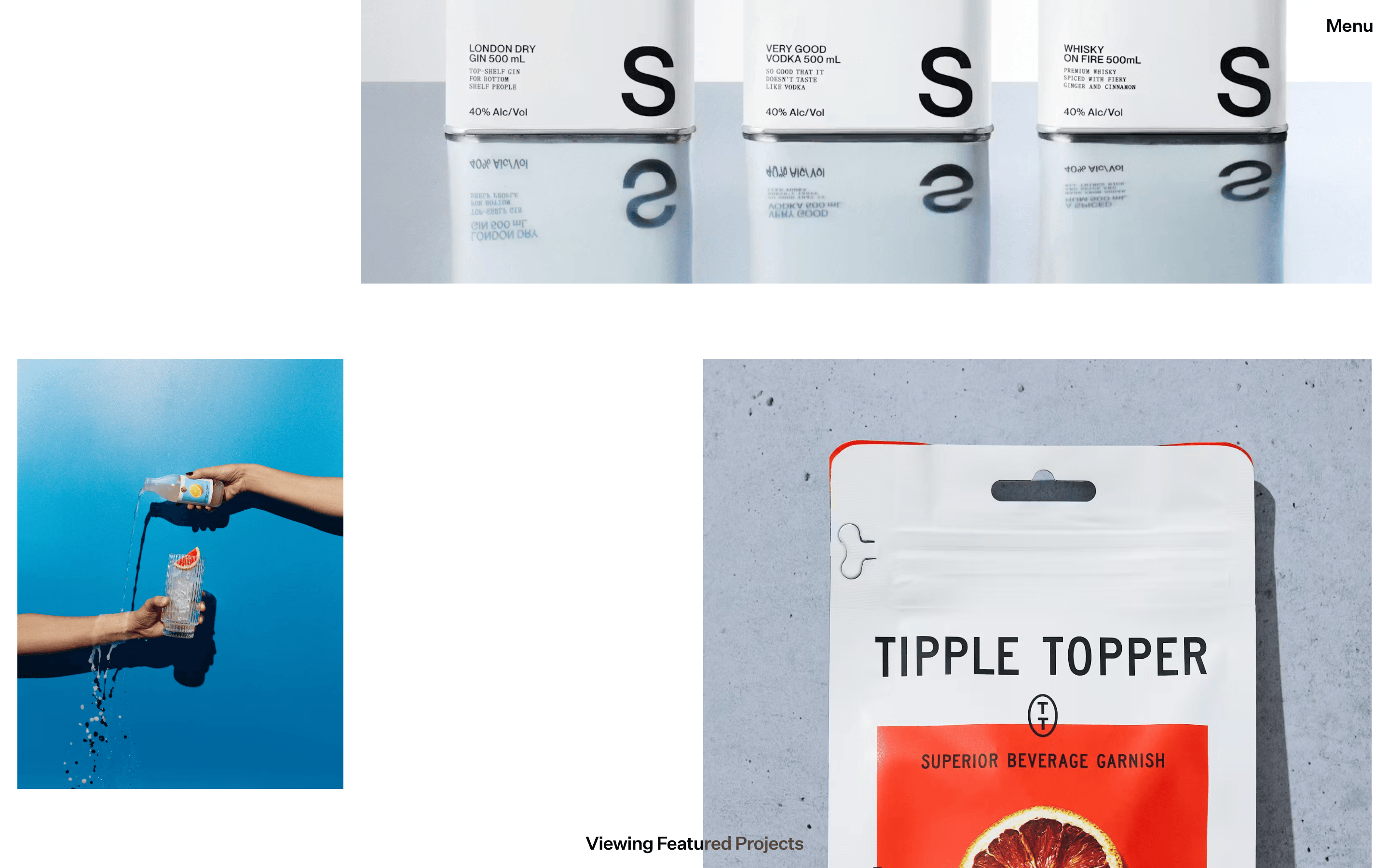
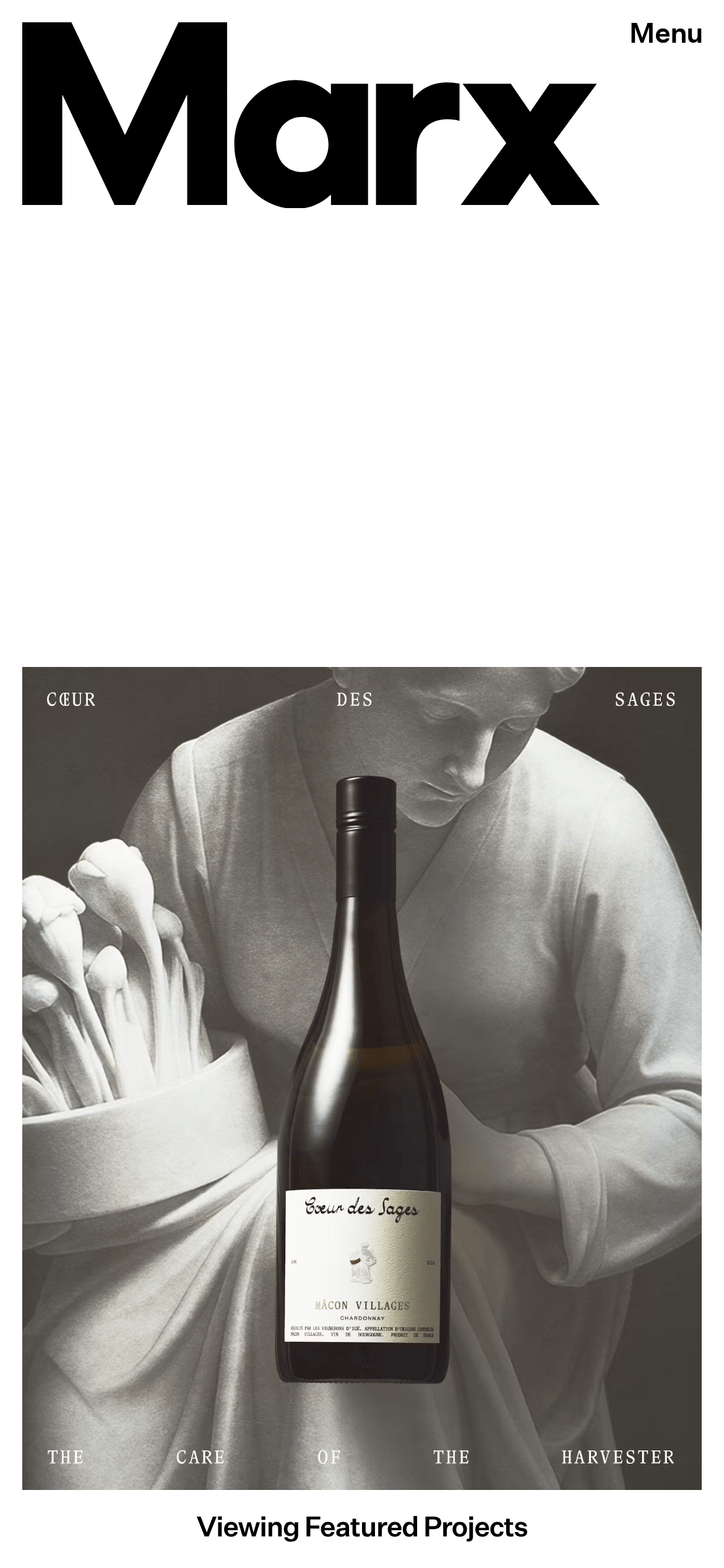
Minimalist portfolio featuring bold typography and high-contrast photography.
Portfolio Agency Bold Typography Photographic Clean
01
Identity DNA
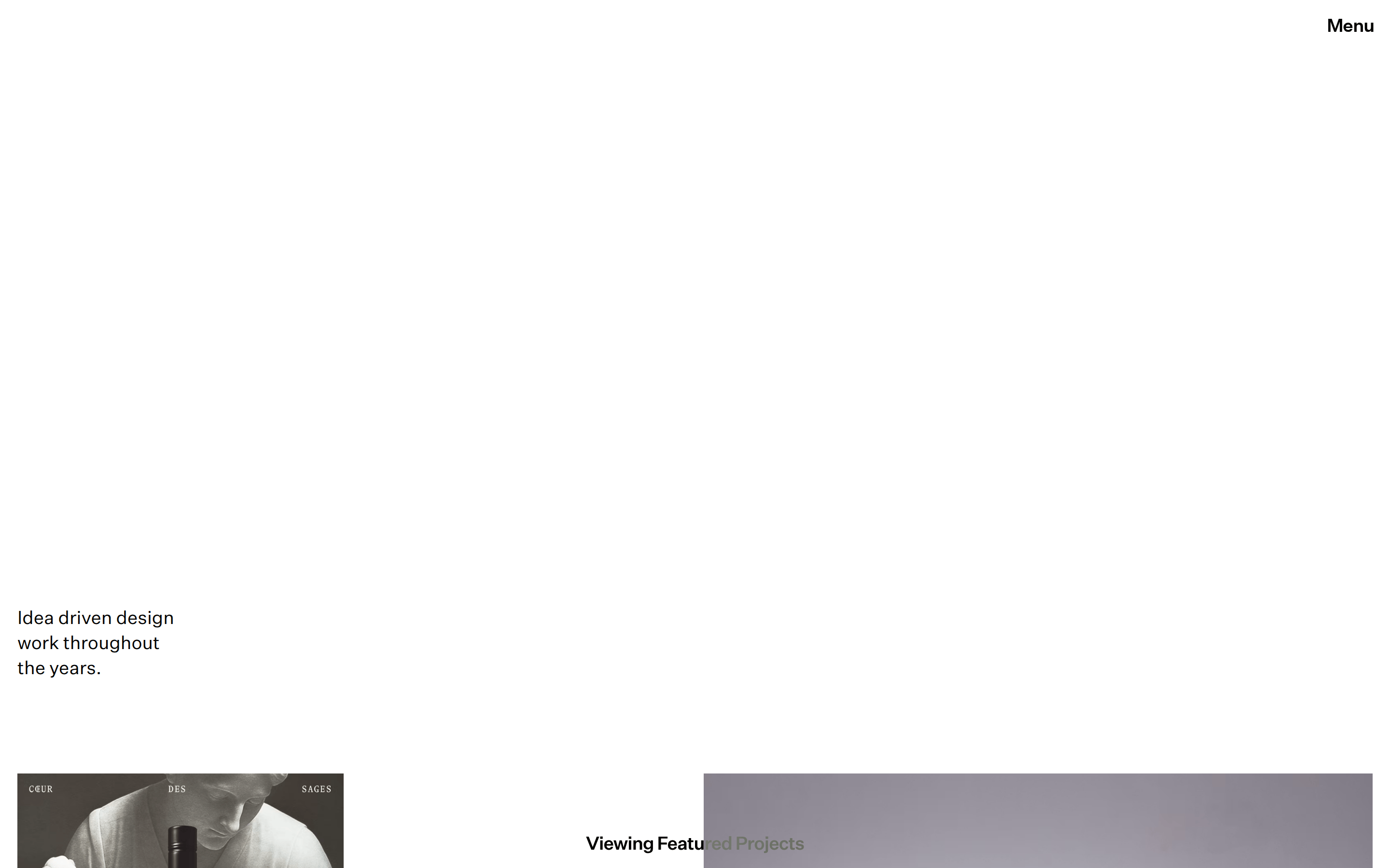
Idea-driven design portfolio minimal bold agency
A high-end architectural blueprint or a gallery exhibition guide.
02
Color
#000000Ink
#ffffffBG
#ebe8e7Muted
rgba(0,0,0,1.0)Line
High-contrast monochrome with warm photographic accents.
03
Typography
geometric-sans · humanist-sans
display 120px · 400headline 27px · 400body 19px · 400Use negative letter spacing for large display text. · Maintain a consistent font weight of 400 for text. · Left-align most body and headline text.
04
Spacing
4px
8px
10px
18px
30px
64px
96px
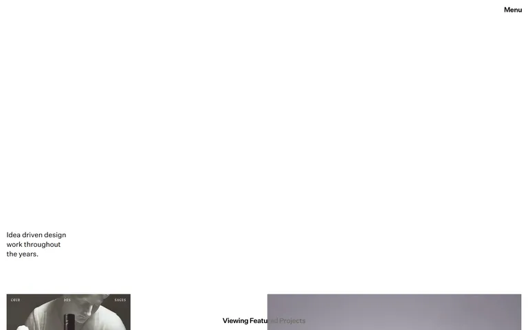
Generous vertical whitespace between sections.
05
Surfaces
sm · 4px
md · 0px
lg · 0px
pill · 999px
None visible.
06
Layout
1280 container
12 columns
18px gutter
768 / 1024 breakpoints
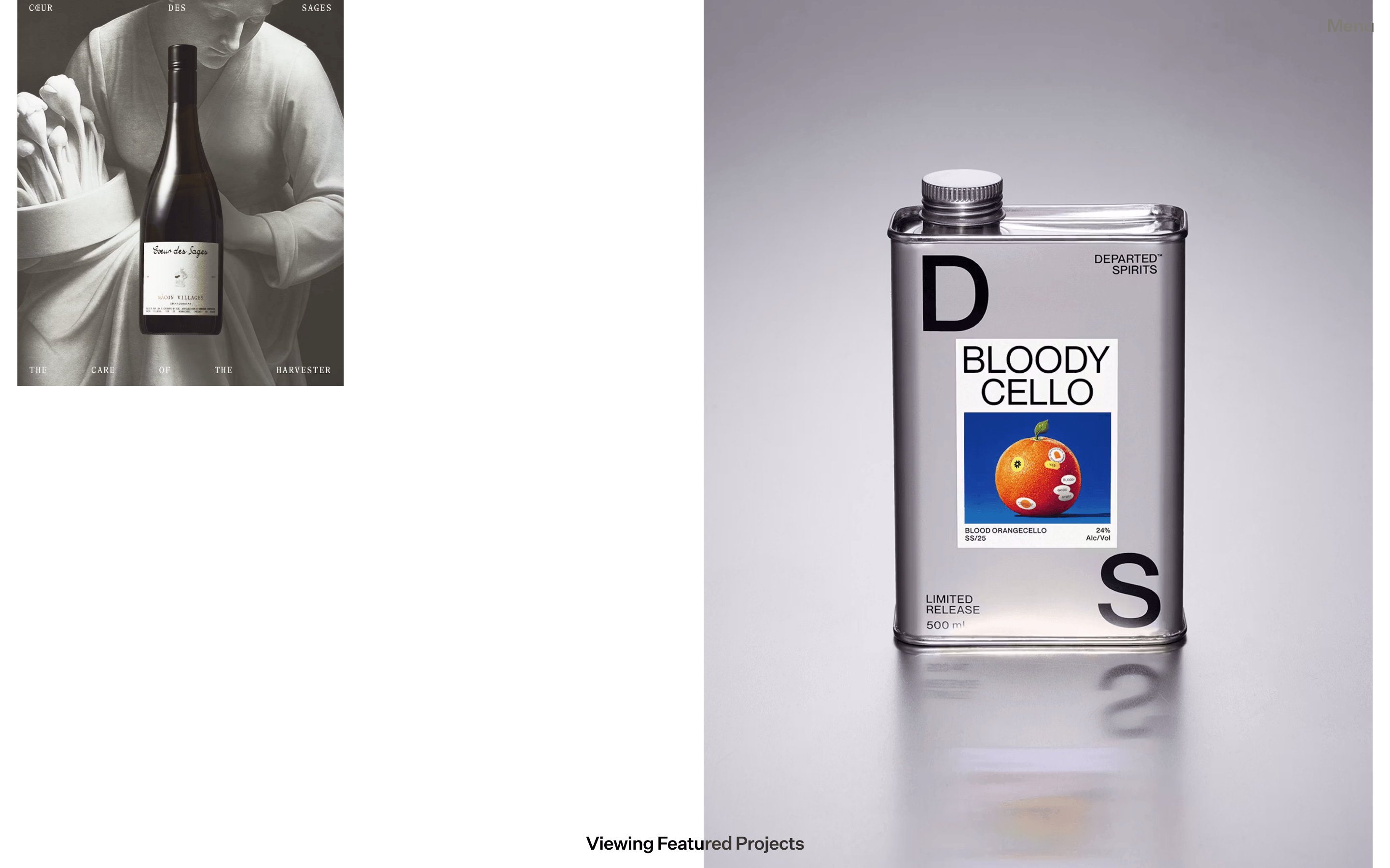
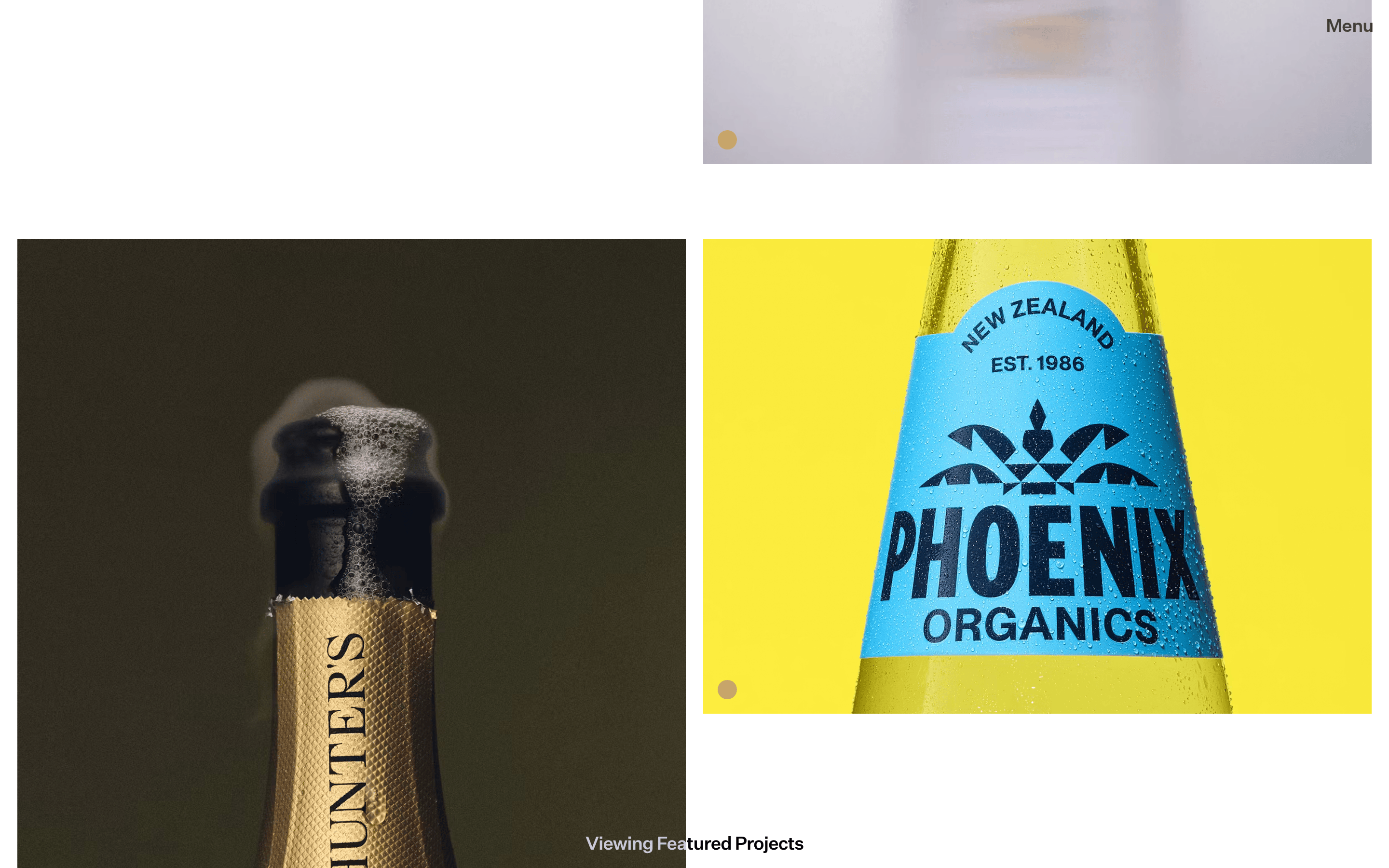
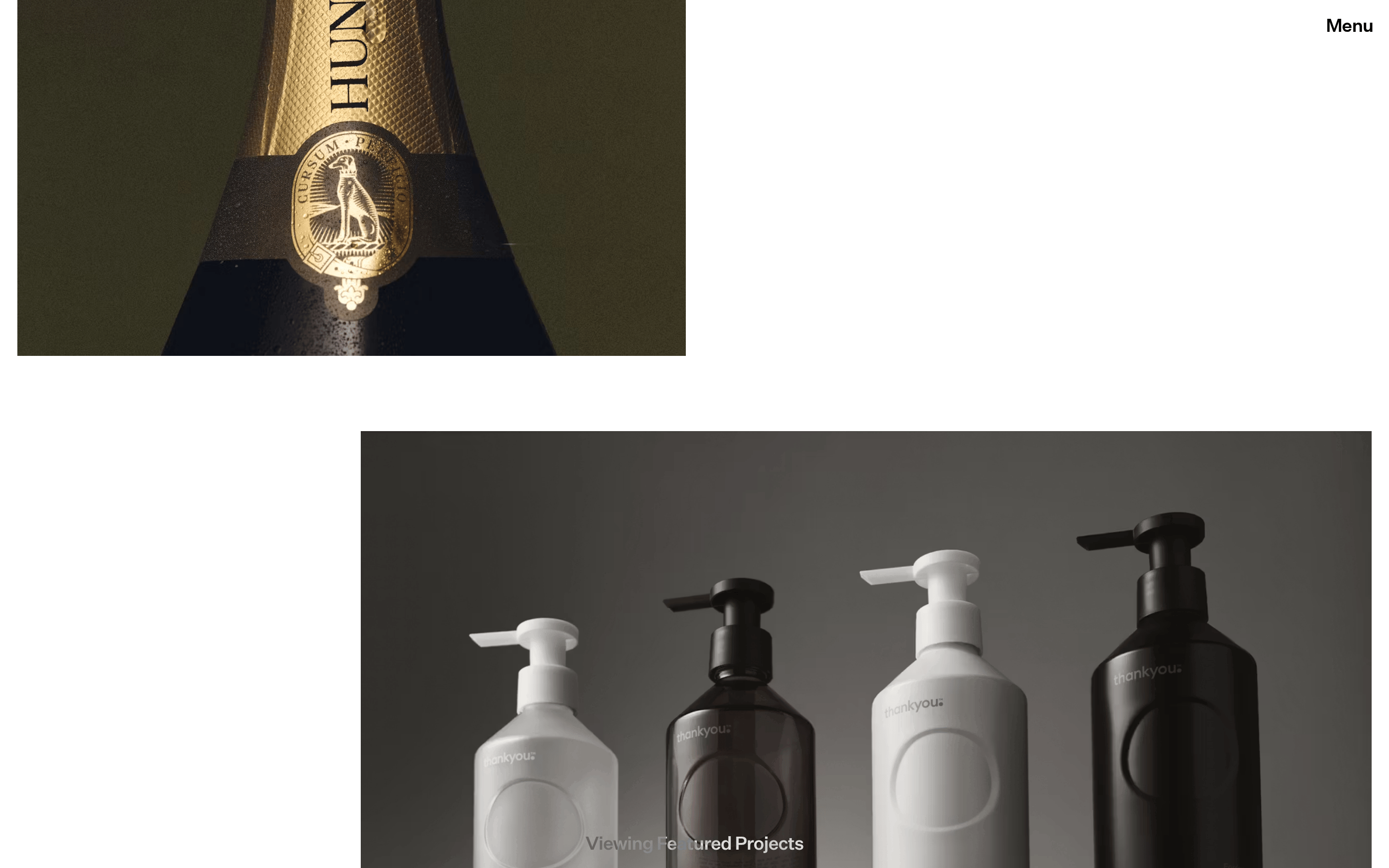
Asymmetric grid with large, off-grid image placements.
07
Motion & Interaction
220ms micro
300ms small
800ms medium
cubic-bezier(0.25, 0.1, 0.25, 1.0) easing
Fade-in transitions on scroll.
Cursor pointer on interactive elements. · Trigger navigation or project view.
08
Components
button Minimal text link with cursor pointer. card Edge-to-edge image with a small circular indicator. chip Small circular color swatch (50% border-radius). hero Massive typographic intro followed by large photographic works. 09
Voice & Don'ts
Tone Confident, professional, and understated. Headlines Short, direct, and punchy. CTAs Subtle text links. Don't use a multi-color palette — screenshot shows a strict black-and-white base with photographic accents. Don't center-align all content — screenshot shows left-aligned text and asymmetric layouts. Don't use heavy borders or shadows — screenshot shows flat, borderless surfaces. Don't use decorative serif fonts for the main UI — screenshot shows a clean sans-serif. Don't crowd elements together — screenshot shows extensive use of negative space. Don't use rounded corners on cards — screenshot shows sharp, rectangular image frames. Avoid: Cluttered layouts Avoid: Excessive decorative elements Avoid: Saturated color palettes 10
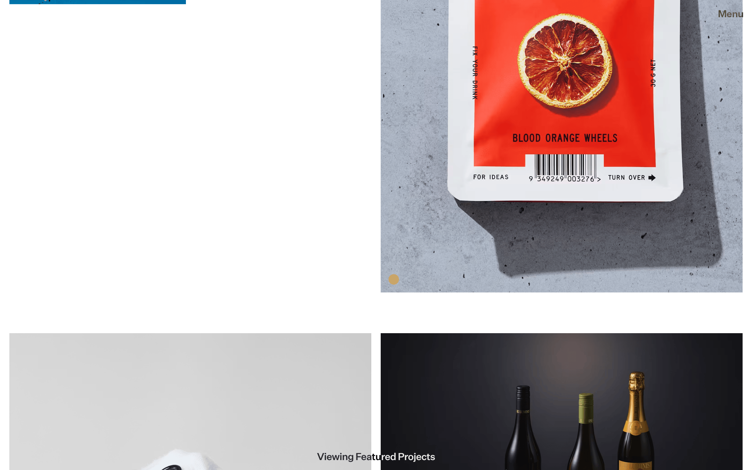
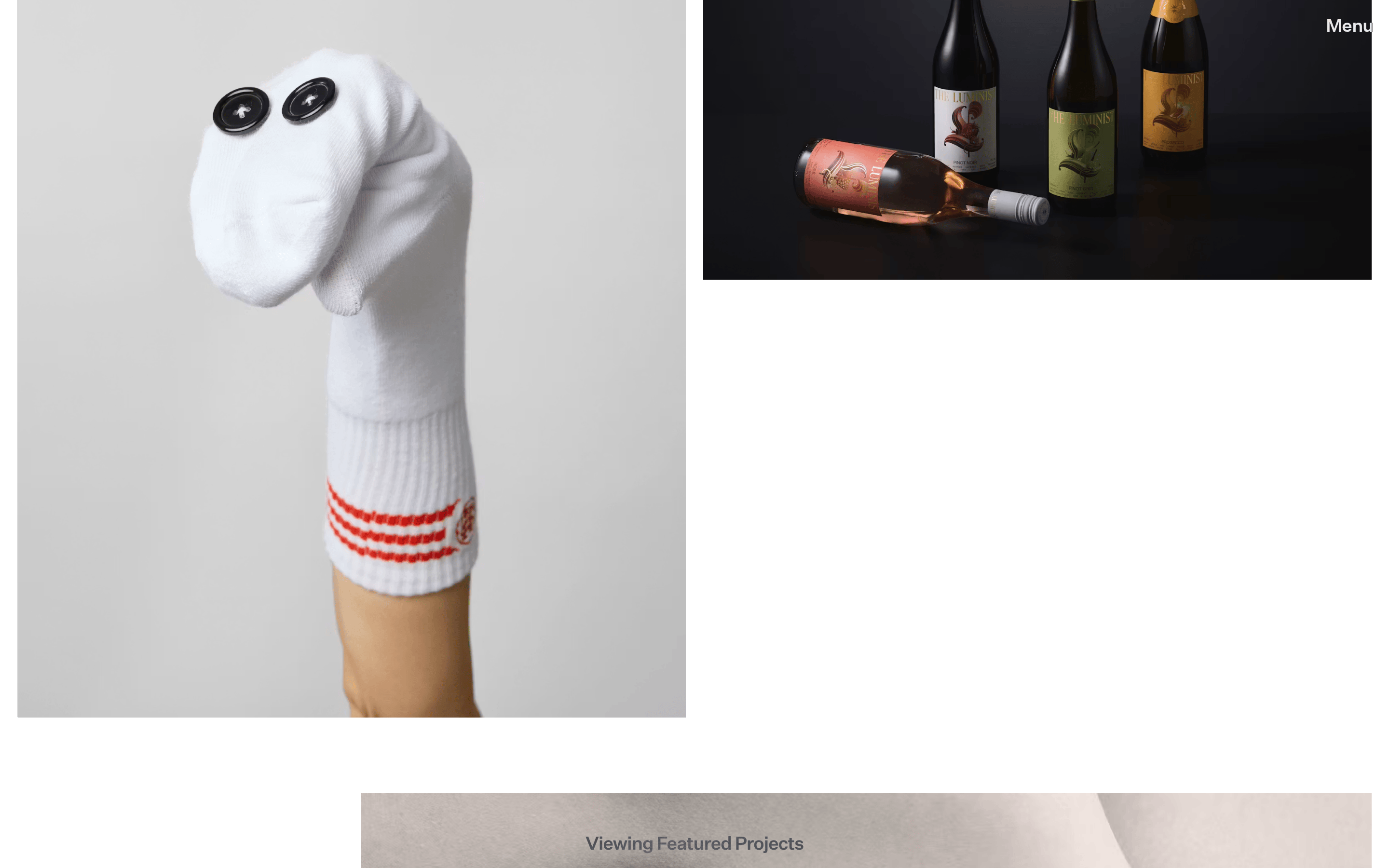
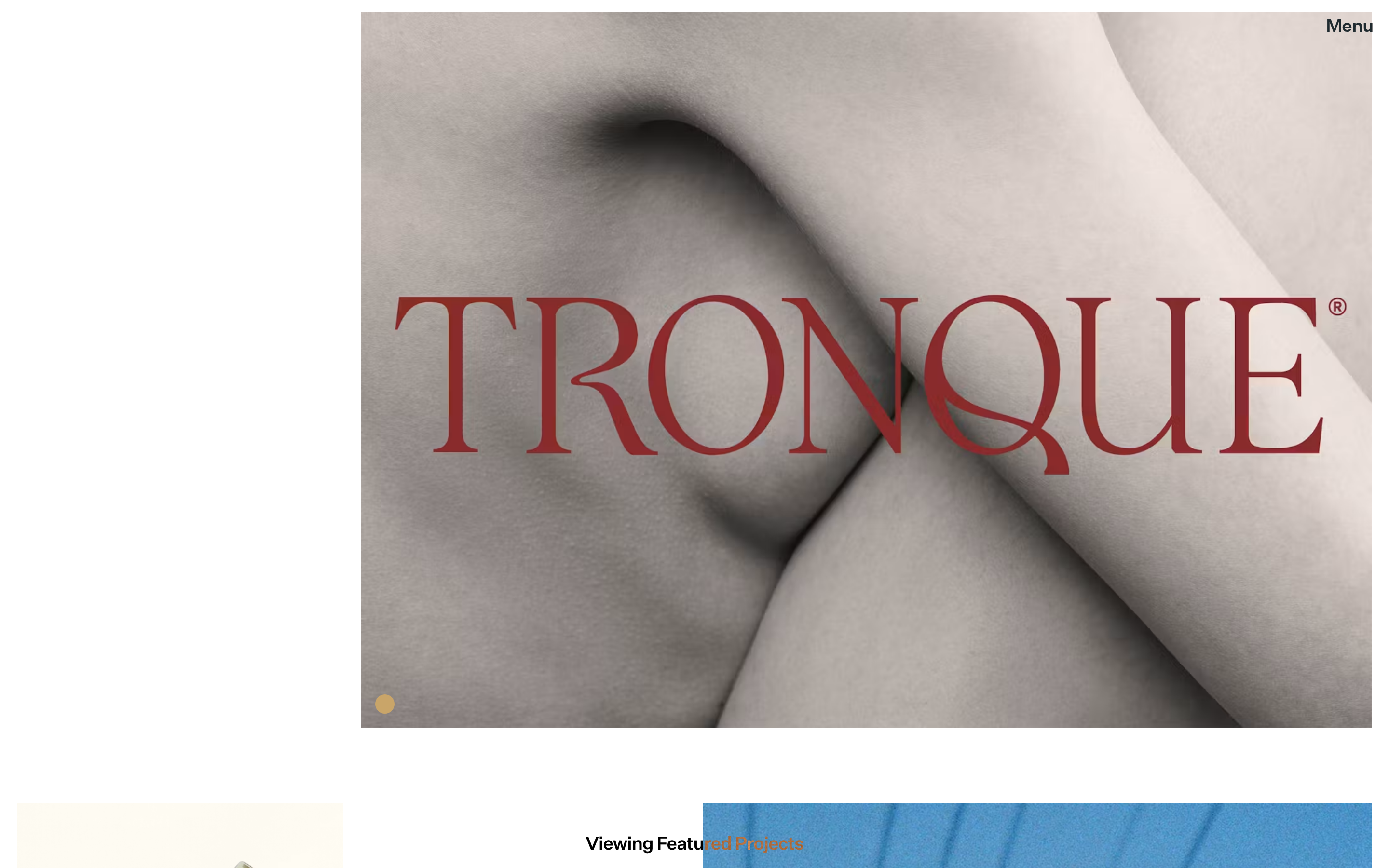
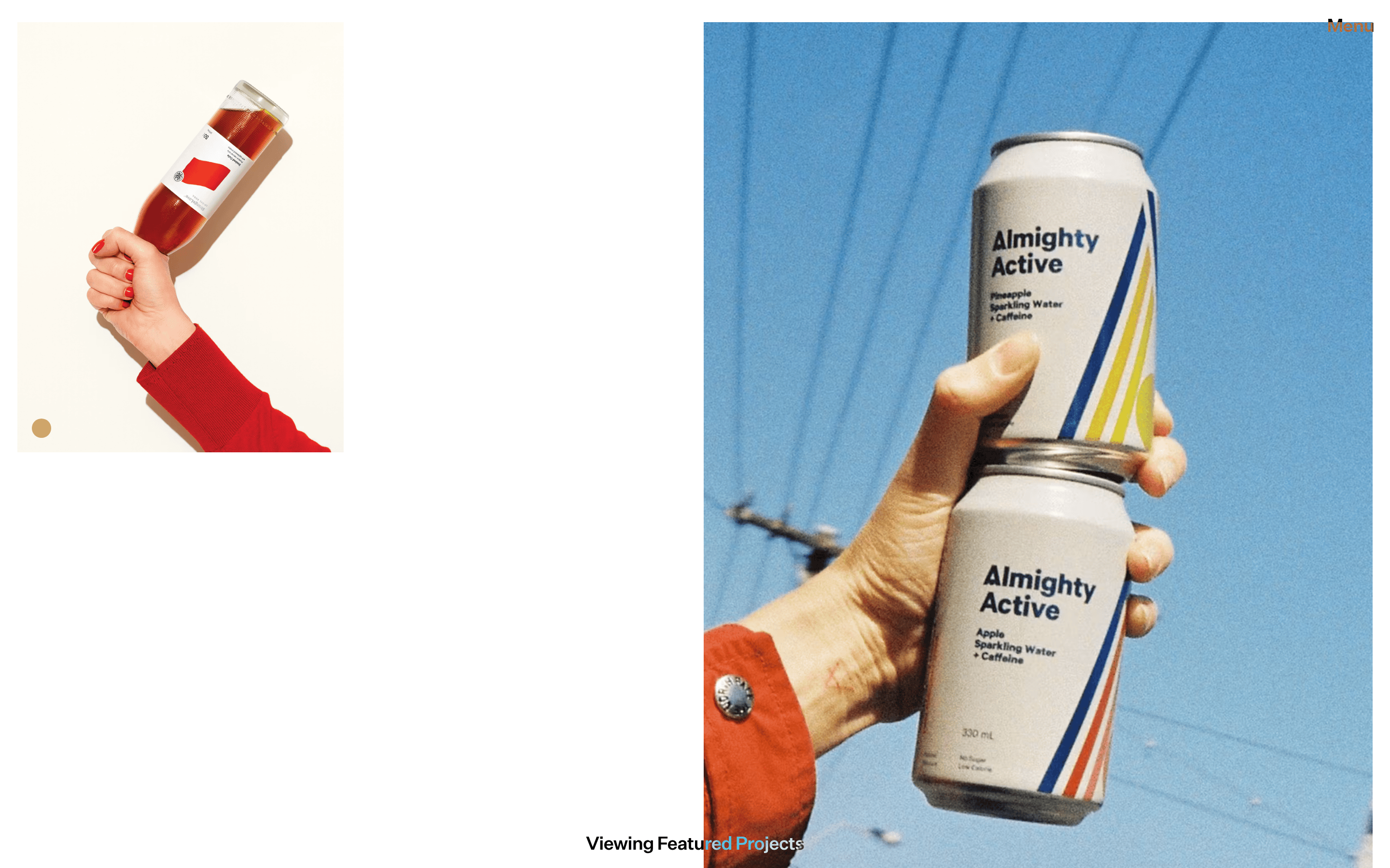
Inside the pack — real screenshots
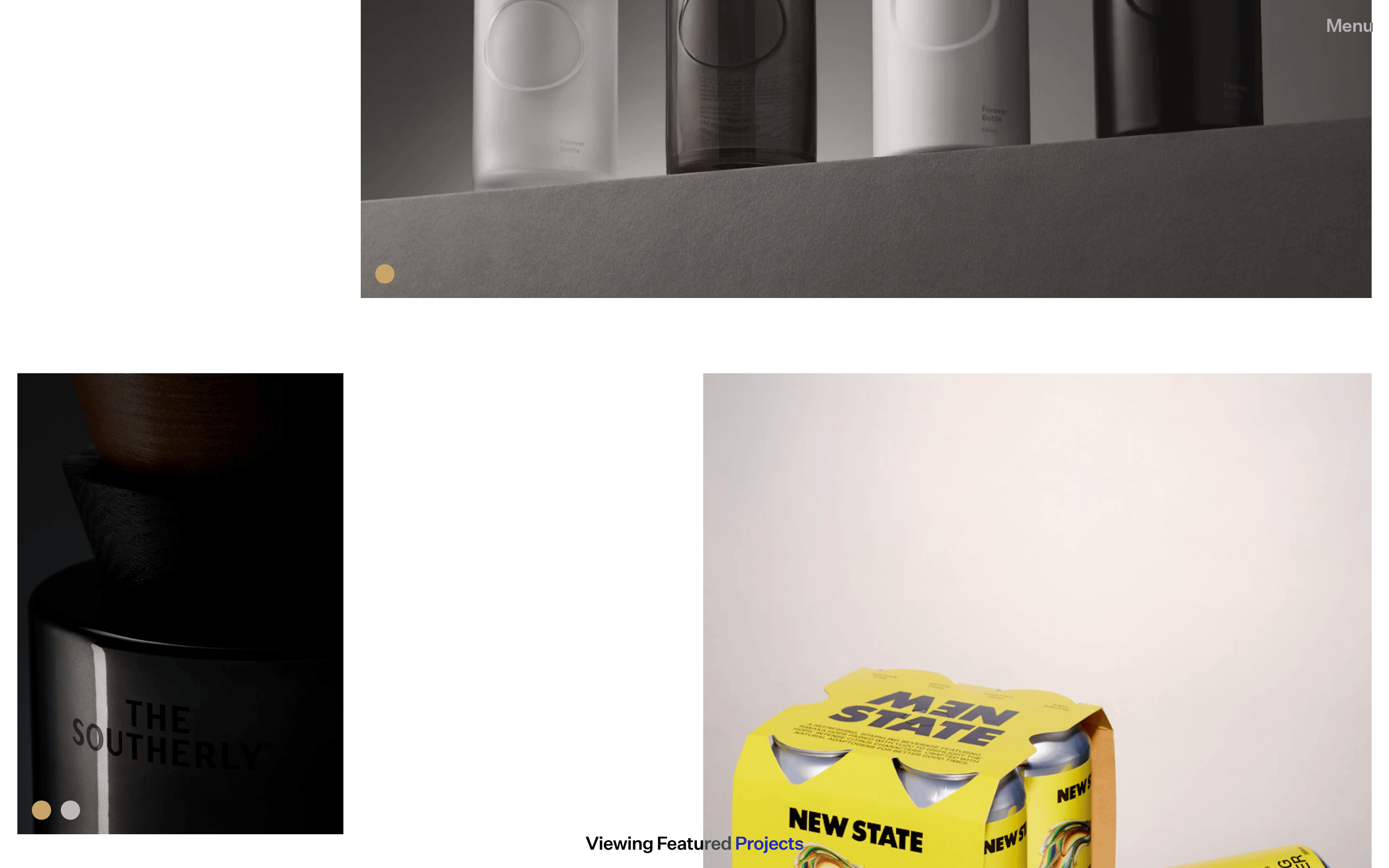
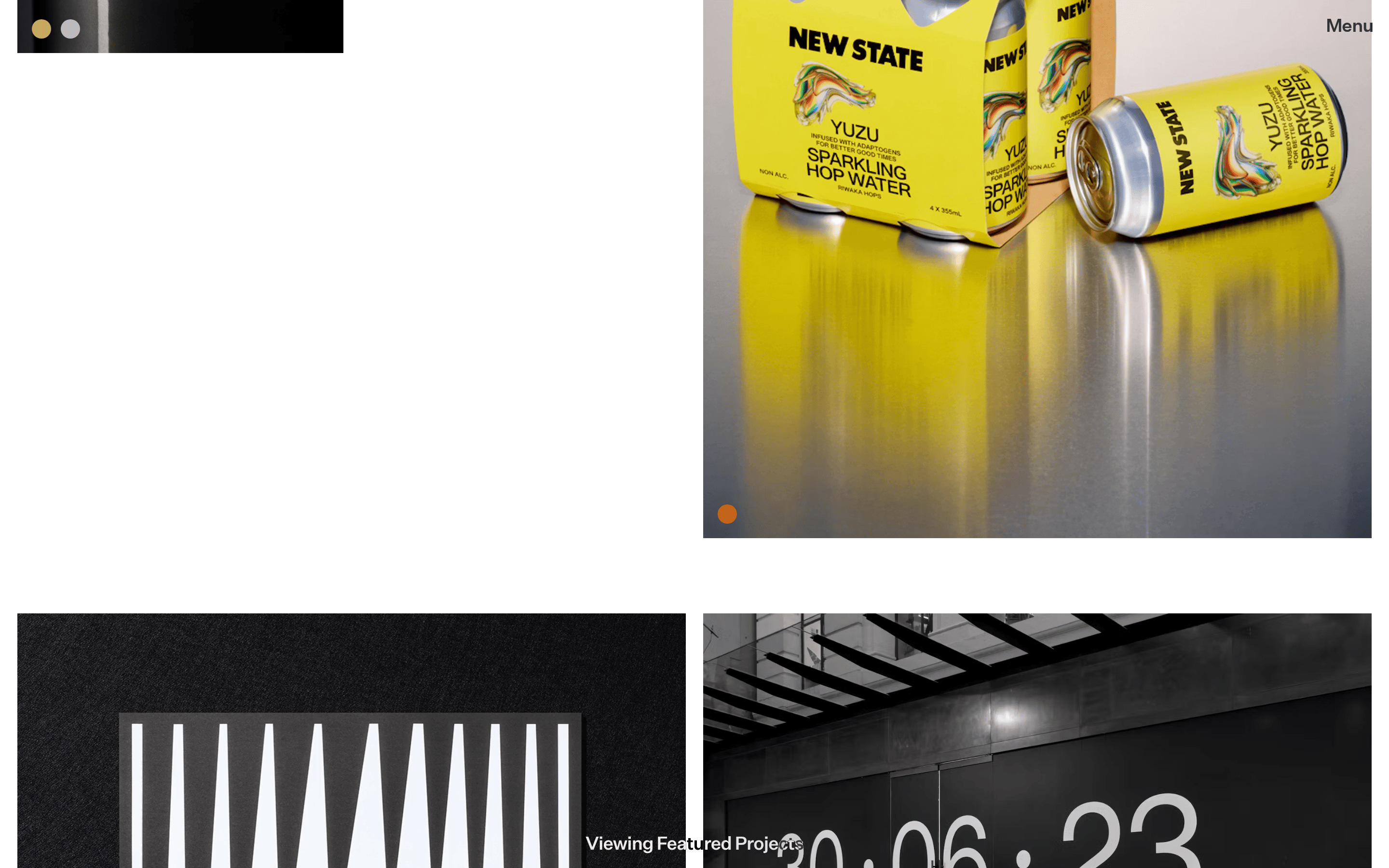
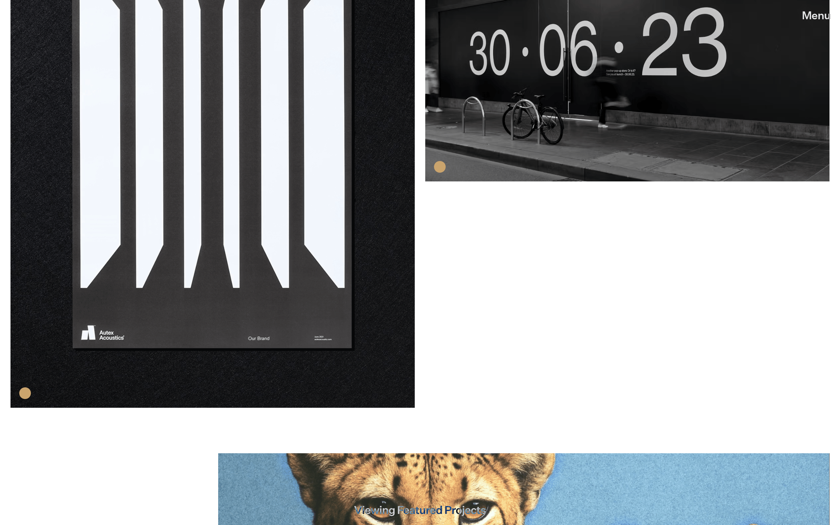
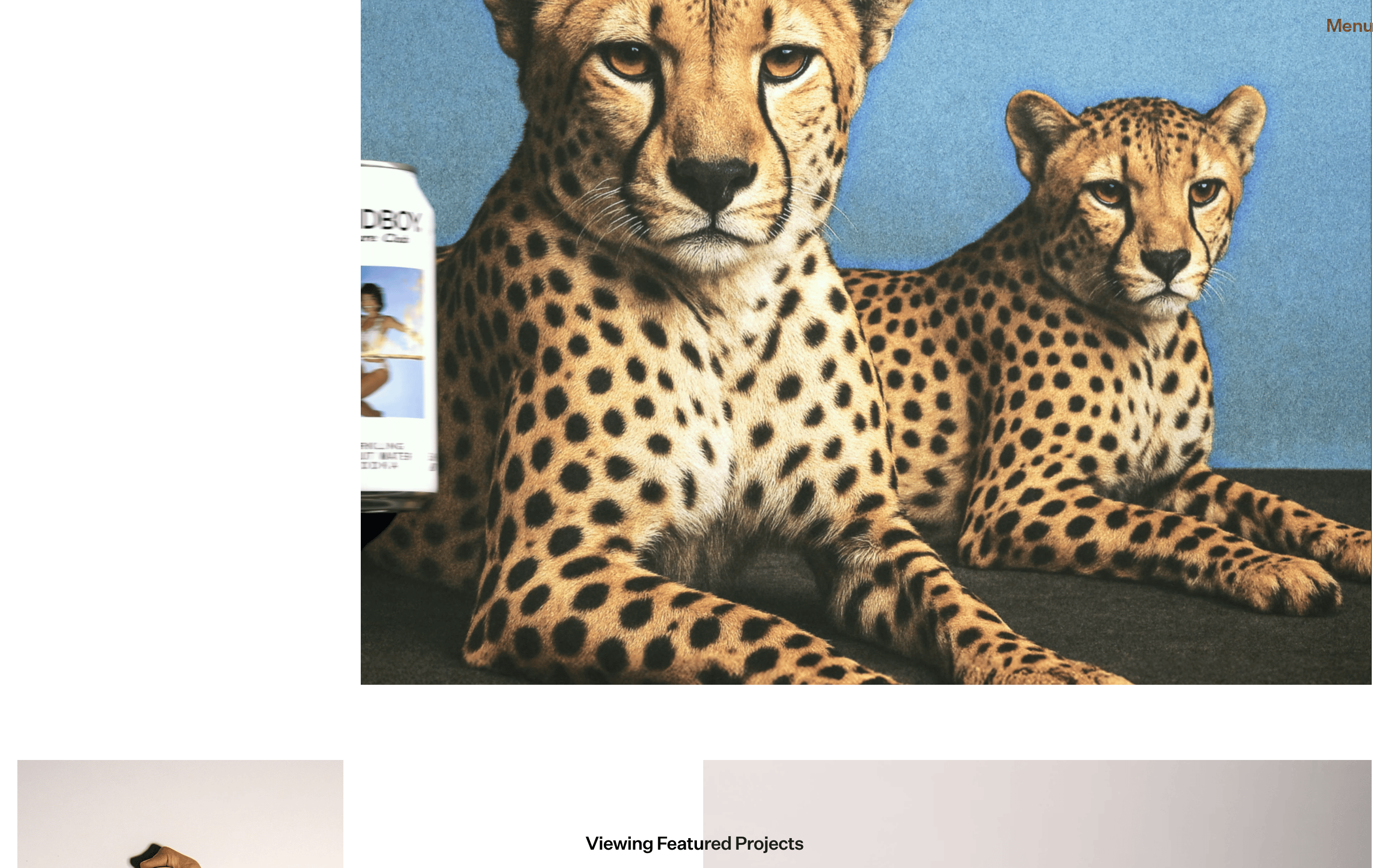
桌面首屏(hero) 桌面滚动分段(90% viewport 步进,作为视觉证据) 桌面滚动分段(90% viewport 步进,作为视觉证据) 桌面滚动分段(90% viewport 步进,作为视觉证据) 桌面滚动分段(90% viewport 步进,作为视觉证据) 桌面滚动分段(90% viewport 步进,作为视觉证据) 桌面滚动分段(90% viewport 步进,作为视觉证据) 桌面滚动分段(90% viewport 步进,作为视觉证据) 桌面滚动分段(90% viewport 步进,作为视觉证据) 桌面滚动分段(90% viewport 步进,作为视觉证据) 桌面滚动分段(90% viewport 步进,作为视觉证据) 桌面滚动分段(90% viewport 步进,作为视觉证据) 桌面滚动分段(90% viewport 步进,作为视觉证据) 桌面滚动分段(90% viewport 步进,作为视觉证据) 桌面滚动分段(90% viewport 步进,作为视觉证据) 桌面滚动分段(90% viewport 步进,作为视觉证据) 桌面滚动分段(90% viewport 步进,作为视觉证据) 移动首屏 Captured from the live site · real computed styles
11
System prompt
This is a minimalist portfolio site for a design agency. The visual identity is built on a high-contrast black and white palette (ink: #000000, bg: #ffffff) with warm photographic tones. The typography is dominated by a clean sans-serif (humanist-sans) with significant negative letter-spacing for large display text. Layouts are asymmetric and grid-based with generous negative space. Critical constraints: Never use centered text for the main body, avoid any colored UI components or borders, and maintain a strict monochrome aesthetic for all interface elements. The design focuses on large, high-quality photography as the primary visual interest.
More from the library en · zh-CN · zh-TW · ja · ko
OpenDesign · curated web aesthetics for AI-readable design DNA · opendesign.cc
Why we curated this: The site is worth including as a prime example of minimalist, typography-led portfolio design that prioritizes content over decoration.