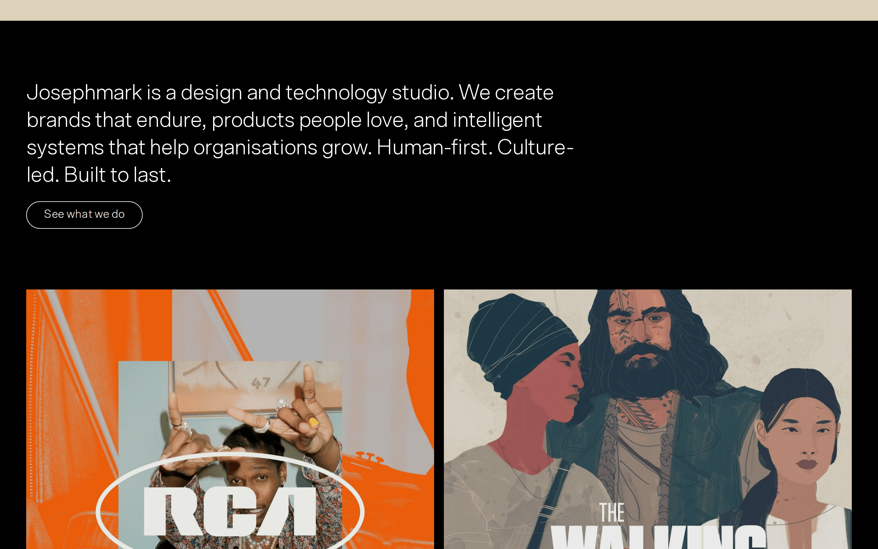
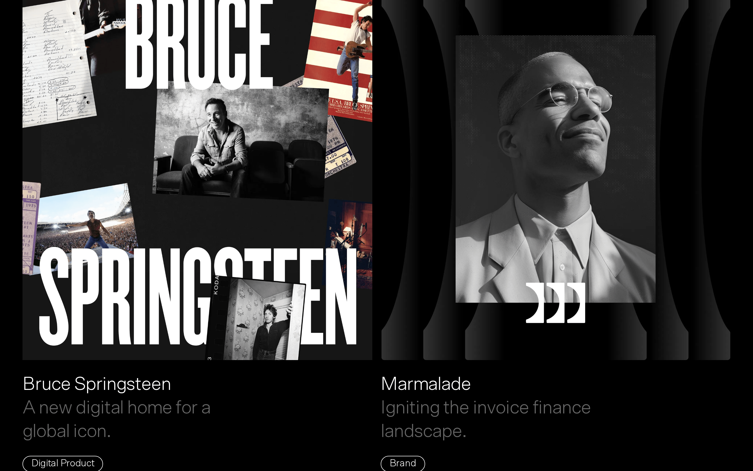
A high-end architectural firm: clean lines, confident statements, and a focus on structural clarity.
02
Color
#FFFFFFInk
#666666Ink soft
#000000BG
#F4F5EFBG soft
rgba(255, 255, 255, 1)Line
High-contrast dark mode with neutral off-whites and grays for secondary elements.
03
Typography
grotesque-sans
display60px · 300
h136px · 300
body16px · 300
small12px · 300
All text uses Scto Grotesk A with a default weight of 300 (light). · Negative letter spacing is applied consistently to display and heading sizes. · Uppercase is used sparingly for labels and tags.
04
Spacing
4px
8px
12px
16px
24px
28px
32px
43px
48px
64px
96px
112px
Generous vertical padding (96px-112px) between major sections to emphasize scale.
05
Surfaces
sm · 4px
md · 8px
lg · 12px
pill · 9999px
Minimal 1px borders, often using white or gray, primarily on tags and UI elements.
06
Layout
1280container
12columns
24pxgutter
768 / 1024breakpoints
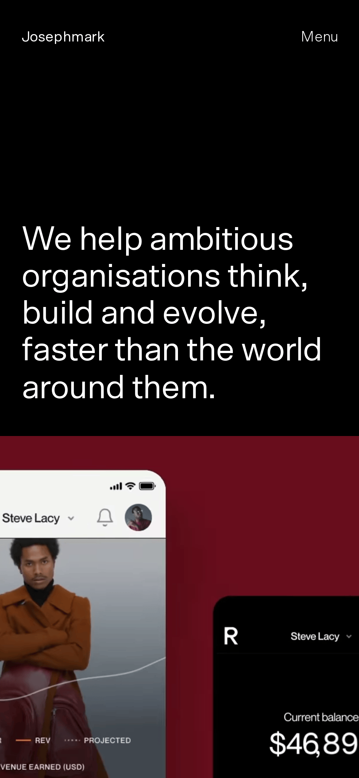
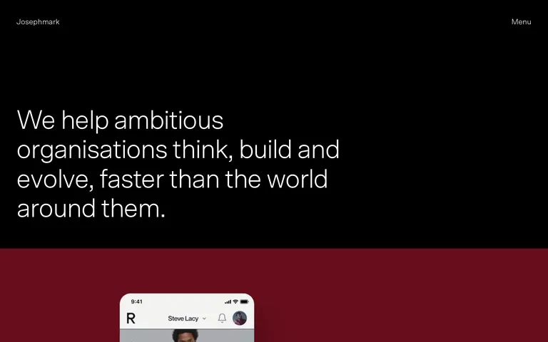
A full-bleed, vertically stacked layout with large typographic blocks and image containers.
07
Motion & Interaction
150msmicro
300mssmall
500msmedium
cubic-bezier(0.4, 0, 0.2, 1)easing
Smooth opacity and transform transitions on hover. · Standard 0.3s transitions for color and background changes.
Subtle opacity or color shifts on interactive elements. · Standard pointer interaction.
08
Components
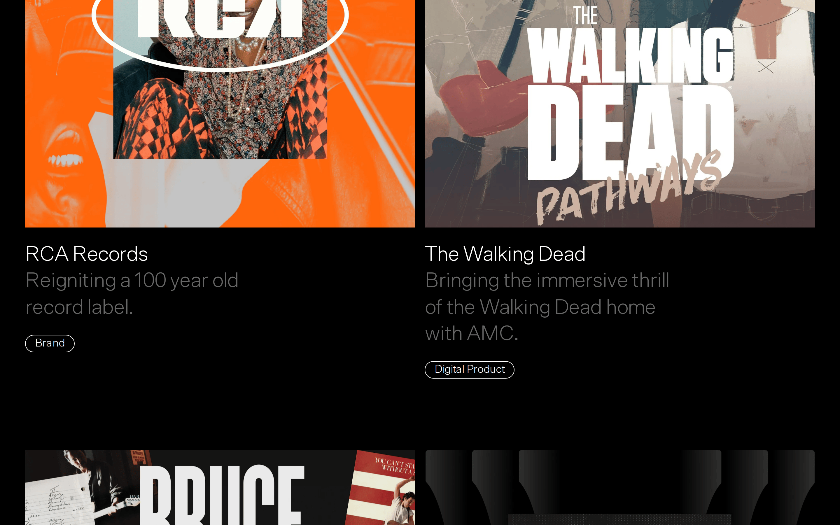
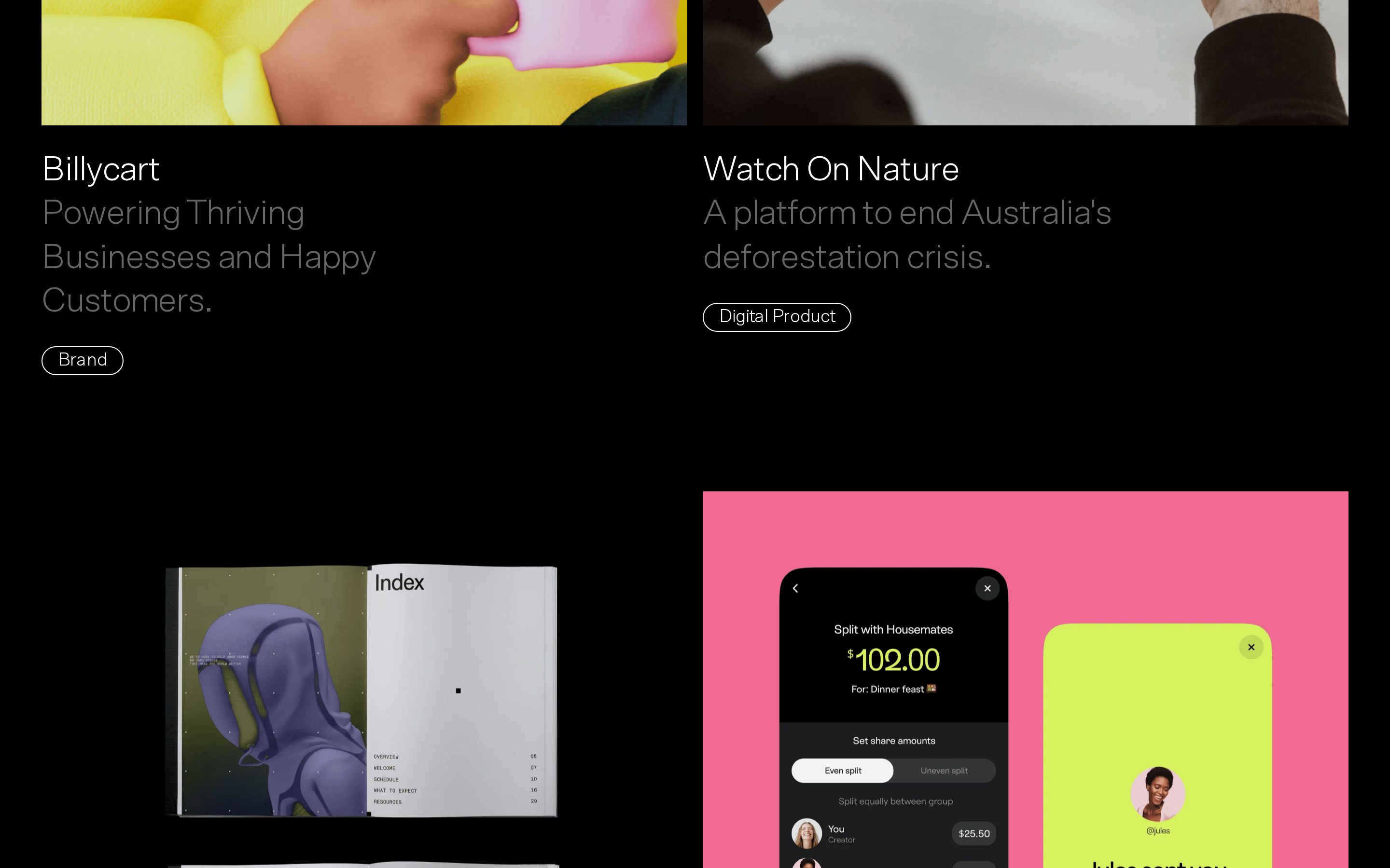
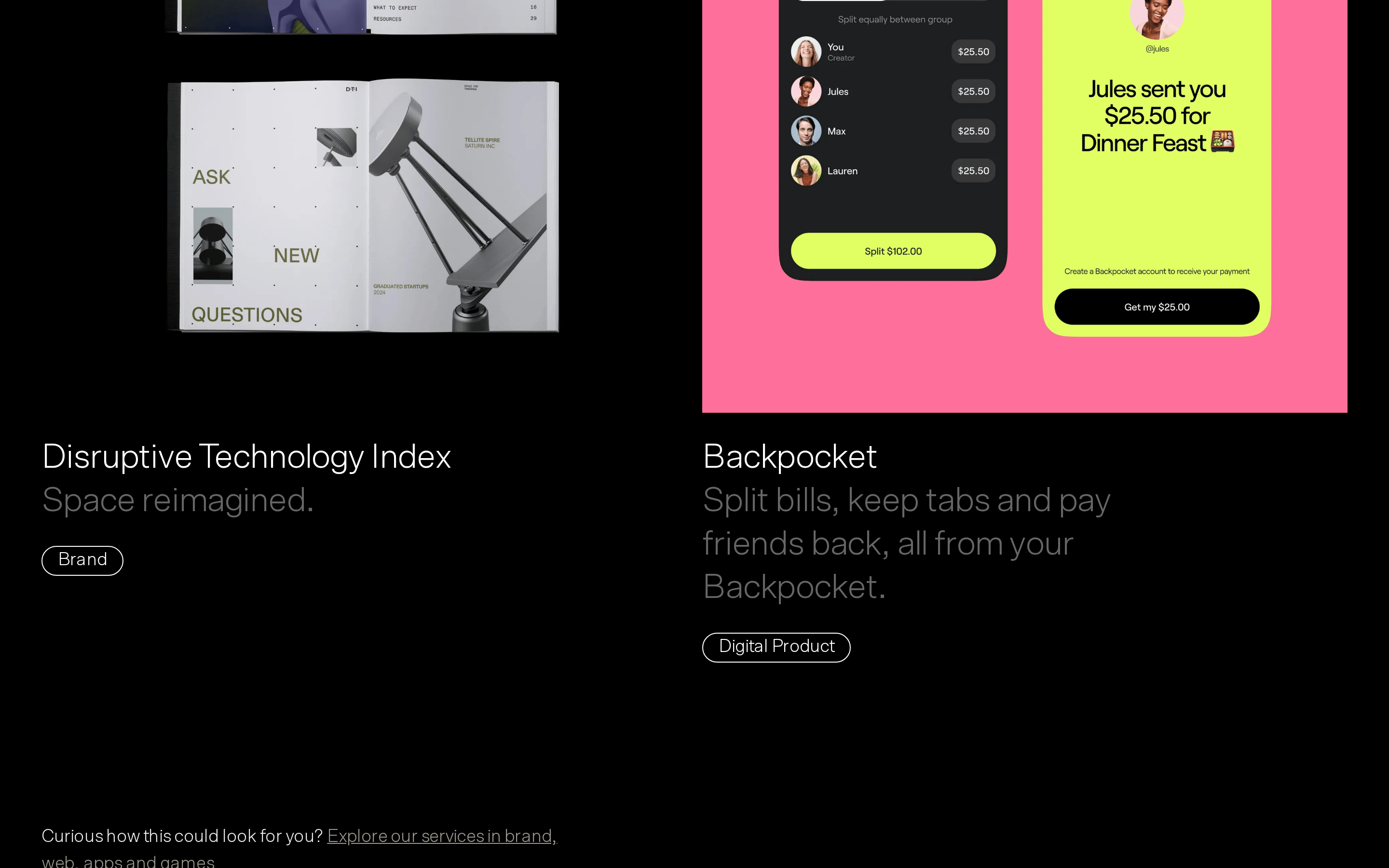
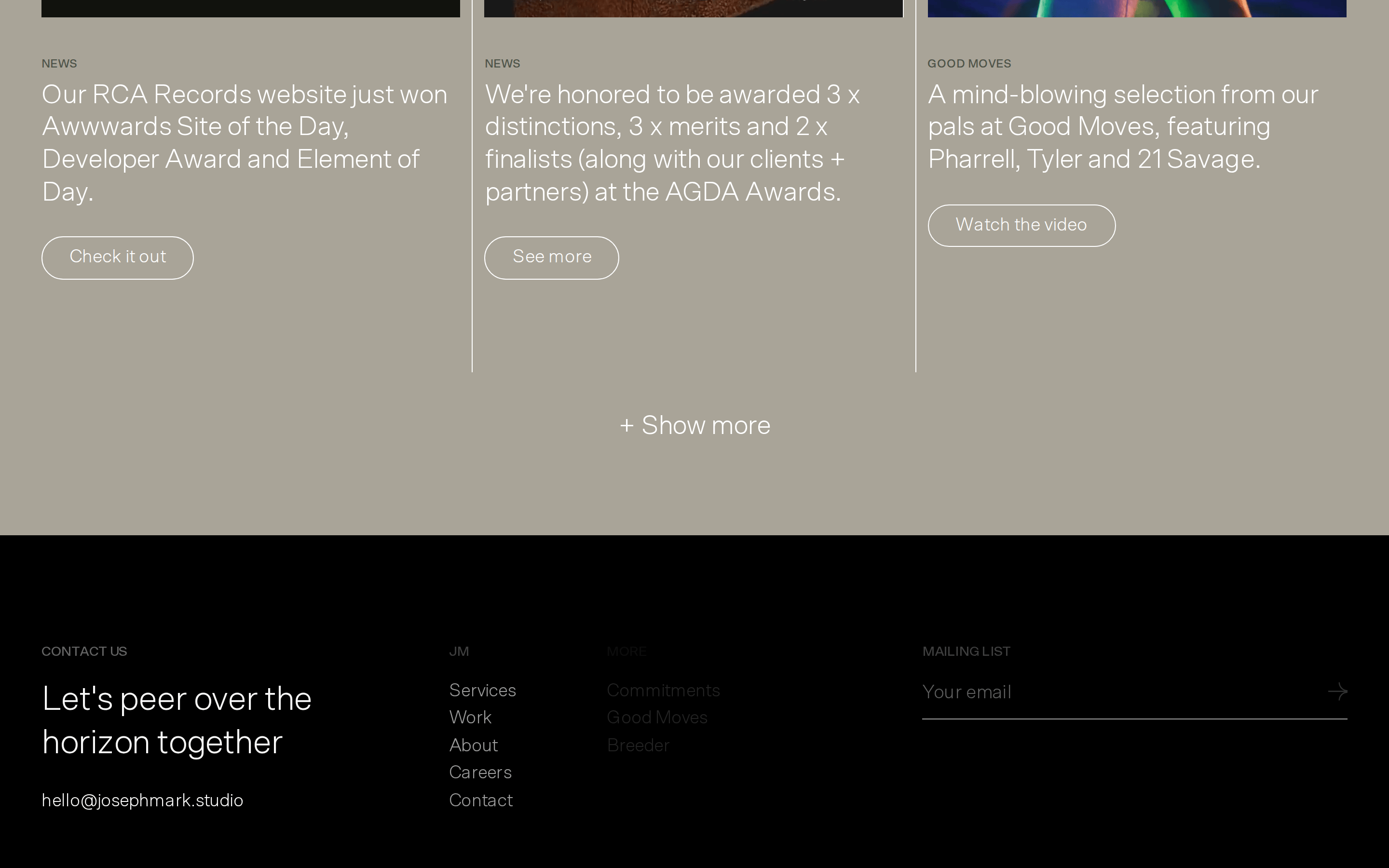
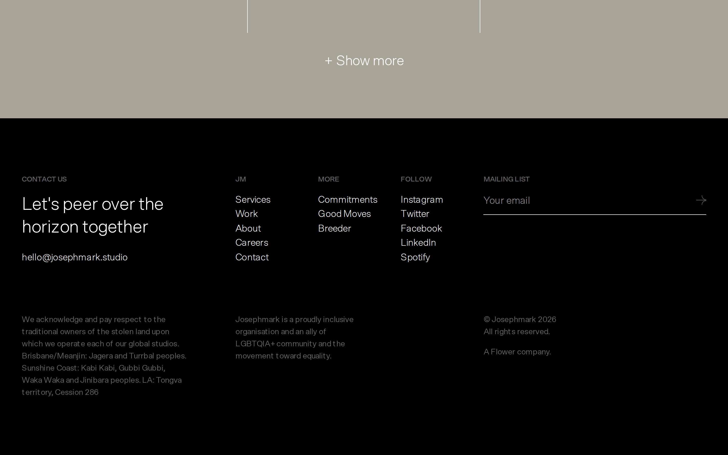
buttonPill-shaped tags with thin borders (e.g., 'Brand', 'Digital Product') and simple text links.
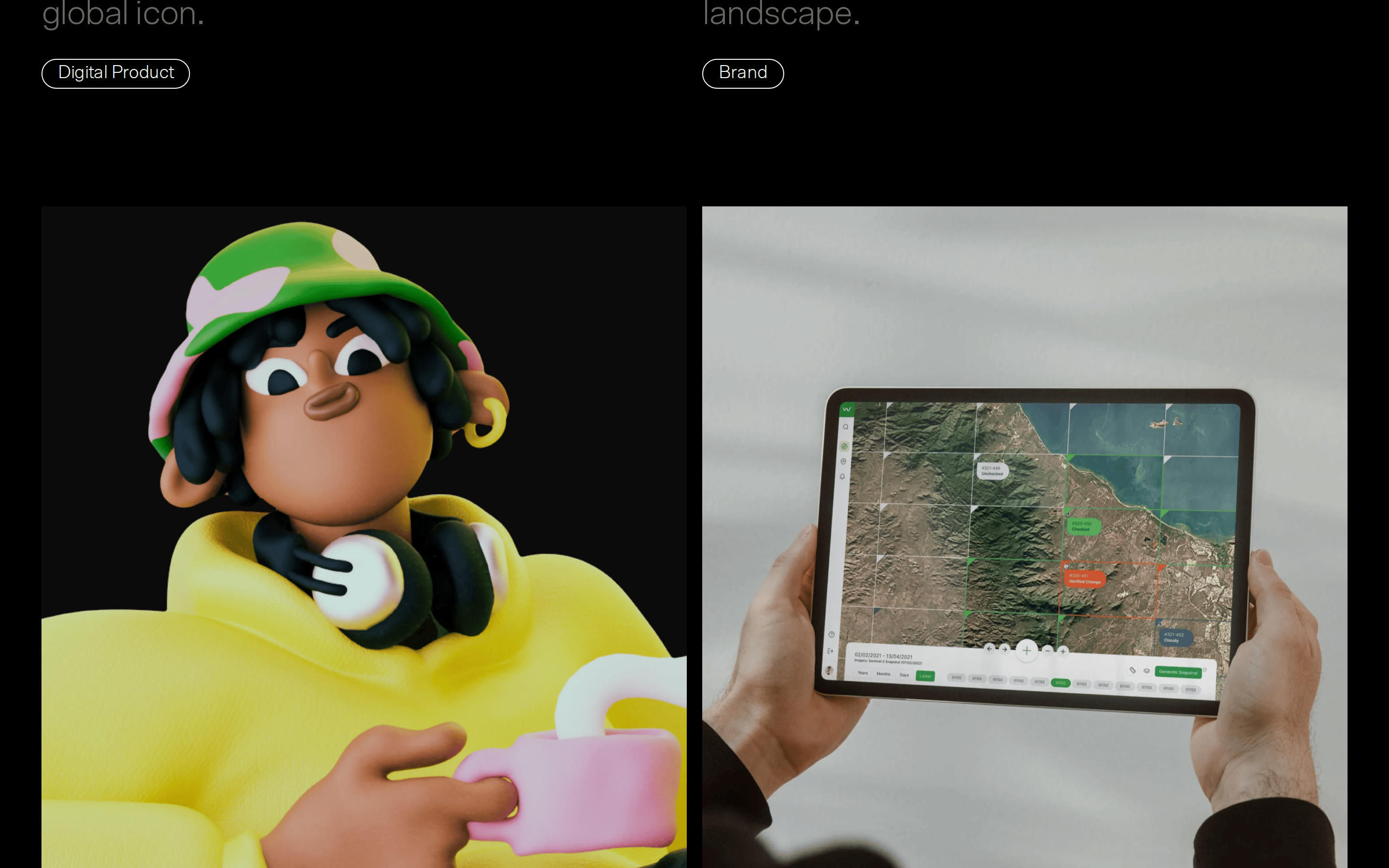
cardLarge image-based project showcases with left-aligned typography and pill-shaped category tags below.
chipSmall, pill-shaped category tags with thin borders.
heroA full-viewport dark section featuring massive, left-aligned light typography.
09
Voice & Don'ts
ToneConfident, direct, and ambitious.
HeadlinesLarge, declarative statements with a light font weight.
CTAsMinimal and unobtrusive, often simple text links or subtle tags.
Don't use heavy font weights — screenshot shows a consistent use of light (300) weights.
Don't use bright, saturated accent colors — screenshot shows a strict monochrome palette with neutral off-whites.
Don't use centered text alignment — screenshot shows all major text blocks are left-aligned.
Don't use complex drop shadows — screenshot shows entirely flat surfaces with no visible shadows.
Don't use tight vertical spacing — screenshot shows generous padding (96px+) between sections.
Don't use standard rectangular buttons — screenshot shows pill-shaped tags and thin-bordered tags instead.
Captured from the live site · real computed styles
11
System prompt
Josephmark is a high-end digital design studio. Their website uses a bold, minimalist dark theme with a strict monochrome palette (black #000000 and white #FFFFFF). The typography is set in Scto Grotesk A, a grotesque-sans, consistently at a light weight (300) with significant negative letter spacing. Layout is dominated by massive left-aligned headlines. Do not use heavy font weights, bright accent colors, or centered text. Avoid dense layouts; instead, use generous vertical padding (96px+) and minimal UI elements like thin-bordered pill tags. The overall feel should be confident, architectural, and restrained.
Bring this taste to your agent
Hand your AI agent a machine-readable spec of this design — tokens, type, motion, the whole DNA.