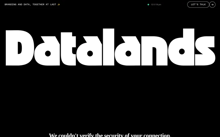
High-contrast monochromatic with stark white typography on a deep black canvas.
03
Typography
geometric-sans · grotesque-sans · monospace
display120px · 900
heading60px · 400
subheading22px · 400
caption12px · 400
Use monospace for UI labels and small tags. · Maintain heavy weight for the main logotype. · Body copy remains clean and highly legible grotesque-sans.
04
Spacing
4px
8px
16px
24px
32px
48px
64px
96px
generous
05
Surfaces
sm · 4px
md · 8px
lg · 12px
pill · 999px
1px solid white for primary outlines, 2px borders on badges
06
Layout
1440container
12columns
24pxgutter
768 / 1024breakpoints
full-width hero sections with split layouts for content
07
Motion & Interaction
220msmicro
400mssmall
800msmedium
cubic-bezier(0.44, 0, 0.56, 1)easing
subtle hover transitions on interactive elements
subtle color shifts or opacity changes · subtle compression or state change
08
Components
buttonrounded pill buttons with white outline on transparent background
cardminimalist layout with clean typography separation
chipsmall pill-shaped labels with solid backgrounds (e.g., orange for case studies)
inputminimal, transparent inputs with bottom borders
heromassive typographic display filling the screen width
09
Voice & Don'ts
Toneprofessional, minimal, and sophisticated
Headlinesbold, direct, and highly visual
CTAsmonospace, uppercase, and enclosed in rounded buttons
don't use colorful gradients — the screenshot shows a strict monochrome palette
don't use decorative serifs — the typography is exclusively geometric and grotesque sans-serif
don't use heavy drop shadows — the screenshot shows flat, clean surfaces
don't use small, cramped spacing — the layout is highly spacious with generous padding
don't use mixed-case hero typography — the logotype is a distinct geometric custom style
don't use complex navigation menus — the screenshot shows simple text links and minimal buttons
Captured from the live site · real computed styles
11
System prompt
Datalands is a visual communication and information design studio specializing in data visualization and branding. The design is defined by a stark, high-contrast monochromatic palette using pure black (#000000) for the background and white (#FFFFFF) for text, with very minimal accents like orange (#FF7400) for specific tags. The typography relies on bold, custom geometric sans-serif fonts for massive logotypes and clean grotesque-sans for body copy, complemented by monospace for small labels. Critical donts include: never use colorful gradients, avoid decorative serifs, and do not crowd the layout with unnecessary UI elements.
Bring this taste to your agent
Hand your AI agent a machine-readable spec of this design — tokens, type, motion, the whole DNA.