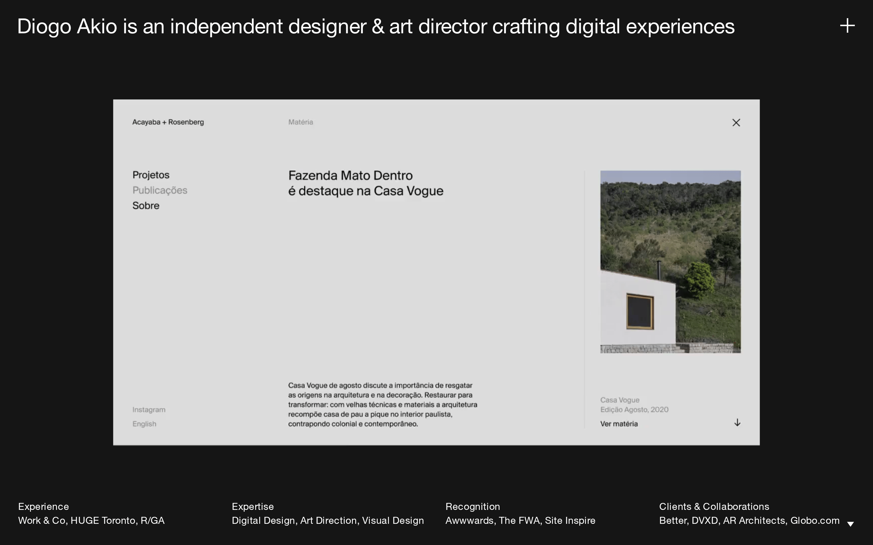
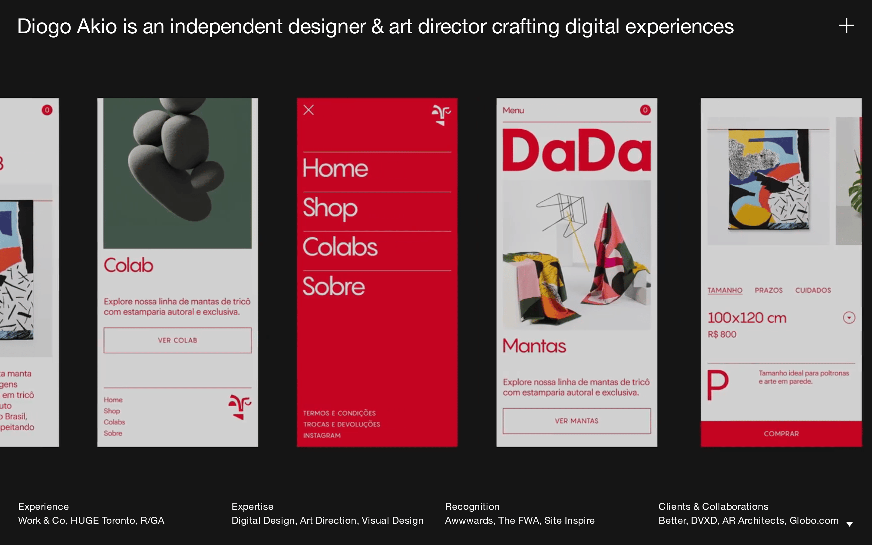
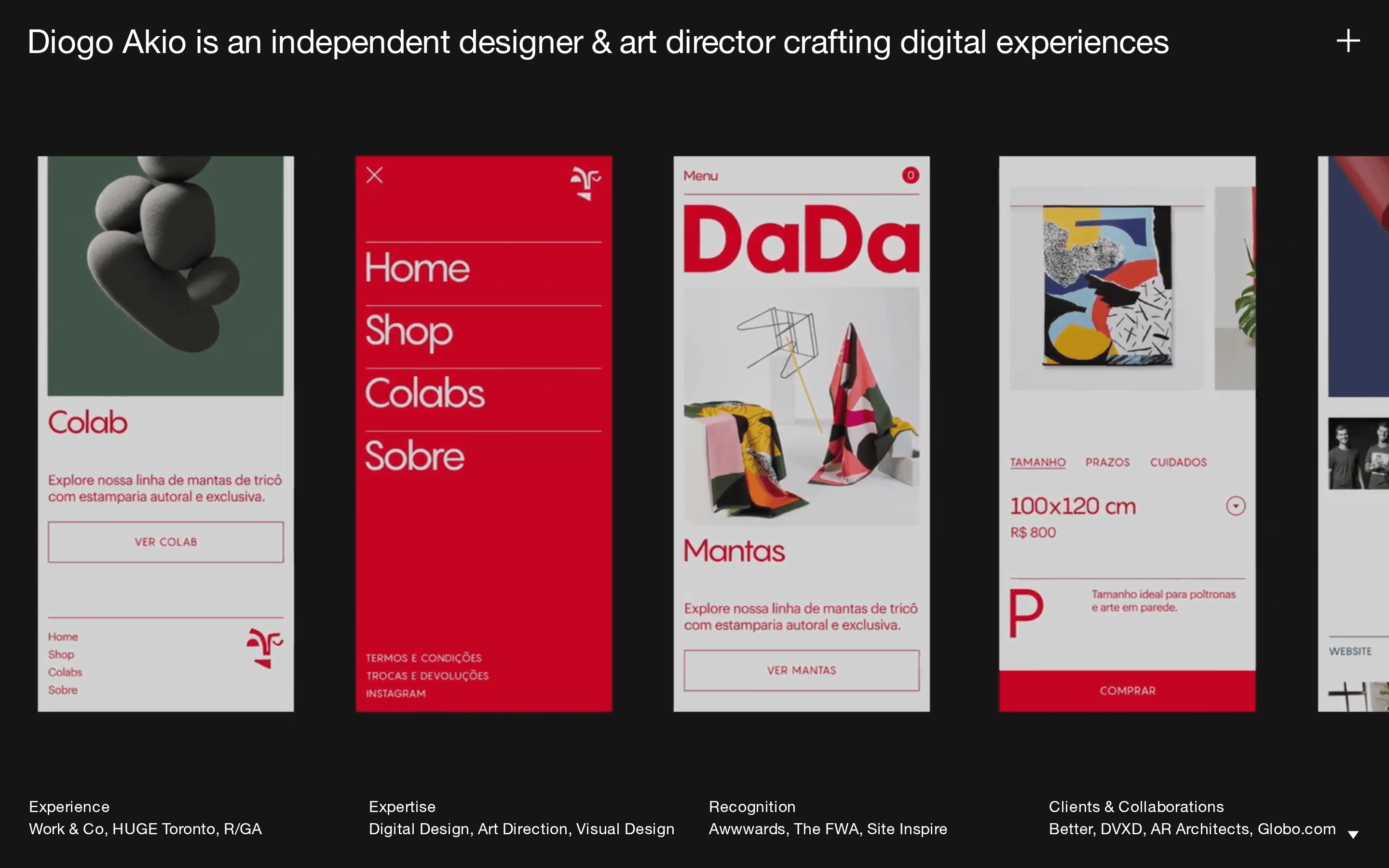
A digital gallery with curated, high-contrast exhibitions.
02
Color
#FFFFFFInk
#151515BG
#1C2763BG soft
#999999Muted
rgba(255, 255, 255, 0.15)Line
High contrast and restraint, using a dark backdrop to let photography and typography stand out.
03
Typography
humanist-sans
display34px · 400
body16px · 400
All text uses a 400 weight. · Display uses negative letter-spacing, body uses positive letter-spacing. · Typography is the primary structural element.
04
Spacing
4px
8px
16px
20px
24px
30px
48px
A consistent 30px gap defines major section separations.
05
Surfaces
sm · 0px
md · 0px
lg · 0px
pill · 999px
Minimal to non-existent; separation is achieved through spacing and background contrast.
06
Layout
1920container
12columns
30pxgutter
768 / 1024breakpoints
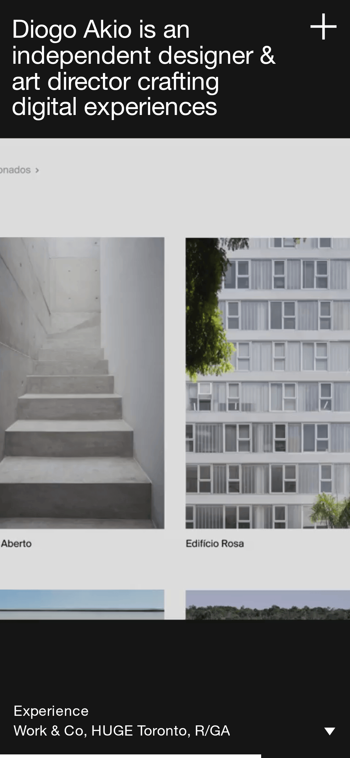
A full-bleed dark canvas with a prominent top-aligned hero statement and a grid-based portfolio gallery.
07
Motion & Interaction
200msmicro
400mssmall
800msmedium
cubic-bezier(0.4, 0, 0.2, 1)easing
All elements have a standard 'all' transition applied for smooth state changes.
Visual feedback likely involves subtle color shifts or reveals on interactive elements. · Transitions to reveal more content, such as the project overlay.
08
Components
buttonMinimalist text links or buttons with high contrast against dark backgrounds.
cardContent presented as large photographic cards or clean text blocks within a grid.
chipSimple, unadorned text elements.
inputNot visible in the provided screenshots.
heroA massive, full-width typographic statement that anchors the entire page.
09
Voice & Don'ts
ToneConfident, direct, and professional.
HeadlinesDeclarative and straightforward, using the designer's name as the primary hook.
CTAsUnderstated and functional, such as 'Ver matéria'.
Don't use a white background — the screenshot shows a dominant dark theme.
Don't use bold font weights — the screenshot shows a consistent 400 weight.
Don't add drop shadows — the screenshot shows flat, surface-level depth.
Don't use a wide variety of colors — the screenshot shows a strictly monochrome palette.
Don't use rounded corners on elements — the screenshot shows sharp, square edges.
Don't use complex decorative borders — the screenshot relies on spacing for separation.
Captured from the live site · real computed styles
11
System prompt
Design DNA for Diogo Akio's portfolio site. This is a refined, high-contrast portfolio for an independent designer and art director. The design is anchored by a dark theme (bg #151515) and white typography (ink #FFFFFF), with a muted accent color (#1C2763) and gray text (#999999). Typography is a humanist sans-serif (HelveticaNeueLTPro-Roman) used in a 400 weight. The layout is a full-bleed dark canvas with a prominent typographic hero and a grid-based gallery. Critical donts: Never use a white background, never use bold font weights, and never use rounded corners or drop shadows. The site prioritizes editorial clarity and a cinematic gallery feel.
Bring this taste to your agent
Hand your AI agent a machine-readable spec of this design — tokens, type, motion, the whole DNA.