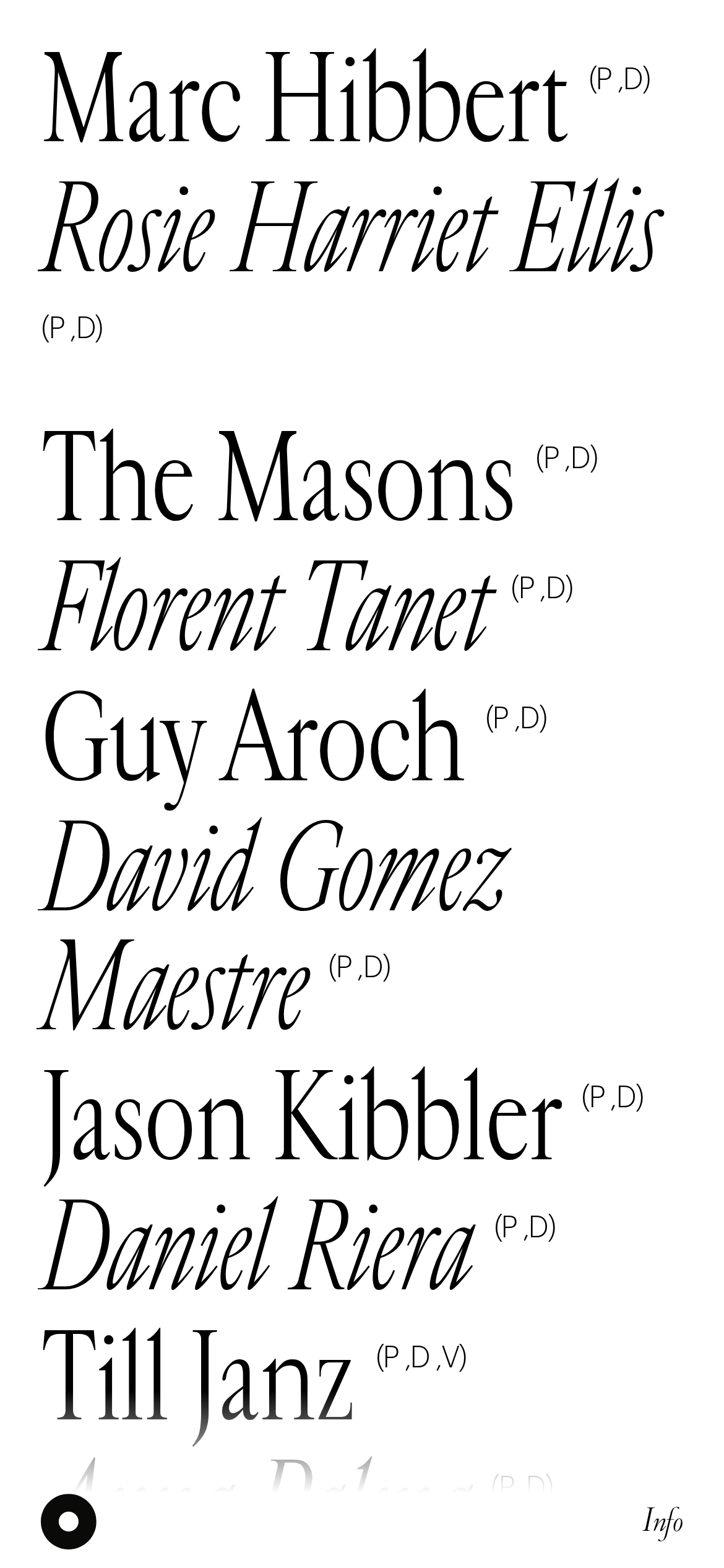
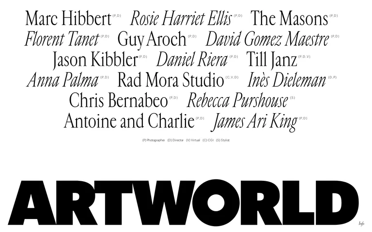
A curated gallery of creative talent presented with classical typographic elegance.
02
Color
#000000Ink
#FFFFFFBG
#BABABAMuted
rgba(0,0,0,0.1)Line
Strict high-contrast monochrome to prioritize the creative work and typographic hierarchy.
03
Typography
didone-serif · humanist-sans
display75px · 300
h175px · 300
body16px · 300
caption12px · 300
Use 'Cardinal Fruit' (didone-serif) for large display text and artist names. · Use 'Graphik' (humanist-sans) at weight 300 for body text and smaller UI elements. · Strictly maintain a single font weight (300) across all typography for a cohesive, refined aesthetic.
04
Spacing
4px
8px
16px
24px
32px
48px
64px
96px
Generous, unstructured whitespace between typographic blocks to allow the text to breathe.
05
Surfaces
sm · 0px
md · 0px
lg · 0px
pill · 0px
None; separation is achieved through spacing and typography.
06
Layout
1280container
12columns
24pxgutter
768 / 1024breakpoints
A clean, single-column typographic flow with a massive logo anchored at the bottom.
07
Motion & Interaction
220msmicro
400mssmall
800msmedium
cubic-bezier(0.77, 0, 0.18, 1)easing
Subtle fade-in transitions for elements appearing on scroll. · Smooth color transitions on hover states.
Text color transitions from black to white, typically over a dark background overlay. · Cursor pointer indicates clickable links.
08
Components
buttonSimple text links with cursor pointer, relying on hover color transitions.
cardNone visible; content is presented as a flat typographic list.
chipNone visible.
inputNone visible.
heroA massive, full-width typographic display anchoring the bottom of the viewport.
09
Voice & Don'ts
ToneRefined, authoritative, and quietly confident.
HeadlinesLarge, classical serif typography that commands attention.
CTAsMinimalist text links that blend seamlessly into the typography.
don't use bright accent colors — screenshot shows a strict black-and-white monochrome palette
don't use heavy font weights — screenshot shows all text at a light weight (300)
don't use border-radius on elements — screenshot shows purely rectangular, sharp-edged layouts
don't use complex card layouts — screenshot shows a flat, typographic list of names
don't add decorative shadows — screenshot shows zero elevation or drop shadows
don't mix many font families — screenshot relies purely on a serif/sans-serif pairing
Captured from the live site · real computed styles
11
System prompt
Artworld Agency is a refined, typography-led creative portfolio. The design DNA is built on a strict black-and-white monochrome palette (#000000 ink, #FFFFFF background) to prioritize the creative work. The typography features a prominent didone-serif for display text (artist names) paired with a clean humanist-sans for body copy, both strictly at a light font weight (300). Critical design rules: do not introduce accent colors, do not use heavy font weights, and do not add decorative elements like shadows or rounded corners. The layout relies on generous whitespace and a massive typographic logo anchored at the bottom of the page.
Bring this taste to your agent
Hand your AI agent a machine-readable spec of this design — tokens, type, motion, the whole DNA.