← OpenDesign CURATED · OPEN · FREE
Dmitrkutsenko
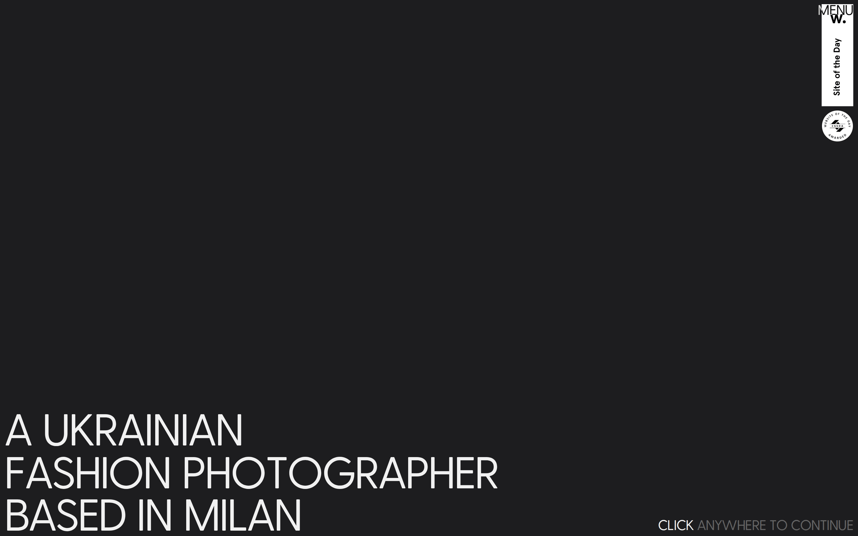
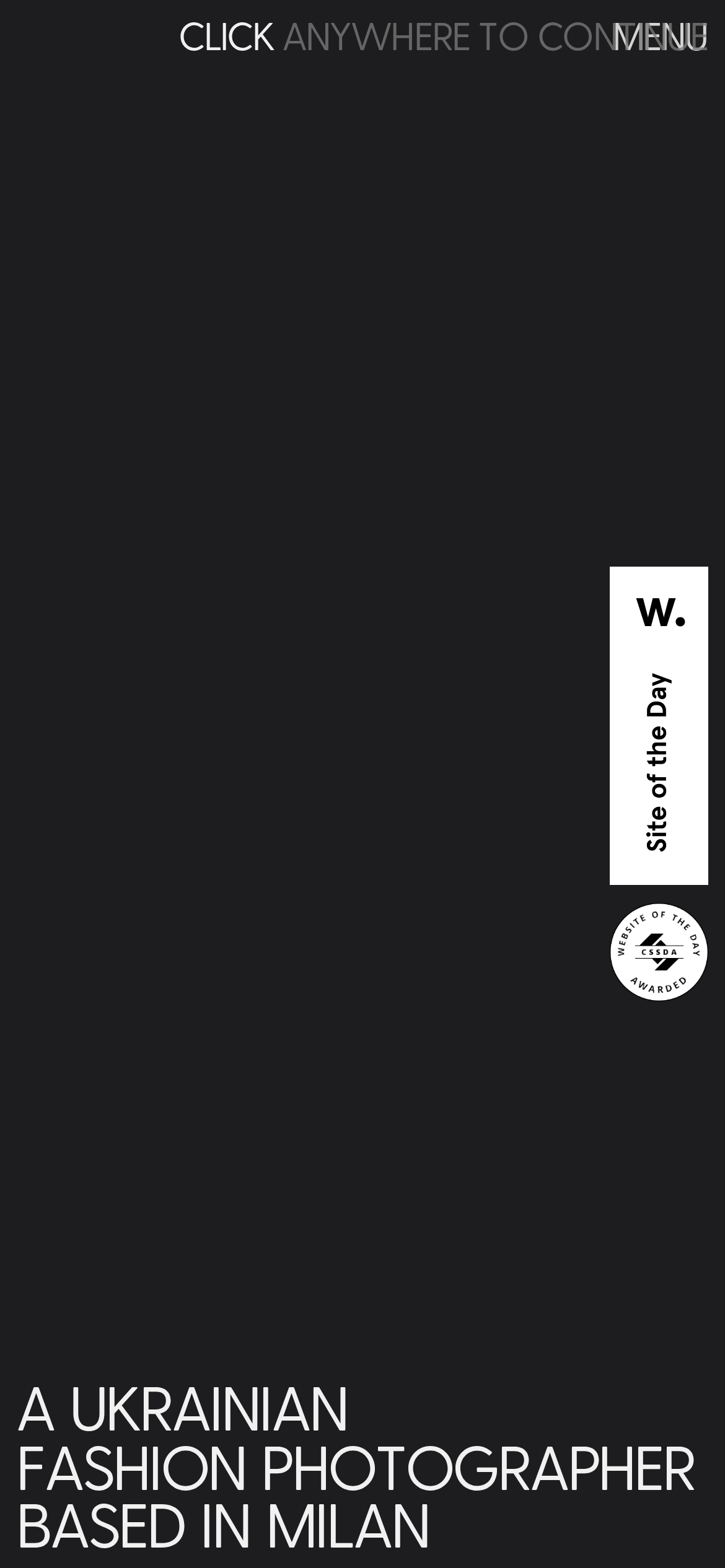
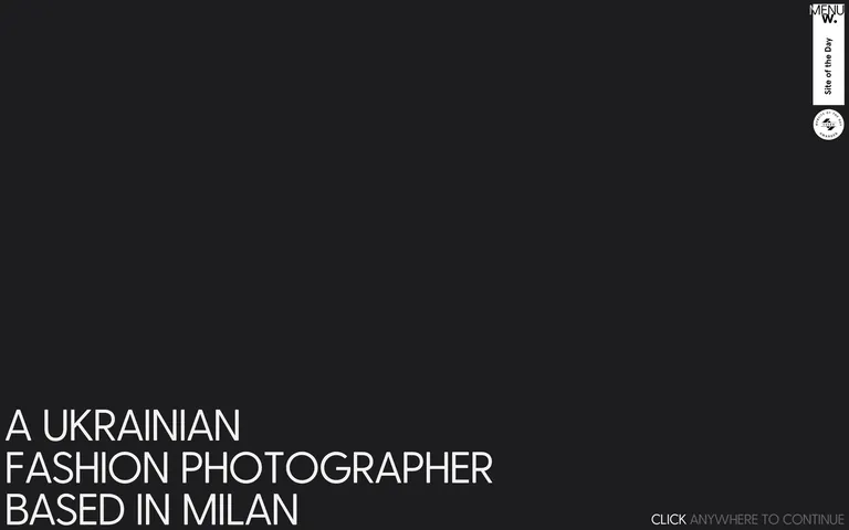
A stark, typographic introduction for a fashion photographer's portfolio.
Photographic Portfolio Studio Bold Typography Curation
01
Identity DNA
photography portfolio minimal premium fashion
A darkened gallery entrance announcing the artist.
02
Color
#F1F1F1Ink
#1D1D1FBG
#656565Muted
rgba(101,101,101,0.2)Line
High-contrast monochrome to ensure photographic content is the focal point.
03
Typography
geometric-sans
display 75px · 400body 14px · 400Display text is uppercase and tightly tracked. · Body text is set in uppercase for navigation and interface elements.
04
Spacing
4px
8px
16px
24px
32px
48px
64px
96px
4px base unit grid.
05
Surfaces
sm · 0px
md · 0px
lg · 0px
pill · 999px
No visible structural borders; relies on spacing and color contrast.
06
Layout
1280 container
12 columns
24px gutter
768 / 1024 breakpoints
Full-bleed hero with minimal, edge-aligned navigation.
07
Motion & Interaction
220ms micro
400ms small
800ms medium
cubic-bezier(0.25, 0.46, 0.45, 0.94) easing
Subtle color transitions on interactive elements. · Implied scroll-driven or click-triggered content reveals.
Subtle background-color or text-color transitions. · Triggers content transition or navigation.
08
Components
button Text-only triggers, often with subtle hover color transitions. card None visible in the provided view. chip None visible in the provided view. input None visible in the provided view. hero Large, uppercase typographic statement anchored to the bottom-left corner. 09
Voice & Don'ts
Tone Authoritative, minimal, and direct. Headlines All-caps, tight-tracking, statement-driven. CTAs Small, muted, instructional. Don't use gradients or complex background patterns — screenshot shows a solid, dark flat background. Don't use rounded corners on primary elements — screenshot shows sharp edges and a full-radius circle for badges only. Don't use bold font weights for display text — screenshot shows a uniform weight of 400 across all text. Don't use a high-chroma accent color — screenshot shows a strict monochrome palette. Don't center-align the main headline — screenshot shows strict left alignment anchored to the bottom-left. Don't use standard sentence casing for navigation — screenshot shows all-caps for menu and CTA elements. Avoid: Decorative elements Avoid: Busy backgrounds Avoid: Cluttered navigation 10
Inside the pack — real screenshots
桌面首屏(hero) 桌面滚动分段(90% viewport 步进,作为视觉证据) 桌面滚动分段(90% viewport 步进,作为视觉证据) 移动首屏 Captured from the live site · real computed styles
11
System prompt
This is a minimalist, premium photography portfolio site. The design DNA relies on a stark, high-contrast monochrome palette (#1D1D1F background, #F1F1F1 ink) and aggressive, tight-tracked uppercase typography (Greycliff, geometric-sans) to command attention. The layout is sparse, with a full-bleed hero section anchoring text to the bottom-left corner. Critical constraints: never introduce vibrant accent colors; maintain strict left-alignment for primary headlines; keep all font weights at 400 (regular); and avoid any decorative UI elements that would distract from the photographic content. Interaction is minimal, relying on subtle 0.4s transitions.
More from the library en · zh-CN · zh-TW · ja · ko
OpenDesign · curated web aesthetics for AI-readable design DNA · opendesign.cc
Why we curated this: An excellent example of using extreme typographic scale and negative space to create a premium, gallery-like atmosphere for a creative portfolio.