High-contrast editorial palette with a soft pastel background and stark black typography.
03
Typography
geometric-sans · transitional-serif
display80px · 700
heading36px · 700
body16px · 400
Use geometric sans for bold display headlines with tight tracking. · Use transitional serif for body text to maintain readability and a classic editorial feel. · Keep line heights generous for body text (1.5+).
04
Spacing
4px
8px
16px
20px
24px
32px
40px
48px
60px
Generous vertical spacing (40px-60px) to separate distinct content blocks.
05
Surfaces
sm · 0px
md · 0px
lg · 0px
pill · 999px
2px solid #000000 for defining boxes and emphasis.
0px 4px 12px rgba(0,0,0,0.1)
06
Layout
1200container
12columns
24pxgutter
768 / 1024breakpoints
Centered content with large full-width photography sections and stacked typography blocks.
07
Motion & Interaction
220msmicro
400mssmall
800msmedium
cubic-bezier(0.4, 0, 0.2, 1)easing
Fade-in transitions on load
Subtle scale or opacity changes on interactive elements. · Immediate response with minimal visual feedback.
08
Components
buttonRounded pill shape with white background, black text, and a colored status dot.
cardFull-bleed photographic cards without visible borders.
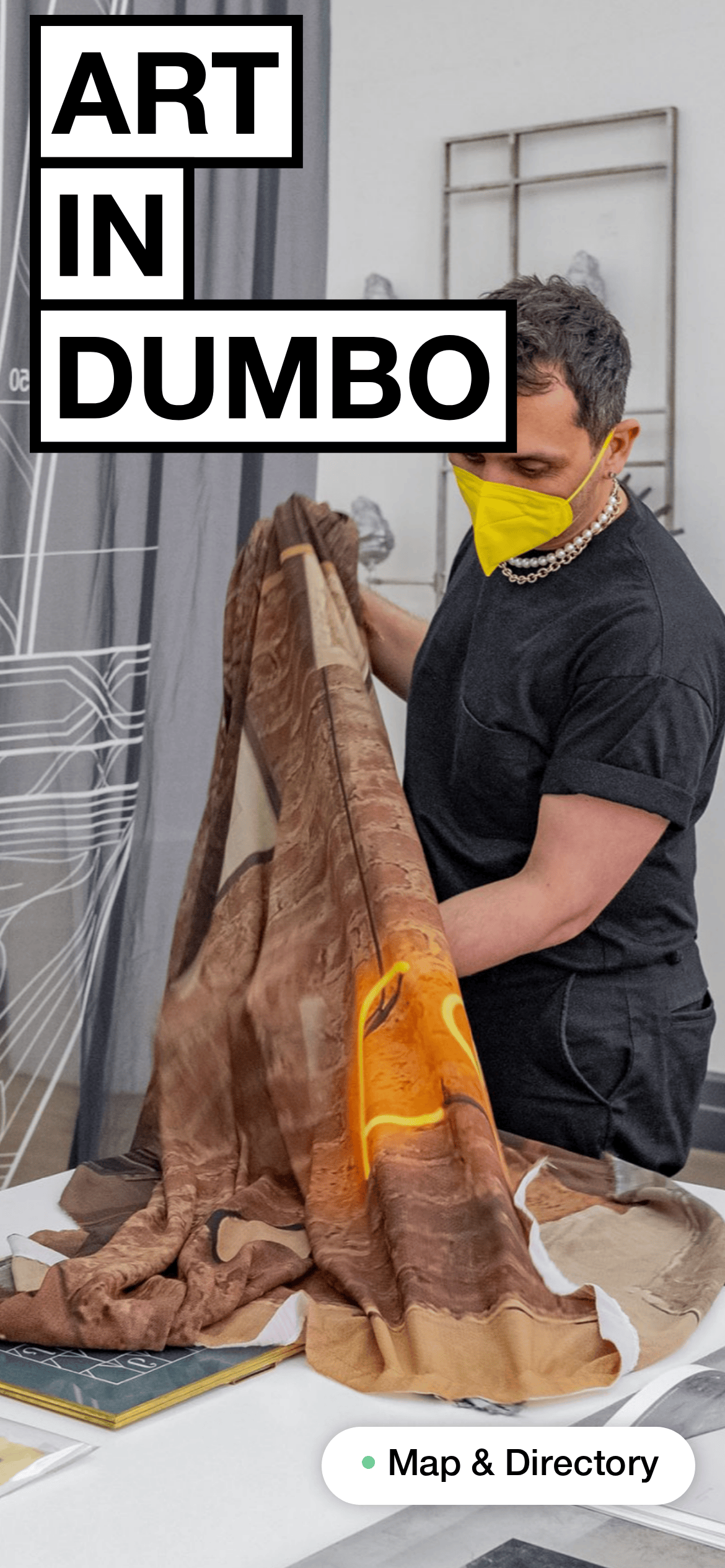
heroLarge full-viewport photography with heavy, boxed typography overlaid.
09
Voice & Don'ts
ToneDirect, informative, and minimalist.
HeadlinesBold, boxed, and capitalized for maximum impact.
CTAsFriendly and clear, often with a secondary visual indicator like a dot.
Don't use delicate or thin typography — screenshot shows heavy, bold sans-serif headlines.
Don't use complex rounded corners — screenshot shows a strictly rectangular design language with sharp edges.
Don't use subtle background tints — screenshot shows a strong, distinct pastel blue background.
Don't use colorful, multi-colored buttons — screenshot shows a clean white pill button with a single colored dot.
Don't rely solely on text for emphasis — screenshot uses thick black borders to frame key words.
Don't use dark mode aesthetics — screenshot shows a bright, high-key, light-themed interface.
Avoid: Elaborate or flowery language
Avoid: Complex multi-level navigation
Avoid: Cluttered layouts
Avoid: Excessive use of gradients or shadows
Avoid: Vibrant or neon accent colors
Avoid: Dense blocks of text without breathing room
Captured from the live site · real computed styles
11
System prompt
This design DNA represents an Art in Dumbo editorial site. The aesthetic is defined by a bright pastel blue (#B0E0E9) background contrasted with stark black (#000000) typography. Typography features a bold geometric-sans for display and a transitional-serif for body text, with a scale reaching up to 80px. Key components include full-bleed photography, pill-shaped buttons with white backgrounds, and bold black-bordered text boxes. Critical constraints: Never use thin or delicate fonts; maintain the high-contrast black-on-pastel palette; avoid complex rounded corners or shadows; and keep the layout spacious with generous vertical rhythm. Use this DNA to create clear, impactful editorial layouts that feel curated and modern.
Bring this taste to your agent
Hand your AI agent a machine-readable spec of this design — tokens, type, motion, the whole DNA.