A curated gallery for high-end interior design projects
02
Color
#EEEEEEInk
#F2F0EDInk soft
#000000BG
#050505BG quiet
#978F84Muted
rgba(238, 238, 238, 0.2)Line
High-contrast and austere, relying on extreme black and white to create a sophisticated, gallery-like presentation.
03
Typography
didone-serif · humanist-sans
display185px · 400
heading92px · 400
subheading75px · 400
body13px · 400
label23px · 400
All text is strictly uppercase. · Typography is exclusively light-weight (300/400). · Serif is reserved for expressive display; sans-serif is used for all UI and labels.
04
Spacing
4px
8px
16px
24px
32px
48px
64px
96px
Generous and asymmetric, utilizing extreme horizontal padding (172px) for focused content areas.
05
Surfaces
sm · 0px
md · 22px
lg · 26px
pill · 999px
Minimal 1px borders and circular outlines (50% border-radius) for loaders and icons.
none
06
Layout
1280container
12columns
24pxgutter
768 / 1024breakpoints
Asymmetric split-layouts and centered, circular loading overlays.
07
Motion & Interaction
100msmicro
400mssmall
500msmedium
cubic-bezier(0.25, 0.1, 0.25, 1)easing
Opacity and transform fades (0.4s-0.5s) for smooth page transitions and UI reveals.
Subtle opacity or background color transitions. · Smooth fade-out transitions for modal dismissal.
08
Components
buttonPill-shaped (rounded-full) with a solid white background and black uppercase text, featuring no border.
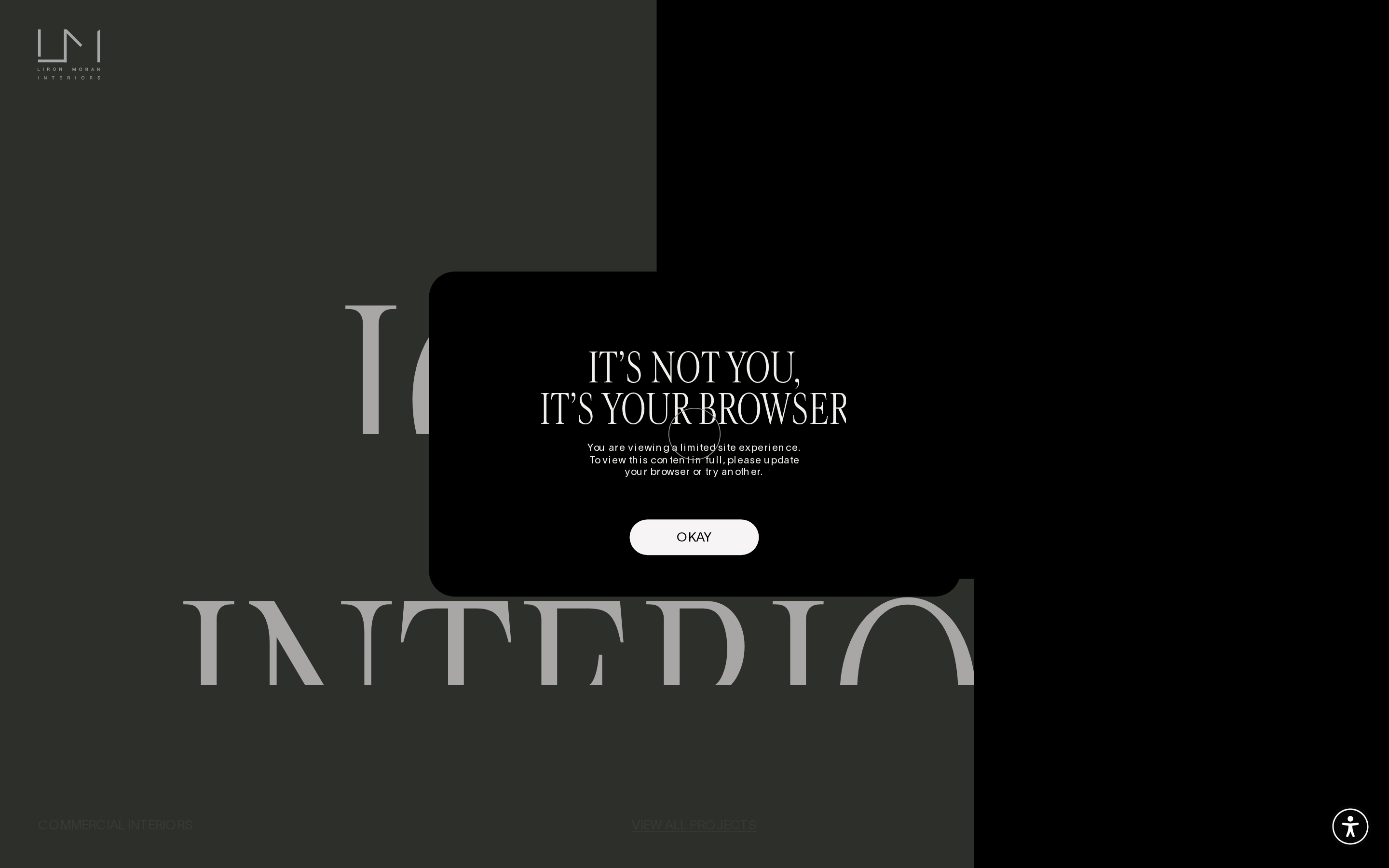
cardCentered modal dialog with a solid black background, white text, and heavily rounded corners (border-radius: 26px).
chipN/A
inputN/A
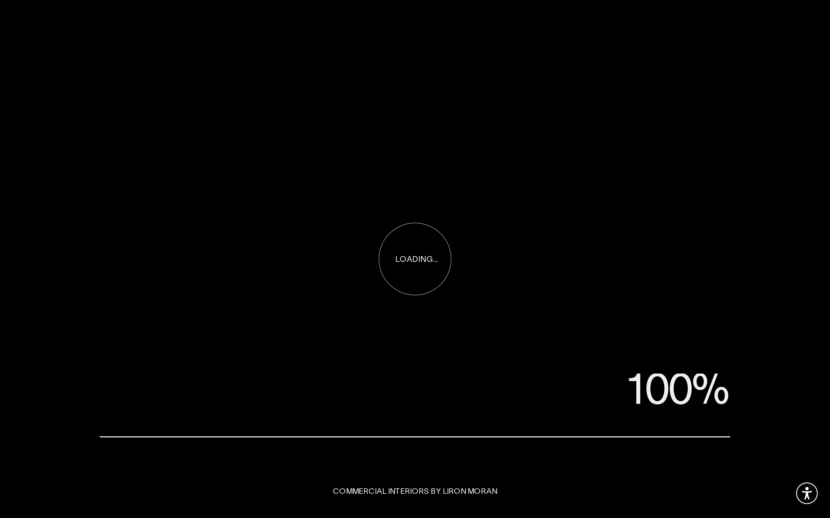
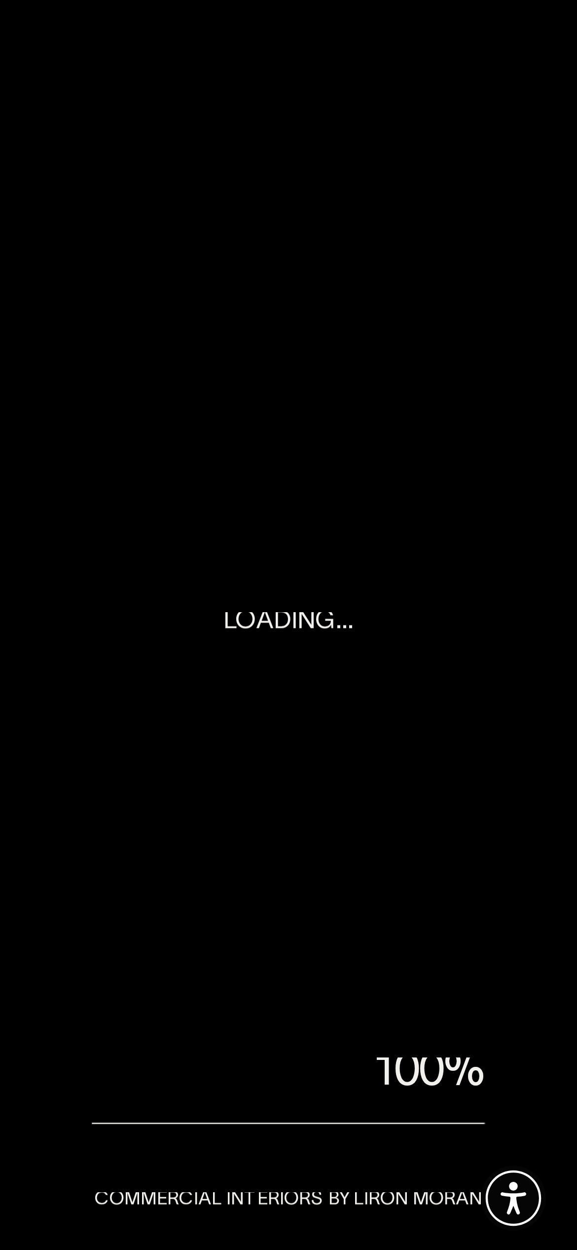
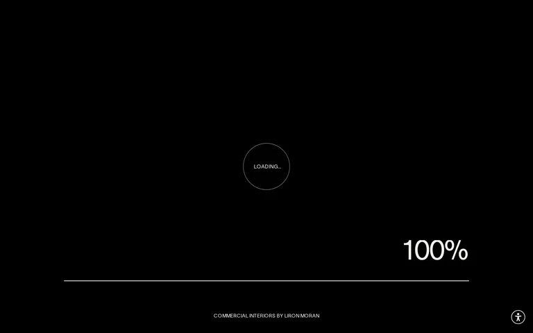
heroFull-viewport, dark-background screen with a thin circular loading indicator and large, bold percentage counter.
09
Voice & Don'ts
ToneConfident, exclusive, and highly refined.
HeadlinesMassive, all-caps serif typography with tight tracking and minimal descriptive text.
CTAsClean, rounded pill buttons with simple, direct labels.
Don't use lowercase text — the screenshot shows all text is strictly uppercase.
Don't use bright accent colors — the palette is strictly monochromatic (black, white, muted gray).
Don't use bold or heavy font weights — all typography is extremely light (300/400).
Don't use harsh box shadows — the design relies on flat surfaces and high contrast.
Don't use sharp corners on prominent components — buttons and cards feature soft, rounded corners.
Don't use cluttered grids — the layout is spacious with generous padding and asymmetric splits.
Captured from the live site · real computed styles
11
System prompt
This site is a premium digital portfolio for a commercial interior design studio, utilizing a strictly monochromatic, high-contrast aesthetic. The primary palette consists of pure black (#000000) and off-white (#EEEEEE), with no high-chroma accent colors. Typography is divided between an elegant didone-serif for expressive display elements and a light humanist-sans-serif for all UI labels and navigation, with all text strictly set to uppercase. The layout is spacious and asymmetric, featuring large display sizes up to 185px. Critical design prohibitions: never use lowercase text, never introduce bright accent colors, never use bold font weights, and avoid cluttered or dense layouts.
Bring this taste to your agent
Hand your AI agent a machine-readable spec of this design — tokens, type, motion, the whole DNA.