← OpenDesign CURATED · OPEN · FREE
Getstark
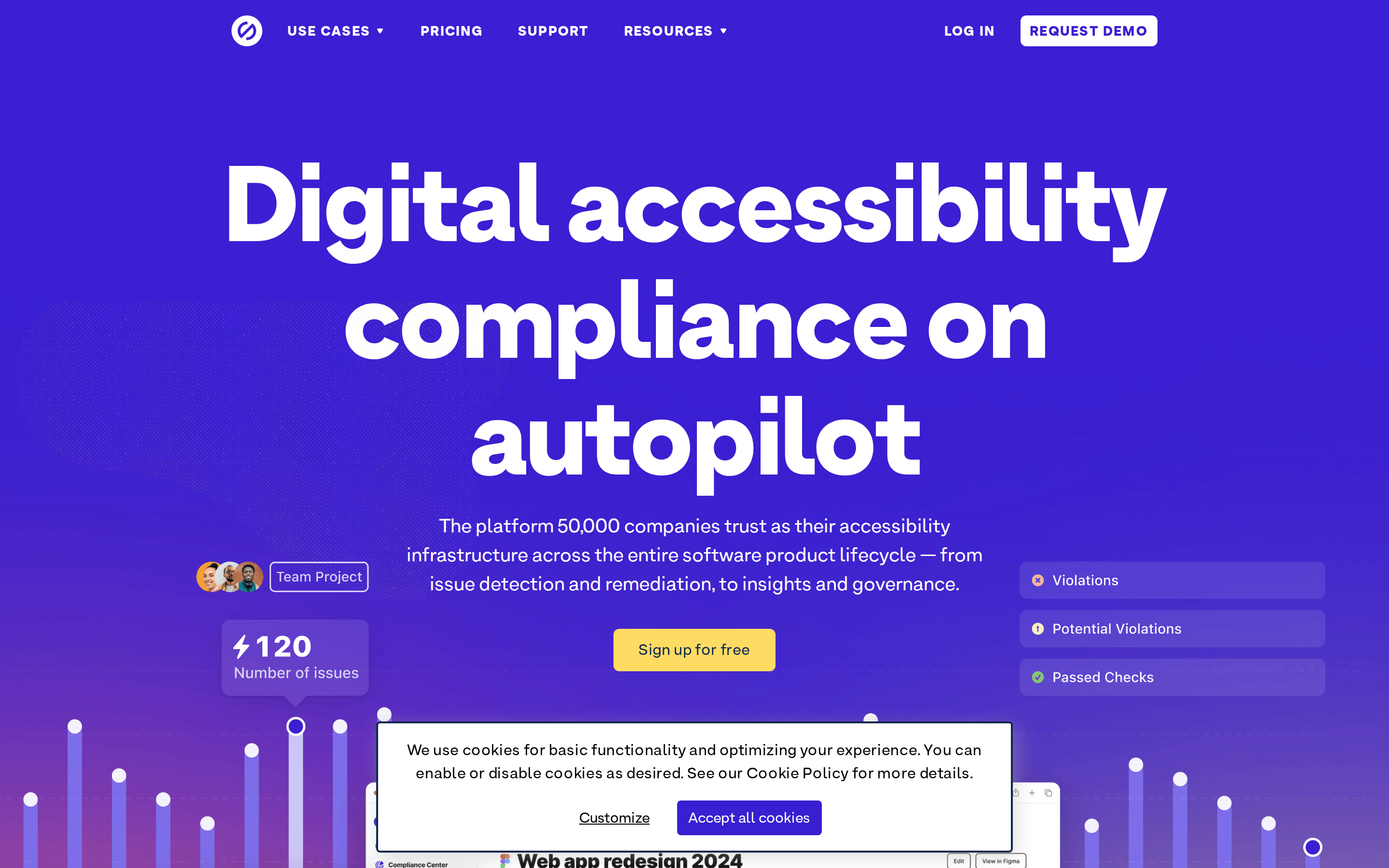
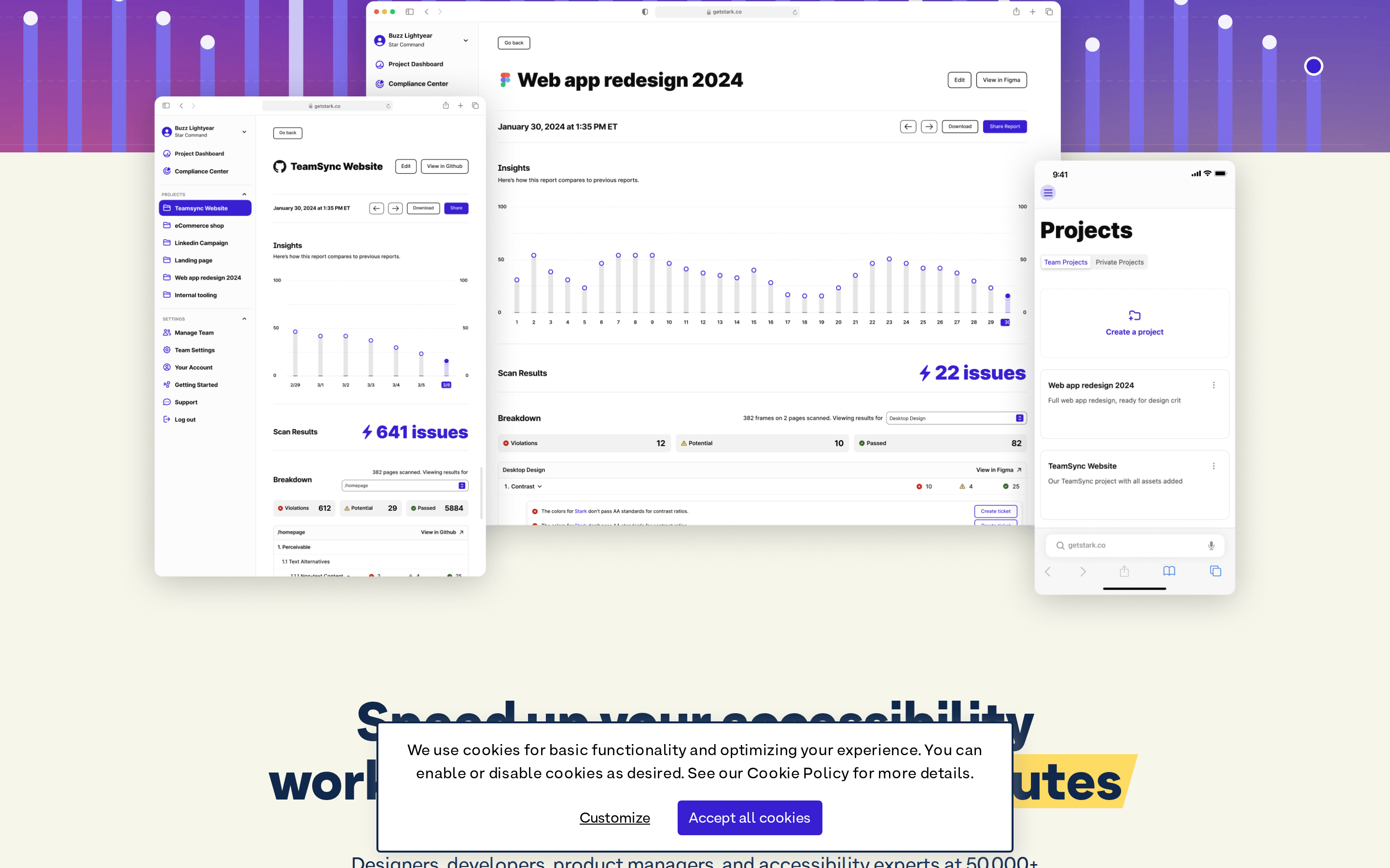
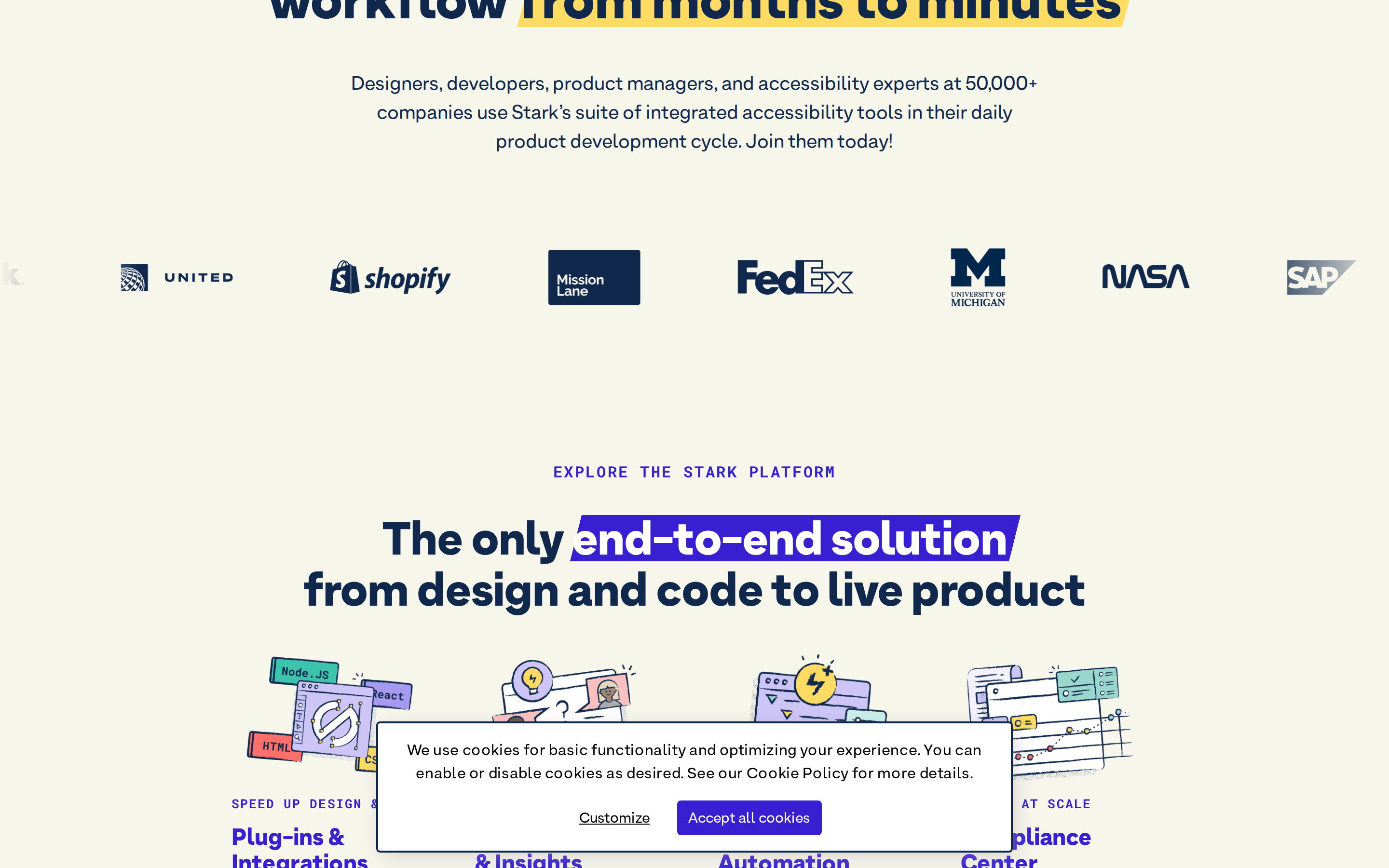
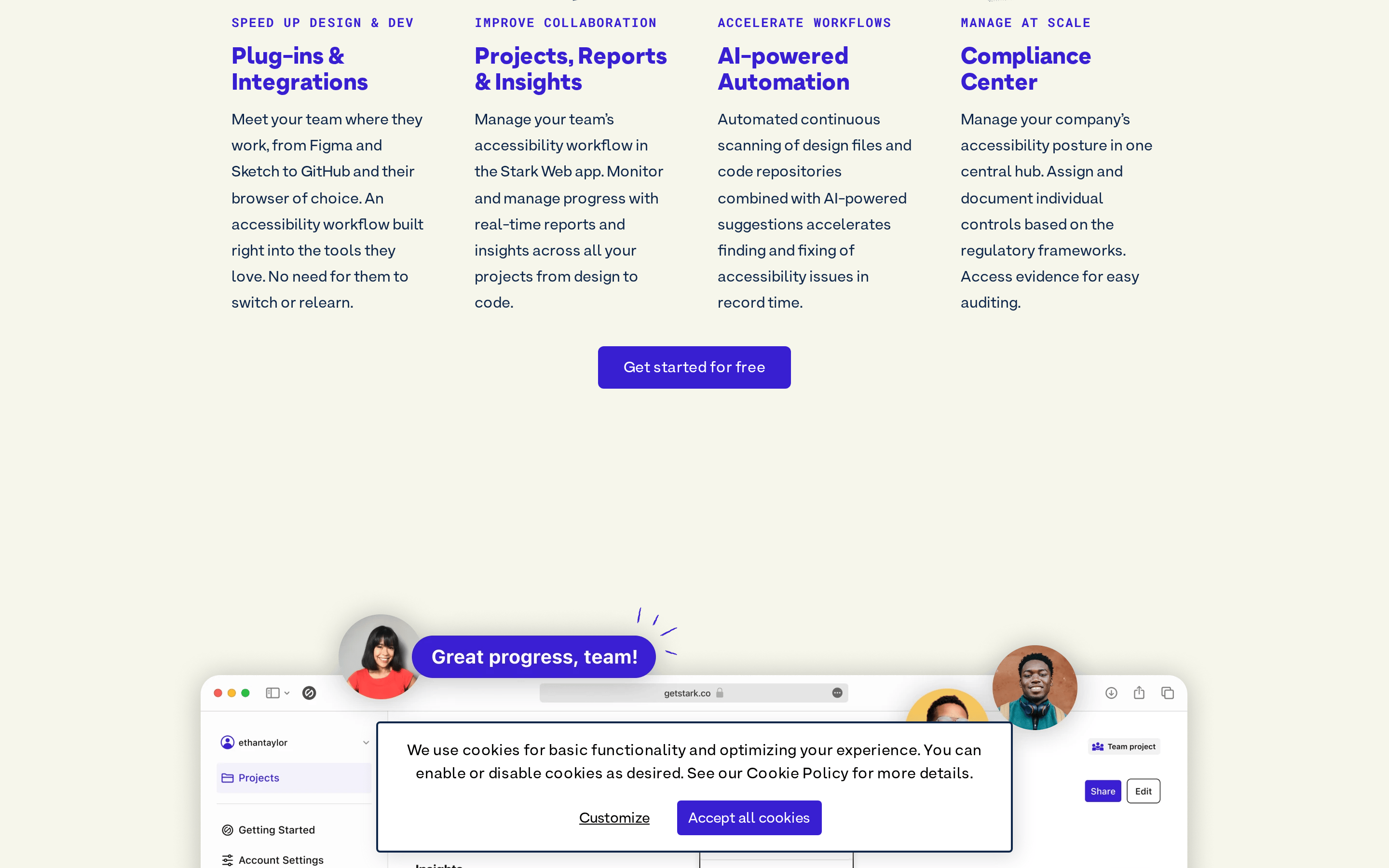
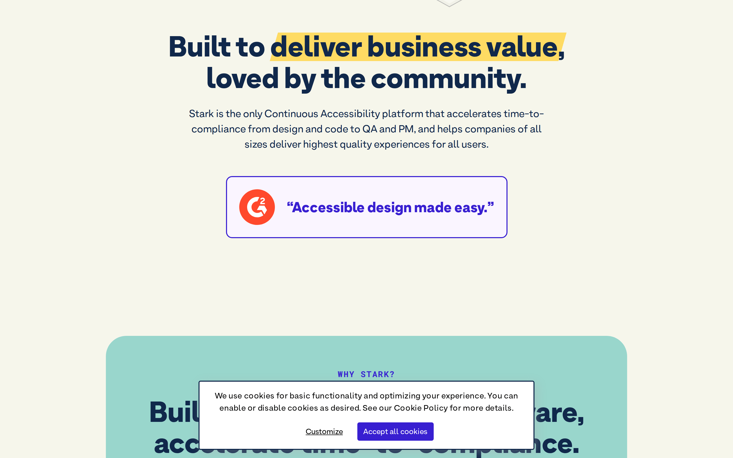
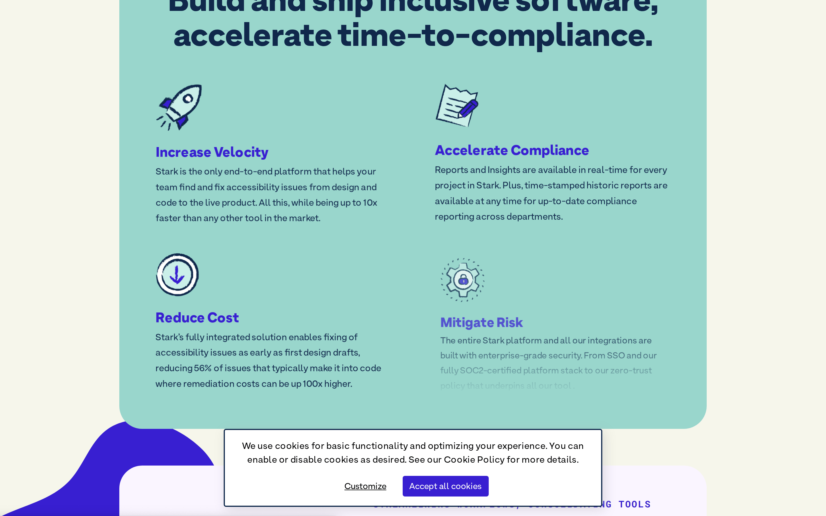
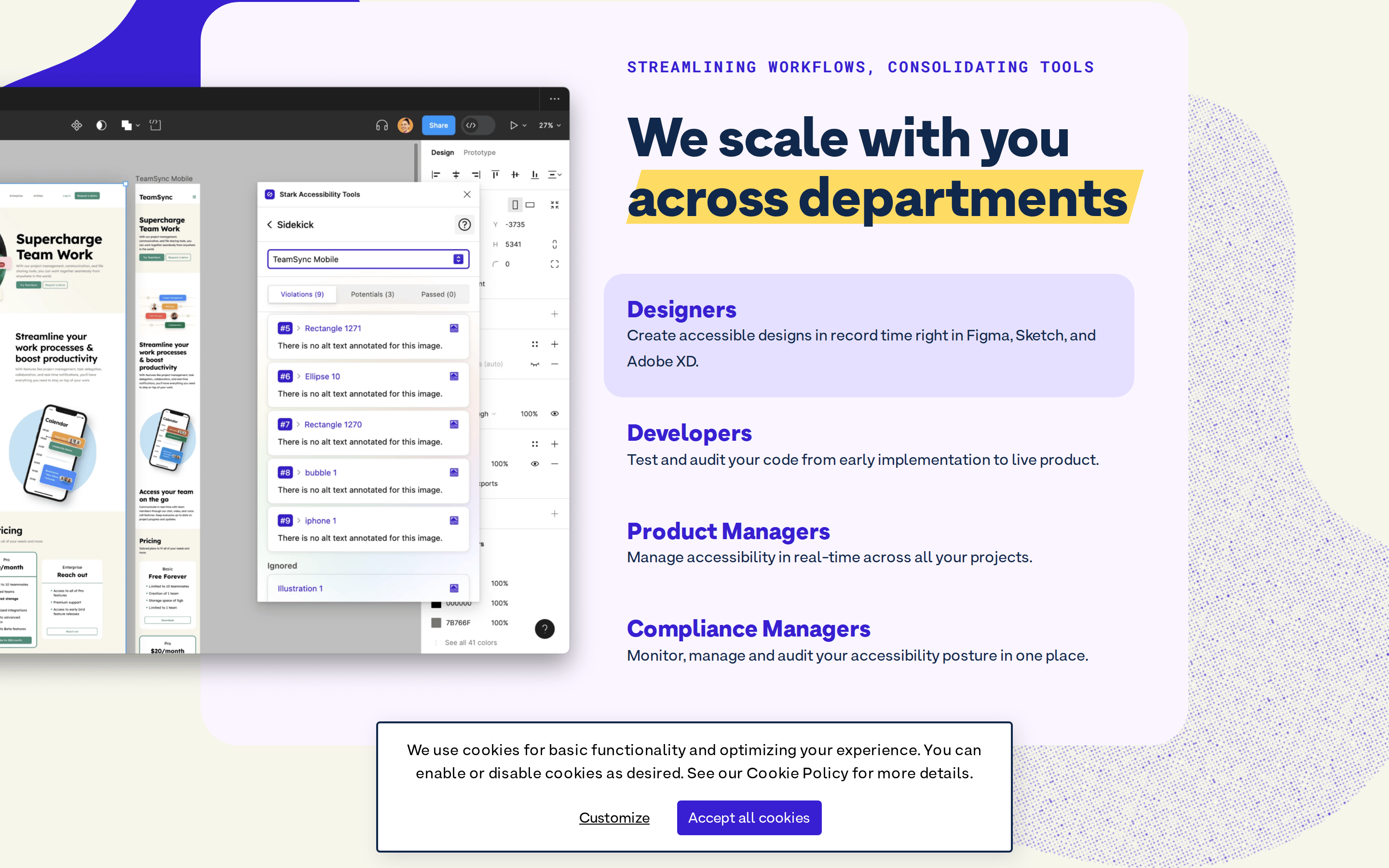
An enterprise SaaS platform that automates digital accessibility compliance across the product lifecycle.
SaaS Productivity Developer Tools AI Bold Typography
01
Identity DNA
accessibility compliance automation design-to-code infrastructure
An industrial-grade accessibility engine operating quietly in the background.
02
Color
#FEDB63Accent
#000000Ink
#FFFFFFInk soft
#381FD1BG
#F6F6EBBG soft
#FAF5FFBG quiet
#10284BMuted
rgba(229, 231, 235, 1.0)Line
High-contrast purple and yellow signals energy and technical precision.
03
Typography
grotesque-sans · monospace
display 56px · 900body 16px · 400caption 14px · 400Use tight tracking for large display weights to maintain visual cohesion. · Utilize extreme font weights to create hierarchy on limited backgrounds.
04
Spacing
4px
8px
16px
24px
32px
48px
64px
96px
Multiples of 4 and 8 to ensure consistent alignment.
05
Surfaces
sm · 4px
md · 6px
lg · 20px
pill · 999px
Thin 2px borders with dark blue or primary purple accents.
0 4px 12px rgba(0, 0, 0, 0.1)
06
Layout
1280 container
12 columns
24px gutter
768 / 1024 breakpoints
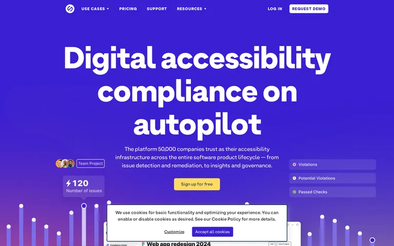
Centered column hero with left-aligned data points and floating right-aligned status indicators.
07
Motion & Interaction
150ms micro
200ms small
400ms medium
cubic-bezier(0.4, 0, 0.2, 1) easing
Opacity and color transitions on interactive elements for a smooth, responsive feel.
Subtle color shifts on buttons and links. · No heavy bounce or scale; relies on visual state changes.
08
Components
button High-contrast solid blocks with slight rounded corners. card Floating white containers with subtle borders for interface mocks. chip Status labels using background colors and icon indicators. input Simple rectangular fields with thin borders. hero A bold, type-driven section that uses a deep purple backdrop to make text and yellow accents pop. 09
Voice & Don'ts
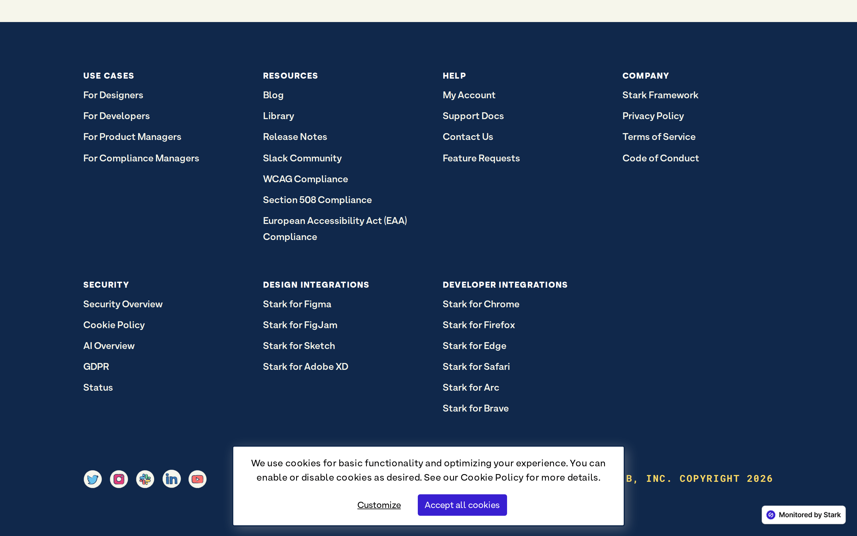
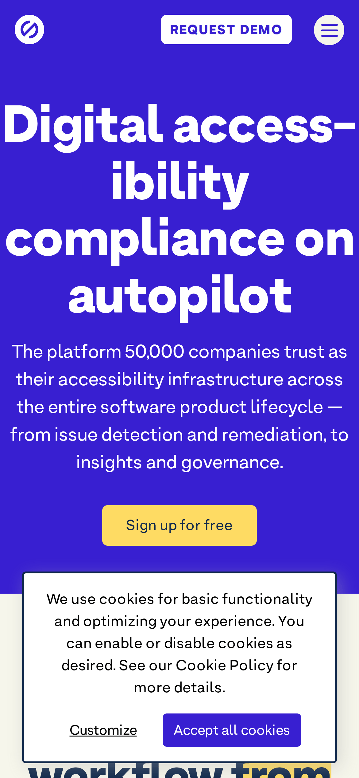
Tone Authoritative, technical, and reassuring. Headlines Direct, benefit-oriented statements that emphasize automation. CTAs Clear, action-oriented phrases like 'Sign up for free' or 'Get started'. don't use muted or pastel palettes — the screenshot shows a deep, saturated purple (#381FD1) as the primary hero background. don't use low font weights for headlines — the screenshot shows an extremely bold, black weight (900) for the main display type. don't use wide tracking for headlines — the screenshot shows negative letter-spacing (-0.56px) for a dense, high-impact look. don't use multi-colored accent systems — the screenshot shows a single, high-chroma yellow (#FEDB63) as the dominant accent. don't use sharp, 0px border-radius on all elements — the screenshot shows rounded buttons and cards, with some pill-shaped chips. don't rely on icon-heavy navigation — the screenshot shows text-heavy top-level navigation with simple dropdown arrows. Avoid: Avoid ambiguous language; be direct about compliance. Avoid: Avoid overly casual slang; maintain a professional enterprise tone. Avoid: Avoid complex jargon that isn't directly related to accessibility. 10
Inside the pack — real screenshots
桌面首屏(hero) 桌面滚动分段(90% viewport 步进,作为视觉证据) 桌面滚动分段(90% viewport 步进,作为视觉证据) 桌面滚动分段(90% viewport 步进,作为视觉证据) 桌面滚动分段(90% viewport 步进,作为视觉证据) 桌面滚动分段(90% viewport 步进,作为视觉证据) 桌面滚动分段(90% viewport 步进,作为视觉证据) 桌面滚动分段(90% viewport 步进,作为视觉证据) 桌面滚动分段(90% viewport 步进,作为视觉证据) 桌面滚动分段(90% viewport 步进,作为视觉证据) 桌面滚动分段(90% viewport 步进,作为视觉证据) 桌面滚动分段(90% viewport 步进,作为视觉证据) 桌面滚动分段(90% viewport 步进,作为视觉证据) 桌面滚动分段(90% viewport 步进,作为视觉证据) 移动首屏 Captured from the live site · real computed styles
11
System prompt
This site is a professional SaaS platform for digital accessibility compliance. It uses a vibrant, high-contrast palette of deep purple (#381FD1) and bright yellow (#FEDB63) on a clean off-white background (#F6F6EB). The typography is a bold grotesque-sans at an extreme weight (900) for headlines, paired with a standard weight for body text. Key critical don'ts: do not use thin headline weights, do not use multiple high-chroma accent colors, and do not use wide letter-spacing in headers.
More from the library en · zh-CN · zh-TW · ja · ko
OpenDesign · curated web aesthetics for AI-readable design DNA · opendesign.cc
Why we curated this: A bold example of using a saturated, single-color hero to create a strong brand identity while maintaining high accessibility standards.